|
Why does this include Quoth? Way to bloat the file size.
And wtf about the config files!!! I wanted for people, even newbies, to be able to play it without having to install something else. Is an extra thirty MB really that prohibitive?
Hmmm. Probably shouldn't have included those cfg files. ...FFS, the 45meg download is really slowing down my DX4 20gig pre-loading on steam >:(
Hey, I just have to give thanks hosting this jam.. it was first time, couldn't put everything I planned on map, but it sure was great experience. Though my maps likes to hide themes behind "core", I hope you can enjoy playing it same way as I did ^^;
Can't wait to get on pc and start playing all these. Shambler not being able to handle Bobs is the most retarded thing. What a spaz! Moreover, this pack is really good! Some creative ideas in here. Though I found the colored lighting in the some of the maps to look odd.
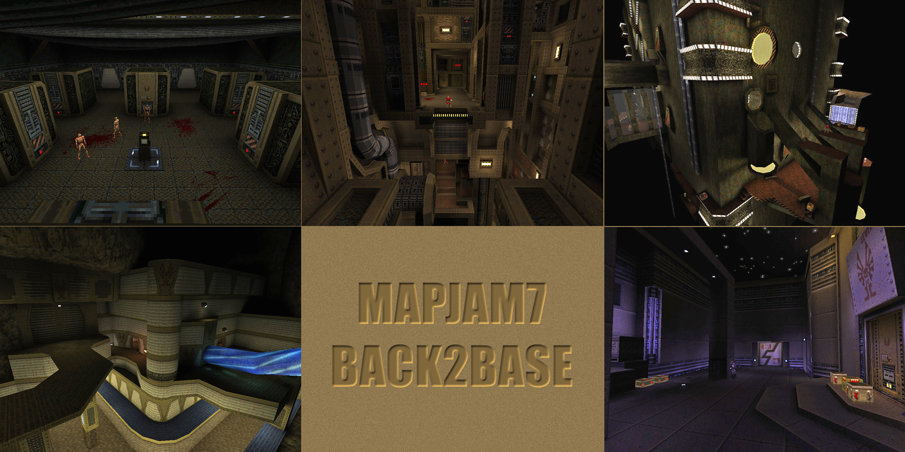
NewHouse: Quite nice for your first map. Shame it's boxed! The map is way too dark for me. The problem here is that you used colored lights as primary light sources which isn't such a good idea. They are almost always darker than their regular counterparts, and especially in the case of darker colors like the blue here. In consequence, I often couldn't see a lot which is too bad, since the control room seem to look nice; it also made combat harder. The silver key supply cabinets are a nice touch. I found a bunch of secrets, but they weren't counted as such - I assumed due to improper placement of the triggers. The glass trick in front of the monitors didn't work as water was opaque for me, so they ended up as flat grey. Nice idea in principle, but doesn't seem worth it. Combat seems just a bit too much teleport/repopulating ambushy, but not so much that it got too annoying. Keep it up! khreator: Nice gimmicks. The item dispensers are an interesting idea possibly worth expanding on. Adds an additional value to the already scarce supplies - trading in stuff. Can be exploited, though (especially with nails). Good-looking tech corridors. Unfortunately, not much else - the map is basically 90% corridors. Generally too dark, though. Would have liked stronger contrast. The darkness/flashlight secret is a nice touch. Unvised, wtf?! mjb: Again, some creative use of Quoth mechanics. The waterfall climbinb and how you acquire the ability, coupled with the exploration are very cool. Navigation is somewhat frustrating in parts, when dismounting properly or jumping off the ladders and trying to land on the ledges fails. Thanks for the safety net... ItEndsWithTense: Or does it? I like the sculpture/vista, very unique and interesting thing to see in an otherwise familiar style/environment. Reminded me a little bit of a certain map by Orl. Small and sweet, although it feels like a missed opportunity not to use the space better. Low monster count is fine, but instead of allowing the player to just run through, there could have been some puzzles or button hunting. ionoose: Take it, use it - the super nailgun falls out!!! Kind of brush porn at its best. Looks very cool and it's a pleasure to just examine the details, despite the fact that it's pretty much a single room, wpoly as expected. As with 10's map, it feels like it's over so quickly with little to do. Not sure how it could have been spiced up more... maybe, again, some more button hunting to activate auxiliary machinery, and a mid-level vermis fight? Anyway, gg guys. Finally, some demos Your face is the most retarded thing ever. I'm actually finding bobs okay in this pack so FU!!!
Thanks negke, but Too dark? On my screen it looked bright enough and some lights was even way too bright, but then again I really should figure out how it might look in other's monitors/screens, I really hope there could be two settings for lights. And map indeed lacked combat areas, I wanted to have enough gameplay, because I need to get rid of whole ice core/water pipe areas otherwise map might have felt uncomplete compared to others huge maps (that was my expectation).
It is wierd that Secrets did not count, because I tested it multipe times and only trigger that didn't activated was illusionary secret. Is it really maps problem or engine related issue?
If your map looked even the slightest bit visible, let alone normal, on your screen, then surely all other maps must look completely fullbright to you. Try Ionous's map in this pack, but wear a welders mask first as it might fry your optic nerve!
http://www.quaketastic.com/files/demos/sham7_demos.zip
All recorded in Fitz0.85 apart from Khrhehahthohr's recorded in Quakespasm. I haven't played Quake for a couple of months and am a bit rusty and am getting used to laptop keyboard, hence a bit hopeless! Thanks
1) Yeah it could be a little bit brighter. It looked ok on my screen, but I found it a little bit too dark on other PC too. So I'll keep this in mind in the future. According to your comment about map being unvised - map was VISed but I guess my pipes and cables are a nono, too much faces. And in one place I fucked up with func_detail and forgot to fix this - in a zombie corridor whole pipe is a func_detail LOL. ps thx for the demo, I'll take a look at it soon :) So it means Everything I did was pointless because nobody can see it. And because contest is over and I can't fix that for this, that really feels great. I just wanted be happy that everyone can Experience it same way as I did. I understand situation quite well, I am just pissed because of me.
How do I make it brighter, is there commands I can use when compiling? There is no way I can go through all the light entities that fast and rise up values.
Also that glass thing in screen actually it worked on higher light values, but it also lighted too much room and that's why I just leave it that way..
Quick and obvious tip for making sure the light levels in your map are not miles off.
1) Look at the lighting levels in your new map. 2) Look at the lighting levels in the stock id maps. 3) If there is a large disparity between them, then tweak your lights, and goto 1). Thanks for pointing out that there is no commands for increasing light's brightness amount. So basically every light entity needs to be almost 300, that's what you mean. So it's gonna take time to change all of those, but maybe that's the only way to do it.
Simple just increasing sunlight doesn't seem to work, because then some of the rooms becomes overly bright when comparing other part.
|
| You must be logged in to post in this thread. |
| Website copyright © 2002-2026 John Fitzgibbons. All posts are copyright their respective authors. |