|
Here's a shot from me looking at the staircase.
http://orl.fvfonline.com/misc/staircase.jpg If you didn't know it was there, you would simply think its part of the wall thats just unlit. Even playing through the map twice, I had a hard time finding the staircase. ok i give up, do whatever you want with the map guys, i doubt i can do anything more with this darn map as i've had to much problems with it to continue putting even more on it, it just keeps erroring out when i try something new
I think a lot of mappers like to think of lighting how a photographer might think of it. In other words, using lighting to "set up a scene," instead of just using it to allow a player to see the environment.
Actually, most people have the opposite problem. Mappers will tend to light to make sure every surface has light on it, because they just built all this stuff and now you have to be able to see it, right? Lighting for effect/realism is only learned in time, after you start to think of the lighting's role in the map as a whole, and not just 'that thing you do after you build the map.' More health and armor would've helped, especially in the beginning. Good-looking map, but cramped in places. If you want to try a slightly different lighting, run this:
light -fast -soft -extra4 -gate 1 -norev -addmin -sunlight 100 -sunmangle 45,-75 -sunlight3 80 -range 0.35 -dist 0.9 qshift It'll reduce the flat minlight effect and overlay with other ambient lighting. If you want more contrast, you can lower minlight and increase range accordingly. You can do one thing with this map - you can learn from the feedback. People have issues with the lighting and some crampedness....a bit more beta-testing would help that in future. It's a genuinely good map and I think everyone appreciates that....it would be good to see more maps from you and I'm sure you will improve their quality.
I played through the map and the lighting was fine for me - not too dark.
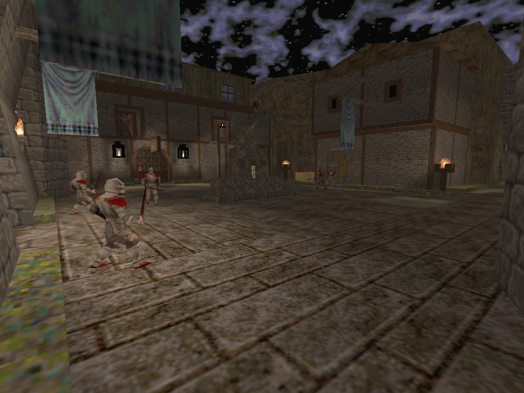
I'm using an ATI Radeon 9600Pro. Lighting has been an issue in the maps I am working on. What looks fine to me, is too dark for others. I think that if Elvis keeps mapping, he can make a fine contribution to the SPQ1 scene. I like where he was heading in the underground sewer system. Also, some simple puzzles like the tome and dragon help break up the typical key hunt. I did find it very cramped. With mapping practice comes a better sense of scale. I've leaned that first hand as I have made areas too tight in my maps. I'm better now. on those two alternate shots that spirit showed, I really dont think that's an improvement at all.
Sorry spirit, dont mean to sound high and mighty, but I cant see how thats good ighting. aguire, do you have shots with the lighting you suggested ? elvis, what shambler said, just take ote of what'sbeing said for future maps because this one was still pretty good even with these issues. I didn't mean it as good lighting. I just wanted to show the difference between totally bland and contrasty. It was not meant as "do it this way" at all!
heh, i have the same card (and problems) like scragbait.
didn't found it to look too dark either. in fact, the dismal lighting fits well to the outside areas, as the maps is obviously set at night time. however, the high minlight level dimnishes the contrast the flames and torches would otherwise have created. local lights with different fade distances might have been better probably. no problems with ammo/health on skill 2. the only tight situation i had was at the gk door. the sewer part reminded me of a doom map for some reason. :) Shots are always difficult to represent how it looks in-game. You just need the bsp and the Light tool from my site and then run the above line, on my rig it takes about five minutes.
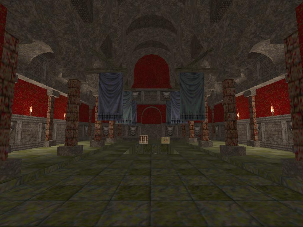
If you want to experiment, just omit the -extra4 option, then it's just a few seconds for each try. Great looking map with a definite Hexen touch; nice textures and believable architecture, actually I thought the hectic beginning was the best part (the ogre can be used to kill a lot of the knights).
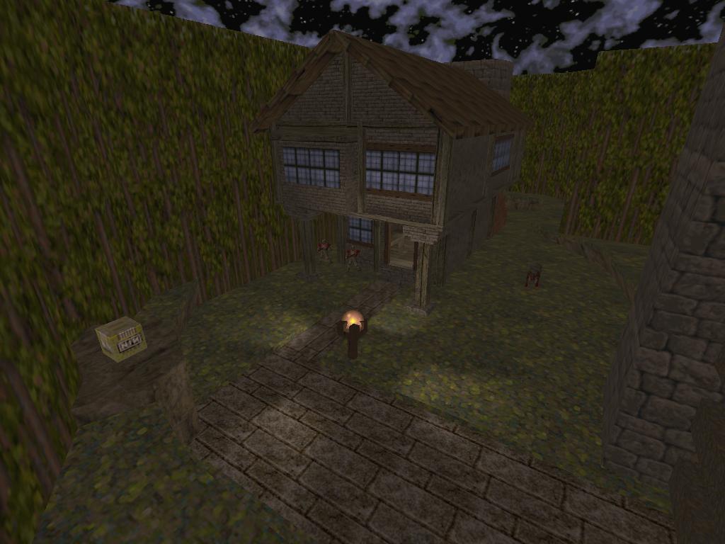
I didn�t like the cramped indoor parts though (not only the player, but also the monsters have difficulties to move here), and also: three secrets, all unmarked. There are better ways to make the player replay a map, i.e. with good gameplay. Honestly, what�s the point of forcing the player to run around the map and shoot every pixel ?/ the armor in the church deserves a golden gay award...gameplay in the mines was predictable, you could have spiced it up by hiding the GL near the end, so the player has to dodge the zombies at first. All in all a nice map Elvis! (and just for fun, here�s a demo :) http://download.jupiter.come2store.com/sielwolf/qshift_sw913.dz Gave me a good fifteen minutes of enjoyment. Didn't find any secrets, which is rather rare for me. I liked the odd touches, such as the vertical sticks with the liquid texture. No clue what it did, what it was, but it looked cool. A little cramped in places, could have used a bit more room to move around. Decent map overall.
I found all 3, had to noclip to find the YA. Was there any clues as to either of the armour secrets? They just seemed to be regular sections of wall. :-)
I enjoyed this map. The first house was indeed too cramped, it annoyed the crap out of me. The rest seemed okay, spacewise. The main courtyard area was fun to ruck with a posse of knights, particularly on nightmare. The highlight for me was the sewers. Great stuff, but the shaft was maybe extraneous and made the last kill really easy. I liked this map a lot. The textures and the architecture are very good (except for the crampedness mentioned by others already). I didn't have any problems with the lightning, it felt just right to me (I used Joequake gl with gamma 0.75). I also think that light contrast was present enough.
The ammo was just right on hard skill and the health supply also. Maybe the map was a bit too easy (the beginning was too hard though). Found one secret by accident (the RA) and it really helped. I thought there were too many knights and the LG wasn't really needed to be there. Also the fights were too static in most cases, only the GK battle forced me to move faster. But those are just minor points. All in all an enjoyable map with nice atmosphere. Here is a demo: http://www.mediafire.com/?8ttgfdmmmjm Nice first run, I loled when you thought that grey armor was a secret :)
@AguirRe: totally forgot about the 2 ogre/vore spawn...hehe I enjoyed playing it a lot, especially the gameplay (but the crampness!!). Though I would have used a little different textures in places, less classic - more custom (more Knave for example). Keep on mapping.
|
| You must be logged in to post in this thread. |
| Website copyright © 2002-2025 John Fitzgibbons. All posts are copyright their respective authors. |