|
Just found this - might be useful for you:
http://bisqwit.iki.fi/story/howto/dither/jy/#Appendix%201GammaCorrection Take a look at the whole article. I pasted a link with redirection to "Gamma correction" by mistake, which is least interesting part of this page.
Thanks, I've read all of it (minus the code, because I'm on a smartphone atm).
So far I've not used any iterative color search methods, only straightforward calculations. But that article may give me some ideas on how to improve TGA skyboxes and external textures. Skyboxes such as "Interstellar" and "Violent Days" still looks pretty bad in Retroquad. Another idea on how to improve external textures is to perform topological analysis to scale the error diffusion in a non-linear way. This is in my mental list of things to try sometime. As mentioned before, this is the best result I had achieved.
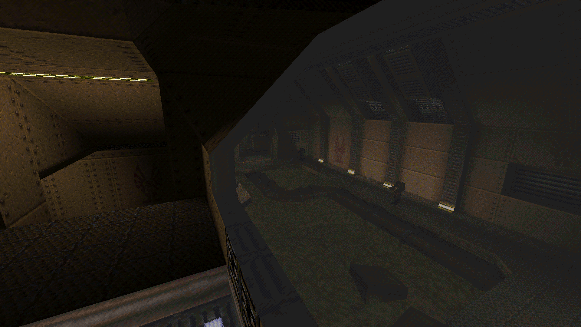
But after testing the translucency on several maps, I've had one more idea. Now I've modified the gamma correction algorithm on the blending, turning it into adaptative gamma-correct blending. This helped to give the resulting image an even more natural look, with even more details being recognizable now. Both this screenshot and the previous one were taken with exactly the same settings (r_slime_blend_alpha 0.6; r_wateralpha 0.5). Thoughts?
I want to use a skybox in my map (before now it was regular boring old blue sky) but i'm struggling to find the right one that matches with the lighting. I think this one kind of works. Any ideas for other good ones? Also, it's alright for me to use it, right? It's taken from AD, but it's uncredited in the readme so yeah. I'm sure no one would really care if I did or not, but I still feel like I should be a responsible citizen and check first. Not bad. You should ask Sock if you wanna do this by the book. Check this page http://quakeone.com/forums/quake-help/general-help/10727-definitive-hd-replacement-content-list.html for links to a bunch of skyboxes.
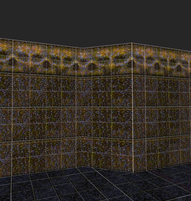
In Photoshop, I would pick the color in these rocks, invert it (Ctrl+I) and start from there.
Interesting changes.
I notice a bit of graininess has crept in in the shadows. You're able to recover quite a bit of detail on the crates, where prior they were almost flat. Is there a method you could apply to selectively remove dithering where it is going to appear grainy? The areas in particular I'm thinking are where the biggest shadows are, or will that ruin the glass transparency effect? Is there a method you could apply to selectively remove dithering where it is going to appear grainy?
No. But while playing the game, the grainyness isn't as noticeable. The area in those screenshots is a worst case scenario, translucency effects usually looks better than that already. So I pasted the id metal skull texture over some fucked up overlapping brushes and it resulted in this weird conjoined twins effect where the overlap occurs. I think I'm going to keep it.
http://www.quaketastic.com/files/conjoinedskulltex.PNG It looks cool but the effect is only in this particular place. All other skulls look normal. Now you need to fuck up the rest of your wall! xD
That's Quake's normal "natural" texture alignment. You'll have to scale/shift the texture on the angled wall if you want to fix it. Even if the alignment looks okay, I sometimes still scale so that the pixels aren't stretched. Depends on how noticeable it is.
I think I'll keep it, it's only in one other place but it's amusing to me. Who knows if it'll be noticeable once the map is lit.
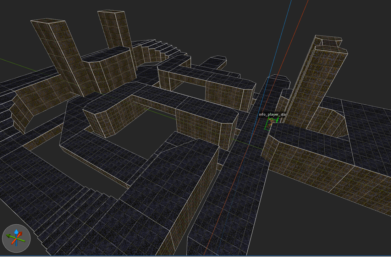
Anyway, here's a speedmapped layout I think I'll make into Qonquer map (originally supposed to be a coagula level). Might make a whole pack of these for kicks. Dunno how the rest of the community feels but imo there aren't enough good Qonquer layouts. http://www.quaketastic.com/files/qonquermet.PNG If those all are in grid (no half pixels and so on), there has to be some extreme math going on behind all this madness.
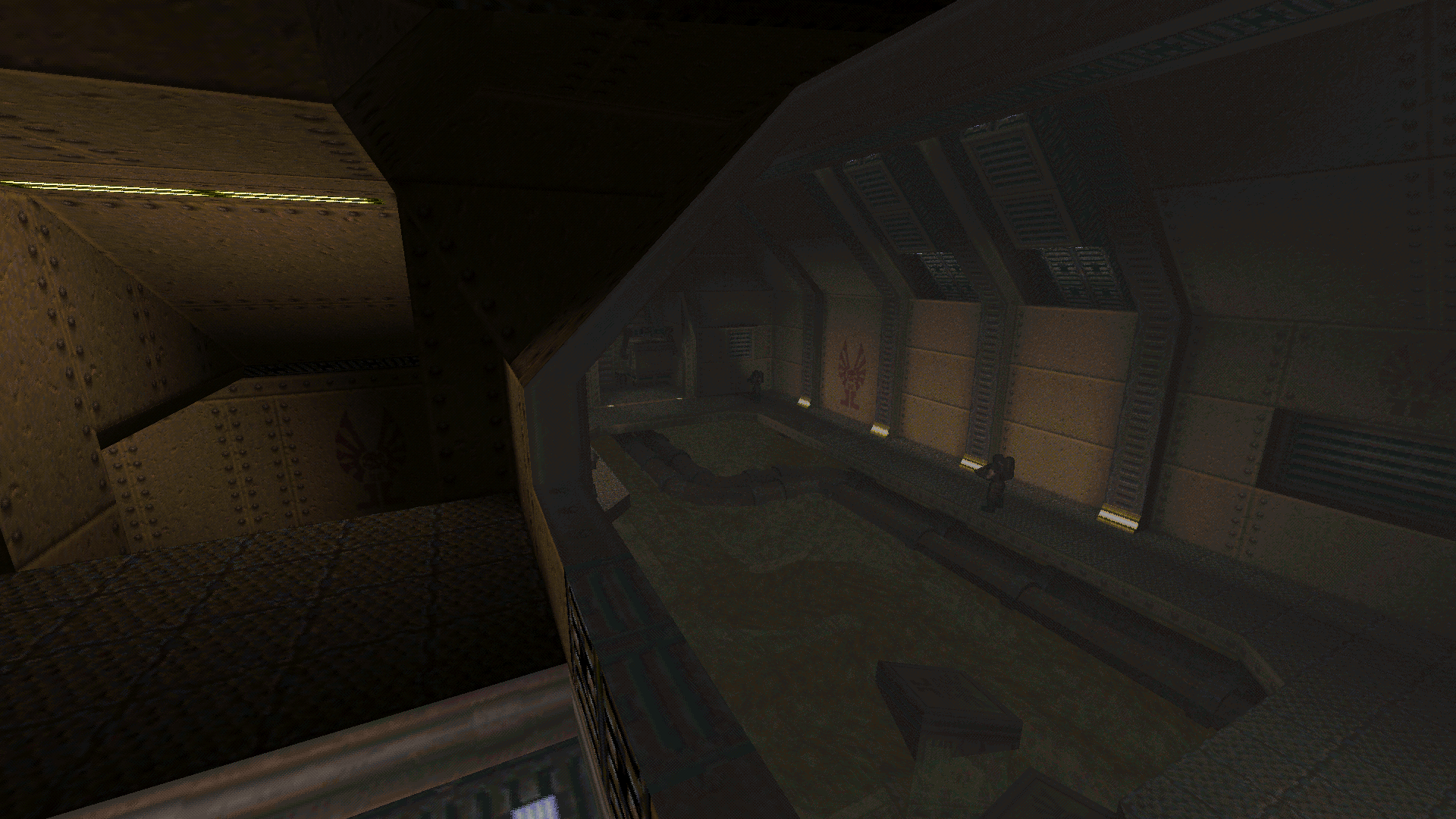
I've added a last step to improve the color blending.
In the previous screenshot, there was still some weirdness in darker areas. Now, in this new screenshot the contrast is more faithful. Now I don't see anything else to improve in this specific test case, and in all my tests through several other maps this algorithm also seems optimal... except for one thing: I've found out that it's only optimal at 50% translucency. I'll have to do some tests to figure out exactly what needs to be compensated from one blending level to another, but I'll leave that for later. Also, I want to thank MFX for his Clean Cut map, which was really helpful to test and improve the color blending. Those flat-colored gray color windows served as a good neutral ground for figuring out which properties of the colors were being distorted, and how. How in the hell you did that? I expect you ported it from another program to the editor, if not, i can't see how.
It can be done in an editor, and quite fast. Took me just 2 minutes after realizing how.
It reminds me of something that happened in 1997: my oldest brother did a 16 steps per round spiral staircase on the grid with just the carving tool that looked awesome and left me wondering for months. And in the end the trick was easy and fast to achieve. What's impressive on Mfx's screenshot in the end is the results, and the goal this achieves: something impressive with fast done brushwork and good ambience, completely the opposite of what i did in the starting areas here. Well, thanks to it i toned down a lot on difficult brushwork, and Mfx's screenshot reaffirm my conviction.
|
| You must be logged in to post in this thread. |
| Website copyright © 2002-2025 John Fitzgibbons. All posts are copyright their respective authors. |