|
Good to see a new mapper! Thanks for posting screenshots.
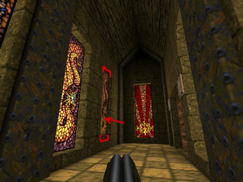
I agree with everything Bloughsburgh said. It looks like a project with potential, but a couple more suggestions: The proportions of the map seem a bit too large in a few places. Examples include the raised Quake sign on the floor in the third picture, the wall-mounted lights in the first, fifth and last picture, and the stained-glass windows in the first and fourth picture. The raised Quake sign will probably make movement around that room a bit more annoying than it needs to be. It's not high enough to block line of sight, so it's bound to just impede player movement. If you lower it so it's just a couple of units high (and maybe turn it into a func_illusionary), it will probably look and play better. This goes for intricate floor details in general. As for the stained glass windows in pictures 1 and 4: I would suggest letting the textures lead your brushwork a bit more. It looks like you've scaled up and stretched that texture to match your brushwork. Instead, maybe try creating brushes that match the scale of the textures. That way you'll end up with slightly better visual proportions. Also think about what the textures represent. A raised stained-glass window that casts a shadow (picture 4) doesn't really make sense -- so either use a different texture for that kind of object, or make the stained-glass window flush with the wall, or recessed (sunk into the wall). A related point: in pictures 2, 3 and 5, you've used a door texture that is rounded on top, yet you've placed the door brushes inside a rectangular opening. Here, again: let the textures lead your brushwork: if your door texture is rounded, turn the doorway into a corresponding arch. Or else, use a different texture for the door. Also related to texturing: pay attention to all sides of brushes. The ceiling lights in pictures 3 and 5 have the same texture (the light texture) on all sides. That texture should only be on the bottom face of the brush; the sides should have a different metal texture. The rooms themselves seem a little too large for the sparse detail they have: the ceilings are high, and the walls are pretty uniform from floor to ceiling. This tutorial might be helpful in learning to avoid that sort of thing: http://isoterra.co.uk/quake/tut1/ I look forward to seeing the map develop further. :) There are two things I don't agree with in that tutorial, namely the recommendation not to use stock textures, and the suggestion towards the end of using minlight: stock textures are fine, especially the runic/wizard textures you're using; it's how you use them that counts. And DON'T use minlight.
But the basic ideas about using non-rectangular shapes, height variation and texture variation to give more character to a room are all sound, I think. I don't have critism,
I only see "for the joy of the game"! Go on! And let the good advice help you. Dude this is dope as fuck! every new mapper should read this!
this will instantly remove all these awkward flat ceilings, floors anw walls. It's a fucking sexy tutorial and I love it.
I'd lost it, thanks for finding the link for me again ^_^ I made this in a couple hours today:
http://imgur.com/a/IBKNq The map is tentatively titled Aaa, which is the hawaiian word for "lava tube" (seemed appropriate). I shall strive to keep the same creativity standards for the rest of the map. I hope I won't disappoint. I wanted something reminiscent of E1M6 and the start map's entrance to episode 3, but different. I think I succeeded. What do you (and the others) think of the title?
I would advise against keeping an "intricate" look like that for too long. Certainly use it in sections, as it is quite nice and it has its effect, but it's quite "dense" and aside from probably not playing well with monster movement, I think it's too visually distracting. I would personally tend towards a solid face for the endcap to the "tunnel" shown here, but in general I would reserve it for interconnecting segments and keep it away from combat areas.
Perhaps it could work as an upper-wall/ceiling detail as well, I don't know. You'll have to see what works, but be wary of creating anything too visually dense. Maybe the tubes could be used as hallways or transitions to rooms...still way too early to make any assumptions but I like the initial idea of it.
The name is cool and pretty original...I can always appreciate it when a map title has relation to the map's theme. It also has the benefit of being almost at the top of a lot of lists, if it were to ever be released seperately.
Although, has anyone tried releasing something that starts with 0? Releases that start with 1 currently sit at the top of Quaddicted by default. Don't worry, I won't keep this level of intricacy for the whole map. In fact, I was already planning on making this starting tunnel lead into a more solid room. I just wanted an opener with a bit of a wow factor.
Glad you like the name. So it's settled, then. I initially found it funny but it's growing on me beyond that. It can be viewed as a cry of panic or pain, plus the original meaning is aptly fitting to the architecture I want to build. Funny thing is, I stumbled upon it completely by accident. I've just remade the main arena. Hope it looks better.
Screenshots: http://imgur.com/6Fqxmao http://imgur.com/v50gh5n Nice screen, lots of detail going on in there.
2 things: The rivets texture looks a bit skewed maybe due to texture scale increase? This looks worse on the slopes sections up above. If that center blue section is meant to be a pool of water, then consider lowering it by 8 units to give it a bit of a lip. This make it appear more realistic rather than directly aligned with the floor. Keep going! Yeah, what Bloughsburgh said. And maybe add a border to the pool. Also, you could try to make the vertical girders protrude more from the wall with the Christ, like they do from the other walls.
That looks pretty decent, but my only complaint so far is that the room looks a bit too bright. I'd suggest toning down the brightness and it will look much better.
The water texture just sitting on the floor looks a bit strange to me. You may want to make it more of a fountain with a perimeter.
http://parentseyes.arizona.edu/placesinthesun/photos/today/places_fountain.jpg Your lighting is pretty bright and flat as others have said. Windows in Quake are usually set into the walls like this: http://pirat.snotboble.net/quake/pics/hip2m65.jpg There are a lot of great touches too - keep going - you are well on your way to a good looking map. Hail hail the gang's all here!
What if you could pick any enemy from Quake ever for your map? What if there was a mod that provided every feature under the sun? What if there was a mod that said the mapper is always right? Many have created awesome content in numerous mods. AD is the closest to combining the most goodness in one package...and still...sometimes you just want a gug to beat up some poor crossbow knights. Sometimes you want a scragmother alongside mummies. Sometimes you want a vermis with lost souls. What if...? Now, if only I can get permission from all the mod authors to upload this someday. (Please note that content shown in picture above is actually coded and fully functional except where certain bosses are only visible when angered in which place I have used a misc_model to show them as non-angered.) I don't know about everything... Where's my X-Men total conversion monsters??????? or weird 1997 porn mod reskins?
/s
|
| You must be logged in to post in this thread. |
| Website copyright © 2002-2026 John Fitzgibbons. All posts are copyright their respective authors. |