|
I saw the map showed up on the front page news (http://celephais.net/board/view_thread.php?id=61352), so it might make sense for further discussion to be consolidated in that thread.
Here :)
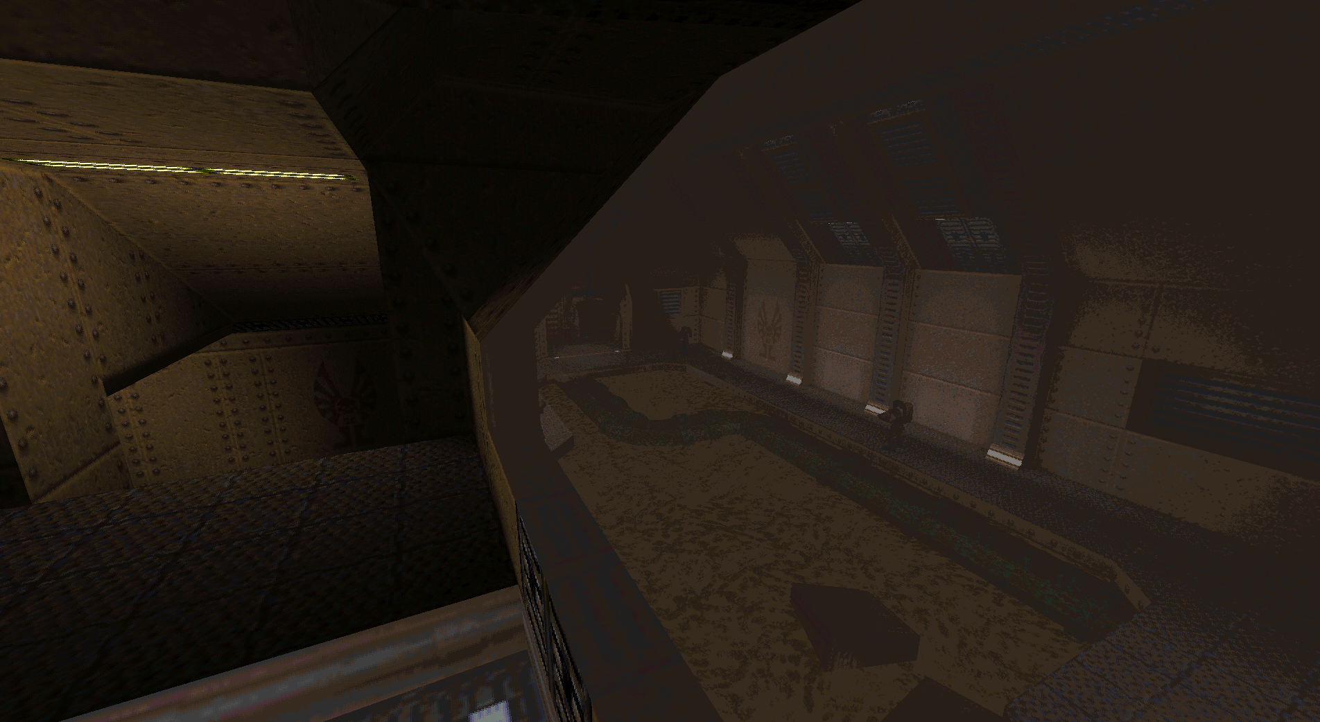
At first, 8-bit color translucency was like this. Due to the limits of Quake's 8-bit color palette, straightforward blending of color values was very lossy.
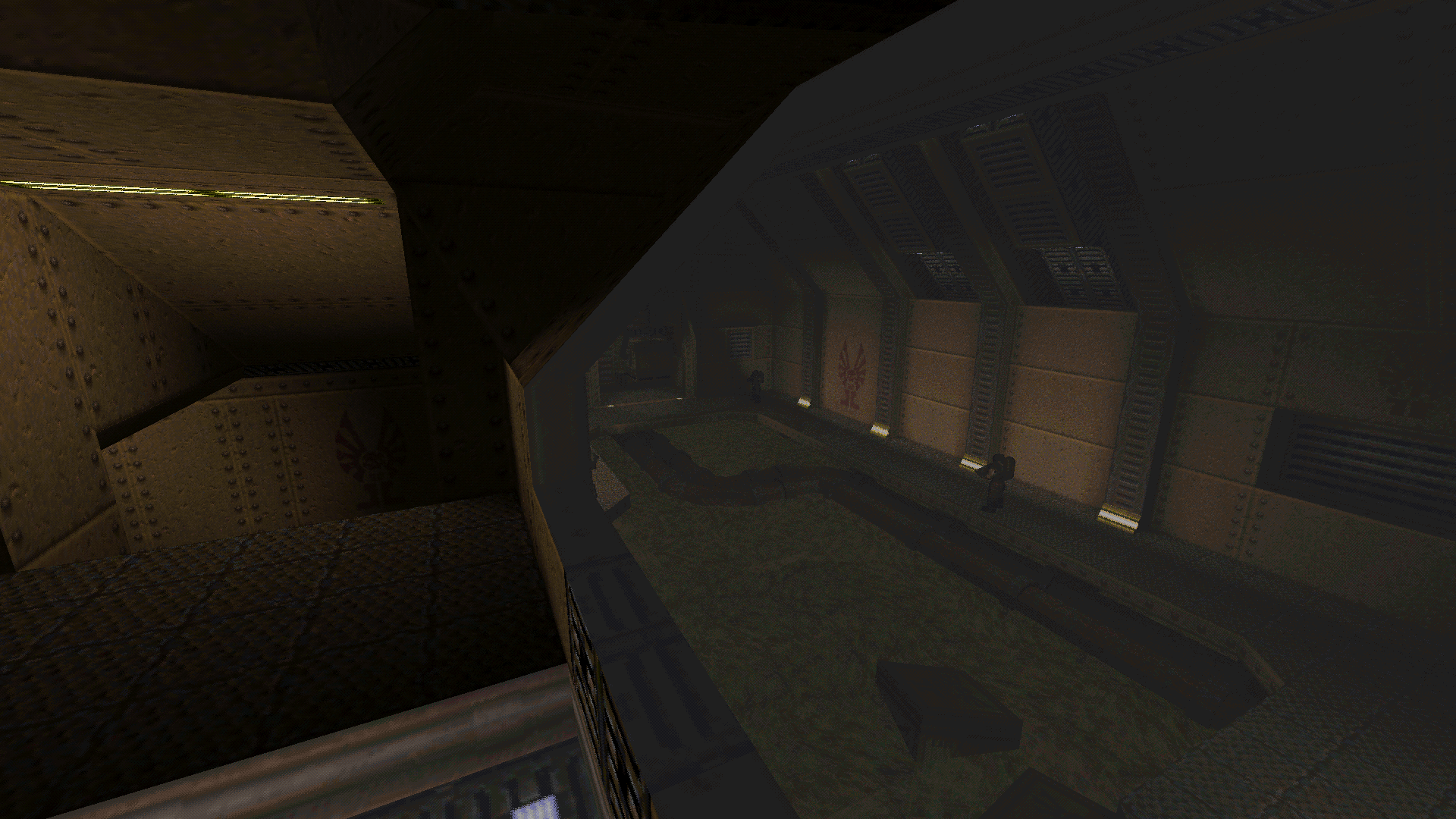
Then I've figured out a way to apply color correction on both translucency and lighting. The colors improved a lot, although the results were very grainy (see how the shape of the slime texture became completely unrecognizable after being blended twice). After that, I've decided to try implementing gamma-correct translucency. The blending became smoother, color hues became more faithful and the shape of the slime texture could be recognized again, but a few details were lost in the darker areas of the image. Now, I've also implemented gamma correction on the lighting. This helped to recover those lost details back, and then some. Now the slime texture is fully recognizable, even through two passes of alpha blending, and details such as the pipe texture on the bottom left of the image are more faithful than ever. For a final comparison, see this 24-bit truecolor mockup I've made in GIMP (which doesn't use gamma correction). If you convert this 24-bit mockup back to Quake's 8-bit color palette using popular error diffusion algorithms such as Floyd-Steinberg, my results are still smoother. I have one more thing to change in Retroquad's color management, but I'm skeptical about further quality improvements. This "one more thing" will be just to simplify some calculations. Because of dithering.
Exactly. The only workaround would be to convert the whole renderer to 24-bit color, which is what the Pixomatic software renderer in Unreal Tournament 2004 did.
Just found this - might be useful for you:
http://bisqwit.iki.fi/story/howto/dither/jy/#Appendix%201GammaCorrection Take a look at the whole article. I pasted a link with redirection to "Gamma correction" by mistake, which is least interesting part of this page.
Thanks, I've read all of it (minus the code, because I'm on a smartphone atm).
So far I've not used any iterative color search methods, only straightforward calculations. But that article may give me some ideas on how to improve TGA skyboxes and external textures. Skyboxes such as "Interstellar" and "Violent Days" still looks pretty bad in Retroquad. Another idea on how to improve external textures is to perform topological analysis to scale the error diffusion in a non-linear way. This is in my mental list of things to try sometime. As mentioned before, this is the best result I had achieved.
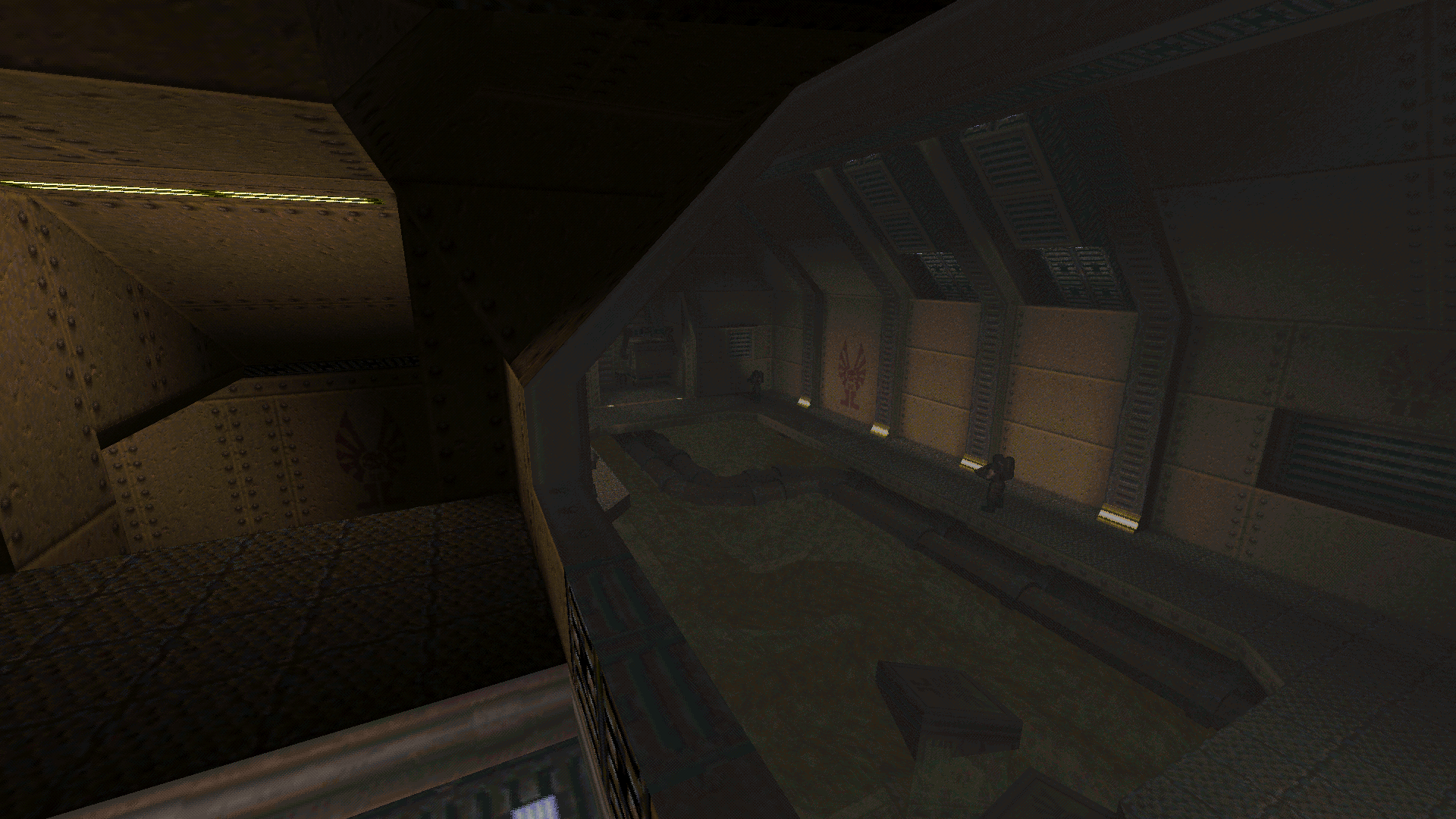
But after testing the translucency on several maps, I've had one more idea. Now I've modified the gamma correction algorithm on the blending, turning it into adaptative gamma-correct blending. This helped to give the resulting image an even more natural look, with even more details being recognizable now. Both this screenshot and the previous one were taken with exactly the same settings (r_slime_blend_alpha 0.6; r_wateralpha 0.5). Thoughts?
I want to use a skybox in my map (before now it was regular boring old blue sky) but i'm struggling to find the right one that matches with the lighting. I think this one kind of works. Any ideas for other good ones? Also, it's alright for me to use it, right? It's taken from AD, but it's uncredited in the readme so yeah. I'm sure no one would really care if I did or not, but I still feel like I should be a responsible citizen and check first. Not bad. You should ask Sock if you wanna do this by the book. Check this page http://quakeone.com/forums/quake-help/general-help/10727-definitive-hd-replacement-content-list.html for links to a bunch of skyboxes.
|
|
|
| You must be logged in to post in this thread. |
| Website copyright © 2002-2026 John Fitzgibbons. All posts are copyright their respective authors. |