|
Cheers Starbuck - these looked absolutely fantastic and seamless with any default idbase texes when I played dm3rmx. I never use idgamma, and all you whingers who do can stfu kthx.
(I jest, I jest ^_^ ) I'm not even sure if I used idgamma or not any more. The textures looked a bit dark when I tried using them, but I nearly died when I saw the different in detail they make over regular idbase textures. The only criticism I have is that some of the computer textures (i.e. the most detailed ones) don't look amazing close up. That's all though, they do look shit hot mostly.
I tried the textures and, overall, they look very good - better than the QRP ones. That said, there are a couple of wall textures that just looks too poor in detail and blurred - as if they were actually just resampled images from the original 8-bit, mostly when you look details like blood stains. Maybe because some of those are 256x256 pixels wide while other use 512 pixels, I don't know exactly - I know it's very hard to match the equilibrium point between the original decaying look-and-feel and the temptation to make everything screaming "hey, I am using 24 bit-colors!". I think it would not hurt to add a bit more detail on some of these, though. In the positive side, the computer and tech themes have the correct balance between detail and fidelity to the original theme. Definitely worth the download.
I want to point out that I went back to the QRP page, and it looks like they are gradually replacing their bad textures with better textures. This might mean that eventually, the QRP set will actually be consistently good.
Most of QRP still looks awful to me. For the most part it looks like they just blew up the originals then applied Median or Emboss filters and upped the saturation.
Either that or they just have no detail whatsoever. They rather ironically lack 'texture'. it's about time I answered them...
Daz ...none of this shitty new textures crap, but enhancing the old textures to look shiny and new without making them look totally shite. Well done! Have you got plans to do the other id sets Starbuck...hope so :) thanks a lot, that's a big compliment as my main goal was to keep the feel of the originals. I don't plan on doing the other sets: it's too much work, and the only set i'd have an interest in doing - the e3 metal textures, have already been done pretty well by the Quake Retexturing Project. Tron From afar things look the same, it's only when you get upclose that you notice the textures are sharp instead of all the details being blurred out... Same again, I really appreciate this... most times I try new textures I have a run around, think they look pretty but change the look too much and delete them. Text_Fish ...Plat_top1 appears to have missed out on its makeover though. :P It has, but with good reason. Basically, it shares it's name with an Episode 3 texture, and if you replace one, you replace the other. There's more info here: http://facelift.quakedev.com/retexture/bugs/ ijed pixies reference? Yes! Well spotted, one of my favourite Pixies songs (Hey, Dead, The Happening, Ana and Cactus are also up there) and the only base pun I could think of at the time :) Vondur very well done! now proceed with wizard.wad please ;) Haha maybe. I meant to show these to you before release, as I was mainly inspired by e1m1rmx. Unfortunately you weren't in IRC when the set was in it's testing stages (!) so only CZG got a look. Preach Also, awesome set of texture, really love the designs of the computer stuff, they've got a crude, cobbled-together machine feel that's really apt for idbase. Because I cobbled them together crudely, no doubt! Speeds luma's are the fullbrights, but they don't work in every engine. Fitzquake doesn't support them, or TGAs for liquids. Hopefully it will in later releases, as I think they make a real improvement. nitin/AguirRe About the whole idgamma thing... I hadn't even thought about it to be honest. Maybe I should tell people to switch it off in the readme. I guess I'm not running it though, as the brightness looks the same to me. As I was making these, I had the original texture extracted from the Gnear Hi, I love the texture pack, what caught my eye the most in the remodeled shotgun (second to last SS) I know its not part of the pack, but can anyone please tell me where I could get it from? Thanks, and sure thing, it's actually only a retextured shotgun, but you can get it on Moon[Drunk]'s page here: http://w1.470.telia.com/~u47016112/quake/ QFan some of them are based on the original quake retexturing project, aren't they? No sir. I made a point of not really looking at any other retexturing packs while making these, so I wouldn't make anything too derivative. The only time I looked was making that stupid light texture with the black background and the bars going across it. I couldn't even tell what was going on in the original, so I used theirs as inspiration :) frag.machine I tried the textures and, overall, they look very good - better than the QRP ones. That said, there are a couple of wall textures that just looks too poor in detail and blurred - as if they were actually just resampled images from the original 8-bit, mostly when you look details like blood stains. Maybe because some of those are 256x256 pixels wide while other use 512 pixels, I don't know exactly - I know it's very hard to match the equilibrium point between the original decaying look-and-feel and the temptation to make everything screaming "hey, I am using 24 bit-colors!" very good observation there actually. It is true, some of the earlier textures I did in this project were only 2x the resolution, and most of those are large wall panels with the windows and the light white concrete bit. I hope to go back and up the detail on the ones that need it on the next release. I wanted to fix this but didn't have time before the end of the expo. what there's more :)
starbuck, might be handy to mention the whole idgamma thing in the readme, no idea how many people use it though so could be not so important. anyway, aguire's suggestion works great. And where are good e3 metal textures, link please ? indeed sir, I plan to update the pack soonish, to improve some textures I feel are kind of substandard, and do a few tweaks. The other plan is to include all the mission pack base textures, but I haven't started on that, as I can't find the mission pack cds :P
Also, I mean to support some more good maps. Any suggestions would be very useful. Biff's maps maybe? Notorious_ray? I've got a far from encyclopedic knowledge of idbase maps, so please remind me of the good ones. And where are good e3 metal textures, link please ? I think the Quake Retexturing Project ones are good, but you'd have to pick them out by hand, as you can only download a pack with all the textures they've done. http://facelift.quakedev.com/retexture/ (about 170mb) I just noticed this texture:
http://facelift.quakedev.com/retexture/textures/new/lgmetal2.jpg It's a single tile repeated 5*3 times? What the hell is the point of this? :psyduck: they have to match the aspect ratio of the original texture becuase the UV mapping is determined by the original texture.
As for why it's so repetitive, i'm guessing laziness. Do you intend to replace textures to health boxes and the rest of this stuff ?
The remodeling project has pretty decent ones:
http://facelift.quakedev.com/download/SKINSbmodels-48files-4-23-05.zip Sorry for necro, but I just want to say thanks for these retextures. They look great.
Also, are there any other sets that go well with these? I really like that they stick so close to original game. Hey, thanks! Awesome to hear people are still using these :)
I can't really recommend similar style textures, all the replacement packs I've seen go for more high-def fancy-pants realism than these, where fitting in with the original textures was by far my highest priority. I notice that the original link is broken though, maybe a mod could please replace the download link in the OP with this one: http://www.quaketastic.com/upload/files/texture_wads/DebaserTextures_v1.zip and the "QExpo Booth" link with this one: http://www.quakewiki.net/archives/starbuck/ cheers! I did actually start working on other themes, but then my laptop got stolen, and I'd made the wise choice to make no backups whatsoever...
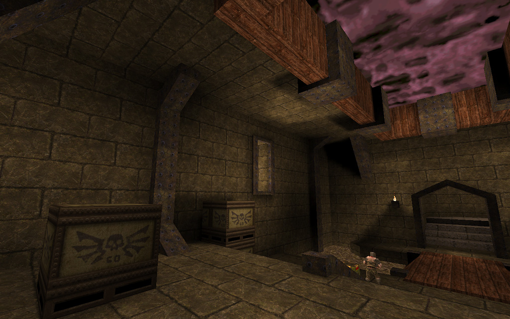
screenies http://www.quaketastic.com/files/screen_shots/e1m2_tex1.jpg http://www.quaketastic.com/files/screen_shots/e1m2_tex2.jpg http://www.quaketastic.com/files/screen_shots/e1m2_tex3.jpg Thanks. Yes, the other ones I've tried stray too far from the original look IMO. If there is one single game that doesn't need new graphical bells and whistles, it is Quake. It's forever awesome.
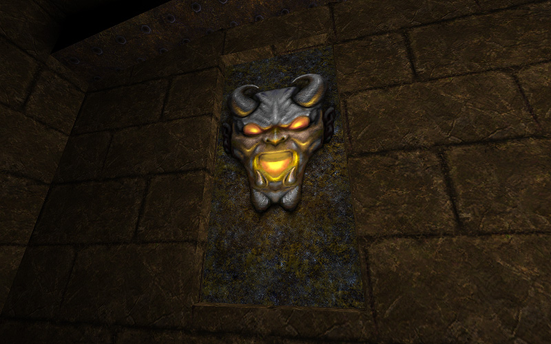
I just attempted to rescue the happy demon with some low tech photoshopping... probably still usable! Would still have to be colour matched with the original though:
http://www.quaketastic.com/files/screen_shots/sbtex_demon.png
|
| You must be logged in to post in this thread. |
| Website copyright © 2002-2026 John Fitzgibbons. All posts are copyright their respective authors. |