|
I remember the moaning about the yellow lights,
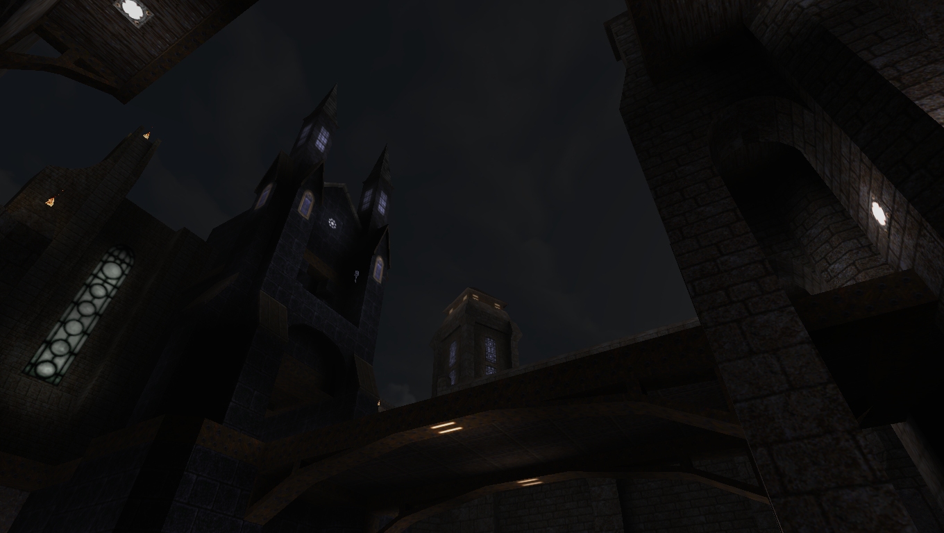
and now people want it back. I like the look now, monochrome or not. People are strange. As for the NetRadiant issue, i have no clue... I had added this room about a year ago. It's a pretty important room, but I was never really happy with how it looked. This is an old screenshot from before I did the re-texturing.
Old Room I worked on it a lot last week end and I think it's looking better. Probably still needs some lighting tweaks. New room Different view is phenomenal!
And yes new room looks better but lighting could be less flat. new room looks MUCH better with the texturing. those windows and bricks are great. the outdoor spires are fantastic. just be careful not to make it TOO dark.
damn sorry Drew seems like I over-interpreted things again, as I always do.
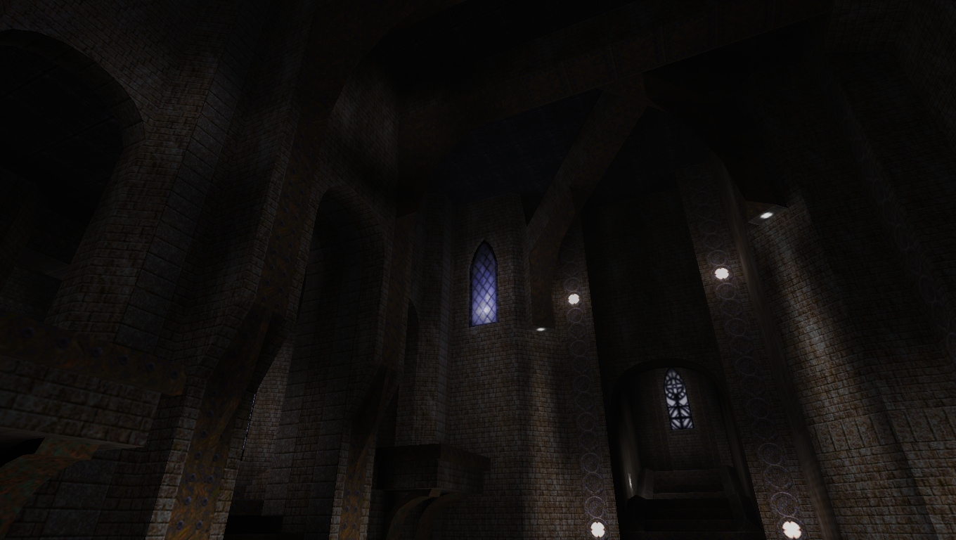
New version of the room is a lot better, everything seems way more considered and detailed, including lighting and texturing. /Eschews gothic label I think the bricks look kind of small in relation to the huge scale of the room. I'd prefer if at least some parts of them could be bigger for a more 32ish style similar to the previous metal4_4 style.
Which is good. The new one looks better because the textures break up the flat areas of the previous one better.
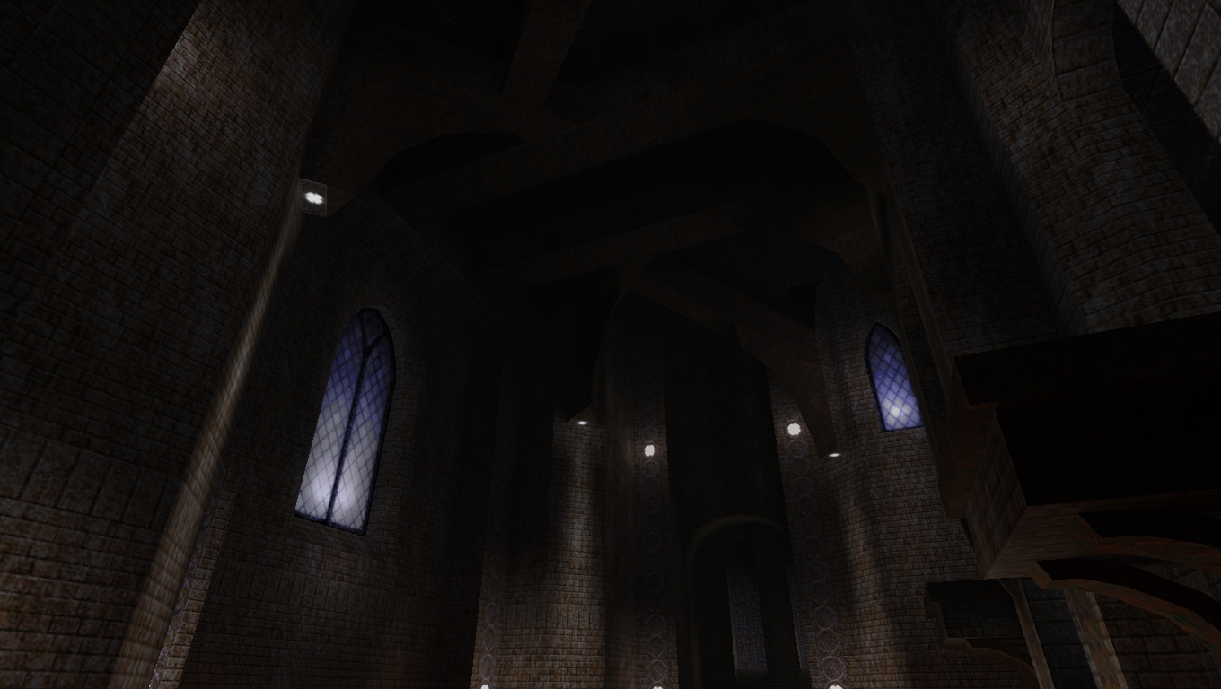
Is there an altar in the middle? Looks very interesting indeed.. neo-gothik / medieval maps are always cool :)
Go finish this ! Looks pretty good.
I think I prefer maps with a higher contrast of light/dark lighting. Also I thing I would personally avoid large flat walls and break them up with detailing with protrusions or texture changes. large flat walls
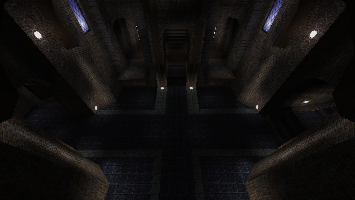
Honestly, what do you mean? There are not any of what I would consider large flat walls in any of those last few screen shots. There are some that are pretty tall though. I wonder if it's something about the angle the screen shot was taken at? Here's an overhead view with an exaggerated fov. I didn't change brightness or contrast from the original, just converted it to jpg so I may look a little dark. http://quaketastic.com/files/screen_shots/Wish13_d.jpg If the walls aren't the same thickness at every height. You can make these transitiones in two ways - with a 'step', i.e. the wall suddenly gets X units thicker, with a perpendicular step, or with a slope. This is true of much architecture because the foundations need to be strong enough to support all of the weight above it.
Either way, it's a nice way of adding a whole other dimension to your architecture. You could add some damage detail to the architecture too, maybe a few cracked tiles, , bricks out of place or missing etc. Overall I think the shots look pretty awesome, just thinking of elements that you could take more advantage of. It doesn't require gussying up. It has a nice stark balance and subtle detailing. In the shots I've seen, I'd consider that aspect of the map 'done'.
What you've got is good. Finish it as you see fit.
Float walls refers to not using geometry (brushes) to make the light map do the work of making a space interesting. But with all the work you've put into the light it's not a mistake you've made. Don't go into pre-release worry. We've only seen screenshots!
|
| You must be logged in to post in this thread. |
| Website copyright © 2002-2026 John Fitzgibbons. All posts are copyright their respective authors. |