|
No luck. I think the set was originally made for Q2 and consists of around 3-4 textures, which were unnamed - 'tex40-3' or something like that.
Got bored searching so just dumped a load of rock into a wadfile: https://www.dropbox.com/s/6z0nibg718wikv8/rocktex.wad Maybe something in there will help. you seem to be making terrain in the way I have tried for a number of maps, honestly I created so many leaks and errors by doing it the way you have done it that it's not worth the amount of time you will spend fixing them.
I hear tri-soup is the best way to do it for creating less errors, and TB is probably the best editor to do it in. As for the shots, I like the first shot the most, though I agree with sock in regards to the odd light textures. The rock texture would be better if it had a little more light contrast in it and a lot less dark contrast. got a bit of a ShadoW vibe going on will all those textures. Will be interesting to see what comes out of this!
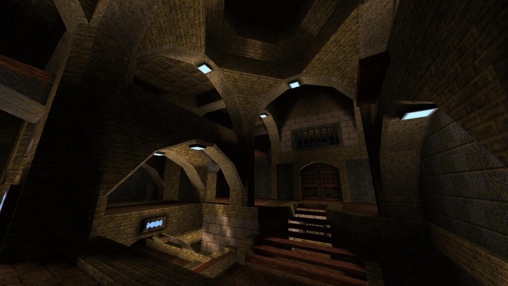
Though I'd definitely change some of the texture choices. Shot 2 I'd take out the tech lights and the metal textures. Probably would replace the big white brick textures and wood textures with something else too.
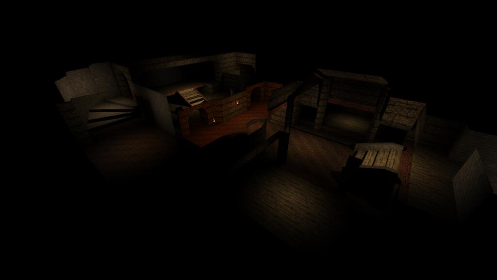
First hot should have more lights: there are too much shadow areas IMHO.
Second shot is really amazing: the work onto arches is really great. Apart from that I concur with FifthElephant's comment on shot 2 about light texture selection: should be more medieval oriented. Keep it up !! for sure.
Also, I assume shot1 is a spectator shot (ie from noclipping, not something the player would see)? Gamma was adjusted for the shots.
http://www.mediafire.com/view/dspkgpempzis1lp/titanmap2.jpg http://www.mediafire.com/view/5i16kf4bl8pd5lj/titanmap22.jpg my kinda map. rock walls could use a little pizzaz, but there is a great Dark Souls vibe going on here!
onetruepurple: shot 2 looks cool, but I also think that it needs other textures for lights, maybe even torches.
mechtech: the shots are awesome, seems like a very nice map, can't wait to play :) OTP's shots... first is a bit dark. Second shot is great, I love the lighting, and the contrast. Not so wrapped in the textures though.
I still don't understand why soooo many mappers just stick with the same old id textures that have been used 1000 times before, while there's so much underused custom stuff out there, that's better than id's textures. The underground void idea was from TLOR Balrog sequence. Towers of stone in an immense cavern. The progression of the map, starts in a stone cave, as the player ascends I add more Castle/stone type stuff. The end will be the player reaching daylight in a Quake medieval setting using the Quoth Death Brigade enemies.
Screen shot 1 is admittedly boring. Needs some texture variance. I hope to have my maps out before the end of 2014. At the rate I'm going working 70 hour weeks... we'll see I'll get a beta release going soon. Shot 1looks like a bloody basement, nice coloured lighting in there..
Shot 2 has some texture problems, they just dont blend. Quake has a very limited palette, mind you... Nice curves you have there, but in shot 1 i dont like the skull texture in the left
on the nockles map. i'm all for mixing up textures/themes, providing it's kept consistent across the map
|
| You must be logged in to post in this thread. |
| Website copyright © 2002-2026 John Fitzgibbons. All posts are copyright their respective authors. |