|
On my sp version of the deck map... so I'm sure I'm almost complete except for a bit of clean-up work.
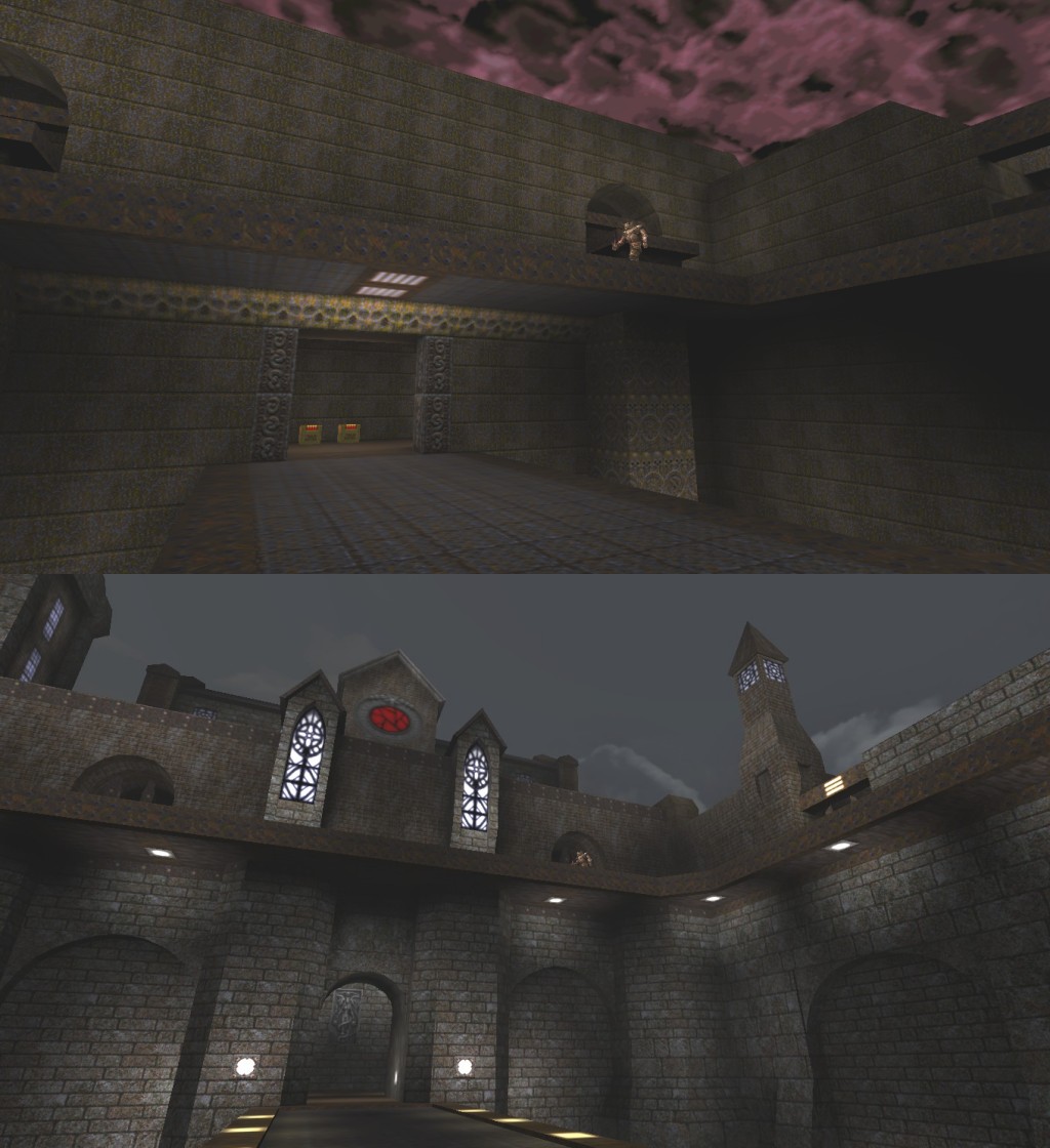
Lots of new areas etc. Anyone willing to play through it and give me lots of feedback, just click my name and then email me so I can forward it to you. (will be sent after I finish work tomorrow) Rick... I see tech, medieval castle and metal all in one screenshot, but not really mixed together at all - more like a scraps map.
I'd try to blend those opposing texture themes better or use some different textures. Put some tech and metal pillars against those big flat brick walls. There is some mixing of metal and medieval and there are some of those slotted style lights and a lot of light3_8 and variations thereof, but I'm not sure why this is bad.
http://www.quaketastic.com/upload/files/screen_shots/wish97vs13.jpg I can make some more screenshots of interior areas if you guys would like to get a better idea of the overall look. I'm about 80% done with the texture replacements and marksurfaces is staying around 32000 so far. Looks cool!
My ignorable suggestions; - Recolor the round, red window to match the blue of the other windows, unless you've got a reason for it to stand out. - Make the back walls of the arches (and perhaps other, free-standing patches of wall) a slightly differently tinted brick. Just so it ain't all gray. I like the castle vibe with the split level, it feels cool. A couple of visual/gameplay suggestions:
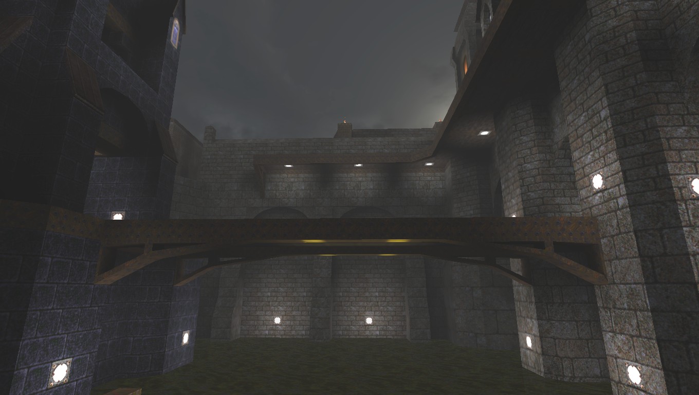
Reference Image * The height difference between both images (A and B) looks very different, how does that affect gameplay? Can the Hell Knight attack easily from above? Can the player attack back? Player/Enemy angle looks very steep * The front section should pop out further so you break the horizontal line of the upper ledge. You want both upper and lower to feel they are connected and part of the same building. Personally I would pull the small towers outwards, put an arch behind the towers to connect the upper section left and right and bring the back middle tower forward to over hang the front gate. * The lower arches need to either go back further into the wall so you get a nice dark shadow or use a different material. Then the edge of the arch will pop out and feel more impressive. Ok guys, not a single person emailed me regarding the beta. I'll give it a couple of days but if no-one emails me then I'm pretty much going to tweak it a small amount and then release.
I haven't done any skill adjustment or anything, it's my first proper SP map so I could do with a little input. Ok guys, not a single person emailed me regarding the beta.
You could be more proactive!?! Email people from this board, most users have email addresses setup. Some people will respond, some won't but at least you will find out. Also you need to think about what sort of feedback you want? and what changes are you willing to make? I now have a couple of beta testers... As for feedback I'm open to *all* feedback, for example I went and changed almost all the trims (and trim alignment), about 30-40 errant brushes, almost all the terrain, and a bunch of other stuff based entirely on negke's extensive feedback alone.
Since this is my first SP map (I have only made MP maps up until now), I suspect I have a bit more work cut out for me this time around. A lot of the time I'm looking for a kick up the backside. Yes, my map is a re-make of "Well of Wishes", but the "Well" is gone now - not that it served any purpose in the first place :)
I do appreciate all the comments and suggestions. @czg You're right, I hadn't really noticed but the red window does look out of place. I've aready made a blue one to match the other windows up there. @sock The hellknight has a monster jump so he can get down, but he can attack okay from up there. The player will have other things to contend with also. I agree that making the two small towers and the red window thingy protrude more to unify the upper and lower sections is a good idea, I think I actually had it that way at one point. The map is pretty big and I'm up against the marksurfaces limit, but I'll see what might be possible. There may not be enough room anyway, since there is this other big chunk of architecture at the other end of the bridge. http://www.quaketastic.com/upload/files/screen_shots/wish13bridge.jpg About those arches in the wall. I only put those there to break up the huge expanse of featureless wall after I enlarged this area. I really don't have any room to make them deeper, I was hoping the small stones texture vs the large stones texture would be enough differentiation. I suppose I could add another (darker) texture. I think I may need to re-color the stone textures anyway to make them less gray and more brown in order to fit in better with the brick texture. It's very hard to make any major structural changes at this point because the map is like a giant 3D jigsaw puzzle. Also, I made a promise to myself when I started this remake back in 2007 that it would not exceed any of the normal engine limits and I'm very close right now on both models and marksurfaces. This map has become more of a hobby than a project but I'd really like to actually finish it in 2013. is one of my favourite old-school releases! One of the very first custom maps I ever played for quake, and one that I actually come back to fairly frequently. Really looking forward to this labour of love, in whatever form it ends up taking, so thanks in advance Rick, and good luck with the final push!
I really like this first effort of yours !
that gate creates a sense of suspence and fright! my comment was for a screenshot way up above Rick's WellOfWishes
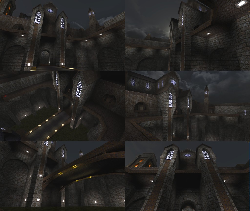
I played around with changing the window towers this morning. I'm not sure I like the new ones. I think they stick out too much and I don't really like the passageway through them.
Screens: http://www.quaketastic.com/upload/files/screen_shots/Wish13_t2.jpg Luckily marksurfaces only went up by about 150. I may move the HK path to one of the sides and lose the middle section of the center walkway. That way I could push the front of the towers back 64 units. That would kind of mess up one of the larger battles in the map though, so I might just go back to the way it was after all. The transition from the octagonal lower parts to the rectangular upper parts is kind of awkward, not sure I like that either. I'm still working on recoloring the textures. The yellow lights on the bridge really stand out though, doesn't look quite right. Unless there is a gameplay reason for them to be different colours?
Nice stuff. The sticking out windows / buttresses + passage through look ok in the shots to me.
The blue/black theme is nice. Be sure to add lights of wind ambient sounds :) That looks damn fine. I'm not sold on the yellow lights under the bridge either, but the rest is awesome.
Those yellow lights under the bridge were just an experiment. I'm still trying different things as far as style goes. I think the orange lit windows in the big tower on the left need to go also.
The new stone textures have a bit more brown and less green and blue than the ones in those screens. They match the brick series a little better. The brick is what's on the wall behind the two middle tower things, just above the walkway. You can tell that it's more brown. May have to take some brown out of the brick as well. Making textures for Quake is a bit of a pain because of the limited color palette. Could you send me those blue window textures perchance? My next map is a completely blue map and I only have a couple of finishing touches to my current map (it WILL be released this weekend!)...
those shots are art, don't agree with the others here bothering bout yellow lighting.
blue n yellow always is a good match, as they are opposing on the colorcircle. human eyes dig that.
|
| You must be logged in to post in this thread. |
| Website copyright © 2002-2026 John Fitzgibbons. All posts are copyright their respective authors. |