|
has been shown by capnbubs -
http://quakeone.com/forums/quake-mod-releases/works-progress/9573-authentic-model-improvement-30.html#post131716 I really don't like the new ligh huge block texture and it doesn't work well with city6_8. The rest is cool.
It seems I can't get away from Quake. I found this growing under the sink...
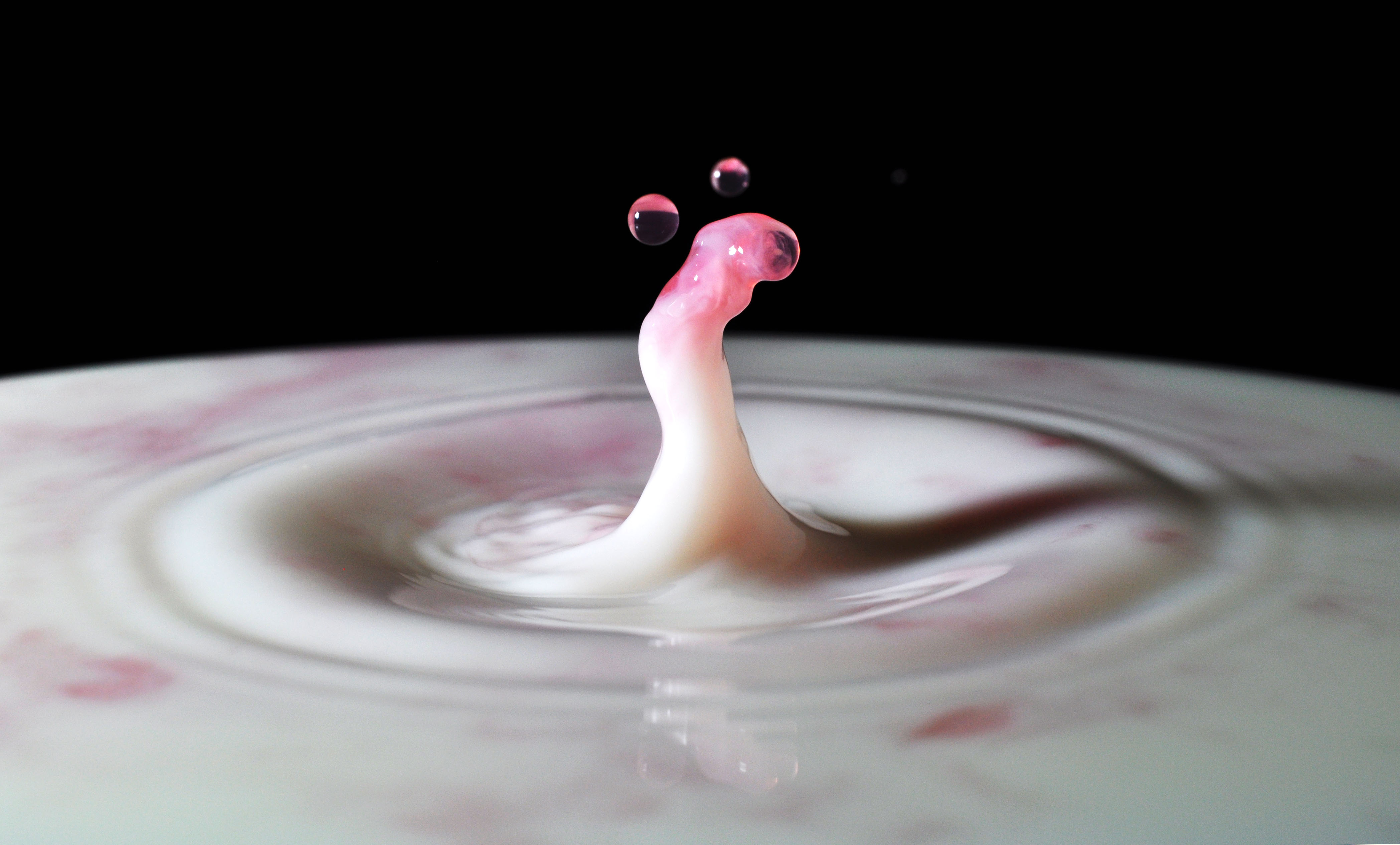
http://www.quaketastic.com/upload/files/misc/DSC_0111a.jpg (Nikoin D5000, SB-700 @ 128th, f16, 60th sec, summer fruits cordial dropped into milk) Excellent picture you got there, Mike!
I tried some macrophoto's once, but almost screwed my new camera with the outstanding lense I needed for that purpose. It gives me reminiscense of my fluid projections I make with my diaprojector and a tumbling double glass coil. http://members.home.nl/gimli/pantharei.jpg who'se afraid of screenshots?
but nearly done.
http://i.imgur.com/LqWcXmN.jpg http://i.imgur.com/CvFKYfE.jpg http://i.imgur.com/p9ja2dX.jpg It is dm6rmx, but it doesn't really feel like dm6 at all because I had to change the size of the main atrium quite considerably. I also added a lot of extra areas and although the original layout is still there underneath, you would barely know it :/ ( :) ? ) You got me hooked. DM6 it's my favourite DM map and i can only see it in the third sc, which i suppose you took from the place the RA is. I'm still figuring which part are the other 2.
Image 1: I love the window design (diagonal bars) around the central arena, reminds me of E3M6 which is one of my favourite levels for architectural style. The ceiling looks like a blob of brown, maybe add some colour (grey/green) to the circular panel/trims?
Image 2: Got some lovely strong architectural lines going on with the bolt supports on the ceiling but the colours feel wrong. The ceiling is just full on brown and it would be interesting to extend the grey brick upwards to break the hard line separating the two sections of the room. Image 3: Looks like a good combat area with multiple floor heights and I love the style of the steps with the brown/green combo. This is certainly the best image for lighting, very dramatic. Looking at the pics again I think they only thing I would say negatively (and who am I to say bad things about other peoples maps?) is that the lighting is a little flat in the first and second image.
I think if the lighting has a lot of good contrast between light and dark then it doesn't matter terribly what textures you use. I've seen very well lit single texture maps that take a dump all over anything I've ever done. ;) just not that excited with those shots. i find the texture use is very bland. :(
the third shot in particular would benefit from some better hightlights, like the bright orange bricks for example (the 'city_*' small bricks). brushwork is very nice though and no complaints about that. i like the metal details. for comments and criticism guys. I will try and improve the lighting a bit more and tweak the colours.
The textures are mostly selected because they are similar to those used in dm6, but I think dm6 has slightly brighter lighting, harder shadows and a more obvious yellow ceiling colour, so maybe I should try bringing some of that out? The textures are mostly selected because they are similar to those used in dm6
If you have added a load of new areas I am sure you can add some nice new textures as well! :P My comments are about the brown you are using, lovely brown detail next to more brown detail = brown blob! Ignore that Than.
U-Haul used the same theme and it looks great. re lighting- I assume the shots were brightened, like all your screenshots, so as to avoid "too dark" comments. Yeah, I guess it depends if using different textures will move farther away from DM6 than you would like.
The original map is pretty boring though from a texture point of view, so I wouldn't hold to strongly to it.
|
| You must be logged in to post in this thread. |
| Website copyright © 2002-2026 John Fitzgibbons. All posts are copyright their respective authors. |