|
But, the nice thing is that you can work however you want in Modo (or whatever) and when you're happy with the mesh, you can then spend 10 minutes breaking it down into convex shapes for export.
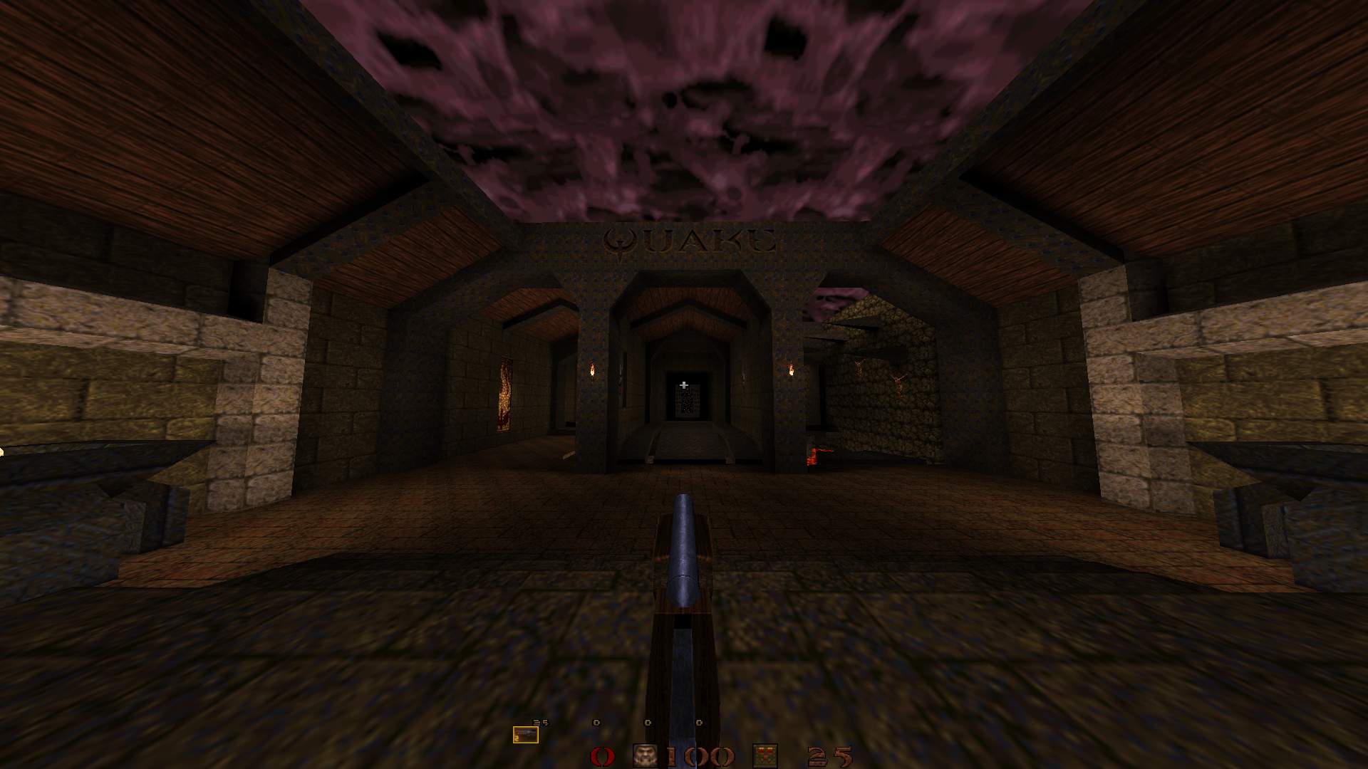
http://www.quaketastic.com/upload/files/screen_shots/fitz0009.jpg
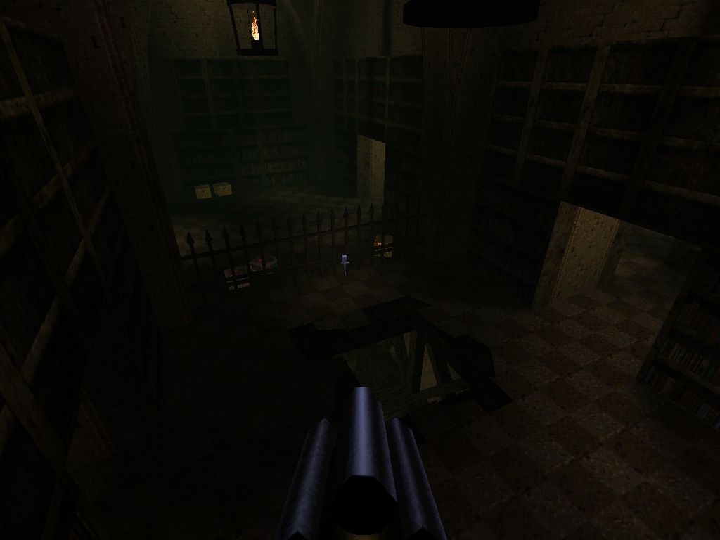
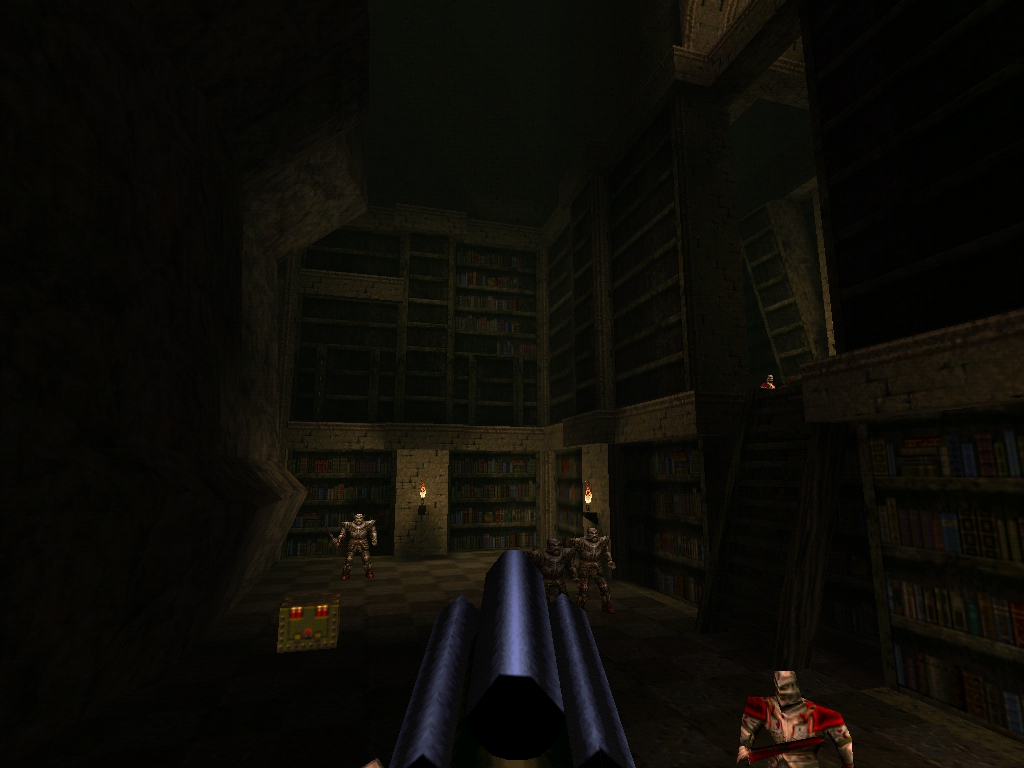
http://www.quaketastic.com/upload/files/screen_shots/fitz0010.jpg http://www.quaketastic.com/upload/files/screen_shots/fitz0013.jpg http://www.quaketastic.com/upload/files/screen_shots/j.jpg http://www.quaketastic.com/upload/files/screen_shots/fitz0001.jpg Could do with a bit more contrasted lighting IMO. More bright spots, more dark spots, but overall less blandness.
I love this shot: http://www.quaketastic.com/upload/files/screen_shots/fitz0013.jpg Need to rebuild the lighting in there i think, i was expecting you might say it�s too dark ;/)
OTP: Yes its definitely some Honey in there, map was made as a hommage to CZG. This is almost done. I have 1 room and a couple of ceilings to do, I've already started item layout and some small testing with Omicron bots.
Once I'm done I'm going to need a couple of volunteers for testing, when it's released it'll have the source Also, screenshots - http://s17.postimg.org/eigyp88j3/deck1.jpg http://s15.postimg.org/b3692gnjv/deck.jpg I haven't 100% decided on the SP version yet. I have a few cool ideas for it though. However it's not a huge level so I'm not certain how I can extend the gameplay time in it to make it fun.
It looks really, really small compared to the UT versions. Is navigation a problem with all those small spaces and gaps between crates?
I agree with Spiney also that is very dark, especially so considering it is a DM map. I like idea of a small 1on1 style D16 layout, I guess I'll have to see it ingame to really judge. In terms of level size it's around DM2/DM5 sized. I think the screenshots are deceptive, the walkways are wider than DM5 for example. The gap between the crates is between 64-128 units. The map is probably best suited for 2-4 players, it's very scaled down compared to the UT version but then again that game has a sniper rifle for a reason! ;)
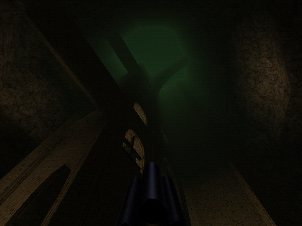
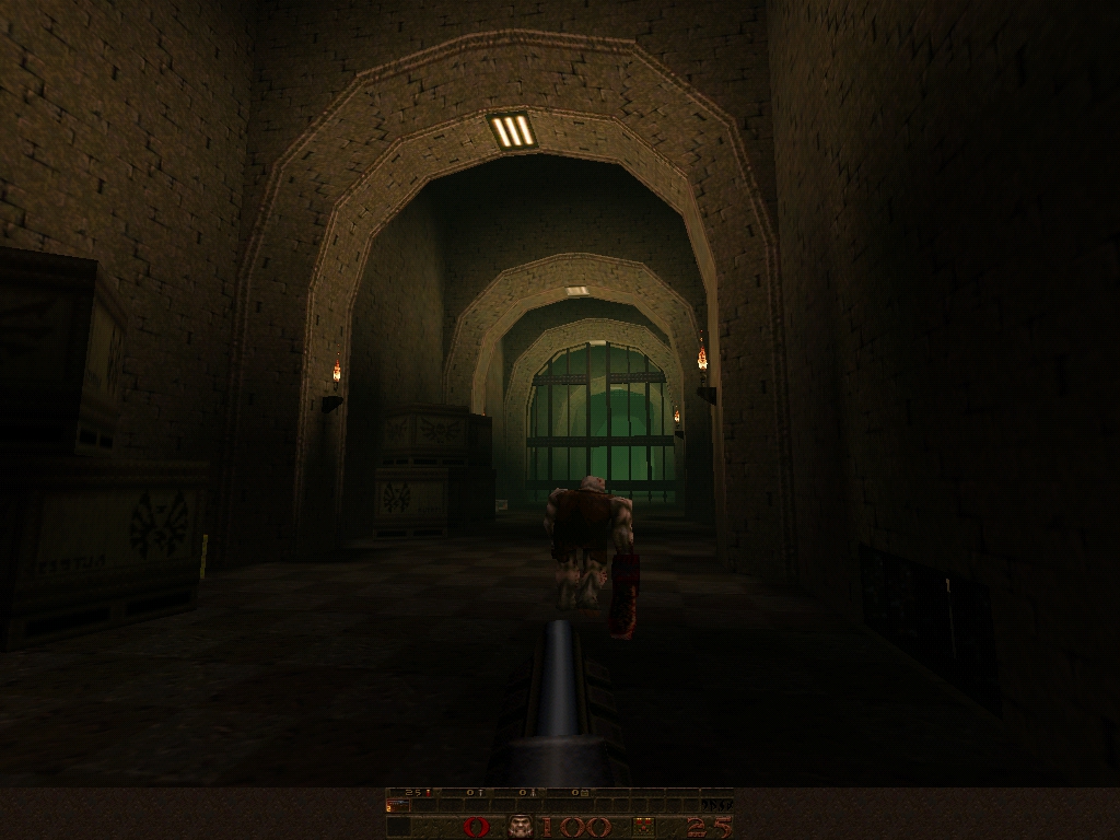
As for the light levels it's definitely something I'm going to tweak a bit, but I'm of the belief that mappers shouldn't be too scared of having dark areas in their maps! :) thanks for considering the request anyway - I'm sure Negke could valuable ideas - he has a pretty amazing track record for wringing gameplay out of tiny dms
As for the light levels it's definitely something I'm going to tweak a bit, but I'm of the belief that mappers shouldn't be too scared of having dark areas in their maps! :)
this is true. however that doesn't mean sourced lights can't be brightened up to add contrast. those shots look fine to me, but it's normally difficult to judge light without seeing it in-game due to everyone's setups being different if you don't end up making an SP version, test it for DMSP2 :) I've always loved Deck16 it's a classic map. Sense of scale doesn't seem quite big enough but perhaps it has to do with unreal fov/lighting effects. But it's great seeing the detail you've put in.
mfx your shit is pretty dope man. I like your pipe work and how you're making your shit so futuristic. I bet you make some pretty cool looking shit for other engines too.
|
| You must be logged in to post in this thread. |
| Website copyright © 2002-2026 John Fitzgibbons. All posts are copyright their respective authors. |