|
not sure how releaseable you consider it as is, but if its not quite there yet, maybe work the bare minimum required to get it into a state you consider releaseable (rather than a state you are happy with)?
@mike, It sounds like you are drifting and not sure what to do next. Get some people to test your map and give you some honest feedback on what to fix. Then mash together the feedback into a master list and it will be easier to see what to finish before you release. By the way, I have screenshots of this map in my quake inspiration folder, it has a gorgeous cave vibe going on.
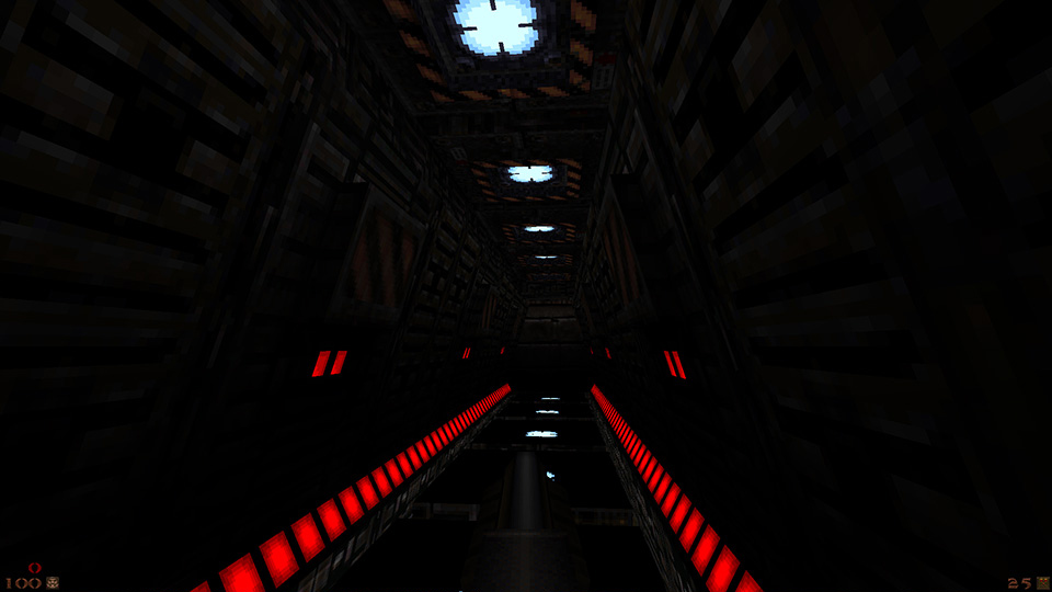
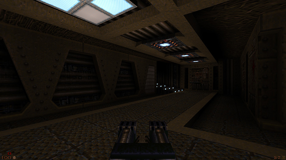
looks good, I really like the corridor shapes you've made. the floor details in shot 1 would be a good candidate for a new texture. shot 3, I would continue the wall shape on the ceiling somehow. I think some ceiling details there and areas like it would be nice.
The basic brushwork and layout of the map seem promising, but there is a lack of memorable details and lighting seems flat. I think stuff like iron bars and such (like in Doom 3's Hell level) would go a long way (and make nice shadows too). Lighting could be more contrast-y.
Static meshes? The best thing IMO would be to put the lights between the struts at the top in screenshot 1 (killpixel). Probably use upward or downward facing spotlights.
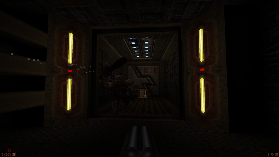
I've not mapped for Quake for about 15 years, I have mapped for UT for a while and decided to give it a go... I have always had a soft-spot for blue maps, though the IK maps were accomplished I didn't like the persian feel, I'm trying to go for some more "elder world" with this. Hopefully this screenshots work -
[url=http://postimage.org/image/r5fobm28r/][img]http://s17.postimage.org/r5fobm28r/Quake0000.jpg[/img][/url] [url=http://postimage.org/image/8r557mpy3/][img]http://s17.postimage.org/8r557mpy3/Quake0001.jpg[/img][/url] ... sorry for the spam
http://s17.postimage.org/68jg6y47z/Quake0000.jpg http://s17.postimage.org/5kalo05i7/Quake0001.jpg Looks good, feels like an elder structure.
Random thoughts; Is it going to be a void map? Be sure to break up the floor with different levels. Moving that giant spike as part of the level progression would be cool. Lava for contrast and +elder look? Those killpixel shots have some great detailing. They look a bit crampy though.
An extra 64 units of height and width would make a big difference to play and looks. Still probably going to steal some ideas from them though :) Maybe change those bricks for some from the Knave set.
Those rune (?) bricks always looked scaled to me. And hey, maybe it'll bring back your interest enough to make the final push and finish it... Don't think it's necessary to say, but you know everyone here wants to see the thing finished. I agree with ijed about the rune "bricks" but it's not just the scale, it's the huge contrast differences in the palette.
As for my blue map I was contemplating exactly all the points you made (yes all of them), making it a void map but not completely, more like an underground cavern fortress. If I have the willpower (I probably don't), maybe having a reverse episode (starting in elder world and ending in a base map), I mean... how the hell does Ranger escape from shubs lair anyway?! You're right about the floor too, the reason I put in a flat floor was so I could ensure the scaling was ok.
Here's what I have decided: no changes to any textures; I will finish the lighting in the last two rooms, but no other tweaks; leave the monsters as they are; full vis and release it.
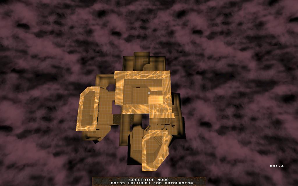
The original map was 25K brushes, which I split into a 7K brush map that was released as FMB_BDG. I have just split this other section into two - I realised that there was a natural break between above and below ground. I have dumped the final arena battle as this was the least complete section and the last gold key door becomes the exit. I will full vis and level 4 light all three sections, and that will take around 200 hours on my Pentium4 machine. It's a compromise but it will see the light of day during March. birds eye layout http://www.mediafire.com/conv/0afac108f986454f4d6b79576fc2a5ca43dbed7cb1dc8e524b4ea1f9865f61906g.jpg
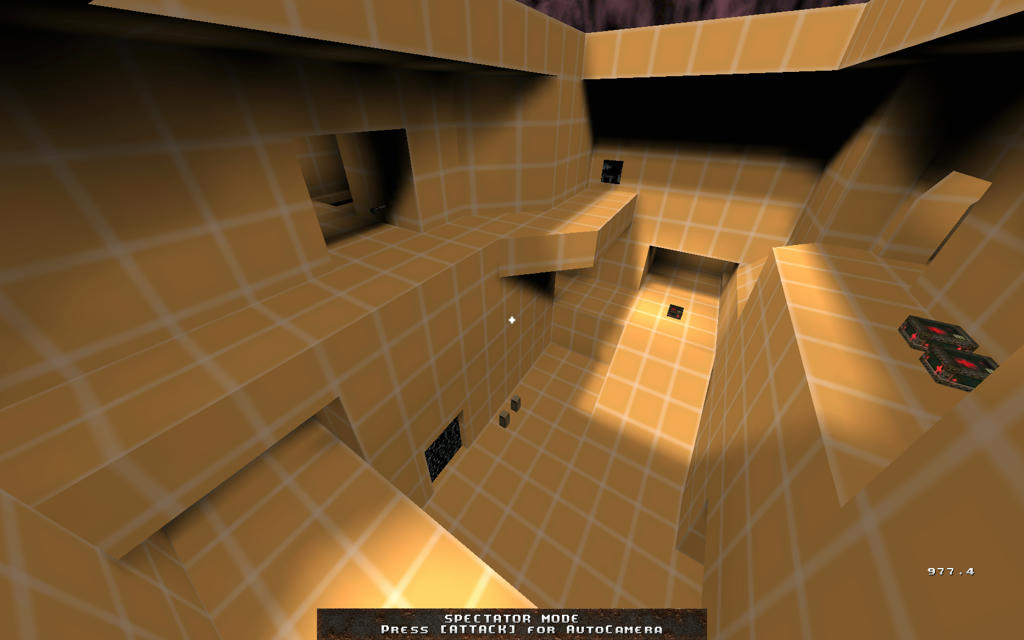
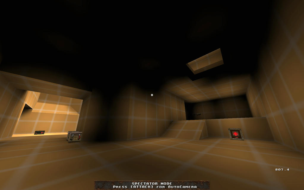
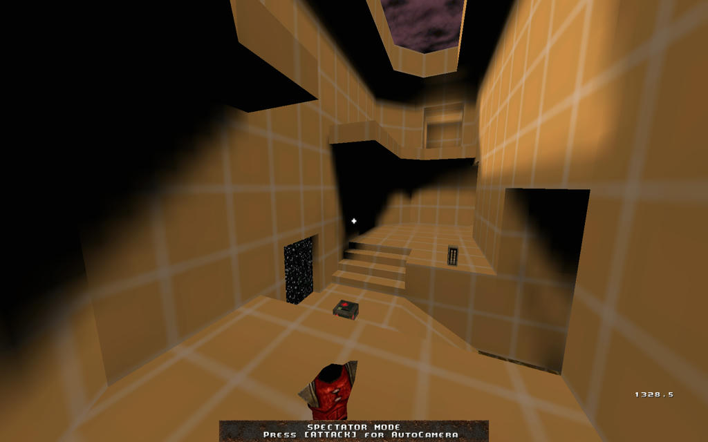
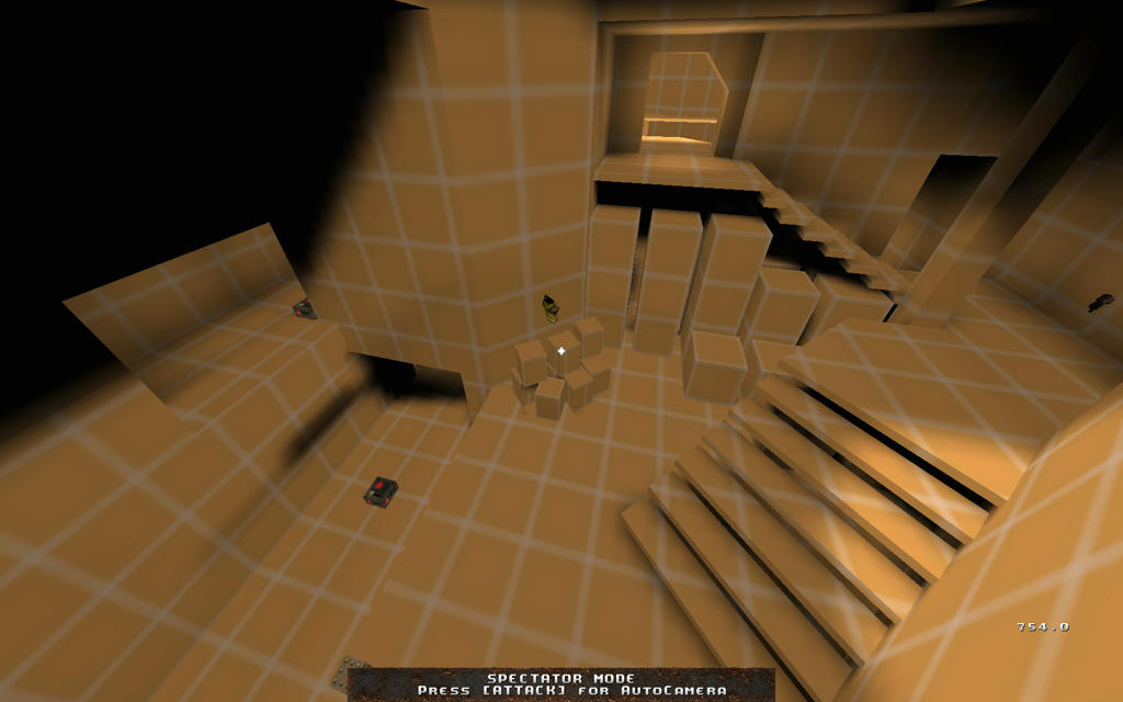
main atrium http://www.mediafire.com/conv/5deef9410e838333748ae48fb7e8414bca7eea659d2c7c059d40a89414ccc9d86g.jpg mega http://www.mediafire.com/conv/f93561c9748fb66318aa56c92680df2ccd2655ffab3affcaf97870308b656a766g.jpg ra http://www.mediafire.com/conv/8a7a965ccfe03e66525db4b511e162ea7f60213b6de1126c9b87df17d0d192166g.jpg ya http://www.mediafire.com/conv/b66a41592a313402d71b1e77bae441a2b40106c581fe7b67b773d40755d389d36g.jpg download exilea2r1.bsp http://www.mediafire.com/file/lr4z4ool532zsq8/exilea2r1.bsp I know this is a singleplayer mostly level design board but I've always been posting my multiplayer maps here anyway as I know some of you have dabbled in multiplayer maps before. It's a competitive 1on1/2on2 tourney level layout that's in alpha stages with just developer textures (an idea stolen from golden_boy) sorry eyecandy hunters. I've gotten some feedback that the mega room is a bit boring and also that the ya-rocketlauncher to mega path connectivity needs to be changed. I'm a bit stumped at what to do for that, any ideas? I'm open to any ideas to make the connectivity more interesting/exciting. I'm also not afraid to completely rework rooms to make the map better as a whole since i have no work at all put into the textures or details. Cheers. Can't say I've ever drawn up a layout in orange textures before detailing the level properly. Maybe that's why I rarely finish my levels. The one thing that strikes me as not great is having the mega-health and rocket launcher in close proximity. One of the things I always hated about DM6 when I played league games was the rocket launcher / red armour room. Seemed like an obvious place to turtle (and it usually was).
Only advice I can part with is that you should never have 2 powerful items together unless it's in a high-risk area (lava jump red armour and megahealth area in DM2, hardly anyone turtles here because the quad is in a different place) My 2 cents: Get it on a server ASAP for live testing. Also try to make the different entrances/exits look clearly different (size, shape of doorways, special textures or lighting) so it's easy to "get" the map.
Provide 1 or 2 more cover/ambush possibilities? It's very open.
|
| You must be logged in to post in this thread. |
| Website copyright © 2002-2026 John Fitzgibbons. All posts are copyright their respective authors. |