|
Yes, manually add them as extra keys in Radiant. What they do is modify the way the lights are rendered: delay changes the attenuation of a light, wait sets its fade distance (default is 1, a higher value makes it fade faster). Delay 2 and wait 2 with a light value of 200 or 250 make a bright light bubble which may look good around light sources like the cross tiles. Note that your light.exe must support it, otherwise it'll do nothing.
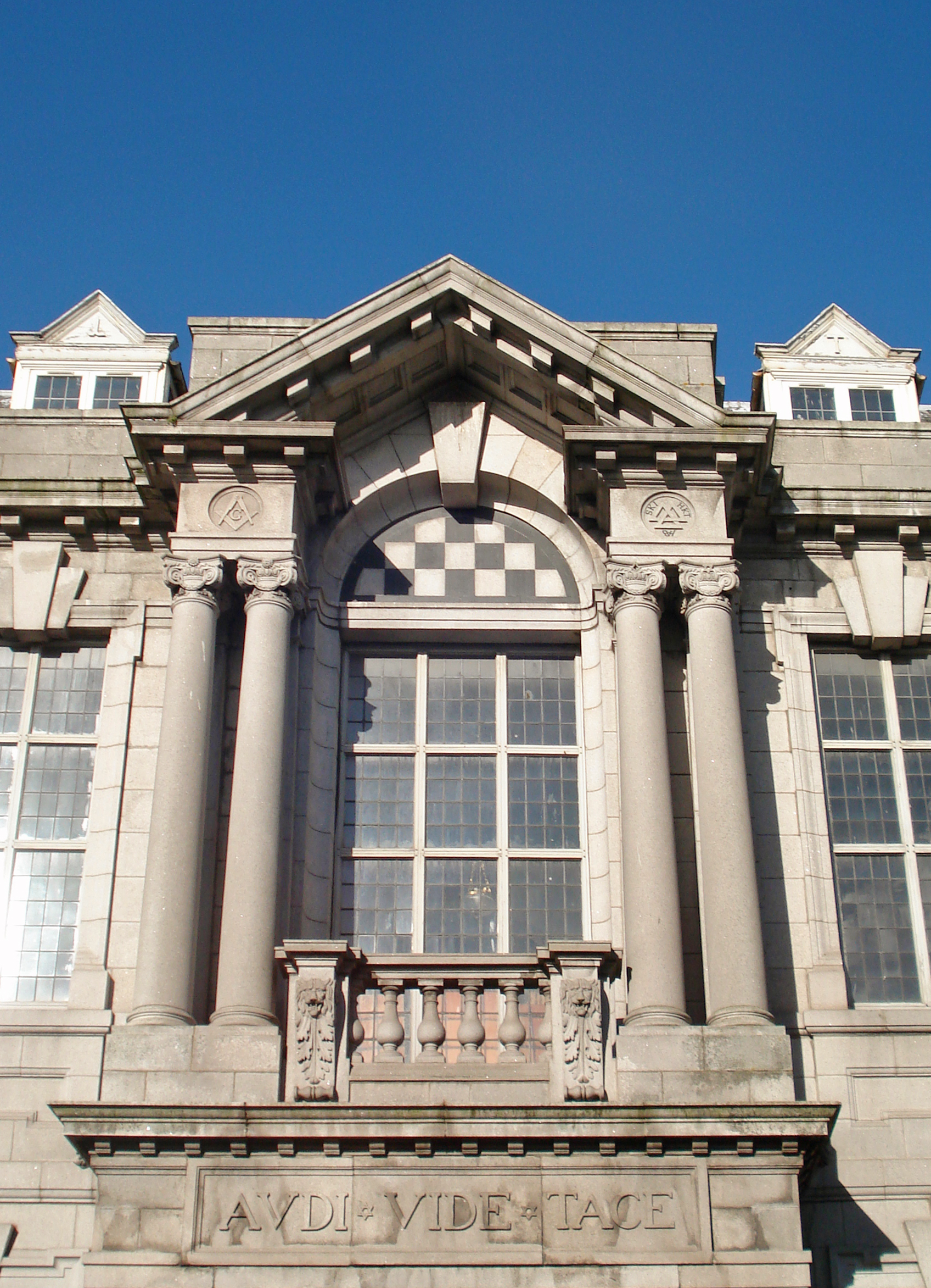
If the delay tricks are not satisfying, you can also try a high light value and a slightly limited fade distance, e.g. 400 + wait 1.5. For the final compile, be sure to use light.exe -extra4 for smoother shadows. Having an info_player_start is always good, for testing and for players who want to check out the layout. After all, you can't noclip in deathmatch mode. This board doesn't have a native search, but you can use Google and add site:celephais.net/board. <Zwiffle> i want to make this http://upload.wikimedia.org/wikipedia/commons/2/2d/Masonic_Temple%2C_Crown_Street%2C_Aberdeen%2C_first_floor_detail_main_facade%2C_Harbourne_Maclennan%2C_Jenkins_and_Marr%2C_1910.jpg in quake
<Zwiffle> negke, make that for me Why sure, no problem. Here you go: http://negke.slipgateconstruct.com/images/4zwif.jpg http://negke.slipgateconstruct.com/files/4zwif.zip Use it as a prefab to finish one of your maps, or the speedmap you're going to make.
Nice style and very cool texture choice considering what you had to make. How long did it take you to create it? What is the scale like compared to the player?
I think it took me some 30-40 minutes. The scale is quite off - the columns in the original picture are much taller; in the screenshot they are 128 units. In Quake, everything is larger anyway (or rather the models are small), so the player size would roughly be from the ledge to the railing (~56 units?). Obviously a building designed for shamblers.
More box maps to test my industrial texture set - http://www.simonoc.com/images/design/maps_q3/indust3.jpg
very cool, my only complaint is the main vertical supports have that angled jog in them -- this makes them look unsuitable to support weight. Vertical pillars, a-frame structures, or arches would look more sturdy.
@Kona: I made a community SP map for SIN (link on my website if you are interested). I also create SP maps professionally (Wolf,Warhead,SM), but I doubt I will create any Q1 SP, I prefer to work with other mappers instead and just provide art assets nowadays.
@metlslime: Yeah the vertical supports are certainly more art than structural, but I do like they way they surround the empty space in the middle. I'm no good at creating textures though I've learned the mechanics behind that..
so I'm always lookin for original brand new sets. Sock, are your textures free to use ? Would you create some sets for me ? All use of my digital work is covered by this Creative Commons Deed. - http://creativecommons.org/licenses/by-nc-sa/3.0/
At the moment I am busy with a new Q1 mapping project and I don't want to get involved in anymore. http://www.simonoc.com/images/design/maps_q3/indust4a.jpg
http://www.simonoc.com/images/design/maps_q3/indust4b.jpg @metlslime, I reduced the size of the metal wall supports and pushed the upper metal ceiling support away from the edge. Is this better? Finished off the crane detail, added fog and tweaked some of the textures. Next to add more junk to the room and do a final decal pass. Feedback and comments are always welcome. I like the overall scene.
I would reduce the fog a little - it's blowing out your shadows and leaving everything a little flat looking. You might also consider upping the lighting behind the main structure so that the silhouette pops a little more. And finally there might be a little too much yellow. Not sure how to fix that other than "don't use so much yellow", though. :) Is this Quake 3? I don't know enough about that engine but does it support over brightening? Like, can you get the light hitting the top of that center structure to pop a little more by amping it up or is it clamped 0-1 like?
sock: it helps a lot; i think the load of the pillars is still resting on the overhang part of the wall below it, but visually it's less obvious now that the pillars are pulled back.
I like the textures but it looks quite dull, colour wise, to me.
It kind-of reminds me of Mirror's edge in a way, with a single bold primary colour for each area and everything else sort of fades into greys and whites. Perhaps add some different colour variants of the yellow texture? I do have other metal colours, one of my favourites is the dock style metal blue, it reminds me of my SIN mapping days. :)
http://www.simonoc.com/images/design/maps_q3/indust4c.jpg The fog is certainly too thick and making everything too washed out and soft. The above screen is the new fog setting, a lot thinner but still there in the background. I certainly need to create a much higher glow from above and try to over bright the outline more. Once I add spot lights to floor/wall areas the greyness should be pushed back. This is a night time shot with everyone gone home for the night. I am going for the central area being bright (glow from above) and the rest melting into shadows. The crane and the various map objects (girders, machinery) are all brushwork and patches scaled up and down via ASE files. No modelling package was used, besides GTKRadiant. Any nitpicks or thing that bugs you about the screenshot let me know. I consider all feedback.
|
| You must be logged in to post in this thread. |
| Website copyright © 2002-2026 John Fitzgibbons. All posts are copyright their respective authors. |