|
Finally decided to strip most of the end area of my Base map out for performance and vertex count reasons
http://www.zealousquakefan.com/wp-content/uploads/2011/08/zqftest03_construction70.jpg Will still have some meaty fights in it, though I apologise for the crate maze factor :E Looks really cool zqf. Maybe vary those crates a little - have some of them rotated or off-center instead of these long straight walls?
I gotta finish the geometry before I worry about textures :/ PS will need to have it tested again since a lot has changed since you chaps played it. If you want to try it again I'll send you a new version.
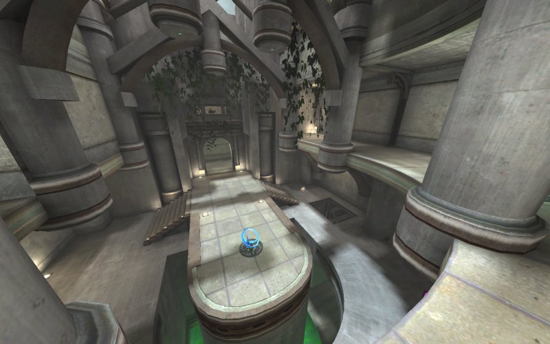
That's really elegant. I'm a fan of that style. I don't like the green pool though, I would suggest changing it to a blue color personally, but it doesn't destroy the look for me.
Blue like zwiffle said or maybe dark velvet red (lava or sub-dimensional void).
very nice! same here re: blue instead of green pools.
if only because the blue will go better with the tan coloured bricks. I think that green is perfect, it looks like acid and I think it's slime that kills the player, right ?
I don't like the "vegetation", if you want to keep that you better add more broken things, the entire place looks "too ok" and the vegetation ruins everything - it suggests ruins, but everything else suggest a place that's actually NOT in ruin. Yeah it's slime, and you are probably right about vegetation. I intended to make more broken things but didn't have enough time for that :|. It was a competition and my time is very limited now, especially for such stuff.
|
| You must be logged in to post in this thread. |
| Website copyright © 2002-2026 John Fitzgibbons. All posts are copyright their respective authors. |