|
Hi guys this is the game I'm workin on(God only knows since when!)
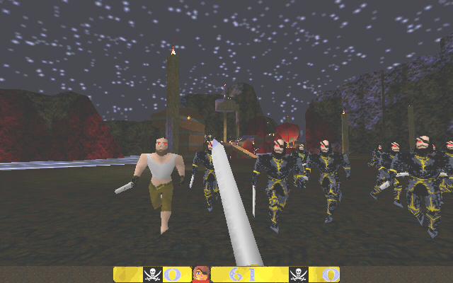
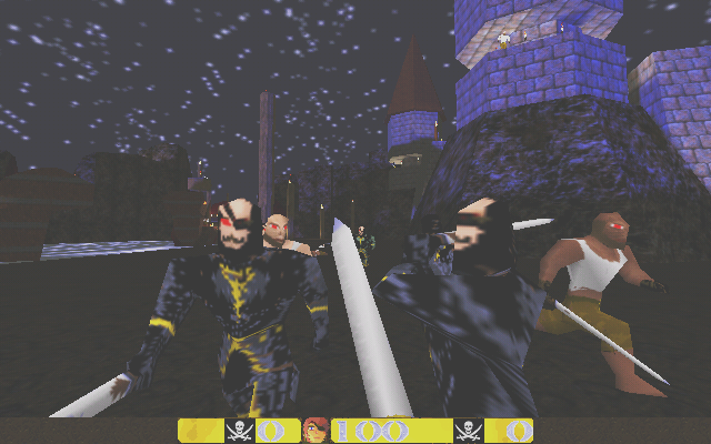
Do you think it could work as a real game? I mean one day I'd like to port it another engine. The thing I'm most proud of is the new dynamic hud. http://www.quaketastic.com/upload/files/screen_shots/quakery4.png http://www.quaketastic.com/upload/files/screen_shots/quakery5.png But I think the skins and the HUD needs more grit and grime..... Good work though. Also a nice skybox might help a little.....
thank ricky, thank quakis(I mostly agree with you)
-it's supposed to be an intended mix of adventure/horror/parody -I want to keep things simple but effective so no overdetails no ultra-techie features; I'm more focused on storytelling -Hud is yellow, it's supposed made of gold -about the skins: yes could be better but modifying all monsters was already a pain ass and don't know if I have time for this. -I have a vision in my mind that I want to finish so some trade-off are necessary ;) Yeah, sorry for this. It is not constructive at all, and I have to apologize, as I don't like people behaving like this with my work (i.e just saying it is pure shit without justifying it)
So to be more specific about what I think is horrible, (even after having read your previous post): - monster skin - texture selection - skybox selection - HUD - You've almost stolen Albator face for the main player (http://idata.over-blog.com/1/42/11/59//Albator.gif) apart from the dead eye side. - I don't know whether the map is for testing but we are in 2011, not in 1996: you could have put more stuff in (details, lightning effects, etc...) Sorry if it sounds rude as it looks like you have put lot of efforts in your game, and I respect that, but well definitely not my taste... And afterall these are only screenshots, and maybe gameplay is fuckingly awesome.. but regarding what you have shown, it didn't give me desire to play this.. Is that an acceptable answer ? I gave constructive criticism too, all I said is that I think the textures need more work, cause really, it looks like you spent a couple of hours on them, and no more, but that is besides the point.
If u dont want a bunch of feedback then dont post in the screenshots and betas thread on Func_. The terrain at least looks nice. The ceiling in the stone tower in the second shot - cut the top brush into wedges and align the textures :D And work into the skins a bit more. And pick a nice skybox. And the texture which is used on the HUD at the sides (original shit-brown Quake one) - replace that with a similar yellow colour to the rest of the HUD, because the two colours clash quite badly. Also I think the HUD needs more texture and noise added - at the moment it looks like you made is using MS Paint, in about 5 minutes. they're always useful..
JPL: now you've been more specific I only add that I'm more interested in creating an atmosphere,a background not a showcase of technical details going nowhere(seems to be the trend nowadays) Mine is a homage to old days 'o Quake when conversions such as FantasyQuake ruled RickyT23: I use mostly Paint.net for my work..eheh simple but good enough I'd like more comments about the concept/theme of piracy in a game like Quake and why so few mappers try to depart from the usual obsolete Quake theme? Ah one last thing: the game that inspired me so much is the legendary AloneInTheDark-2 (Infogrames) a fantastic mix of horror/piracy.. Some of you remember it ? For any that are interested :)
http://www.l4dmaps.com/details.php?file=11517 Amazing map. I really like what you've done with the apartments, it makes them feel much more dangerous. Spreading the weapons out more helps as well, though I'd suggest having one or two more next to either the start trigger or the spawn point for those players who don't enjoy exploration so much.
I only found one "bug" in this version. Near the start trigger, if you climb up the generator and the lamp on top of it you can get on to the four vertical girders. This is a fun place to snipe from but unfortunately tanks and common infected can't climb up to you, meaning the only infected that really stand a chance of hurting you are smokers and spitters. Also, if you are unlucky enough to be incapacitated or knocked down by either of the afforementioned when you're up here the bots don't try to revive you as I guess you're out of their reach too. So I'm playing with maps that actually give you powerful weapons :)
If anyone likes horde fights you can test it :E Thanks once again, I had no idea you could get up there! Seeing that bug made me go on a mad clipping spree around the map to make sure no other craziness could happen :)
Added some low tier weapons to the spawn position, the lazies will have to put some effort in to get better weapons ;) Next release will be final I think, unless I find anything showstopping!
|
| You must be logged in to post in this thread. |
| Website copyright © 2002-2026 John Fitzgibbons. All posts are copyright their respective authors. |