|
already post for some guys :)
http://trinca.quaddicted.com/joequake036.jpg http://trinca.quaddicted.com/joequake039.jpg my maya map for christmas i hope... let�s see if i got time to finish it. I succeeded to develop a new Q1 monster with more than usual combat tactics, it seem to be rather easy to kill.
Constant shooting at it stop all attacks in pain frames, so it's not such a strong monster afterall. This inspite of the "self.pain_finished = time +2" which ought to give the monster time enough to reach its attack state. When you say that time + 2 should be enough for the monster to reach it's attack, are you taking into account the length of the pain animation as well? It might be worth making sure that sometimes granito_pain_decide returns without running any pain animation even if pain_finished < time. Although weak monsters like grunts tend to go into pain from any attack, you'll notice that the chance of the more powerful monsters going into pain is proportional to the amount of damage done, you could try adding that code to the granito.
Trinca. I typical don't think of Mayan as curvy (i.e. 1st shot), but I can't wait to see what you do with the theme.
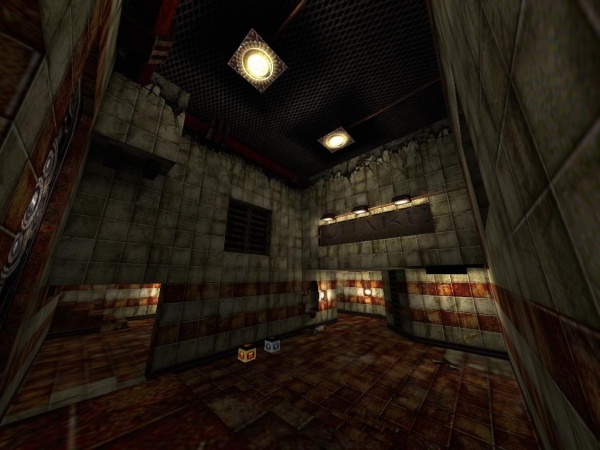
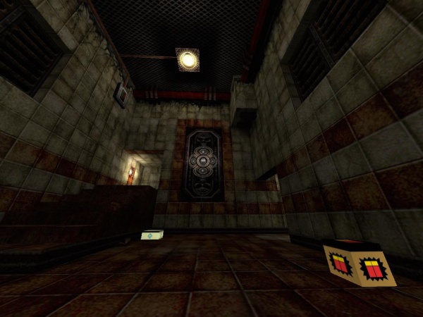
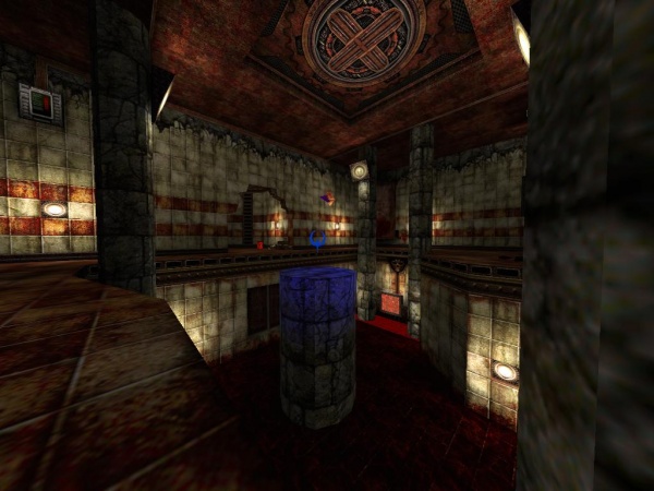
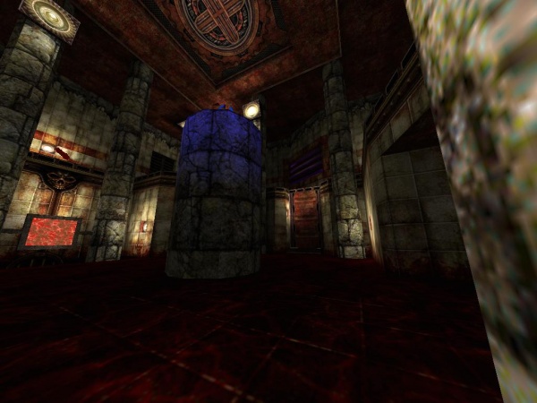
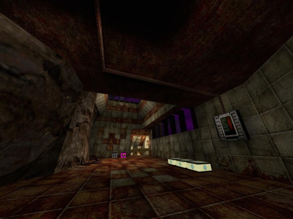
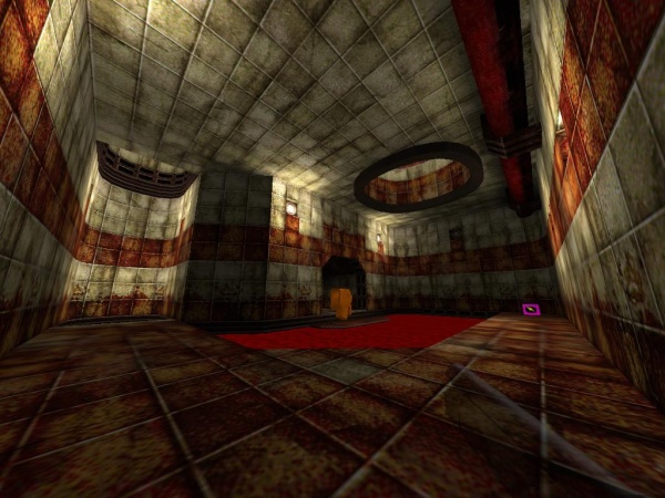
A new quakeworld map called dspdm6 beta 4 "Blood Hunger Doctrine" need beta testers for fix all possible error and finish the work.
Screenshots: http://dsp.quaddicted.com/dspdm6/dspdm6_001.jpg http://dsp.quaddicted.com/dspdm6/dspdm6_002.jpg http://dsp.quaddicted.com/dspdm6/dspdm6_003.jpg http://dsp.quaddicted.com/dspdm6/dspdm6_004.jpg http://dsp.quaddicted.com/dspdm6/dspdm6_005.jpg http://dsp.quaddicted.com/dspdm6/dspdm6_006.jpg http://dsp.quaddicted.com/dspdm6/dspdm6_007.jpg http://dsp.quaddicted.com/dspdm6/dspdm6_008.jpg http://dsp.quaddicted.com/dspdm6/dspdm6_009.jpg http://dsp.quaddicted.com/dspdm6/dspdm6_010.jpg http://dsp.quaddicted.com/dspdm6/dspdm6_011.jpg http://dsp.quaddicted.com/dspdm6/dspdm6_012.jpg BSP File beta 4: http://dsp.quaddicted.com/dspdm6/dspdm6_b4.bsp Cheers ^^ http://members.home.nl/gimli/arcus2.jpg
http://members.home.nl/gimli/arcus1.jpg http://members.home.nl/gimli/arcus3.jpg small start of my map with the continue.wad Roman Temple?
I wouldn't use the floor texture in shots 1 and 3 though; looks pretty low-detail. Are you really the same MadFox who used to post maps here in the past?
Looks nice so far, lighting seems to require tweaking. Don't mix base textures in. http://negke.quaddicted.com
Some colorful screenshots, e.g. of my still-WIP vertical map. Most people will probably know the stuff already but anyway.. dunnoh, do I realy have that madmapper's hat,
or were my last maps that offcourse... Screenshots are taken with spirits config.cfg advice, but it makes the pix look rather fisheye, and turned my gun in a pinriffle. Trinca, you don't have to judge it. I'm 'still here with my part in the base-start map, and wonder why I made it. It needs more details and a bigger texture variety. Also, quit mapping because you are obviously no good at it. (^_^)
dunnoh, do I realy have that madmapper's hat,
or were my last maps that offcourse... The base/mine map I play tested of yours was solid in design. Two interesting looking projects!
Neg!ke - Nice map - very clean and stylised construction - Interestiong how you use idbase bindings on a mid-evil theme (also interesting website - never seen it before, I like the look of the 'fleshy' speedmap :P Madfox - Also looks very nice, nice texturing, good positioning of lights. I would maybe drop the lighting down a bit, and sourced lights (like the flames in the second shot) i would concentrate the immediate light around the flame by adding a 'wait' key with a value of '2' or something like that maybe, or maybe just drop the light level a bit... I dunno ;-P Madfox discovers proper texture combinations, the world will never be the same again.
Speedy that looks uncannily like you (the map pics now dude). I like the theme. I have some suggestions.
- All but the last shot looks cramped. Also, make sure to lay clip brushes over pointy bits or recesses in the walls. Cramped hallways plus pointy bits sticking out would equal not fun. - Those textures are good, but very directional. Make sure to align everything. I'm mainly noticing arcus2.jpg, the column bases and curved arch bricks. Because the brick texture is heavily shadowed, it really stands out that it is not aligned to the architecture. - Similarly, realism in texture choices. In arcus1.jpg, there are horizontal boards across the slanted ceiling that should be wood, not detailed marble. RickyT23 - I am just on the point of brushes. Trying to get them aligned. I thought to be smart and imported it in DMM. Now all texures are back in the grid again, but it obviously turned all my lights with a delay - 1 option.
Shambler - Thanks for your command. I tried to email you, but it seems as if your adress will ever be the same mailerror. Grafh - This is my first map with a skybox. The outer part is very big and I'm fitting the map with small boxes I created in DMM. If I delete the boxsides it won't be so cramped anymore. Also by importing and exporting in DMM some textures get substituted.
|
| You must be logged in to post in this thread. |
| Website copyright © 2002-2026 John Fitzgibbons. All posts are copyright their respective authors. |