|
i was staring the first pic for a minute thinking hmm, that really does look like the originals, a bit too much? :D
But yeah, looks good! One thing, should the divots in the metal plates be a bit bigger, like in the originals? Top left. are that it does indeed look better (to me anyway) than most, if not all other attempts that I have seen, which have all looked a bit tacky to my eyes. Yours however don't seem to have that negative quality.
Good you are staying close to the originals, which is prolly why yours look/feel better. Look forward to when I can actually see them in action. I recently got the urge to work on high-res versions of the IdBase textures.
hahaha, join the club! http://www.lunaran.com/files/q4_idbase3.jpg and now seven people complain about specularity: omg, waaaa waaaa, specularity!! waaaa...
;) seriously, nice job, both of you! starbuck: i like the direction you are going in-- keeping close to the originals like that. i think that's really the best way to go about remaking textures for popular q1 textures, since we're all a little anal retentive that way. :P lunaran: specularity isn't bad at all, but if you could make it a little less uniform, i think that would help. the bump mapping looks good. i'd love to see a full set of this for q4. Lunaran: it looks good except for the specularity.
Starbuck: it looks good except for the textures you didn't do. A worthwhile project indeed. YOU FUCKING ROCK YOU ARE AMAZING I WANT TO HAVE YOUR BABIES, BUT BECAUSE I AM A MAN I'LL TRY TO FIND YOU A OVERLY SUITABLE WOMAN TO HAVE YOUR BABIES AND THEN I WILL RAISE THEM FOR YOU AND NAME THEM "STARBUCK", "IS" AND "THESHIT". HOT DAMN THAT LOOKS NICE. MORE! GIVE US MORE!
Lunaran, yours look nice but I whine about specularity and that making it look overly blurry. Starbuck wins this round. http://www.student.vu.nl/h.e.beck/noh.jpg
old shitty screenshot of a shitty map. expect these textures to be released soonish (need to polish them a bit first tho)! Not really a big map, it's supposed to be played in an engine with support for fog(fitz among others)
http://www.chimpans.se/volcanique.rar omg, that's so hard, but I didn't noclip and finally managed the starting puzzle. It's easy if you're smart, clever trick there. When did you have time to build such a big level? It's quite atmospheric.
Btw, stretch the lava at start a bit, you can see the edge despite the fog. (fitz) Here's a WIP shot of a q4dm I'm working on with gibbie's and Lun's textures:
http://biff.leveldesign.org/pics/map_shots/wip/q4/imp4dm0_1.jpg Looks familiar, I know. I've only got like four map layouts in me =( at the bottom center-to-right area. do the 45degree thingy. ;)
otherwise, i like it (although it could do with some more interesting lighting, but since it's a DM map, i guess that's out of the question :S ) Starbuck and Lunaran: both sets look bloody great so far. Can't wait to see the finished packs
Starbuck: Hell yes -- meant to put it in the above post, but more power to you on the revamped q1 idbase -- looks sexay =D
Zwiffle: Pipe down, you -- Myrmidon is not dead. Necros: Doh, saw that b0rked trim myself -- and don't start on the lighting, I've heard enough from gibbie about it ;D Madfox: send beta to my gmail account
Starbuck: oh my, yes!!! Don't forget to do the unique base textures from MP1 and MP2 as well :) Lunaren: yaaaaaaaaay, I hope we get some SP levels out of them (pokes tongue at Beef). ok it's updated again and this time it's surly beta it could even be final ;)
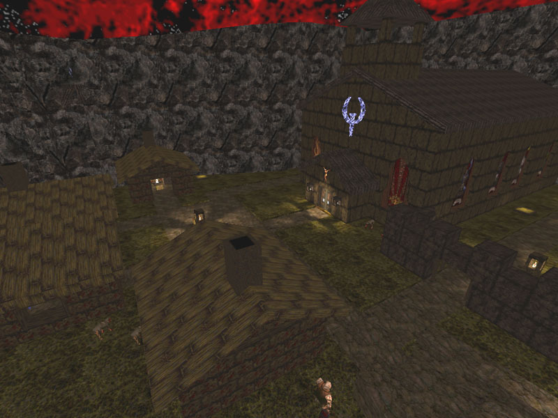
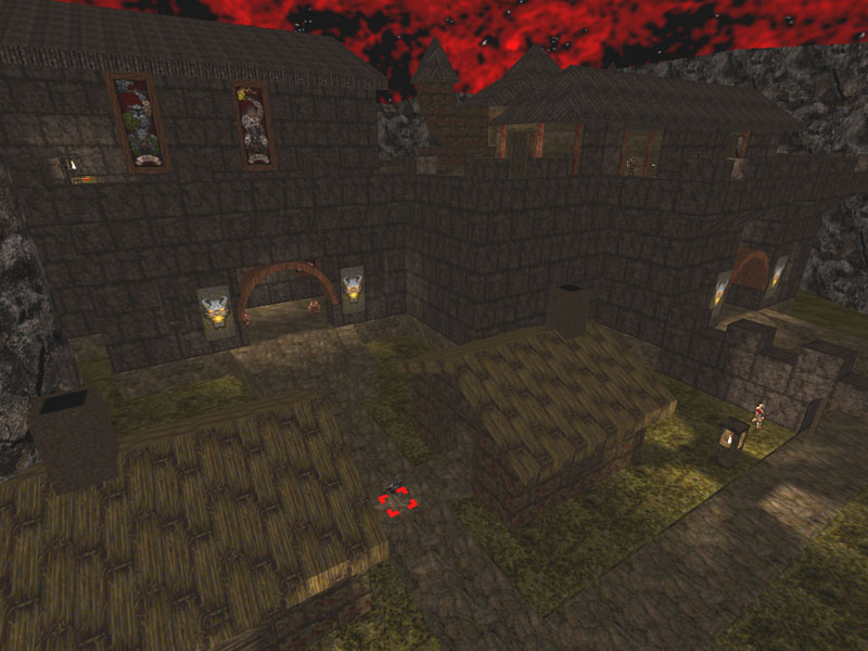
ok now i've changed the map so it's a sp/dm map from now on not only dm anymore do post back after testing it as i'm very glad how it looks and feels :) i must be getting beter as Trinca got killed on the map and that i didn't expect neather did he lol the 2 shots are taken from sp and dm mode and from the same spot so you see the difference have fun http://www.multi.fi/~elvis/quakemap/hellvill.zip http://www.multi.fi/~elvis/quakemap/hellvill1.jpg http://www.multi.fi/~elvis/quakemap/hellvill2.jpg it on Normal and it's a pretty nice map! It looks good and gameplay is solid. It was too hard though; more health and shells are needed.
There are two critical doors to the final area with the ogres that won't open due to their spawnflags; 2052 should be 2048. You should also go through the map and delete all invalid origin keys from your brush entities. the final doors you are talking about shoulden't open at all they are just there and for sp only the one that opens are on the top not the bottum one
i shut that door completely just becuase it didn't work right in sp mode, it's like one other door it's just there to block and i haven't set any origin keys at all on this map so i woulden't know what you are talking about some thoughts in no particular order:
-i played it on skill 2 and didn't think it was too hard. but a little more ammo before the encounter with the vores would be good. -some additional bits look nice, like the broken grate and the barricade in the caverns/ra room. -add some secrets, for example the quad on the mountain ledge and the ya house -more monster teleports (when certain items, weapons and the keys are picked up)! particularly the outside area needs to be more crowed. -the button for the final door is hard to spot, maybe a (weak) light there. -some doors/walls that open later or not at all could use a message. -the exit building has a big red window on the outside, but it's missing on the inside. -the exit looks bland with only a black texture. what about using some nice liquid (lava maybe) or make it a corridor into darkness with a negative light? -some torches a somewhat far away from the walls (and the chandelier). make the gaps less obvious (if it doesn't screw up their light, of course). -don't box the map with the sky brushes! use sky only for the top brush and fix possible leaks manually. -add an intermission showing the entire village? i better don't start with r_speeds, so that's about it. dunno about deathmatch, but as i already said, i don't think it'll work out. some teleporters might be helpful, though. -the exit building has a big red window on the outside, but it's missing on the inside.
this i have never seen please explain where it is i use both fitzquake and fuhquake to look at this map and nowhere i've seen anything like this the chandelier started to look a litle like this when i made it a func_wall don't know why put the polycount dropped very much when doing it -don't box the map with the sky brushes! use sky only for the top brush and fix possible leaks manually please tell me abit more about this your the master and im the n00b even if i've mapped a litle ;)
|
| You must be logged in to post in this thread. |
| Website copyright © 2002-2026 John Fitzgibbons. All posts are copyright their respective authors. |