|
New version up. Same link. The lights that were h0rked are fixed and ambient has been lowered by about 50% and it's looking less washed out. I also added a second SG and RL and some detailing here and there and various and sundry other crap.
Same links, updated pics: http://www.planetquake.com/pjw/screenshots/pjw4dm1a.jpg http://www.planetquake.com/pjw/screenshots/pjw4dm1b.jpg http://www.planetquake.com/pjw/screenshots/pjw4dm1c.jpg Download: http://www.fileplanet.com/dl.aspx?/planetquake/pjw/mapstorage/pjw4dm1.zip I still think it looks a little flat. I understand that is bare so that it runs well and is easy to play competetively, but I think you can still add a few more interesting designs and shadows in places which won't interfere with the areas players are going to be moving through.
The towers have some nice angles, but the walls just look a bit bare. This is only exacerbated by the fact you have several different textures all sharing the same plane. Perhaps angle some sections of the wall, extrude others slightly and add some interesting lighting or designs to the walls. Also, I personally think that the curved doorways look a little out of place in a map with such chunk angular designs. Perhaps you could design a more angular doorway and use that instead? God... commenting on your map has made me really want to have a go myself. I used to love mapping for Q2, and the game itself had some really great designs in places. I'm going to see if I can find a copy for a reasonable price here and buy it if I can. Unfortunately PC games in Japan are not so popular, so I might have trouble tracking it down, despite how big a title it is. They also still sell pc games in ridiculous fat cardboard boxes rather than slim DVD cases :( (http://www.amazon.co.jp/exec/obidos/ASIN/B000BNY9LW/qid=1136010855/sr=1-1/ref=sr_1_10_1/250-3209704-5480269 - see!) Shame I can't download it via Steam or something :( METL! Can we have a Q4 icon please? im interested to see how the void plays... :)
Eh? I'm not sure what you mean. You mean all the drops off the edge? @Than, I may do a bit of extrusion/angling on some of the wall sections--it's not expensive and will add a bit of variety. Thanks for your feedback. :) If you want, can't you just order it from the U.S. or Europe, or wherever? I have finished all the main brushwork. The map has also an exit now. The gameplay is ready in 95%. There will be about 85 monsters on hard skill. The other skills have to be done yet. There is still much work with details and decorations; some bug fixing is needed also.
Here are some pictures again. http://republika.pl/quake_1/hdn4.html http://republika.pl/quake_1/hdn5.html http://republika.pl/quake_1/hdn6.html I have also created a simple web page :) http://republika.pl/quake_1/index.html Great looking stuff Ankh -- can't wait to play the level. I love the blend of textures in those shots.
I really like the way you have used the blue theme here - the first shot on your site is especially nice.
However, I can't say I am crazy about the red rivit trim - perhaps there is another more suitable texture you can use instead? I think perhaps the light grey brick would look nicer. Keep up the good work though. pjw, I'll run through tonight - screens look better.
Ankh, bring it on! Can't remember the last blue map I played (possibly anonca base) but I like blue themes. Have you tried replacing Kell's red rivet with the silvery one from the same set? Without red elsewhere, that particular trim sticks out like dog's balls. I'm going to dream blue until this is released :) I hope that the map will fulfill all expectations :)
I have tried some different trims some time ago and I liked the red one the most. This rivet texture is also used on some lifts, bars and lights, so changing it to brick doesn't work easy. I would have to replace it manually with at least two different textures. I will try the blue rivet texture and post a screenshot here. Necros - what's wrong with the texture you are speaking about? I can't imagine how I could change it. just that that same texture is used on the walls too. maybe it's just me, but wall textures on ceilings look bad to me.
NOT enough bloody trims!
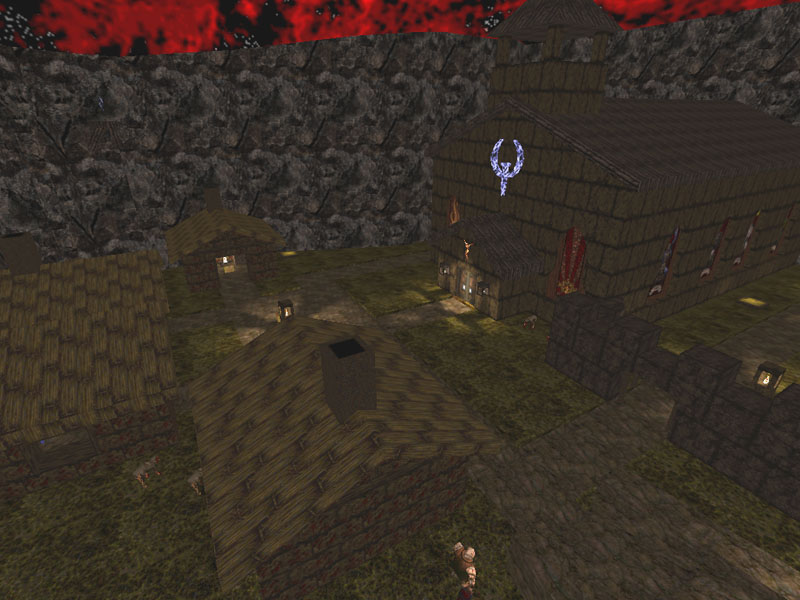
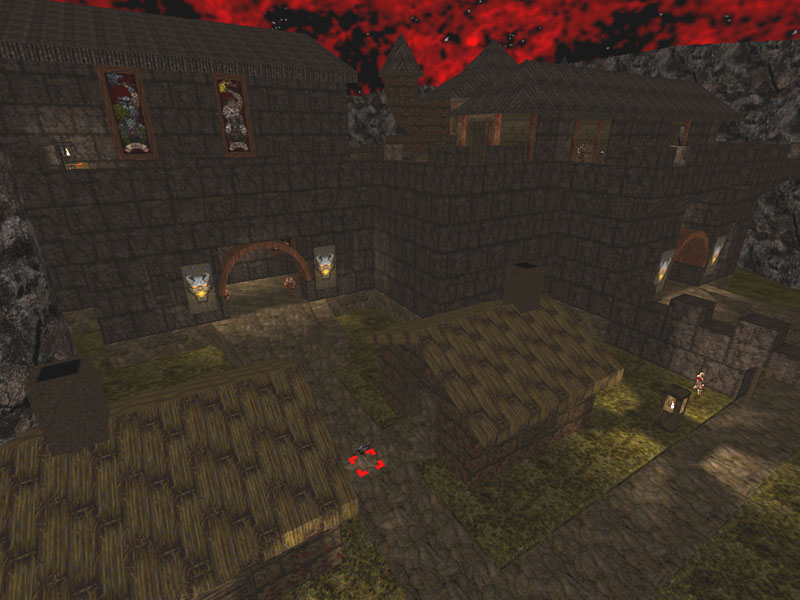
Who says that!!? ;) Now, seriously I plan to add some trims and decorations in the area posted on the last screenshots. I will check if I can do something with the ceiling texture, but I'm not sure about it. screenshoots of my upcomming quake dm map hell village hope you masters like it :)
http://www.multi.fi/~elvis/quakemap/hellvill1.jpg http://www.multi.fi/~elvis/quakemap/hellvill2.jpg Looks good, but I would lose those "upside-down ice cream cone" trees.
hehe that tree was just a test to see if it would fit
and why does this look as a sp map when i was trying to make a dm map, please say what would make it more dmish :)
|
| You must be logged in to post in this thread. |
| Website copyright © 2002-2026 John Fitzgibbons. All posts are copyright their respective authors. |