|
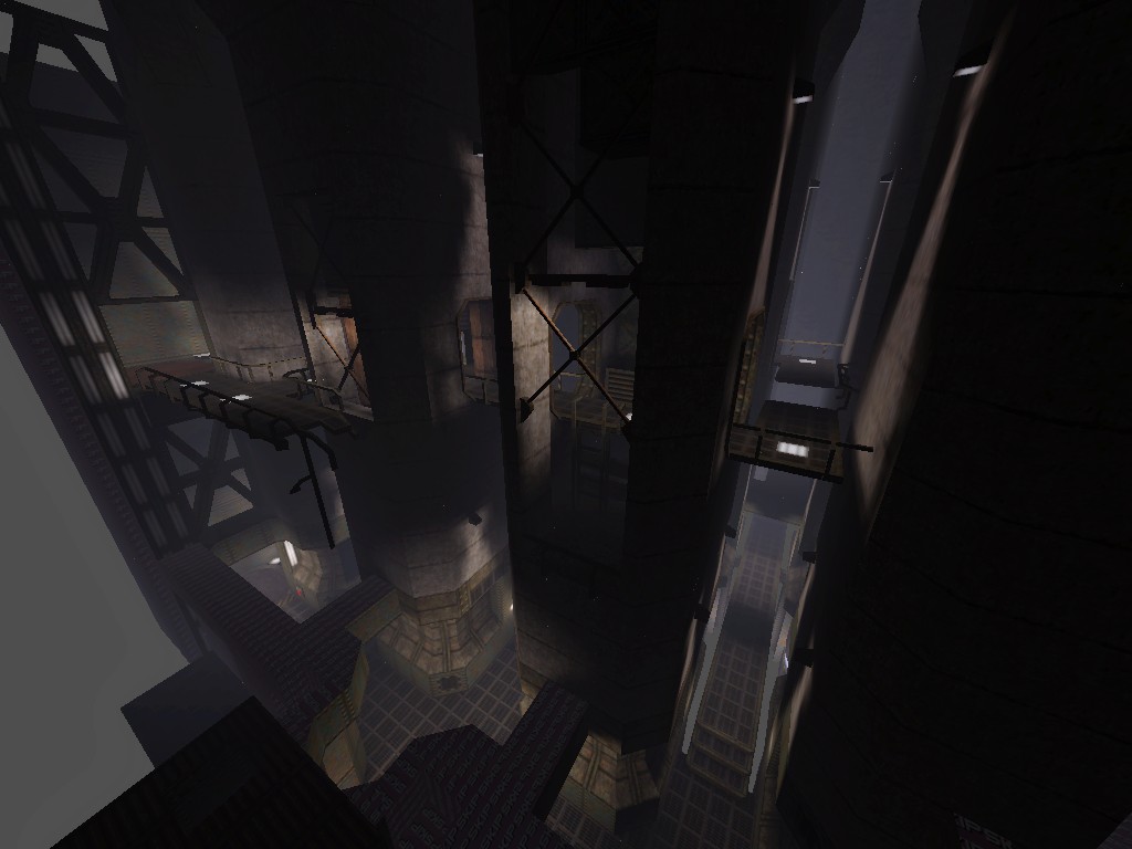
is that a remake of e2m1? (I got that impression, or at least an e2-ish impression, from the moat/drawbridge type setup).
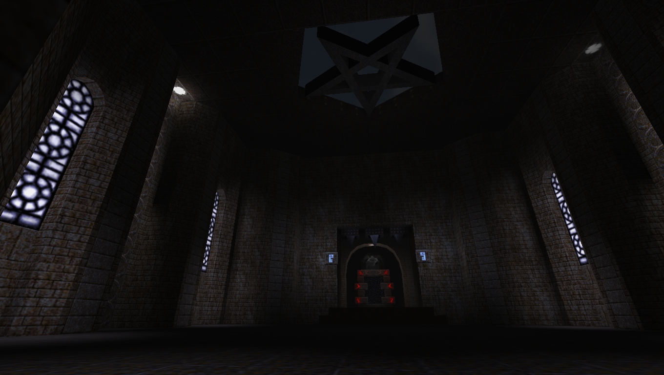
Looks amazing. Extremely atmospheric. ps, I always light windows like that. if it's inside the light must be coming from outside, if it's outside the light must be coming from inside, heh. I guess what hits me wrong there is not necessarily that it's physically inaccurate but more that it makes it plainly obvious that there's a spherical light source sitting in front of the window. I dunno
I agree with willem, FWIW
The current technique would probably be fine if the light was more subtle. Currently it's bright enough that it has my brain looking for a source. Dimmer and I might accept it as general ambient lighting bounced from somwhere else. I think it's the fact that the sky is the only thing in the scene with that color. When compositing a scene you need to repeat the main hues in several locations in a scene or it might look off. Ditto for the windows actually. It doesn't need to be as bright or saturated either, just repeating a certain set of hues already helps a lot. I tried to tone it down to bring it more in line with the rest of the scene, but ideally there should be other things in the set that share the color palette.
https://www.dropbox.com/s/h13yssu9o5hq6wb/telefragged_001.png
https://www.dropbox.com/s/l2h6b9okm8zq8d8/telefragged_002.png Yeah, dropbox. Sorry I'm in a hurry. But it's kind of flat, and in more way than one. The lighting could be a bit more dramatic, surely, and perhaps sink the middle of the floor, a bit?
I have been wondering how much detail you can pack in to a map before things start to break. I got to this point when I started seeing wandering vertices and degradation.
http://www.quaketastic.com/files/screen_shots/5the1m1.jpg How about a spotlight above the pentagram so it casts it's shadow on the floor?
5th, nice stuff, but it's a bit bright - some shadows would help. And trenchbroom needs a lighting preview!
Also, I'll post some proper shots of mine (with proper links as well) soon. I feel like the gate and teleporter are too small for the scale of that room. Perhaps just making the gate larger would do it.
Otherwise, yeah it's cheesy, but such is Quake amirite Yeah, the lighting in that room needs work, that's why I'm looking at it. The floor could be less flat also, don't know if my marksurfaces can handle that though.
How about a spotlight above the pentagram</> There already is one, but it's turned off in that shot. the gate and teleporter are too small I'm pretty sure it just looks that way because of the angle you are seeing it at and partly because I kicked the fov up to 100 just for that shot. The actual distance between the gate and the teleporter is over 800 units. Both the gate and the teleporter are pretty large, 192x192 I think. I decided to register since i'm becoming interested with this community. also, screenies:
http://i.imgur.com/aZWtINM.jpg http://i.imgur.com/N9CJjl4.jpg http://i.imgur.com/xpt88vy.jpg "How about a spotlight above the pentagram so it casts it's shadow on the floor?"
That pentagram is way too high to get a crisp looking shadow out of it. I've found that if you use a func_detail brush (so no vis or r_vis hit) along with a skip texture (so the player never sees it) and then place it where the player can't get to it (and that there's never going to be an enemy above the player) that you can make some very detailed shadows in tall spaces like that That'll allow for a crisp shadow, but another way might be to have the pentagram purposely distorted; going up the walls and so on. Although I suspect that wouldn't work in that particular room.
I'm thinking of that one room in id1 where for no reason there's a Q shadow on the floor. And of an unreleased custom map that did some similar shadow painting tricks. It's kind of hard to see what's in the shots. Screenshots from the game are always dark, usually they need brightening in Photoshop or whatever to leave the contents more visible.
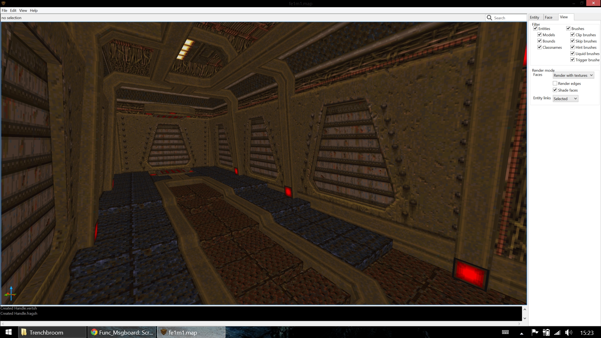
New quoth map in the works? Is it single player?
|
| You must be logged in to post in this thread. |
| Website copyright © 2002-2026 John Fitzgibbons. All posts are copyright their respective authors. |