|
Trouser activity is measured in either front or back occurence and evaluated by the implications each side brings with it in context. Spatial orientation is largely irrelevant in this respect.
Doesn't this equally depend on locality and the coordinate system used? e.g. Your orientation might no be straight from 2 colluding sets of post-2-lates.
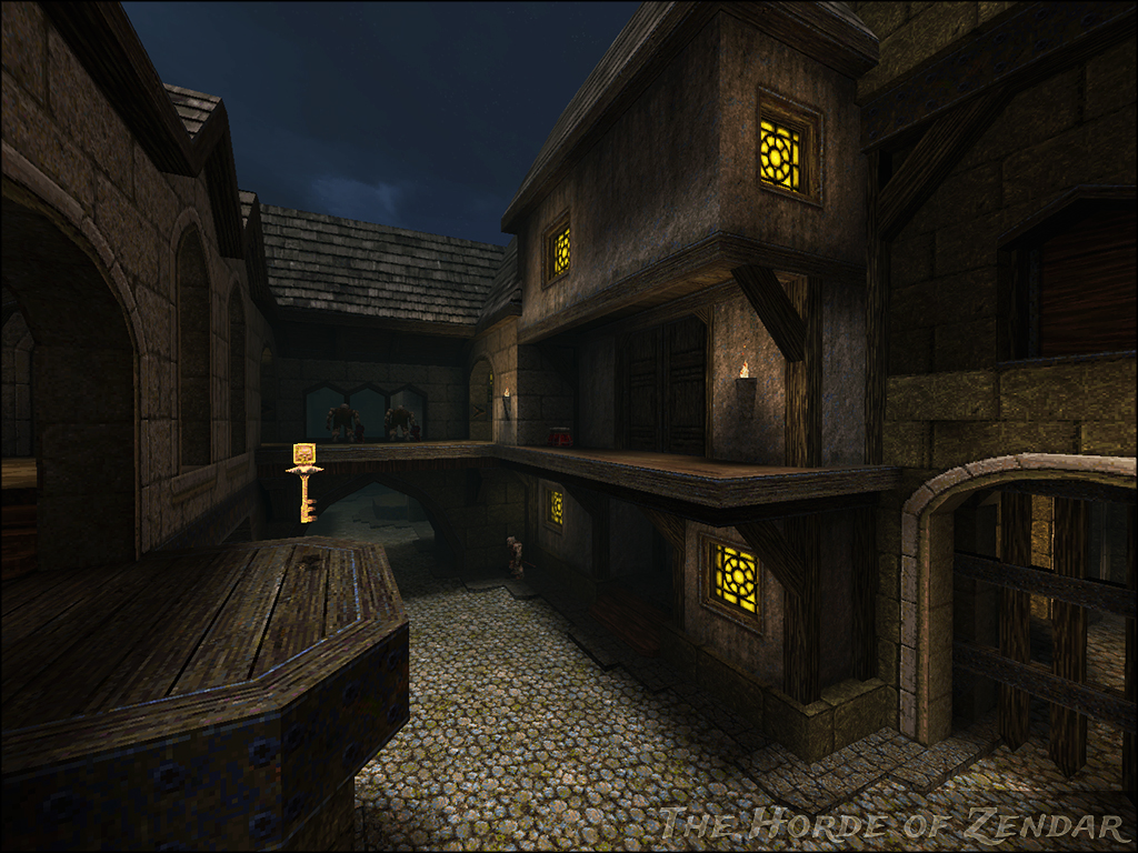
I like your stuff, sock, but I really wish you'd change your lighting style when it comes to those yellow inset windows. The light would in no way be able to hit the walls like that and it just looks
This probably wouldn't work, but could an info_notnull with effects 8 produce a fake volumetric glow for the window effect?
Hm. Even if not, might be useful for marking buttons or other stuff, will have to give it a try. but I think they would be better if they were a bit more orangy like the one on the left? opinions opinions...
Looks very nice. I also have to agree with a couple of comments.
I think the upper square window has too much of a greenish tint, more to the orange side would look better I think. And the way the light from it illuminates the surrounding wall is a little unnatural looking. That light would have to be reflected back onto the wall and there is nothing there to do the reflecting. What I had in mind...
click About the lights being unnatural, I think the windows would stick out much more without them. It's okay to sacrifice realism for improved local contrast, imo. Plus you need some kind of light source for lighting those parts anyway. Doesn't bother me much. That literally looks like this http://multiplayerblog.mtv.com/wp-content/uploads/2008/08/diablo-fan-06.jpg
|
| You must be logged in to post in this thread. |
| Website copyright © 2002-2026 John Fitzgibbons. All posts are copyright their respective authors. |