|
@Spirit
your trick works, but the result is pretty weird. I don't think the DMSP mod works as it should in this case. O well... i changed texturemode back to linear_mipmap_linear. don't like pixelated textures... that was by design? why?
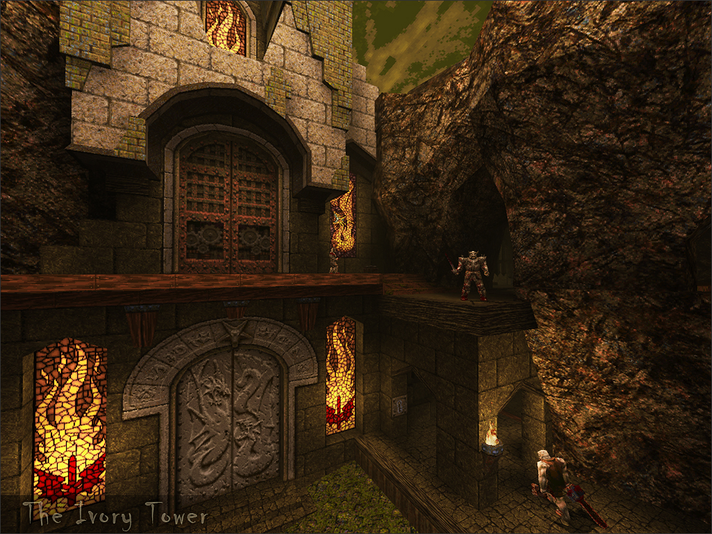
@jakub, I have no problems with anyone changing my default or even deleting the pak1.pak file. If someone wants to change it to their liking that is perfectly fine with me. The new textures in this map were designed to match (pixel density) the existing assets. I designed the visuals in this map to be viewed at original filtering because it maintains a consistent visual theme. I have nothing against HD assets and I certainly don't think Quake should be viewed in low resolution for eternity, but until I see good HD assets I will continue viewing Quake in Pixelvision. Seriously though, blurry textures is heresy. No it is not, my preference for pixalated textures is nothing to do with heresy or thinking that Quake should be like the original it is to do with visual harmony and consistency. I believe that when you design a game the pixel resolution is important, if you are going to design something to be HD then everything needs to be HD. Having a mixture of original and poor HD assets is very bad IMHO. I also think blurry texture filtering is terrible, I love playing Quake at higher resolutions, but I do not like looking at the game with blurry vision! Embrace the crispness of the original art, it is gorgeous! The pak files are only there for the custom models and an edited quake.rc that forces the particular GL texture settings sock prefers. I wish you would respect my vision for this map, I designed it to look a certain way. There is nothing forced about my settings, you can delete the pak1.pak file if you want. ...that I like sock a lot more now. Not that I disliked him before, but those Pixel Rants were glorious, summed up my thoughts.
@jakub, SMC is an awesome mod for DP, it is good to know that it works with this map.
@Hrimfax, glad you liked it. The map is certainly designed for people to enjoy the details. it seemed to me that there were multiple "shortcuts" that served the same purpose, just in different places. @Rick, it is about choices, there are 3 main shortcuts in the map. Demon door at the beginning to get the NG early and surprise a monster. SK bypass via the lift so you can ignore the lower mines. Attic attack to get to the Altar room quickly and pickup RA+SNG. stop mapping Sock. @spy, it seems people here want me to map less, probably a good idea! and then agree...
Blurry textures in quake have always annoyed me, even in the 3dfx days. I wished that we could have had the sharpness of the unfiltered textures with the speed of 3d acceleration. I'm only of this opinion with every game up until Quake 2, I don't mind Q2 and beyond having filtered textures as they were designed with this look in mind. But Quake, Doom, Hexen etc I prefer the sharpness of the original art. I _think_ I played on Hard, that was what the centerprint suggested, but I was never sure. I might have accidentally triggered the Normal difficulty as I later on got that centerprint (after falling, trying to reach the green armor). I kind of hope I was playing on Normal because I found it a tad easy.
Anyways, DirectQ mucked up the demo, but LordHavoc was so gracious to extract the main gameplay via a hex editor for me, so you can see the actual session here: http://scar3crow.com/quake/demos/sp/scar3_ivory1.zip 100/101 (missed a Knight, was in a rush so I didn't go looking for him, though I could hear him). 5/10 secrets I believe. Got lost some, and by got lost, I didn't have an objective for a while. I knew I needed the gold key, because I could see the gold door, but it took me a long while to find it and have it be blocking my path. That was my only real issue with the map, I didn't have an objective. I found the silver key before I really noticed the silver door, which was long before I could reach the gold door. That is a lot of negative, but I very much liked it sock. The brushwork was excellent, particularly the damaged steps and bits of stonework cropping out. I also enjoyed the presence of monster_jumps keeping the areas from being flat. The enemies just out of sight that you will catch the attention of during a retreat is also excellent. I really hope to see more from you, and as for pixel density, I greatly appreciate it. Thank you for that effort. Personally I love the pixelated textures. I have nothing against the blurry filter but I do love pixels.
"I wish you would respect my vision for this map, I designed it to look a certain way. There is nothing forced about my settings, you can delete the pak1.pak file if you want. "
I think you misunderstood what I was saying. I was just mentioning to barnak that he could delete the pak1.pak file if he wanted to play this with a mod (DMSP). The 'forces' reference was in relation to the quake.rc doing it (because thats what it does although I should have probably said overrides maybe), not you :) Not sure what I did when I came to this point-of-no-return drop down. I think I just dropped haha.
Here's a demo: www.etherealhell.com/etherealhell/demos/ivroy.dem Half the time I was drinking my cappuccino, hence long pauses, haha, then the last part is me noclipping around seeing what I missed because there were still 10 enemies left. I only found one simple secret. Kind of feel like I need to replay it because I must have missed quite a bit - that's the problem with having so many secret areas in what is actually a pretty short level anyway. I would have only had a couple secrets, the rest can be part of the playable level, but then I've never been much of a secret hunter. Like your last one, it was a bit disorientating at times, maybe because the layout goes back on itself so much, almost too much because you stuck to get confused. I did anyway. On the other hand, the style here is fantastic. I love the darkness, and the texture usage, it's a really unique level actually and definitely goes in the pile of levels to replay every now and again. I like a short blast. The atmosphere reminds me of The Crawling Chaos. And it has a sense of belonging, with the mine, rather than just being random Quake level with no purpose. The end battle... I'm not a huge fan of the crushing machines, it makes it too easy. Shambler and Vore broke it up, but hell I would put them in at the same time, cause some real chaos. That is a lot of negative, but I very much liked it sock.
@scar3crow, no what you said is perfect, the map is actually broken. The primary route to the gold key (overall map objective) is not clearly designed and encourages players to wander around lost, not really a good design. @Kona, yeah the last battle was a bit of an after thought, I ran out of time and ideas. :/ @distrans, I was hoping this map would break from the usual pattern I use for secrets. I tried to use less demon doors and more variety. I assume it was better this time around as no one has commented. Thanks everyone for the demo's, I don't plan to watch anymore as most people just seem to be wandering around lost and frustrated. A disappointing release on my part, especially after all the effort I put into creating the broken/organic brushwork. (Any mapper will know how time consuming it is to create that stuff) Some hard lessons learnt with this release that I plan to apply to my next release! This was a great map. I have played it a bunch of times now and I love the none-linear gameplay. Plus, as a mapper, I hella appreciate the amount of work gone into the design. Even the subtle ground/rock blended textures you used to fake alpha terrain mapping were noticed :)
Nothing wrong with breaking out the comfort zone and making something different! You are being awfully hard on yourself, I found this map to be excellent. Architecture, gameplay, lighting, it was all two thumbs up. And truth be told, I don't mind a bit of exploration, I find it adds plenty of replayability to a map, rather than it being just a straight linear path all throughout.
You'll see in my demo, not once did I get lost, or appear to be frustrated. If I'm looking around, it just means I'm appreciating the scenery and brushwork you have accomplished. Ivory Tower gets an A+ from me. First run demo, hard skill. http://qrf.servequake.com/~orl/misc/orl_ivory.zip Should play back in any engine. a very negke-ish comment :-)
I hope to review this next week and I am super looking forward to it. Seeing new design ideas in theory, practice and debate is also fascinating. Sock has definitely brought fresh air to the musty vaults of Q1SP. Yeah I definitely wouldn't call this a disappointing release sock. While I kinda felt like I was on the verge of being lost, I don't think I ever actually got lost (did I?) and always seemed to be on the correct path. GK and gk door all popped up when they were supposed to.
It's the kind of non-linear map that would be even better on a second playthrough. Maybe slightly more variety in texturing and a tiny bit more linearity would help in future? But I still loved the architecture and texturing! Basically, this map rocks.
Anyone who gets completely lost is a dome. Getting a little bit lost is good fun and adds to the atmosphere. Pixels in Quake suck dick and deleting pak1 should be default. I think watching first-run demos can mislead and lead to valvefication if you try to cater. I did get lost or at least felt that way but if I had known that the map intended to be very open I guess would have reacted differently. Having a challenge in spatial navigation is not a bad thing. I definitely prefer it to the way HL2 (iirc) or Portal 2 removed any kind of choice.
In your maps everything is so detailed that it can get overwhelming. :D Sock, if you go and make a fully linear map after this, I'll find you and skin you alive!
|
| You must be logged in to post in this thread. |
| Website copyright © 2002-2025 John Fitzgibbons. All posts are copyright their respective authors. |