|
|
I think that the aesthetic choices lack a clear direction (and effort), and that the mapping will definitely improve as you release more maps.
But I found it very original, with a unique and unusual take, familiar but foreign enough to be always intersting. The reason the textures look like that is because it was mostly me experimenting with wally. In fact, the first textures I made were just layers of filters.
But good to know you liked it! So you were d*cking around with Wally and the result is what looks like some scribbles of fullbrights all over ids perfectly fine textures.
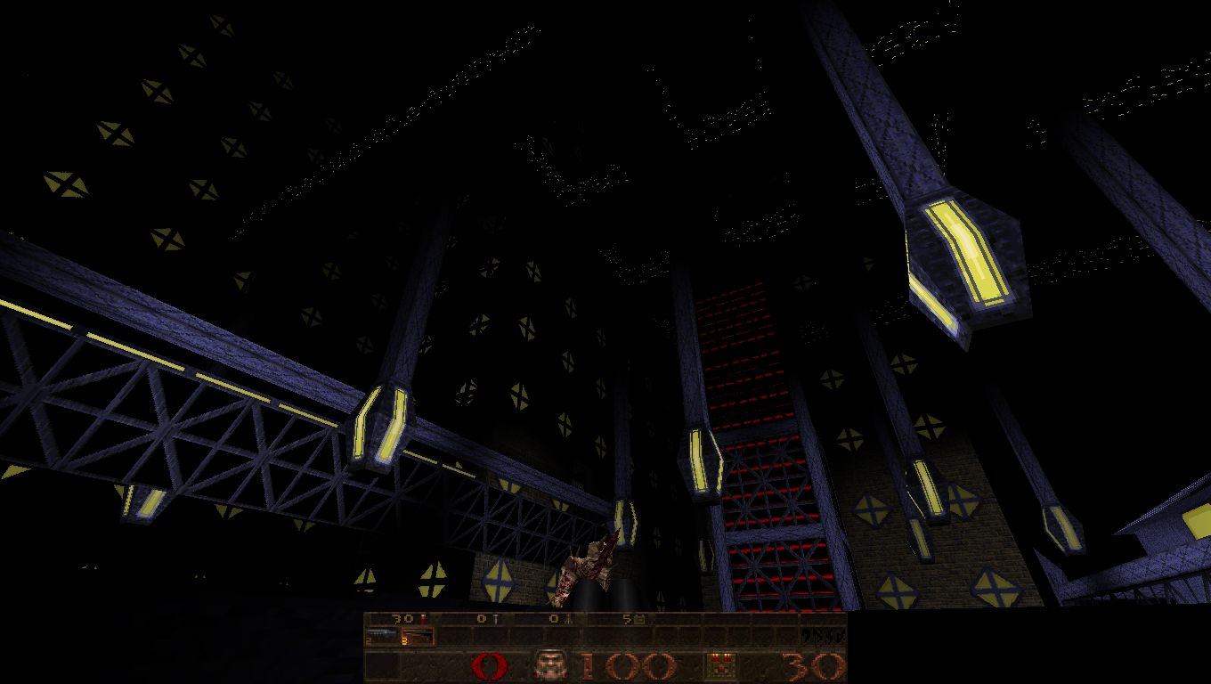
That and the big yellow fullbright diamond window things. This is just jarring. Why not model actual windows with brushes and use the many existing window textures? I can't tell what I'm even looking at. With so many years of Quake mapping, and hundreds of Wads, why dump this out like this. That and there is not nearly enough ammo and weapons at the start should the player proceed forward to fight the ogres, rather than take the other path to the double shotty. I concur with the lack of effort here. Here's my Playthrough. I agree that some of the textures seem amateur (not that I could do better). A neat and unique concept overall.
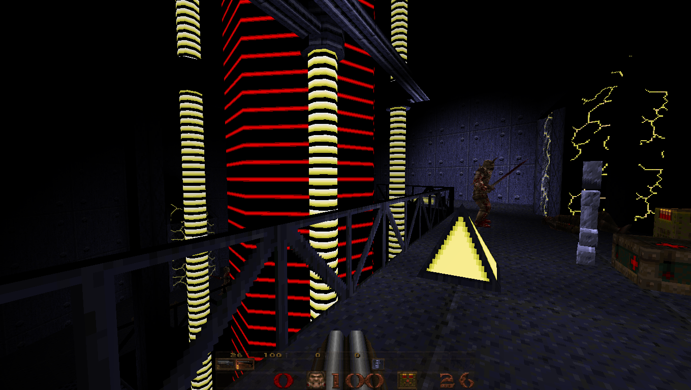
I think you had a lot of interesting ideas here but something got in the way. Poor lighting, tight corridors and questionable textures are the culprits here. It feels like a rough draft of a really good idea. The end fight was really good but felt out of place in your map. I think you could rework this idea but I'd start from scratch and work on your textures.
5/10 Trippy map. The texture quality is bad, but there's some interesting concepts in them.
It reminds me a bit of some After The Fall maps. |
| You must be logged in to post in this thread. |
| Website copyright © 2002-2026 John Fitzgibbons. All posts are copyright their respective authors. |