News | Forum | People | FAQ | Links | Search | Register | Log in
Screenshots & Betas
This is the place to post screenshots of your upcoming masterpiece and get criticism, or just have people implore you to finish it. You should also use this thread to post beta versions of your maps.

Need a place to host your screenshots? Upload them here:
http://www.quaketastic.com/
Username: quaketastic
Password: ZigguratVertigoBlewTronynsSocksOff

[[[CAN WE PLEASE HAVE A NEW PASSWORD FOR THIS AS THIS ONE IS UTTERLY FUCKING ANNOYING]]]

File size limit is 128MB.
First | Previous | Next | Last
 
http://www.quaketastic.com/files/screen_shots/q70v05b.jpg

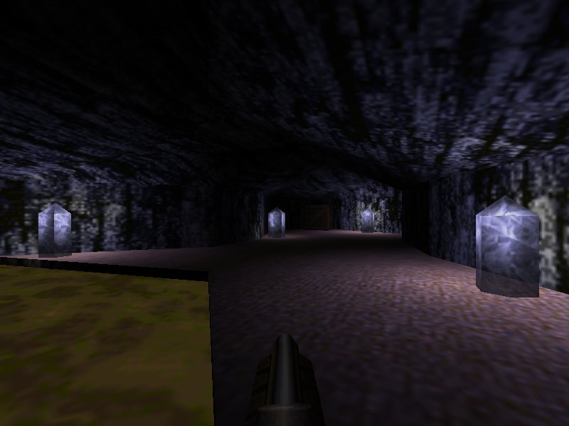
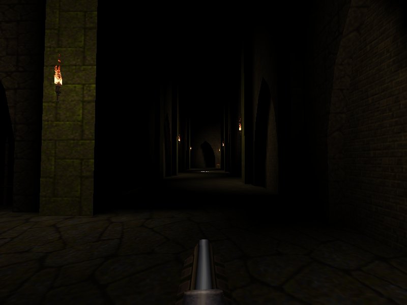
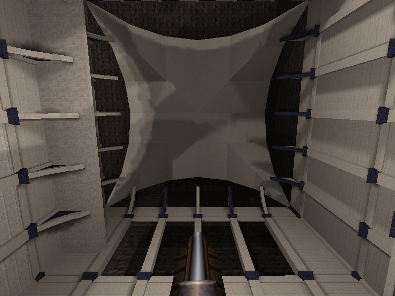
I haven't goten any good lighting into these after hours of tries. I want it so the monsters are lighted when they go near the torches but are mostly in the dark the rest of the time, but i don't want to lower the torches even more. I suppose the answer is doubling the number of lights, but ...
http://www.quaketastic.com/files/screen_shots/q73v03_400_3.jpg
http://www.quaketastic.com/files/screen_shots/qep73v03c_400_2.1.jpg

Any ideas for this ceiling? Nothing i tried convinced me. The lighting will change in the future.
http://www.quaketastic.com/files/screen_shots/qep73b03.jpg 
 
if you can't figure out what to put on a ceiling, just cloak it in darkness! :D

for the first shot, there isn't much you can do to make better lighting there because the brushwork doesn't really allow for anything. if you had rougher stones and things jutting out that could cast shadows, that would certainly help.

for the second and third shots, try putting the light down by the base of the pillars instead of high up and put them in the little corner where there's the inset arch so it casts shadows. 
Chugging Along... 
 
looks like it's coming along quite well. one thing i really like about doom mapping is just how fast moving the whole process is.
just be careful with doing the lighting effects because if you need to change the area later, it can be really annoying having to deal with all those sectors. 
 
looks good.
I really should try doom mapping some time 
 
it's fun and easy to get into!
doom builder: http://www.doombuilder.com/
slade (in beta): http://slade.mancubus.net/ 
 
Love Doom, don't really play too many custom maps though. 
Personaly, 
I recomend GZDoom Builder. 
My First Quake Map 
I Dig It. 
 
I Also Dig It 
 
I Definitely Burrow This 
 
 
I'm excavating so hard right now! 
 
Seriously though that's a potentially interesting bit of topology for moving/fighting around, and I've always liked the mossy-block Quake texture set as being one of the "most Quake-ish". Keep fiddling with the lighting. 
Decent Stuff! 
Huh 
The full version of that texture set has a lot more textures, but for some reason I don't have it in a cloud service anywhere.

I'll check on my local drives tonight for it. 
@purple 
Those textures look really nice! 
Full Green Tex Set Plx 
Nice work on your first map there Brown96, keep it up! 
Please Do, Ijed 
* Brown96, that looks good. Work on the lighting and, that angled brush at the left, looks unscaled to me, but maybe it is the perspective. That many health packs make me think that it is for a big fight, so i got wondering which kind of fight culd be pulled there.

* Faethon, Mechtech, i have some demos for you. When i get some time i'll send you them with some comments with. 
My First Quake Map 
the healthpacks are modified with QuakeC. with another spawnflag, they give only 2 hp. there is a total of 48 hp and 100 armor to be had in this room, and you will encounter a total of 2 wizards, a hellknight, and 4 knights. given that the nailgun is found in this room with 75 nails, it feels "about right" for my skill level.

http://i.imgur.com/1SMAxNL.jpg

i still haven't messed with the lighting in the previous area yet. i intend to do so over the course of the next day or so. thanks for the feedback. 
Ok 
Found the textures. I'll prepare a neatened up pack.

They were painted for RMQ and feature modified / expanded sets of the id1 textures for the most part.

Should I email them to you as well Spirit? 
Ijed 
Sure, I will upload them then. 
What Engine Is That? 
With reflective water!? 
I Like Brown, 
and green. 
RickyT23: It's DarkPlaces With R_water = 1. Nothing Fancy. 
 
Re: Shots Nice Oldschool Style 
reminds me of the Bad Dark Cistern a bit, or Round the U-Bend (hey negke and than, how about more Dm-for-SP remakes, such as dm2?). 
RMQ_Texture Wads 
Texture sets armed up and sent to spirit, you can also get them here:

https://www.dropbox.com/s/6uahnrw014qztfg/rmq_textures.zip

The wads contain work by myself, Gb, OTP and probably some others.

The textures are based off the id1 textures and designed to fill out the gaps in the sets. Often there's a cool texture in id1 but you want to expand it into a style a bit more, which is what happened here.

The rotmet set is the one mentioned above, and is an entire texture set based on a single texture from id1; met14. 
Sweet! 
 
 
these are really good, thanks for uploading them. :) 
Hopefully 
They'll find their way into a release :D 


I'm on the fence on these textures, some of them are just extended versions of the originals (ie, someone has just copy and pasted the tiles to make them bigger versions of the exact same texture). Some are just badly sprayed on...

It's not all bad, but it's more bad than good. 
 
Some of the darkmet textures have way too pronounced shadows and highlights. Not to offend anyone, but they look amateur. "Bevel and Emboss"?

The techsludge wad is also questionable. 
Yep 
There's some crappy sets in there, but there's also some useful, more finished ones. 
On The Other Hand 
Some of the redtech stuff looks really cool, a nice compliment to a regular idbase map at worst. Especially those hybrid red-trim-on-idbase ones at the start of the set... 
Recovered This From An Old, Old CD 
Except the second one.

http://www.quaketastic.com/files/screen_shots/canon_coce.jpg
http://www.quaketastic.com/files/screen_shots/canon2_coce.jpg
http://www.quaketastic.com/files/screen_shots/Flipad_coce.jpg
http://www.quaketastic.com/files/screen_shots/Temple_coce.jpg

Currently modifying the second to go more to the grid (it is a miracle it doesn't complain about the first, as there is almost nothing on the grid) and change lighting and balancing. Probably, I will use it later for some single player map.


* About the textures, fist of all thanks to Ijed for uploading them. Second, i do think they are a nice addiction to id textures maps, there is one third that are questionable or just cheap as some of you already pointed out, but the rest can add a good variation to id textured maps.

The redtech one is going to be on one of my maps for sure. It is a pity that i don't like runic theme, as there is some textures for details quite usable. 
On Textures 
bluemet has some utility, even if they are simply tiled version of the original.

darkmet has the best additions.

Salvage the best of those two and release a single wad.

redtek is just awful. Horseshit brown is just about the last color I look for in a sci-fi atmosphere. 
Lol 
So, mrs Vore, what colour do you want to paint the dungeon?

Dogshit brown?
Cowpat brown?
Mouldy brown?
Horseshit brown?
Manky Brown?
Smoky Ochre with hints of brown?
Stale Coffee Brown?
Third eye brown?
Crate brown? 
... Just Simply In 
brown... that would make the deal ;) 
POST MORE SCREENSHOTS! 
one time previously I said this and it worked, so I'm trying it again. 
Ok Then 
Ok So, Con Queso 
/tfrag10.png 
OMG lol 
Great Shots Btw! 
 
At This Rate We Will Know All About Your Maps Before Playing Them 
 
Cocerello 
 
Then You Won't Have To Play! 
 
Apparently It Still Works 
beautiful stuff you guys! 
Ok Then 8-) 
Good Job, Tronyn 
Ijed, that way i don't have to record a demo. Less work for me. :D

Those shots look very nice. Awesome stuff indeed, even thought i still don't like the brown brick texture, but now it looks better than in your previous shots.

* Ceci02: that fog looks good. How you did the distorted effect on the teleporter? Looks eerie.
* Ceci03: mixing a construction with a natural environment is something i always liked, and in this one looks nice, it shows, but there is room for imagination on what's farther up.
* Cecia08: that looks amazing, it makes me remember of some UT maps or of the most interior room in the alien caves in Forbidden Planet (the first one, of course).
* Ceci09: that provides a nice contrast with the rest of the map, with those white bricks.
*Tfrag01: that water texture that end in an unexpected place?
* Tfrag05: in the vicinities of the central pilar it looks impressive, as if there were something incubating in there, but when the rest of the brushes are pitch black, the lava looks like if there were some bug in there. Maybe with some brightness 30-40 delay 1 lights ...
* Tfrag11: i love this, i love the fluids tank.
* Tfrag14: after so many good looking small places, this ample place adds a good variety and it feels like a breather. 
Cocerello 
The effect on the slipgate are thin layers of multiple func_illusionaries, with decreasing alpha values. Starting at 0.5, to 0.1 i think.

Not recommended, as this is purely a visual effect, and eats too many efrags. 
Rubiconyear? 
nice work :) 
Erm.. 
Its rubicognak! Cheers! 
 
Excellent stuff, all of you. 
Thanks For The Comments 
tfrag1 - waterfall
tfrag5 - Yeah that area is an unfinished secret, based off the altar secret in The Nameless City.
tfrag11 - It has some functionality not apparent in the shot, you might have to play after all!
tfrag14 - I avoided showing the other outdoor areas since I'm still tweaking them heavily for visuals. 
Uh Oh 
It seem that there's rubicon fever going on in this thread! 
COME ONE COME ALL 
Cross the Rubicon... 
Go On 
and make a ikwhite fever to counteract it. 
Hrimfaxi 
locust4: please, please, use those ceiling girders to cast some sweet shadows! (please!) 
All Look Great! 
 
Wow 
that response was off the hook - thanks guys!

These shots are exciting. Rubicon 2 was awesome, and it had that "partial conversion / mission pack / slightly new version of Quake" feel, so I'm really looking forward to going back to that world.

If you guys are all using the Rubicon2 mod, you should just link your maps together into a giant "Rubicon 2 - 2" episode and release it during QEXPO. Or maybe you are already doing this and it's a conspiracy. I am now going to stop making annoying suggestions and go map. I will post some shots in the near future. 
 
oh btw, kingpin textures look good alongside rubicon! 
It's Called 
The Rubicon Rumble Pack 
Oh Dear... 
...after Hrim's second shot I just stopped. I'll be upgrading my system to guarantee playing this lot. Rubicon2 and variants forever!!! 
Nice Work You Guys 
really cant wait to play them! 
Necros Is Correct 
 
What texture set is that OTP?? 
"set"? 
Singular? 
 
If that's multiple sets then you've done well, it looks good. Kinda doomish. 
It's 
jf2, Kingpin, Doom 2, cr8, and Jackboot. I try to learn from the best texture mixers (aka distrans). 
Hi All, I Just Made My First Map Release For Doom 2! 
 
omg woodmet!

also, make a news post about it ring. 
Reposted On My Blog Ofc.... 
Pretty good map. IMO I think it suffers a little from not enough ammo near the beginning and also it's quite tough, I never realised that the Revenants rockets tracked the player until I played this map. 
 
Plus it's a bit too linear, could have done with a couple of branching paths. 
Thanks, Fifth. 
I got some recommendations from the guys over at the ZDoom fourms and I fixed some misaligned textures and an area were the player can jump onto the crates and over the fence to get the blue key. I've uploaded V2 of the map btw. 
RoQ 
pretty cool map, but what 5th said.
Needs more ammo. 
Someone Need To Switch To Thief DP-ThiefTMA 
 
 
RoQ: Overall a nice little map for a first release. Demo recorded with ZDoom 2.7.1 - not sure if it works across quickloads, though.

Q1SP screenshots: Cool. 
I Was Bored And I Made This: 
Progress Of A Sort... 
5th 
 
 
That wood needs a lot of realigning on the smaller sides. 
^^^That Nickname 
needs a lot of imagination on both sides:) 
Hrimfaxi 
If you don't finish that beast of a level I will cut you.

So many screenshots :O Looking good! 
#10822 
RLOF 
Alignment 
In this case I'd agree that a bit more alignment might be good, and wouldn't distract from the ID1 stylization going on. Agree with mfx too about that particular wood seeming somewhat out of place in shot 2.

1st shot atmosphere is rad, can't wait to play it! 
So 
When is the QExpo anyway? 
 
The map has a lot of wood trims so that's unlikely to change much. Alignment is something I usually stick on top of as the map progresses, though I will be looking to get the next couple of maps tested before I do a second pass. The second pass usually involves refining everything and adding a few extra secrets (so the people who tested have a little extra something once it's released). 
Something 
Rubicon Screenshot Megadump. 
All looks great. HTH. x 
Yes. 
Rubicon shots look very cool, i'm excited to see this megapack when it's released.

P.S. regarding <a href="http://www.quaketastic.com/files/screen_shots/tfrag05.png
">this screenshot</a>, you should give r_oldwater 0 a try :) 
 
P.S. regarding this screenshot, you should give r_oldwater 0 a try :)

Failed at my own messageboard 
Metl 
why did you default that to on? i always looks worse. :( 
Necros: 
probably a mistake.

My philosophy when working on fitzquake was that it was a drop-in replacement for glquake -- lots of people using broken glquake, so let's give them an engine that is better, but has the same defaults for cvars and stuff so their hand-crafted configs still work.

Another example is gl_flashblend, which still defaults to 1 in fitzquake. Notably, both of these cvars default to the higher performance setting rather than the higher quality setting. This is due to targeting the same hardware specs as glquake, which at the time was reasonable.

But this is a new generation of players at this point, and most people get recommended fitzquake who just installed quake from steam or are coming from a different custom engine. And they have much better computers. So I really should change all the cvars to give the best looking experience. 
 
I should really finish that secret. All the testers are disappointed when they find it, and oh back at least once, thinking I can't possibly have left something unfinished...

Oldwater? Ok. Don't remember what that does...

I miss r_lavaalpha, r_slimealpha, r_telealpha. 
 
everyone who uses fitzquake or quakespasm should turn r_oldwater off (set it to 0). it makes the water texture warp completely smoothing (like it did in software quake). 
Misc 
nothing much here (hopefully some actual screenshots in the next few weeks, as I am finally about to have some spare time), but anyway:

q2warehouse-ish coloured lighting shot previously posted:
http://www.quaketastic.com/files/screen_shots/oldcolour.jpg
version with no coloured lighting:
http://www.quaketastic.com/files/screen_shots/nocolour.jpg
The more I think about it, the more the second one looks more "Quake." Btw it is a bitch to light those white textures especially in a level with no global minlight.

I was going for foreboding:
http://www.quaketastic.com/files/screen_shots/bw3.jpg
and a random editor shot of more fleshy life forms interfering with things:
http://www.quaketastic.com/files/screen_shots/noob%20saibot.jpg 
Nocolour 
The more I think about it, the more the second one looks less "Regurgitated disco horror."

Definitely better. 
Tronyn 
use fullbright pixels on the lights???

and yes, please go in the no-colour direction! <3 
Both Are Good In Their Own Way 
Of course wihtout colour is more Quakey, we are more accostumed to that in Quake. Provide both versions, if someone doesn't want the colour, he has it easy just by removing the .lit file

In the coloured version i like the violet coloured glass at the left. I think that more subtle colour in the rest of the lights is better for Quakey feeling. Non-coloured shot feels a bit dull, maybe it is just a feeling i have after seeing the coloured version, maybe it is because it is mostly black and white textures, maybe it needs stronger contrast in shadows or some spot that calls you to look at.

The third shot is perfect. don't change it. It feels like a shot from a recent high-technology graphics game.

Fourth is good too, maybe the texture used in the inner part of the window at the right ...

RingofQuaddamage, i can't give you a decent opinion as the last time i played Doom was 20 years ago, but those look good, maybe less of that brown texture. 
Tronyn 
 
Nocolour Shot Is Better 
but the lighting is a bit dull. 
Colored Lighting 
quake doesn't have to be black&grey only. i like colored lights, just make them less intensive. only mild color tint here and there would be enough. 
Pretty Great Stuff 
there from tronyn. :) 
 
even to us colourblind, the coloured version is a rainbow overload. no colours pls.

bw3 is a work of art though! 
However... 
I still claim that a two-color light scheme could be used to great effect. Too bad I don't have any engines with colored light to work with.

Look to James Cameron's lighting techniques and try it again. 
No Colour 
Personal preference 
Work Continues On My Mini-mod! 
 
Not a big fan of "smooth" lighting in Doom. Most of the time it doesn't look nearly as natural as lightmaps, but it eats a lot of sectors.

Just a personal thing, of course. 
 
Considered swapping the cave textures for something slightly brighter and less noisy? 
So 
Who wants to test the Rubicon Rumble Pack? 
Sure, I Would Like To. 
Just send me the DL link by PM in steam. 
RRP 
Best start map ever. Just wanted to get that out :) 
Shhht.. 
 
BRB IN SPACE 
Nice. 
is this a custom texture set? I dont recognise it 
ROQ 
Wow, nice ! Gives me desire to play Doom again now ;) 
@fifth 
I am using community chest 44 textures (by various people) deconstructed textures and a sky from Vrack 3. 
More Wip 
Niiiiiiice 
 
Looks Nice! 
That somehow reminds me of the first room in Wolfenstein. 
I'm Making Something For MAYhem2048 
 
All Doom maps look the same to me. 
 
because of limitations of the engine or because custom textures are more rare in doom maps? 
Neither 
It's simply because if you don't play a game, you're not familiar with the nuances of its custom content. Someone not playing Quake would feel the same way. Which is not to say that of the vast amount of custom levels there aren't indeed many generic parts that look alike. 
 
Partly probably that but I mostly blame the lack of brushwork and lighting. 
 
Yeah well, Doom doesn't work like Quake at all in that regard. You can do nifty architectural stuff in Doom but nothing too complex. 
Spirit 
Have you tried out some of the newer Doom engines? I personally like Risen3D and some of the maps made for it, especially the Egyptian themed one. If I were the type to give ratings I'd easily give it a 9 out of 10 (nothing ever gets a 10 in my book because there's no such thing as absolutely perfect). 
 
I recently tried some stuff for Risen3D. Felt like going back in time to the mid-00s, when it was all about making Doom look "modern" without much consideration for exploring its strongest points. The models are straight from that era, very little has changed.

Although it's probably wrong to judge by one level that I didn't even finish. 
 
10 doesn't have to mean perfect. It can mean, "Has my highest recommendation". Making 10 mean perfect means your scale is from 1-9. With 9 being perfect. And down the spiral we go!!! 
Turn It Up To 11. 
Nuff said. 
 
Risen3D is not available for Linux and looks buttugly. Thanks though! 
 
"10 doesn't have to mean perfect. It can mean, "Has my highest recommendation". Making 10 mean perfect means your scale is from 1-9. With 9 being perfect. And down the spiral we go!!!"

I blame my navy days for that. Nobody got a straight 4.0 evaluation from me, including myself (yeah, I had to evaluate myself which was kind of pointless really). Nothing is ever perfect and I'm always distrustful of any score that says something is perfect. If you can't find at least one fault with something, no matter how small it may be, then you weren't really looking at it.

I'd have to say that there are very few things that get that level of scrutiny and attention to detail. Generally speaking the worst enemy of good enough is trying to be the best, that usually means that nothing is ever finished because you're too busy polishing the cannonball to actually get it loaded and doing its job.

So yes, I suppose my scale is actually 0-9 out of 10 (which is still a scale of 10 if you think about it). 
Ratings. 
I used to really prefer the rating system of 1-5 in the old CVG mags.

1. Poor
2. Average
3. Good
4. Very Good
5. Excellent

With this rating alone it would still make you want to read the article because it still feels less scientific than percentages or marks out of 10.
Plus CVG used to have a call out box with a second opinion on the game.

I really miss that mag, it was the greatest. If a game feels like it should somehow be worse than 1/5 they used to put little turd symbols all over the place. 
Turds 
Now THAT is what Func_Msgboard needs. Every post that I have ever made needs that as an icon. Instead I'll use a crate, which is a sort of turd-ish thing seeing as it just sits there, takes up space, and is not something that people want to see. 
Just The One Screenshot... 
I have a problem... my "quake like id did" is become a little bit more detailed than I intended... Oh well.

https://www.dropbox.com/s/4b412mxcf71j37j/map4.jpg 
 
It's looking pretty sweet regardless.

Do you have any particular "rules" that you're trying to operate by, or are you more or less going by feel? (I remember that the DTWID guys really went hog-wild trying to figure out concrete aspects of the specific design styles of various Doom map authors.) 
Not Really JL 
I am making this entirely on my own and I don't really want to spend any time going through the minutiae of each mappers style. Generally speaking most of the maps in Quake could have been made by any of the other maps, *except* Sandy who had an almost doom-like style to his maps. I'm not even sure if I will end up finishing much beyond the first episode.

That also brings me to something else, should I release each episode as I complete it? 
QTWID 
Sounds sexy. I'm ready. 
 
I like the clean look of it... like if Id had spent the time making sure everything lined up neatly. 
 
IMO you should release episodes (or even individual maps) as soon as you are happy with them. 
That Shot Looks Very Nice 
Its more detailed and clean than previous maps, maybe even to nice, compared to the others. Not that they aren't pretty in their own way, but this is different, obviously, and might stand out as such. The nice details within the map might slightly undermine the aesthetic of the pack overall... Then again, as a personal project, whatever. I'd also be worried that the project could get extended/distended if you start feeling the need to do that consistently throughout, if I were you.
I'd say that considering the relatively quick pace at which you made the previous maps, it would be a better pay-off to release episode-by-episode, or, if you can make yourself wait that long, until the whole project is 'finished' - whether that's a 'megawad', or 2 episodes, or whatever.
That being said, one or two maps released early could, depending on your work/motivation style, give you the impetus to keep going at a fairly quick pace... 
....jesus 
who, other than myself, after a long day at work, and hoping to be constructive but worrying he is just rambling, writes like that? It is, I feel fairly safe generalizing on this point, a super fucking annoying way to write. 
... 
Drew 
All too recognizable, I start rambling trying to articulate trains of thought. Rereading afterwards makes me realize I could condense stuff into a third. I even piss myself off reading some of my crap. Lol. 
Yes Totally, (long Winded) Story Of My Life 
... Or whatever. 
Something's Changed With Func... 
 
Trenchbroom Tutorial Video 
I decided to create a tutorial video, this is a test. I would love some honest feedback on it, I want to create a series of vids which allow someone with zero level design experience to easily learn how to map in a short space of time.

https://www.youtube.com/watch?v=BisleGBgQ4w 
This Video Is Private 
 
Whooooooopsssss 
Ok I set it to unlisted public. 
First Impressions 
Do an intro. Something that lasts 10 seconds and has a logo with a cool name.

Script it; you tend to repeat words a bit. Even if you throw the script out you'll be more fluid and comfortable because you have practiced.

Divide it into sections;
Tools
Compiling
Editor Setup
Engine
Brushwork
Lighting
Entities
etc.
At the start of each of these would be a good place to show your cool logo again as a type of intermission. This will help users pause, come back to it, try things out etc. and keep their mental place in the video.

Don't start with the func page - this should be something towards the end 'you can get help here'.

Show a map in the background near the start before you get into the detail, like 'You're going to be able to build this by the time we finish'.

Finally, finish with a preview of what the next video will contain. Maybe even break it up into lots of shorter videos covering the various topics above. This would allow viewers to jump back and forth and get to the video that explains the problem they're having. 
Fifth 
First of all, thanks for supporting TB, and a tutorial video is certainly quite welcome.

That said, I agree with everything ijed said. The video needs more structure and a script. I think if you plan ahead a bit more, you can make a much better video.

Also, I noticed that you don't use orbit at all (Alt + RMB drag on an object). I think you it would do your editing speed wonders if you try and use orbiting more. I myself never look around without orbiting anymore - it's just so much more useful than strafe + look. 
Sleeps, 
I actually created a bunch of tutorial vids with a friend about a year ago and they were much better than this. He helped me do all the structuring and scripting (he makes films), but he's also very slow at making stuff and terribly unreliable at releasing things. I'm basically throwing myself into the fire by trying to make videos (I spent 3 hours trying to figure out why I was getting lots of noise and feedback on my mic).

The reason I posted my test video here was to get feedback on what I need to work on. I wanted to make the first video a very quick "set up and make your first map", I find if you get very quick results and feedback from learning something new then you'll want to stick at it. If you have to watch several hour long tutorials without getting any kind of results or gratification then the time invested will feel wasted for the pupil.
Getting that first hurdle overcome will mean I can spend more time helping people refine their ability with TB.

As for using orbit, I generally forget about it most of the time. I find the tool very situational due to the nature of mapping for quake. If it was solid space mapping that back culled the outside faces then it would probably feel far more valuable to me. I'd much rather have a forward/backward movement that I can make as fast or as slow as I wanted (and smooth rather than the incremental feel that it has now) and a smoother strafe. 
Q3bsp With Pixlz 
http://spawnhost.files.wordpress.com/2014/05/pixel4.jpg

Did a test for someone about making a pixel art FPS.

Map format : FBSP (512x512 lightmaps, dirtmapping)

Texture format: 32x32 TGA file, RGB (but indexed to quake palette along the way), using an image by Moondrunk

Torch from SJ. :-s Sorry, I was too lazy to make huge square particles, but it's quite possible.

Engine: FTE (SJ) 
 
Why does everyone think that pixel art is about big square pixuls and nothing else? 
GB 
The torch looks sexy, really. 
Beware Of The Stairs 
Madfox 
M.C.Escher style is great! how do you navigate in there? Are you rotating the whole thing in game?
Or..? Just curious 
 
there's probably no real good way to navigate that in the fashion you would like to. I could imagine a set up using portals in unreal but it would have been tricky to do. 
Wow 
yes, Madfox gets even crazier!

Will your trademark animated machines be included?

I have yet to see any game pull off an escher-esque environment (ie people shooting at you from different alignments) - I think Prey was probably the closest. 
Astrolaboria 
-@mfx :
I saw the quake level of the villa of Escher and became so pleased that I wanted to try the other. Print through the animation master, I found a project of Buce Vo, which had a 3D version of it.

Although it looked complicated, I made a model of Pepacura, and I was a little obvious. After I came out a couple of times drunk out of GtkRadiant I began to shift sections. Turning parts can work, but it pointing my eyes to my nose.

-@5thfant :
It looks a bit, but sometimes it is difficult to. Using wrong buttons if the screen is vertical, putting a ladder against the ceiling.

@-Tronyn :
Good idea, from now I'm thinking in func_trains that go my misfits way. Why not make it a giant harmonica that jugs from top to button like a LunaParc? 
MP Level "Paradox" In SIN 
That pulled off the "escher-esque environment" pretty well.

Or is this single player only related? 
Speedy Textures 
I tried my hand at textures a few nights ago:

http://killpixel.com/textest.jpg

From a picture of a rusty baking pan, I cut out horizontal bars and applied bevel/emboss to each one.

The cool part is you just use the eraser to make the worn/distressed bits and the bevel/emboss as automatically applied.

Slap on some grime and blend as you wish, shrink, sharpen, adjust hue/saturation and brightness contrast, index to quake palette and BAM, speedy textures.

This set took about 1.5 hours total.

Now that I know how to make textures I'm going to experiment with less generic designs. 
 
Beautiful! You might want to team up with http://forums.inside3d.com/viewtopic.php?f=17&t=5442 , which looks super promising. 
KillPixel 
Really interesting and nice texture set !

Keep it up ! 
 
Standart Photoshop effects such as Bevel and Emboss are cool for some quick results. Although it's quite important to not rely on them too much. Sometimes they can be a bit too obvious.

Ah, Inside3d. I noticed it's quite hard to get there. After around 2 months of waiting I finally gave up hope that my account will be activated in the current decade. 
 
@Spirit, thanks!

@JPL, for the amount of time, thought and effort that went into them I think they turned out pretty good.

@dwere, agreed. However, using any effect or method injudiciously will look amateur.

If this was anything more than "learn how to make textures" I would have fixed the glare atop the "1138" sign to dim as it moved away from the light source, among other things.

I also understand these textures are about the easiest to make: Simple, geometric shapes with a noisy surface in shades of brown... kinda hard to mess that up. 
 
dwere: Your account should be enabled now. 
 
Why, thanks! 
I3D 
 
OT 
dwere, I fixed the rendering glitch for your model: http://sourceforge.net/p/quakespasm/patches/19/

I'd like to ask on inside3d if the change I made is reasonable, I basically just randomly removed a 0.5 offset from gl_mesh.c, and the results looked good :-)

KillPixel: nice start on the texture set. 
 
Interesting.

They probably added this offset for a reason. But no matter what the problem was, their solution seems rather hacky.

Thanks for bringing attention to this oddity. 
 
my guess is 0.5 puts a vertex on the center of a pixel, rather then the vertex being on the corner of 4 pixels. I can't say why it's there unless it was to emulate winquake, and obviously you're saying it doesn't. 
Green Shift 
Looks Nice ROQ :) 
 
The 0.5 Change 
Bear in mind you're gonna make some people unhappy by changing that 0.5 pixel offset - for example sock took advantage of it on some of his models to create "half-width" highlights on a skin at double the resolution the skin size normally allows details. The Quoth .mdl format ammo models are also textured with the assumption that UVs sit at the centre of the pixel - which prevents them being a pixel perfect match to the bsp versions, but they're gonna be a whole pixel adrift on the right hand edge after the patch.

If you say it's closer to winquake then that might justify it, but just be warned that the GL rules might have become the defacto standard in the mean time...even the software renderer in QME uses the centre point. 
Re: 10914 
that makes a huge difference. 
 
God, I hate GLQuake. 
Good Point Preach 
Yeah, I guess glquake's behaviour for the texture alignment is probably more of a de-facto standard than winquake's at this point 
 
This "different standarts" situation is rather sad. It pretty much eliminates the idea of pixel-perfect detailing. Even if you align everything for one engine, it will look like ass on another. 
Probably Should Be A Cvar Then ... 
 
Cloudy Pixels 
 
Sock working on a quoth map?! Nowai 
Sock 
Keep it burning! 
Hm 
This "different standarts" situation is rather sad

I feel like I just had a discussion with someone about this.

also: yay sock 
 
if every GL-based engine uses the 0.5 offset, and QME (the only native authoring tool for quake models?) uses the same offset, then it seems like this is probably worth keeping.

Probably if you want to "fix" this you should have a cvar that can restore the behavior of all other GL engines, since a lot of content has been made now with qME and tested in a GL engine. In fact what content HASN'T been made with qME? 
Incompatible 
Yeah, glquake and winquake are just incompatible in this small way. I'd give the tiebreaking point to glquake, only because winquake alias rendering has a bunch of artifacts when it renders far away models and large polygons - the distortion is very high. It's harder to make the case for an exact standard based on an inexact renderer - even though it has seniority.

Disclaimer: I may be biased, on account of having carefully accounted for the glquake behaviour on several models and tools, not knowing that winquake behaved differently.

ps: Loving those force-field walkways sock! 
SOCK IS BACK 
HAIL SOCK 
Yay Sock 
fuck, you're just so good at this!

Also Lunaran, what ever happened to the grimy medieval map you posted shots of years ago? 
Also: 
Sock, that looks awesome. 
Jesus' Ringpiece 
Sock, you've made look that even more fucked up and cool than what Neggers does with space maps. Sweet. 
Was Gonna Say 
Kind of a Negke vibe. 
 
yay socks back and has been mapping all this time!

never been a fan of floaty space maps, but it looks sweet. fog is very atmospheric. 
Socks New Map 
has the most notes of any map I have posted on my quakeguy blog and I only posted it a couple hours ago (35 notes so far) 
For An Upcoming Zdoom Jokewad Called WOOO 2 
Glad To See 
sock is back 
Sock 
Stop being the better negke! 
Negke 
Stop being the less productive sock! 
Shambler 
Stop being a mean Scampie ! 
... And Forgot To Mention... 
Sock: the shot is awesome ;) 
 
Nice pic Sock, look fantastic 
 
Also Lunaran, what ever happened to the grimy medieval map you posted shots of years ago?

it turned into five of them, with new monsters. dear god somebody help me 
Lol! 
that's the problem I find, it's more fun to build stuff and then expand it than it is to finish it

still I'm definitely looking forward to it 
!!! 
 
Delete And Start Over Again 
 
Thats Pink Floyd? 
anbd the the texture is jf2rust42..
cheers.. 
#10942 
Amen 
Metal Mixup 
 
People Will Be Mad If You Dont Release... 
Especially those 60+ likes I got on tumblr when I posted the image ;)

http://quakeguy.tumblr.com/post/85936164682/didnt-sock-say-he-was-retiring-from-quake-maps 
 
to have inspired you sock, you inspire me too!
Peace! Release it, come on. 
 
60 likes? Pff, I got 130!!!!!!1123 https://www.facebook.com/8723859970/photos/a.10150277895379971.1073741827.8723859970/10150371386514971/?type=1

Still looking for ACTIVE volunteers to join the page, I lack talent at recruiting people who like to post stuff... Join now to gain a lot of internet power and fame. 
 
Wait... posting on func_msgboard is the secret Captcha for activating an inside3d.com account? That's even more selective than NeoGAF! :-) 
Quake Like Id Did - Dilemma 
I am at a dilemma, I started work on making the secret map for the first episode of "quake like id did" and it was going to be a low grav map. In-fact I was going to probably do 2 or 3 low grav maps in total, but I have learned that on standard quake it has to be named e1m8.

Here's the dilemma choice -

1. Have no low grav maps.
2. Name the map e1m8 and have just one low grav map.
3. Have multiple low grav maps and use quoth.

I don't want to do #1 really. If I do #2 it means we get just the 1 low grav map like in vanilla quake. If I do option #3 then I could have a normal mode, a hard mode and a quoth mode (aka "quoth like id did"). I don't know how much of a pain in the butt it would be to balance for a vanilla mode and a quoth mode though.

Any thoughts? 
 
#2 sounds good to me! But it's not like I'd lead a pitchfork-mob to your castle if you do something else. 
#2 
with mob! 
 
as i assume there is a workaround for your problem.
Negke can help you for sure. 
 
http://mobile.sheridanc.on.ca/~jonescor/temp/progs.dat

add 'gravity' to worldspawn for custom gravity setting. 
Do I Trust This File? 
Is it going to replace all the enemies with spawns? 
 
that would take more effort than actually doing the custom gravity thing. 
I Doubt It Would Take That Long To Do... 
which reminds of this mod that fixes every single aspect of quake....

http://celephais.net/board/view_thread.php?id=60978 
@FifthElephant 
Option #2 is closest to the map pack title of "Quake like ID did it" IMO. I thought that the original concept was just to jazz up, expand and otherwise tweak the original levels as if ID had all of the time in the world to make them instead of being under a deadline to get it out the door.

Now that may mean that they might have added more secret levels with low gravity (I would think that that little extra bit of fun would have been something that they would have made the player have to work for before they could play it no matter what) but as it stands there is only e1m8 hard coded into the original engine which to me says that the "The way ID did it" part of the title means that that was a conscious decision, after all once the engine allowed for low gravity it would have been just as easy to make it a worldspawn entry.

There is a simple workaround, if you are willing to make each episode it's own standalone mod in its own folder you can have four secret maps named e1m8 with low gravity without changing anything in the engine or progs.dat. It's not like anything carries over other than the episode gates anyway (the sigils too) but that's just to activate the episode gates and allow entry to the final boss battle with Shub and there is a simple workaround for that too by simply making it tie into the final exit in episode 4.

The main downside to this is that it forces the player to take each episode in order instead of allowing for them to pick and choose (and the Nightmare skill teleporter might have to be moved).

Just my 2 cents... 
Oh, And... 
A quick scan of the progs.dat that necros posted looks like all that changed was that all of the "Official" map names (e1m1 through e4m8, all of the DM maps 1-6, Start and End maps) now allow for gravity to be set. I also didn't see what I saw in the joke progs where all enemies were turned into spawns. Adding a custom progs.dat is not an issue and to be quite honest you would have to do that anyway because if ID had unlimited time to roll out Quake they would have caught the fish kill count bug and fixed it anyway so no harm, no foul. 
Also.... 
Quake came with a custom progs.dat, so why shouldn't your map pack? 
Well.. 
I don't know what that prog fixes. I have no coding skills so unless someone donates a fixed one then it will just be the low grav... 
 
The idea isn't to spruce up all the id maps but to make an alternate universe quake. I kind of regret calling it that since it definitely feels much more detailed. I don't even think it will run on the original engine. 
I Don't Even Think It Will Run On The Original Engine. 
If you don't mind asking, why not? Unless you're breaking the original engines limits that is. If so I get it and I completely approve (not that my opinion matters a bit of course).

One of the things that I forgot to mention in my previous post was that I almost positive that your project would break the limits set by the hardware of 1995, and why not? That was one of the issues that ID was facing and why there was a much more blocky layout.

I think that any Quake level should still have that blocky feeling (at least in the background) because that's part of what classically defines it (and the original models wouldn't look right if that blockiness wasn't there anyway) but with todays tools, engines and hardware there's no reason to not get a bit more detailed or add more surfaces to draw at once even when you know for a fact that it's going to break the original limits

I was under the impression that you were going to basically keep the general tone of each level, add some new areas to explore, move some secrets and maybe add new ones but in the end keep enough of the original levels general idea to make it recognizable as such while switching up the gameplay to make it fresh again (that's what the similarly named Doom mod did so that's what I assumed here). Was I wrong in that impression or have you changed your vision as to what you want the end product to look like?

I'm not trying to sound whiny here (especially when the whole thing is going to be free anyway so there is no reason for anyone to complain) but there is only what I've read here written by you to go on and the screenshots are few and far between. 
 
With all due respect and not meant as discouragement but QTWID not running in the original engines would be a major disappointment. 
... 
Would be a major breach of public trust. 
Re: Alternate Universe Quake 
I wanted to address this separately because I wanted to make some very specific points on it.

Alternate universes in fiction (and lets face it, Quake is set in a fictional world) have things that are the same yet different (sometimes very different, but still recognizable). For example, even though they share a lot of similarities in settings in a general sense, Star Trek is not set in the alternate universe of Star Wars. They are two very different universes.

I hate to sound like a Trekkie but if you look at how they did it the bones (not the doctor) were the same. The ships were similar in layout and overall feel, the enemies were similar (although they may be the opposite where who was once an enemy were now your friends and vice versa) and so on. In other words you knew what was going on was in an alternate universe, there were enough similarities to know in a general sense where you were but you may have to do things differently to complete your goals.

As a simple thought example, in the original Start.bsp the easy and hard level teleporters might be swapped in an alternate universe where reading was from Right to Left. In that universe it would make perfect sense and not cause anyone to bat an eye but would certainly draw comments in the original Quake universe. I'm not saying that a simple transposition is the answer but that the basic idea's could be the same while still being very different in implementation.

In another example e1m2 has a lot of things going on as far as choices for the player to get around. In an alternate universe some of the original ways to do things would have to be kept while others wouldn't be there but replaced by something different. Secrets, weapons and ammo may or may not be in the same places but the same amount and types would be there, that sort of thing. Continuity is the keyword here. The player has to be able to say to themselves "Hey I've been here before but it's different now".

Let the levels that you are re-imagining keep the bones of the originals. Then you are doing a "Quake as ID did it" because those bones are what helped to make Quake in the first place. Otherwise you are just doing another original mod or map pack and that may or may not stand out above the others. Gimmicky gravity might not be the way to go unless you do some careful thought on it first.


Again, just my two cents and that's not worth a whole lot these days. 
Would Be A Major Breach Of Public Trust. 
I respectfully disagree Shambler.

There are at least a few (free I might add) engines out there that are at least as good as the software 1.0.8 and GLQuake ones that do allow you to break the limits. Unless you want to play on a x386 with 8mb of ram and maybe, if you are lucky, a 260mb hard drive there is no reason for not being able to break the limits, not anymore.

If FifthElephant wants to keep it inside the original limits I have no problem with that (what I said was pure conjecture, but I did expand upon it) but it might limit what he has said in the past about what he wanted to do (he was after all recently considering switching over to Quoth which is so far outside of the limits that it's not even close to being original Quake, so consider that). But ultimately it's his project and it's his call. I'll respect his decision either way and let the work stand for itself in the end. 
Errr. 
Quake The Way ID Did It?

There's a clue in the name... 
"RMQ" Flashback 
If it's no longer what the name implies, better call it something else. People take issue with those things. 
Lol Who Cares What Its Called? 
 
Fifth 
IMHO do what you think is best. Whether or not that conforms to some nostalgic pre-existing name based bias is another question. 
FifthElephant 
look at the original qsrc world.qc

=================
void() worldspawn =
{
lastspawn = world;
InitBodyQue ();

// custom map attributes
if ((self.model == "maps/e1m8.bsp")|| (self.model == "maps/insertyourmapnamehere.bsp"))
cvar_set ("sv_gravity", "100");
else
cvar_set ("sv_gravity", "800");
============
that should do the trick
something like that 
Quake The Way ID Did It? 
I agree 100%. But it's a take off of "Doom the way ID did it". And that is not something that would ever run on the classic Doom engine. It exceeds the Doom limits in almost all respects and requires engines that exceed those limits, which is why I said that I expected that this would exceed the Quake limits.

Did I say "Exceed" enough? That is kind of the point of these types of things. Quake made as if almost no limits were there to keep the original level designers constrained to very limited .bsp and hardware constraints of the day. What would they do given the broad palette that they left behind if they would do it now?

The concept was never to run inside the limits of the original Quake engine (and apologies to FifthElephant if I ever misrepresent this, that's all on me) but to take the original levels and tweak, twist, modify or otherwise change them to be the same, yet different. All while not worrying about original limits.

He's (apologies to FifthElephant if you are a she but he works better in text) is trying to re-image the original Quake levels in some other way. From past comments made by him I was just trying to remind him and the readers of this thread of what he said his idea was months ago. Mission creep sucks and all I wanted to do was to nudge him away from it. 
 
The sentence is "Quake The Way Id Did It" not "Quake The Way Id Might Have Done It If This And That". 
 
Doom The Way id Did doesn't exceed any vanilla limits. It was designed to be as close to the stock levels as possible. 
Quaketree, You Obviously Misundertand 
Doom The Way ID Did does run on the classic engine. The whole point of the project, and similarly FE's Quake The Way ID Did, was to make (new) levels that look and play like they could have been part of the original games, as if made by ID themselves. It does NOT mean touching up on the stock maps or making overly detailed maps that break vanilla engine limits.

I'm also of the opinion that the QTWID levels should run in vanilla engines, otherwise it would defy the goals or the idea of the project. How can they exceed the limits anyway - one should think that smaller, less detailed maps wouldn't even come close to having any of such issues. If they do, there's clearly something wrong with the design.

At the end of the day, it's FE's decision how to proceed. However, I would be very disappointed if it turned afterwards that tweaking the levels for vanilla limits was possible after all. 
Well Then. 
This is a lot of text.

I will probably be disappointing many people with this project. The first couple levels will very likely run on the original engine but the last two maps I made I went a bit mad with the details.
The maps are supposed to be like an extension to the game not a revisit of the originals.

I think if I went back and took out all the details just to make it run in the original exe people would be mad. I might just give it a name like the expansion packs and let it be its own thing.

People will still see the inspiration from the original game 
IMO 
I am a mere lurker, but I think a proper QTWID should be a community project where detailed id style analyses are used to vet and refine maps, just like DTWID. Studying the DTWID site and Doomworld discussion threads would be a good first step. And of course all maps should be vanilla-compatible. Anything else does not follow the TWID ethos and should really use another name, IMO. I very much hope someday a proper QTWID is done, and it would be unfortunate if the name was already taken by a set of maps that follow a significantly different design philosophy. 
Slipgate 
I agree with you on all points. 
Ok, Just Tested 
using winquake and all the maps except map 3 run fine.

The only problem is map 3 took me quite a long time to make and is fairly elaborate. I dont think I could go back and rework the entire map. I think I would have to redo a lot of it from scratch. Honestly it may be unsuitable for redoing as it's just too detailed and too much of the map is visible from any one point.

As for making QTWID a community project? I did make an attempt to do this and the guys here ended up doing a speed map session that ended up only 1 map really feeling like it was made by id. 
 
Which limits does the third map exceed specifically and by how much?

Community projects don't work here anymore, unfortunatly. There's simply too little of an active mapping community left. 
 
The geometry is disappearing, probably too much shit visible on screen. So you can see into the void in a number of areas.

This is the only map which has this problem. I'm probably going to have a look at making some cuts to get it to run in vanilla. 
 
Oh. I thought you were talking about the hard limits that crash old engines. Technically, according to the rules disappearing stuff or grey flashes shouldn't occur in TWID maps, indeed, mut this is not that much of a critical problem in comparison. It can be alleviated by adjusting maxsurfs and maxedges in software engines. Of course, if you could optimize the areas a little more, it would go a long way. Still, no end-of-the-world problem as it sounded at first. 
 
Aren't there already tonnes of maps that are qtwid (ps shouldn't it be qtwidi, what happened to the 'it'?), just play anything from 96/97/98 and they're all within original limits and mostly id textures.

What exactly is Quake the way Id did it anyway... small, blocky, underdetailed levels? Is that really what people want to play now?

I'm all for creating some levels inspired by the style and design that id did, but "extremely under-detailed" shouldn't be a prerequisite. You can make an id themed map with detail.

I wouldn't worry about a custom progs and it not running on the original engine. Is there anyone at all that would actually attempt to run this in the original engine at 640x480? I'd still be playing it in dp. 
Got It To Work 
in standard quake. Probably still needs a tiny bit of tweaking but it's pretty much resolved. (Just chopped down on detail a bit)
The detail I have reduced isn't going to be missed, the map has still retained the same feeling. I think once I am done with this pak I will make a much more detail intensive map like I did with q-deck. This should restore balance to the universe. 
For Those Who Aren't Familiar With DTWID 
According to the DTWID site:
"The idea behind this project was to imagine that the original Doom had more maps before the release, but they were lost. The mappers tried to simulate the work of John Romero, Sandy Petersen, Tom Hall and achieve that authentic id-feeling in their maps."

Achieving that id feel entailed analyzing Romero, Petersen, and Hall's individual mapping styles/habits and refining submissions based on community feedback to better emulate those styles. You can see how the project developed and find some great design analysis in this gargantuan thread:
http://www.doomworld.com/vb/wads-mods/52046-dtwid-public-beta-5-released/ 
Jesus 
if the name causes so much offence (spiney was rigth re RMQ reference) call it soemthing else and still do what you think is right fifth. 
Mapping Advice 
Community projects don't work here anymore, unfortunately. There's simply too little of an active mapping community left.
Sadly this is the state of quake mapping nowadays, but there are a few people still around. It really depends if the project is going to be organized properly and actually finished!

if the name causes so much offence
I get the impression people are concerned because the project name means something special to them and feel it is not going in a similar direction to the previous doom project.

After reading the first couple of pages of the Doom project it seems the doom community spent a lot of time analyzing and trying to understand the original authors building styles and design ideas. I assume this is what Fifth has been doing, but his design process has not been visible to the community, hence the comments.

Here is an awesome quote from the Doom thread that could easily apply to Quake mapping:

You do know that the main reason the stock episodes looked the way they looked is because:
1. id had to make suire the levels could run on a common computer from the early 90s.
2. Romero was a better level designer than Petersen.

I would say that to create a level that mimics Romero you would have to throw away all bells-and-whistles off today and follow the rules Romero made for himself:

* always changing floor height when I wanted to change floor textures
* using special border textures between different wall segments and doorways
* being strict about texture alignment
* conscious use of contrast everywhere in a level between light and dark areas, cramped and open areas
* making sure that if a player could see outside that they should be able to somehow get there
* being strict about designing several secret areas on every level
* making my levels flow so the player will revisit areas several times so they will better understand the 3D space of the level
* creating easily recognizable landmarks in several places for easier navigation
 
 
being strict about texture alignment

lolololol 
 
Well, when you don't have fancy preview modes and auto-alignment features... 
 
There shouldn't be this much of a debate. It's not like Fifth is planning on reinventing the wheel with a tiny mod, he's just trying to redo e1m8's key feature. Blame Romero for being a lazy dicklord who could've easily made gravity a worldspawn key/value instead of doing a shitty hack.

The goal is to make maps that emulate id's, who cares if it's /id1/ or not. Is it 'more' like id did it if he has to use an entity hack and break save game compatiblity? id would never have shipped a map like that. They would do it right in code.

Besides, done in it's own .pak, a custom start.bsp can be made. id wouldn't have had players bring down the console and type in skill choices or which map filename they want to go to. 
Lol 
Blame Romero for being a lazy dicklord who could've easily made gravity a worldspawn key/value instead of doing a shitty hack.

Actually it was American who's been responsible for the main QC coding
Just wondering why the id had never fix all of the qc bugs 
Heh 
although some people may be getting a bit butthurt (and not really, even) *I* certainly can't condemn anyone for that even if they do and actually this is a good design-based discussion. I just hope 5E doesn't take any of it for discouraging since it's great to see episodes still coming out these days, episodes are easily among the most exciting releases. The idea of an e1m8-inspired map obviously knocks my socks off as well (it's true though, e1m8 is arguably cooler than e3m5, yet it hasn't got tributes). 
 
I just hope 5E doesn't take any of it for discouraging since it's great to see episodes still coming out these days
People are just expressing opinions, ultimately its Fifth's project and he can do whatever he wants. Its certainly not much fun to hear lots of people moaning about your project idea, but there are plenty of people who will love it regardless of what direction it is going in. 
I'll Love It 
Cause it was made with TrenchBroom, and therefore, love. 
Basically 
all the maps made with TB are my grandchildren. 
 
Stop it .. all of you, stop it! You're making me want to map and I don't have the time for that. AT ALL. Stahhhhp... 
Scampie 
The reason FE is being publically criticized and subsequently shunned is not because of the mod, but the fact that at least one of the maps exceeds old Quake's visibility limits (*).

Thus the blame isn't on American McGee for employing hacky code, but SleepwalkR for releasing an editor that encourages detailing! 
 
(*) Which, like I said, doesn't seem like that much of a problem compared to the hard limits. 
 
Hold on, there was shunning? Did I miss the shunning? Aw man. It's been a long time since I could get a good shun on. 
/me Shuns Johnny Law 
 
 
Maybe I should just released it without telling anyone that it didn't work on standard quake to see if anyone noticed... ;) 
 
You could take the offending maps out of the pak and release them separately.

Or leave it all as is and call it something slightly different. id tribute pack, or, something.


Or: just do whatever you want! it's other people who are apparently having the heart attacks. 
 
I am looking forward to your release more than the next sock! But the QTWID label might invoke different expectations than what you made. Either live with some bullying from pseudonymous internet twats or name it QTWITIMHDID. 
 
quake the way i think id might have done it ... dude? 
Options = Twats 
But aren't we all internet twats? Am I right guys?

...guys? 
*Opinions 
 
All This Makes Me Very Unenvious Of What The Epic Guys 
will have to put up with for the community based new UT development. 
 
Ha ho no kidding. 
"Unreal Tournament The Way Epic Did It" 
 
Sorry About That 
I probably shouldn't have brought it up...

Fifth, I think that I made it clear that you can, and I encourage you, to make it the way that you want it to be. There can always be a QTWIDI-2 or whatever. My comments were purely based upon what I recalled about what you said that you intended to do way back when you first mentioned it several months ago (December-ish I think). Whatever you release I will play through and based upon QDeck I think that it will probably be pretty good. I personally would stay away from Quoth though. That kind of goes outside of the whole "The way ID did it" part. If you do go with Quoth I would suggest changing the name. 
No Shunning, Just Kidding. 
 
Fifth 
Ignore all this.

Just make something you think is cool. 
"Unreal Tournament The Way Epic Did It" 
Is what it will turn out like. When they realise they actually do know how to make UT better than all the gibbering internet fucktards do (as proved by the previous 4 incarnations of the game). 
 
'id quality is bullshit!' 
Natural Selection 2 Is Worth Playing 
 
Floating Pixel 
 
dat skybox tho.... unffff 
Please Release That Sock 
 
 
Is what it will turn out like. When they realise they actually do know how to make UT better than all the gibbering internet fucktards do (as proved by the previous 4 incarnations of the game).

Pretty much? I had thought this was true from the outset and that this was mainly a way for epic to generate buzz. designing a game by committee is a disaster waiting to happen as everyone tries to pull in different directions and I have to assume they are aware of this. 
Yes 
now you have to! sorry, but its awesome! 
Sock 
very nice. is that your own skybox? Can't remember seeing that before. 
Sock 
Can you make the antennas pointy and much taller, and stick impaled guys on them because that's what I do in every map I make...

Uh, I mean, good work, keep going :) 
 
Shame sock didn't put a clothline with a dirty sock as a credit easter egg in Zendar like I suggested. Perhaps this map is another opportunity. 
 
"Pretty much? I had thought this was true from the outset and that this was mainly a way for epic to generate buzz. designing a game by committee is a disaster waiting to happen as everyone tries to pull in different directions and I have to assume they are aware of this."

Obviously every community suggestion won't be taken at face value and blindly to the game. There's a difference between developing a game "for the community" and "with the community". The latter, which is what we're doing, comes with implied curation and filtering and iteration. 
 
"and blindly ADDED to the game", I meant to say. 
I Still Dont Envy The Filtering Part 
will take lots of patience :) 
 
Or lots of interns. 
Design By Comittee 
is the worst idea. However!

I think a lot of people feel very passionate about their games and what makes a good one (I got a lot of feedback, I will take it).

I think a lot of people really understand what made UT great in the first place. Things that I hated about the newer UT games were the bland colours and the stupid American Footballer style proportions on *everything*. 
I Have To Say Though 
People who will actually make some UE4 prototypes, instead of simply spamming the forums with walls of text, will be listened to by Epic first and foremost. I wonder if that was an intentional way on Epic's end of encouraging people to subscribe. 
PICTURES ! 
This topic is about screenshots. C'mon guys and worms, show us more pictures of Quake maps in the works. I want an erection ! 
 
Yes, prototypes are the way to go if you really want to make an impression. Words are great, but if I can fire up your blueprint sample and PLAY what you're talking about ... that's gold.

"Or lots of interns."

As a first pass filter, maybe. Ultimately, it will have to be looked at by someone at Epic - likely me - before it goes into the game for reals. 
 
AAA games are already designed by committee, may as well have the gamers on that committee too. Even if all their suggestions are fucking stupid, they are likely to lead to better gameplay than what your art lead is suggesting. 
#10894, Dwere 
The point was to prove that a 90s style look is possible with FBSP, q3map2 and FTE, using non-paletted (ie RGB) TGA textures.

The idea was to demonstrate that technology is not per se a hindrance in achieving that look. 
Scampie 
Or marketing, production, creative dictator(s), other designers, parent company wanting to 'help' and of course, the client.

bloated, distributed teams are becoming a thing of the past. The industry has changed so that more agile and focused teams are more effective.

Hopefully this will mean the end or at least attenuation of committee design.

Still a long way to go though. My title is games designer, which really means facilitator. 
 
Random brain rambles, but I wonder how many of those stories of "the publisher ruined our game!" are actually true.

I know it happens sometimes but I think at least some of those must have been smoke screens. Sometimes a game is just shitty. :) 
Oh Yeah 
Not trying to excuse the oinkers I've worked on.

Biggest culprit for a bad game is a bad team and/or teamwork.

This can be caused by morale though, and there's nothing for lowering morale like a command from on high that's counterproductive and must be done anyway. 
Haha 
"there's nothing for lowering morale like a command from on high that's counterproductive and must be done anyway."

Sooner or later, no matter what field you're in, you realize that The Wire describes your workplace. 
Willem 
From my experience, it was a little of column A and a little of column B. A mixture of directionless idiot leads, with a Publisher (who happens to own the studio) who just wants to flip Call of Duty shaped hotcakes off the griddle. So you go from atmospheric horror/puzzle game with time travel mechanics, to mediocre and forgettable shooter with time travel story. 
 
What game are you talking about scampie? Singularity had time travel...

A lot of games suck because there's a mass of dumb cunt gamers though don't know what good games are. The younger console market who just want to do STUPID FUCKING MINDLESS SHIT like minigames and running over pedestrians and collecting pointless crap like new outfits for your character. I've been playing far too many of these open world sandbox games lately that seem to be more about just fucking around doing random shit with your mates over while eating pizza, instead a really amazing gaming experience. Unfortunately, that seems to be what brings the money.

Dead Rising 2 is the current one I'm playing through and I'll take any COD game over DR2. 
 
@nitin, yeah this weekend hopefully.

@necros, yes this is my skybox. I bought the latest version of Terragen and have been testing out some ideas, this is one of them.

@ijed, the architecture is a cross between runic and base. The towers of runes are suppose to be topped with metal antenna poles. No spikes or bodies for this map.

@negke, never been a fan of easter eggs in my own maps, just simple secrets is enough.

@rest_of_the_idiots, seriously start another thread "UT dribble" or talk in general. This thread is suppose to be screenshots and feedback. >:( 
A Peak Into Crateworld 
For Scampie 
Yes 
I was working on it for awhile at the end of that 'two year mess' 
And I Should Add 
I have nothing but respect for the team that came after and actually finished it.

But I can only relate my time during that story... and it was not a very happy time. 
Sock 
awesome look forward to it. 
The Problem With Bob ... 
...is That. 
They are fucking annoying to fight against. Not hard, just annoying.

Map looks rad tho. 
Maybe Thats An Idea 
Change them for Sentinels?

Those are a bit more runic than tech and don't have the dodge behaviour. 
Ffs 
Man up, you pussies. Bobs are much less annoying than any other Quoth enemy.

Sentinels are most likely too slow/poorly visible for that environment. 
 
Bob is rad for its retro look (rivaled only by Floyd from Rubicon 2) and death sequence (I dunno, I just like it). 
Singularity 
Really interesting read. I enjoyed the little I played, but the the shoddy DRM (game freezes when not connected internet) broke it for me :(

Steam is DRM enough, I wish publishers would stop bogging down their products with this crap. 
Ffs 
Cliche up, negke, you macho nob.

Actually, sentinel's slowness would work well in the void I think, it could add some vibe to it, especially if they have patrol routes. 
Although. 
I should have faith in sock, I doubt even Quoth can ruin his reliably fine gameplay balance. 
 
Man up, you pussies.

The new enemies are belligerently unfun. Each one feels like Doom3's "bludgeon the player and call it a challenge" design philosophy brought to Quake.

I could tolerate this at first for the sake of playing cool maps from the community, but it became a dealbreaker when some in the community made clear their attitude that it was my fault. Quoth can apparently only be appreciated by people better than me, because I'm a pussy.

I won't even read the news post for a new map farther than the word Quoth anymore, regardless of who made it or how cool it looks, because I already know everything I need to.

For sock, I'd make an exception. Good thing Quoth implements impulse 205! 
Doom3's "bludgeon The Player And Call It A Challenge" Philosophy 
Doom3 was challenging? That's news to me.

This is how Doom3 "bludgeoned" the player:

"Ok now, we're gonna spawn not one, not two, but THREE enemies in your general vicinity. Be ready, we're giving you all the ques that this is going to happen... hey, here it comes, get ready. It's coming. Aim your weapon, use your WASD keys. Here it comes. We're gonna spawn them one at a time, just in case you get flustered, ok? Get ready. Actually. Nevermind, here's a scary sound and a medpack."

NIGHTMARE mode was such a missed opportunity in that game. They had the chance to offer a challenging difficulty setting, instead it's just veteran with decreasing health :| 
Well 
There are two sides to the issue, in my view. I agree the gameplay in many Quoth maps can easily become annoying, but is it because the enemies are designed in a bad way or because the authors use them in a bad way?
Probably a bit of both: It seems to me they were intentionally designed to be more difficult in order to provide a high-tier supplement to the stock enemies much like the occasional fiend and shambler in a base or medieval map. However, authors often use them as replacements for regular enemies which results in a much harder overall experience rather than situational difficulty spikes.

So perhaps a misunderstanding on both parts. Designers wanted high-tier supplements while mappers expected normal-type additions for extended variety. Add to that a possible veteran player mindset on both sides and the result is frustrating gameplay.

I don't mean to bash people for not liking the new enemies, prefering less taxing combat, simply being not as hardcore players as others. Shambler being the exception of course! :) However, in the case of Bob, I don't understand the hate it often gets. It's not unbalanced in terms of health and damage like several other Quoth monster; the only thing that sets it apart from the regular enemies, in a positive way IMO, is its unique attack behavior which I don't consider difficult to read and master at all, there's no randomness or unfair behavior. 
The Problem With Bob ... 
Sock
Let me be you're betterman(live) 
About Nuwolf 
i'd like to here , whats happened to D4 beta
anybody in 
Lool 
I had no idea people disliked Quoth's gameplay until, I think it was with ARWOP, someone said that Drake was just like Quoth - I thought that was a good thing but apparently not!
Personally I think Quoth is great, but apparently I've underestimated the traditionalism here, even though I didn't even use a skybox until 2008.
Anyway it's nice to see forum activity and Sock screenshots. 
Guys... 
this is supposed to be the screenshots thread. not some debate thread. 
 
discussion goes where ever discussion currently is. over the long run, the thread will go back to it's original purpose. 
Relentless 
I think relentless is a fair assessment of some of the Quoth monsters. On investigation, I found that sometimes they were literally more relentless than stock monsters in nightmare. When the patch notes for 2.2 say that the "contrast" between nightmare and other skills has been increased, translateed that says the worst offenders have had such behaviour shoved into nightmare where it belongs, and more resemble Quake creatures in skills 0-2. 
Yeah 
I get the flak Quoth receives despite my personal love for the additions on offer, but I've always felt bob criticism was weird -especially after he got retooled. his pattern is very easy to master, I think. 
 
I think that sometimes designers will design a monster that's numerically in line with Quake monsters, but put one in a test box with a pillar in the middle, easily kill it without being hurt, and think "oh, I need to make that way harder." Thing is, every existing Quake monster fails that test too. You can even (laboriously, with practice) solo a Shambler with the axe just by doing the "shambler dance." The danger of a Quake monster doesn't come from its abilities, it comes from how those abilities overlap with other monsters, with surrounding architecture, with where the player's attention is focused, and with how his movement is constrained.

Meanwhile, the whole Quoth menagerie has homing shots and perfect leading shots and hitscan attacks with no anticipation frames and every new dude is like his own miniboss.

this is supposed to be the screenshots thread

You're right!

http://lunaran.com/pics/lunsp2/lunsp2_0019.jpg 
Fucking Incredible 
 
Lun 
That looks more moldy than my 92 year old grandmother, and I like it! 
Addendum 
to people complaining about actual discussion taking place on this forum for a change: Calm down. 
Lunaran 
Bring back the forge screenshot! 
Solution: 
use rubicon monsters, they are fairly nonthreatening when spawned alone in a cube room :) 
 
I really liked Singularity, it's an underrated game. I didn't realise it had such a scrappy development. Ironically I think it's a better game than Wolverine Origins in pretty much every single area.

Funny that it had such big issues running in ps3/xbox - the levels are all pretty small and linear for 2010. 
Damn (re Singularity Development) 
I know there's Hellraid, but I always hoped Raven would be able to return to their roots. I guess I hoped for the same thing with Human Head. Hell even with id, since they've done nothing in 10 years that reminds me of their old stuff. I especially suck at letting things go, but from Heretic 1/2 to Call of Duty franchise work just depresses me. We all know the masser the market, the dumber, but I'm sure all of us have seen the same commercial influence corrupt things - the parallels with music aren't too hard to see. 
Community Game Development 
Saw this on reddit, pertinent to a previous discussion...

http://imgur.com/LI3UBoN 
Lun 
Fuck yes. Love the moldy mildew monolith deal you're showcasing there. I'd say I can't wait to play it, but I guess the last couple years prove otherwise. That shot has me more excited than Sock's though, which is saying something! 
That Shot Form Lun 
reminds me of the atmosphere from another game, cant quite remember what though! But love it. 
Lovely Skybox (where Can I Get It?) :) 
 
yeah looks great lun (once I put it into photoshop to turn the brightness up hehe) 
 
 
hehe exactly willem 
 
man up you pussies! lunsp2 is for hardcore players who cover their windows with black tape! 
Lunsp2 
i love the massive height of that hall. something that might be a cool theme would be a map where every room and hallway must been taller than it is wide except where absolutely necessary. 
#11059 
For the common sense - see, you ARE capable of it.

But, it's not just about the difficulty or the imbalance, it's about the annoyance - Bobs are one of the easier Quoth enemies, but fighting them is annoying due to their size, dodge mechanics, and distracting attack. 
Necros 
For one of the maps, I've set the goal that the player starts near the very top of the valid grid, and the exit must be near the very bottom. All (or nearly all) the 768^2 maps had the player start at the bottom and ascend, which is a very natural progression to the point of being the default. I wanted to see what the hurdles were in designing a map where the player is always descending, deeper and deeper, without just stacking locked chambers.

http://lunaran.com/pics/lunsp2/m2editor_side.png

Discouraging shortcuts is tricky in a game without falling damage, as is creating combat scenarios where monsters below you are still threatening.

When I build it out for real it'll be fun to transition the visuals to an extreme degree as you descend, so it feels like you're disappearing into the bowels of the earth. 
 
yes, i've tried going from top to bottom as well and those problems are why i never followed through with a complete map.

finding ways to stop the player just jumping down without flat out putting walls everywhere is a huge challenge. I am curious to see you complete this map just so I can see what you end up using. :) 
Endless Wind Brushes. 
HTH 
Whoa 
Lunaran, what editor are you using? 
That's Radiant 
 
Sikkpin's Qe3 
an unreleased version with bugfixes someone here sent me. it was either necros or negke. anyone know where sikkpin's gone?

I like QE3 because it still scrapes a folder full of *.qc files for /*QUAKED*/ comments, so I can document entities as I create/change them in the code, and not have to faff around with maintaining a separate file. Also because it's basically Radiant. :)

necros, having lots of death pits helps. I made a chart of the maximum distance a player can leap horizontally given 'x' height difference, so I can make areas visible down below the player that are just far enough away that a flying leap still sends him into the void. you can also use a ceiling a bit wider than the floor, so if you try to drop down you'll slide straight down the side of the ceiling brush and past the ledge. it's still possible sometimes to nail a gentle keyhole trajectory between the two if you do that, but it's hard enough that it probably falls under "speedrun tricks" which is okay. 
 
I like QE3 because it still scrapes a folder full of *.qc files for /*QUAKED*/ comments, so I can document entities as I create/change them in the code, and not have to faff around with maintaining a separate file. Also because it's basically Radiant. :)

i now feel like a complete buffoon. i had no idea it could do that and would always copy/paste the comment block into a separate file. god damnit that is a massive time saver.

how do you set it up to do that? set your base path to your mode folder? 
Yeah 
f5 to edit project, and change "Entity File(s)" to "c:/games/quake/sickmod/src/*.qc" or whatever.


seems like id used .qc files like a functionality garbage dump. qe3, qcc, and modelgen each parse .qc files and digest separate but overlapping parts of them. 
 
my god... how did i not know about this feature?? 
SleepwalkR 
That could be cool to have in TB... 
 
@Lunaran, lovely mouldy look, I thought you had finished that map? Is that green or black fog at the top? Are you reworking the textures?

More Metal Pixel Pimpage - Runic Prison 
Nice Stuff 
Are those from the wad I uploaded a while back?

Metal is great. You are obligated to keep it clean and 'bland' for want of a better word...

Gah this is a fun hobby. 
 
one thing that would be nice for metal would be an ikbase style set with some angled textures for a bit more variety. 
Runic Base Trim Set 
Are those from the wad I uploaded a while back?

No, I started with two large rune sheets from my favourite metal map by Kell. I then extended the rune shapes into larger panels and created a collection of colour/style matching metal trims and door structures that also work well with the id runic set. I even created runic light fixtures with horz/vert versions for correct rivet shadows.

The final set has enough panels and trims to create enough variety for edges and large set piece objects and not feel out of place next to id runic pieces. The wad and source map will be included in the metmon pak file if anyone wants to play with them in their own projects. 
 
sock, I've already had to rethink a bunch of visuals in the first couple maps because you one-upped me so much last year, please don't make me have to rethink the metal map too :( 
Lun... 
just do what I'm doing... intentionally make shit maps and say "it's like id did it". ;) 
 
lmao 5th 
Well, This Looks Different... 
Looks Good Quaddamage 
is this a map, episode or megawad? 
It's Actually Another Part Of A Map I'm Making For WOOO 2... 
...Which is an upcoming jokewad for ZDOOM. 
 
It's certainly a mega screenshot ... 
 
Are those hexen rocks? 
Mmm Jokewads 
I love doom. 
So Many Pixels... 
Looks Great Killpixel.. 
Really love shot one.

RoQ, not bad... make your screenshots smaller though jeez! ;) 
 
First pic looks cool as fuck, Killpixel. 
Doom Is Somewhat Adequate 
Thankee, Thankee 
oddly, shot 1 was started and completed in an afternoon. I wish all areas went by so effortlessly :(

all shots are very WIP, btw. 
Those Are Some Sexy Corridors 
 
Corridor Crawls. 
I like them. 
The Lighting 
Is pretty sweet also.

In the second shot the stripes of light are coming from the left? (outside of the shot)

The third one also has an interesting indirectly lit look. 
Lighting 
In the second shot, the stripes of light are coming from the top.

When I first started this map I knew nothing, not even that light had properties that could be manipulated (falloff, angle, etc) so I thought of this little gimmick to kinda get light the way I wanted it.

In shot two, you see a little bit of a white light texture in at the top, it's illusionary. Behind it is a shaft with a bright light at the end. This allows you to focus bright light into any shape you want, in this case, a rectangle. By moving the light closer or father away you can change the sharpness of the projected light.

It's a cool effect. You can have very controlled bright light in otherwise dark areas. The contrast becomes even cooler when enemies move between the shafts of styled light.

Now that I know how to change light parameters It's not my go-to way of lighting, however, I still use it for it unique effect in certain areas.

Here are some very early shots, the top right was the first use of the shaft light method.

http://www.killpixel.com/kpcn/KPCN_old.jpg 
 
I remember playing an old version of this... it was pretty unique. :) 
Thanks! 
Good info :) 
 
Last shot reminds me of some architecture I used in the Monolith map in E.Y.E. Good stuff. 
 
The Rune of Black Magic is whispering dark secrets into my brain, Scoob!

http://secretfunspot.blogspot.co.uk/2007/10/50-scooby-doo-background-paintings.html?m=1 
Killpixel 
bottom right shot looks so cool. Way to go. 
Wow 
love those scooby-doo backgrounds.

I love how they light the nighttime scenes with shades of blue. I wonder if this was an influence on lucasarts adventures (esp. monkey island) which has a similar style 
 
 
nice lightning block in the middle. 
More Textures + Mapping Derp 
A few days ago Lunaran posted a pic of a really nice looking Quake4 map. Upon looking through the rest of the screenshots, this caught my eye.

It was sexy and I knew I'd seen it before, like here in Doom3 or here in Quake2.

These areas use tall, pillar type brushes that look structural. In between them you can place walls, eye candy, or whatever. It makes mapping flexible and it looks cool. Ordinary walls now have a bit of interest and the utilitarian look if the beams/pillars adds believability.

So, since I'm over a decade behind on mapping theory, I gave this idea a shot. This also gave me an excuse to give making textures a second try.

BAM.

It's generic as hell, but still cool. This is part of the big map I'm working on. The new textures will seem jarring, as there aren't any others elsewhere, but, meh.

Download the map and take a look for yourself, or Download the textures if you'd like to use 'em. 
 
nice textures! 
Boys... 
I think we found our next speedmap session. 
Killpixel: 
are those your textures?

If so, some advice:

1. edges of features should line up with pixel boundaries in a consistent way. For example, your floor texture has 4-pixel wide openings, but the space between openings seems to be 4.25 pixels, so the third slot is obviously .5 pixels off, and then by the 5th slot you are back on grid. This creates a lot of unnecessary and inconsistent antialiasing.

The wall vent in the top right screen shot, far right edge is an example of repeated features completely not lining up with the grid, so they are all blurry and weird looking

2. repeated patterns like vents and ribs also should be powers of 2 in size. This way even when mipmapped down they retain their crisp readability. Your floor vents are good because they are 4 pixels wide with 4 pixel gaps (once you fix that gap width) so even on the third mipmap they will be crisp. So try to make things 1px, 2px, or 4px in size, and gaps between features should be 1,2, or 4px wide.

3. All of the textures in your screenshot have almost the same color across the entire texture. It's a very flat, brown look. Adding some sort of contrasting material color can really help make your textures pop. It doesn't have to literally be a "Color", it can be more brown but of a different value (for example you have one panel that is slightly darker brown, try making it even darker so it stands out against the lighter brown you are using everywhere else. It can also be the same color but a different saturation, for example taking that brown and fading it almost to a dirty grey color. And of course you can add more of a real color too. The red pipes in some quake2 maps is a good example of color that pops well.

4. finally, a good way to maintain color harmony with different textures -- once you have more than one color :) -- is to make sure that in any given texture, some pixels share the primary color of other textures. The quake palette helps with this of course. if you look at the quake metal textures, the grey textures have blue pixels and the blue textures have grey pixels, so the eye sees those repeated colors and it pulls the whole scene together better. Textures that don't look good together often have no common colored pixels. 
Textures 
@necros - Thanks!

@FifthElephant - IF you do, you might wanna download my first attempt at textures and mix them in for some much needed contrast.

@metlslime - Thanks for good advice. I fixed a few other textures that suffered from the misalignment issues you mentioned, but then just got lazy... I should fix these. What they would look liked mipped never even crossed my mind, nice pointer.

And yes, they're all exactly the same color. I should do something about that. hehe... looks like Alien3.

And your final point is very nice, I'll put all your advice to use my next texture making go around (third times the charm, hopefully).

Tell me what you think of this idea, and if it's not a very good one on a technical level:

I planned on greyboxing an entire map, focusing purely on gameplay. Then making a single, giant texture for each wall, all uniquely drawn. It's basically like megatexturing quake style. I think this could yield some really cool results, however, my technical ignorance causes me to wonder how bsp/engines would deal with that.

Just imagine: a map without any tiling textures, just a big, uniquely drawn canvas full of detail... 
Killpixel: 
It's worth trying but you should do an early stress test to see if it's even viable -- there are a number of steps in the texture loading pipeline that probably never had to handle 100s of megs of texture data. You'll probably need a giant -heapsize, for example.

Also, map load times will go up linearly with the amount of texture data to load. I like how quake takes 2-3 seconds to load a map. Changing that to 30-60 seconds doesn't sound like fun to me as a player. 
 
"Tiling textures are really just a crappy form of compression." -John Carmack

"No, they're a great form of compression." -Lunaran 
 
Carmack 1, Lunaran 0.

yes killpixel studying the level details of lunaran and others like him that are good at architecture is the best way to improve your mapping skills. 
I Love The Style Man 
Speedmapping could be a great idea with this set :) Totally Doom-base style (which I love).

<3 
Tiling 
Crappy form of compression, great form of workflow. 
RickyT23 
Glad ya dig it :D I rather like the doom base look myself. 
 
Carmack will decide on a viewpoint that he finds "pure" and then use that as the justification for a huge amount of decisions that must be correct because they're derived from a pure assumption.

We all heard the story he kept trotting out about "being able to see what brick will pop out of the wall" in a cartoon because the brick is cel shaded and the wall is a painted background and that's why lighting should all be unified and real-time. Great, sounds terrific. Lighting wasn't unified up to that point, of course, because it allowed you to make pretty deep case-specific optimizations that made your game actually run fast, a lot faster than Doom3, but now you've talked yourself out of that completely for pat-yourself-on-the-back points. Anyone else would be called naive.


Tiling textures are, from a certain very grognardy point of view, a form of compression. Sure. And if your goal is to perfectly simulate the real world, yes I guess it's not 100% accurate. In the context of the reality of having to make a video game, however, it's really pretty damn good.

1) Very simple to implement. Already supported by 100% of hardware!
2) Artists intrinsically understand it and can work with it easily.
3) Players barely notice, and environment artists barely notice once they've started playing and stopped looking.

I no longer take the view that the goal of a video game is to perfectly simulate a real world, because doing so just so you can fill it with absurd gunfights and guys who wear tires for hats is dumb. Building a game with nothing but unique surfaces and textures that the player will then drive past at 40 mph in a dune buggy is dumb. 
 
but that concrete wall looks literally the same as THIS concrete wall!

MY IMMERSION! 
 
I planned on greyboxing an entire map, focusing purely on gameplay. Then making a single, giant texture for each wall, all uniquely drawn. It's basically like megatexturing quake style. I think this could yield some really cool results, however, my technical ignorance causes me to wonder how bsp/engines would deal with that.

Its a trap! Unfortunately the only person who is really going to notice all this detail is you because you created it. Most players will notice the first room, but after that it, it will just become a blur of detail overload.

I never really understood the fascination with the metal Doom3 texture set, its mostly fixed sized panels painted over generic corridors. I really preferred the wide atrium, outside areas and underground temples to the constant alpha/beta/gamma lab corridors sections. 
 
Taken in context, extolling the virtues of megatexture, his comment makes perfect sense.

But, sure, if you want to talk realities of shipping games you certainly wouldn't want to listen to John Carmack. What's he ever done? ;) 
 
Let's also bitch about how Quake maps are slower/harder to build/longer to compile than Doom maps because of all the bullshit innovations. 
On A Tangent 
All realistic games suck. 
@sock 
I see your point, and you may be right.

However, I quite liked the (macro) detail and uniqueness of RAGE. It didn't feel like detail overload and the environment always had my attention... of course, that could be because the game had absolutely nothing else to offer.

The idea of greyboxing is to give the level designer total freedom in terms of gameplay. Later, the artist can "make it work", making giant, area specific textures which gives the artist flexibility needed to do that.

So far, my little test is coming out much better than I expected. The mapping is easier, the texturing is easy and it's looking really cool.

I'll post my results in a week or so. 
"What's He Ever Done?" 
Number of games (non-id & excluding expansion packs) shipped on Quake3 engine licenses, according to Wikipedia: 15

Doom3 engine: 6

Rage engine: 2


Do the Unreal or Crytek engines only support one lighting path? They must, if it's such a brilliant streamline. How about fully virtualized textures and geometry? 
Lun 
mean this?
https://www.youtube.com/watch?v=00gAbgBu8R4
This is so 2011. 
 
wasn't that video panned as just a play for investment capital? 
 
Well, you know, billions of voxels are really just a poor form of compression. What we need are actual digital atoms. 
Reality 
Seems like a pretty shitty form of compression, although then again we seem to be getting some hints that it's more efficient than we think 
"What's He Ever Done" 
To the best of my knowledge he's never made a level. Carmack is an engine guy. That's not a bad thing or a pejorative statement but as I see it it's not in his toolset to be creative outside of programming. I liken him to the guy who lays rebar, makes forms and pours concrete into them. He makes the foundations that great buildings stand upon, but I wouldn't call him an architect even though the architecture wouldn't stand without him making the foundations that they sit upon.

This line of thought brings to mind some other people. For example Henry Ford made a blanket decision that all of his cars would be painted black. It was a wise decision in that it streamlined the production process but soon enough people were paying extra money to get their cars painted in colors other than black. Ford made the cars but others added color. As I see it Carmack is the Henry Ford of the gaming world. 
It Should Be Noted 
"Pure" mapper's perspective is also limited. 
"Pure" Mapper's Perspective Is Also Limited. 
Without a doubt. But I will say that the mapper has to learn the limitations made by the engine so they tend to understand what they can or cannot do. The guy who makes the foundation doesn't always know what will be built upon it so it has to be both robust and flexible. Carmack did that well and I have a lot of respect for what he did. But, his vision was in programming the engine and what it could do, not the levels themselves.

Doom and Quake were both built upon Carmack's engines. What came out of it wasn't Carmacks doing any more than any work of art was made by the people manufacturing the paint, stretching the canvas or quarrying the stone. 
I Dunno 
I think at some point he made some deliberate decisions relating to what sort of game he wanted to see, including its environments; he seems to have dealt with mappers' requests with impatience. I think he did have a vision of the games and that the limitations of his programming reflected that. The artists worked within his context and that context was certainly not mostly unconscious. 
 
I understand the analogy somewhat, but I think that creating an innovative engine is a bit different from manufacturing some generic tools for artists. You can't do the former without a slightest idea of what you want to see in a finished product. That's the problem with Carmack's latest efforts - they're too focused on certain goals, and therefore are less flexible. 
 
Holy hell ... Look, the quote in question is in regards to selling megatexture as an alternative to levels mapped with tiling textures. His point being that all tiling textures are is a form of texture compression - he has a valid point.

I don't know why the argument that Carmack never made a level raised it's head here, but it was never argued that he HAD so we can leave that one outside for now.

Technologically speaking, the quote is correct.

Ask any artist (at least the ones I know) if they'd prefer tiling textures or unique textures and they will almost always choose unique. Tiling textures, however, are more realistic for shipping games but I think that's more of a workflow/storage issue than a visual or aesthetics one.

So if uniquely texturing worlds ever becomes as easy, workflow wise, as applying tiling textures you can bet money that it will become the standard. 
Willem Hit The Nail On The Head On All Points Raised 
Also, unique textures =/= realism.

To me, megatexturing just makes the art (realistic, surreal, cartoony, whatever) more rich and interesting. 
Heheh 
To me it justifies a $59.99USD price tag and 50GB of data XD 
WIP Plutonia Map 
[IMG]http://i.imgur.com/IIAMOk7l.png[/IMG] 
 
 
Looks nice! 
Looks Good 
makes me want to go on a doom binge 
Some Unfinished Business 
1 2 3 4 - Kell 
Ugh 
So good. I remember these... Are they lost forever, or are you advertising that you have the source? 
 
please tell me you will be finishing those, neg!!! i loved them back when he started them and they are still amazing. 
 
I don't have the source. Just stumbled upon the screenshot while searching for a particular video for mocking sock and thought I'd share them for inspiration. 
#11162 
That implies you still have them!? 
 
not the sources, no. these were maps Kell made during Quoth dev that he had originally intended to make into an episode. Unfortunately, what you see is most of what there is. 
New Paint On The Walls 
1 2 3

Socks Sky is from sock, havent got a better one at hand now:)

map is just a speedmap with nothing really in it, no time.. 
 
that looks super cool!

If only the egyptian enemies from rogue weren't so shit they'd fit in so well there. 
Ooh Yeah. 
Agree! Maybe the altered ones from Drake? Certainly a few centroids would fit the setting!

By the way, holy hit You map fast! I really have to get trenchbroom working.

Also shame about the kell source. Great inspiration for a new subtheme though 
 
Gaunts and polyps in masses... 
A Collection Of Unfinished Things 
http://scampie.net/wp/?p=102

http://scampie.net/etc/mapshots/junk/

Some good, some bad... most will never be finished, some my get reworked someday. Who knows! 
Scampwaste 
It is really weird to me that someone took the Wasted set I uprezzed and repainted for Quake3, based on the Quake2 set, and downrezzed them for a Quake1 wad.


also, dunwich is too cute not to finish. maps with little houses and graves are neat. put the castle in that nero shot at the end of it. 
FFS Scampie. 
Get reworking and releasing already, some of those look great. 
#11167 
And i was thinking that no one mapped for DoE because it is a mythos and in reality it doesn't exist ... 
 
Yeah scamps you need to bloody release some of these ;) 
 
I'd love to see Lemuria finished Scamp. Or just combine all the tech stuff into one level. 
Wow 
why do you have so much great-looking unfinished stuff? Lemuria has a really unique look to it and I would love to see a full level in that style. I guess it's probably because (like me) it's more fun building stuff than finishing it.

Shame about the Kell sources, I never forgot about that "netherworld palace" idea he seemed to have going on.

How about a speedmapping theme where each mapper takes one of those kell shots (or one of glassman's old shots) and uses whatever it depicts as a centerpiece for a level. 
I'm Still 
really gutted about bal's unfinished maps. I dunno how anyone can throw that much work at a bunch of maps and then not finish them. Seems weird to me. 
 
dawn you mfx, those shots are super uber fantastic!!! 
Oxymoron... 
I have no idea why there hasnt been a lot done with this set. It's quite nice (except the lack of a door texture, had to kind of fudge one together).

https://www.dropbox.com/s/7swzkbah0qdetpy/doomoxy.jpg 
 
That set was made for a Quake3 level that didn't have any doors in it.

Quake's at the same texture res as Doom, just use the door from Doom :) 
Nope 
I like my door that I made better ;)

There's a really neat lift too actually. 
 
same here fifth, i think they look great. so much better than plain old idbase. I did a couple levels with them, dm levels for q3 and q2 and really liked using them. don't know why q1 users don't branch out a bit more in texture use. maybe it's too much effort to find different wads. but there's a lot of good tech style textures that could be mixed to fantastic results. 
Well ... 
There is some textures that don't look as good when sawn in the Editor than in a map, but i think that the main reason is that people prefer bad already known textures that take the risk. Thats probably the reason too because some people don't like custom mods.

My reason is that i prefer to know how to use Quake's well before moving to the rest. The same as when i use mainly vanilla Quake instead of mods to map. The only thing that goes out of that rule is Quoth entities that give the mapper the opportunity to do some interesting things and others that would need elaborate setups without Quoth.

Fifth, those textures choices look good. Keep on it.

About WIPs, i would be happy the rest of the year if some of this got released. Just by releasing an unfinished one would be enough.

https://www.quaddicted.com/pipeline 
Dunwich/The Experiment 
both are deserving of release based on shots alone, particularly the former - such a great look!
Lun's suggestion to put the necro castle at the end of Dunwich seems possibly fitting if the progression from the church is downwards, beneath the floorboards and into the earth; it would look great situated in a dark cavern rather than a dusky pink sky 
Screenshots Of Projects To Be Discarded In The Near Future 
First up, I was inspired by Sock's monstrosity to make a shitty Coagula map, though it is really much more indebted to (and aiming for the quality level/ scope of) ELEK's Coagula 2. Black fog in lieu of lighting, because who has the time, am I right ladies? No monsters either, nor any real idea of how gameplay will go. I'd say this is like 30-50% done.

https://www.dropbox.com/s/4x65z65l6vfbxc5/coagish1.jpg

https://www.dropbox.com/s/7yk9qauwqg4efwc/coagish2.jpg

A slimy speedmap that I started for Quoth that seems worthy of expanding a bit, even though the gameplay overly difficult in that classic Quoth-implemented-badly way discussed elsewhere. Silver lining: no Bobs!
Probably like 60-80% done, depending whether aforementioned expansion actually happens. Also some fucked up parts I have been avoiding dealing with that will take a minute to fix.

https://www.dropbox.com/s/sohag3stimetbae/slimespeed1.jpg

https://www.dropbox.com/s/gt08w6a2kujiliv/slimespeed2.jpg

https://www.dropbox.com/s/z8nh9jzfvm4qx39/slimespeed3.jpg 
Stop Using Dropbox For Posting Images You Lazy Shits 
 
 
What's the issue with Dropbox? It works for me. At least I don't have to enable a bunch of useless JavaScript to see the pictures, unlike most of the other image hosting sites. 
 
Some work places ban it which is retarded. It's an incredibly useful tool. 
Dropbox 
Blocks public access after a number of views, doesn't allow to open the image separately, is blocked in some work places, etc.

There's no reason to use it over imgur. 
 
That Works. 
But Drew's and Fifth's don't. 
Huh, Didnt Realize That 
Seemed like a nice way to skip the hassle of uploading to quaketastic. So yes I'm a lazy shit. (go map). 
I Dunno 
Why mine won't work. Hmmmmmm 
 
If it's in your public folder, just right click it in Windows Explorer and choose "Public Link". Paste that link anywhere you want to show it ... 
 
Well I don't have any problems viewing anybody's screenshots from Dropbox. There is a Dropbox background where it whines about requiring JavaScript, but I could always just right click and select "view image" if I really didn't want to see that. Doesn't actually bother me though.

Blockage in the workplace is another story. If that's the case for you, then you probably have the same issue with lots of other sites besides dropbox. For some reason, many employers don't like to pay people for surfing the internet. 
 
For some reason, many employers don't like to pay people for surfing the internet.

Especially fun when clients send you blocked URLs! 
 
Dropbox also implies "this file will be deleted whenever I feel like it" while Quaketastic is meant for longtime accessibility. 
 
Rick - Sure, but for any white collar, creative type job the internet is pretty important for a whole array of reasons. Blocking it in the hopes of raising productivity likely does the opposite.

Spirit - Fair point! 
I Use Dropbox 
simply because it's the fastest and easiest way to host files. I always click the link I share to make sure they work (they always do for me on my home pc).

I dont know why it wont work for you. It's unlikely that files on my drop box will be deleted soon after I upload them, I am just not that organised. Also I think it would be unfair for me to throw WIP shots on quaketastic, seems like a waste of bandwidth. 
Imgur? 
 
 
Well I have posted some of my wip pics on tumblr, I could always hotlink them. 
 
Also I think it would be unfair for me to throw WIP shots on quaketastic, seems like a waste of bandwidth.

Absolutely not!

Tumblr links are very volatile from what I know. Imgur likes to recompress pictures and deletes them after a while http://help.imgur.com/hc/en-us/articles/201476457-How-long-do-you-keep-the-images-

I just organised the archival of 140,000 mp3s off a dying website, I care about longevity. 
 
If you use a pic hosting site, use Minus, it doesn't recompress pics. 
Article 
Some Map waffle and reflection on making things in a hurry.
(Features screenshots too!) 
Nice 
Thanks sock 
Spirit 
Longecity is one thing, authorship rights is another. Some people like to keep control over their images, the freedom to delete them whenever they please. 
Negke 
then posting on a public (as can be) board might not be what they want but rather something more private with a restricted audience? 
Just Use Quaketastic You Gits 
It's what it's there for. Don't worry about bandwidth, it's practically unlimited. 
Drew 
Shots look good, map on! 
Sock 
is that not available for download? 
Hahaha 
thanks for the comment mfx 
Futur-a-maper 
@nitin, I want to do more to the map and release it another time. The article is just me making notes and thinking about what went right with the map session. 
Right 
thanks, I think it looks too good not to release. 
A Little Something I'm Making For NOVA 2 
Messing Around With Heretic 2. 
I made the brushes in trenchbroom and then used quark to add the lights and other entities.
It's not an ideal way to do things but until Sleeps adds full support for other engines this'll have to do...

http://www.quaketastic.com/files/screen_shots/Htic2-01.jpg

http://www.quaketastic.com/files/screen_shots/Htic2-02.jpg


The first lighting pass looked pretty good, but with subsequent rebuilds I've noticed the lighting get a bit weird. 
Sweet 
I'll so play a Heretic 2 map. I loved Heretic 2 and mapping for it. The texture sets weren't as flexible or durable as Quake's, but it did have a distinct art style with some really great environments (the sky cities, mountain temples, etc). Tons of cool map objects too. Quake2 engine + fantasy style produced some interesting creativity. 
 
Looking at those screens makes me wish that Enclave had custom maps. :( 
*cough* *cough* 
RoQ 
What do you use to make your maps? 
Trenchbroom 
 
Oh Shit, Disregard The Above Post 
I actually use GZDoom Builder to make my doom maps. 
Yeah The Doom Maps What I Mean. 
I should give it a try when I have another free weekend. 
TRENCHDOOM 
 
Even More Doom Stuff 
Kawaiiiiiii 
I really should give doombuilder a try... 
 
Shame I never got to finish the big Doom map I had started a couple of years ago. Only did the lower part, a dark blood sewer/dungeon - there was supposed to be an upper floor as well, some sort of butchery factory with monsters working on large meat grinders with conveyor belts and all. Unfortunately, at some point I accidentally overwrote or deleted what little I had and then lost interest for the time being.

1 2 3 
Great Scott ! 
 
Wow 
that really IS too bad!
Love the outdoor area, reminds me of Necros' doom-style Quake map.
What about that villagey Quake map you posted shots of a while ago? If you're not making anything especially for the Honey map jam (I'm not, I'd love to take part but I'm not, as any mapping I do at this point must be dedicated to finishing old stuff, not starting new stuff), then you should just box that up, fill it with zombies and rottweilers, and submit that (after all Honey did start with a village).

now I'm going to go map. 
Yeah, Great Scott 
Who's Scott anyway? 
Musta Been A Beercup Icon 
 
Scott 
He was a great man...

@RingofQuaddamage - Looking good! The second image of your last post is sweet. I'm a sucker for blue floors and tan walls with a bit of tech.

@negke - Well, you've made good progress, you should just hold out and do a megawad :P

With maps that big it would be, what, 64ish hours of playtime? I'm ready. 
 
Mother of god! 
It's Like A Party In My Eyes! 
 
Beam Me Up, Neg!ke 
Shame the releporter beam got stuck. 
Those Shots Look Good Negke 
I always liked mapping for Doom. I had a couple of maps that I was going to release once, but I ended up contributing them to a total conversion/megawad project.

I had to make a lot of changes so that they would fit in with the megawad thing, but I've always wanted to take the time to rework them back to how they were originally and release them as stand alone maps. 
 
sexiests floor plan I have ever seen 
Negke 
did you ever make any progress with that map i sent you? if not, i was thinking i should just release it as is. 
 
I'm afraid I didn't make much progress. I suppose it could be released in its current form and would be accepted by the Doom community - there many newly released maps that are more plain. However, I'd like to give it another shot - just a few touch-ups in some of the bigger rooms might do wonders. It's not like we're pressed for a release date. 
 
sure, np. i was only going to push it out if you had given up on it. 
Don't Give Up On It! 
I would like to play a Necros/negke collab very much. I mean holy shit. 
 
not so much a collab, and more a 'i gave up and negke was pissed because he playtested so much' :P :P 
Dat Floorplan 
o_o 
Since You Guys Are Talking About Doom Now... 
you can play MAYHEM 2048. I made a map for the wad and you can find it on the list of maps in the op. http://www.doomworld.com/vb/wads-mods/68303-mayhem2048-it-is-ready-idgames-pending/ 
Looks Like Someone's Guts 
 
Necros + Neg!ke Collab 
you guys could call yourselves negros! 
ROQQ 
Some textures are missing when I load up your map in zdoom?

http://imgur.com/g1NCuN0 
Fifth 
Grab RC4 of Mayhem 2048: http://www.speedyshare.com/aYEEb/MAYhem2048.wad

my map (emerald gardens) is map 14. 
WIP Wad Update 
Map 01 is about done!
http://i.imgur.com/JboYARn.jpg 
KP14: Quake Megatextured 
Here is what Quake looks like megatextured. It's uniquely textured (well, 95%) but it's not one physical texture, rather, nineteen of them (not including the door texture and accompanying shader). Shader? Oh yeah, this isn't BSP29 either, it's FBSP (q3map2/qfusion). "Megatexturing" for vanilla quake is pretty laborious, which caused me to abandon my first megatexturing project. However, I did get some useful graybox textures out of the deal.

The most notable benefits of switching map formats are:
1. No palette!
2. No WAD repacking and map recompile to update them in-game.
3. Textures must only be divisible by 2 rather than 16.

The room took me about three solid evenings to make, quite a bit of that time was spent fiddling around and getting the hang of things. One who is experienced could do a better job in less time. I say this because it pertains to my initial question: is megatexturing Quake, or a derivative, viable? Based upon my findings, my answer is ABSOLUTLEY.

Of course, certain variables alter it's 'viability'. For instance, opting for textures with a greater pixel density than Quake will result in much more texture data. My test, KP14, has exactly 3mb of textures. If I were to make a map 100x larger and megatexture it, it would only use approximately 300mb in textures, which is nothing.

This is the workflow and benefits of texturing this way that I imagine:

Concept art is the anchor, the unifying element that both the level designer and level artist will use. This is key. The level designer lays out a map focusing almost exclusively on gameplay, the level designer does not texture the map, he only grayboxes it. The map is continually refined until it plays great, I mean beautifully, as this is the designers main focus. Now that we have a great playing map, the artist goes in and draws all over it, focusing only on making it look great. The end result is a map that looks AND plays great.

I feel that by narrowing the focus on these two elements, the end result is of much higher quality. Both the level designer and artist have a much higher level of freedom than they would if using traditional texture sets.

There are other details, but this is the gist. It sounds good on paper, at least.

Anyway, here are some pics of KP14 being assembled.

bam and boom 
 
That is a shitload of commendable effort! I like the direction you went, it reminds me of both Rage and Warsow at once, somehow.

To be honest, though... I think I'm siding with sock and Lunaran on the matter, in that while the difference between regular textures and unique textures is obvious on paper, the average player won't really notice it in game. And especially not in the heat of Quake combat.

No palette!

But you can already have that with normal BSP and external textures. 
If I Had One Complaint About Your Art Though 
Is that you seem to give everything a fairly thick outline. Which is okay on its own but you'll notice Quake hardly ever does that.

Place a couple Enforcers and ammo crates inside that corridor and they will stick out considerably (and not in a good way). 
Clearification & Context 
@onetruepurple

Sadly, I went down the wrong road in the art direction (I was going by the seat of my pants anyway), as this effect could be pretty easily achieved with tiling textures.

When I say "Megatexturing Quake" I really mean megatexturing a game that is a Quake derivative. In other words, a unique IP built on the tech.

Agree, if you're looking to simply map for Quake, this method is overkill and the result is very un-Quake. However, it's doable if that tickles your fancy.

"the average player won't really notice it in game. And especially not in the heat of Quake combat"

The reason many games suck today is because the are made for the average player. They're not my target :) 
#11226 
O_o

Are you sure that is Doom? Maybe i played a different game. Too awesome to be true.

If you don't release that we will loath you forever. 
Roqq 
I have no idea how to download that file. I dont want to download an .exe 
 
The Mayhem wad?

At the top where it says:

Download: MAYhem2048.wad

just click on the file name. 
Fifth 
try this link: http://www.speedyshare.com/aYEEb/MAYhem2048.wad

and click on the underlined message that says mayhem2048.wad. it will download the wad file. drag and drop the .wad file into your doom 2 directory. 
 
I must have been doing something wrong badly here. Got it this time though. 
 
Too many insta-death situations for me... the chaingun ambush was overpowered IMO 
Quake Mega-Texture Thing By Killpixel 
Fuck, that's awesome. 
 
Just keep doing your thing KP, I dig. 
Indeed 
very cool. 
Yes, Very Very Stylish!! 
 
 
"the average player won't really notice it in game. And especially not in the heat of Quake combat"

The reason many games suck today is because the are made for the average player. They're not my target :)


my head hurts 
Lunaran 
Mine too.

otp is right, this is overkill for Quake. I wasn't responding to the statement itself, rather, the underlying philosophy (however, in the context of Quake mapping, is appropriate).

If you only do things the average player will notice or appreciate your games will be just that: average.

That's all I'm saying. 
Thankee 
@RickyT23, Spiney, nitin & mfx

Hopefully this is just the first baby step of something awesome.

time will teeeeelllllllll..... 
 
if you compress an mp3 so that the average listener can't tell, does it become average music? 
YES! 
 
I See Your Point, But I Think You're Missing THE Point 
Also, as someone with a background in music and audio production, my answer to your question is this:

The artistic merits of the music are not lessened. However, the overall impact of the expression could be compromised because of the technical limitations of the medium.

To put my point in question into simpler terms: Developers who make games as shitty as their target demographic allows will end up with shitty games.

The "average player", in terms of the largest generators of income for the devs, set the bar pretty low. Going above and beyond that bar, even though it doesn't positively impact your bottom line, is not a bad thing. 
Reqiuem Avenging Angel 
Been Playing this game called

http://en.wikipedia.org/wiki/Requiem:_Avenging_Angel

It's like a cross between Quake II and Undying and it's pretty good.

It's on Isozone, and it runs on Win 7 using wndmode.

http://pcgamingwiki.com/wiki/Requiem:_Avenging_Angel 
Sorry Wrong Thread 
 
 
hiring masses of artists to uniquely texture your entire game world isn't "going above and beyond the bar" for just the discerning environment art geeks in your audience, it's a captain-goes-down-with-the-ship style decision made purely on the principle that unique is automatically better, and that tiling a texture is "shitty" and only worthy of these fabled unwashed masses who are ruining everything with their F2Ps and their QTEs.

and you've spent how much time on just that one room? honestly assess just how much value is added by slightly different faded paint, slightly different scratches on the corners, and having a different big number on each wall, and tell me you're excited about the possibilities that it opens for doing a whole map that way. 
Lunaran 
You made several points, I'll address them one by one:

I must have been unclear in my wording. I'm not saying games with tiling textures are shitty, nor am I saying that games with unique textures are superior. My previous points aren't about a specific practice (in this case, texturing), rather, the idea that doing enough to get by, or generate profit, is sufficient.

Also, my conclusion that uniquely texturing a game on this level of tech, at this pixel density is a viable route is not based on the "principle that unique is automatically better", as you assert.

In my eyes, unique textures makes it possible to create very rich environmental art, that is, if the devs have the capacity wherewithal to do so.

To quote you:

"honestly assess just how much value is added by slightly different faded paint, slightly different scratches on the corners, and having a different big number on each wall, and tell me you're excited about the possibilities that it opens for doing a whole map that way."

To quote what I said to otp a few posts up:

"Sadly, I went down the wrong road in the art direction (I was going by the seat of my pants anyway), as this effect could be pretty easily achieved with tiling textures. "

Clearly, I understand I didn't have the wherewithal to utilize the freedom of unique textures.

And of course, not being a moron, I have "honestly assessed" the logistics of doing things this way. That was the whole point of doing this in the first place ;)

This room took me a solid 10 hours to texture over the course of three evenings. That is a long time.

To quote my initial post:

"One who is experienced could do a better job in less time"

Some dirty math:

Say I want a level 30x times that size, that's roughly 300 hours of work. At a 40 hour work week, one artist could finish it in 2 months. for ONE artist, working full time, they could theoretically pump out 6 levels a year.

Say you want a 16 level game done in 1.5 years. A team of three artists would be sufficient. That's basically 2 levels per 6 six months for each artist. I'm talking artists, there would be a separate team of level designers.

To me, this isn't "hiring masses of artists".

If uniquely texturing games wasn't viable studios wouldn't be doing it.

Bleh, maybe I'm nieve (I'm sure I am), on the flip side, maybe you're jaded. These are just my findings and my opinions, if you disagree with them I understand. I should be more clear when simultaneously discussing separate issue that have both stemmed from one subject... 
 
You assume work is linear, and vastly underestimate, which is the downfall of many a project manager.

"30x times that size" is not going to be a whole level, it's going to be 30 more empty hallways each with their own slightly different textures. Your basic sci-fi hallways are the easy part of making a map.

Make it 300x more, and you have a slightly more reasonable estimate... but it will likely be even more than that as complexity of the level grows. 
 
Aww man, you got my hopes up that Spike actually implemented it in FTE somehow. Calling lots of standard textures megatexture is like promising the greatest boobs ever and then they turn out to be fake. :(

Wouldn't texturing like this be very wasteful on memory?

You still seem very limited to the faces so the look is not very unique. It looks very similar to recent Q3/QL. I was expecting some really wild texturing not "standard tileness". For random decals as detail you could just use decals. 
 
"You assume work is linear, and vastly underestimate, which is the downfall of many a project manager. "

Very much so, yes. Assuming a linear level of productivity over the life of a project is just not realistic. People will get bored, tired, distracted, etc. You won't have consistent levels of output.

And even then, doing an entire game with levels don't like this would require an astounding level of discipline where levels won't be changing once they are textured. That has NEVER happened on any project I've ever been a part of.

That's why things like decals are preferable to painting in splatters and such that cross multiple walls. The walls can change, the decal can move, etc. It's flexible and inherently far more productive than repainting the decal every time you decide that a pillar should be 16 units further to the left. 
 
Having said that, I understand that actual megatexture games don't have all those limitations ... they have a source file that bakes down into the final so you CAN move things around. It just requires baking everything down again.

Doing this for Quake with existing level design tools feels very limiting. 
 
Just keep doing your thing KP, I dig.

This. 
After A Night Of Troubled Sleep 
I went to bed last night with the essence of Lunrans comments fresh in my mind. I realize that my time/work assessment is about the most optimistic it can be while still remaining quasi-realistic. I choked down a few bits of harsh reality, some of which has been posted mentioned by Scampie and Willem.

Work is not linear. Nor can I expect anyone to BLEED this project until it's done. Just because I could abandon life for a year and a half to live at a computer desk doesn't mean I could expect that of anyone else.

My outlook is often optimistic, it hasn't failed me yet, in terms of personal projects and work. But I understand going by a plan that is very much "best case scenario" is unwise.

After taking a more cynical, or realistic, look I would say using standard, but diverse tiling texture for a majority of the map with key areas uniquely textured is a goal that would require little bloodshed to achieve.

As for now, I'm going to have to let this topic rest. I have more stuff to work on. However, I'll continue to weigh all points raised here. 
 
For a hobbyist project, I think you can do whatever you want. Who cares? It's your time, spend it as you see fit. :) I was speaking from a professional perspective.

I think uniquely texturing areas is an awesome idea but the key is to make it worthwhile. Not just, as Lunaran pointed out, a unique number on the walls or custom scratches. But really stretch it ... look at Rage for inspiration. It's very obvious in a lot of their environments that the textures are unique. 
 
And their geometry often makes it so that custom textures are required to make that geometry sing. 
Yeah 
It looks good, but the architectural style of 'future base' is designed to be built from prefab panels and girders, the generalised look of which doesn't lend itself so well to megatexture.

Take what you've got and stretch it as Willem says - explore the benefits of megatexture within the Quake setting.

I dunno. How about turning the centre of the base into a gigantic crater? Or twisting parts of it into organic shapes that have been warped by demonic / slipgate energies.

Anyway, keep going - its great to see stuff like this. 
Heh 
I'm a pretty lazy mapper, although I do try to incorporate the feedback I get... but yeah, whenever I cut corners I used to think "well, it *is* free" but these days I kind of have to in order to get it released at all.

I loved how maps in the Myth series of games were basically megatextured whereas other RTS games at the time were using tiled images (and were mostly just 2d as well). But for FPS, even for Rage, I don't think unique textures everywhere is an efficient use of artists' time. My $0.002. 
IDK 
I mean I saw the Rage editor videos - these guys were painting onto a 3D world map, just as you would paint onto a 2D canvas in Photoshop. It gives the ability to use decals for example, but without unnecessary layers underneath [at some point in the rendering pipeline], and then do little touch-ups here and there.

I like the fact that you can use tiling textures and then touch parts up to make each part seem more unique.

Imagine if SleepwalkR put this ability into Trenchbroom! Imagine an editor that would allow you to pixel-paint onto any surface, and then created the necessary .mips and generated a wad when you export the .map file....

Good idea, huh, huh?

I bet there's some ready-to-use code out there that would save the effort of creating a painting app from scratch, it could be hacked into it.

Then doing what Killpixel has done wouldn't be as time-consuming... 
 
I really geeked out over Myth maps... the placement of goals and terrain features, the available unit selections, how that all worked together. Some of those big texture maps were cool and iconic; I even used them as desktop images for a while. But they were also the barrier that told me if I wanted to make my own Myth maps I could either become a texture artist or fuck right off. So that was a bummer. :-) 
Painting On Walls 
One could import a map into blender. Also, Photoshop CS6 has a greatly improved 3D editor. I'm not sure how well it would handle a map, or even sections, though.

The most time consuming part of the method I used was grabbing the dimensions of each surface. Doing that for an entire map could take a week or more. But once the dimensions are grabbed, a basic, flat texture is made and placed into the map. After that, it's only a matter of drawing on them.

This pic shows some of the basic textures placed onto the map before they were drawn on.

Obviously, if one were to do a whole map (or more) in this way, the artist would have asset libraries to pull from. It's not like every surface would be hand drawn from scratch.

This kinda makes me think of the game Riven. Although pre-rendered, the world was uniquely textured. If they had used tiling textures, the impact of the environments would be diminished, imo. 
 
When your game's just a prerendered slideshow the whole debate kind of goes out the window because there's a bunch of other tricks that come into play instead - noise based textures, editing and compositing in post, etc. Whole new renderer, whole new point of view.


For a hobbyist project, I think you can do whatever you want. Who cares? It's your time, spend it as you see fit.

Willem reminds me, I should point out that I never meant to tell you you can't do this. It'd be pretty hypocritical of me considering I released a tool-assisted q3 map with fully unique geometry. :P I've just never had any real faith in megatexture as something that adds appeal for anyone other than the people who actually art the environments. I know, I've got the exact same internal artist voice that's always saying "more, more, better" but I know that voice is greedy and utterly unbounded by practicality.

You seemed to be on the same koolaid pretty hard, so I couldn't help but pound the keys. Sorry about that.


Embedding textures in the .bsp does present a neat opportunity for bundling in unique assets, but only if they can be created in a smart way and are only used for the "hero pieces" where the most eyeball value will be derived. Like ijed said, a prefabbed repeaty space hall is the worst place to show this off. I always thought that if there was anything in Rage that did visually benefit from an all-unique approach, it was geology, the domain that suffers the most from tiles. Nature rarely repeats itself.

ugh, now I want to go add compiler-level procedural rock textures and grass blends that just bake huge unique textures into the bsp :| 
Rage + Outdoors = Nice 
Rage did have some of the most beautiful outdoor environments I've ever seen in a video game. 
Re: Johnny Law 
lol, me too.

Once upon a time I had an idea for a long, story-based "episode" that would take place in several different games, including Myth and Rune. Then I realized that yeah, efficiency is a concern. 
Lunaran 
When your game's just a prerendered slideshow the whole debate kind of goes out the window because there's a bunch of other tricks that come into play instead - noise based textures, editing and compositing in post, etc. Whole new renderer, whole new point of view.

I didn't mean as an example of practicality or viability. Simply, that unique textures offer a look that tiled textures could not.

For a hobbyist project, I think you can do whatever you want. Who cares? It's your time, spend it as you see fit.

Heh, a no point did I ever feel I was told I "can't" do this. I don't think anyone here would dictate to anyone else what they can or can't do. Should, well, that's another story... *cue Never Ending Story music*

For contextual purposes, this would be more than a hobbyist project. A potentially commercial effort with a small team of 4-8 people or so. Otherwise, the question is simply "should I spend my personal time doing this", which is something one could answer themselves.

You seemed to be on the same koolaid pretty hard, so I couldn't help but pound the keys. Sorry about that.

It's no problem. Hearing other perspectives was the reason for posting. I already knew what I was in for.

Like ijed said, a prefabbed repeaty space hall is the worst place to show this off.

Agreed, I mentioned this as well.

I'll get a better idea of the logistics of it all as the project evolves. It's still in it's infant stages and at a time when possibilities are on the table and examined 'tis all. 
Isn't This Supposed To Be The Screenshots Thread? 
 
You Asked That Already. 
And you got an answer:

discussion goes where ever discussion currently is. over the long run, the thread will go back to it's original purpose.

If you're not interested in intelligent discussion regarding game design, then, well, I have bad news for you. 
Well 
actually most of this HAS been directly related to the (numerous, cool, interesting) shots that KP posted.

I'm afraid that there aren't enough people mapping right now for a new 15-20 posts in a thread to be all screenshots (err wait... actually that's over in the Honey map jam thread!). 
Right.., Back On Toppic 
Here are some screenshots from work in progrez.
shoot screen shots 
Wow, Love The First Shot 
looks great, a few suggestions:
-marble tile floor texture looks out of place, I'd suggest something more like city4_1.
-I'd use a darker, solid rock texture (actually city4_1 might work) with less obvious lines, for the lining of the arch.
-See how it looks with a low minlight (30?) and fog; this might solve the issue of black surfaces next to lit ones.
-make it so rotfish jump out of the water (heh). 
Use A Decent Light Compiler Madfox 
And look at this explanation:

Link

Brushwork looks cool, needs ambience! 
Madfox Saves The Day 
what's going on at the base of the waterfall? is that an mdl?

also, on a scale of "yes" to "absolutely" how much is this your reference image for the first shot?
http://th05.deviantart.net/fs71/PRE/f/2013/082/1/4/a_narrow_and_desolate_ravine_by_crs1009-d5yy6s4.jpg 
More A Dark Night.., 
Tronyn- brushtex is a bit out of order, as it was more a case of will-it work or collaps.
As it works I was planning to use the rock5_2 tex for the cliff.
The light errors were due to the light1.24 of BJ.

@mfx- thanks for the tutorial, almost gave it up after finding Tyrlight.

@Lunaran- whole waterfall is an mdl, at the base is what my poor imagination could think of turbulence.
On the scale to "maybe" and "sure" I must relay to the inspiration and reference thread like four elephants asking: someone should make this fifth.

Cliff Demons" .OBJ pack has fine eyecandy for skyboxes by Poison
Gorgeous Images 
wait, shouldn't that go in the Mapping Inspiration thread?
jokes... actually it's really cool to see what images mappers used for inspiration... perhaps the basis of a future article at Quaddicted. 
 
Yeah, that looks cool, MadFox. Although aligning all those textures will be a bitch. Great inspiration images, too.

On a somewhat related note, I imagine a Tronyn version of that Ukrainian castle would be like this. (Hint!) 
Heh 
aka, with way less detail & is very angular, & I should stop pretending there's terrain around it, since any such attempts suck anyway? if so, totally fair!
sh(ee)it with how slow I am my levels should have more detail... so I'll just call it "oldschool/doom style" heh. 
 
actually it's really cool to see what images mappers used for inspiration
I used that IMAGE for inspiration for the bridge at the front of Zendar. It is not perfectly the same but it has the same vibe. 
Go Madfox 
that looks very nice. +1 on it needing some good looking fog. 
Huh 
I have only just noticed you can link things with labels on func now.

test

cool! 
100 Points For You! 
 
Wait, How Do I Do That? 
 
@RingofQuaddamage 
Here - check section - "What HTML markup is allowed in my posts?" 
 
Lunarana: you've been able to do that since the site was launched... even on Qmap you could do that. Possibly even on Qboard. 
Wtf Lunarana? 
it's like typing bananana you just can't stop 
 
actually i think i added the anchor tag support after launch... originally you could only put raw URLs and it would auto-convert to links 
I AM A FAGGOT! 
HUMP MY RUMP! 
<-rekt 
 
A More Important Observation 
I need to stop derailing this fucking thread 
If There Only Was Something Topical You Could Post Instead... 
 
+1 
 
 
I've posted a screenshot more recently than you 
 
I posted two in the jam thread. 
 
Best Use Of OTT Darkness And Coloured Lighting... 
...I've seen for a while. Evil as fuck. 
Oh Man 
That looks straight up satanic. I love those bone candles. 
 
@otp: son of a bitch!

@tronyn: son of a bitch! 
I Run Faster To The Moon Than I Become True Purple 
moon runs purple

The last screenshot shows the strange behaviour of using another skybox. It looks as if the green has becomes silver.

I'm searching for a good fog setting.
If I use 0.02 I get a fine effect indoors,
but outside my skybox gets hazy.
So I make my skybox harder in contrast but even setting fog to 0.01 or 0.005 it seems to keep its thickness in outside area's.
The results of the distance wil be due to it. 
Damn 
these look good. 
Tronyn 
Spike some people/bits on those trees! 
Fuck Yeah 
 
Madfox 
r_skyfog command will set the fog level applied to the sky only.

You can't set it in the map file though. Either enter it manually or put it in a quake.rc file in a game folder.

I don't know if engines other than fitzquake can do this. 
Worldspawn 
I added it to worldspawn and it works fine.
I'm just obvious about seeing no change in 0.01 and 0.005
I think the scale ends at 2 dec. 
 
 
Interesting texture combination, keep going. 
Thanks, Skacky 
I was busy procrastinating :P 
Started Something New 
Looks Cool 
keep it up (and keep it simple)! 
Looks Sweet, Mechtech 
...and strangely familiar...

Look forward to playing the final product! 
Boss Fight :) 
 
That must be a tronyn level 
 
I cannot see the phallus for the trees 
Re #11330 
Looks like you used the carpet from my local Gaumont cinema. 
@Mike 
Did a search for "Gaumont cinema"
I think your right about the carpet.
Carpet 
More Gaumont 
My memory is clearly better than I remembered.

It had fairly Quake type ceilings as well
http://www.flickr.com/photos/woody1969/3970147660/

I think most of the Gaumonts were kind of art deco. 
 
Made something for Plutinya 1024

Danger close

You guys like? 
 
I Like 
Looks fun :) 
Looks Good 
now please also make a jam map :) 
Scampie 
IMHO coloured lighting is too saturated. Otherwise looks great. 
 
searching the right light
Madfox 
Make the windows glow in warm yellow:) 
I Feel Guilty... 
for posting that picture. Looks good though madfox. 
Agreed 
the canyon is lit from within and the castle is not. 
Perfect 
 
 
@mfx -I took your advice the light tut. The whole canyon is lit with a few lights.

@5th - Won't blame you, more the fact that I haven't seen chance to participate in the mapping jam.

@Lun - I went back to zero light and there are only three lights with a 30 wait 0.4.
It seems large spaces take ohther light advantages than small rooms. 
Ruined Architectural Scale 
A few screenshots (from a map which I may or may not ever finish) illustrating the evils of 16 unit high steps.

Ruined

Architectural

Scale

And just for good measure...

Step fronts are not for detail 
 
I don't see a problem tbh. 
 
I like the scale of those steps, fits Quake. Awesome first shot! 
 
That is an outstanding looking map alright.

For all the meticulous texture work, though, I'm not sure about the tiled texture on the curved stairs. 
Rick 
Could you add a couple of that red_dish runic textures
just drop em here and there , right now that looks very monochrome 
Rick 
What others said: I don't see any problem with the stairs, and it looks really good :) 
Looks Good. 
Release please. 
Wheee 
Rick ! 
Looks awesome.

Please, finish this map, or I'll set an army of fiends to your ass. 
Negke Made Me Smile 
 
 
It's from the Z-Kart community project
 
The 16 unit steps comment is just a bit of a joke referencing a post in the Map Jam 2 thread, as is "step fronts are not for detail".

...I'm not sure about the tiled texture on the curved stairs.

The brown part on the top surface? Not real sure about that myself, but haven't come up with anything better so far.

Could you add a couple of that red_dish runic textures just drop em here and there , right now that looks very monochrome

Yes, the map is mostly grayish brick and stone with wood and rusty metal here and there, and slightly tech looking light fixtures. That's pretty much the way I want it.

I had a big red window at one point and some yellow lights under a bridge, but several people said that looked out of place. I guess you actually mean the little squares with the runic symbols like you see on exit teleporters? 
No Red Needed 
IMO. Also stairs look fine, if not mind glowingly gorgeous. What's holding you back now? Still struggling with limits? 
 
"step fronts are not for detail"

I meant 8 unit steps.

"I can't fit any detail in there!"
"So don't!" 
 
I know, I was just making a bit of a joke.

The 16 unit steps are obviously staying. I might change the name of the map to "Ruined Architectural Scale" though. Has a nice ring to it, eh?

Anyway, here's one more picture. I figure if I just actually work on the thing I could finish it pretty soon. It's really just minor nit-picky things that need doing now, it's playable as is.

Wanted: Sexy vampire chick to perch on ledge 
Love The New Expansions If Stock Textures 
Someone really should make a new id megawad with all the stock and all the new id1 variants made by sock, than etc 
 
Release that before jam3 so it can be the theme 
SECONDED 
totally 
That Was Re: The Megawad 
but yeah, it applies to both 
Thirded 
 
@Rick 
I know, I was just making a bit of a joke.
Your behaviour is not a joke, this is you being an online bully because you feel my comments are a reflection on your own work. As I have stated this is my views and work ethics and it does not mean you have to be a jerk about it.

Getting everyone to agree to your view point by showing screenshots of a map you have been pushing brushes around on for a year with no before or after comparison of steps heights does not prove your point, it just makes you look petty and vindictive. 
*Stair Wars Theme Playing* 
 
Heh 
now as someone who has an unfortunate tendency to be petty and vindictive, but who also uses 16 unit stairs...

...at least don't threaten to not finish the new well of wishes, if it's already playable! 
Step Size 
I find the 'discussion' on step/stair size quite interesting as I couldn't remember what I used to do.

So I just reinstalled BSP, loaded an old map and had a look. Wow! I can see I was firmly on the side of sitting-on-the-fence (or perhaps that should be handrail)

For narrow staircases I mostly used 16 unit step size. For wider staircases e.g. the stairs up to the Imp's Castle in FMB-BDG2, I often used a 16 unit rise with an 8 unit step at the front, giving a sloping tread.

I do remember that I tried to introduce a degree of asymmetry into my maps, so maybe that also had something to do with it.

(that's if anyone gives a toss) 
#11370 
WTF? 
To Be Fair 
Rick did kind of go apeshit in response to socks comments which, while ovely prescriptive, were certainly not aimed at him. 
Lol @ Stair Wars. 
I get that step do look a bit bulky at 16 units but it shouldn't be something to start a flame war over. 
16 UNIT STAIRS 
THATS THE NAME OF A HORSE I USED TO OWN 'MAM 
 
I Propose 
That us 16 unit purists start a new messageboard which more adequately reflects our values. 
Can You All Fucking Stop Now 
 
Map Jam 3! 
16 Unit Stairs Only! 
 
+like 
16 Units World 
for the next mapjam or speedmap.

All the brushes should have at least one dimension (heigth, width, depth) of 16 units. 
Splinter Group 
sixteen unit stairs with textured fronts that subtly convey the feel of 8 unit stairs without the extra polys/work to build them.

Anyone with me? No..?

:( 
 
how about making a ramp with a stair texture on it? With a parallax shader it might work. 
 
Ramp loses the detail of the player view shifting up each step... guess you could hack in a camera animation that fakes stepping.

On that note, I actually noticed while testing my Jam2 map that Quake does a funky thing where it shifts your camera up/down a staircase when you are on them if you are in a default view (don't mouselook at all). I hadn't realized it did that but that seems really smart when you consider that most players were expected to play Quake with keyboard only. 
I Think It Does That On Ramps As Well. 
 
Time To Get Back On Topic 
Or Make A Shader That Just Procedurally Builds The Map 
Then just make a box room, and apply the shader... 
On Topic 
 
that's not ...

why do i even try with you people 
Bobbin' On The Stairs 
I often would put clip brushes over 16 unit stairs to turn them into ramps so as to stop the bobbin'. They still looked like stairs but the player would glide up them. 
 
We did that all through Unreal Tournament as well ... players would rather slide up staircases. It's less jarring to the camera. 
OTOH 
I think in Quake, the player will slide down when standing on those fake ramps, no? 
 
He will. But who stands still in Quake? :P 
SleepwalkR 
This is why I don't clip stairs in Quake. I do clip stairs in other engines though. 
 
Quake also has ramp jumps, which shouldn't happen on stairs.

I think the small bit of camera bob, done with some smoothness so it's not too obscene, helps with immersion. People are used to stairs in real life, and stepping up a step is accompanied by your head being lifted up at that moment as well, not a smooth gradient upwards that a character's bounding box would do as it slides up a ramp. 
Lol What 
if this view-tilting is not smooth enough, it's obscene? strong word choice I would have gone with "annoying." 
 
Standing still happens in Quake. Fighting often happens on or around stairs, and since they physically behave differently players will expect their movement to be one thing or another, cued by the geometry that they see. Sometimes the best safe place to peg an ogre or taunt a fiend might be standing on some stairs, and sliding out of position in that case when you don't expect to would be annoying.

Also, everyone avoids ever jumping around on stairs because stepfinding doesn't happen while you aren't FL_ONGROUND so stairs become momentum-killing walls, so ramp-clipped stairs is a confusing signal that way, too.

easy solution: actual ramps!


Quake3 had nicely fixed camera movement and physics going both up and down stairs (so you don't run off the top of the top stair and go DOOF DOOF DOOF all the way down), but messing with Quake player physics in .qc or the engine is probably unreasonable. 
 
although now that I've said that the engine guys who read this forum will see it and by the weekend we'll have three new network protocols and "sv_useoldstairphysics 0" 
I'm Thirsty 
for screenshots 
Post Yours 
 
I Have None 
 
If Life Were As Easy To Solve As That 
... We would be completely bored.

Make some.

For example, you can do something for the jam2. In the 48 hours that remain till the deadline, you can finish something as big as the shortest ones in jam1. 
 
Here's something I'm working on. in editor because I'm new to this and have yet to compile a map/didn't research how yet!!!

http://i.imgur.com/7DgjCqy.png
http://i.imgur.com/3dz61m2.png
http://i.imgur.com/YmDaDx7.png

also texturing comes later! I hope you fill in the details with your brain so it's not so ugly. 
Nice! 
Have you mapped before? That looks pretty decent!

I suggest learning how to compile sooner rather than later, just in case you have some gotchas. It can be easy to make bad brushes or something that the compiler won't like, and it's nice to know that as you build!

Here's where I link my getting started mapping tutorial and point you at 'Tools of the Trade' and 'Time to Compile' sections! 
Thanks!!! 
I played a lot in Hammer before, and DromED (which was a failure), and dark radiant but never released anything. I've finished a number of maps that were mostly quick throw-togethers.

http://i.imgur.com/dYGKPU2.jpg
http://i.imgur.com/9FXDhni.jpg
http://i.imgur.com/drFbf7E.jpg
http://i.imgur.com/CUkwRJA.jpg

This is some of my older stuff I made in Hammer, never really had much of a game play plan for it, but it was intended to be ported to the dark mod. I like to think I'm very good at storytelling, and think of a lot of ways to tell stories through level design and lots of creepy stories to tell. That's what I'm doing with my map up there, but I'd never sacrifice game play for story...I want to be great at both.

I'll have to look at that later on, and thanks for the advice! I'm trying to go on the general rule if it doesn't crash trenchbroom it won't make a compiler kill itself. 
Failing At DromEd Doesn't Surprise Me 
I should know it, I still have a Thief map in the backburner that's on hold due to stupid compilation errors. NewDark made things easier but the interface is still a pain and the compilers are dogshit.

Your stuff looks pretty cool map, keep it up! 
Mmmm 
Nice shots, reblinds! This one is particularly intriguing. I'm ready to play when it's done.

Make some.

I am :) Just not screenshot material yet. I posted a couple dozen shots these last 30 days. I wanna see what other people are doing! 
Oops 
by "this one" i meant http://i.imgur.com/3dz61m2.png 
Welcome To The Dungeon, Reblinds 
Good brushwork there. Looks good, I can see that the inspiration comes from sources outside Quake.

When you finish reading the wiki continue with this and this, this and this are for later. 
Thank You Everyone! 
Man you guys are really supportive. I should have posted years ago when Quake mapping interested me. My main inspirations are Thief and Quake. I just hope I can make an effective non-linear level where the secrets are more focused on alternate routes and giving the player combat advantages through that. That's one of my goals. I'm gonna have quite a bit of reading to do, but thank you for everything, this is all really exciting for me! I'll try to get back to you guys with some more finished content later on. 
Wow 
This community must have changed in recent years. He called us supportive! 
Reblinds 
Continuing on the supportive note, you should check out sock's maps, esp. zendar. It's a prime example of exactly what you're trying to do. He also wrote a along article on his web where he explains many of his choices. 
Hexagons, Hexagons, And Orange Hexagons. 
Hexcraft 
Makes me feel like Tron. 
 
Reminds me a little of Ribbiks' releases, "Swim with the Whales" and "Stardate 20X6" in terms of its one-colour contrast theme. Could turn into something interesting if the idea is approached well, but that all depends on which direction you're planning to take this map toward. 
Cont... 
In fact, a hexagonal themed texture set could help compliment the visuals, i.e. perhaps some dark, neutral coloured hex-floor tiles to dial down on using solid black. 
 
There's a Sunder map that's made with lots of hexagons as well. 
 
Aard's 10 sector map was made of randomly generated hexagon sectors: http://strlen.com/maps/doom/ 
Thanks For The Comments, Guys. 
The map I'm making is inspired by Ribbiks's entry for Doomworld Mega Project 2013 
If You Like Quake And Thief 
 
Not sure if irony, but 
 
I wasn't, I think it would be neat to see more people making ITS maps. 
A Map I Was Making Back In 2006 That Never Gonna Be Finished 
 
Sure it will :)

Give it a push! 
 
Push it into MFX's email pls 
Pulsar 
that looks good, why will it not be finished? 
Agree 
was looking on phone before.
On laptop, those look really nice - very solid theme going on, it looks like. If you don't want to finish, you should seriously consider posting the scraps! 
I'm Making Another Map For Plutinya 
Cool Style 
 
Yeah Man 
looks classy and interesting.
I love how flexible Doom is in that regard. 
 
That's cool. One of the rare shots that makes a Doom level look like an actual place rather than an abstraction. 
Nitin 
I was making this map for a while a long time ago (textures are mix of speedbase, quake2 and some other wads), then moved to another city without pc, then finished arcanum map, then was busy with real life, then found these screenshots in my id1 folder in 2014. I lost the idea of it. Tho need to check if the map file is somethere at my current pc. 
Yo 
A rare day with no work and university work I can procrastinate has led to me opening up an editor for the first time in a decent while.

http://www.mapsbytron.com/images/random-temp-stuff/lobby.jpg

Obviously incomplete, just working out a style. 
Is That Darkplaces? 
Looks pretty rad.... 
Nope 
Doom 3. 
Tron 
I like it, the ceilings with the inset bits are cool, but the overall shape of that area is quite square. I think it would benefit from either changing the floor height in some parts just up and down a bit or making that left wall bow outwards a bit and to get some angles in there.

Nice vegetation models, btw, are they yours? 
 
the overall shape of that area is quite square.

doom3's rectilinear light volumes perversely encourage you, for performance reasons, to build areas of the same shape.

that's about as good as rooms in doom3 get! 
 
Yeah... I dabbled in D3 for a bit and really disliked that about the lighting. :(

Still, I doubt many people would have trouble running a map with 3 or even 4+ lights on the majority of the surfaces if they are small like the above screenshot these days. 
 
This is just really a little passageway between areas, if it gets expanded out more then there will be more interesting shapes for sure.

Vegetation models are downloaded from some stock models site, can't remember the name right now. I've been playing with different material techniques to try and get some plants in Doom 3 that don't look like total arse. Having nice assets to start off with certainly helps.

With regards to light counts, Doom 3 is ten years old. I just operate under the mindset that so long as it runs on my five year old machine I don't care about things like light counts. 
 
I just operate under the mindset that so long as it runs on my five year old machine I don't care about things like light counts.

I think that's a safe assumption to make. I'd like to see some doom3 maps that are in the same vein as modern q1sp where you just make whatever as long as it runs good on a modern machine. 
Doom 3 Makes Me Cry Sometimes 
I'd been paying so much attention to getting some nice faked bounce lighting going on that I completely forgot to check what any entities looked like in the area. Stuck an imp in and it was half in darkness with ugly solid black shadow that didn't fit in at all with the lighting of the area. Pulled out a couple of the lights and replaced them with a larger one which doesn't look as good but at least things fit into the environment better.

I should have remembered to check that earlier, been caught out by it in the past. That's what I get for not doing any serious mapping for a few years.

Fucking unified lighting. >.>

So not much progress to show, apart from that I've just been experimenting with various lighting tricks like god rays, thanks to help from Zombie.

http://www.mapsbytron.com/images/random-temp-stuff/lobby2.jpg
http://www.mapsbytron.com/images/random-temp-stuff/lobby3.jpg 
 
isn't there a way to use shaders to apply lighting only to some shaders and not others? you could make a new shader for the monsters and have lights that only work on them and not the world. lots of extra work though. :( 
You Can Do Exactly That 
Was discussing that idea with Zombie earlier tonight, it's a crazy amount of work though since the tools aren't set up to do it easily. 
Doom3 Lighting 
is really painful sometimes. tho it's very powerful, it's hard to make everything look good 
 
If you have the time, painting special light shaders can help a lot.
If you are making world geometry in a 3d editing suite, there's the option of baking on lightmaps as well.

But yeah, it's mainly inflexible unless you are willing to dump tons of time into it.

However, these days I think you could get away with making oversized light volumes with the exponential light shader and lighting areas like you would a quake map... 
 
I painted unique volumetric lightmaps for a silly Quake4 map. Results weren't bad, but it took a while and meant even less flexibility.

Raven added a little fudged normal map contribution to the ambient light shader in Quake4 (Doom3's was just flat diffuse) because we just had to use it so damn much. Every multiplayer map except DM11 had one big ambient light covering the entire thing, because otherwise nobody could fucking see the other players. 
Lun 
Replayed Strombine just yesterday checking out that lighting technique you used, I think I'm definitely going to be stealing that gui based interaction system you came up with for it. 
 
I read Tron as Tronyn and was pretty confused. 
Oh Yeah 
I forgot I even did that. It's a GUI plane with nothing in it, right? So you get the interaction with nothing displaying? You should probably take it a step further and have some kind of glowing interaction hint display in worldspace, like the hand icon in RTCW.

It might not work in Doom3 though, I think D3's GUIs had to have an opaque background? If it doesn't you could fake it with doomscript. Doomscript was the only good part of that engine and it was great.


also I think Tron, Tyrann, and Tronyn should merge into a superentity and do battle with DazDranz and negkcros. 
 
Doomscript was the only good part of that engine and it was great.

Hell yes. I loved that scripting engine. 
 
Jim Dose took it with when he left id and now it's in L4D2/Portal2 and called Squirrel. :P 
Hmm 
I'm all in favor of this super-entity idea, so long as I get to be one of the arms.

Been playing around with creating a custom ambient texture, Strombine style. Produces some nice effects around vegetation when a bit of colour is introduced for the filtered green light and I think it's definitely getting adopted as a standard technique by me. Can't really see it in effect in this shot, but I figured everyone can enjoy a fine wall of Imp ass.

http://www.mapsbytron.com/images/random-temp-stuff/lobby5.jpg 
Early Quake 2 Project Made In TB 2. 
http://www.quaketastic.com/files/single_player/maps/q2map1.zip

No screens but it's a really, really, early look at what I've managed to do with TB2 so far. I have to say this is going to be an awesome time for Quake 2 players when TB2 is finally here. 
Hear Hear! 
 
SW And Also For Those Who Dont Have Quake 2 Installed 
I had to edit the .map file cause I couldn't find the way to edit the face properties. (I kind of copied whatever the properties from an identical file in quark, fairly easy to do actually but a real ghetto way of mapping also)

http://www.quaketastic.com/files/screen_shots/q2-tb2-1.jpg

http://www.quaketastic.com/files/screen_shots/q2-tb2-2.jpg

http://www.quaketastic.com/files/screen_shots/q2-tb2-3.jpg 
Looks Good 
The warm lighting fits with the textures, but the cooler lights don't as much, maybe you'll need to tone down the saturation on those ones, except on the third screenshot. 
Sneak... 
I'm just gonna sneak this in here before I go to bed...
http://quake3world.com/forum/viewtopic.php?f=10&t=50439 
 
overgrowth and bare fluorescents go well together. are these your textures? the ornate copper floor and ceiling are beautiful. also pipes and ventilation vanes!

probably the most visually boring is the mineshaft... 
WOW Hipshot 
This map is incredibly beautifull. I played it a bit on my Mac mini, and it's running very well. I'll try it with some bots tomorrow.

Really awesome work ! 
Necros And Barnak 
Thanks

Some are mine, some are just photosourced from cgtextures. But I produced them all into the level if that means anything.

The actual ornate floor and ceiling are actually more or less like the source, but the pipes I've made myself, the small pipes are actually a really old texture.

Feel free to use the textures, I'm gonna make a source release of this later on too, all max files, map file etc 
 
By "superentity" are we talking a human centipede kind of dealie? Sounds fun. 
Fifth 
You can edit the surface and content flags in the face inspector by clicking on the ... Buttons. 
Really???? 
I feel like an idiot if I missed that. 
There 
Hipshot 
Looking good man. Will download later. 
Cocerello's Map 
The map is ok, but (as others already said) has a very bad gameplay. I write this just after I played the map, I came here to see what others say, I thought maybe I'm stupid or something. I played on EASy skill, I repeat - EASY (skill 0), not even normal.

You say the map is unfair only on hard, sorry, but that's bullshit, pleas try to play your own map on EASY and see how easy it is. I ran out of ammo quite fast, playing with just the axe is not fun at all, especially when you are fighting death knights and fiends.

Otherwise the map is ok, but please, please, next time try to test your own map, at least a quick run from start to end on normal or easy to see if it's "doable". 
Bad Post 
Somebody please delete the previos post, it was meant for other thread, I can't edit it or delete it :( 
 
Play it where it lies! 
Quake Was Made For Little Girls, Sissies And Grannies ! 
All these old nannies are knitting and stretching their wool :

http://fsgregs.startlogic.com/Public_Files/Cham/Pictures/sissies.jpg 
Post #11468 Undeleted 
we don't have a delete feature, and if it is flagged as spam your IP address gets blacklisted, which is not what you want, so i unflagged it. 
 
Not really a screenshot, just some initial test bits for a quake texture pack I plan to make when I got a bit more time.

https://dl.dropboxusercontent.com/u/15588722/quaketest.png 
 
beautiful! 
Very Nice 
 
Ptoing 
Have you done any PXart before? 
 
If by PXart you mean pixelart, then yes, infact I am a professional game artist who is specialised on pixelart. 
 
Me and my friend [url=http://store.steampowered.com/app/239070/]released a a pixel art game last autumn[/url], where I made almost all art, I've also considered making some q1 textures with the q1-palette.

I'm always looking for talent, do you have some home page or portfolio? 
 
You can go to http://ptoing.net which links to my slightly outdated art blog and pixeljoint gallery. That should give you an idea of my skillset. ATM I am mainly focusing on getting better at 3D in my freetime. 
Hipshot, 
you made Hammerwatch?! I freaking love that game, me and my friend played the co-op for hours when it first came out!

Ptoing, your stuff reminds me of old school bitmap brothers -

https://www.tumblr.com/search/bitmap+brothers 
 
Thanks, the Amiga OCS stuff by Dan Malone is certainly an influence. 
Ptoing 
seriously though, I hope you do make a full set in this style, would be amazing. 
 
I plan to. It will probably take a while because of work related stuff. Work first and all that. But I am pretty fast once I got going, and once I got some decent base textures for metal and rock and all that those kinda things should be fairly fast as well. But yeah, plan is to make a full set or sets. Base, Metal, Rock, Weird shit.
Yep, yep. 
Omg Bitmap Brothers... 
I loved xenon 2 
I Really Need To Start Signing In... 
Ptoing, your style reminds me a bit of heretic. I like the orange, not many textures like that. 
 
Thanks. The colour I used is not indicative of the colours in the final textures, just one of the 16 colour ramps to get a good base. But I want to make textures with colour variants which are not that common in the original Quake set.
I still have to experiment and get a feel for the colours and which ones work well together. 
Ooooh 
Looking forward to seeing more of this! 
Bitmap Brothers 
I always wanted to play Gods, and spent hours trying to guess how it would be in reality, based on some full color double DIN A-3 pages in a magazine, that had all the levels in the game on those pages, as a guide to complete it.

Xenon 2 is also a game i miss a lot. I always loved the feature about buying weapons, upgrades and bomb-like equipment, like the one where you get enough weapons to fill the bottom of the screen for a few seconds.
Unfortunately, those are the only games i know done by them.

Looking forward to you work, Ptoing. If you do it quickly enough, it could be the next map jam theme ;) 
 
Doubt it will be ready for the next map jam, but yeah, would be cool if it was used for a jam when it's done. Would love to see what you guys can do with it. 
 
Oh hey ptoing, remember you from Apedogs and Unit16 when I used to lurk there a couple of years back. I have no doubts those textures are going to go out like hotcakes :] 
 
Hah, small world. 
 
Some more stuff. Maybe I should make an own thread for this? And yes, I plan on doing colour variants of probably most of the textures. Or at least for the ones where it makes sense.

https://dl.dropboxusercontent.com/u/15588722/post/func_msg/runicanimals.png 
 
the top row looks the best. like bronze or something... would be cool if there was some teal/green in there like the id *cop* textures. 
 
Yeah, teal/green could be nice. So far I am very much still in an experimental phase, seeing which colours work together well. Top row looking best I would say is highly subjective, thought I quite like it myself.

I think that it will heavily depend on the surrounding textures used and as such I will have variants of almost all textures in my pack. a) because it's easy and b) mappers will have a lot more variety to choose from to give accents to their maps or use it for stuff like secrets, hints and the like.

Oh btw, I have not tried this yet, but I take it max amount of animations for a texture is 10? +0 to +9? 
 
Are those too small? I would have expected twice the size (or maybe map editors always scale up textures?) 
 
Those rune animal ones are 32x32, which is the size of the red rune textures in quake for example. I will probably make combinations of different ones as well, and have them as single ones too.

Most textures in Quake are 64x64 actually, I will probably go more towards 128x128 for walls since that will allow for more variation on bricks and such. And it's not too much more work.

But yeah, I think I will make a new thread for this and post my updates there. Don't wanna clog up this thread. 
This Is A WIP Thread 
so if it it's WIP then it's the right place to post. It will be nice to see a new texture set... shame it's not purple (we're dying for a purple set here!) 
Func Threads Are More For Large Discussions 
ie flamewars 
Damn Straight 
 
 
Fifth: There will be purple variants. VARIANTS OF EVERYTHING! I reckon that I will have over 1000 textures when this is done. Because variants are quick. Like make a brick texture. Make a banged up variant, make an even more banged up variant. That is 3 textures.

And then 5 or 6 colour variants of each of those and potentially mixes where you combine 2 or 3 coloured bricks into one texture for more funky kinda layouts, which would already be 15-20 textures from one basic brick texture alone.

And again, yes, purple will be available, I promise :) 
So I Was Wondering 
Just made a 128x128 brick texture and then made 9 really quick brightness variants. This is really easy to do and surface colour vs lighting in the level is something to take into account.

https://dl.dropboxusercontent.com/u/15588722/post/func_msg/brickgradient.png

But I was wondering if this would be a bit overkill. Because once I do other colours (not every ramp is as stretchable as the browns) and stuff like mossy variants and so on it will quickly go to 100 variants for this single texture alone.

This also makes me wonder how to best organise the wad file. It is probably best to break it up into several wads. Question is how exactly. Theme makes sense. Base, Metal, Medieval, Runic and so on. But the question is whether to break it up into colour sub wads or what. Suggestions are welcome. 
Ptoing... 
are you a god damn wizard. How did you make a 21 colour texture look 24 bit? Like seriously?
Also, careful with the last 2 lines of the quake palette, if you didn't already know the last 2 lines are reserved for full brights. (just checked and I'm sure you've avoided this problem anyway but still)

As for texture organisation, just make sure you name the textures well. Like wall1, wall2, wall3, trim1, trim2, trim3, light1, light2, light3 etc etc. 
My 2c 
I think 8 different shades of the same texture is overkill. 3 is probably the sweet spot (bright, middling, dim) as level designers can then use the three shades to make cool shapes.

I would rather see variations of the texture with different trims, misc small details like blood, scorch marks, etc as then level designers can also incorporate those elements of the textures into the game play of the map.

Textures do look great though! 
 
Hehe, Thanks. And yeah, I am aware of all the ins and outs of the Quake palette, colormap and so forth. I actually have 2 palettes I work with, one with and one without the fullbrights so that if I use dirty tools like blending and the like no fullbrights can creep in.

Yeah, it will probably end up being.

brik##gr kinda format and use the #s for variant and shade and the gr for colour, so that would be green or something, will see.

But so you are saying, basically yes, more variants are useful.

I can see that, since you might wanna make a level that has an area of dark bricks without being actually that dark, or use lighter bricks in some not so well lit areas.

I fear that this set will go into the 10s of thousands, haha, not even kidding. It could happen. 
Also 
Just a quick thing that popped into my head : Consider doing some extremely large versions of some of the "bread and butter" textures in your set. For example in czg's level "Honey" there is a 512x512 wall texture that is all simple brick but has loads of different grime, grit, dust and moldy bits on it. It really helps break up the repeating nature of the large surfaces in that map! 
 
Ah, posted at the same time as DaZ was.

I will totally make variant stuff with less destruction, more destruction, blood, trims, what have you. And those will only become more once I amass a bigger texture library to combine from. But this variant thing for the shades is literally 5 seconds of work. But I also see where you are coming from with the 3 brightness versions.

What probably is also something to take into account is mixed brightness/colour textures. Since doing that with brushes would be a bit tedious/overkill. 
 
Yeah, see what you are saying. I will have a look at the Honey textures.

This one being 128x128 is already bigger than most original Quake ones, where stuff like bricks usually was 64x64. I will have 64x64 ones in there, but I kinda doubt I will do that for bricks. 
 
Btw, what are the naming conventions for quake testures. Do the names have to be 8 symbols only or can they be longer? 
Ptoing 
are those palettized? if so, good job. if not, you should check to be sure it looks ok.

if you want to make huge amounts of variations, go for it, but please don't lump them all in one wad file. a mapper can easily load multiple wad files to get whatever textures they want, but it will just be a mess to sort through hundreds of textures in a single file. 
Necros 
there's only 21 colours and they're all on palette... I'm blown away to be honest. 
Ptoing 
http://quakewiki.org/wiki/Textures

Nice work! Looking forward to seeing them on a map!

Are you the same Ptoing from Pixelation forum by any chance? 
Ptoing: 
 
Yeah, they are palettised. I work in Cosmigo Promotion which is geared toward indexed work/pixelart and animation. So nothing here was painted at a higher bitdepth and quantised down, it is from scratch using the Quake palette.

And here is a little teaser for FifthElephant :)
https://dl.dropboxusercontent.com/u/15588722/post/func_msg/purplebrick.png

About the organisation, yeah. I don't think I would have them all in one wad. It will for sure be wads sorted by theme, texture type so they can be easily found as well and you will have groups that make sense in editors like Trenchbroom.

What would be good to know is if I can give the textures longer names than 8 symbols, and which symbols are allowed. I reckon alphanumeric only and _- or something? seeing as + and * are special. Any clearing up in this regard would be much appreciated. 
 
than: Yes I am. To my knowledge there is one other person that goes by the name of ptoing but our paths have not crossed so far.

metlslime: thanks a lot :) 
Textures Can Have Names Longer Than 8 Symbols 
but I don't know what the maximum length is. 
 
It says 15 characters in there. And I reckon 15 should be enough.

brick1_2purple is 14, so yeah. 15 should be plenty enough. 
These Textures Are Pretty 
But they're very big.

I think brick works well if it's small and dense. It's interesting that you have stuck to the same palette gradient in order to get more out of the texture colour range.
It might need to be made grittier or dirtier in order to fit the quake aesthetic, using noise and colours from other sections of the palette.

Here's a really simple room I just made -

https://www.dropbox.com/s/rbuzgtoy873p2e4/ptotex.jpg 
 
In this screenshot the texture is scaled to 0.5 in order for it to fit with quake's scale. 
 
Hm? Why scale it down, I am confused. The texture is 128x128, but has the same scale as all brick textures in quake, just less repeat. As in the bricks are the exact same size.

I think bricks work in all sizes and of course I will make smaller ones as well which probably can be 64x64 tiles, but I might as well make stuff 128x128 since it is not a lot more work if I got good base textures.

Some variants with more colour shifts are a given, I have been looking at the Quake textures quite a lot to see what colour combos they used and such.

How many variants of the texture have you actually used in that little room? 
Seems Like They Are The Same Size As The E1m2 Bricks. 
 
 
Last one before bed.

Highly experimental this one, and also WIP. I quite like the colour combo in this one though.

https://dl.dropboxusercontent.com/u/15588722/post/func_msg/weirdrocktest.png

Also, I appreciate people doing small tests to see how these look like in maps, but please do not use them for anything you release until the set is done. 
 
First quake since 16 years back
http://imgur.com/bnkNg4Z

I'm only learning how to develop my textures into Q1 and also trying out both radiant and trench, I will probably build a little singleplayer level later on. 
 
I scaled down as I wasn't sure about how to use them. I won't release anything until i see the full set to be honest, if these initial textures are anything to go by this should be really nice.
Also I probably should have gone to bed rather than mess around with these. I will keep a close eye on this thread. 
 
* Ptoing:

- Purplebrick: looks good, with a strong personality. I'm also waiting to see a purple texture set, and if there is a orange and pink ones, even better.

As Fifth said, i also see that they aren't very Quakeish. It's good because that gives us the option to make maps with a different feeling, but most mappers prefer to make Quakeish maps for Quake, so it can affect how many people will use them.

Something that had bugged me is that in my eyes those are blocks, more than bricks, at least in size. Apart from the size, i can't tell for sure if that is stone or brick.
In Quake, bricks are usually smaller (8-12 units high), like ID's city1_x and city 2_x textures. Check Quake e4m7 for reference.

Don't misunderstand me. It is good to have bricks so big, but it is probably better if bricks so big aren't common in the texture set, except if that is one of the charms of the set, if it is like that, ignore what i said about their size and keep going like that.


- Weirdrocktest: looks good as well, as a desert rock texture, but the tiling is a bit obvious: In a normal texture that wouldn't be much of an issue, but rock textures are often used outdoors, where most brushes are well and homogeneously lit, very big and you see them from afar, so the tiling is way more noticiable (in this case, the whitish zone in the upper-left corner).

Try to make all rock textures at least 128x128 and make some 256x256 or maybe 512x512, and check that there is no point in them that stands out noticiably (in this case probably getting rid of the whitish zone is probably enough).

Well, most of those tips are in Rorshach tutorials(at the bottom of the page), so it is probably better if you read them directly than me continuing to write.


*Hipshot: looks decent for a first try. It would need something around the door, a frame, or better, some rockish detail.
Glad you are coming back to the dark side of mapping ;) . 
Gonna Do A Quake Map 
Any requests? I remember when I posted my Quake 3 WIPS here that people said that certain themes were done to death. I can only promise to do my best but it would nice if it's a theme people would like to see.

I'm also open to continuing unfinished stuff that people don't care about anymore. Just hit me up! 
@SpronyvanJohnson 
> I'm also open to continuing unfinished stuff that people don't care
> about anymore.

Please, check this thread :

http://www.celephais.net/board/view_thread.php?id=61065&start=19

Two very nice maps almost finished, that were scraped ! :-( 
Sprony 
Rather you build with a theme you want to build with and that you have ideas for, regardless of what other people feel like seeing. Make us not tired of e3 metal! 
Cocerello 
Thanks for the feedback, I appreciate it. Just keep in mind that all of this is super WIP.

The main difference from Quake stuff is that they do not have as much colour variance, though there will be versions of them which will have that. But probably clean colour ones too, like they are atm, can't hurt.

As far as the size goes, there are plenty of textures in quake with stones/brick/whatever which have the same dimensions, just one a smaller 64x64 texture instead of 128x128. But yeah, there will be bricks/stoneslabs of many different sizes, don't worry about that.

The weirdrocktest is just that a weird rock test, and I am well aware of all it's fault, I have been doing pixelart tiles for almost a decade professionally, so I know about hiding the grid and all that.

Those tutorials you linked me to do not seem to be there, but I am sure I have read similar stuff before. And I could ask Kevin the next time he is in a hangout I frequent as well. 
Sprony 
Well, if you just want a theme that no one does. How it sounds a map for DoE expansion, in Alice textures, that relies heavily in rings of invisivility, and fully geared towards DMSP or COOP? 
 
i think there's definitely room for some more strongly coloured sets. some great maps have been made with the terracotta textures recently... Terracity and Red Slammer come to mind. They have an almost stylized strong orange theme moreso than e1m5, for example. 
Necros 
For sure. I think the Quake palette can produce some pretty funky stuff, but there are not many textures in the default set which use the more "non-earthy" colours in a broader way. Those are mainly used to add accents to other colours. Such as the purple and cyany colour. 
Ptoing 
Ok, no problem. I'll be expecting your work eagerly. Keep it fun for you. But ... if i were to say something egoistical, i would ask you to make it as crazy as possible, with white, pitch black, orange, violet, purple, as the main colour in and as many colours versions as possible :).

Well, if it is easy as you say to make colour versions of existing textures, maybe i could try begin to learn at texturing by doing that. I always wanted, but never knew where to begin. For now i am getting info on the issue till i begin with that.

I have been doing pixelart tiles for almost a decade professionally, so I know about hiding the grid and all that.
I know that you have been working as a pixel artist, and checked the links you provided, but by basing myself on those i though you worked in videogames with art similar to Monkey Island, for example, which is a very different work to texturing, and because those tips, even if they sound basic, i have seen them not present in enough famous videogames to put that info there for just in case ... Well, i just wanted to explain the reason.

Those tutorials you linked me to do not seem to be there
Rorsarch tutorials are there, but not the video ones, those are probably lost forever. I was telling you about some text based ''tutorials'' at the very bottom of the webpage, below of where it says: ''Various help pages'' and ''MAP TEXTURES''.
I suppose you probably know what they tell, but even with that, check them if you are bored, they are short, but kind of the base of texturing in Quake's community. 
@all 
Thanks for the comments. I'm very impressed with the unfinished stuff by Bal. However, I wouldn't have expected otherwise from him. Having said that, it's way out of my league but I still feel I could at least mess around with it. Quake and SP level design is completely new to me so having such an amazing base to start from is pretty convenient.

In the read me he says that all the content is unreleased Nehara stuff. That's a mod I was unfamiliar with (relatively new here). Does this mean I can't use the textures he used? Does anybody know this? 
 
Yeah, I will make variants, I said that already :) Atm I am doing a less bread and butter texture because I was bored of making bricks, haha. Gonna post it later.

And yeah, editing textures is a good way to start I guess.

I have done tilework for Wayforward, specifically on Aliens: Infestation for the DS, which was very limited in terms of colours and tile usage, good practise. And I have done other tile stuff before where you have to try and hide the grid. But I see where you are coming from.

Ah, found the tutorial stuff. It's under help. Will have a look a bit later. 
 
Just read some of his texture stuff and I actually disagree with some of his do's and don'ts. Specifically saying to not work at scale. I think working at scale gives you more control at the pixel level, because if you scale down shit will go to mush.

Another thing is that he does not seem to like textures like the bricks I done based on scale, saying the bricks are too big. I would disagree there too, especially in a game like Quake where epic/monolithic architecture works really well.

But yeah, the stuff where I agree I already knew. 
Please Ptoing 
 
Test 2 At Full Scale 
At full scale those texture do look pretty nice. In this picture it looks a bit like a cake but I reckon if you stick to the same colour range it will look good, just flat purple was really nice. (no this isn't a proper map, it's the shell map I made that ended up being my jam 2 map... I use it to test texture themes)

https://www.dropbox.com/s/suhl6p3t3zhkffn/ptotex2.jpg 
I Would Prefer Them To Be Dirtier 
The bricks, that is. They look a bit too clean for Quake IMO. 
 
mfx: Noted :) I quite enjoy doing Gigerish stuff.

Fifth: It does look like cake, yummy layercake.

SleepwalkR: Yeah, they are quite clean, as I said before, these are a base pass before mixing in other colours, doing "moss passes" and what have you. I think I will provide these clean variants in the pack as well though, because that can't hurt. Would be neat to have a map where stuctures get more and more decayed as you go along.

And here is what I been working on today. Also still WIP. And NSFW.

https://dl.dropboxusercontent.com/u/15588722/post/func_msg/basrelief.png

And there will be several broken versions, colour variants, splattered with blood (offerings to the goddess) and so on. And probably runes on her sides below the hands and besides the head. Variants are a lot of fun to make once you got a good base to work from. 
 
I think I will provide these clean variants in the pack as well though

PLease, please, do that, as long it isn't extra work for you.

You can always put them in a different .wad or even create a discarded textures .wad to keep the general feeling of each texture set. 
Fifthelephant 
Those so pure textures look suitable to Alice and other videogames in very weird surrealistic worlds, by looking at that screenshot.

Problem with that kind of texture combinations it that they usually require to keep the number of shadows to a minimun or give the map a minlight of 50 or more, because dim lighting makes all colours more similar between them. The good part, or bad depending of how you look at it, is that that issue is more prominent with ID textures, due to their similarities as usually they share at least the third most used colour in each texture. In fact, I tried to do a colorful map in ID textures and ended like that, so had it switched to brown-green textures, as dim lit areas is part of the gameplay of the map. 
Great Stuff 
There's a load of potential with everything you're doing; please keep going :) 
Alright, Getting To Know The Editor A Bit More Now. 
Nice One Hipshot... 
Looks good, I like the texture blend of the rock and grass... would look nice at the top too! 
Still Doing The Q2 Map 
 
That looks pretty decent for 3 textures. :D 
FifthElephant 
Yes it would, I'm just gonna figure out the best way of doing that on those angles, in this engine =) 
Hipshot 
Wow, that looks very nice. I know you've done amazing things for Quake 3 (and some other multiplayer games), but just out of curiosity, is this your first single player map? 
FifthElephant 
Cool, keep at it! Are you the only person in the world making a Q2SP map, or is there an active community of Q2SP mappers? 
Total_newb 
There seems to be a somewhat active community at -
http://leray.proboards.com/

But the Q2 community is nowhere near as active as ours and I am struggling to get answers to my questions fast enough. I expect once TrenchBroom 2 is release we'll see a huge increase in the different maps for different games. 
Aguirre 
should also officially release his q2 engine, it is perfect IMHO. 
I'm Using Quake 2 Pro 
it seems to be doing the trick pretty well... what's so good about Aguirres? 
Nothing To Fiddle With 
it looks like q2 just with WS support and other things similar to what Fitzquake does. 
Total_newbie 
Well, haven't done any mod SP since HL and Q1 really, so it's gonna be a really fun to return to it! 
What HL SP 
did you do? 
"since HL And Q1" 
You've made Q1SP content before? Did you use a different alias? 
Nothing That Matters... 
I did it ages ago, nothing that matters so. 
 
Assuming you did q3 maps hipshot?
This is quite nice http://lvlworld.com/media/id:2126/s:212612893015555064

I like the style, brick and sewery at the bottom, with mixes of wood and pipes and a more realistic setting with buildings. You should convert those textures to q1 and do a full q1sp out of it. 
Convert? 
Why bother if some existing made-for-q1 wads can pull this off just as well. 
You Mean 
The Kingpin set? There's another industrial one as well thats similar and I think Nehahra had a few in the same vein.

Can't see anything wrong with having more industrial textures.

Although after staring at the Rubicon2 set for months I probably won't be doing industrial for a while! 
Rivets, Rivets Everywhere!! 
Run! 
[Kona] 
Yes and <a href="url">this one</a> I just released, same theme kinda, but "even more". But I feel the Q3 community is "dead", even the QL forums, there's like 2 new maps there.
And I have been wanting to do Q1SP for a long time now, so I figured why not now, those Jam2 levels are really great! 
Why Can't You Edit Your Posts Here? 
Some 2003 Throwback Map Stuff 
Bigger Version 
ROQ 
...lookin' good. 
Not Kingpin 
the bricks can be jf2, the wood can be from a sock wad, and the metals could be cr8, ogro, or even some idbase/wizmet mix
Kingpin In Quake 
Has been underused. Here's a map by yours truly that uses Kingpin to good effect, if I may say so myself:

http://mpqarchive.pauked.com/index.php?view=viewcomments&review_link=17000 
Doors 
A made a func_door, out of two brushes. But it doesn't move. When I create a door with a single brush it moves, also, looking at E1M1, that door that consists of three brushes, seems to move, but I can't see that they do any different than what I do, seems to use the same spawnflags, just different shape and texturing.

I did search on google for a solution, but I'm having a hard time finding good Q1 mapping newb tutorials that describes the issue I have. 
Well, Two Things 
@Hipshot: Sorry for pointing out the obvious, but there are at least two things you can try. You can look at some released map sources and see how exactly they have implemented the doors. The map jams come with sources for all the maps, so they would be a good place to start. You can also find the sources for the original iD maps that John Romero released many years ago. They are a bit old, though.

And the other thing is to copy your door into a minimal map that has only the features you need to play it and attempt to open the door. Then if there is a problem, post the map here and ask people to look at it and explain why the door doesn't work the way you expect it to. For example, make two boxy box rooms and put a door between them. It doesn't even have to be lit properly or look pretty. 
Hipshot 
By two brushes I assume you mean two seperate piece that move in different directions?

If so, turn on the "Don't Link" spawnflag. 
Captain Obvious 
Sorry, that I wasn't clear enough, but I looked at the E1M1 Source map and it was as simple as mine, that's what I thought was so strange.

For some reason, it didn't move, but when I created a new one today, it worked, they look exactly the same in the editor, strange.


@ijed, it works w/o the don't link flag, it moves both brushes.

And sorry about posting this in the wrong forum section. 
 
That's not it. If he's got two doors linked they'll just open at the same time. That's what linked doors do.

If a door made of any number of brushes isn't moving it's probably some small silly mistake. Doors in Q1 aren't much more complicated than doors in Quake3.

If it has a targetname it won't spawn a touch volume, because it will assume it will be triggered by something else instead.

Is the lip too big? If lip is the same number as the door's size in that direction it'll move (lip - size) = 0 units. 
 
So I was editing the Quake palette, specifically the last ramp before the fullbrights with the horrible saturated blues.

https://dl.dropboxusercontent.com/u/15588722/post/func_msg/quakepals.png

What I did was just extrapolating the ramp back from the colours on the right side of the ramp.

This is likely what this ramp looked like before someone decided that they needed the Dopefish secret.

I am pondering using this for my textureset, though I wonder if I should make it mandatory or if I should make an extra wad with all the textures that make use of the new colours (probably not that many, seeing as the difference of this blue ramp to the other blue ramp is similar to the differences between the 2 purple ramps.) 
That's Hardly A Big Change From The First Blue Row Though 
 
 
Yeah, I already stated that :P

It is very similar to the difference between the 2 purple ones, mainly saturation change. 
 
If you use a different palette will it display properly? 
 
yes, you can modify the palette the engine uses. in fact, this was done for the YPOD doom mod so that the textures and art assets would look good.

the only thing to be wary of is to check that stock assets are not negatively impacted, but i'm sure ptoing will take care of that. 
 
I think the only textures where the sat blues are used are the dopefish stuff (who cares), one of the stained glass windows and the silver keycard texture. None of those should suffer (probably look better actually)

I will probably have to supply an adjusted colormap too, but that would not be a big deal. 
 
 
Don't make two identical blue rows just because there's precedent. The fact that there are two very similar purple rows is already stupid, especially when the complete list of purple things in Quake is three items. 
 
Haha, yeah I know. But the resulting blues would be more useful than that fullsat blues (though I guess I could do something else with the saturated end). 
 
I thought about it more, and I think the list of purple things in Quake actually is three items:

- Runes
- The sky
- Voreballs

Am I missing anything? 
 
http://imgur.com/MUf2uMO

Id1 texture arch07? Or not id1? Purple. 
 
It's used in a few textures, but never as the actual colour of an object, just as an accent/blend colour. Underused for sure. 
The Slipgate Too 
And yes, there's a version of an arch (or a window?) with purple, but it only appears in QTest.

Someone should make an otp.wad :P with purple variants of existing textures. Jam! 
Reccomended Settings For Screenshots? 
 
 
like in the game? or like the image itself? 
Did Not Have A Lot Of Time, But... 
here's some more work on the big stones tile and a tiled view.

https://dl.dropboxusercontent.com/u/15588722/post/func_msg/brickstile.png

There are still areas which need some work, to hide the tiling a bit (mainly the area where there are 2 broken bits right next to each other, which creates a dark bit.

Colour variations on this are also not final, just research, but it works pretty well I think. 
 
They look so rounded and smooth. Like blocks of cheese. 
 
Buncha moldy cheese! Actually, with the colours that Quake has you could make some pretty good cheese textures. 
 
Haha, blocks of cheese, indeed. And there you have a name for your texture set. 
Just Passed The 5000 Brush Mark On My Latest Map... 
Kewl! 
Cheers! 
Very Nice 
You can pop the texture box and visgroup box underneath the Categories/Objects/Faces box, just drag and drop - then BOOM - you have more room ;) 
Oh Cool.. 
just saw the name of the map. 
 
Looks pretty rad! 
Oooh Classic Idmetal 
H Y P E

can we get a nicer screenshot? :D 
Thanks 
MFX: Thanks

RickyT23: Startlingly obvious, but it never occurred to me once. It feels like my mapping window has doubled in size, which is hugely helpful. Thanks.

MFX: Discovered it while browsing the <a href=http://www.noevdia.com/news.php>NED</a> website for new releases. The name stuck in my mind (didn't hurt the I liked the <a href=http://aluktodolo.bandcamp.com/album/finsternis>album</a>

Fifth: Thanks

Daz: There is no nicer screenshot. It's mostly wide-open areas that are only partially complete. This is one of the few places cohesive enough to represent the map in a positive light. 
HTML FAIL 
Daya 
skill 2 demos for gravelpit_1.3: https://www.dropbox.com/s/buhx9ux7w4vdaor/grav13_ericw.zip?dl=0

Looking good. The final arena still needs a bit more ammo, I think.
There could be more monsters given the large spaces... Maybe spawn in reinforcements when you hack the computers? (totally cliched of course.) 
 
Don't know if this link will work but ... messing around on the long weekend. Coding...

https://drive.google.com/file/d/0B6cay6zUJZndTU15R2UzcWZuZEE/edit?usp=sharing 
Gore Is Good 
Knave is done to death i heard someone saying last time around:)

Prove him wrong! 
 
Whoever said that is an asshole, Knave rules.

Is that a Knave and Zer combo? I always wanted to do just that. 
 
The gore fountain is indeed inspired by Zer, but it's my own code... 
Sweet 
new willem map! 
Dat Font Rendering! 
Also nice level ;-) 
 
Right? I can 45 degree with the best of them... 
 
So I got my OBJ to MAP convertor thing running .. you feed it an OBJ file and it places the MAP formatted text on the clipboard, ready for pasting into Trenchbroom. This SHOULD alleviate a lot of the issues I was having with trying to get good looking rocks and other shapes.

We'll see. It still carries with it all the Quake weirdness with plane accuracy and stuff. It works OK with simple edge bevels but trying to do something even slightly complicated and the planes start sliding off just enough to get misaligned certs where shapes meet...

... actually, SleepwalkeR : Does Trenchbroom use the grid size at all when handing pasted MAP text? Maybe that's why the planes seem so wrong sometimes. Probably not but it's a long shot. I'll try setting the grid to 1 next time I have a problem and see what happens.

/ramble 
Obvious But... 
Did you snap the geometry to grid after pasting it?

edit/actions/snap verticies

It has crash problem in TB1 when snapping large amounts of geometry, like entire levels, but thats probably just a memory issue. 
 
Oh yeah, I can fix it by manually twiddling verts and such in Trenchbroom but I'd rather not. A clean paste is my goal. Heh... 
Nope 
TB parses the pasted brushes just like it would parse them from a map file. The grid has no effect on this. I suppose that either you are snapping your plane points to integer coordinates, or that the process by which you determine the plane points is not accurate, or, finally, you're seeing the inherent imprecision of the vertex generation algorithm that TB uses. 
 
Yeah ... OK, thanks for the info! It's close enough for what I need so I'll probably move on. :) 
Ye Olde Screenshot Thread 
123

Not much texture in this, mostly column01_3 with some runic addons:) What do you think? 
 
Very nice. 
Very Nice!! 
You and Sock should conspire to build an episode ;) 
Very Nice!! [Edit] 
You and Sock and negke should conspire to build an espisode ;) 
 
Gah! Really nice mfx. Love the architecture, wow... 
 
You and Sock and negke and CZG should conspire to build an espisode ;)

I don't like these whitish textures though 
How Could They Be Improved? 
Or just more variety overall?
Have the same issues, all looks alike.. 
Mfx 
Sauber :D Looking good. What I always wanted to try is make a textureset very specific to a level.

One of these days, once I got more time and am done with my other texture stuff I would totally be up to doing that with some people on here. As in you people map stuff, plop on placeholder grid textures and I check what the sizes need to be and make specific textures to fit what was made. /me shakes fist at time! 
Negke Should Make An Episode. 
By himself.

The shots look nice. The silver key cathedral in particular stands out, and looks finished.
I wouldn't say that same-ness in looks is particularly prominent to me.
Maybe the ceiling textures/ architexture could be broken up in shot 3... 
Idea Spam 
Make some gigantic floating asteroids between the structures that the player doesn't walk on as points of reference, but make all the actual buildings from the same repetitive style. 
Mfx 
i absolutely love your visual style!
can you make it more asymmetrical? 
Make The Next Jam A Chainmap 
if you want to see a colaboration by all these matters.

Now that i mention that, wasn't spposed to be the third jam on september?

*Mfx, that looks very good, and the textures look OK in both highly lit and in darker areas. Please make a map out of that, with more of the second screenshot, the other two, while having their own personality, are still probably too similar to Sock's map. 
More Doom 3 
[IMG]http://i.imgur.com/KjNiThI.jpg[/IMG]
[IMG]http://i.imgur.com/jTfgK2w.jpg[/IMG]
[IMG]http://i.imgur.com/DFsl4BQ.jpg[/IMG]

Obviously ripping off Mars City pretty hard, don't worry there are non-corridor areas in this map. 
Oh, Right, No Inline Images 
whoops 
Mfx Are You Referring To My Post 
Or just more variety overall?
Have the same issues, all looks alike..


could you try to use metal4_4(rotated) tex instead?
just to see how it works and fits(or not)

i'm not insisting to you switch the whitish immediately, just for variance 
Doom4 
 
Mfx 
the two-tone look is very quake3.

It seems very clean and pure. Not bad in and of itself, because not every quake map has to be a rusty gory mess, but with filthy blood-covered ogres and knights crawling all over it might seem a bit odd. 
MFX 
Looking great! Love your diamond thingies. 
MFX. 
Holy shit! 
 
That's a beautiful Quake place. It's nice to see textures with a light palette that still has the Quake-y grit/grain, and shows off chunky architecture. 
Mfx: 
I really like #2, it's the one shot of those 3 that evolves beyond "brushes" into "architecture." The shape of the door echoed by the shape of the large angled pillars on either side is really sweet, the overall profile of the floating island is cool, the chain and broken stairs are cool. The only bit that seems out of place is the arch; i don't think you need or want arches in this level. The wedge / triangle shape plus angled pillars and mitered ends seems to be the unifying motif, a curved shape like the arch works against that unity and looks out of place. 
Thanks For Your Feedback Guys! 
 
Mfx 
indeed. We should totally try that sometime when I got more time. I mean even just using the textureset I by then hopefully will have made and adding to it where some more specific textures would be needed. Like for platforms, lifts, arches, tech machinery and so on. Or even for chainlinks. making a texture that has built in edge wear at the appropriate places. 
Mfx 
looks great. I like ijed's idea too. 
My September Quake Project 
I thought I posted this ...

Sorry if this is a repeat. Anyway, I'm doing a project this month and hope to have something to show at the end of it.

WIP test level:
https://dl.dropboxusercontent.com/u/161473/SeptQuake/Update1.jpg

And here's a utility I made to help out with converting OBJ files to Quake MAP files for pasting into Trenchbroom. YOu still have to work with convex shapes and such but it saves time in that TB really only supports cubes at the moment.

https://dl.dropboxusercontent.com/u/161473/SeptQuake/Update2.jpg

I'll post more info as the month moves along...

Bonus shot - heads on pikes! Gibbable, of course:

https://dl.dropboxusercontent.com/u/161473/SeptQuake/SpikeHeads.jpg 
 
that is a very interesting style, don't think i've ever seen anything quite like it! 
 
very cool, look forward to seeing more of it. 
 
chains are the new crates. 
COOLBEANS 
NICE WarrenM I'll be watching this 
The Artist Formerly Known As Willem 
That looks really good! 
 
WarrenM, that is so fucking cool. What 3D software is that? 
WarrenM 
Yup, looking very neat! 
 
@WarrenM: Will you be releases the OBJ converter thing? Also, am I correct in assuming that it also uses UV data to get texture scaling and rotation and such? Or did you do that in Trenchbroom after importing?

@FifthElephant: Looks like Modo to me. 
 
Thanks guys!

Yes, it's MODO. I lurve MODO.

And I could release the OBJ convertor thing. It's not as awesome as you're imaging, believe me. :) All texture work is done in Trenchbroom. The OBJ->MAP thing is a simple polygons to planes thing.

BUT it's useful for getting shapes that are hard to do in a traditional Quake editor. 
 
If you do a MAP->OBJ thing as well, we have a deal. 
 
Do you mean MAP or BSP? MAP wouldn't be THAT hard ... 
Mfx 
I know, that's why i said you should stray from it, to create your own map. 
Willem 
looks rad. 
 
I would love to tinker with the converter 
 
I'll definitely release it ... probably once I get done with this project. I'll include the source as well as a lesson in what NOT to do with code. 
Looking Forward To Another Quake Map To Play! 
Because I'm too lazy and obsessed with doom mapping. 
 
MFX you got talent, love the visual.

Simple and efective. 
WarrenM 
I like it, looking good, nice style. 
 
Spasm62 
Gives me impulses to to make the smoke.spr a broader range of five frames, and to decorate the sides of the corridor with an animating roll of trainview frames.

Great sreenshot. 
 
Three red spots and a flashing white blot! 
 
That's what I see too. DAMN that's dark. 
Mystery Train 
The side slide of a static ent can make smooth animations,
alhough they get queer in long termain.

func_train 
 
Haha, awesome. 
 
i love train levels. the constant and fast movement gives a very action feel to a level and the sound contrast between indoor and outdoor portions works really well to set the tone for pacing. 
Did You Play 
The Q2 Lazarus pack called Citizen Abel?

Its a heavily scripted cyberpunk story style mod which has trains and car chases.

And a fight against a helicopter. And a casino.

It's great. 
 
played the first one... was really shit.
this is what you're talking about right: http://blendogames.com/older.htm (at the bottom)

there is a train sequence but it's little more than running across the top of 6 cars while monsters spawn behind you.

i was thinking more where you're fighting through the cars themselves with different types too (cargo ones, passenger ones, fancy passenger ones, etc...) where monsters can break in through windows or in the case of cargo containers, open those side doors or something. 
Citizen Abel 2 
Maybe it hasn't aged well, but that unit was very good, according to my memory. 
 
Experimenting with both a different visual style and also hammering out bugs in the OBJ->MAP convertor.

https://dl.dropboxusercontent.com/u/161473/SeptQuake/Update3.jpg 
They Got Better 
With each version, the 4th was great. I think that's the one with the Makron as a crime syndicate boss, and more involved train stuff.

Also I stole an idea from it 'telefragged' :) 
Willem 
Minecraft has taught me that wooden floors and lava don't mix. What about flagstones?

I hope you've got some eerie sounds for that void as well :D 
Sick! 
 
 
Haha, never even thought of that ... lava and wood. My general feeling is, "Fuck it, it's Quake" - but who knows. 
How About 
Break up some of the wood and have lavaballs bounce from below. 
 
Looks very Doom-ish! 
 
it was... ok.

also Quake2 engine has bizarre physics. Like the way you bounce all over angled floors or how you will slide down even modest slopes, not to mention to way you will step up on a ledge if you jump towards it. 
Willem/Warren 
YES. That is all. The finely crafted... almost delicate brushwork looks fantastic. More please! 
Very Alice-esque! 
Or Burton-y, if you like. 
Citizen Abel 
3 and 4 are very good. 1 and 2 not so much. 
WarrenM 
cannot wait for this map. 
WarrenM 
Cool..! 
 
Cool stuff. Also lol, clearly Willem is doing this to procastinate work on the UT. 
It's A Long Con 
The obj->map converter works both ways and he's converting all Q1DM's into UT4 maps as we speak. 
If That's The Case... 
then Epic will finally manage to have a good deathmatch level in one of their games. 
 
Hah! Truth be told, I'm off work this week so I'm hoping to get some real work done on this project. We're moving into our new condo today, so starting tomorrow morning I should have days of time spread out before me to work on stuff ...

The convertor is working well enough. It's very delicate however and I don't totally understand why. Probably my lack of programming skills. But it works well enough to get shapes converted and that's all I need for now.

Now I just have to decide on a visual style and start putting some sort of playable map together that works well with my mod ... Argh! 
 
Willem that looks shit hot 
 
Agreed. Super awesome style keep at it pleas 
 
Trying to squeez an Ogre!
Hope he don't get bored. 
Is That 
The bit of the Vermis we don't see? 
CS:GO Map 
I realize this is a little OT for this forum so feel free to ignore me, but if any of you play any CS:GO I'd really appreciate your feedback on this map I've been working on! 
 
looks nice, but I can see that the texture is really broken on the tower in shot #5.
Can't really comment on gameplay as I don't have the game. 
 
Oh yeah, thanks for the spot! That's where the tower turns from a brush in to a displacement with alpha blending, so I'll have to extend the displacement down to the bottom. 
 
or hide it with rocks... btw, I really like how worn down the cement looks. Reminds me of some coastal fort I visited in Florida. 
11686... 
...Ogre == auger & "bored"
With wordplay like that Madfox I'm starting to think you control of the English language is far better than I thought :) 
Some Progress On The UE4 Whitebox Challenge 
Cross post from the news item:

I thought I would share some screenshots of the amazing stuff that these guys are developing:

Russel "Castle" Maekim:

http://i.imgur.com/7lSU73K.jpg

http://i.imgur.com/EpWGwmT.jpg

Chris "2d-Chris" Kay:

http://i.imgur.com/zj2J78l.jpg

http://i.imgur.com/uJNMtQt.jpg 
 
These last two shots are great. 
 
Hard to go wrong with that nice color scheme 
Text_fish 
that map looks hella nice. I dont have the game installed but it looks good.

Sprony

I like the second map the most. The first map feels very 2k3 or 2k4 UT and I wasnt a huge fan. 
Warren. 
Latest shot has a great style! 
2d-Chris 2nd Shot 
If the skybox has only one sun/moon, the shadows are in the wrong place on the architecture. 
SleepwalkR 
How about a feature to render the skybox and sunlight direction... 
 
ZBrush for basic shapes, ZRemesher to bring poly count down, optimize and chunk into convex shapes in MODO, OBJ->MAP, and into Quake ... Voila, a face shaped cave entrance.

https://dl.dropboxusercontent.com/u/161473/SeptQuake/FaceMadness.jpg

I'm sick, help me. 
That Is So Cool! 
 
Do Some Gothic Statues! 
And boroque fountains! 
The Empire Strikes Back.. 
Both. 
Very cool. 
Warren 
Thats awesome, same for mfx too 
 
mfx - Oh shit, nice! 
Fuck Me Silly 
Warren, that pipeline is nuts. Excellent results. 
Warren 
nice technique. 
 
Thanks to Preach and his awesome FBX->MDL Python skills this project has been extended as I now have the ability to do custom models...

https://dl.dropboxusercontent.com/u/161473/SeptQuake/CustomBanners.jpg 
Le Reddit Was Here :^) 
Nice. They're going to be very useful in giving the map more color. 
 
Thanks to Preach, I can now do custom models and skins. Let the fun begin!

https://dl.dropboxusercontent.com/u/161473/SeptQuake/CustomBanners.jpg 
Cool! 
Dig the look of the map. There isn't enough contrast in the lighting imo, maybe its just too much minlight? 
WarrenM 
Your quake looks old school, what engine are you running? 
 
 
DaZ - Lighting is all temp, just letting myself see what's going on.

RoQ - Quakespasm with everything set to "old school" 
How Did You Set It To That? 
 
 
It's basically just setting the texture filtering to nearest, the particles to square and ... I think that's it. 
 
Oh, and I run sort of a low res so I get that old Quake software feel. 
So 
Is dickbutt going to be the final boss? 
 
I shudder to imagine his finishing move... 
I'm Regretting Speculating About This Now 
 
I'd Also Add These For Additional Oldskoolness 
r_lerpmodels "0"
r_lerpmove "0" 
@Necros 
Reminds me of some coastal fort I visited in Florida.

St. Augustine? I visited there in the early 70's as a kid. It was quite the trip. We went from Key West to Jacksonville and back (my grandparents lived in Plantation at the time). We hit Disney World less than a year after it opened so no Magic Mountain for me (this is my sad face). We honeymooned in Florida but we went for Expo instead. That and Sea World, some water park next to Sea World that I can't recall the name of (the Der Stukka slide I remember though, jammed my swimsuit so far up my ass I'm still picking out threads over 30 years later. The wife also remembers it because it turned her swimsuit into a thong long before that was fashionable)and Coco beach because she wanted to go to Ron Johns surf shop. 
 
nothing so fancy. there are a bunch of them that are nominally maintained yet still look pretty run down (eg: http://fortdesoto.com/ ). 
Ok... 
I was thinking east coast and not Tampa. St. Augistine is the oldest fort in Florida so that's what I thought you were talking about. Fort Myers was going to be my second guess. Desoto was my third.

I'm not a big fan of the Gulf. It's too shallow. Deeper is better when you happen to be inside a submarine. The North Sea and Irish Sea was also a problem in that regard (600 feet isn't the best depth band). The White Sea and the Barents were all good though. Deep water is better, less chances of hitting the dirt that way. 
Very Nice Warren 
I think this mapping scene is only getting better with age!
I need to get my pc sorted out so I can join in again 
WiZaRD MeTaLS!!!! 
Nice Broken Wizmet1_2 
 
More Screenies Please! 
Thank you! 
Please Release Me 
Good Job, MadFox ! 
 
Nice... And Indeed... 
... it needs to be released now ! 
Nvidia DSR 
So in the latest Nvidia driver they have included something called "DSR" or "Down Sample Resolution" that lets you boost the native rendering resolution of any game by up to 4X and then resize the image to your monitor (basically giving you controllable super sampling in any game you like).

So here is The Marcher Fortress in 4K resolution http://www.quaketastic.com/files/screen_shots/marcher4k.jpg

Great for screenshots! :D 
Dsr 
nice screen. does nvidia dsr work with any dx version and opengl? i use gedosato sometimes - borderlands 2 in 4k downsampled to 1920*1200 looks amazing - but it works only with dx9. 
 
What's the benefit to the gazillions of anti-aliasing options? Super sampling is from the 90s, right? 
Aa Variants 
supersampling is extremely resource demanding and incompatible with some modern engines. post-procesing fake aa works always but the result is questionable at best. instead of sharpening the image it just blurs everything. the idea behind dsr is interesting. would be nice to have one standart for both amd and nvidia cards. i tested stalker: shadow of chernobyl in 4k donwsized to 1920*1200 and it it incomparable with those crappy fxaa or mlaa fake anitaliasing modes. proper supersampling doesnt work in stalker so downsampling is the only option. of course you need super fast gpu.. 
Jakub 
The driver release notes state that is should work with any game, opengl/dx. I believe you do need a (somewhat) recent nvidia gpu for it to actually work however, I have a 660 and it works for me.

As for performance, yes it is super resource demanding. Quake was just about holding 35-40fps @ 4K resolution but I also had 8X msaa anti aliasing enabled as well which much be a huge resource hog with so many pixels on the screen.

Definitely recommending for screenshots only! 
Old Games 
i think it's a good way how to play older games that are not so hardware demanding. in many older games we can set 4k resolution and even standard gpu can handle it at playable fps. 
Stress Test 
Not sure where to put this so I'll post here.
Seeing the trend towards large BSP2 maps. I wanted to see how far I could go before something broke. I used Hammer 3.5 and the ID map source. I was able to add the first 14 Quake 1 maps to a single BSP2 file.

I strung the maps together so you can play it. Somethings are broken due to redundant targetnames.

http://www.mediafire.com/download/ipdets9uiogdq3y/stress.zip 
 
cool! i had tried to glue the other episodes into a single map and couldn't do it in bsp... maybe now that bsp2 is more widely supported, it might be time to revisit that project... 
This Would Be Very Cool IMO 
Run through quake in a single go. I like. 
 
How easy would it be to convert the q2 maps to q1, maybe string several together using bsp2? replace the baddies with their q1 equivalent, maybe rework some of the textures. could be a cool remix project. 
 
Give me the sources of your Q2 maps and I'll tell you. 
A Quick Thought 
A glimpse at the original Id map sources shows they have targets and targetnames like this:

"targetname" "t143"
"targetname" "t143"
"targetname" "t141"
"targetname" "t142"
"target" "t53"
"target" "t144"
"targetname" "t144"

It's no wonder they clash if you try to join the maps together. However, I think it would be easy to transform them by adding the map name as a prefix, so you'd end up with names like
"e1m2t142" and e1m2t144" in map E1M2, which is where I got the above lines from. These names couldn't clash with those from any other map, because the other names would have different prefixes.

This a simple text-processing task that any programmer can quickly script together. If there aren't any serious problems with the simple solution that I am missing (not knowing the map format inside and out), it looks it could make joining multiple maps together much easier.

So, I guess I almost volunteered to write such a program with this post. Heh. Does anyone think a little helper program like this would be super useful to have? 
 
sed -i 's#"targetname" "t#"targetname" "e1m2t#g' 
Amen. 
 
It's Just A Regex 
find ^(s+)?"(kill)?target(name)?"s+"(.+)"(s+)?$
replace \\1"\\2target\\3" "whatever_\\4"

That covers targetname/target/killtarget, are there other places targetnames are referenced in the standard id progs? 
That Should Be 
\1"\2target\3" "whatever_\4" 
Not Very Practical 
Your proposed solutions are not very practical for people who only use Windows without Unix-like extra packages like Cygwin. (Which is not what I do.)

I found only the three keys, killtarget, target and targetname with this:

grep (BACKSLASH)"t[[:digit:]] *.MAP -h | awk '{print $1}' | sort | uniq

Replace (BACKSLASH) with the actual backslash character, because the preview is apparently eating it.

It printed this when run on the Id map sources:

"killtarget"
"target"
"targetname"

I think that a simple Python script would be more practical for Windows users. They'd only have to one fairly basic install to run the program, if they don't have Python already.

People who want to do this, but don't have the programming experience, just ask someone. It really is as easy as czg made it look. Just, you know, better not ask Spirit, because he will judge you for not having sed on your computer :)

(Actually, I will too.) 
 
No need to provide a tool, just do it once and release the result. The sources are gpl after all :)

I don't judge anyone, I just feel superior! czg's regexp looks much nicer but he probably has some seeds on his MacBook Air. 
 
use a proper text editor and you can stick that nice regex in there! :) 
JAMMING 
Here is one final pic of my jam3 map : http://www.quaketastic.com/files/screen_shots/jam3_daz_4k.jpg 
DaZ 
cool.. 
Nice Daz 
Very evil looking 
The Crimson Slipway 
Is that a euphemism? 
Lol! 
yes, Zwiffle returns with an epic post!

(I wish there was a gib icon) 
 
I wonder if the bsp file is smaller than that image. 
 
ehh at least it looks awesome! 
Jam3 Teaser 
 
This jam is looking sweet! Nice work, guys... 
Nice Shot Daz 
does tronyn have a shot too? 
Yes 
I should be clear that this is something I finished, rather than started, for the jam. I wasn't even sure if the theme fit, but then again the theme is evil, and I find using the zer chaingun in this map very fun.

http://www.quaketastic.com/files/screen_shots/jam3t1.jpg
http://www.quaketastic.com/files/screen_shots/jam3t2.jpg 
 
My god ... it VIS'd ... finally. Lots of blood on the floor getting this thing sealed. Likely due to my wretched brushwork but whatever.

https://dl.dropboxusercontent.com/u/161473/SeptQuake/MyGodItVISd.jpg 
 
Looking great! 
Warren 
Yup! 
Hmm? 
Looks awesome, but doesn't seem very vis-straining. What was the time elapsed? 
 
VIS time is very fast (a few minutes). Getting it sealed was the problem. VIS was consistently convinced that it could walk straight through walls into the void. Aggravating. 
Nice! 
Reminds me of a Thief map. 
 
Lovely colours! And yes, also reminds me of Thief. 
 
looks nice 
NICE 
Still looking forward to mesh->map script 
Warren 
looks superb from up here! Looks nice and varied, like the colours and the lighting a lot 
 
My hope is that this bastard ships tonight ... just... please. PLEASE SHIP.

https://dl.dropboxusercontent.com/u/161473/SeptQuake/shot2.jpg 
Test 
Looks Nice. 
Also, how did you even manage to make the rock / ground blend texture? 
Lol 
totally not retro, way too good for that :) 
My Turn 
Bit More Retro 
but still too good :) 
 
I really like how you get terrain textures to blend. Great texture alignment work there, it really makes a difference to element the terrain bits to the next level. 
 
Loved watching skacky on twitch last night ... you're a beast, skacky! :) It's hours and hours of constant brush throwing. 
 
"high Fives.." 
Awesome Warren! 
Dear God 
The screens this year just keep topping themselves. 
 
This is absolutely amazing. 
Warren. 
That's kinda vaguely semi-okay...


...in a fucking great sort of way! 
A Map 
with many such islands in the sky would be great. 
 
with many such islands in the sky would be great.

oh god... i was just happy with the one island, but that would truly be glorious to behold. 
 
skacky, warren: awesome screens! 
WarrenM 
That looks good. If you release that, I'll play it. 
Amazeballs! 
 
 
Wow. You might have use for this
Ag 
The negke city shot strikes again! Finish it! (or I hope someone will)! 
That Looks Fucking Amazing 
 
 
Top: my retrojam1 map.
Bottom: My Zendarified version.

http://i.imgur.com/stvt7aB.jpg 
Looks Great! 
 
Crappy Screenshot Time 
Sadly I had to work today, so didn't get started until about 7 hours ago. Sleep time now, but I was able to throw down 1039 brushes. Maybe 40% done at this point. Don't know if I'll be able to finish, but I like what I have so far.

http://i296.photobucket.com/albums/mm196/voiceofthenephilim/rg2_ionousA_zpscf4e95dd.jpg 
Nice Start :) 
 
Looking Good Ionous! 
 
Skacky's Upcoming Q2 Unit 
I Kid. 
Great shots both skacky and ionous. 
<3 
 
It Evolves! 
Otp What Are Those Of? 
 
 
retrojam2_skacky.bsp 
 
Not fond of the colored lighting. It looks too dark and saturated, possibly wrong tone, for that skybox. 
Or 
.. use proper smooth fog color... such as white grey..

IMHO, this looks pretty nice :) 
 
yeah looks great... just the sky is bit light in comparison to the buildings, it makes it harder for the eye to focus on the detail with the brightness behind it. 
Some From Sock: 
Hipshot Skybox! 
I tried many times to make a map that works with that sky and failed.

I always wanted rotating sky parameters like in Q2... 
I'm Pretty Certain 
That this will be my, and many others, favorite map from Sock, in terms of visuals alone. 
That's... 
... indeed really nice :) 
CTF 
I made a static entity of a flag and hope to get smarter to get the backside not transparant. I need one that is doubled sided textures but the parms for it are a little kinky. 
Madfox: 
just duplicate the polys to make the other side, and add edge polygons to connect the two. Quake doesn't have double-sided polygons. 
Yea 
I couldn't find the right program for it, then I used Q2mdl-v9.0
to copy the parts and save them as 3ds.
Rather a long trace for 74 frames.

I had how-now and now know-how
..,
it was an old problem.

Uploaded to quaketastic as qflag.zip
as here
I Made A Map 
For a neverhappened jam.. Now i dont know what to do with it. Hmm...

https://pbs.twimg.com/media/B4aVM6TCEAI_Pio.jpg:large 
I Have An Idea 
Release it! 
^^^ That ^^^ 
And more that. Crapping fuck that looks nice, finish and release! 
Flood It 
And then build an E1M4 remake on top of it. 
Horde Of Zendar Called 
They want their level back....

Finish it! 
Mfx 
Nice :) Looks beautiful.

I'm also making a similar thing, but i map WAY slower than you, so give me a month or so :)

If I was to make any comment about the screenshot you posted it would be 'try some different rock textures'. 
 
Looks like a great level for exploration AND progression ... gah, really nice! 
Go 
release it ! 
Make The Rock Grey First 
 
 
mfx, you are a mapping machine!

love your maps dude!

:) 
How About... 
A Zendar re-make of Shadow Over Innsmouth? 
Shambler Remake In Progress 
https://dl.dropboxusercontent.com/u/1849053/Shambler_Wip.jpg

Currently working on his rig and animations. Already have him working in engine too but with temp poses. Once I have him working properly then I'll post more images.

The skin / texture will take me the longest though. It must be epic.... 
 
Yeah, getting the fur right seems like the hardest part. 
 
shambutt 
 
hmm, if engines supported transparency on models, fur wouldn't be too bad. you could just make a few bits that hang off the model and the rest could just be painted on.

as it is, you might be better off just going with a white albino skin interpretation instead. 
Cool 
I think it will be the fur that makes or breaks it. Shamblers have fur!

The head looks like it is not hunched forward as much as the original.

Perhaps the muscles around the elbow are slightly too large? Now that I think about it, I think a lot of underlying muscle structure would be covered by the fur? It suddenly looks a bit weird!

I don't know if you intended these shots to be a size reference also, but the new Shambler looks much bigger than the old one which will cause problems when in game.

Great start. Love the teeth! 
Skiffy 
I think that's awesome! 
Shambler Skin IRL 
Omg 
Does it even have eyes?? 
Transparent Fur 
hmm, if engines supported transparency on models, fur wouldn't be too bad. you could just make a few bits that hang off the model and the rest could just be painted on.

I tried this on the dancing shambler model
http://tomeofpreach.wordpress.com/2012/12/24/shambler-dance/
I added a tga skin with an alpha map so that the "furry" polygons could be shaped like tufts rather than triangles. The trouble is that you quickly end up with overlapping alpha-blended triangles, which start rendering in the wrong order causing visual artifacts. Doesn't mean there isn't a way to do it, but you may need to be careful. 
General Direction 
The screenshot is not a scale indication. It is also in a bind pose for those wondering why its not hunched over. The forearms and claws are bigger yes but its a style choice I am going with and it looks bloody evil in-game. Don't worry you shall see :)

As for Fur... I think I will be going more with monster distorted pale flesh and blood covered skin / exposed muscle instead. of fur. Maybe I will have some fur on the back and its nether regions though. 
Alpha Fur 
Does Quakespasm or Fritzquake support alphakey on MDL models? 1bit alpha like they use on the sprite FX? That would avoid alpha sorting on models. 
 
maybe similar to the doom3 mancubus... but less fatty? it certainly wouldn't be a bad choice. 
Re: Generic 
As soon as I read your post, I envisioned a version with Zendar textures, but also involving Heretic2 textures and Ik/palace-style textures as well as Heretic 2 statue models like the giant amphibian dude, a huge super-detailed palace/ancient village getting progressively slimier as the map descends towards the waterfront. Then I remembered, there's no time to map and even if there is I have other things I must finish. But damn that was a great idea anyway! 
So... 
Zendar + Heretic 2 + Koohoo? That would = awesome! 
 
a huge super-detailed palace/ancient village getting progressively slimier as the map descends towards the waterfront.

Something like this? 
 
hehe, that was actually going to be a sort of weird arx fatalis styled map.

The idea was that the surface of the planet was constantly covered in acidic rain (the rain would have caused damage in the finished mod) and that the surface inhabitants had all moved underground, as in arx fatalis.
the twist was that this somewhat medieval setting was basically a facade built overtop a high-tech facility, so stone and brick corridors have air returns where you can hear fans whirring, underground waterways lead to hydroelectric generators and eventually as you got deep enough, it was a full-on ikbase area ending in a quake rune-gate.

it was kind of a reverse monster progression too, starting with demons and medieval guys and ending with tech guys.

man, that video made me nostalgic... 
That's A Worrying Use Of Past Tense 
 
Well 
maybe THE ULTIMATE SHADOW OVER INNSMOUTH could be a gigantic turtle map.
Spires and palaces -> Skacky
Moving parts and dungeon scenarios -> Necros and Madfox
Design aesthetic and QA -> Sock
...etc! 
That's 
A fucking cool Shambler model.

I'd vote against transparent fur, in games it just tends to look out of place. Polygons aren't suited to it IMO. 
Shambler Wont Be Fluffy. 
http://www.compositeeffects.com/site_images/CU/HRM/image_107.jpg

Going more this type of stuff for his skin. Will be fun to pull off. I always read it as distorted flesh and gore hands and blood covered limbs / mouth after all. Never got the fur sensation. :P 
LOL WUT 
I guess its not a shambler then! 
Sure It Is :) 
It just depends what folks read in those blurry pixels from the old model. Flesh or fur who the hell truly knows. 
It Is. 
Short, thick, bristly boar-like fur.

As any fule kno. 
Finally Got My Map Tools Setup! 
Random doodle... first time doing Q1 maps. Colored lights for the win?

https://dl.dropboxusercontent.com/u/1849053/Quake_Mapping_01.jpg 
Hmmm 
Colored lights for the win?

100% saturation red lights on dark green quake textures is just about the worst lighting combination possible, so I would say "win" is very subjective here.

Look at sock's maps for a good case study in how very subtle coloured lighting in quake can work in the right places. 
Well. 
Nice designs, the walls look great.

Would look good overall without the coloured lights. 
 
I do like the feeling those red lights give off though in combination with the textures, reminds me of a mix between Sixth House caves and Daedric Shrine locations from Morrowind. 
 
Using colored lights as main light sources isn't a good idea in most cases. In my view, you'll get better results by using regular lights for the overall lighting and colored lights only with a fairly small radius for a subtle tint around the light texture. 
Walls 
Agreed with negke there, the way the coloured lights have tinted the doorway in the close-up works really well, but the spotlights seem a bit intense. 
Btw... 
We're quite averse to coloured lights on here, I think it's a reaction to Quake II. 
Hmm 
We're quite averse to coloured lights on here, I think it's a reaction to Quake II.

I'm not so sure any more. A few years ago I would have agreed with you but looking back at the last year or two of releases, external assets in the form of replacement models and coloured lights have become the fairly normal, rather than some abhorrent beast.

It's really interesting to see the shift over time. I remember when even the mention of using a coloured light in a level would have you running from the forums, wiping the flames from your body as you went.

Opinions can swing and this is usually accompanied by a map release that pushed the envelope in some way. An author does something in a fantastic way that keeps the Quake aesthetic intact while making the level/game look better and the community accepts it. Most people hated coloured lights because the examples they have seen are horrid magenta / green / red combos in a medieval map or some such other idiocy but as soon as someone did it right it cottoned on.

I think another side of it is that some people (I suppose I am included in this subset as well) have always seen these various graphical upgrades and additions as somehow taking away from Quake's old school identity and turning into some awful botox infused mess that has no idea how old it is :)

I don't really view it that way any more, as authors have figured out for the most part how to incorporate new things such as coloured light, replacement models, increased map detail limits into the base Quake aesthetic and still keeping its essential Quakeness.

So yey for that.

This got long. Not picking on preach' post at all I just got inspired and nostalgic after reading his message :)

Now go map you scums, don't you know there's a JAM on!? 
Of Course I Know 
Coloured Light Or Not 
The question you have to ask yourself is:

do you wanna keep it oldskool with the 1996-era white lighting flava, or do you want to be a funky fresh nuskool 1997-era colour cat? 
Colored Lights For The WIN! I Say 
Not to worry I wont do ugly colors. I guess the "got compile tools working" part should have been stressed a little more. As for the lighting I do plan on using it ALOT but in a tasteful fashion. This is just a test map for random butchery. How intense can lights go and what do all the 5 zillion light settings do in the end with these new compilers. So you all get to enjoy my Frankenstein creations for now till I figure out all the buttons. As for the white lighting of the original quake? I think its time for subtle warm and colder colors for those interior and outside areas.

I do like Quake 2 but indeed they went a bit Primary back in the day. Back then it WAS Colored lights for the WIN!?! Before that nobody had done it much before accept in the realms of prerendered CG. nobody thought about tasteful interior lighting.

But we'll see if you guys like my eventual creations. Wandering from Unreal and Cryengine into the older tech is fun.

I love a good Min Max challenge.

Cheers! 
More Mapping Fun 
Doing a map in the style of the new Mapjam4. Doubt I will finish it in time though. But hey nice learning process at least for me.

https://dl.dropboxusercontent.com/u/1849053/Quake_Mapping_02.jpg

Some early style experiments. 
Too Dark 
can't really see anything :) 
At Least... 
...the darkness helps hide the slightly-too-strong red lighting, tho. 
 
I find red lighting difficult to get right.
It needs to be strong enough that it is clearly red and not pink, yet that is usually 'too strong' in that it just looks like batman forever. 
Colored Lights... 
... when well executed, it gives awesome rendering. Just try to make it smooth: no saturation, no strong colored lights, just smooth... and that will work fine... 
Maximum Size Map For Standard Quake 
For anyone looking to make a huge map that will fit within the standard .bsp size.

http://www.quaketastic.com/files/single_player/maps/hugemap.zip 
 
@Fifth: Pretty interesting.

@Skiffy: Looks promising, keep it up. 
Even I Agree Too Dark :) 
 
 
I find red lighting difficult to get right.
It needs to be strong enough that it is clearly red and not pink, yet that is usually 'too strong' in that it just looks like batman forever.


I always had the impression Quake engines do something strange to the blending of red lighting, sometimes it appears equally dark as it's surroundings while it should be brighter... or something. Cantputmahfingeronit. 
 
With multiplicative lighting (and also real world lighting), component red light is going to eliminate any blue and green luminance information, and likewise with any other combo, so colors and brightnesses can appear to change weirdly. Rune metal for example has a lot of blue and green in it, so hitting that with pure red just gives you a strange dark mess.
Justoffthetopofmaheadtho.

You wouldn't ever use pure component green lighting, or blue, red technically shouldn't be an exception. Is it just because it's a DARK VIOLENT COLOR that it feels less inappropriate than super crystal green? 
Red Lights 
need a high saturation or they're just pink, as Mentioned above. The reason they look dark in Quake is because lots of the textures are green.

Green + red = black.

The map looks good, keep the lights. 
Whoops 
I skipped Lunaran's post :p

To elaborate a bit, there is also a clamping issue; colour components can only be so bright (ie 255) which often combines badly with the quake palette / textures. Specifically red as well, since it practically requires 255 0 0.

Once you know this, you can use it for specific effects. The screenshot still looks good, but the proof is in the playing. 
How To Do Colored Lights In Quake 1 
1. git gud 
Mor Progress On Map Jam 4 Attempt 
https://dl.dropboxusercontent.com/u/1849053/Quake_Mapping_03.jpg

Some more areas developing. The blood tunnels will get more open spaces soon... But I like the door style :) spikes! 
Ooooohhhhh ! 
Really nice ! 
 
An obvious texture misalignment. :) 
Looks Good 
 
Skiffy 
i feel like the middle screenshot has too many of the cross lights in one spot.

maybe if the bottom ones were the rectangle lights, or even better, if the lights that had two on the same pillar were merged into one long 192 unit tall light, it would make it look better. 
Yea I 
Dwere, Texture issue is with Trenchbroom bug currently... or my compiler need to check

Necros, Yea I need to consolidate some of them into the taller ones or change style indeed. I also want to make the area taller and a bit more spaced out since it goes past too quickly. The lower gravity requires that I make those upper platforms a little taller :P

Still not bad for 2 hours of mad mapping at 2 in the morning for that entire space haha. I am enjoying this. A lot less work then UE4 :P 
Skwkyigfifg. 
Good stuff, I like the proper metal style and the tall pillars. Keep it going! 
Skiffy 
Looks promising, proper style throughout, the last shot espicially.
Map on! 
Agree 
More of this please! 
 
Looki lookie, my new level. A shameless rip of Overwatch, still, someone needs to do the empire of the rising sun some justice in Q3. 
 
Soes anyone have or know where one could download those old, original pre-shipping screenshots of Quake 1? Remember the ogre (not even the shipping model, I don't think) walking down the hallway, the shambler fighting in front of the slatted stair case .. and a few others. And the dragon!?

I've scoured the internet and they seem to have disappeared. I'd love to get a hold of those and check them out again ... 
Seem To Remember 
that Spirit had a bunch on Quaddicted somewhere. Could be wrong though. 
 
AEon's nostalgia pages would be the best source but I cannot find them online. 
@WarrenM 
An old ogre pic is included in this PDF.

http://www.quaddicted.com/files/misc/Tronyn-QuakeSlides.pdf

Here are some other pics, including one with the dragon.

http://www.gamers.org/games/quake/screens.html

Dat 90s screenshot resolution. 
 
Thanks for that! That ogre shot is cooler in my memory but whatever .. nice to have it back! :) 
 
heh, I had a similar feeling about a Quake2 (pre?)release screenshot I remembered... A gladiator on a bridge over lava...

Tracked it down and ugh.... box room, saturated light, stretched textured on boxy character model. 
 
Mapjam 4 Progress. 
Spent some time on a new area that you'll find yourself in early in the map. Had some fun with terrain as well. Included a snapshot in-editor of that madness!

https://dl.dropboxusercontent.com/u/1849053/Quake_Mapping_04.jpg

Then just some more small scale are details when you are not bouncing off the walls in low G.

https://dl.dropboxusercontent.com/u/1849053/Quake_Mapping_05.jpg

Hope you like it! 
Temp Lighting. 
In case anyone wondered. Not final lighting at all. 
Skiffy 
that looks lovely! 
 
i really like that doorway design with the spikes. very distinctive and quite original as well. you should try to work that design into more of the map, make it something that appears in more than just doorways. 
Very Stylish. 
Glad it;s not final lighting tho. Impressed with the designs for sure. 
Looking Good So Farm Skiffy. 
 
 
Man that looks awesome. Pretty neat trisoup in the last screenshot as well. 
Very Nice 
I can't remember the last time I saw a Runic map like that. It's almost like a resurrection of the Runic maps of 10 years ago, but with modern build quality, scale, lighting, etc. The blood bowls casting light are a cool touch. 
Very Very Nice ! 
Yep, this map is promising.

I think that Runic metal is the best "out of this world" style for Quake1. 
Neat! 
Really promising shots there! 
Is That The One With Don Draper In It? 
 
Whoops Wrong Thread 
 
Lol 
 
I Was Expecting Screenshots... 
...not this. 
If This Can Be Done In Minecraft, It's Certainly Possible In Quake 
 
This actually. 
Tbh 
I dont think anor londo would be a good fit for quake in terms of gameplay. 
Well 
whether the compilers will agree with you is another matter. 
The VIS TIMES ALONE!!?? 
 
I Made Some Teleports 
Its Beautiful.... 
What madness is this? I love it! 
Aaaaaaand 
I'm through mapping. There's no point.


There's just no point. 
Anor Londo 
would love to get to the top of the buildings in a low gravity environment.

Now to think which kind of gameplay would fit that ... 
Negke 
I'd be really interested in building something like that, actually.

Funny but I actually preferred this: https://i.imgur.com/IV2lL.jpg instead of the second link you posted. This is way more interesting to look at, what with both the circular design and the whole built-into-the-mountain thing. 
 
lower right dome looks like a bellend #sorrynotsorry 
To Add Some Content 
Using some of the external editors for minecraft to whip out amazing structures like this is probably fun, but I imagine as soon as I started I'd ask the question "why am I using this engine?" 
How About 
one of us just wins the lottery, so that we can ALL have the "3 months" or whatever that it took that guy.

Loved the link btw. Sucks that as time goes by there's less time for mapping. At least for me. And others perhaps. Ahem. Necros.


If one of us wins the lottery, we should all just make "What Quake was supposed to be" as a game. You travel to different realms, upgrade the hammer, it has RPG elements, etc. Lol. 
If I Won The Lottery 
I would start up a game studio as one of my first things to do... and hire a bunch of people from func. 
And 
I'm through vising, there's no point.

Full:97.71 Elapsed 116h13m Left 17h13m Total 133h27m 87%

happy newyear. 
WHA! Vis Madness 
Using all the tricks in the book I am sure too. I tried a lot of Sock's tricks from Zendar with Func_Detail and Skip Render brushes that would contain those elements. TON of work sheesh but does make it worth in the end. 
 
133 hours is long, but it's not exactly LONG.
WVIS would help. 
Mfx 
beautiful. 
 
Seriously, multithread that shit. :) 
Mad Vis Ness 
Too late for wvis now, it was just a shot in the dark,
looking if my efforts would have faith, and have a test vis.

I heared the stories of vis time for months,
but I didn't see this one coming.
I expected three days, my limith for vistime.
If it's more my interest become mapping smarter.
I had to take more care for the "sawn into leafs" warnings
and block everything out in func_wall.

Full:98.98% Elapsed:134h59m Left 10h36m Total: 145h35m 92% 
I Know Those Approximations. 
I predict three more days:) 
 
I don't know what sort of abuses you guys are throwing at VIS but damn ... I haven't seen a VIS longer than 10 minutes in years. 
Madfox. 
Seriously. func_detail everything that isn't the shell of the level, and I would guess your compile time will drop like a stone to <1 hour with tyrann's latest vis tool.

Of course, don't that as gospel, I haven't seen your level :) 
 
Seriously. func_detail everything that isn't the shell of the level

Out of interest, how many bmodels can you throw into your levels these days, what with increased limits and whatnot?

Is the answer "all of them"?

Also, I'm guessing Tyrann's new lighting wizardry makes bmodels visually seamless with world geo?

#OutOfTheLoop 
Wait I'm An Idiot 
func_detail isn't bmodel

Actually - my question still stands :) 
 
bmodels actually draw quite slowly. I had an great idea of making a huge, unreachable terrain as an external bsp bmodel.
I got less than 15fps. 
Yeah 
although that should be fixed now in QS 0.90.0, large bmodels should render as fast as the world.

With tyrutils you can set "_shadow" "1" on a func_wall to make it cast shadows. for more info: http://disenchant.net/files/utils/docs-release/light.txt . haven't tried that feature myself though. 
 
although that should be fixed now in QS 0.90.0, large bmodels should render as fast as the world.

Sweet. What was the reason the rendering sucked before? 
 
I think it was just lack of batching OpenGL calls (not sorting the bmodel faces by texture), so for each face of the bmodel, there were a bunch of gl calls to set up the gl state (bind textures, etc.), then draw the single face, then reset the gl state. This is fine for ammo boxes, but as the bmodel gets complex, all of those state changes start to take most of the drawing time. 
 
although that should be fixed now in QS 0.90.0, large bmodels should render as fast as the world.

Oh cool, I might try that again then! 
Bmodels 
I was wondering about these... what is the process for making them that is different from normal mapping? I would love to do some custom pickups myself... 
 
there is almost nothing different.

you put some brushes into a .map file, add some lights, compile it.
next, you load it in the same way you would any other model file and it display in the engine.

if you make them solid, you can walk on them and collide with them just like any other.

you *can* rotate them, but it is weird and there are some technical limitations on that.

problems:
dynamic lights will not work on them (except in some engines)
if you rotate a solid bmodel, the collision is broken.

also, you don't need to make ammo pickups bmodels. they could be normal models, like in sock's mod. 
MDL Files For Pickups... How? 
Since those work in Vanilla quake those are BSP I thought. I did not spot MDL's I must be missing something... 
Fun Fact 
While I'm not sure that sock exploits this, stock quake engines don't actually use the file extension to decide which file format to load. So you can take an .mdl format model, rename it b_shell1.bsp, and the engine will still load it. Or you can rename it hello.jpg and that's fine too, you can still write a mod with that as a custom resource. 
 
I think it was just lack of batching OpenGL calls (not sorting the bmodel faces by texture), so for each face of the bmodel, there were a bunch of gl calls to set up the gl state (bind textures, etc.), then draw the single face, then reset the gl state.

Ouch. 
Ok The Model Trick Is Interesting 
I will have to give that a try indeed! :) 
Word Of Caution 
It seems like the kind of thing that modern but cautious custom engines (like fitzquake derivatives) should display a "extension does not match model contents" warning, and exotic custom engines that support lots of other model formats may have broken support for inadvertently. Also, bear in mind if you replace a bsp with a mdl, the game will crash if that entity is given SOLID_BSP status - you need a genuine bsp for that to work. 
 
Everytime I read this I'm stunned... that Darkplaces & co. are still seen as "exotic" in some corners of the Quake community. Lord Havoc is among the people who put the most time and energy into this community, into QC extensions and so forth. He basically wrote the book. Yet, no one uses his engine except for custom textures. It's really weird.

Back when Nehahra was made, engine extensions were apparently cool.

Don't take this as a mortal insult, I'm just completely stunned by this.

I'd think a mapping theme of "use at least 1 Darkplaces extension and Q3BSP" would be pretty interesting to see. But well, that's just me.

Again, no flame. Just marvelling.

I'll go back into hiding now. 
 
The trouble is, for me, I really don't like the DarkPlaces look. So if the default look turns people off (I can't be alone) then engine extensions are going to be of minimal value.

Added to the fact that you'll then be locked into DP for your map and ... bleh. 
Darkplaces 
I would be interested to hear why people don't like DP (ooh-err!) around here.

To be fair, last time I tried DP (oh behave), was a few years ago, but it felt sluggish compared to fitz, had loads of annoying eyecandy crap on by default and I couldn't be arsed to trawl through a ton of stuff on the internet to figure out how to make it look more like quake - and the physics felt just slightly different.

I am aware that it has loads of awesome potential for modders and mappers (q3bsp spoooge)- but because no-one here plays in it, there isn't really an audience for DP-specific maps. 
I Like DP 
Darkplaces is a good engine, too XD

The only thing I disliked about it was the mouse smoothing/acceleration or whatever it is. But I'm sure I can probably adjust it, if I only knew how.... 
Kinn 
Out of sheer curiosity and insanity, I just installed DP to check how close to Quake can I make it look.

Model interpolation is essentially required, since you can't turn off movement interpolation.

Particles are shit and blurry even at the highest quality, and apparently there's no option to make them square. They don't behave correctly, either, because way too many of them spawn, and also smoke particles seem to fade to solid black before disappearing. This is very noticeable when using the GL.

Underwater warp exists, but the actual water surface doesn't get warped. All it does is a Q3-like rotation.

No way to disable colored dynamic light, by the looks of it.

The game font is scaled at some weird size that makes it blurry with linear filtering and MSPaint-quality jaggy with nearest filtering. 
 
OK, but if someone is able to use QC extensions (or, hm, if someone is able to create game levels, even) I would expect them to be able to take DP's particlefont image and just paint themselves some nice new particles, even blocky ones if they want.

If too many particles spawn, well, the particles are customizable so someone could write a vanilla set with square blocks instead of dots.

Waterwarp is gonna have to be a shader. You can probably do it with a Q3 shader, but I think MH wrote some pretty cool waterwarp GLSL some time back that could be ripped. Perhaps there's even a cvar for Quake-style waterwarp.

I'm just saying these issues are not insurmountable for people who routinely create game content. IMHO getting to use the QC extensions is worth a little investment polishing the particles and whatnot.

Just as an example, hipnotic and I believe Chapters (and who knows, maybe Quoth) uses copyentity implemented in QC. It's in hordespawn I believe. That is absolutely horrible for various reasons. DP has a nice simple builtin that does that. Same for many other things. It's just an improvement to have such things provided as engine builtins any way you look at it.

I agree that it should have a "vanilla preset" like FTE does though.

Regarding DP-only, well, a lot of maps are Fitz/QS-only in practice, which is the same thing. DP is easy to install and free.

On the other hand, extensions could be added to Fitzquake etc, but that's gonna be significantly more work and you need engine coders to do it, whereas most of the other stuff can be done by content authors.

Just my 2 cents. 
Otp 
Cheers. One of the absolute most basic requirements of a custom quake engine should be that it's possible to make it look like vanilla Quake.

Otherwise, well there's your reason no-one uses it here I guess. 
Gb 
Well it sounds plausible that a modder could jump through a ton of hoops and make DP look quakey enough to please most people for a specific mod, but I don't think that will help it be adopted much.

My reasoning is that I'm assuming most of us quakers really just want to have a single engine of choice for all our quaking needs - fitz, QS, whatever - it works for everything, or at least 90% of everything. If DP only looks acceptable on maps/mods designed specifically to work around all the silly eyecandy stuff, then I don't think that's a great solution. 
 
I love DP (darkplaces not double penatration) and wouldn't use anything else. Maybe it takes a bit of getting used to, but I go back to fitz and other engines are find them a bit vanilla. Also there's lots of maps that say "don't use DP due to bugs", but I still use it and never come across any of these so-called bugs. 
 
I started trying to use DP to get some cool texture effects going, but the shader tech in DP has some pretty severe limitations and being spoiled by Doom3, I kind of grew frustrated with it.

And then there are some fundamental changes to how some things work in the engine that break some QC stuff that relies on the original behaviour and tracking down the console variables you need to set to revert back to the old behaviour is annoying. 
 
"I go back to fitz and other engines are find them a bit vanilla"

That's what the rest of us LIKE about those engines. :P 
 
DP is great. It's just that to me and the way I generally use Quake it feels too "awkward" to use compared to ports like Fitz/QS - too complex in its usage and features/settings, too slow in terms of loading times.

In a larger, more active community, I guess it would've been more established as a modding platform, similar to ZDoom, but Quake doesn't have that anymore. For the remaining people the costs of making something DP-only may not justify or outweigh the "costs" in most cases. 
 
*benefits/"costs" 
Or The Other Way Around? 
Damn it, someone make me a moderator just so I can edit my stupid posts.. 
Kona 
what willem said, it's hardly a gfx fancy game in terms of content. 
It Just Keeps Getting Bigger!.... 
So yea.. it keeps going. And I have a few other sections I still need to brush out! Madness. I am enjoying this mapping thing though.

https://dl.dropboxusercontent.com/u/1849053/Quake_Mapping_06.jpg 
Great Stuff. 
Some interesting designs in there. See if you can work on interconnectivity a bit too. 
Sky Vs Sky 
old sky meh:

http://i.imgur.com/Aas7Mtn.jpg

new skybox hotness:

http://i.imgur.com/MSq6U56.jpg

Note the nice new knight.mdl. Aww.

I think the new sky/fog looks way better. 
Indeed. 
But yes, map? 
Reminds Me Of 
the town of Laketown from The Hobbit. 
That Looks Waaay Better Than Before 
I like the tone of the rocks and the sky.... 
 
Yeah new sky/fog looks definitely better. 
That Water Surface On The Old Pic Looks Very Wrong 
 
From Warren 
https://dl.dropboxusercontent.com/u/161473/Misc/QuakeAO.jpg

AO or not, this screenshot fucking owns. 
Dunno What AO Is. 
but I know that's some nice design there :) 
-=- 
Shambler 
look in the mapping help thread for more of the pretties.

In short - we have a new toy! 
 
qriple zomby

info_light makes the light origin so dimm,
hard to believe that spots emmiting so much light.
already over 720 ents while the limit is 620. 
 
Looks really good MF. Definitely need to get some small radius lights near those light textures. Other than that though I'm liking what I see. 
Madfox 
Those screenies look like '96 - '97 era screenshots.
Do you have an old PC? (just wondering) 
 
Looks really cool overall, Madfox! Agree w/ fifth on the light fixtures; it looks a bit weird to have a nice cone of light hitting the rocks, but the fixtures themselves are dark.

In those screenshots at least, the skybox brightness is also a bit overpowering, maybe they would fit in better if darkened a little in an image editor? 
Bleh 
@-5th All the info_light have an upper light, but that makes the entcount so hight.
I tend to a light0.3 with dist0.7 and range0.7 -light15 for a large area soft ligtning.

@-uaddy Quake screens always are point of taste.
Sometimes I can't see a thing.
This case was I support them on my own site and they were low jpgs.
I turned them into high, hope you see.

@-ericw you're right about the skybox, but it's the fog0.02 that's causing it. I changed the boxtga but it won't work, only clearing out fog, but then they're so awfull cliffdemon it cries out colour. Or no fog and soften the original. 
Ah Cool 
For fitzquake family engines, you can set "r_skyfog 0.1" to reduce the fogging of the skybox (default is 0.5) 
 
Make another light near the light texture itself with a small radius (like "wait 3" or something")... pretty much standard practice for the type of light you've made. 
Oops 
didn't know that r_skyfog 
Made A Cinemagraph Of An Old Videogame 
 
WARNING: 16,384px * 12,288px.
http://triptohell.info/moodles/junk/fte-megapixely.png
hopefully your browser will cope... 
 
I'll never know since NOD32 blocks that website. 
I Like The Useless HUD There 
 
Yeah, I Wondered If Anyone Would Notice That Hud. 
 
WARNING: 16,384px * 12,288px. 
My browser coped fine.

My boredom threshold didn't.

Most pointless screenshot ever, congrats. 
 
Chrome can't handle it 
 
Spike: hah! Just what I needed to test my megapixel viewer :P

lotsa pixel

Should work in every browser
(do tell if you have issues) 
 
fyi 'my' megapixel viewer = https://openseadragon.github.io/ 
May I Let Facebookloose On That? 
 
 
Feel free! It's on my shared hosting which I canceled half a year ago. Apparently they're too lazy to close it, should have done it earlier. lol. 
Q2 Map For Q2 Cafe Map Thingy... 
http://i.imgur.com/EaTaJIh.jpg
http://i.imgur.com/poYy8tj.jpg
http://i.imgur.com/oQWkLo1.jpg

Took me a day to do all the gameplay blocking out first and the basic lighting. And then another day to do all the texture work and do the lighting proper.

I think gameplay-wise it's one of the best DM maps I've done, it's like a cross between DM6, Q2DM8 and Deck-16.
Contest hasn't really started yet but the map is mostly done, needs a couple of gameplay tweaks and a bit of bug-testing. 
Needs More Ammo 
I might run out if I hold down mouse1 all the time. DM is supposed to be about dealing with a fuck-ton of enemies and surviving against ridiculous odds, not ammo management. 
 
I see what you did there 
Looks Neat And Well-designed. 
If a bit grey in places. 
But Enough About My Hair 
 
Yeah... 
Maybe make some of the inset pieces either orange or black, even though visuals are a secondary consideration for DM.

Here's a primary one though; the 16 unit slope next to the stairs might cause a problem for movement. 
 
I think colored lighting is overdone in a lot of quake 2 maps. The lip on the stairs is not a problem but the ladders in the map are a bit crap for some reason.
It's mostly done now and I could release in its current state and be happy but the contest doesn't start for a bit so I might polish ot up before then. 
Nah 
I meant change the textures to those red/orange bulkheads - if memory serves they are the same versions of the ones you've used.

I always liked the powerstation black textures as well, but maybe that's just fond memories of that episode, probably the most enjoyable one in Q2 for me. 
 
If you're not interested in colored lights, I suggest stronger shadows where appropiate. Obviously visibility in DM is a concern, but nobody would mind if the ceilings faded to nearly complete darkness.

Maybe even hack AO into q2's light somehow? 
 
Q2 has radiosity. It literally already has the real thing. 
 
i remember trying to compile a map with q1rad a short while ago and it was still slow as hell.... i dunno, but fake radiosity seems like a better option even now. 
Hello Gentlemen 
Recent Quake mappings:

https://flic.kr/p/qMCsgc 
Wow 
That's really nifty.

How'd you do the rain? 
Oooh 
It's like a rainy terra4... 
Nice. 
Very nice....keep it going. 
Question 
How much of that is func_detail? 
 
Somebody please finish CZG's terra 
 
it's not finished? 
Finish It, Hypnos 
 
Just A Little Bit Of What I'm Toying With... 
Mostly just theme testing. Not properly nailed down the layout yet...

https://pbs.twimg.com/media/B9Mi3aSIcAA_F5e.jpg:orig 
Lunaran 
CZG : "There's supposed to be more of them, and they should have a proper finale, but dammit, I'm so sick and tired of these things. " 
Who Cares. 
Terra is fine the way it is.

Fifth that looks arousing. 
Hypnos And Fifth 
keep going guys, screenies look neat. 
Yeah 
awesome looking work both of you :-) 
Hypnos 
that's a cool look and needs to be expanded on! 
Fifth 
How did you get transparent textures to work? 
Quaddy 
the transparent colour on the palette is index 255, the peachy coloured one. Also your texture name needs to start with a "{" character for it to be recognised as a masked texture. "{cobweb.pcx" for instance.

https://www.dropbox.com/s/o8se6ino3z7fwfr/cweb.jpg?dl=0 
Thanks 
Thank you fifthelephant for this information. 
Note About Masked Textures 
If you use it then for non solid objects like cobwebs make the brush func_illusionary. And for solids make it a func_wall otherwise you may get hom errors etc 
MineQ 
FifthElephant 
You are on a roll. I love the Q2 stuff. Looks very true to the original. Also, are those decals (spiderwebs) in Quake? 
Sprony... 
Nah, I messed about with ripping them from some Thief FM, converting it to the quake palette etc.

I just wish that quake engines supported having an alpha on a masked texture. But it's not to be :( 
Sprites 
I just wish that quake engines supported having an alpha on a masked texture. But it's not to be :(

Well, you can use a sprite, you just have to bake lighting into it... 
Fifth 
All (afaik) of the engines with { texture support can also take an 'alpha' key on the func_. Only problem is, if you go below about 0.7, QS/MarkV/DirectQ have a bug where the whole alpha-mask part will disappear. But at least you can make the cobwebs slightly transparent. 
FranckQ 
I hesitate to say this, but what about the monsters?

...

5th: Level Upped! Now bug Sock for the Spiders... 
MineQ 
@ijed I do not know yet for monsters. I hesitate to integrate is the vera thereafter.

Extra Screen WIP: Startmap

http://image.noelshack.com/fichiers/2015/07/1423503957-spasm0002.jpg
http://image.noelshack.com/fichiers/2015/07/1423503956-spasm0003.jpg
http://image.noelshack.com/fichiers/2015/07/1423503952-spasm0001.jpg

I think the startmap be over in 3 or 4 days.
I rework the texture to remain in the quake universe.

Thanks 
 
Edit: have seen later for monsters ! 
2spooky4me 
 
MineQ 
Welp 
very doomish, and very 2d flat 
 
Doomish ..? 2D flat ...? 
 
I think hellish or hell themed is the main reason 
2d Flat 
All 90 degree angles man.
Looks pretty evil, I like evil looking stuff. You could put a few lights in with "light" "100", "wait" "0.25", to light up the totally black areas subtley 
But 
it's MineQuake. The only lights allowed are ones that simulate the lighting properties of MineCraft's various light-emitting objects. 
Ok Not Exaclty 2d Flat 
but flat/plain 2d
is what i'm trying to say

and dat pic looks like it could've been a level from d1-2

sorry, no offense here
i'm retarded 
Aaaaah 
I see! Mine-Quake - all 90 degree angles. I'm stupid - carry on.... Looks evil as f@ck! 
MineQ Wip 
http://www.noelshack.com/2015-07-1423924190-spasm0008.png
http://www.noelshack.com/2015-07-1423924185-spasm0007.png
http://www.noelshack.com/2015-07-1423924193-spasm0005.png
http://www.noelshack.com/2015-07-1423924189-spasm0006.png

I read your recommendation and try to do the best . Of course it is square , for this is the theme of minecraft > < . I work on the optimization of the room and light now.

Thank you for your comment 
FranckQ 
theres excerpt from frib's readme

I promise you that there are no crates, no 'jump pads',
and nothing which could be accurately decsribed as a 'curve'. [b]Angular
is beautiful too! [/b]

bear in mind
Angular
is beautiful too! 
Picasso Design... 
... not sure angular is my of my taste... curves are greater... have you even seen a woman with cubic boobs ? That does not work... except in Mine-Quake ;) 
Ricky35 
 
Dammit 
rickyT35
Mike Richards LA Kings 
Viridian 
Thanks all.
The rain effect is from Zerstorer with a model instead of a sprite.

Really love the Terra series, haven't played it in years. Definitely influenced by czg's work.

https://www.flickr.com/photos/129414687@N03/16342455767/ 
FranckQ 
That's so cool! Would love to see the monsters styled in minecraft too 
Hypnos 
That is damn sexy screenshot again, i really dig the mood. 
Guys 
Ahahahaha 
ah holy shit :D 
 
I just felt a great disturbance in the force ... as if millions of profile pictures were suddenly switched to Doom Guy flipping V's. 
 
That is holy SHIT awesome... 
Funny... 
... idea...

we should do the same with the Quake guy :) 
:) 
Lighting Test 
http://www.quaketastic.com/files/rift0test.png

Uses AO and light dome style GI. 
 
ohh yeah, that is a perfect use for that! 
Gaah 
Looks good, seems like it might be even more atmospheric with fog and a skybox that has green mountains that would appear to merge with the map edges.

One day I will have time to map again... GB just posted a ton of shots on the Quakeone.com forums which makes me want to map even more... 
Yeah 
EricW's AO appeared at just the right time.

Been messing with lights, fog skybox and various options to get the nicest look, something I don't usually bother doing.

Next up, foliage. 
_sunlight2 
gb asked about getting _sunlight2 in my modded tyrutils, and I made some progress on that this weekend with more code borrowed from q3map2:
https://runeofearthmagic.wordpress.com/2015/02/22/yoghurt-sunlight/

The second shot is my modified tyrutils using a 200-light dome, and unlike _sunlight2 in bjptools, they're regular additive lights instead of minlights, so you get some nice gradients in the shadowed areas. Also at the same time I added a penumbra feature that splits up the primary sunlight, giving it some nice soft shadows (neither screenshots is using -extra or -soft, light time for my code was around 20 seconds).
Need to polish a few things, write docs, etc, but will have a beta up for this sometime soonish :) 
Errr. 
Dunno what any of that means but the 2nd shot looks well good, lighting wise :) 
NICE 
That is a huge improvement! 
 
Now do it again with not-the-worst-possible settings in the first shot...

Not saying the new way is not great but that is not exactly a fair comparison, is it? 
Soft Shadows! 
What's the unfair comparison? 
Wow 
You have my sword etc. 
 
isn't the first one without all the soft and 4x4 shebang? 
 
I think the second one is too, actually. The softness is only the penumbra, if I understood ericw correctly. 
Actually 
The second one is what I'd expect the first one to look like with just the improved light dome effect.

Extra4 would just make the edges of the shadows smoother, and is the sort of thing it'd be hard to discern at that distance.

What you've got in the second one (appears to be) more sunlights producing a more contrasted effect overall and the additional shadow casts, which are the much, much softer edges.

I'm mouthing off because right now I'm trying to achieve the same thing by hand, and the effect is very similar... but nowhere near as nice. 
Ericw 
looks pretty nifty. I dunno if it looks better than slapmaps fake GI lighting.

https://slapmap.wordpress.com/2013/04/23/outdoor-lighting-and-fake-g-i-in-quake-with-examples/

Infact I know it doesn't. I think once you add all the fancy new features in then it'll look real nice. I'd love to play with this. 
Fifth 
surely with AO turned on, it'll look just as jolly? 
 
I think with AO turned on it will look good. But probably not as good as fake GI. The thing with the fake GI is that it's less uniform, has brighter highlighted areas.

I think you'd have to spend a bit of time making it less uniform. It would be nice if there was a way to add a bit of a gradient (brighter at the top and slightly darker near the bottom).

Still though, these extra features are always welcome. I assume someone will add radiosity at some point too ;) 
 
And of course I expect someone will get around the problem of adding phong shading ;) 
 
Spirit, neither one is using soft or extra4, it's just that the second one has lots of suns to give the soft edge on the purple light. I maybe should have left that feature for another comparison, but oh well.
Here's another test where the sunlight deviance angle was raised to 25 degrees: (cloudy day diffusing the light?)
http://i.imgur.com/zJ3nqFt.jpg

The main thing I wanted to show is the effect of using minlight for the light dome (first shot) - this is why the shadowed areas look flat - vs regular additive lights in the light dome (second shot). I think the light domes have a similar number of lights actually.

Fifth, yeah, good point. Could just be a question of tuning the parameters, not sure. 
 
fuck that looks good. 
Speaking Of Sunlight 
back in the elder days when i made maps, I remember various quake engines drew the skybox at different orientations, turning the highly sophisticated idea of sun direction matching the skybox artwork into a bit of a "why do I even bother" situation.

What I'm trying to say is - have the various engine peoples sorted that shizzle out yet? 
 
i think so. 
Necros 
thanks! also I remember on your website, you were saying it would be nice if you could split up a light entity into a bunch of smaller lights in a ball- i've got that working as part of the same patch, it looks handy! 
Awesome! 
how are you doing the fake GI? When I did it, I just spawned a bunch of suns in a sphere and divided the light level by the # of suns. I had to convert all the light variables into floats though because each sun would have like 0.5 light intensity. :P

I also find it is *insanely* slow because each sun is now impacting onto the entire map. 
Yeah 
that's all I'm doing. It's a dome for _sunlight2, and for regular _sunlight I just jitter the angle a bit on each sun to get the penumbra effect.

It is slow, but none of those screenshots took more than about 20 seconds to light (and I'm on a laptop, though it's an i7 quad, so 8 hardware threads.) It'll be a lot worse for -extra4, but even if it's 4 or 5 minutes for the final light compile, that's not bad. 
Lol Kinn 
"Elder days," I hope you come back one day.

With all this lighting discussion, I am hoping for some help from some of you with a question I have, "WHY SO UGLY!" I have a map whose architecture I think is reasonably okay, but it always looks like shit in-game, and I think the lighting must be part of it. I have looked at it enough to feel stupid even trying to figure it out. I hadn't even mapped this year until a week ago, and I may be living in a tent this summer while trying to finish my Phd (lol)... but nevertheless I am going to annoy some of you (and/or anyone who volunteers) with this question of WHY SO UGLY, posed in .map form, soonish. 
Ericw 
I assume you are accounting for how there will be more suns near the poles of the sphere? my problem was I forgot to do that, so there was a much larger percentage of sunlight coming from straight up and less from the sides. 
Http://i.imgur.com/zJ3nqFt.jpg 
Yeah so you need some texturing, good skybox, bit of fog maybe, looks like a neat village layout for Quakey exploration... 
You Fucking Cunt 
Don't put urls in the title please kthxbye. 
Http://i.imgur.com/XdTlIeZ.png 
porblem? 
How To Right Click If The Mouse Is Magic? 
 
 
Oh, hey, instead of just making it clickable here are 3 steps that are super easy instead ... wat? 
Bitches. 
Just put the URL in the body. 
 
 
Just sayin' it's not the end of the world you know? 
Kinn Should Write A Book 
i believe his a great writer 
And He's My Favorite Poster Right There 
 
For SleepwalkR 
h
t
t
p
:
/
/
i
.
i
m
g
u
r
.
c
o
m
/
z
J
3
n
q
F
t
.
j
p
Http://i.imgur.com/zJ3nqFt.jpg Just In Case. 
But nice on Scampie that's solved that. 
Somehow I Knew This Would Happen... 
 
 
funny someone else is working on foliage at the same time, well here's my attempt at it:

https://www.flickr.com/photos/129414687@N03/16453403469/ 
Foliage? 
I've tried that recently. And by foliage I mean shitty, drippy slime and dopey ass looking plants. 
Wow Really Cool Shoots 
What game is that? Potions, zombies, trees, looks great.
REAlly liked the Quake shot as well; Cyclopean for sure. Loose stones are a nice touch. 
 
cool! I think this is going to be a good year 
NICE 
Looks like Angkor Wat 
Yes 
Foliage is the hot new stuff it seems.

The maligned and yet mighty {

And just as EricW starts putting together lighting models that are especially suited to open terrain. 
 
hypnos - that looks hot! 
I Like It 
crisp, crunchy, old school foliage, fits with the aesthetic whilst progressing it in a way that's perfectly cromulent to quake traditionalists imo. 
Both Shots Look Good 
 
 
Foliage was pretty much possible all the time, with oriented sprites. 
 
Oriented sprites won't work for anything other than grass tufts or maybe flowers. 
 
also they don't take lighting.

rubicon2 originally had sprite-based metal grates, and i tried to make it work better by having the LD choose the lighting level (by setting the skin index) but it still didn't look right almost ever. 
Yeah 
.spr for anything environmenty always looks like pickled arse.

.mdls do also, but to a lesser extent. 
Currently Using .spr32 
really wish autosprite2 was vp parallel upright :/
maybe there's an "autosprite3" on the horizon... 
Indeed 
rags do look ugly in sprites.
They are only usefull in caves at distances. The ones 5th_elephant uses are better but static.

rag.spr 
Alpha Textures 
on .mdl files would be nice. I don't know how feasible it is though. :)

That way you could make rags/spiderwebs that can move with the wind etc :) 
Yeah 
I'm looking at the same problem - I want thin fenced stuff with alpha that can blow in the wind and has lightmaps applied.

I can kludge it with some entities, but really a hierarchy (eg. bones) is needed for this type of stuff. 
Hexen2 Mdl Flag 
#define MFH2_HOLEY (1u<<14)
set that bit in your .mdl header's flags field (hex editor? 78th(#77) byte becomes 0x20), load it up in fte, marvel at palette index 0 now being alphatested (that's the theory anyway).

or if its an iqm you can just provide your own shader while playing with the model's bones via csqc. lightmaps is less easy, although iqm does support vertex colours, while mdl would need to bake it into the texture itself.
I guess this stuff needs some new light util tweaks. 
Mooie Vis 
A zoo een mooie vis 
Moldy Ruins Concept 
Pretty much starting over with that rainy level as the visuals keep evolving.

https://www.flickr.com/photos/129414687@N03/16585062198/ 
Yeeah Not Bad ;) 
 
Love That Shot 
 
One Can Almost HEAR The Atmosphere 
 
Lovely! 
 
Very Good, Hope To Play That Map Soon! 
 
Whoa 
absolutely love it! Perfect texturing, and what looks like nice dirtmap lighting... and the transparent textures too! Great example of using new techniques but keeping an authentic quake feel. 
That First Shot Is Great 
love the sense of scale and atmosphere in that first shot.

second shot looks properly damp and dreary too. 
1st Shot's A Photoshop Yo 
 
 
cubespew is spreading to the other quakes

but, yeah, what's going on on the floor in the first shot? it looks ... painted over? 
Well 
unless quake can do reflective water suddenly, then yeah it sure looks like a shoop.

Dude says it's a "concept" tho, so I guess it's a...concept. 
 
Yeah, it's partly shopped, don't want to throw away anymore brushwork so I'll be painting over primitives before building them. It's convenient to be able to make your own reference. 
 
Not Quake, but whatever ... I finally finished a contest scene and submitted something.

MODO, Substance Painter and Unreal Engine 4.

http://www.polycount.com/forum/showpost.php?p=2272200&postcount=8

Moving on ... Qonquer map jam and then who knows! 
Toy Soldier Style UT Map 
Why not make one of those? little people maps have been a staple part of maps for a long time :)

https://www.youtube.com/watch?v=2FRkAat9ROA 
 
Bedroom maps are a staple of every UT game. Many will be made, trust me. That's not a niche that needs filling. 
People Need To Make More Giant Bathroom Maps... 
...inside crates! 
WarrenM 
Absolutely wonderful stuff! I love the details here, so authentic and personal. Love the Far Side calendar, and all the games and tapes. Zork! Bards Tale! Slayer mixtapes! Coffee rings on the dungeon map. Great attention to detail.

Also I guess all the fingerprints and griminess was substance painter? Looks like a sweet tool.

Probably a bit too late for construction criticism, but if not, I thought the empty cans looked a bit sketchy, and I would've preferred the carpet if it was dirtyish and more of a subdued colour. Also where the hell are the cheeto crumbs?

Overall though, amazing composition and really shows off your modelling / materials skills. Makes me want to get an oculus rift and just sit there.

You should make the full house and set a whole game there. 
Oh And 
make the commodore playable obviously ;) 
 
Thanks a lot!

Yeah, it was all done with Substance Painter, actually. It's all I want to use for texturing these days... 
Post Screenshots! 
do it... 
Amazing Detail Warren 
 
 
Omg 
so stoked! 
Lol That's So Modern Hollywood Meta 
Instead of a trailer, I'll offer you a trailer for a trailer!

Why not a screenshot for a screenshot? 
Warren 
Awesome.

related to that, I've been playing with qbsp a bit and trying to get it to load .obj's directly, like the q3 utils could do with misc_model, and it seems pretty promising. the disadvantage is there's no collision against the model, since I don't reconstruct brushes like you are. 
 
Too bad Quake doesn't have a weapon clip etc, because I wouldn't mind having to make my own collision.

Guess you'd need to do something funky with skip textured func_walls to make the collision for a misc_model? 
 
ericw - That sounds more useful than what I'm doing. :P Honestly, I tried that at one point as well - inserting model triangles directly into the BSP but I didn't understand the code well enough to get any real headway on it.

That code is ... well, let's face it, it's a mess. 
#12130 
ericw - that sounds awesome - does lighting work with them? I can see that being a good way to get things like decent dead trees and whatnot 
Warren 
I tried an experiment like that a while back - I wrote a program that took a bunch of triangles and stuck an extra vert on the back, pulled out a little to create a tetrahedron, which I then wrote out as a brush in a .map. An optimisation could be used when, depending on the topology, pairs, or trios of model triangles had a convex relationship and could be used in a single tetrahedron brush, which brought the complexity down a little bit.

It worked very well, but I found that when used on a large-ish scale, e.g. to create big cave systems, all those funky planes would caused the bsp compiler to go bananas and generate microleaks. Made no real difference even if i made sure all tetradedron verts were snapped to grid.

In these days of detail brushes however, it might not be so much of an issue... 
 
Yeah, that's the "spikey" option. It usually sucks but sometimes it works so ... might as well include it. 
Argh 
Sorry Ericw, I'll get back to that soon - got sidetracked with the Qonquer Jam. 
 
It worked very well, but I found that when used on a large-ish scale, e.g. to create big cave systems, all those funky planes would caused the bsp compiler to go bananas and generate microleaks.

I wonder if the next enhancement to the engine and tools should be increasing (or removing) the maximum number of unique planes. 
 
I wonder if the next enhancement to the engine and tools should be increasing (or removing) the maximum number of unique planes.

Don't know if this was an issue.

I just think the compiler wasn't really designed to handle that sort of geo. When it tried to make a bsp tree from several hundred non-orthogonal triangular faces, everything ended up being sliced and diced with floating point inaccuracy stacking up until it eventually plopped a great big Welsh salad on the table.

I haven't tried it though since detail brushes became available. It probably works a bit better now. 
 
maybe at that point it really is time to move on to bsp3. :S 
 
Interesting 
does the "standard" option simply take all the polygon planes in the obj model and define a brush with them? So that option would only work if the obj model is convex? 
 
Right, it treats each mesh in the OBJ file as if it's a set of planes and converts it into Quake MAP format.

It doesn't do any kind of automatic decomposition. The meshes need to be convex already or you'll get weird results.

I WANT to do some sort of automatic convex brush breakdown but ... it's a seriously tricky topic. 
 
maybe at that point it really is time to move on to bsp3. :S

I'd rather people bite the bullet and just embrace q3bsp, rather than add more cruft to the q1 bsp format. 
 
I'd rather people embraced UE4, rather than add more cruft to Quake. 
 
Right, it treats each mesh in the OBJ file as if it's a set of planes and converts it into Quake MAP format.

It doesn't do any kind of automatic decomposition. The meshes need to be convex already or you'll get weird results.

I WANT to do some sort of automatic convex brush breakdown but ... it's a seriously tricky topic.


Yeah, that would be the holy grail, but it's a massively tricky problem :/ 
 
I'd rather people embraced UE4, rather than add more cruft to Quake.

Don't throw the baby out with the bathwater. 
 
I don't know what I'm waiting for as this seems to work, so ... If you're feeling brave:

https://dl.dropboxusercontent.com/u/161473/OBJ2MAP/OBJ2MAP_PreviewA.zip

I don't have any docs written yet but it's pretty straightforward.

If you're using Trenchbroom, you can just paste the results directly into your map. If you're using Jackhammer, you'll need to load the resulting MAP file and copy/paste the brushes over.

This is also a test to see if this needs anything other than the EXE to run ... I think it should "just work". It needs .net but everyone has that these days anyway.

Windows only, suckas! 
 
I'd rather people bite the bullet and just embrace q3bsp, rather than add more cruft to the q1 bsp format.

i meant q3bsp. :(

is there any chance of seeing it implemented in quakespasm? ^_^; 
 
first we need to add light styles to it 
 
wat. 
 
first we need to add light styles to it

http://i.giphy.com/wJ0EQe2y5dRgA.gif 
 
ikr. how is this even possible. 
 
NICE. I have to try this, feeling brave! 
 
WarrenM, I couldn't get it to output a .MAP file. Pop-up window tells me "Input string was not in a correct format".

3dsmax-2014 x64, exported OBJ using default options. Exported 3 OBJ's; a box, a pillar, a humanoid creature. None of them could be used to output a MAP.

Any particular OBJ export options to use, or what am I am doing wrong/missing? 
 
Can you send me the OBJ files?

warren.marshall@epicgames.com ? I'll debug... The box will be enough if that causes the error. 
 
After messing with qbsp a bit I'm kind of fed up with my approach, I think Warren's tool is the right idea. My patch was fragile/ugly and could fail in strange ways (e.g., sometimes the models block gunshots and sometimes not, because of qbsp black magic :-/

For mesh decomposition: would this do the trick? https://code.google.com/p/v-hacd/
Tempted to play with that.. 
Q3bsp 
I wouldn't be totally opposed to supporting it in quakespasm, if there is a substantial q1 map release using it, not sure what the rest of the team would think.
To be honest though, I think it would be a lot of work for little benefit, given that we have bsp2 now, which has essentially no built-in limits. 
 
but what about the issue of unique planes? afaik, that is still a limitation of q1bsp regardless of bsp or bsp2. 
Yeah 
I always figured that the only motivation to adopt q3bsp in other engines would be if there was a worthwhile amount of q3bsp Q1 mappage already existing (for use in DarkPlaces, or that one other engine that currently supports it, I guess).

Has anyone even made a q3bsp Quake 1 map? 
 
bsp2 should be fine with >64k unique planes.
From what I can see, the only reason vanilla q1bsp had a 64k plane limit is the planenum field of dface_t is 16-bit, but that's been increased to 32-bit in bsp2 
 
Wow, 3DS Max spits out a special OBJ file format ... yeah!

So new version ... should handle more OBJ goofiness now:

https://dl.dropboxusercontent.com/u/161473/OBJ2MAP/OBJ2MAP_PreviewA.zip

Much thanks to WizardExt for the OBJ file samples! 
 
v-hacd ... I think we JUST integrated that into Unreal Engine 4 for collision mesh generation.

I think that might work but it would have to have an option for exacting output because I don't think anyone will accept approximations. They'll want the exact mesh they modeled.

But I'll look at it, it can't hurt! 
 
Oh, and if more people could give the OBJ2MAP thing a go, I'd appreciate it. I want to make it real release but I'm afraid that there's something I'm missing. And the immediate problems WizardExt ran into tell me I'm probably right... 
 
 
Shit just got real! 
 
tool sometimes outputs scientific notation for small numbers. just round to 0? anyway, TB can't parse that. :(

{
( -63.6619 8 -2.5683 ) ( -63.6619 -8 2.5682 ) ( -63.6619 -8 -2.5683 ) EMPTY 0 0 0 1 1
( -55.6619 0 -4.99999999998835E-05 ) ( -63.6619 8 -2.5683 ) ( -63.6619 -8 -2.5683 ) EMPTY 0 0 0 1 1
( -55.6619 0 -4.99999999998835E-05 ) ( -63.6619 -8 -2.5683 ) ( -63.6619 -8 2.5682 ) EMPTY 0 0 0 1 1
( -55.6619 0 -4.99999999998835E-05 ) ( -63.6619 -8 2.5682 ) ( -63.6619 8 2.5682 ) EMPTY 0 0 0 1 1
( -55.6619 0 -4.99999999998835E-05 ) ( -63.6619 8 2.5682 ) ( -63.6619 8 -2.5683 ) EMPTY 0 0 0 1 1
}
 
 
Odd, there's code in there to handle that ... but I guess it's not handling it in all cases.

Can you send me the OBJ file that does that? warren.marshall@epicgames.com? Or just give me a download link or whatever? 
Which Programs Use This? 
Not really looking to be a pirate 
OBJ2MAP 
OBJ2MAP worked for me under Wine in Linux and successfully converted a small obj file containing a single octahedron. If there is a larger obj file you'd like me to run it on for more testing, gimme a copy and I'll give it a go.

The window layout is a bit wonky, but it's all right to use.

http://i.imgur.com/jCrqM4J.png 
Necros 
I can't believe TinyPic isn't dead, either. 
Coder Challenge 
Make the tool automatically scale and align the brush textures based on the skin. 
 
primal - Thanks for looking! Nice to know it runs under Wine. That layout is basically correct...

Fifth - https://dl.dropboxusercontent.com/u/161473/OBJ2MAP/OBJ2MAP_PreviewA.zip


I have some test meshes from various people that are behaving stupidly. This is the joy of trying to release something publicly. :) 
 
Finally We Can Get Realistically Modelled *things* 
 
OBJ2MAP (alpha 3) 
https://dl.dropboxusercontent.com/u/161473/OBJ2MAP/OBJ2MAP_PreviewA.zip

+ added field to the UI so users can choose the decimal precision they want
+ added code to remove scientific notation in number results
+ added log file for debugging purposes (OBJ2MAP.log in the same folder as the EXE)

This should handle your gear mesh without scientific notation in the map file now, necros.

This also writes out a log file so if you get a problem going foward, please include that file with your bug report ... it may help save a life! 
 
Using the "spikes" method with current fixes...

https://dl.dropboxusercontent.com/u/161473/OBJ2MAP/Gear2.jpg 
Hypothetically Speaking 
if there was a special texture applied to the non-drawn planes of these mesh-brushes, that represented "this plane is not supposed to be part of the bsp", could a suitably modified bsp.exe use that info to discard these planes in way that simplifies the compilation process / makes it less error prone / makes these structures more robust and less likely to leak? 
 
I could add a field for a user specified texture name to be applied to the extrusion and spike faces that get added pretty easily if that would be useful, sure... 
Awesome 
i've had some scaling problems with that converter, objects scaled way too large.
Now its working, thanks warren!
Go map! 
 
Seriously ... time spent on this is not time spent on my jam map. Gotta buckle down ... Sunday!! 
OBJtoMAP. Run As Admin To Fix Possible Crash! :) 
For anyone having issues with crashes when pressing the GO button to convert OBJ to MAP files make sure to run the program as an Administrator. :) It crashed for me at first but then I thought I would give it a go in admin mode. Worked perfectly then. 
 
Am I the only one who has an admin account on their machine? :)

Out of curiosity, what crash are you getting? 
 
I could add a field for a user specified texture name to be applied to the extrusion and spike faces that get added pretty easily if that would be useful, sure...

Certainly a worthwhile feature. Could default it to "skip". 
When I Say Which Programs 
What I meant was which 3d modelling software? No piracy ofcourse. :P

Is Gmax still a thing and does it export to obj? I have blender but it's a little bit obtuse (plus getting grid snap to work is impossibru) 
 
Oh, most any modeling app will work. OBJ is an ancient old format. 
 
Kinn - will do! 
V-hacd 
Found a thread were someone tried using v-hacd in a SketchUp -> Hammer workflow, and it sounds like it didn't work out because of the v-hacd results only being an approximation.
http://sketchucation.com/forums/viewtopic.php?f=323&t=60709

I found another reference to this library, which seems to do exact decompositions, might be promising:
http://doc.cgal.org/latest/Convex_decomposition_3/index.html

re: texture coords, I did get conversion of UV's from .obj to .bsp tex coords working when I was playing with qbsp. I could probably contribute code to convert from .obj UVs to .map coordinates if you want (would probably need to offer the user a choice of Valve 220 format, or standard) 
 
Wow, really? Texture coord conversion ... that would be interesting! Being able to UV in MODO rather than Quake would be cool. 
 
I'd say UV in 3d modelling would be only go so far because of the way textures tend to skew in the standard .map format. I think it may be better in 220 as it is more accurate. 
 
Imagine stone statues and things like that. Would be KILLER. 
 
Yeah, from what I could tell, the conversion is lossless for triangles with UV at each vertex, to the format .bsp uses. (If you have a 4 or more -sided face, I think you can make it stretch weirdly at one corner in a way that can't be stored in the .bsp format, but that shouldn't usually be an issue.) Valve 220 is almost the same as the internal .bsp format, so that should also be lossless. You'll get possible distortion with standard map format, but nothing can be done about that.

This was a .md3 I grabbed from nexuiz, converted to .obj, and ran through my patched qbsp: https://www.dropbox.com/s/o4fbwqc9lq5uk93/obj.jpg?dl=0

Messy code is here: https://github.com/ericwa/tyrutils/blob/obj/qbsp/brush.c#L784
basically you just have to solve a "known 3-vec = (known 3x3 matrix) * (unknown 3-vecor)" equation.

I could give it a shot if you don't mind sharing the source (either just privately or here?) 
 
Wait ... those spider things are BSP? I'll be in my bunk. 
 
Let me get the first real version out and then we'll talk. I'd LOVE to get some sort of convex decomp thing going along with texture coords ... oh yes. 
Errmmm 
that's amazing! Right?!

the possibilities for this seem ludicrous 
 
Warren, cool, sounds good!
Yeah, the spiders are in the BSP - each one's a func_illusionary, but instead of being made of brushes, qbsp is getting the faces directly from the .obj file. It can also insert them directly into the world instead of into bmodels, but you still don't get collision, and the model may or may not block gunshots depending on the obj file.
I think going via .map is the way to go in the long run, though my approach has the benefit of handling textures and concave models right now... I can post it if anyone wants to mess around. 
Ericw 
omg - keep working on it, you'll get there! 
RE: Gear 
I probably didn't do that right. I think the real way would be to convexorize the stuff myself and then rotatecopy it. That way I could use your default setting to generate several brushes instead of 1 brush per face.

auto convexorizoring would be awesome though, but likely really mathy and complex. 
 
Yeah, I had that thought while looking at the gear ... doing it yourself would definitely be WAY more efficient in terms of brush use.

But, the other methods will work now so it was worthwhile as a test case. 
OBJ2MAP 1.0 
I'm going to do a proper news item tonight or over the weekend but for now, I think we're at 1.0 and ready to release.

+ logging should be more reliable now
+ added more info to log
+ user can specify a texture name for visible and hidden faces

https://dl.dropboxusercontent.com/u/161473/OBJ2MAP/OBJ2MAP_Release.zip

https://dl.dropboxusercontent.com/u/161473/OBJ2MAP/ReleaseShot.png

Run it as administrator! Apparently that's necessary for some people. 
Still Runs With Wine 
I just tested the latest version with Wine, and it worked fine. Since it's going to be a 1.0 release, I thought it was a good time to confirm this.

There are a couple of minor typographical errors in the log file. It says:

"Copy To Clpboard : True" - should be Clipboard
"Beginnning MAP construction" - should be Beginning

Glad you shared the program with us all. 
 
My attention to detail is stunning.

Thanks, will fix! 
Convexorizing Yourself 
is definitely the way to go: http://i60.tinypic.com/zm1c7p.jpg 
 
Nice. 
Bumped 
I can't wait trying it out, but I'm stuck on the message:
it's not a valid win32 application. 
 
That's odd. It's definitely a 32bit application. What OS are you using? 
 
'not a valid win32 application' is typically a dependancy issue. make sure you have .net 4.5 installed (I think that's its only dependancy). 
 
Yeah, should just be .NET. Although that's a terrible error message if that's what it is...

Also, run it as an administrator. Don't know if that's relevant. 
 
i think the run as admin is only if you're writing to a folder that is normally protected, eg: program files, or documents?

and yeah, that is a shit error message for a missing dependency. :\ 
Passed 
I'm using WinXp servicepack 3, but it's fresh installed.
Also I hate adding an administrator and password as I'm the only user,
so I can't even reach that prick.

I think it is the .net.45 not installed.,
but in that case I'm not lucky
because it won't fit WinXp.

I'm an ancient fossil, I know. 
Windows Xp 
Is(was?) fucking awesome. I miss it anytime i have to use windows 8 
 
Why is that? I'm honestly curious because I'm hard pressed to think of anything I don't like about Windows 8.1 
Windows 8 
Broke a gazillion of awesome old games by ruining DirectDraw emulation.

I wouldn't even complain if compatibility mode worked, but it simply doesn't. 
I Prefer Win7 To Win8 
 
I'm Totally Un-informed With Win 8 
So that was just my knee-jerk reaction from using it for ~1 day I'm afraid. First impressions were not good though, it seemed very naggy, it forced a restart without me being able to postpone. The mobile/desktop UI mashup was confusing at best, and enough's been said about the start menu.

I presume it gets better though use though? Or at least that the annoyances can be mostly tweaked away? I'm planning on building a windows gaming machine sometime soon, so I hope I can come to like the OS :) 
OTP - Direct Draw Issues 
you can fix the DirectDraw problems in windows 8 but it involves changing registry settings. The problem is that it limits frame-rates in fullscreen mode but not windowed mode.

You can fix it by following steps on this guide -

http://www.blitzbasic.com/Community/posts.php?topic=99477#1202630

It's not a very well known guide at all and I spent a lot of time searching google for a fix. 
 
Windows 8.1 works 99.9% identically to Windows 7. 
I Actually Like Windows 8.1 
It's a good operating system. The fact that direct draw is broken is a huge problem for me since I play a lot of old school games. There are other problems I have had running games on win 8.1 (like hotline miami 1 being broke, amongst other titles, because game maker isn't built for win 8.1).

For anything other than gaming it's really great, but gaming on pc is going through a golden age right now and microsoft needs to step it up. 
Meanwhile 
I've read that Hotline Miami 2 doesn't run on XP? 
 
but gaming on pc is going through a golden age right now and microsoft needs to step it up

what's fun is that it's not because of anything microsoft has done, but in spite of it. that's one of the strengths of the PC space, that even with msft's totally clumsy efforts with GFWL, constant driver fuckups, and their single-minded dedication to bringing every good gaming experience they can acquire exclusively to the xbox, it's still been entirely possible for other parties to do a total end run around the de facto owners of the platform. 
Technology Arms Race 
The advent of the internet allowed individuals to take the power of their own creativity and make stuff that the slow, short sighted and clumsy megacorp can't for various reasons.

I don't think its a golden age, because that implies that it will end. Instead things just get more and more possible as we improve our methods.

I can now 3d print a working gun I want, all media (which the megcorps want to gate access to) is effectively free, governments and corporations are fighting a constant losing battle against the rest of humanity, and they're giving ground each time a new startup appears with a cool idea and just does it.

The next step would be the dissolving of such cumbersome and wasteful institutions as we approach a type of creative singularity. Which will happen once the actual costs of production become low enough - which many smart people are currently working on.

Yes I'm talking more about physical products, but we've already reached a point where this same community is producing free content of a much higher quality than many paid digital downloads.

Someone is going to come up with a cool idea which frees this content creation from the licensor's.

Hm.

I should look into how much it actually costs to license Quake1 from id. 
 
So to wrap up my Throne Room posts from a little bit ago, the contest wrapped up and I managed to squeak into 10th place! Only the 9th loser, not bad!

But I got the prize I was shooting for so I'm happy!

Now, back to Qonquer jamming ...

http://www.polycount.com/2015/04/07/the-throne-room-10th-4th-place-winners/ 
 
Grats and well deserved! 
 
cool warren. probably only 10th because, well, it wasn't really a throne (if that's what the contest required), but it still looked cool. 
Oh Hey Warren 
On noticing you're using Modo to UE4, what's your pipeline? I had some trouble exporting FBXes that UE4 would accept, and I'm just wondering if it might be that my Modo version is too old or if there is something special you have to do to make it work. 
 
I use the FBX 2010 exporter inside of MODO, if that helps. I use MODO 801 as well.

Does that help? 
 
Kona - It's funny because a bunch of people messaged me saying how much they liked my scene and it should have ranked higher. I even had a few judges tell me I was in their top 3 - yet, 10th place. :)

I don't mind tho, as the prize for 4th-10th was exactly the same so other than ego there's no difference.

Was a fun contest tho, and I had a blast making all those props... 
 
It helps in that now I know it's just supposed to work, and I don't have to do any conversion steps inbetween.
I'm still using Modo 501, so I guess my problem is it doesn't support the right format? Time to try to upgrade I suppose!
I did get it to correctly import geometry, but the UVs were missing. 
 
501 might be the problem, yeah ... I don't know how that version handled FBX files. :) 
 
It does output something that identifies itself as FBX 2010, but probably not the right FBX 2010.

Thanks for the info! 
 
If it helps, this is my FBX export settings in MODO ... and it's a screenshot so it's on topic!

https://dl.dropboxusercontent.com/u/161473/Misc/2015-04-08%2006_27_38-Preferences.jpg 
Guys 
this thread called screenshots & betas for purpose. 
No It Isn't 
 
Yes It Is 
 
Yes It Is Not 
 
HEY GUYS WHAT IS THIS THREAD? 
 
 
so it's a beta of a tool, get over it 
 
Didn't mean to get in the way of the flood of screenshots pouring into the thread. 
Doesn't Seem To Work 
This doesn't work for the modified .map files in COD: WAW :( 
A Bloody Mess 
Interesting! 
I think the candles in shot 2 should create a brighter hot spot around them, it seems very flat atm.

Shot 1 looks really cool. Again maybe a little dark though. Nice atmosphere however! 
Redone Lighting For Jam5_hypnos 
I took out all the lights and replaced it with the new sunlight stuff and also added dirt mapping. I loved his map but the lighting seemed like fullbright. I also added WarrenM's skybox.

https://www.dropbox.com/s/ueyhc3a7bn33efa/hypnos.png?dl=0 
Fine Screenies 
Feels like a domish start of Quake4.
skybox greys me out and wrench my tornados! 
Even I Say Too Dark 
this time tronyn :) 
Fifth 
is hypnos ok to release that version? 
QuickerQonquer 
http://scampie.net/privfiles/QuickerQonquer.zip

Not a full release or anything, no bug fixes or anything... but if anyone wants to try this out, I've tweaked Qonquer a little to make the early rounds faster.

There are more enemies at a time, a little less delay between spawns, and time between waves is shortened. The effects of difficulty are much more pronounced now too.

I tried not to go too crazy so all the jam maps wouldn't become unbalanced (items still respawn at the same rate, so I can't make it too fast!), but I think this will help get to that later fun rounds faster 
 
Scampie - maybe post that into the map jam news thread as well. Nice work, thanks! 
Nitin, I Haven't Spoke To Him 
So I'm not really going to release it without his permission. But it's more of a proof-of-concept. What I found interesting is I just wanted to add dirt mapping at first but I couldn't get it to work right without nuking all the lights in the map. 
Scampie 
That works really well for me, makes the mod feel fun from the first wave and I ended up playing for quite a bit on each jam 5 map. I do feel my map is overly hard now but I think it's because I was evil with vores and shamblers. 
@Fifth 
Go for it and thanks for the re-light!

Didn't have time to explore the light past the initial ones I placed in the scene. Haven't even had the time to play the jam yet :( 
Hypnos Map 
Cool, I will tweak it and release. I like the custom textures in the map btw, did you do them? 
Textures 
Sort of, blending mixes of stock textures and a few from knave. I'll expand it if I ever make a standard map with this theme (or someone else could do it..) 
Do It And Host A Map Jam! 
You don't even have to make a map (actually you do, I've decided new rules)... would love to see this theme explored more!
(playing your map to the assassins creed sea shanties is fun) 
Hypnos. 
Yes, you DO have to make a standard map. 
 
Looks like I have no choice in the matter!
Still backlogged with taht rainy thing I started in December so I'll finish that first.

Sorry fifth! No jam organizing, time is scarce. 
Jam5_hypnos2 
Enjoy my tweaked version folks.

http://www.quaketastic.com/files/single_player/maps/jam5_hypnos2.zip

I added the source and a readme explaining what tweaks I have made and compiler settings etc. Just pop it into the Jam5 maps directory. 
New MOD By SOC. 
Anyone Interrested 
in a doom3 textured map?

http://imgur.com/a/RaYdi#0 
 
Third shot is neat with the pixelated textures. Love that look. Almost has a Dark Forces vibe.. 
Sexual! 
That looks really good MFX! :) 
Sock's Mod 
looks excellent.

mfx, yes sir very interested although I find the skybox too contrasty to the textures personally. 
Yes To Both. 
It does work well when it's mostly obscured, like in shot 2, though. 
 
mfx: shots look promising, but:

try turning on trilinear filtering and crank up anisotropic as high as it will go. The see-through gratings will hopefully look better. 
Yep 
will do, shots were taken on mobile laptop with poor gfx. 
Sock 
Did bellends drive him out of func or something? 
Long Story. 
TL:DR Kinn go map. 
I Have 
an erection.

On both counts. 
By That I Mean 
the screenshots look amazing. I really like the Doom 3 shots, brushwork looks fantastic as ever. And Sock's mod looks really sweet too, the Furry Knight isn't very cute. Got some moves though. But the shots of the lava cave look really immersive :) 
MFX. 
Another MFX map?? Ooooh could be tempting. Of course :P. Shots look great, well apart from Shot 3 but that will look fine in GL...

Kinn: It was the flounce of the decade, so, errr, yes?? 
Hehe... 
Sock's last shot looks quite the homage. 
 
sock's screenshots are making me homagesexual 
My Func Gay Lovers! 
It was the flounce of the decade, so, errr, yes??
As always there is mighty stirring of the drama teacup here! :)

Arcane Dimensions is indeed a new MOD I am developing featuring tons of new content from many different people all nicely stitched together into one package. I only intent to post about it in one place and have no interest in chasing everyone (the 5 active quake people) around on 4 different quake sites! if anyone wants to post news items on other sites, by all means use the screenshots.

As always feedback is most welcome and is really important to my creative process, so get involved and post comments over at the Moddb pages! Obviously once the mod is finish I will be back with a news items and download link!

@nitin, @rickyt23, @distrans, @lunaran, thanks for the comment and feedback and yes lots of homage! 
Welcome Back Sock! 
 
Yay! More Sock Stuffs! 
Also, just wondering, don't you still have a job IRL? 
Paperclip Quake 
Scanned a cardboard layout of a ship, and transformed them to textures.
Now I want to make a mod that scrambles the monsters into nonentity paper rags
Time For A Remake = 
And Keep It Quake+ 
Get on your fifth elephant!
Flying Dutchman 
RetroJam3 Hype! 
Mine is almost, almost done but I'm too tired to continue today. I've also pushed the deadline to the 28th so Ionous and Back2CCCP can finish at their pace, so negke and OTP, go map!!

http://i.imgur.com/jl9iCsN.jpg
http://i.imgur.com/amw4iAf.jpg
http://i.imgur.com/xNXW9Ua.jpg
http://i.imgur.com/AGdX6WY.jpg
http://i.imgur.com/m4pv2WW.jpg 
Amazing 
 
Wow Old School MadFox ! 
 
Skacky ! Can't Wait Playing This One ! 
NICE MAP DUDE ! 
Metal4_4hype! 
Looking great! 
Retro Jam Progress Shots 
Add Some Red 
looks nice but very sterile imo. Needs blood or other red/copper colours! 
Plant A Tree 
Feeling like a poststamp.

After two days of texture tags the map starts cluthering in lower areas, while it didn't before. Added no brushes, just texturing.

I must admit I'm over marksurfaces and entity limit, but while only texturing that can't count so much? 
 
Looks hot, Madfox! 
 
I almost feel bad for posting that picture ages ago... how long have you worked on this?! 
Speaking Of Works Long In Progress 
What ever happened to Than's next DM remix? 
5th 
you didn't had to do what you did
but you did

and I thank you!

first screenshot dates from 6-6-2013.
I'm a snail what mapping concerns. 
 
SUPER early look-dev for a thing I want to do. I've never tried this approach : work on visual hooks in a test map before starting the gameplay layout.

Might save time, we'll see!

https://dl.dropboxusercontent.com/u/161473/PersonalMapJam/PMJ_A.jpg 
Warren 
i prefap already. 
 
Looks clean and pretty! 
 
kinky dopefish 
 
I want googly eyes on all the quake monsters now. 
Doom Map I'm Working On For Mayhem 2015 
 
I wish I could make a few doom maps, I really hate the way gzdoom ed works though. 
New Map: MyHome Alpha 
Map: My Home Alpha 1
Mod: Quake
Link: https://www.dropbox.com/s/x7alibiwjm8wdg3/MyHomeAlpha.zip?dl=0

I have reproduced my house to integrate the quake atmosphere there .
Currently there are 40 monsters, 3 secret. I finished a 6-minute rush by knowing the secrets course.

It remains that the first part of the map so alpha . I'm still working on balancing the placement of weapons etc ... You can make suggestions, I will study there after.

Thank you and good games. 
Too Cramped. 
The rooms are all too small for proper Quake game play. The corridors are too narrow and the ceilings too low.

it may be "realistic" but it is not particularly fun for Quake game play.

I didn't like all the teleporting enemies, even teleporting directly infront of you or even behind you depending on where you are standing.

It gets better when you go outside because you now have space to move. You can get stuck in the cage that comes out the floor after picking up the SK. Need to add a button in the hole that will raise the cage again.

Couldn't find SK door so I gave up :P 
@DaZ 
The problem I wanted to keep the real proportion . but I agree that his remains narrow for the games. next time I would increase the proportion of out realistic and increase playability .

There is 1 boutton secret per floor.

I intend to overtake me on the rest of the map expanding the corridors.

Thank you for return 
 
I once made my house in UT, kept the same scale as my own house pretty much but sadly these games are designed with really fast player characters in mind and dont work from a gameplay POV. Larger spaces might work, like your town centre or something but these are usually very flat and wouldnt work for different reasons. Some games it may be cool, like Doom 2 or Duke 3D or even newer games like Left 4 Dead or Half-life 2 since those can have more real-world settings. But Quake is really abstract. 
 
"The problem I wanted to keep the real proportion . "

Yeah, don't do that. :) Real world architecture might be a good learning platform to get used to Quake editing, but it doesn't make for good maps. 
Pretty Cool 
Neat little map, I enjoyed running through it. From the description I knew what to expect in the gameplay department so I wasn't particularly disappointed by a lack thereof and don't hold that against it. Also, as much as I love Quake, I feel its gameplay is pretty flat and limited even in best case scenarios.

I made a Quake map once and tried to be somewhat "proportional". In my experience, that's impossible as Quake is fundamentally disproportionate: crazy move speed, insane jump height/distance, quakeguys eyes being in his chest, massive pickups, etc.

Maybe you could find a happy medium by just keeping the map architecture proportionate to itself and double, or maybe even triple, the map size. Something along the lines of de_rats, just not as huge.

This would more or less play to Quake's strengths (freedom of movement, more enemies in the combat space, etc.) and you could scratch that "proportion itch".

Just my two cents, nifty project nonetheless. 
 
quadammage lift 
Oblivionaut 
Should be coming with the RetroJam3DLC pack soon-ish.
78 monsters on skill 2/3, 6 secrets.

http://i.imgur.com/2V0A34a.jpg
http://i.imgur.com/GosQpUV.jpg
http://i.imgur.com/K584OaI.jpg
http://i.imgur.com/qW7OVkG.jpg 
 
damn 
Wow 
not sure if it's the map we deserve or the one we need right now, but looks awesome! looks like it combines some great elements from the ever-classic e1m8, as well as runic maps by kell and necros! can't wait!

I just spent several hours building some evil bloody flesh thing today but don't have anything worth giving images of yet. 
Skacky 
Looks awesome: release it now !! 
I've Never Been Discouraged From Mapping By A Screenshot 
Until now. 
Awesome 
 
Dat Skybox! 
BRB, changing pants. 
Nice! 
 
Retrojam3_negke Scrapped 
The Cthulhu eye texture fits very well. 
In The Great Democratic Tradition Of Func_msgboard 
I decide that we take a vote:

Is negke a fuck?

AYE X

NAY 
 
I checked out MyHomeAlpha.zip and found it exceptionally well made for a "my home" map. Very creative, surprising and fun. Got stuck in the zombie cavern, is there a way out? 
Negke 
is a huge cock. 
Meant In The Same Vein As #12307 
Of course I'm going to finish it - can't wait to see Daz get lost in search of the key doors! 
Yay! 
Mmmm veiny. 
.lit2 
http://i.imgur.com/zwuQv4j.jpg

Spike and I (mostly Spike) have been working on a .lit2 format that can do custom lightmap scales per-face.

It's looking promising: it'll be backwards compatible (light will generate regular lightmaps, .lit, and .lit2), and I have some tool support already (you can set "_lightmapscale" on a func_group/etc. to modify those faces, same as q3 I think). 
Wonderful 
I am imagining all the amazing lighting effects I can do with more detailed shadows. Been after something like this for years :D 
Ericw 
That's awesome! Can't wait to see sexy new maps sporting this extra quality! 
 
Nice!...misaligned texture... 
 
it's classic id style... 
Haha 
I have a folder full of crappy box maps like that for testing compiler features. 
 
so that's pretty damn amazing??! so you basically end up with a .bsp, .lit and .lit2 and your engine will just ignore the .lit2 if it doesn't support it? that's awesome! 
Necros 
 
 
i see you mentioned there will be a _lightmapscale setting for func_groups?

so you will be setting lightmap scale based on faces, however, would it not make more sense to set lightmap scale per light instead?

i think 90% of lights would be fine with their old resolution, but for key lights (eg: those shining through cool transparent textures) a higher resolution would be desired.

so could you not just output low res shadow onto a high res lightmap by default and then when a light specifies it, do the extra traces for the high res shadow? 
 
If you do it per light, what about cases where you want the sunlight casting strong shadows in just one particular area? You set your sun as a high res light and you end up having an enormously inflated lightmap size just for that one transparent chainlink fence texture casting shadows into the courtyard, whereas with per face you can just set the courtyard faces to be high res. As ericw said, the method he's proposing is basically the same as the Source engine, and per face works very well there in my experience. 
@necros 
The way it's currently set up in the light tool, that'd be a bit awkward because the tool needs to know each face's lightmap resolution before starting the light tracing. I think you would need whole lighting pass just to figure out what faces a "high res" light is hitting. 
Global Setting 
A global lightmap scale setting would be very nice also. 
Lol Daz@ 
"i basically want the global lightmap to be the highest" 
 
I have to ask ... why ever opt for standard lightmaps? It isn't like machines today can't handle it or that memory is scarce. Jack that bastard up and let's roll! :) 
What Warren Said 
 
I Guess 
ericw is doing .lit2 as an external file to allow other engines that don't support it to play the map, albeit at lower res. I think this is a good thing 
Also, 
I find it amusing that you can have real-time lighting and shadows etc in dark places (and I guess you could make some really nice maps using this) and yet it seems the community is still in love with baked lighting :P 
 
Real time lighting without bounce isn't all that useful. Stencil shadows only go so far... 
 
would it not make more sense to set lightmap scale per light instead?

you're right, this would, in fact, not make more sense. you're picturing only the use case where you put a torch in a little lantern cage thing to throw those neat lines, and you'd rather just tag the light to upres every surface it touches. this sounds like a recipe for winding up with tons of faces with far higher resolution than they need.

I'd be just as excited about selectively turning lightmap resolution DOWN, in areas where high ceilings are shrouded in darkness or on the backs of pillars or what have you where there isn't a lot of variation or contrast in the lighting that actually hits that face. I'm a pretty obsessive optimizer though.

Having control only per brush and not per face is a bit of a shame, but I understand it's a .map format limitation. Maybe we need a new, extensible .map format first :) 
 
"this sounds like a recipe for winding up with tons of faces with far higher resolution than they need. "

But again, who does this affect? What machine is having a problem loading Quake levels because of texture/lightmap memory?

Turn that dial to 11, let's go! :) 
 
What machine is having a problem loading Quake levels because of texture/lightmap memory?

Lots of them were until the recent version of QS.

There's a fallacy here that a 1996 engine can have no bottlenecks in the year 2015 - it absolutely can. 
 
Because of texture memory? Not other limitations? 
 
Some maps slow my surface down 
 
:-| 
To Be Honest 
I'm kinda with WarrenM here.

If the whole map runs fine with increased lightmap resolution, I think I'd just go with that, rather than spending a ton of time setting up funcs all over the place where detailed shadows appear. 
Hmmmm 
Brainfart really

let's say the compiler does a hi-res lighting pass. After this pass, could you then do something a bit clever like automatically detect surfaces that have uniform or near uniform lighting and automatically downscale the lightmap resolution there as appropriate? 
 
@WarrenM, if you compile a box room and whack the lightmap scaling to 0.0625 (1:1), then fire a rocket, your framerate WILL plummet (you can use rtlight-style lighting to avoid any slowdown, or just use gl-style flashblends instead, in any current engine including vanilla... assuming you were getting those slowdowns from crazy lightmap resolutions in vanilla anyway).
throw in a load of flickering lightstyles and your framerate will stutter 10 times a second (this can be worked around like rmqe already does, although this is not without its own cost).
high lightmap resolutions are NOT without their cost, and using a scale lower than 0.25 (4 texels to each luxel) is probably going to be abusive unless constrained to specific surfaces. 0.25 should generally be okay though.
For reference, 0.0625 gives 176mb for just vanilla start.bsp. There is no way around the load times, if nothing else. Using that resolution on every single surface a light might hit is just impractical, but you can get away with it if its just one or two surfaces.

@necros, typically you want the lightmap resolution concentrated behind the fence texture (typically ground). spreading it around the entire light is going to be wasteful. see my remark about <0.25 being abusive.
it would be nice to auto-detect the surfaces that got light applied to them through a fence texture, or areas with hash shadows, possibly by just calculating it at a high res and then reducing the resolution if it doesn't have many harsh boundaries on it, but this is likely to result in either every surface being high-res or significant glitches between highres and lowres surfaces.

@ericw, presumably the "black" texture should have its lightmap scale set to a low resolution by default, as it shouldn't normally be significant anyway (really this should be surfaces that have all texels set to 0). 
 
Maybe it could use the standard res lightmaps for dynamic lighting effects ... like, overlay them on the high res lightmaps. Odds are you wouldn't even notice. 
 
Kinn, I was thinking the same thing, automatically lowering the resolution when it won't be visible would be cool. Just need to try coding it. 
Yeah 
there's gotta be a pretty standard image processing algorithm that finds the minimum resolution for an image that still preserves its significant details. 
 
my original suggestion was with the implication that all lightmaps would be high res, and only indicated lights would cast high res traces (because it is the traces that will take the most time). For other lights, they would put their low res maps (upscaled to match) on the high res lightmap. (like simply increasing a bitmap's size by 2x, maybe use some filtering to smooth out the results)

I have had light take several hours when doing final passes with -extra4 and all that other stuff.

increasing the number of traces to get high res light maps would increase that by order of magnitude, I would imagine...

unfortunately I hadn't considered how dynamic lights would work what with having to update all those lightmaps.

could there be 2 full lightmaps, one low res for dynamic and one completely static high res one and then just do some additive blending at run time?

also, for setting lightmap res on faces, would that just be a huge pain? If i set 1 light to be high res vs setting all the walls, doors, plats, whatever else in the room to high res? 
 
the problem with per-surface lightmap res is how you get it from the editor to the qbsp. it would require a new .map format instead of just new entity fields. and that would require editing all the map editors etc too, which becomes a significant undertaking.
I doubt that it would be that hard for the qbsp though. 
 
You could do it with the standard .map format by using texture names as flags... so a surface with the texture "*texturename*$lm256" or something like that would be flagged in the light compiler as using a 256x256 lightmap res.

Might be a slight pain to work with, but if you're only going to utilize the highres lightmaps in key areas, it shouldn't be too bad to set up 
Pixel Journeys 
 
Nice, I really like the lava river ... the organic shoreline with the structure of the pillars works really well. 
Very Nice. 
Also what Warren said, lava river is the one. 
Spoogetastic Sock 
how big is this and when is it coming? 
Duke Screenie 
Near completion with a few tidbits left to do.

http://i.imgur.com/EpzDPbq.png 
 
Neat!

What editor are you using? 
 
Nice, I never say no to new Dook maps. 
 
Yeah I wanna play it :) 
Searching For Link 
Hi, I was browsing this thread and came across a screenshot on some blog, I'm trying to find it again. It was of a fairly basic scene, with two views. One with void or dark area, the other with lava. I'm pretty sure it was from this thread, a few pages back. Anyone recall? 
Arcane Dimensions? 
Not AD 
The scene is of a corridor with a gap in the floor, which has lava in the second view. I think it's a single image of composed of two shots. 
Hypnos2 (or 1) 
In post #12241 there's a link to a map from jam5. It crashes my ezquake as it loads, did I install it wrong or is it for another client? 
 
ezquake is a quakeworld client, it is not meant for singleplayer, it will make you play a different singleplayer, it will not support mods, you should use quakespasm, fitzquake or directq. 
@dogman 
Use sv_progtype and sv_forcenqprogs 
 
AAS, I can load the map with both of those set to 1 but crash on spawn. With ezquake.

But jam5_hypnos2 doesn't look like the early shots from posts 12087 and 12106 :) 
 
ezquake is a quakeworld client, it is not meant for singleplayer, it will make you play a different singleplayer, it will not support mods, you should use quakespasm, fitzquake or directq. 
#12362 & #12365 
slowest double post ever :P 
Found That Screenshot I Was Looking For In Another Thread 
Cave Of Pixels 
@WarrenM, @Shambler, thanks :)
@Nitin, 2-3 maps from me, no release date yet, still building stuff.

The AD MOD project is also designed to be a resource kit for mappers to play with and luckily MFX is busy creating a new map for AD. 
MFX Is A Great Addition! 
Looking forward to this MOD, more and more... 
Sock 
sweet. you + mfx = me very happy. 
Room Of The Moment 
http://i.imgur.com/UPkmIqc.jpg?1
From my first map. Sorry about the hud. Dig it and get out. 
Room Of The Moment 
Well, it looks better than my first map, which was a box covered in textures that came with the qED map editor, that said "qED" on them in big letters.

Pretty hard to see much in that screenshot, but the lighting from the sky looks good, could do with being lighter on the left side of the screen as I can't see anything. I think the engine/texture replacements are getting in the way of seeing whats going on. Looks like you're adding some nice detail to the computer section.

Would recommend downloading an engine such as Fitzquake if you haven't already.
http://www.celephais.net/board/view_thread.php?id=60831&start=871

happy mapping! 
First Room 
is the hardest :) Keep going! 
Misty Moon 
Rises over Foggy Bogbottom (more MFX goodness) 
More Like 
boner rises over foggy bogbottom 
Looks Fantastic As Usual 
 
 
Sick. 
Looks Okay I Guess 
slightly better than dogman's shot. 
I Cleaned Up The Room A Bit 
Still simple. Didn't want to leave that first one without an update :D
http://i.imgur.com/0tW0Dhm.jpg?1


Do people screenshot qw maps here? 
The Usual Genius... 
https://www.youtube.com/watch?v=entq9ZReftE&feature=youtu.be

Some really cool stuff especially later on, I do think some breakables need a higher HP though. 
 
Marvelous! :)

Also, not gonna lie, those candles on the floor as light sources made me tingly.

So, so good. All of it. Great stuff... 
Perfect! 
I loved the atmosphere in that clip :D 
 
oh cool, i love that monsters can brake brushes on their own, especially that melee attacks can do it. awesome. 
Uh 
also 'break'. 
 
@shambler what is so genious about it? I mean, breakables already been made in hexen.

yeah, it looks cool and, as it was noted by necros, I like that monsters can destroy those specific brushes on their own.

But I wouldn't call it genious anyhow. 
 
But I wouldn't call it genious anyhow.

Don't worry, you won't ever have to worry about anyone mistaking you for a genius. 
It's Not So Much Breakables 
but how the video shows that feature has been implemented, both from an AI sense and a mapping sense! 
 
My one complaint is that it sometimes lack a little clarity in the visual language -- i.e. these brown bricks are breakable, those ones aren't -- but I'm sure sock will sort that out before release. 
 
Yeah, and the way the AI interacts with it is cool. Makes it feel like a native feature rather than an add-on. Them pathing to a boarded over window and busting through looks great! 
Agreed! 
Needs some slightly different shade of brown for the breakable rocks perhaps. Or make the cracks more evident.

I know I'll miss it otherwise :D 
50 Shades Of Brown To Make The Crack More Evident 
so Daz won't miss it. 
Its 
All design language that needs to be done by the mapper. Honestly its well done ingame :) 
 
can the breakables be made weapon specific... axe for wood, grenades and rockets for bricks, everything for glass? 
 
if we're talking a modern game, it would have a giant arrow pointing at the breakable, then perhaps a qte such as spamming the space bar to break said breakable. 
Well 
That wouldn't be far removed from spamming LMB. 
 
I'm just talking about clarity of design. If some brown bricks break and others don't, that's going to turn a cool feature into something annoying.

And I don't pretend that sock doesn't know this ... I'm sure he does. :) 
Escape From Your Cell 
I need some feedback for the "final" version of my Quoth map before I can host it on Quaddicted.
It is a short map and was made so I can have more experience in Quake mapping and making maps that aren't recreations, which is why it's kind of blocky.

screenshots:
http://image.noelshack.com/fichiers/2015/25/1434630724-escape1.png
http://image.noelshack.com/fichiers/2015/25/1434630726-escape2.png
http://image.noelshack.com/fichiers/2015/25/1434630713-escape4.png
http://image.noelshack.com/fichiers/2015/25/1434630765-escape8.png

download link:
http://www.mediafire.com/download/449awkn0ijiw8kx/escape.zip 
Escape 
I enjoyed your map. I think it has a strong Doom feel, so you can say it's blocky by design. You're right, it's short, but it's consistent and looks good. I couldn't find any of the two secrets, but maybe it's just me.

I played it with the MarkV engine, without the Quoth mod.

But don't realease it yet. It probably has leaks, because all exterior surfaces are visible. You didn't just put the whole level inside a box, did you? 
@Daya 
Two things about this room in escape8.png you posted:

1- The open corridor above this room leading to the end is a nice touch. This corridor should have rails instead of solid walls, so the player can see the room below. It shows off your design and add to the "accomplishment" sense: reminds you of a fight you already had. Wich leads me to...

2- The room seems too big for too few/weak enemies. You feel like "what was supposed to happen here?". This is a big room with a valuable item, the YA. The battle here should be memorable. Maybe a Fiend room, not Enforcers'. Or maybe the enforcers would be in a level above, surrounding the room, giving them advantage.

P.S.: yes, I didn't play it with the Quoth mod, but hope these comments worth something. 
 
It's kinda strange to complain about the lack of opposition while playing without the mod the map was intended for. 
It's Not A Complain, 
I made the disclaimer. Didn't wan to play Quoth, but wanted to help anyway. The author can decide if it makes sense or not.

About (1): maybe it should be a corridor made of glass panels. It would show off the room below. 
Update On Escape From Your Cell 
https://www.mediafire.com/?449awkn0ijiw8kx

*Made some changes on the enemy placement
*Secrets are a little bit more noticeable
*Modified the bridge so you can look down on the computer area, even jump down here

Issues I can't seem to fix is destroying the first computer brush, light and ambient sound at the start of the map when the player shoots the computer

And yeah, it is a Quoth map so you kinda need it to get the full experience ;) 
Nice One Day 
it's a fun little map.

I'd make the nail gun a little more noticeable or prominent as I somehow managed to miss it.
I still managed to complete 90% of the map with just the shotgun and SSG so maybe tone down the ammo a little?

Also the room full of ogres, plasma dudes, flame guys etc is the best battle (although a bit hairy when you only have the ssg) I think this fight should be the last fight in the map?

Anyway, nice little saturday morning distraction! 
S'more Small Tweaks, Like Make The Nailgun More Noticeable 
:D 
Played with Quoth now. It makes it harder, indeed. I like the new nailgun position. Like that you made the secret door slide in, not out. I wouldn't change anything now, but that big room...

In nightmare mode, I just stayed at the top of the stairs, behind the glass, killing everything that tried to climb with the shotgun. Maybe some enemies would activate when you get in, other wave when you get the YA, and finally the worst wave when you get the silver key. Maybe that stair would be broken, so it's a one way only into the room and you have to cover beneath the computers, and not just climbing the stupid stairs again.

I was actually waiting for it, but it didn't happen. I took a breath before getting the YA and another before getting the key, waiting for the worse... but nothing happened.

Just my 2 hundred cents, though. The level is already a lot of fun the way it is! Nice work. 
Today Is A Sad Day 
Well That Sucks 
 
 
Well it's up on moddb, 99% of what goes up on moddb is bound to be cancelled eventually. At least it didn't drag on for years like most of them.

Maybe he'll come back to it one day. 
Don't Panic 
just be patient :) 
It Aint Over Til Its Over 
Listen to Daz and be calm, all is fine. 
ALSO LISTEN TO MFX THE SNIPER 
 
Mfx Is Over 
 
Chill Winston 
 
Looks Lovely! 
 
Another Update On Escape From Your Cell 
*Fixed the readme file
*Fixed some geometry errors like clipping brushes
*Added a new spice to the final fight
*Fixed ogres appearing at the wrong skill

https://www.mediafire.com/?449awkn0ijiw8kx 
@Daya 
Nice! And talk about EXTRA spice. 
It's Out 
I'd like to hear your thoughts about this 1v1 deathmatch level:

https://drive.google.com/open?id=0B3Ww0W8WFfq7ejJqTFRONUNUUEE

The textures are mine, except for the stock Quake teleport. The skybox is derived from a Q3A skybox I took from .:lvl:. The sky texture (for those who don't like skyboxes) is derived from a picture I found at http://thefulldomeblog.com/ All credits will be in the final version.

To make things easier, the zip contains the level, the Reaperbot and MarkV executable. Just run markv.bat on Windows and you're set. To add a bot and start the deathmatch, just press B. I recommend to add just one, it's a tiny level.

I wasn't cheap on geometry. Think I pushed the limits a little.

To do: music (it's being made by a friend).

Just let me know your impressions. 
Also... 
... it doesn't have a name yet, and I'm open to suggestions. 
 
Super pretty! Reminds me of counterstrike

No idea about DM.

Never ever put a id1/config.cfg in a download. >:D 
Oops! 
*facepalm*

Here is a better zip. Deleted the other one, so no one curses me.

https://drive.google.com/open?id=0B3Ww0W8WFfq7Tk5KUVpIU0FnMDA 
Escape By Daya 
Not bad. Seems to be improved a bit. When you said you added extra spice I'm not sure that's what I had in mind ;) 
Adib 
that is a very nice and striking visual you have in that map. Reminds me of some of the later UT99 community maps with the texture set.

In terms of gameplay I think you really need several ways up the tower. Someone with the RL could easily dominate the whole map at the top since it has just one entrance and you can pretty much rain down rockets at people below. 
@Fifth 
Wee, thanks!

Yes, more than one way up (to every floor, by the way) is always a good thing.

But the upper two floors only have the bigger weapons, 1 health and some ammo. Health and armor is at the lower two floors. Doesn't it give balance?

I was thinking about a secret with a Quad at the first floor (or maybe underground), so you can get to the top with: yellow armor, mega health, super shotgun, super nailgun and quad, giving you leverage.

What do you think? 
Damn, These Are Some Sexy As Hell Textures 
 
@skacky 
:D
Couldn't use all of them yet. There is a sidewalk, a brick road, grates and fences, arches, iron gates, plants, parquet... 
Adib 
Level looks great, played a few rounds with bots.
Fifth already said it: a second choice of route up is needed.

After that, make a singleplayer map.
..and show us the other textures! 
Sure Thing 
Yes, a single player would be nice. Gotta organize prefabs and wads out of this stuff.

What about these map jams? Is it a thing closed to friends, or anyone can join? 
 
Anyone interrested and able to map can join. 
Adib. 
Satan's scrotum those textures are NICE - best new ones I've seen in Quake for a while. Great use of fog and lighting too.

I'm not really sure about DM but it seemed like the map wouldn't be free-flowing enough, needed a bit more openness and route choices. 
Adib 
I've used the provided executable and batch file, but I can't see anything because of the fog. 
@dwere 
Really? That's odd. You're the first to give this feedback. Maybe it's an engine issue and some cvar tweaking at the console would help. 
@Shambler 
That's exactly where the textures came from, how did you know?

And yes, I'm thinking about a second route now.

Thanks! 
@dwere 
Set fog 0 and r_skyfog 0 in the console to get rid of the fog. 
Adib... 
I think the map is a bit like Aerowalk, but it does need a couple of routes to the top, probably a 2 way teleporter also. Having the powerful weapons at the top needs to also come with some big risk or way of countering a height advantage.
I would have given more feedback earlier but I had a short break. I would add a second lift and maybe a couple of ramped or stair-way paths up. Looks good though, can't wait to see the rest of the texture set. 
@FifthElephant 
Yes. But there should also be a Quad far away from the upper levels, so one could storm upon the rocket launcher with leverage. 
Those Who Mentioned Gameplay, 
please, try out this new version:

https://drive.google.com/open?id=0B3Ww0W8WFfq7QmxENE1FYXBVY3M

It's still WIP, just to test the gameplay.

There are 2 elevators, one for each room in the 2nd floor;
The nailgun room now takes you to the terrace;
There is a quad damage still poorly placed. The goal here is to see how it breaks RL dominance. 
Pictures ! 
This thread is supposed to be about pictures. Please post pictures ! 
Betas ! 
This thread is supposed to be about betas. Please post betas ! 
Boobs! 
ahemm, forget it.. 
CZG's Moobs? 
Pwhoar! I'd beta-test those. 
Picture 
I shall try and satisfy your demands with a picture.

http://www.stjohninthewilderness.org/wp-content/uploads/2015/07/oms3_2_overhead.png

It shows the majority, but not all of, the second part of my map oms3_2 in a birds eye view from the editor. The first part lasts about 20 minutes, and I anticipate the second part presented here lasting anywhere from 20-30 minutes. The construction is nearly complete, with only one big area left to create and apply details to.

It will absolutely require Quakespasm and or RMQ since it not only breaks every standard Quake limit known to man, and probably some not even known, but it slightly extends beyond the +-4096 boundary. In other words, its huge. 
Yeahhhhh ORL 
 
Pron 
 
Totally 
 
Lets Bang. 
 
O_o 
You Post That Screenshot Of Mouth Salivating Goodness MFX, 
And you have the nerve to call my map pron? :) 
Orl & Mfx 
fantastic! 
Quality Screenshots Abound! 
Heh... 
...that looks as far from Periwinkle Paranoia as anyone could get. Looking forward to it Ionous. 
Boobs (oYo) 
 
ionous - It looks like stars in the night sky. 
You Guys. 
Rock. End of story. I can see fuck all from those shots, but I just know they will be good :) 
@Daya 
Awnnn I got a thank you in the credits! :D You're welcome! Glad to help. I'm stealing your readme template, though. 
New Version 
Your comments about gameplay were absolutely right. DM-Cepheus plays much more better now. Check it out:

https://drive.google.com/open?id=0B3Ww0W8WFfq7eTdqM0hhOG1DSnM

As far as I can tell, it's finished. What do you guys think?

P.S.: Promise to build some single player next. 
"much More Better" 
geez... "much better" 
 
http://imgur.com/fQ3VK3f

Start map, maybe. 
Holy Shit 
incredible. 
 
gorg mfx 
 
awesome, i'd love to see a map that is composed of a dozen of those floating chunks, different sizes, where you have to travel from chunk to chunk. Mmaybe using wind-tunnel type launchers, or maybe by riding various moving platforms/ferries, or maybe the chunks move closer and farther based on the wind, like in bioshock infinite. 
Metlslime 
That is exactly the plan, some hanging wooden bridges, some stone arches, floaters in between, ladders, chains, and a new gadget to explore it all... 
No 
no grappling hook. I promise. 
On A Similar Vein 
I always liked the concept of a treetop city, like what the ewoks had on endor, or "tree top town" stage of donkey kong country.

Having said that I don't think it would easily lend itself to a quake map, maybe deathmatch, but it's probably a bit tight for monster combat. 
FUCKING HELL. 
Each year I think that people have done the cool stuff and explored all the cool styles in Quake and anything further will just be a improvements and rehashes (no bad thing).

And then MFX does something like that....okay so maybe it is the same old textures, maybe people have done enough floaters before (I did a massive one after wednesday's stir fry), but fuck me that just looks so good. 
@mfx 
What a beauty. Awesome job, man. 
Yup 
We need coag4. 
Mfx: 
in between the floating architecture, you should have a piece of a large tanker ship, and it should be connected to the other islands with big drooping chains that you run across. 
Final Version 
To anyone interested, the final version of that level is:

http://www.mediafire.com/download/7dscbi1pvo730in/dm_cepheus_markv.zip

Here is a video:

https://youtu.be/UB8HxFaBXpI 
As Long As I Posted This On Daz's Stream, I'll Post It Here Too 
https://dl.dropboxusercontent.com/u/32711504/pulsar_runic1.jpg

Almost no lighting so far. I wanted to make a small map, but it turned out to be pretty large 
Wow 
Just wow. 
Thats So Cool! 
 
 
Lovely. Love all the layered geo, that's going to look amazing... 
Awwww YEAH 
i love that metal texture used as trim in circular designs. wonderful! 
Woah. 
Trimgasm! 
 
that looks awesome. I much prefer small maps with detail like that than huge maps with plainess everywhere. 
Really Liking That Shot Pulsar 
Good luck! Hope this marks your triumphant return to quake mapping! 
Looks Excellent Pulsar 
 
Brush Abuse 
Gotta love it. Beautiful. 
Not Working On The Map Jam - 
Because I have pressing matters to attend to -

http://www.quaketastic.com/files/screen_shots/sensf1.png 
I Am Cumming 
You better have rolling boulders around the corner from there. 
Mmmmm Hmmmm. 
Interesting, good stuff. 
TDM Map To Test 
Note: Textures and lightning not yet done. Only checking basic layout / item placement for now.

After wanting to jump into level editing for years a friend recently asked me to make a 3v3 -> 5v5 TDM map for an event and this is roughly what I came up with.
I just want to check feedback on anything that needs changing badly.

Linky: http://www.mediafire.com/download/uvxnf915bd4svg7/spz1dm2ftk_test.zip 
Re TDM Map 
Whoops, should have mentioned it's for Quake / QW 
I Found A Screenshot 
i think its worth posting despite the gun.
http://i.imgur.com/re4mmwk.jpg 
Yes The Pipes Are Hollow 
NICE 
Strogg invaded netherworld 
 
I was excited, but your forgot r_drawviewmodel 0

-1/10 
I Will Be 
harvesting your brushwork 
Just A Little Texture Experiment. 
Works pretty well for like 15 minutes of work. Leaves could be added with fences maybe. And different coloured version (more brown) would be very feasable for barrier structures.

https://dl.dropboxusercontent.com/u/15588722/post/func_msg/bambootest.png 
Just Spooged A Little 
Fucking hell mfx that's some fine brushwork in this shot: http://i.imgur.com/fQ3VK3f.jpg

Looks like if Studio Ghibli did Quake 
Heya 
thx. Go map! 
Cradle To The Grave Map 
Hi. First time user. I'd like some feedback on a level I'm currently working on. It's a remake of the first level of Monolith's original game, Blood. I've added a few if my own touches to the concept to make it look more like a modern work.

Please watch this YouTube video to see a complete run through of the map.

http://youtu.be/wqaZqz-MM6g

I'd love to hear any criticism and suggestions.

Thanks!

Ruin 
Interesting! 
Very promising.

Outside bits look good. Rocks could do with some more rounding off.

Inside bits boxy and a bit cramped.

Textures are consistent but look a bit like arse.

I'd say, keep the design and layout, upscale the inside rooms a bit, add some more interesting quake-like designs and details to them, and go for a more subtle texture set. 
Small Progress On Textures 
This is just a quick test I made, which I think works pretty well.

https://dl.dropboxusercontent.com/u/15588722/post/func_msg/brickstile_test.png

Basically it still is only 8 different blocks from the source 128x128, but they are distributed around the 512x512 so there is a less obvious tiling grid.

Older for comparison:
https://dl.dropboxusercontent.com/u/15588722/post/func_msg/brickstile.png

Also this version is already somewhat dirtied up with tints and the like, so ideally I would do the tiling pass on the cleaner version, and then dirty up from there, so the dirt is actually unique. I reckon for stuff like bricks and the like, things that tile across bigger areas, this is worth it, no? Do we even need small 128x128 versions? 
Ruin 
as a fan of blood I really like the look of your version of the map. :) 
Ptoing 
texture is very well done... though I think if you want the texture to be used alongside or fit in with the current set of textures then it needs colours from different parts of the palette. When you look at even some of the most simple textures in quake it's very rare they stick to the same colour row. 
 
Atm this one uses colours from 4 rows I think, but they are all brownish, apart from the little grey bits I got in there. That kinda stuff will be what I will do later on when I got a really good base to work from and sorted out some other colour variants first. Little bits of green, blue, whatever works nicely.

Though I am not necessarily thinking about how these will work with the original textures, since I want to make a full set, trims, buttons and all of that. So mappers can just use my set if they want, but it should work OK with the original Quake stuff nonetheless.

Also when it comes to all the wads that are floating around out there, from the Dooms, Heretics, Hexens, stuff like Kingpin and what have you. All of those are kinda different styles and people still mix them together (more or less successfully)

So with that in mind I will just mainly focus on making a selfsustained set where people will not generally think "Oh, I need this one texture from the original Quake here." 
Ruin 
Everything on the right track, but get rid of that 'kin' horse that's following you! 
 
Just the Quake marine wearing his step dancing shoes. 
Looks Good Ptoing 
Though I am not necessarily thinking about how these will work with the original textures, since I want to make a full set, trims, buttons and all of that.

If that's the case just keep doing what you're doing. In comparison to Quakes textures though, Quakes are considerably more noisy and generally don't have as many colors per texture as yours do.

Maybe play around with adding a bit of noise for some texture that will register close up in game (try 1% uniform monochromatic before indexing). If you do that, you many not want to dither at all during indexing, or at least very little, depends on the look you're going for. Are you using Photoshop?

...and then dirty up from there, so the dirt is actually unique. I reckon for stuff like bricks and the like, things that tile across bigger areas, this is worth it, no? Do we even need small 128x128 versions?

Good. I opted to go for larger textures for textures that will often occupy large spaces. Go for unique as possible as much as you can in this case. Typically, I'll make the entire thing unique or make half the grid seams then copy-paste, flip and rotate bits and pieces till I fill up the whole texture. after that its just a mater of drawing in the bricks and tweaking.

I cheat a lot, however, on basic pattern based textures. For instance, I made a brick seam template, which I can manipulate with masking layers and layer styles. This lays over the base 'brick' image. Then of course, detail passes, which take the most amount of time.

Anyway, your texture looks very good. I posted my first textures here a little over a year ago and they looked like ass. Nice work! 
Thanks KillPixel :) 
Some Quake textures are more noisy, some less. In general there will be a bit more colour variation in tiny amounts. As far as colours goes, this has 27. There are plenty in Quake which have way more.

I use Cosmigo Promotion, which is for indexed work. Like a more powerful version of DeluxePaint and the like. I do have Photoshop as well, but I probably wont be using it that much for these textures, apart from maybe some groundwork. I like to have 100% control as to which colours become which when I repalettise and I wanted to practise indexed texture work a bit more anyway, so this is a good excuse.

Also I have been doing pixelart for over 10 years professionally now. So that helps with this kinda work as well :) 
 
Also I have been doing pixelart for over 10 years professionally now. So that helps with this kinda work as well :)

I bet, no wonder your textures look good. I look forward to seeing more! 
Thanks 
It will probably be a while until I have some more time for this stuff. Pretty busy with working on a game we just released a while ago on Steam early access, as well as a freelance gig I need to finish. If I had the time and money to just do this right now I would, but alas. 
What Game? 
I saw one that looks similar to SLAIN that just hit early access. 
Bombernauts 
http://store.steampowered.com/app/246920/

If you like really chaotic multiplayer fun that is more aimed towards party than competition you will probably enjoy it. We also seriously need more players. Going a bit slow right now, though I am confident it will pick up over time and when it gets more exposure. 
Awesome 
Makes me want to plug in a N64 controller. Looks cool, I hope it goes well for you guys. 
Thanks 
 
Ruin 
Quake is a fast game, as Shambler says, what you've got there is a bit crampt for how quickly the player can get about, meaning that they're going to trip over the geometry quite a lot as it is now.

For the aesthetics, try and make the textures match the geometry they're placed on a bit more, that can help a lot to lead you to new ideas for the layout and deco itself.

Also (and take this as you will) don't use Darkplaces. It might sound purist, but if you can't make it look good in Quakespasm no amount of real time shadows, bump maps or particle fx will save it.

But yeah, it looks good - keep going and good luck! 
 
Not as much Quake related, but more something that bears similarity to Quake. The level is mostly done in Ogier, but TrenchBroom also came in handy for speeding up the process of creating cliffs and rock formations. For anyone curious, the game is Enclave.

http://www.ogier-editor.com/files_ogier/Forum_Northern_01full.jpg
http://www.ogier-editor.com/files_ogier/Forum_Northern_02full.jpg
http://www.ogier-editor.com/files_ogier/Forum_Northern_03full.jpg
http://www.ogier-editor.com/files_ogier/Forum_Northern_04full.jpg 
Fucking Shit! 
Quake conversion please!!' 
Nice! 
 
Wow 
looks very pretty/atmospheric, makes me want to get enclave, makes me fondly recall when I had time to play games, and also makes me want to play lots of coop rpg/action games / quake maps at christmas. win. 
Enclave Is Fun! 
And perfectly consumable in bite-size chunks :) 
Enclave Rocks 
also that level looks very nice. 
 
Great to see Enclave finally getting some mapping love. Looking great so far; rich design and tons of architecture! I've still got the editor all setup here, but nothing has come to mind yet. :( 
Enclave. 
Was good. CyBear of this very forum worked on it. Never worked out how to get combo moves working properly, but it hit the medieval 3PS melee vibe just right. 
 
yeah i remember how varied and interesting the maps were too. all very different with a good solid theme in each.

ranged attacks were hard for me though... really difficult to aim the bows and xbows... 
 
Thank you for the kind words! I've always found that Enclave has some great level design, and it's made all the more interesting that it's a brush based engine similar to Quake. (The editor can even save levels in .map format.) I still need to get back to finishing some of my Quake levels, but this was definitely a good diversion.

If anyone's interested in Enclave (and with any luck editing for it as well), just shoot me an email as I have a few spare Steam copies. 
Couple Of Previews 
Sweet! 
Gotta respect cool stuff made with Quake textures.

What about this orange container? Is it just a brush with a very good and hi-res texture scaled down? 
Previews. 
Both cool, well apart from the castle which is cool / fucking great ;) 
Adib 
The orange containers are from jf_obtex .wad which is used in rubicon I believe. 
 
jf_obtex.wad is actually a palette conversion of the quake 2 textures I made for the "oblivion" mission pack 
 
Well I never knew that :) 
Blood Bathroom 
Here's a wip of the blood bathroom I'm redesigning. I'm creating my own .wad (which is the most fun I've had in a while), and I'm making custom textures for my Blood levels, instead of using the textures ripped from the original game.

My goal is to make prefab's of all props. This is a demonstration of that.


https://db.tt/CkP02bou 
Ruin 
this is really neat, you know there was a Blood TC project for Quake a while ago? They probably could have used your talent very much :)

Also for something like your maps I feel that Quake doesn't quite offer the right variety of enemies, if I was you I would check out either Drake or Quoth or perhaps even wait for Socks Arcane Dimensions mod as they will probably have the right kind of variety of enemies. 
 
T-T-T-T-TRIPLE POST!

Sorry guys, my browser has been a little weird lately. 
FifthElephant 
Thanks for the constructive criticism, Fifth. I agree that Blood and Quake are a funky mesh. I decided I'm going to attempt to use Quoth , since they do have a lot more features and rotating brushes, which would be great for the doors in Blood.

Yes, I am aware of Transfusion/QBlood total conversions. I feel that what I'm going for at this time is more of a blood-inspired complete episode with subtle changes to the original Quake gameplay. I'd like to keep this mod simple and focus on level design above all else.

If this project picks up momentum, I'd like yo get into my own custom enemies and weapons. For right now, as you've said, I feel Quoth offers a lot of elements that will fit in this project nicely. 
 
Here's a level designated to prefabs for upcoming levels I'll be working on. All textures were made by me, with resources pulled from cg textures, and the Getty's public domain website.

These are all map objects, created with Trenchbroom. Also used Wally and Gimp for the textures.
https://db.tt/WzLz1Bw3
https://db.tt/As5oHXBU
https://db.tt/qX9kCHUA 
Video 
#12533 
That looks great! 
 
Neat! Those look cool.

I'd love to see more Quake-y type prefabs like that. Medieval dungeon stuff ... 
Very Cool, Ruin 
I'm playing through Blood for the first time atm and I'm thoroughly enjoying it. Can't wait to play this project, so far everything is impressive. 
Ruin 
Really nice scene, I love this kind of setting. You mastered those curtains, the look so very real.

What are these textures' size?

So, this is something I'm calling "Concreto":

http://www.mediafire.com/view/rq6382z4ibfgc43/cct01.jpg

Textures are derived from stores' catalogs and free stuff. I'm giving proper credit when I release.

Along with cement and iron, I intend to make it fire and brimstone as well... 
Dinner 
Thanks, adib.

I'm keeping all the textures the standard quake resolution. I believe the curtains texture is 128x128.

There's a lot of stuff I wanted done for my maps, but since I couldn't find proper textures to truly fit my theme, I started making my own with a lot of help from cg textures and other online resources.

Here's a pic of what I was able to finish tonight. https://db.tt/tq71feoO 
:D 
Lovely!

I think you should risk more with texture size, make them at least 256x256 and scale them down on the surfaces, in Trenchbroom. That would give them a sharper look. The floor, for example, looks washed.

Also, it looks like you're facing something Warren was talking about few weeks ago: Quake player is a speedy dwarf and it's very hard to make realistic sized stuff for him. To me, it looks like you're getting close, but this is something you can only tell while you play. 
Concreto 
 
You guys are using the worst image hosts imaginable (Photobucket, Tinypic, Mediafire, etc). Why not direct links to Quaketastic or Imgur? 
Yeah 
was about to say the same. If you can't post a direct link to a jpg file, learn 2 internet plz. 
Adib 
Coo. I think the light coming from the white lights on the pillar falls off too fast, it looks very artificial. Maybe the skylight is a little too blue as well, but hard to say without seeing more of the level. 
 
DropBox gives you 2GB for free if you sign up. Direct image links. Get some. 
 
As for the shot, the white lights are a little weird as well in that they wouldn't be splashing up on the bottoms of the pillars like that. Your light entities are too far away from the light source... 
Cant View The File Here 
Stupid Host, use quaketastic or imgur. 
Imgur 
No sign up required, no buggering about, just upload and go.

http://imgur.com/ 
Dropbox 
Doesn't go directly to the image, so for many places is more than a nuisance than a help, for many reasons.

For other things, like for big files is good. 
 
It certainly does.

https://dl.dropboxusercontent.com/u/161473/Misc/RobotDesigner.jpg

Does clicking that not just load a JPG for you? 
First Time ... 
I see it like that.

All i have seen till now where like the one from Mediafire Adib linked to, and in worst cases, the page wouldn't even load, depending of the system the page used and hard/soft used to load it. 
 
Yeah, Dropbox usually puts a WOULD YOU LIKE TO SIGNUP popup above files hosted there. Super annoying.

imgur has the drawback that big files get re-encoded and dropped after a while. Just use Quaketastic! 
 
It might be because people don't know how to use DropBox ... If you right click the image in file explorer and use the "Get public link" option or whatever it's called, you get a clean link. I imagine there are ways of sharing via DropBox that do annoying things like what you guys are saying.

The way I do it, it's transparent. 
Dropbox Has The Disadvantage 
That the files are likely to disappear when people clean up their Dropbox though. 
 
Sure, there's that. I treat my public folder as frozen but I know not everyone will do that. 
Grrr.... 
There you are:

http://quaketastic.com/files/screen_shots/cct02.jpg

Someone please delete cct02.jpg from "files" directory? Don't know how to do it. I saw the "screen_shots" dir too late.

DaZ and Warren

Thanks for the comments. Warren is right about the splash. DaZ, I can try either a longer falloff or a weaker bright. That amount of brightness is falling too fast, indeed. But the blue comes from a night sky (yes, another nightie level). Makes more sense now? 
Adib 
really neat, the concrete + metal + flesh theme is unique.

One idea, try making it so the lights below the concrete pillars don't light up the lower part of the pillars, since it looks like that should be in the light's shadow (or at least, receiving less light than the floor does).

Also think the blue might still be a tad too saturated, I get a bit of a theatre/movie lighting feeling from it. 
 
There would be some light reflected off the floor that would illuminate sides of the columns. I would probably stack 2 lights per side, one near the floor and the other slightly higher and dimmer. 
 
Thanks everyone.

About the pillars, I think Warren and Eric are saying the same thing. So I turned the big lamps func_wall and placed a point light entity inside each one, instead of using surface light. Lamp + pillar look better and the metal parts trace a soft shadow on the floor.

So far, this room is all I got. I'll get back to your comments when it's time to tweak.

I'm inspired by The Devil's Advocate and a 2009 movie called Walled In. 
Feedback Needed 
More Stuff That I Am Working On - 
MFX / Sock 
Flames will look bad as mesh IMO...

Why not a particle effect instead?

Otherwise, it's cool - I like flying melee enemies a lot :) 
Mfx 
Loved the Lost Soul. I think it's finished the way it is plus flame particles (agree with ijed). 
Fifth 
Looks like a metal map using some base textures. Metal is my favorite Q1 theme. The level looks all atmospheric already, and it's looking great. Wanna play it.

I know that while you're posting you should be mapping, but I'd love to hear more about people's creation process. 
Fifth 
Looking awesome.

I made a crappy speedbase version of muh_bad a while ago, uploading in case it's useful: http://quaketastic.com/files/texture_wads/speedbzmuhbad.wad 
Rad As Fuck Fifth 
 
Adib 
my creation process usually involves a huge amount of procrastination. The problem is that my PC is my primary form of entertainment so it's easy to get distracted away to youtube or steam.
One of the biggest things I find about mapping is that you need to actually lay brushes down in order for something to get made. Mapping in front of an audience, like on twitch, kind of forces you into a frame of mind of "well I need to be doing *something*" so you just throw brushes down in the hope that something decent will come of it.

First thing I do is pick a theme and make some prefab areas, usually a test map, play with lighting a little bit and some specific shapes (long curved rooms, stair way ideas, door-ways and windows etc), think of it like creating a kind of "palette" in which you're going to paint your map. It also helps to keep the theme consistent.

For the main map I usually start out by making some shapes on a 64x64 grid just to get the ball rolling. Even if it's just the main atrium or a couple of rooms. I then see about how traversing the environment might be fun, so I make some raised platforms and stuff and think about how the encounters might play out. When it comes to detailing I have made my test map with prefabs already, so I see how they fit into the gameplay area I have made, sometimes it involves shuffling things about and making areas bigger or smaller.

The last part, but the most important, is to ensure you put at least 1 spawn in the map. Preferably in a small room that is hard to escape from if you find yourself in there. 
Spawn 
You mean a tarbaby? I thought you all hated this monster.

Anyway, I used to blockout the level completely and then start to make prefabs. For jam 6 that cost me about the time I took polishing the map after deadline.

So, now I'm starting with an overall concept and making prefabs. I got stuck because I don't know where to go after that room I showed above. I decided to just think and prefab other spots to connect them later.

But you're right: maybe I should prefab and map separately. Let's see how it goes. 
Fifth 
that looks spectacular. The first shot reminds me of UnrealED type architecture. 
Nitin 
One of my earliest forays into level design was for unreal... 
Lost Soul 
@mfx- model looks great, I like the way it has it roundings and carves it mouth. Maybe make it more vampire with hooked teeth.

I made one for the quake/doom mod Hangar, but mine is more smaller and I used a torch for flames. 
Question Re: Modelling 
All kinds of new methods have been invented since I last played with qme (and did so amateurishly even then) but I'm wondering how easy it would be to convert models from other Quake-engine games (q2 engine, or even q3 engine), PURELY models for decorative items - no animations.

I find lack of decorative objects in Quake, very limiting. In Drake there's trees at least and the hexen 2 statue, so that helps. 
Well 
if you have a model that fits in qmle it is easy to export one frame out of it to a 3DS or DXF file.
Opening a new model from scratch and import the same frame back in Qmle you can save it as a mdl.
From there it can be used as a static entity that can be used in game as eyecandy.
As long the model excist on the extention 3ds or dxf and is under the 1000 verts / 2000 triangles it will do.

Just give it a qc code like:

$frame 0

void() squad_stand1 =[ 0, squad_stand2 ] {};
void() squad_stand2 =[ 1, squad_stand1 ] {};


void() model_squad =
{
precache_model ("progs/squad.mdl");

self.solid = SOLID_BBOX;
self.movetype = MOVETYPE_NONE;

setmodel (self, "progs/squad.mdl");

setsize (self, VEC_HULL2_MIN, VEC_HULL2_MAX);
self.think = squad_stand1;
self.nextthink = time + 0.1;
};


Of course you need to compile it in a new progs. dat. 
Tronyn 
preach has a md3 to mdl converter so depending on what you need, it could be trivial to convert them! 
Thanks For Feedback All Ya! 
The model is done by Sock in the end. We just collect thoughts together... 
Thank You Madfox And Necros 
(it is awesome to hear from Madfox and Necros! If I won the lottery I would pay you guys to make a giant rotating mechanical quake episode).

I will write you guys later this month. I will see if I can rouse PM from his slumber. 
Egypt 
Great Stuff Fifth. 
Liking the stuff ur posting, hope it comes to fruition. 
^Iron Maiden! 
 
 
Wow 
Fuck that, and fuck anyone who targets 8chan in particular. 
 
I Don't Care :-) 
 
This Post's Body Contains A List Of Things Dumber Than Chan Users 
 
 
sure 
 
I'm really with czg on this. Meh. 
 
Aren't 8chan users mostly pedos?

I'm just going from things I've read, I've never visited that place. 
 
yep, and antisemitic. 
 
It's just shitheads fighting with other shitheads, who cares. 
 
the part about imgur being used in an XSS attack doesn't bother you? Don't you guys ever go to imgur? 
 
This post has some details on what happened and some updates:
https://www.reddit.com/r/technology/comments/3lw2g6/imgur_is_being_used_to_create_a_botnet_and_ddos/cv9tzzm

It was concerning that it was able happen of course... but Imgur has removed the images with the attack and fixed the exploit of how it got there in the first place.

Still, it was shitheads targeting shitheads. You were only affected if you went to specific images that were uploaded with the exploit, and they were all posted to /r/4chan/ and /r/8chan of Reddit. Hard to muster any concern for them. 
There Is A Lot Of Trash On Those Boards 
but there is also a lot of interesting content too. Just stay away from the *troublesome* areas. 
The Areas With Pictures Of Willies 
 
You Mean The Secret In The Q2 Final Map? 
 
+1 
 
Redo 
Ok, after obtaining a little more knowledge about Quake mapping (stackenblocken actually did help!) and using tronyn's lighting tools, I was able to come up with this so far:
http://www.quaketastic.com/files/screen_shots/dp20150923220544-00.jpg

Thanks,

Ruin 
Ruin.. 
Looks interesting ! 
Yup. 
Cool overall design, will be interesting to see it fit into the Quake vibe and scale. Keep it going! 
Nice! 
 
Ruin, 
that looks super nice. It looks like you're spending a lot of your "budget" on those railings. If I was you I would try to use alpha or masked textures instead.
https://www.quaddicted.com/files/wads/blood_transparent.zip
you will have to put a { as the first character in the texture name in order for the pink bit to be transparent. And transparency isn't supported in some engines like Dark Places, I hear you can write a shader but I have no clue how that works. You could also make things like cobwebs to get a creepy mansion vibe going on. 
Ruin 
Cool! 
 
That looks cool, but those railings are exactly what brushes are not for. 
 
It's fine to build small details like that in brushes in my opinion, but it would be better to use them for detailing in areas where you actually would like to have the player looking.
Along the edges like that it will just be a part of the backdrop and "disappear" even though it's right there. 
FifthElephant 
I wasn't even aware that there was a way to do transparent textures in the Quake engine without an external file with an alpha channel.

I wanted to avoid transparencies because of this weird bug I've been having in Darkplaces, where any object behind a transparent brush becomes invisible, showing the void behind it (refer to my first map for an example of this).

I know a lot of people have been telling me not to use DP, but I love the features and overall feel of that engine.

Perhaps I can create both a shader file, and use the pink transparent color for support on other engines.

Also, meant to say "Tyrann" not "Tronyn"...sorry Tyrann :(

The _dirt feature is amazing. I hope I don't get carried away with it... 
Ruin 
Yes, I'm pretty sure you need a TGA file with alpha channel, but it works.

About this "bug" you're reporting: BSP compilation deletes faces covered by brushes. Compiler is not aware that you're using a transparent texture on that brush, so if you see through it and there's nothing else behind, you'll see HOM. Make the transparent brush a func_wall and test it again.

Quakespasm and Fitz Mark V have this "{" transparent feature. 
Re: Ruin - About DP 
In your Cradle level, darkplaces shows the same shadow artifacts on the ground that made me give up on this engine. QS, MarkV, EzQuake, none of them show these dark spots. You can see them around the graves in the beginning of your level, for example. 
OGkspAz TDM Map 
oGkspAz, I've bumped around in your map briefly online, and I think you could add some geometry to block up some of your atriums slightly. I know you had 5v5 in mind, but my impression was that the rooms are too open, and the connecting corridors are really claustrophobic. Sorry if this comes too late :p

To everyone else, does anyone discuss or play quakeworld here? :) 
 
Take a look at the General Discussion thread, the last 25 posts. 
Things 
Babel Tower 
I love this kind of design, you can't go wrong with it. Looking forward to play.

On a side note, I'm still amazed by how people here love texture mode GL_NEAREST_??, the "pixelized crap", like someone named it. You are conservative folks. 
Pixelized Goodness 
Won't play any Q1/Q2-engined game in any other mode. Hell no. 
 
I think I was the one that said "pixelized crap".

The way I see it, Quake was a pioneering game in the world of hardware accelerated 3D graphics with texture filtering. Why use that capability to emulate the appearance of archaic software rendering?

I know a lot of people disagree, and that's fine. It's a personal choice, kind of like whether you want to run Windows 10 and be spied on by Microsoft or not. 
Erm 
pixelized crap

they are pixel art textures. They are designed to look like that and they look like runny poo when you use blurry filtering. 
 
"The way I see it, Quake was a pioneering game in the world of hardware accelerated 3D graphics with texture filtering. Why use that capability to emulate the appearance of archaic software rendering? "

Because that's what the art was authored for. Blurring it removes the charm and character from the textures. 
Rick 
When I played Quake I played it software mode. I played the game with a 3dfx card but even when I had one I still preferred the blocky textures. Also GL mode had rubbish lighting because it lacked overbright. 
 
"The way I see it, Quake was a pioneering game in the world of hardware accelerated 3D graphics

Actually, GLQuake was rife with all sorts of graphical glitches and compromises that made the game look a bit rubbish compared to the original software version. Please don't point to GLQuake when making an example of what Quake was designed to look like :) 
#12613 
You are a wise man. 
#12613 
You are a wise man. 
 
Why use that capability to emulate the appearance of archaic software rendering?

People is answering: "because it's archaic art". What surprises me is that more people would be largely using Q3 textures to map for QS or MarkV, but most of you rather stick to traditionals. 
 
People is answering: "because it's archaic art". What surprises me is that more people would be largely using Q3 textures to map for QS or MarkV, but most of you rather stick to traditionals.

This is not really any different to the "more polys = betterer" "argument".

Open up any Sock map. Note how awesome the texturing is, and how the low-fi textures compliment the low-fi architecture and the low-fi monsters. Once you start randomly adding hi-res to certain aspects of the game and not others, the cohesion just breaks down. 
 
Yeah, I mean obviously you can set up Quake to look however you want, but just in service of explaining why I myself like to disable texture filtering I'd say the same things as Warren/Kinn. The game's visuals were designed a certain way, and while that doesn't mean it's immune to improvement, it does mean that changing certain things may "break" its look by making it less harmonious.

On a similar note that's why some things about the look of Unreal/UT rubbed me the wrong way. I like those games _a lot_ and am only teasing if/when I get involved in the "Quake vs. Unreal" wars, but I always thought they tried to do too much with texture detail for the level of geometry detail that they had available. It's probably at least partially just because I imprinted on Quake first, but I always thought it had a very nice match between its chunky geometry and pixelly/impressionistic textures.

Unrelated P.S.: negke is playing some cool Than maps right now on twitch.tv/negke 
More Resolution = More Freedom 
Just for the record, I've seen amazing things people here do using 1996 textures. Scampie just posted some. 
 
more resolution is not more freedom.

I have fun making content for this game rather than doom3 or unreal4 because I can spend as long on an entire quake level as one model in those engines. 
 
Sock's mod has a nice alias prebinded: 'pixels'. It lets you switch between crisp textures or blurred textures simply without having to remember the obscure GL_WHATEVER_MODE_SETTING command, so you can all set it to whichever you prefer. 
 
More resolution is more work, nothing more. 
Go Bind 
alias filter1 "echo Point Sampling -OFF-; bf; gl_texturemode 6; r_particles 1; bind F1 filter2"
alias filter2 "echo Point Sampling -ON-; bf; gl_texturemode 3; r_particles 2; bind F1 filter1"
bind "F1" "filter1" 
Lol 
the 'bf' is a nice touch

"shazam! pixels!" 
 
let's make it a powerup you pick up in game. 30 seconds of pixel-vision, and you can jump twice as high. 
 
Hi-res Minecraft powerup! 
My New Dm Map Im Working On 
http://imgur.com/a/qoq41

not a whole lot to look at without textures / detailing. just working on the layout. might inspire someone with the basic architecture though 
Inspiring 
Looks like it will be a really nice DM map. Love arenas.

What QuakeWorld client is this? 
Preview 
Fifth 
This and #12560 are the same? It's evolving really nice. These screenshots are beautiful. Again, you guys squeeze sweet juice from these textures. Kudos. 
Fifth 
looks nice 
Adib 
Yes, it's from the same map. The second shot isn't really lit. But I enjoyed the silhouette so much that I thought I would share. In-game it's a bit too dark. 
 
I enjoyed it too :) 
Playing With Texture Lights, Only Source Of Light Is Lava. 
Zwiffle 
Very nice! Looks like it could have been a good map for the last jam! 
Zwiffle Has A Timemachine 
Looking brilliant, the rockwork especially!
Go map! 
 
adib: thanks, ezquake. 
Streaming Tonight 
forgot to add im doing some level design streaming tonight. just working on that dm map cleaning up the brushwork and changing a few things before texturing / lighting / detailing.

http://twitch.tv/foogs_ 
Not Much Progress Was Made Tonight 
im awful at the art part :(

http://imgur.com/a/YJnut 
Foogs 
Sweet broken floor. I could see the layout when you noclipped. It will be a fast 1v1 arena, right? Those are my favorite. 
Jam 6 DLC Feat. Zwiffle 
hype. 
Cradle To Grave - Redo 
After considering a lot of the constructive criticism and suggestions from Quaddicted and here, I've made some changes to the original idea for my map. This is a complete overhaul. Please let me know your thoughts.

Thanks!

P.S. for some reason the video is super bright, but I recorded it without it looking like this, so I don't know wtf. I have bad luck with technology, I guess...

https://youtu.be/x3G7NDBwQpE 
Enclave On Sale @Steam 
 
Foogs 
Watching you run through the map last night makes me think this will be an excellent map to play on. I'm not sure about your texture choice, also it looks like your texture res is lower than it should be? Even quakes textures aren't normally that low resolution, you should always take your preview screenshots at the best quality you can.

I'm not 100% sure on the theme, I dunno if the texture you have on the walls is doing it justice since it's more of a floor or ceiling texture. I kind of expected something like the DaPak or ZTN style aesthetic. 
Ruin, 
The scale looks really great now! I'm glad you took on-board the advice given.
The outdoor area feels really huge. I would get some people to playtest the map a few times and get them to record some demos for you with annotations to help you fine-tune the level. But it looks great. I still think the monster variety in standard quake isn't doing the level justice and I would recommend using Quoth, Drake or waiting on Sock's mod to gain access to a larger bestiary. 
Fifth 
that looks really nice and moody. 
5th 
2nd shot needs some pipes!

1st shot looks super fucking sweet. I'd personally add some trim or something along the window there though.
Really digging the slime. 
Zwiffle 
continue please 
It's My Birthday! \o/ 
Happpy Birthday Darryll! :-) 
 
 
Happy birthday!

And we get the gift? I want to play it! 
Happy Birthday! 
 
Happy Birthday! 
Go map! 
RIP Zwiffle 
 
Looks Cool. 
happy birthday.
please continue. 
Some More Progress Shots. This Time With Textures 
Foogs 
looking good man!!

Interesting texture set, I haven't seen that one before. I'd probably have the floor texture as something that is a different colour to the walls for contrast. Also if you're using coloured lighting then I find picking 2 colours works well... Make them quite subtle so it adds tone but doesn't make the map look like crayola.

https://www.dropbox.com/s/0tb6qoepfyno6e6/lightingexample.jpg

https://www.dropbox.com/s/qy4rektk41ddgma/qon1.jpg

Having 2 tones adds a lot to a scene 
Agree 100% 
Maybe integrate some Rubicon textures in? They'd fit pretty well... 
Smore Screens From Tonight 
 
what's up with the water? Looks like the faces got split somehow; check that the textures have the same alignment and offset as that will prevent the faces looking like one smooth bit of water. 
Foogs 
Yeah looking a lot better with the contrast... dunno if I would have chosen magnolia for the floor but it's your map!

Necros is correct on the water, make sure the water texture is aligned otherwise the faces will split and it will look weird in the engine. (I usually select all water brushes and reset their alignment and it will fix this for you) 
 
Yeah, I call that a "GL seam". Any time there is the slightest difference between the textures, you get one. Rotation, pixel color, offset, etc., any difference at all. In this case, I'd guess the scaling is different. 
Shots. 
Scampie map - awesome, keep it going.

Fifth map - awesome, keep it going.

Zwiffle map - awesome, keep it going.

Pixels - pure shite but who gives a fuck at least we can easily make the game look good and proper with the usual GL renderers. 
 
Pixels - pure shite but who gives a fuck at least we can easily make the game look good and proper with the usual GL renderers.

nice opinion u got there m8 
Welcome To Func 
Where everyone plays favorites and everyone is in bed with everyone else whilst comparing who has the biggest and thickest map to use to violate everyone else. 
Mine 
bigger is larger than your worst! 
Enclave 
Mentioned in #12510 and some following messages, Enclave is on Steam sale until the 5th. Amran posted some screens of his custom map for it, if you don't remember.

The game is also being given away for free (in the form of a Steam key) with every new account on DLH.net!

I released a version of the map a while ago, and also the source for it if anyone is interested in a closer look. I'd be excited to work on more content for the game, and a collaboration with others would be interesting to do as well. The link to the map is below (and the source files can be found under the 'downloads' section).
Northern Watch (on ModDB)

More information on the map and a progression video are included under this topic (Ogier-Editor)
Help 
http://imgur.com/Nl2ZTCk ive looked at all sky textures and changing them to moving every brush to a different location to moving lights. Why is this little bug happening? Bengt Jardrup light tools. Thanks for the help. Sorry Shambler for something k? 
Help 
http://imgur.com/Nl2ZTCk ive looked at all sky textures and changing them to moving every brush to a different location to moving lights. Why is this little bug happening? Bengt Jardrup light tools. Thanks for the help. Sorry Shambler for something k? 
Foogs 
not sure.. I would see if my light tool makes any difference: http://ericwa.github.io/tyrutils-ericw/

Also, what engine is that? There is a bug that 64-bit engine builds can have that looks like that. Check in quakespasm? 
Spz1dm1 - Simple Duel Map 
Right - technically my first almost finished map (started on spz1dm2ftk after this)

Somewhat inspired by cpm3 and Aerowalk-ish.
Feedback welcome.

Screenies:
http://quaketastic.com/files/spz1dm1_1.jpg
http://quaketastic.com/files/spz1dm1_2.jpg
http://quaketastic.com/files/spz1dm1_3.jpg
http://quaketastic.com/files/spz1dm1_4.jpg

Known issue: Textures on 2 spots not lining up after compiling yet it's correct in TB.

http://www.mediafire.com/download/0aczfxuv8cnfcvl/spz1dm1.rar 
More Stuff.. 
http://www.quaketastic.com/files/screen_shots/5thdm1a.jpg

Basically an expanded DM1 style map, heavy influences in places and straight up rip off in others. 
SPZ 
Looking good so far.

I think on the walkway on screen 2 you should stick some trims on there.

Screen 3 there should be a little extra detail, lots of flat space that could do with filling.

All in all though this is a really lovely looking effort for a first map, you should be proud. Looks very classic id. 
Fifth 
nice

one day I wanted to combine all e2 maps (except the base, though even that could be used as a "gateway point" across a bridge or something) into one giant megamap. Riffing on the original content is always interesting. Your shot looks suitably eldritch! 
SPZ 
I made you a demo with all my thoughts on your map... I'm hoping it's constructive. I think your map has loads of potential.

http://www.quaketastic.com/files/demos/5thspzdm1.zip 
Tronyn 
Thanks dude. I like the idea of the having a mega-map made from an episode. Though I would probably choose E4 because I'm a sadist.
Actually there's quite a few places in my map where I took inspiration from Episode 4. For example I didn't use the 64x64 sized buttons, I made Sandy style thin buttons (the tall brick style with the sword?). I also threw a bunch of spawns in there too, very under-used enemy that doesn't feel unfair if you stick em in the right place. 
@fifth 
Thanks for the feedback. I'm visiting family but will check out the demo when I get home this evening. I've been trying to think of ways to fill out the SNG / RL room and even the platform it's on now was only added before upload. 
@fifth V2.0 - Thanks 
Fixed the stairs near GL, wasn't really very fond of that setup myself. Trimmed the lava walkway. I was only aware of the grenades that get stuck on down angles and not the look down thing so will see what I can do there, Contemplating a room through that wall and maybe shifting SSG + GA there. The 1 unit lip on the trims came from q3dm6 but I was very much in two minds about it, flattened it again.

The weird angle near the bottom RL is also intentional as the stairs are clipped off to allow for angle jumps. You can jump from the bottom stairs onto the platform with the TB (and if timed correctly up to the YA from the pillars angle too).

I figured lighting is going to be an issue for me. Still looking for decent lighting guides. Things that say "If you're having this issue try this" etc instead of the current "this command does this" versions out there. Having big problems lighting spz1dm2 due to this.

Might have to move some weapons around and maybe even drop TB entirely. I stayed away from powerups due to wanting more of a 1v1 map but have contemplated a TDM version featuring an extra room or so with at least a Quad.

Thanks for the lots of z-axis comment. Was definitely a theme I was trying to go for. 
Spz 
For lighting it might be worth checking out this guide, it's a little out-dated -

https://shoresofnis.wordpress.com/guides/lighting-basics/

This has some stuff you might be interested in -

http://ericwa.github.io/tyrutils-ericw/

and this isn't for quake but you may find the general advice to be sound -

http://www.worldofleveldesign.com/categories/wold-members-tutorials/magnar_jenssen/functional-lighting-magnar-jenssen.php


My own advice when lighting is concerned -

If you have a light (like a spotlight) then put a bright light near the source, like something that is light 300-400, but make the "wait" key 3 or 4. Then use a fill light. That is a light that is lower brightness, like 100-200, then use "wait" of a sub-decimal. Maybe 0.7 perhaps.

Doing the above gives you a nice bright light source but fills the room with a nice level of ambient light. You could even double up on the spotlight effect by having a bright light near the ground where it would hit.

You could try messing with the "delay" key, mappers like Sock tend to create fill lighting with a delay of 5, a wait of 2 and a light of 1000. This will ensure the light will fill an area nicely but wont look super bright due to the way delay works.

Another thing with lighting is shadows. Having the interplay of light and shadow is always good. Think about how you can obstruct a light in interesting ways to cast shadows with interesting shapes. It's not practical in a realism sense but Quake is a very abstract world.

Lighting takes practice, and I would say copying is the best way to achieve your goals. Try and emulate nice lighting scenes, look at other maps that have good lighting and emulate it. The key to making maps and getting good at it is making test maps. I guarantee that every mapper here has 5 times as many test maps than the amount they release.


That's lighting.

When balancing weapons and powerups I find you need to ensure that a player has to work hard to dominate. So make weapons spread out as much as possible. Some weapons you will need multiples of, like the super shotty and nail gun. This enables new spawn players to be able to arm up against players with the rocket launcher or lightning gun. Put powerful items in more dangerous places, this gives you a risk/reward scenario where taking risks net you a reward. Like putting a Quad in a tricky jump over lava, or a rocket launcher at the bottom of a central atrium (moving into an open area makes you a sitting duck but if you get the gun then you'll be powerful).
Put powerups in secret out-of-the-way areas.

I used to love making DM maps, getting the gameplay balance right takes a lot of thought. 
Also For Lighting 
A nice little way of adding extra depth to your lighting is by adding -dirt to your light.exe command. It will add fake ambient occlusion and make corner areas darker. You may want to bump up the brightness a little to accommodate for this but you will find that scenes "pop out" a bit more and add extra depth. 
Re: Fifth 
oh man I would love to see someone try to fit E4 into a mega-map, but I have no idea how anyone could go about it. My plan was to just stack the e2 maps and/or use them as different sides of the same giant structure in a swamp, calling it "The Tower of Black Magic." I'd love to win the lottery and dedicate 6 months or a year to that. But if you were picking E4, it's hard to say what the meta-environment would be; certainly not a swamp. Much of E4 is indoor without even a sense of any outdoors existing, which is part of why it's so strange. Maybe the meta-environment could be piles of dark stones, ancient ruins, or just void? What's "outside" The Tower of Despair? 
Ericw Light Tools 
your tools are fucking amazing. texture alignment actually matches what is in radiant. surface lighting is going to make lighting maps so easy. thanks man. 
Beta 
Where can I upload a beta of my map for some of you to test? 
Re: Beta 
I would suggest Quaketastic:
http://www.quaketastic.com/ 
Tronyn 
i had started on something like that but at the time bsp2 wasn't common and it was well over standard extended limits... now though....

my plan had been to use the nameless city map as a hub and then glue the major parts of each map around it.

the nameless city would become a more outdoor area and you'd eventually be able to explore hills and such around between all the other maps. i never really got far with e4 (little more than taking the sky brushes off of it) but i do have an e2 which has a decent start but I got sidetracked with trying to do some weird base monster vs demons war thing which ended up being dumb :P 
Cool Idea 
Make a 6 megamap remake of id1. One of the levels becoming the hub / filler for all the others is cool as well. I wonder if it could be done removing all the end/start level teleports and using some sort of extended key system.

The RMQ map scraps have could be useful... just sayin. 
 
the big problem which made me stop completely on the e2 remix was there's not enough room in +/- 4096.

the way I wanted the e2 one was to have all the maps connected by terrain as if they were on giant world. you could explore each map separately in whatever order, but there were not gates that would stop you from finishing any one map without visiting at least another.

but yeah, you'd need at least +/- 8192 to really get it done nicely. 
Hm. 
 
Also 
The RMQ scraps wouldn't be much use considering the size restriction. Each individual map used most of the 4096 footprint. 
 
no, that was unrelated :)

i had planned to continue working on that goofy rpg mod i started, so i needed a huge map where you could spend time leveling up and such, have more difficult areas you might go back and visit later, that sort of thing.

now i hadn't considered converting some maps into dungeons... that's an interesting idea, but i still prefer the idea of a big sprawling map with canyons and rivers connecting everything together. 
Would Be Hilarious 
If you could fit in all of E2M2-7 in with some trickery like ijed said, but there was no room left for the lost E2M6 entrance. 
Shifterb8 Screens With New Light 
http://imgur.com/a/nEUE4 <-- 4 shots

got to play with ericw's tools. only have 1 light entity now. pretty awesome makes changes so much faster. feels a little overbright but pretty happy with how it turned out. 
Foogs 
Noice. Make sure you slap a bit of AO on that gentleman too. 
 
foogs, kinn is right. If you're using ericw's fork of the compiling tools you can add -dirt to the command line. Or add it to the worldspawn. Either way it will add some extra depth to your scene by faking ambient occlusion. 
 
Yeah and you'll want to goon around with the various dirt settings. Here's a handy visual guide!

http://ericwa.github.io/tyrutils-ericw/ 
Spz1dm1 - Some Updates After Fifth's Suggestions 
Moved a few items around and added an extra room after getting rid of the big ramp.

http://www.mediafire.com/download/94w8mbq7alssjy6/spz1dm1_14Oct15.rar

After this I vote I'll need some help lighting spz1dm2 
Spz 
I like the addition of coloured lighting, looks nice. Map looks a lot better now. Still a few things I would clean up, some of the trims near the lava need to go all the way to the end of the platform edge for example.

But my quibbles would be minor at this point. 
Just Realized 
i just realized i was doing lighting with gamma 0.5. no wonder why everything is so bright :(, But it's what I play with though :( So I guess I should do lighting with default gamma in quake? 
 
gamma should be 1 when mapping because that's the default. 
 
disagree, gamma should be used to make the stock ID levels look correct on your monitor, then you should make your levels similar to the brightness of the stock ID levels. 
^ What He Said 
 
Trimz! 
Just had a look at the map and no idea how I missed that. Thanks for the heads up. 
Compiler Problems 
The last time I asked for help with Screenies I was told to put it in the screenshot thread instead of Mapping Problems so here goes:

I have two different compilers on the PC: Txqbsp and Tyr_qbsp(renamed so that I could differentiate).
Both of them are giving me texture alignment issues (IE they don't match what I see in TB)

With Txqbsp this happens:
http://www.quaketastic.com/files/screen_shots/spz1dm1_txqbsp.jpg

and with Tyr_qbsp this happens:
http://www.quaketastic.com/files/screen_shots/spz1dm1_tyr_qbsp1.jpg

and generates 5 warnings:
"*** WARNING 12: New portal was clipped away in CutNodePortals_r
*** WARNING 12: New portal was clipped away in CutNodePortals_r
*** WARNING 10: Reached occupant at (-720 -688 294), no filling performed.
Leak file written to spz1dm1.pts
*** WARNING 22: Healing degenerate edge (0.000000) at (208.000 -1264.000 512.000
*** WARNING 22: Healing degenerate edge (0.000000) at (224.000 -1248.000 480.000"

leak being here (my teleport entity might be extending outside map, I'll check)
http://www.quaketastic.com/files/screen_shots/spz1dm1_tyr_qbsp2.jpg

1) Why? and...
2) What do? 
Addendum 
 
 
You can likely fix the second one by passing in "-oldaxis" or whatever the flag for that compiler is. It flips the 45 degree determination logic... 
The 3rd Warning Is Crucial 
check the coords given, there is a hole in your map.
You can put the .pts file into your /maps folder, load the map in engine and via "pointfile" command check where the leak is located. 
Lol 
i read only the half of it.

Note that liquid brushes (*prefix) dont seal your map, so it looks like that teleporting brush could be the cause of the leak. 
 
The strange thing is with txqbsp the leak doesn't happen. There's a solid wall behind that teleporter brush. I just checked the entity after my post earlier and that's also not outside the map. Possibly due to the supposed leak it does not vis with tyr_qbsp either.

-oldaxis worked by the way thanks. 
Pointfile 
You can also load the pointfile in TrenchBroom if it's in the same directory as your map file. 
Addendum 
It's under the File menu. After that, you can ride on the point file trace, look in the View > Camera menu to find the shortcut keys to advance / retreat the camera. 
Pts 
 
No It Wont 
first try to delete and remake that brush, if you haven't already. 
 
After various cases of "Is it this one? Delete, recompile, No!" etc I just deleted the whole lot and started again.

Good news: No leaks
Bad news: wtf...
http://www.quaketastic.com/files/spz1dm1_wtf.jpg
(could have sworn i was in the screenshots directory, oops...) 
 
Yep, thats a missing face, check for floating point inaccuracies.

Or even duplicate brushes at that spot. Or or or.

Try to keep the brushes on grid and their texture alignments too. 
If You're In Trenchbroom 
Snap the verticies of all nearby brushes. I think it's under edit? Or Tools maybe. 
 
Okay, figured something out. No matter what the brush looks like, as soon as I add it inside this area, that wall to the in the WTF screenshot gets the missing face. Even these 2 pillars I have in now cause the same issue.

http://www.quaketastic.com/files/screen_shots/spz1dm1_TB.jpg 
Interesting... 
Just ran a test. Compiling the exact same .map with txqbsp instead of tyr's and that brush works fine. 
 
In my experience those sort of differences between tyrutils and txqbsp are usually due to the different default epsilon values the compilers have.

For research purposes: try passing the flag "-epsilon 0.0001" to txqbsp, it should bring back the flickering face. The next version of my tyrutils-ericw will support that "-epsilon" flag so you can tweak it.

However, as ijed says there are probably some off-grid brushes / small misalignments that are the root cause. 
Epsilon 
Just gave it a go but no flickering faces that I can find anywhere. Tried snapping vertices too (Ctrl+A and the ctrl removing all the entities. Ouch)

Thanks all though. Giving up for today. I'll make do with the misaligned trim for now. 
Screens Before I Call It Final 
I don't really wanna do any wall detailing. but here's some screenshots before the final release:

http://imgur.com/a/GNRJv
-extra4 -dirt -dirtgain 0.5 -dirtmode 1 -light 50

http://www.mediafire.com/download/5qio1p35pvaqe90/shifter_b10.bsp

thanks for the advice on the lighting tools and everyone elses input. 
Nice ! 
 
It Really Looks Nice! 
 
Curves And Yellow Light 
Pulsar 
looks good. I can see some vertex snapping issues in that screenshot on the right hand side. This type of architecture can be difficult to get on grid for sure. 
Fifth 
It's actually on grid in editor but it turns out that way after qbsp. Don't know how to deal with it. 
 
pulsar: which editor and compiler are you using? make sure you turn off integer planes in TB, this has always been the source of problems for me. 
^^^ 
and same goes for radiant, there is a integer option there as well. 
Hm 
tho I've got an idea of how to fix this. Though every vertex of these brushes is on grid I have a problem with the shape due to the difference between rear face that can't be seen and face that is actually visible. If I cut of the rear part of each brush , I may solve this problem.

http://clip.corp.mail.ru/clip/m0/1445188735-clip-112kb-b5AsCfnN6ugp.jpg 
 
I used to get issues like that when I used Worldcraft. 
Pro-tip 
for something like this it may be better to use pyramid/wedge shaped brushes instead of cuboids. 
 
vertex being on grid has nothing to do with it.
the plane described by those vertices cannot be represented by an integer, this is the source of the problem.

try using other shapes like fifth is suggesting, also try splitting that square shape into 2 tri faces. (eg: turn 1 brush into 2 brushes each representing half the face). 
 
necros: I use jackhammer and updated version of aguire's txqbsp.

fifth: Yep, that was the idea I got. I'll try it when I get home.

It's funny that such ideas come not when you're making the actual part, but when you share it. 
 
paper dog programming! 
Impressive 
Making curvy corridors are always difficult. I tried once but gave up after some time, so well: you made it right, keep it up ! 
 
Worldcraft/Hammer for some reason lets you use vertex editing to create bullshit impossible brushes that you only notice when your bsp is full of cracks. Primary reason I stopped using Hammer tbh. 
 
To make curvy things in Quake, it's best to stick with triangles (triangular pyramids in this case).

http://quaketastic.com/files/screen_shots/jam66601.jpg 
N00bs 
Tris Suck Big Time. 
Also this. 
Pwnt 
 
Sorry If I Sounded Assholish. 
I would just expand the brushes, Pulsar, to close that gap. I wouldnt care too much about intersecting stuff, the compiler works it out in the end.

Unless, of course you want a dibblydeedobbledoo super clean map file, but basically you search for integer solutions for diophantic equations with those curves being snapped to grid.

Ermm yeah, this wont work(as far as my tiny knowledge of this topic is correct..) 
Oh And Of Course That Shot Looks Ace As Hell, Even With Those Gaps! 
Thats what i wanted to say in the first place!

Quad Post! 
 
My steps actually curve, the tops are not flat (the corners are not co-planar). Every face on the steps is a separate brush face, not created by BSP chopping up rectangles.

It compiles error and warning free. Also, it was a real pain in the ass to construct.

I left it in my Jam 6 map if anybody wants to look, but I didn't use it because it has serious clipping issues. 
I Would Ignore Mfx 
cause he's one of those fel-wizard mappers who uses unholy incantations to appease the BSP eldritch-gods.
You have no idea how many babies he's consumed just to get his foul maps to compile. 
I Would Ignore 5th 
 
Pulsar 
I think it is a great map piece!

After all the wrenchtalk I even haven't the nerve to enter it.

Heep! There's a geek on my wall cheek,
I wish I didn't seek the freak when I was the innocent mapper
on cripple creek!. 
O_O 
 
Ignore Me 
^v^ 
Pulsar 
looks sexy. 
Ignore Madfox At Your Peril 
 
Anybody Said "curves"? 
Oh Fuck What 
 
That's Cool 
 
How Does One Take Those Grey Textureless Screenshots 
like in #12738 and #12739 and on ericw's light tools page?

Also gaaah, need to get back to mapping. Stupid life, always getting in the way. 
 
r_lightmap 1 in quakespasm/fitzquake 
Cool, Thanks, Scampie! 
Also, PuLSaR, I think that looks great, vertex issues or not. 
Mankrip 
That is cool, i love the transparent transition to lava somehow. 
Kinda Made It Better 
splited those brushes in 2 triagle shaped.

how it looks from previous screenshot spot:
https://dl.dropboxusercontent.com/u/32711504/mark_v_0016.png

it seems like those gaps are gone.

what it actually looks like:
https://dl.dropboxusercontent.com/u/32711504/mark_v_0017.png
https://dl.dropboxusercontent.com/u/32711504/mark_v_0018.png

also it produces tons of spam in compile log :/ 
Just Listen To What Necros Said 
Snapping vertices to integers will not fix it. You need to ensure that the planes line up. The vertices depend on the planes and not vice versa. 
PuLSaR 
That's great! Gapless surfaces are one of my recent topics of interest, due to their influence on features like Phong shading. 
Pulsar 
As I said before, you guys do magic with these textures. =~) 
Okay I've Had Enough. 
This whole recent "I love Quake even though it's shit ugly and unplayable, thank god you guys can polish this old turd!" meme has gone past getting on my nerves and now it's just plain fucking annoying. 
Enough Already? 
http://i.imgur.com/ZS8lJ47.png
You should see how funny not rotating bboxes from monsters react to round brushwork. 
That's A Valid Opinion 
And this is why improvements should be optional. It's good to keep a foot on the ground and not forget what the game's design is really like. Otherwise, it may lose its personality. 
Pulsar 
one last thing you can try is to stretch the brush out so that the faces overlap. this will let qbsp knit things together without gaps. it won't be pretty in the editor, but it should be fine in game. 
 
Released final version of that map I was working on. Thanks again for the help. I'm always lurking here if I have anything helpful to add to anyone I'll try to post more often.


http://www.mediafire.com/download/bdoqbovbl28849i/shifter.zip

http://www.quakeworld.nu/forum/topic/6700 
Foogs 
Had fun playing against a Reaperbot in Fitzquake Mark V and Quakespasm.

In Fitzquake Mark V I get stuck at that upper ledge when teleported from LG + YA + RL site. That doesn't happen in Quakespasm. Probably not in EzQuake, or it would be fixed already.

It's a beautiful level. Really good textures, nice lighting, good navigation. The old Reaperbot mastered the level, easily going everywhere.

Great job, man. 
Lava Exhaust? 
 
that's awesome. 
Mmm Lovely 
lava ice cream 
 
i want eat 
Would Like Some Minor Trim Along Those Rubicon Walkways 
but that's just nitpicking I guess?
looks cool, particularly since it looks like there is a dense knot of hyperdetailed corridors within that structure. 
 
lol. Level name found: Lava ice cream maker. 
Doom 4 The Way 1996's ID Would Have Done It 
 
 
Not Quake but what-ev ... Kind of has a similar vibe. :P These are progress shots of a set of meshes I'm working on for the Unreal Marketplace ... and Unity ...

It's almost done. Just gotta grind through a bunch of tech details and such ...

This is standard game dev stuff. Lots of little pieces bashed together to create an environment.

https://dl.dropboxusercontent.com/u/161473/WarrenMarshallBiz/CrumblingRuins/WIP/CR_K.png

https://dl.dropboxusercontent.com/u/161473/WarrenMarshallBiz/CrumblingRuins/WIP/CR_L.png

https://dl.dropboxusercontent.com/u/161473/WarrenMarshallBiz/CrumblingRuins/WIP/CR_M.png 
 
Looks Pretty Sweet 
I think I'm right in believing that this kind of soft-edged, "cartoony" design has been closer to your forte than the usual realistic gloom? :) 
 
It does seem to be what comes out when I start making stuff. 
Pretty 
is this for a particular project or just for fun? 
 
Marketplace and Asset Store stuff ... I want to sell it as a mesh set. 
Selling Meshes 
has that been a success for you so far? I could imagine buying assets for an indie project could run expensive unless you have some self control... 
 
I've only been doing it a few months ... it's not a living yet but I hope to get it up that high eventually. 
 
Lovely, Warren! 
Nice 
I hope that works out, quality seems to be there. 
Yeah Nice Vibe Warren 
 
Those Looks Pretty Cool 
 
 
Warren 
it looks great man! 
Looks Boring 
just kidding, looking great really!! 
Cool 
Reminds me of Vermintide after playing it a whole bunch today 
Yeah I Was Thinking Gardens Of Morr 
Very similar thematically 
NICE 
Looks like Tiny Keep art but higher def. 
Awesome! 
What 3D software is this? 
IPACKTHAT For Lightmaps! 
As for collision generation... yea pain. 
 
adib

Those shots are in UE4

Skiffy

Oh yes .. iPackThat fo' lyfe. 
Warren 
brilliant, I love the style! Fantastic execution as always. 
Love It 
 
For What Its Worth 
I have a handful of scrap maps sitting around on my hard drive - a couple of which are almost id1 quality/length, hovering at 50-70% done.

I will probably post here in the next little while, since real life doesn't seem like it will be mapping friendly for the next decade or so.


yup. 
My RJ4 Map - 
Apparently 
Sock has been feeling the E4 spirit too:

1 2 3 
I Saw Those 
If he did that in his spare time for retrojam I will be so envious. 
 
That would own but those screens are distinctly from his mod (note the particle effects). 
Recharche 
my thunderbold!!! 
Oh Man! 
Madfox, you are awesome. 
You Know 
I was thinking just the other day of how to fake a working conveyor belt in Quake, and other than a convoluted func_trains system I'm not sure if it can be done. Looks good madfox :) 
 
yeah, thats neat! 
 
I wonder if it works properly... 
My Five Pence 
@-Tronyn: You haven't seen the dopefish yet.

@-Zwiffle: I think it is as hard as the escalator in Quake.

@-mettfuchs: gut zu wissen, dass ich ein Begleiter zusammen habe.

@-5thphant: this fucking demo took as much time as the construkting of it. What I learned is that all engines have another way of exposing.
I am still missing some frames though. 
So I Decided To Try GTKRadiant... 
Result of Boredom

I still would prefer Jackhammer, since Radiant seems to be more complex and challenging to master. 
Hehe 
it's funny you say that as, coming from a radiant background, i find hammer editors very difficult. 
Start Map Theme Of Sock 
#12812 
My body is ready. 
 
Are those custom textures in shot #3 of red brick alpha blending into green brick? 
That Looks Fantastic! 
It's a shame he isn't around here on func_ anymore. 
 
The bone recess in pic 1 is awesome. I'm ashamed I didn't think of that earlier. 
That Sauce 
is awesome indeed 
Conveyor Belt? 
It reminded me of this infinite scroller experiment I've made over two years ago:
https://youtu.be/-qvli2BFIGk 
Mankrip 
dat potato resolution. Do you have a higher res video? 
 
I don't remember. That thing is really old. 
Looking Amazing 
 
Like Over Two Years Old 
I think computers were made out of vacuum tubes back then, so give him some slack. 
ROFL 
:D I love this place.

Anyway, the variable framerate of the Quake engine (in that case, FTEQW) made the loop get out of sync, so the floor repositioning is noticeably abrupt, and the mountains behind the trees aren't spaced correctly.

This is why one of my goals is to implement scrolling textures. It will be a much better, cleaner, easier, more flexible and more accurate approach. 
 
wouldn't mind scrolling textures for waterfalls, actually.

but then no one will use it until other engines have it too. :( 
 
as long as the texture name prefix for it isn't '(' or something dumb, you might have a chance... 
 
well we already have {, so using } would be a nice bookend to that atrocity! 
Where Is Sock Posting This Stuff 
TWITTER 
Elder 
scrolls maybe? 
Make Sure 
To use something that turns your grammar from context free to context sensitive. That would give me another chance to get told to fix my parser when I complain about it. 
My Turn 
@necros 
I *REALLY* hope editors have started properly using quotes when saving .map files by now...

it'd be really nice to NOT use yet more name prefixes as they tend to fight each other. Maybe we should start hiding our extra surface attributes inside // comments for backwards compatibility! :P 
 
if we rely on comments then we have to add support to all the map editors, and the map compilers also need to add support and it won't be in comments since there aren't any in a bsp file. If we use prefixes then the only the engines need to add support for the feature. 
Spike 
What so you mean by using quotes properly? Texture names are not enclosed in quotes, at least according to the unofficial map specs:

http://www.gamers.org/dEngine/quake/spec/quake-spec34/qkspec_2.htm#CMFMF 
For Scrolling Textures 
I'm certainly going to use surface flags. Q1BSP doesn't support these, but scrolling textures would appear broken in vanilla engines anyway.

Surface flags will also allow for physics scrolling (so conveyor belts will really work), and for entity interaction (bind it to an entity field, so the entity can toggle the scrolling on/off and change direction and speed at will).

And the "{" for alphamasked textures is dumb.

I already have plans for a new map format. Things will eventually happen, and I'm going to do it carefully.

Editor support will also be considered. 
SleepwalkR 
the unofficial map specs are just that - unofficial.

I'm far too lazy to actually test it, but as far as I'm aware the following is a valid-but-sadistic .map file as supported by QBSP (apart from the bit in angle-brackets that denotes the other planes, because I'm too lazy to come up with witty wtfs for those too):

"{" // }
classname worldspawn
sounds 2 "{""(""what" the hell ")"( 1 shoddy parser ) ( hello "2, or 'to' if you'd prefer" you ")" "tex with space"naught//(shift_s) slash(shift_t) there(rotate) 1t(scale_s) 2oo(scale_t) //and a real comment.
<OTHER PLANES>
"}" "wad" "c:\this\is\borked\"
"message" "and somehow\nthat was a newline, at least for the engine" "}""{" classname info_player_start }

thank god nothing actually uses all those quirks... at least not all at the same time...

the various bits of punctuation (especially noteworthy with the ( and ) brackets) MUST be their own token, which is why they normally have extra spaces.
the format is simple and stupid. a token is just a token, once parsed it is irrelevant whether it originally had quotes.
A token is either quoted, or its all chars until the next whitespace where 'whitespace' is any char above 32. Because this check is agained signed chars, any utf-8 chars or non-ascii ansi chars will be considered whitespace but can be quoted to pass them through unmodified.
If a token did have quotes, then whitespace is not needed after the token to determine the end, as this is inferred from the fact that the quotation ended. Additionally, there is no special handling for punctuation (like any kind of brackets).
New lines are disallowed in certain places, but entirely optional otherwise (with the obvious exception at the end of a // comment).
Double-slash/single-line/c++ comments are only recognised as comments when they are at the start of a token. If they directly follow an unquoted token without whitespace beforehand then the token will contain the slashes rather than the parser seeing the comment. Because they are terminated by a newline, they cannot be used anywhere that a newline cannot appear.

*SOME* editors write quotes around texture names (I'm fairly sure I've seen this happen). These editors do not have problems with spaces in texture names, and also avoid the {foo issue when importing in certain other editors (although nothing can be done about those other editors saving and then failing to re-load the file they just wrote themselves, other than fixing the editor).

QuakeEd uses the exact same helper functions as QBSP. It doesn't write quotes itself (and thus will bug out if the file is re-saved thanks to the spaces in the texture name), but it should parse it all just fine (I don't have a machine with actual NEXTSTEP on it).

If you're worried about compatibility with other unofficial tools then just write the quotes only when it has chars that are not azAZ09_*+
If an editor sees "{foo" as literally containing the quotes then at least it'll save it out correctly too, even if it cannot display the texture properly in the editor.
But whatever you do, don't write out a file that the same bit of software cannot then re-load!

So yeah, that's what I mean by 'using quotes properly' - using them in order to stop your importer+qbsp from reading the file wrongly. 
 
"*SOME* editors write quotes around texture names (I'm fairly sure I've seen this happen)."

I'd like to see an example of that. I've never come across that in all my years of Quake tinkering. 
Mankrip, Serious Question 
how does one make a new map format, with everything that modern mappers want without losing the q1 feel?

If we're going to lose the feel of the q1 experience, then why not just use an engine that supports and migrate our mapping HL(2) / D3 / Q4 formats? 
 
Depends what you mean by "q1 feel". BSP2 already lead to many not very Q1-ish maps. 
 
Bsp 2 with quake 2 style surface properties would be a dream. Phone shading!!!!! 
 
 
Nice Response. 
It is clear that you've put a lot of thought into this. I hope you can get it through to completion.

On a side note, why re-write an engine rather than contributing to an existing engine? Your comment seems like you'll be doing it for philosophical rather than practical reasons. It sort of seems like you'll be re-inventing the wheel if that is the case.

Unless you want a bare-bones engine. In which case, yeah, go nuts. 
 
And faithfulness to the Q1 feel will depend entirely on the mapper.

These are wise words. 
I'm Reluctant To Have Quoted Texture Names 
Because I'm really not sure whether other editors can read them back in properly. One option would be to have TB write with quotes if the input map file had them in the first place, and have some option to turn this behavior on and off.

Demonstrating how bad the QBSP parser is doesn't really prove anything other than "QBSP doesn't conform to the agreed upon standard". And from what I have seen so far, the unofficial Quake specs appear to describe the least common denominator that all tools that I have seen so far understand.

I do agree though that having texture names in quotes would be the best option. I just fear for compatibility, and it's quite important as a lot of people seem to use more than one level editing tool. 
SleepwalkR 
The 'agreed upon standard' also doesn't include floating point coords, nor Hammer's texture planes stuff.
Writing out .map files that the same editor cannot later read in is always going to be broken however you look at it.

By all means only use quotes when they're actually needed (yay for smaller file sizes), but do make sure they're used when they ARE needed, because writing out a file that can only be read by your own program is muuuuch better than writing out a file that can be read by nothing.

The times when you NEED quotes are:
empty texture string.
texture name contains spaces / other whitespace.
texture name contains chars that an unofficial parser may consider to be punctuation.
texture name contains non-ascii chars

Also, I wouldn't call QBSP's parser bad, I'd much rather call it simple. And by simple, I mean that its tokenizer is consistent and predictable.
That said, showing exactly what weirdness you can throw at it is fun, as well as a possible way to hide other optional extensions (without needing the qbsp to write out multiple copies of the same texture). 
Shamblernaut 
 
Fuck Yeah 
 
 
Carmack is kind of an exceptional individual, but more power to you. Doing it yourself is very rewarding. 
 
If Carmack created it all almost alone, then it's humanly possible.

Way to go assuming Carmack is human. 
That's A Great Attitude 
For a hobby project. Doesn't mean you can't get a job that pays the bills though. 
Does It Have To Be Hobby? 
Writing a game engine from scratch - nothing stops you from trying to get it greenlit. 
Mankrip 
that's awesome.

Do us a favor, if you make a new map format, document and comment the hell out of your code so that others can implement it in their own engine too :) 
 
Carmack also wasn't nearly alone - Michael Abrash was instrumental. 
 
SleepwalkR: I do have a full time job. The payment is low, but it's almost stress-free and gives me free time to study.

ijed: There are some plans for a commercial release using it.

Shamblernaut: Sure!

Lunaran: Yes, and I've already beaten some of his contributions. My particle drawing code is faster than his x86 ASM code, and my Z-buffer drawing code in C is as fast as his x86 ASM code. I like the challenge of optimizing the software renderer. 
 
There's a lot more to a game engine than the renderer. Don't pat yourself on the back too hard JUST yet. :) 
=P I Know 
 
 
Great stuff! I'd recommend posting over at the vogons, there are some super smart and retro affine people there. 
Monsters 
keep a hold on me! 
Where's That Mini Shib Niggurath From? 
That thing looks great.

Also, somebody should tell the second Orbb that his RL is backwards. 
Bender And The Dopefish 
 
Dude... Sweet 
A true medieval Ogre!

And Bender, the robot from Futurama, armed with the Perforator! 
Yes 
I know, have another look, I changed the pic.
It was quiet a lot of work to get the both parts together,
when I saw too late how the launcher is placed.

Open for command, please hit me, before these beastards do! 
 
why is there bender lol i'm dying 
 
rocket launcher is on backwards :| 
In D&D 
Madfox is Chaotic Chaotic. 
In D&D 
Madfox is Chaotic Chaotic. 
 
i can turn my head 90 degrees to the left and cross my eyes. it's in 3d! 
It Always Irked Me 
how the ogre holds a nail gun, yet shoots grenades.

I once modded them to shoot nails. Ruined the ogre experience. Always felt like he should have had a sack of grenades that he reached into to throw. 
Ambient_fox 
Mini shub was born while I played OneDarkNight and the Old One wouldn't let me win that tiny orbit.
So I painted my eyes and received a blind spot from the
rocket of this creep.
Bender is there to steal fried schrimps of Scampy and he sure jumps the gun with his shiny ass!

Much fun to meet a monster that doesn't do what you expect.
I'll never cured from chaotic after QuakeTest'96. 
That's 
what I ment with a blind spot. 
Omg 
that's so cute 
 
oh no my fried schrimps :( 
#12869 
I love mini shub! 
 
awesome. baby shub and eyeball look great in their solo photoshoots. 
Thanx 
We did it for you! 
Madfox 
your are a gem of its own kind! 
 
 
i like the ceiling. 
Skybox Generator 
Recently a really cool skybox generator was released... but it took me fucking forever to figure out the right orientation. So here's a cheatsheet and a link to the tool to help you get started -

https://twitter.com/GavinEdgington/status/670624431459442688

It should be easy to figure out, make sure you save as a .tga file and the asterisk is what you name the skybox. 
 
That's very cool!

What do rt, bk, ft etc. even mean, though? I've never seen an explanation anywhere. 
Right, Back, Front Maybe? 
 
 
Basically you need to name the file ending with those things. DW is right, it stands for right back front etc. 
Pretty Awesome. 
Nice, quick skybox generator. 
 
fifth, the _ isn't necessary, or you're going to have to specify your 'skybox' in worldspawn with an underscore at the end of the name.

also, front/back means x+/x-, left/right means y+/y-, and up/down is z+/z-. (or more likely some daft never-tested rearrangement of same.) 
#12880 
dn=down
up=up
ft=front
bk=back
lf=left
rt=right 
Lun 
yeah I was so excited that I had figured it out that I insta-posted my findings... There are definitely problems. However, it's probably the most helpful thing I've done in a while :P 
 
 
To Be Fair.. 
Even Valve struggles to get their own skyboxes correct. If you turn the graphics down to minimum in L4D2 then the skyboxes disappear because of missing texture errors... 
'Even Valve' 
Hm... I saw how they did their path finding solution. They're incredibly good at some things and have massive knowledge gaps in others.

I think I own most of their games though, so just ignore me. 
 
Right. Valve make great games but have god awful tools. It's always been that way... 
Molten Texture Mapping 
 
Oh my ... 
 
that's awesome 
 
...what is it? 
 
is that playing at full speed? it's so wonderfully hypnotic.


..

sensual, even. 
HOW 
:D 
Awesome!! 
This Owns 
 
Charming 
that _should_ be on your patreon page 
PuLSaR 
My Patreon page is gone for good, I won't reactivate it. But I'll keep coding. 
Xmas Presents 
The code is written, the art is drawn and the mod is under the tree!
Are youReady? 
Looks Fantastic 
I am excited, not sure if I'm ready though! 
Pretty Sure I Am Ready... 
...to die horribly. Ace looking map there. 
 
That church/abbey looking structure in the back is sort of what I see in my head when I think about what I want a Quake level to look like so ... excited! 
I'm Ready! 
...terrified, but ready. 
My Body Is Ready 
 
 
Circle of destruction, hammer comes crushing, powerhouse of energy! 
 
+like 
FUCK YES 
 
.soc 
It's not complete without a boss monster
I Agree 
It's indeed an awesome monster. The .mdl is in the main folder and there's a corresponding .qc file, too. 
 
yo; badass :o
except some tris are inverted in the .mdo?

anyway, yeah, someone do something with that. it's awesome! 
Is That The Q3 Custom Made Violator Model Reskinned? 
or your own creation sock?

Either way, I am ready yes :) 
The Gun? 
No 
the big white looking things. 
They're From Bastion & Marcher 
And knowing how much Q2 and Q3 content those used, I'm gonna say... probably yes? 
Awesome 
Recoil, noise, that's how a weapon should be! 
+1 
As I've said before: "Cannot wait!" 
Arcane Addendum 
@OTP, @negke, the source for the mod will be released, you are welcome to add any extra monsters yourself. I have already added 23 new monsters, I think that is plenty enough from me.

@nitin, The white skinned monster is called a Minotaur in the mod, Here is a video showing in action. The monster is from the Marcher mod, similar code but it has some new tricks. The model is originally from Hexen2, like most of the new monsters I have put into the mod.

The plasma gun model is from slapmap/speedy, very cool model, it is my own QC setup. I do have extra documentation on all the new weapons and how they work, it will be part of the release. 
The Wizard Boss 
the tri's are flipped, yes, but for some weird thing that happened during my export process - when animating it's fine... apart from the wrists breaking a bit :L

It was supposed to be the boss of episode 2. 
Xmas Tales 
On the fifth day of Christmas,
A Skull Wizard gave to me,
Five Lo-st Souls 
 
Yay, more flying creatures! It always bugged me that Quake had, like ... one. 
Yessssss 
>:}

Do you plan to be giving the skull wizard a more quakey skin...? 
Yeah. 
Skin is kinda meh for Quake. Skulls look very high quality tho! 
Wardrobe Dilemma 
@Kinn/Shambler, What is "A more quakey skin"? 
"A More Quakey Skin" 
I have to agree. This one's a bit more "high-fantasy" than "eldritch terror", in my books. Probably because of the bright red cloak. Maybe a swampy green one would like better. And a big toothy grin. 
 
I loved it. 
Hmmm 
I think the worst bit is the high contrast black and yellow trim all over the cloak. The red would probably work, but maybe the red needs to go a little darker and the yellow/black trim replaced with a different trim design that's a bit murkier, and less contrastey?

Maybe the cloak also needs to look a bit ripped and dirty. 
 
Read : More brown 
Brown Could Help 
but really it just looks a lil too clean, both in terms of the primary color contrast and like it's physically not grimy enough. 
Fits A Knave Setting Very Well Imo 
 
The Skin Looks Great 
As do the Lost Souls and the candle models in the back. Nice. 
I Like The Skin 
Makes the guy stand out as someone special. 
Heh 
I obviously think the Skull Wizard is epic and am really looking forward to that map/mod.

Most Hexen II monsters have been ported to Quake somewhere by now; are there any yet remaining that haven't?

Ps post screenshots people!
I will when I get enough time to make something worth taking a screenshot of lol. 
Screens Post Shots 
made a new skin for the fish.
almost there.
the screenshots for lol gorge ofSin
Xmas Tales 
On the Twelfth day of Christmas,
Cthulhu sent to me,
A Wraith who loves to burn down trees! 
Nice! 
Great Egyptian-themed setup. Where are the statues from? 
Hexen II 
Please port any and all remaining Hexen II content!

(no Raven/Heretic logo on func_ unfortunately) 
Someone Has To Say It 
yeah, keep ripping stuff from other games and mission packs. if you're gonna get a C&D then you might as well do it in style.

that was meant to be sarcasm, just in case people didn't realise.
mods get much harder to endorse when the user has to buy and manually merge content from 20 different games just to avoid copyright minefields. 
 
can someone plz port all the monsters from shogo 
 
Someone Has To Say It

But why on earth say it now? Sock's about to give us all the best Christmas present ever and you think it's time to drag this old thing up?

Take all the big quake releases from the last fifteen years - it's probably hard to find one that doesn't in some way use assets from other idTech games of the 90s - be they textures, sounds, or in some cases models.

I'm not saying it's all perfectly above board and legit, but if anyone gave a shit, surely they would have given a shit. 
On The Fifth Day Of Christmas, Activision Gave To Me 
a shit 
 
What are they gonna do? Undelete it from my drive? I have backups! 
Kinn Is Right 
And considering the amount of repurposed content in both Bastion and Marcher he's kind of a celebrity authority on January he matter.

inb4 the "stealing is creative bankruptcy" argument. 
What 
on that matter.  
In January I Do Matter 
because that's when my birthday is, yo.

repurposed content in both Bastion and Marcher

To be fair, back when I released that pair of otters into the river - just over a decade ago - I was young, dumb and full of "don't tell me what to do, mum", HOWEVER...

I think the horse has bolted, the ship has sailed, etc. etc., let's just shut the hell up and enjoy the tasty Christmas pie sock is cooking up for us. 
And Yet 
You chose not to include the q2 weapons out of legal reasons. 
 
You chose not to include the q2 weapons out of legal reasons.

Actually the q2 weapon support in my mod back then was something I did for my own personal gits and shiggles - I never had any real intention of supporting them in the publicly released map(s). 
 
You know, it's weird ... and I admit it ... but the thing that excites me most about socks upcoming mod are the candles, torches, breakable stuff and AI improvements (I thought I read there are some, right?).

Those are things I've long missed in Quake.

Those little candle piles and such on staircases really turn my crank. 
There's A Lot 
Of exciting stuff to play with and I'm sure we'll see some great new maps for this mod in the coming years 
 
January will bring us kinn_plantagenet.zip? 
Not This January 
maybe next january, depending if I can score a few months of unemployment between now and then. All these bastards keep giving me work though... 
#12949 
Seconded. 
Lots 
of screenwriths, afterall. 
 
Damn those screenwriths >:{ 
MADFOX 
love the fish, love the castle, love the balloon tree next to the castle, love the lolshots of the weird remake of that one part of ETC for HL 
Hmmm 
 
Hmmm 
 
Ok Full Disclosure 
I'm drunk 
 
we figured that out at 'love the fish' 
The Fish 
loves half a horse in ten minutes. 
 
So he can finish in 20? Not bad. 
 
#12949
i'm looking forward to admiring sockarchitecture!

#12952
yes, I'm sick of bastards wanting me to do work. leave me alone I just want to video game. 
The Necromancer's Keep 
 
Yeah, yeah ... SHIP IT. :) 
 
Necro. 
<Shambler> <onetruepurple> http://scampie.net/etc/wip/necrokeep_tease.png damn
<Shambler> dat vibe
<Shambler> sick
<czg> looks like a scampie map AKA shit
<Shambler> love the little details
<Shambler> hush zweiburp 
More Arcane Dimensions Stuff 
That Looks Fantastic 
tell me the AD release date to make me finish my extended retrojam4 map faster, cuz nobody will notice my release if it takes place shorty after AD =) 
When It's Done 
 
 
Lame. 
Ok Fine 
Soon TM 
Alright 
let this be my last screenshot then.

https://twitter.com/MaikFranzXaver/status/678277515916496898

Check your tree this year, there may be some Arcane Dimensions lurking under it,
lit by glowing candles... 
 
<czg> nice viewpoint you're probably never going to actually be able to see! 
Noob Czg 
never must've heard of info_intermissions. lols. 
#screenshotsaturday 
 
MFX 
That looks great

I've long wanted to make that type of map. "Intermission / Kleins Bottle" was great too. 
Ace Looking Stuff Guys. 
xxx 
 
 
Hot Damn 
 
Mapping Machines 
 
How Many Maps 
in this mod? 
The Final Countdown 
@PuLSaR, the mod is under the Xmas tree, you better hurry! We are planning a release some time before Xmas Day!
@nitin, 10 proper maps and 14 secondary test/start/end maps

My trip down memory lane ... Firetop Mountain 
Sweet 
look forward to it. 
All Those Shots Are... 
... awesome !!! 
Yule Gift 
Dawwwww! 
 
E1M3 Inspired - WIP 
Woah 
Love the style. The blood water works really well with the green bricks and lighting.

2nd shot looks very cramped in the vertical space. Suggest lifting the ceiling somewhat and raising all the structures up to support it.

Getting a very "classic id" feel from it, nice! 
Blood!! 
Those freestanding gateways with the hanging sconces are rad.

Can't wait to play it! 
 
Thanks for the comments.

@Daz the cramped vertical height in this area is actually inspired by a real life location in Florence (the museum at the Medici Chapel see link.) We just took an awesome family vacation to Rome, Florence and Venice. Not sure if I'll change in this little area it but def understand it's limited for combat.

@NarNar. That was one of those "I'm out of ideas for the night, let me try this." Glad you like it. :)

Less than 50% completed on the overall design. But lots of vacation time to keep at it!! 
Oops 
 
I actually like the idea of having low arches to duck under during a firefight in a more open area, the way mice have the safety of their lil hole in the wall. 
 
Hi-res kernel-dithered texture filtering, with 3-step hi-res kernel-dithered lightmap filtering.

[url]https://pbs.twimg.com/media/CXByDhLWwAE9MK2.png:orig[/url]

[url]https://pbs.twimg.com/media/CXByEVaWMAAwpQc.png:orig[/url]

[url]https://pbs.twimg.com/media/CXByEgmWAAAqNwe.png:orig[/url] 
Clicky 
Mankrip 
The pixelized version is the original and the smooth is yours? 
Yes 
 
Beautiful! 
 
 
Looks blurry. What's the difference with normal filtering? 
Necros 
 
 
That looks awesome. 
 
I just don't understand why people want to mess up all that gorgeous pixel art. :-/

But it looks like a good algorithm, yeah ... 
 
I just don't understand why people want to mess up all that gorgeous pixel art. :-/

This.

It's like taking Quake's monster models and running a meshsmooth on them.

I can see it being interesting from a coding point of view. But...the art, man :/ 
Because It Sells 
The general public doesn't care about pixel art, and I need not to take pride on such technical limitations. Such advancements are optional, of course.

Also, I'm aiming for specific technical challenges, and for a specific visual style to use in games made with Retroquad. 
 
what message board does the general public post on? 
 
"The general public doesn't care about pixel art, and I need not to take pride on such technical limitations."

I guess that explains the complete lack of interest in retro gaming. 
Oic 
Didn't realise it was software rendering there. Very cool you got modern he filtering look with software, although as others have said, I prefer the pixel look because it's clean and sharp. 
 
Lol, here we go again with the pixelated crap vs. realistic graphics thing. 
 
Vasoline smear isn't realistic. 
WarrenM 
It's not a lack of interest, it's about giving people options.

And retro doesn't mean pixelated. By your standards the SNES isn't a retro console, because it uses true translucency instead of a pixel grid like Genesis games does.

Also, the Nintendo 64 is a retro console, and Quake 64 is a retro game. But whatever, have your opinion. 
 
It's just a personal preference thing. I prefer the pixel graphics in Quake and I generally dislike anything that messes with it. Smearing, blurring, high-res texture packs, fancy shader effects, etc. 
On Retro Artistic Style 
One thing I agree is that the filtered look isn't perfect for Quake, because Quake's assets were not created with filtering in mind.

However, Mario 64 would look like ass without filtering, because its assets were created with filtering in mind.

Both are different retro artistic styles, made for different retro technologies. My style will mix some different retro approaches into its own thing, with new assets made specifically for it, offering a different vision about retro gaming.

And, well, if this is giving people some food for thought, that means I'm in the right way. Some disagreement is normal. 
This Old Argument... 
As long as the option to switch blurring off is present then who cares? 
Lunaran 
Retroquad will remain compatible with Quake, although my main focus now is on developing this engine towards creating a commercial indie game.

Quake-specific improvements aren't a priority now, but I'll also work on them from time to time. 
 
People are expressing opinions. It's OK. You don't have to try and shut it down. 
 
That was for Fifth. 
I Prefer The Pixelated Look For Quake 
But that filter sure is impressive in its own right. 
Warren 
I generally dislike (...) high-res texture packs

I'm surprised, because you seemed to like those I made for Cepheus. 
 
I like that the filter is skewed like N64 mipmapping 
 
adib

Hence the word "generally". 
Funnily Enough. 
The world being made up of lots of little visible squares isn't fucking realistic either you shitcunts.

As long as the option to switch pixellation off is there, who cares tho?? 
 
It's existence is an abomination unto the Lord. THAT'S the problem. 
LOL 
 
 
I don't understand the fascination with writing software renderers with "modern" features. I mean, this has been done in the Unreal 1 and Unreal 2 engine, and also done in that old Pixomatic thing from RAD Game Tools:

http://www.radgametools.com/pixo/PixoWithUnreal2004.txt

Unless, of course, you like heroic coding:

http://blog.codinghorror.com/i-happen-to-like-heroic-coding/

But it's not innovation in any way. 
 
Not everything is done to innovate or profit. Sometimes it's just for pure enjoyment. Folks 'round here call it a 'hobby'. 
Testing Stuff 
Now I'm doing some detailing here and there with my map on the more finished areas I decided to experiment with phong shading again -

http://www.quaketastic.com/files/screen_shots/5thphongrocks.png 
Fifth 
That makes my phong erect but FFS enable anti aliasing already. 
Fantastic Looks Awesome 
can't wait to mess around with the phong shizzle 
Well Phong Innit. 
No point moaning about anti-aliasing with non-GL Quake surely?? 
Looks Lovely 
 
#13030 
I don't understand the fascination with writing hardware renderers with "oldschool" features. I mean, this has been done in other engines.

Unless, of course, you like lazy coding.

But it's not innovation in any way. 
 
Sorry for the trolling, but it's impossible to demotivate me. I just don't care about such arguments. I'm used to them. 
Ah Mankrip 
I see what you did there. I used to use anti-aliasing in my quake all the time but it does tend to look smudged when I posed a JPEG online so I decided against it to get a little sharpness in my images. 
 
I just phonged. 
 
I just phonged. 
Twice In A Row Apparently. 
Phones need spinny things to let you know you hit submit already. 
Phongs Need Spinny Things. 
 
How Far Along 
Is that Map fifth ? 
What Compiler ? 
Hey Fifth what compilers are you using for this stuff? Am I also seeing see through glass with shadows being cast on them for the building on the left or am I crazy? 
Skiffy 
you are indeed seeing glass with shadows cast on them. My method is using a texture with lots of gradient detail but only in one direction (to simulate those "lines" you see on glass), but setting a very low alpha amount. I believe the texture is a metallic one.

As for the compiler I'm using the test build that Ericw posted in the tyrutils thread. It has smooth lighting support. 
Finally Starting Mapping For My Mod 
Doing the start map now

http://image.noelshack.com/fichiers/2016/01/1452201677-screen1.png

Living the dream boyyyyz 
<--- Jealous 
 
Of What? 
 
Good Installation 
of Trenchboom. 
Those Viewport Has Its Charme, Right. 
Love me some editor shots from time to time. 
Living The Dreaaaam 
Sleep 
Of finishing a mod, giving life to a vision, winning a learning curve... 
But.... 
Well ok then. 
Daya - Your Mod? 
Do you have any details on what you are up to? Curious. 
Dumptruck_ds 
Technically a simple 8-maps long singleplayer campaign. It adds 3 weapons (Infantry Gun, a basic machinegun ; Gatling Gun ; BFG) and some more monsters, both custom and some added from Scourge of Armagon. I'm also planning on adding a Berserk Powerup where the general rate of fire is increased by 3.
The basic premise is that some strange ruins have been discovered on a northern island, so a colony is made there. 3 years later all hell breaks loose and you're sent to "investigate".

While I'm at it, here's more screenshots:
http://image.noelshack.com/fichiers/2016/01/1452276770-screen3.png
http://image.noelshack.com/fichiers/2016/01/1452276781-screen4.png
http://image.noelshack.com/fichiers/2016/01/1452276772-screen5.png
http://image.noelshack.com/fichiers/2016/01/1452276777-screen6.png
http://image.noelshack.com/fichiers/2016/01/1452276775-screen7.png 
Daya - Your Mod Pt 2 
Looking good and sounds pretty fun. 
Stairs 
please don't leave the stairs floating like that, put some supports under them thx!!!! <3 
That's Good Timing Because I Just Thought Of An Alternative 
I Put A Support Under My Stairs For You Daz 
Which Map Is That, Scampie? 
Looks cool. 
Daya 
Your shots look neat too! Go map! 
 
An Arcane Dimensions Jam needs to happen. 
It Does 
But please, no sooner than early-to-mid February. Right now I am completely and utterly swamped (like treading in waist high shit) with volunteer work and I only fet enough spare time to annoy skacky on Steam.

Currently the ratio of jams to finished otp maps is 10:0 and I am quite eager to fix that, especially with AD. But I would very much like a breather from everything else first :( 
Hey Sexy, Nice Gams 
 
mfx, it's e1m1, obviously. 
How's It? 
 
Looks interesting man... can't wait to see more. :) 
Wanna Chaingun And BFG That 
 
Pew Pew 
red lighting is a bit over the top, I would dial it back a bit!

Glad you worked out the fence texture stuff!

Also not too keen on the rock texture used but that is personal preference I suppose. I think something with less green in it might work better? Hard to say.

Add a white light to the front of the teleporters so the skill text is more readable. 
Changed Rock Texture For Something More Fitting 
Oooh Yeah 
New rock texture rocks! 
Yeah 
that looks good. Be careful with saturating lights like this, especially when those lights share the same room.

I know we all have different taste in what it "should" look like, but on the other hand most here would agree on "what it shouldn't look like".

Right? 
You're Totally Right 
Objectivity fuck yeah 
 
 
...and from the archives....

https://www.youtube.com/watch?v=8KK7qwyi9mY

that was my testmap for the stupid coffins no one saw in necrokeep... originally the monsters spawned below the ground and rode them up, but they broke in the real map so they just spawn above ground but since no one even sees the coffins explode out of the ground it doesn't matter! 
 
...more from the archives...

https://www.youtube.com/watch?v=QmsfYn1jF_I

when the nailgun used to be in the center of necrokeep, and did the e3m2 thing... couldn't ever get it looking right and I ended up moving the NG anyway so it wasn't easily missed. 
Almost Done Here, The Nightmare Secret Still Needs To Be Done 
http://image.noelshack.com/fichiers/2016/02/1452591659-razenkrauft20160112103624-00.jpg
http://image.noelshack.com/fichiers/2016/02/1452591659-razenkrauft20160112103630-00.jpg

Though I gotta ask, what's the ambient entity for that "bzzzz" sound effect used for emulating electric lamps? ambient_light_buzz doesn't produce a single sound. Also, I looked at the original start sourcemap to see how to go to the next line for a message, I tried /n as shown but this doesn't work. What gives? 
 
Isnt it \n instead? 
Oh, That Was It, I'm Always Confused Between / And \ 
Still, what about the ambient sound? 
 
...there's ambient_flouro_buzz and ambient_light_buzz as the total entirety of ambient sounds with the word 'buzz' in them... I let you go ahead and experiment and discover which one is the buzz you want.

(also, ambient_light_buzz DOES work, it's just a low constant hummmm of a light, hard to notice if you have music on) 
 
That coffin thing was cool. 
W00t 
letting mappers build their own rubble props for breakables is such a great feature. You could go really nuts with it and unique breakable rubble for everything :o 
#13083 
Lol read my mind was about to post much the same thing. external bsp model breakage is one of those "holy shit that's awesome how did no-one think of that before" things :) 
 
Quoth 2 had this feature in 2008. 
Remember 
Anything that references a progs and also ref a bsp - we had this back in the day as well. Only real problem is setting the size of the pieces. You can either leave them as points or try and guess. 
 
You could go really nuts with it and unique breakable rubble for everything

The end result would certainly be cool but I'd rather take a nap in the garage with the car running 
 
LOL, exactly ... 
 
Even if you automated it by writing the generation of breakable bsp models right into the compiler, so that each piece can take roughly the average lighting of the area where it will be used, it would simply make the way they spin in that wacky not-quite-physics way all the more glaring instead.

I'm very okay with tossing a big handful of small, generic .mdl material 'gibs' and calling it a day. 
 
I kind of assumed the furthest anyone would want to go with it would be reusable gibs that match the texture of the object (which is what AD did anyway) not unique gibs for every single object. 
Daya 
#13078

that centerprint in your last screenshot seems redundant since from the screenie it appears obvious that you're supposed to use the door with the massive red lights on top. 
I Meant It More As A Way To Tell The Player There's Something Else 
As there's a teleporter just behind that brings him back to the skill room 
 
 
I'm not sure if that's an failed attempt at making an opengl sierpinski triangle, or sadism.bsp with a corrupt graphics card 
 
it's lunsp2 :( 
 
I cant wait to play this modern art masterpiece. 
 
Quake surely needs more maps devoted to abstract expressionism. 
Sick Fire And Brimstone Theme There Dude. 
 
That's A Lot Of Lava 
Are you going to print that and sell it for a million dollars? 
Update For The Shambler 
Here is a little video showing the Shambler with all new mesh and animations! Still working on the texture so not done yet but sooooonnn....

https://www.youtube.com/watch?v=OemMkCeTB6Y 
That's Awesome 
 
Kudos! 
Great job. Can't wait for the new anims. 
Skiffy 
when it throws its head forward, can it open its jaw at the same time? 
E1m1 
Holy Shit 
Doom hype really is in overdrive 
Nice 
 
Ultra-Violence 
Wow that is really impressive!

Can't wait to play! 
So Awesome 
Quake stile doom intro map with such wicked style! 
Shambler Jaw.. 
I actually did not make it so the jaw can open. Did not feel right for the remake for some reason. 
Looks Great! 
 
Base Hype! 
 
@Scampie 
Looks great,
are there more areas yet to cr(e)ate? 
 
are there more areas yet to cr(e)ate?

Yeah he still has e1m2 through to e4m9 to do. 
Would Be Nice. 
I've never played Doom anyway.

But, does that mean no crates? 
Use Rmq 
 
 
It's just e1m1... I had considered putting some other stuff in there, but I decided against it, felt it wouldn't be right. It's ultimately a pretty short and sweet map, 5 mins if you spent time finding the secrets. Which you might want to do if you want to survive hard...

And yes, I managed to make a base map without any crates... unless you count the explosive boxes. 
Looks Great, Scampie! 
 
 
Wait, wait, everyone, hang on ...

"I've never played Doom anyway."

We're just going to let that go? 
 
My brain blocked it. As much as it blocks your new nick. :) 
I've Not Played Doom Either 
Unless those 20 minutes me of me waffling around in MAP30 with cheats counts. 
Scampie 
the baseman. Looks great, and with AD it will play great. 
 
I know people who haven't played doom... haven't watched star wars or indiana jones...

It's a dangerous world out there full of scary people. 
Well 
I did watch Indiana Jones. Public opinion dictates that I should have hated 4, though, which I didn't. 
For Me, Quake Is The Video Game. 
I have played Dyna Blaster a lot. I could play Wolf 3d at school but it was not approved at home. There was no chance for Doom either, so I continued with DB.

Then, on a summer holiday I got introduced to Quake.
It was the full step from full 2d to full 3d.

More than a decade later I said 'let's shoot some'.
I remembered Quake however I never got past e1m4 before: the drop down to the gold key in e1m3 with the zombies and the ogre guarding the silver key in e1m4 were enough to make me start playing Quake in 2010. 
No Doom Here Either. 
Watched a mate play it but Quake was my first gaming experience. 
<3 
You're all so young. 
 
I started with Doom 2. I had played the shareware Doom, but you couldn't buy the full game in stores, only mail order. Doom 2 had just come out, so that's where I started mapping. I remember clearly my first one room map, four walls, a double barrel shotgun and an imp. The ceiling was apparently the same height as the floor, so I could'nt move to pick up the gun and the imp killed me. I was hooked. 
 
Was shown Doom and Quake at the exact same time. '96 or '97 (just before Quake 2)

Saw Doom, thought "cool". Saw Quake, thought "HOLY FUCKING SHIT BALLS".

Immediately forgot about Doom and never played it myself until about 2000 or so. 
 
I often feel slightly alien in my exposure to games, especially on pc... I actually don't remember a time were videogames weren't part of my existence. I've played everything that id software made as it came out and each successive id game blew me out of the water. 
 
doom was my favourite over quake until like 98 or early 99... quake was awesome, but it felt slower than doom. plus hordes. 
Re: 13118, I Too Assumed Having Played Doom Was The Default Here 
I played Ultimate Doom a ton and Heretic as well, even started crappily mapping for Doom, then Quake came out. The open levels that Doom and Heretic had were something that I missed in Quake and Hexen II. 
 
The open levels that Doom and Heretic had were something that I missed in Quake and Hexen II.

Yes! This is why I didn't really switch over right away! 
 
The first videogame I ever played wasn't even electronic. It was an arcade machine in 1975, a periscope where you try to torpedo the passing boats. The periscope had lens, but the boats were little cardboard shapes, the sea was a series of parallel lanes, the torpedo was a red led crossing the lanes, the sinking effect was a red lightning on the horizon.

I loved that machine. I was too little, my father had to lift me to play. 
My Goodness 
Good God 
that is some classy lighting scampie. 
Texture Update For Shambler! 
Here you go! Still need to fix the hands but he can open and close his mouth now. It was requested and I got it working after the fact. Worth the effort I think.

https://dl.dropboxusercontent.com/u/1849053/Shambler_Mouth_Texture_Update.jpg 
Thank You 
For making an updated shambler that actually looks like a shambler. 
 
God damn!

Skiffy that is freaking incredible! I really can't wait to see this in-game! 
Shambler! 
we want the Shambler in AD!!! 
Unit Offsets For Shambler? 
Anyone know all the movement speeds to the shambler? I know he moves 8 units per frame in his walk.. but not sure for the others. Is there a snippit of code where I can see all the info? :) 
Shambler In AD 
Working as fast as time allows me. I do hope I can get it done before the patch. But we'll see. I am polishing walks and runs still for foot sliding and there is some seams left to fix... plus his forarms and hands need some love still.

Sooooon..... 
 
Skiff, Sock is a good person to ask about all that... And also a good person to ask about including the shambler in AD with some extra goodies ;) 
Skiffy 
that is some badass shit! i love it!

here's the amount of movement per frame:
http://pastebin.com/xFm144ig 
That 
is so sexy 
I'll Admit 
I was quite apprehensive about a new Shambler model when you first started talking about it but this stuff is beyond brilliant. 
 
where are we at with authentic monster replacements now?

grunt
dog
shambler
 
Seriously, nice job on this! Someone else said the same above but I LOVE that you updated it and still kept everything about it that makes it what it is. Beautiful work. 
 
I would accept a new Quake if all the graphics were updated in this fashion. :) 
Skiffy. 
Congrats for revamping an iconic monster that makes it still look like an iconic monster. You can be trusted with Quake :D 
 
AD is full of detailererered id monsters isn't it? 
 
AD might be ... i thought it was mainly new variants rather than straight replacements though. 
 
Well, if they're all redone in AD and nobody noticed... that's kind of the same as them not being there. :P 
 
well i haven't played it yet, so that's no criticism 
 
There's a new Hell Knight and Ogre model, but they are not straight replacements, they have different animation lengths.

You can't drop them in like Lunaran's Knight. 
Nice Work 
the shambler looks great 
AD 
has improvements, like extra details for death knights and ogres (extra spikes and armour details). Some extra varients like the zombie knight. If you didn't notice the upgrades you must have your eyes closed ;)

The enemies that have seen visual upgrades are the grunt, dog, knight, player model. Now we have an improved shambler. 
AD 
And don't forget the monster footsteps in AD. The shambler stomping around...hoo! Who knew you could make a shambler even scarier! 
Skiffy 
We need moar polished monsters! 
Suggestion For AD - Shambler 
In SMC (by Seven - QuakeOne), the Shambler seems really heavy. This feeling is the result of the shaking earth when he walks runs and falls dead. I personally love this effect. Would it be possible to implement it in AD?? 
Terrific 
 
 
yeah looks awesome. Can you give him real teeth, rather than painted on teeth? That's the only bit that I reckon looks like it should be 3d. 
Noooooo 
don't add more polys for the sake of polys 
 
Things like spikes, and I suspect teeth, are susceptible to vertex wandering with animation. It would probably be fine if it wasn't for quakes 8 bit models. 
Agree With Kinn 
re: not agreeing with kona 
 
i would agree with kona except for fifthElement's reminder that it will turn into trash with the low-precision coordinates. 
 
FifthElephant, I meant 
Lol 
Chris Tucker. 
MDL Sucks For Tiny Details. 
Teeth maybe if I get MD3 support... otherwise the dang things jitter and wobble like crazy. The default MDL format just cant handle tiny details. That is why I stuck to using a texture instead. 
This Feels Way Better 
than the quake remodelling project

and for that matter the retexturing project

they both felt really plastic with the implementations at the time... too much bump mapping, overkill on coloured lights.

see:
http://qrp.quakeone.com/screenshots/ 
See. 
That looks like ass.

Skwiffy's shambler does NOT look like ass.

People need to learn from this shit. 
 
Beautiful, amazing job.

Does the skin have to be 256x256 pixels? This one looks bigger. 
Skin Is 256x256 :) 
The arm and leg is mirrored but I hide it with a unique middle torso. It could be 512 x 512 too I believe but right now the shambler has a 1 to 1 pixel ratio with the level geometry. Kinda nice ha. 
Remodeling Project 
I am sure the tech on Darkplaces can make some sweet visuals but you need artists that have an eye for proper color and details. Those screenshots are very primary in their understanding of design aesthetics.

I personally prefer all hand painted textures plus default Quake1 geo is just not detailed enough to hold up with super high resolution textures. The stuff being done in AD on a BSP level could work with double rez textures I think.

One of the few things I would love to add in all the quake engines is better water. Water with shadows and reflection and proper murky depths.

I'll be sticking around for the foreseeable future so expect a few more remakes of classic monsters. PLUS colabs with other members to expand on the remade monsters abilities and behaviors. 
Nice? 
Extraordinary, I would say. It's amazing that you painted so much detail into 256x256.

About water, I would love to see UT-like water surface. 
 
http://scampie.net/etc/mapshots/ad_e1m1_win1.jpg
http://scampie.net/etc/mapshots/ad_e1m1_win2.jpg
http://scampie.net/etc/mapshots/ad_e1m1_win3.jpg
http://scampie.net/etc/mapshots/ad_e1m1_win4.jpg

MarkV WinQuake shots... map still looks cool :D In fact, without the colored lighting and fog to distract, all the lightstyle animations look much cleaner. 
Neat! 
But that slime is bigger than 64x64, isn't it? That causes some distortion. 
 
it's a 64x64, but the texture is scaled up on the liquid brush, there's a func_illusionary below it as well with the same slime texture rotated and at normal scale. It looks pretty goopy and thick that way I think... Looks better in normal MarkV than in WinQuake MarkV though. 
Shambler Head Gib Progress! 
 
I'm not 100% sure on the missing tooth... maybe it's because I'm used to the texture having such lovely teeth? 
 
That's pretty nasty ... :P 
That Good Or Bad? :) 
 
 
Nasty is usually good when it comes to forcefully disconnected monster body parts... 
Color-corrected Alpha Blending 
 
 
Looks great mankrip :) 
Damn 
 
Mac Version Plz 
 
NICE Water. 
I like that a lot. Now we just need some reflection and make it standard for all engines going forward? :) 
 
Skiffy: Water reflection isn't in my plans, I don't see any gameplay reason for it and it's not needed for artistic consistency.

SleepwalkR: I don't have a Mac. =P 
Razenkrauft Is Now Schlossherr 
Beginnings of the first map, a Port Town:
http://image.noelshack.com/fichiers/2016/05/1454452471-shlsr1screen1.png
http://image.noelshack.com/fichiers/2016/05/1454452490-shlsr1screen2.png
http://image.noelshack.com/fichiers/2016/05/1454452480-shlsr1screen3.png
http://image.noelshack.com/fichiers/2016/05/1454452486-shlsr1screen4.png

And seeing how much trouble I'm getting with coding properly the BFG, I'm thinking more of doing something similar to the Shotcycler. It would be easier to code (though I won't add in shotcycler jump for obvious reasons) and its design would be on the same tier as my Gatling Gun: great damage output, but eats lots of ammo and has a wind down time coupled with an arbitrary fire. 
What WAD? 
Taken Directly From Deathmatch Classic 
I saved it as a quake wad, I was surprized quakespasm and so forth got no texture errors, but there's still bullbright pixels there and there. 
Looking Good 
Very nice start of the port town Daya! 
Cheers 
Azymuth 
Using a rotating static entity as a skybox
 
Rotating skybox + VR = vomit!

Otherwise it could be cool if it rotated much more slowly 
It's Pretty Good For Cosmic Horror I Think 
 
 
cool, needs to have a radius of like 4000 though.

And try rotating it in quakec instead of animating it, to eliminate swimming vertexes.

Or, try making it rotate with the model flags, like weapons do.

And needs a higher-res skin :) 
Madfox 
I would love this functionality with the skyboxes we have now since there's a nice range of cosmos skies available.
It would also be neat if we could control the speed and other settings too. :) 
Speaking Of Skyboxes 
Wasn't there a quake client that has Unreal-style skyboxes (the one that could have multiple layers of textures)? 
Turning Skybox. 
I used a resolution of 320 x 1324.

The bad ods are the texture skin takes boths sides for resolution. It is layout as a flat layer but comes up in qmle as two sides.
So only the half is used.

A static entity can only use 256 frames so I'm bound to the fast turning, or change it into a player, who has more frame content to include.

My qc know-how is too poor to change it into a qc file. I thought the weapon turn flag goes rather fast and is there a way to change it?

For now it is 1404 units and that is more than qmle can catch, as it appears as a white dot.
If there was no skin correktion in fitzquake to 320 height it wouldn't come on screen.

@-fifth: well, I would like some support on this subject. I'll send you the file, see your email. 
 
try using the rotate flag AND animating the rotation in the opposite direction. the combination of rotations might give you a slower cumulative rotation...

maybe.

or.

 
I was thinking of animating it only for a half cycle and use the skinfile doubled in length. In this way the speed slows down.

Necros, how do I add a rotation flag?

I made a static entity before, used the texture name to upgrade it to 512 and placed it in the high resolution teture file.
In game it came up right, so now I wonder how I can place this sky skinfile upgraded in this texture file.
I did but for some reason the texture won't come up in game, maybe because it isn't square.


Fifth.., you're email adress is lame! 
 
whats up with my email?? :P 
 
why not have a false skybox using the rotate stuff in the "teaching old progs.dat new tricks" thread? 
Server Blooper 
@-fifth: it may not be your email, but I tried to send an email and keep
"Can not send the message because one of the recipients was etc."

A turning skybox would leak the file? 
 
no, like a faux skybox.

have it properly sealed outside the skybox. 
So 
I just did, downloaded the rothack_example and changed the fans into a skybox.

I made it turn slow '0-3-0' and as long there's no sky gfx/env set the box turns, although not smooth, more like a clock abcis.

When I use the gfx/env option of a skybox the box keeps turning, but the front side left right stay frozen. 
Does Anyone 
Does anyone have a good looping ambient sound of wind, particularly as in winter wind in the mountains?

http://www.quaketastic.com/files/screen_shots/frost.png 
I Would Whistle For That! 
 
Tronyn 
check ne_ruins' pak0.pak...
sound/ambience/region_windmnt.wav might be good? 
 
that looks disturbingly like hexen2's mission pack... you might want to make sure the textures are legally usable.

also it definitely needs some sort of trim, the boundaries between snow and sudden cliff face has a very low poly budget to it (both next to walls and drops). 
What Spike Said 
The edges desperately need blending. I suggest the jam2_mfx rock textures. 
Tronyn 
AD has some excellent wind sounds and ambience noises. 
Very Helpful 
thanks guys!

textures are from Daikatana E3, a mainstay of Q1SP. 
Sry For Double Post 
maybe I should ask Romero if he wants to make a guest map for this episode - lol maybe I even will too... 
First Part Of The Port Town Almost Done 
 
I really don't think anyone will spend big bucks to take you to court for using the textures from a 20 year old game in a free non-commercial map for Quake that. Nobody cared when we used to do it with latest releases in the late 90's, early 2000s.

alice, quake 2 and it's various mission packs, quake 3, dkt, heretic 2, hexen2, kingpin, rune, fakk2, undying, wolf, sof, doom 3. None of them cared then did they? So they're even less likely to care now.

Hell, if I was mapping I'd be ripping the Doom 4 textures and other modern games :D 
@Tronyn #13208 
If you hit SHIFT+Z you can make the active view fill the editor window. You hit SHIFT+Z again to unfill it. Great for taking pictures in the Worldcraft/Hammer/Jackhammer editor. 
 
Are editor screenshots the new thing?
Sucks to see no lights. And clip brushes?!? Come on. 
Tronyn 
You can have some of my wind if you want?? Might not fit the map though, maybe better with fire and brimstone theme??

BTW, the top of that rock texture could do with some editing so it's not as an abrupt transition to the snow above, otherwise, cool stuff. 
Daya. 
Go map for HL2. Seriously. You've obviously got good ideas and passion for it, but I think you're going to struggle to fit those into the Quake engine / style... 
No Way 
I prefer Quake's gameplay a lot more than HL2 (or any other FPSes I've played, even Doom. The only one that comes close is Unreal but it's stiffer). And the only struggle I have right now is for natural brushes like cliffes and mountains, but I can learn.

It all comes down to using the grid system properly anyway. 
For One Of My Map In My Mod I'll Take Inspiration From This One 
https://www.youtube.com/watch?v=9buU-_Vbqeo

Sure it's Daikatana but considering it's the only game that comes close to replicating Q1's movement I think it's worth mentionning. 
Woops, Wrong Thread 
someone delete the post above 
Well 
it's a very early shot, I just wanted to post something to show that I'm not dead and along with the question re: the wind sound. This is the first chance I've had to map in months.

haha Shambler. 
Test Screenshot Link 
 
"Are editor screenshots the new thing?
Sucks to see no lights. And clip brushes?!? Come on. "

Yeah, I agree. That shit's fugly. :) 
Map's Playable As For Now But 
dmc.wad still has some fullbright pixels, making stuff ugly, so I have to rework them. It's tedious but doable. 
 
ericw has a small tool that removes brites. 
Neat, What Is It? 
Or can TexMex do that? Since there's some fullbrights I want to keep 
Yes 
Editor shots are the new things. From now on editor shots only. Bwhahaha. 
Yep 
I Jizzed A Little 
 
Oh Yes 
 
Fullbright Pixels, Begone! 
OMG !! 
Really impressive set of well done shots ! 
 
It has a certain Kinn flavour with the greens and copper colours. 
Actually 
I meant to say Kona not Kinn... 
Color & Brightness Correction + Light Dithering 
This is how vanilla Quake renders dwmtf.bsp:
http://www.quaketastic.com/files/screen_shots/retroquad_dwmtf_s2_correctionOff_ditheredlightOff.png

And now this is how Retroquad renders it:
http://www.quaketastic.com/files/screen_shots/retroquad_dwmtf_s2_correctionOn_ditheredlightOn.png
There's no colored lighting and no texture filtering on this screenshot. 
Vore... HD... Remake WIP! 
So yea... I could not resist starting on this one just as I finished up the Shambler. Might as well keep the momentum going right?

Vore Wip Screenshot!

This is the final mesh and unwrap with a temp rebake of the old texture with some quick cleanups that included fragments of the face from the GIB head texture. Same workflow that I employed on the Shambler. So get the shape done first and then work ontop of original texture as a starting point though ultimately that gets replaced almost entirely.

So like before I will most likely setup my animation rig with proper animations before working on the final texture.

I'll keep you all posted! 
 
It looks like a great model but (I probably won't be the first to say this) - the addition of ladybumps and a slim waist may not be to everyone's taste :} 
Was A Lumpy Thing :P 
In the case of the vore... It really was so badly constructed with zero lack of any sort of anatomy. We'll see how it looks like with a more final texture. For the torso I will be going for a more gaunt emaciated ribcage / waist.

Ha it wont be sexy when done I hope. That or folks are in to some freaky stuff on this forum.... 
 
Interesting stuff there Mankrip... is there a major performance hit with this? 
Voorrre! 
Whew, the vore getting a Skiffy job? Fantastic.

I remember first hearing the idle sounds of the vore and it chilled me to the bone. 
 
That's great Skiffy!

I always thought the Vore was female anyway. Looks great so far, can't wait to see how this progresses!! 
Fifth 
The only significant performance hit comes from the dithering, mostly because the lightmap uses a separated surface cache now, which is combined with the texture in realtime.

The color & brightness correction has near zero impact on performance. 
 
Resist the urge to add human tits to a weird interdimensional monster just because it's female. The lovecraftian horror that comes from unknown things from beyond our world is reduced when they have relatable human features. 
 
(other than that, looks good :) 
Relatable Human Features 
Like breathing. 
 
CZG told me that you need to add a vagina... which, I assume, is where vorelings come from?

Also make a birthing animation.

Screw all these guys not wanting a female vore ;) 
Skiffy 
can you make the vore really twitchy? like really fast acceleration of movements.

might make her seem more arachnid-like 
Vore 
I think it could make a subtle suggestion of female anatomy, yes. If people notice, it adds an even more twisted look. So far is looking great.

I saw Fifth's shambler video. Its movements are so well done, so smooth, it's impossible not to wait for all other monsters' revamp. 
Mankrip 
Man, this is some wicked render! Retroquad (I still love "Retrowheel", but anyway) is gonna be outstanding. 
P.S.: 
it's very clear now that you're not reinventing the wheel: this and other screenshots show what you're trying to achieve and it looks very unique. 
Agreed With Metlslime And Adib 
I always got a feminine vibe from the vore monster.

I think subtle suggestions would enhance the model but nothing further than that in my opinion. 
 
You guys hang out with the wrong women. I never got the "vore is a girl" thing :/ 
 
you haven't met my ex. 
 
According to the Quake manual, the vore is male!
I concur with metl's statement. 
 
Oh god this is the new "Fiends have eyes" / "Shamblers have fur", isn't it? :( 
Vores Have Penises! 
 
Vormits Have Balls! 
Hands up for skiffy! 
 
Vore idle confirmed 
Nice Vormit Jugs. 
Both of you, unbridled geniuses. 
Fiend Has Eyes 
Awesome vore! Tho I'm also not a big fan of humanisation of creatures from another realm. It should be more unhuman that human.

Madfox: this is so great! You made my day! 
 
The fiend has boobs too... boobs on everything! hooray!

Seriously though, the fiend has eyes, the shambler has fur and the vore is a girl... just the facts people. 
 
mankrip: whoa awesome

"with zero lack of any sort of anatomy" <- i like that! 
Elder Boobed Creatures 
If vore has 3 legs it may have 3 boobs. Fiends may have boobs on the back (with eyes). 
 
I hope Skiffy takes the negativity with a pinch of salt. Because this forum has some of the worst trolls, even worse than youtube. 
 
uh no what? 
 
To be honest I kinda want Skiffy to give it a couple of big pendulous dairy cannons now just to mess with us. 
Plug 
in your juggling vormit. 
I Am Thick Skinned :P 
I'm just going to finish the skin and animations and then see if you guys are still on the fence hehe. 
Color & Brightness Correction + Light Dithering 
Here's a more complete set of comparisons.

All these images are 8-bit color data rendered via software in a 8-bit color mode using the vanilla Quake palette. Without colored lighting, and without texture filtering.

Lightmaps are rendered using a separate surface cache, which is combined with the texture in realtime.

The lighting has four steps of dithering applied to it now. Each dithering step is done on a different step of the rendering, so they're actually multiple different approaches to fix different aspects of the vanilla software renderer's limitations.

These comparisons are extreme cases, which are quite common for completely custom textures in maps designed without the original software renderer in mind. The better the texture & palette combination is, the smoother the resulting image will be, with the color differences being more subtle. I already have a method for generating an optimal palette from 24-bit images, so a game made from the ground up for this engine should look significantly smoother than this.

I've still got to propagate these color corrected lighting modifications to the rest of the renderer (water, skies, and sprites first; MDL model rendering needs a complete update). Afterwards, I'll start preparing some completely custom content for a demo.

No correction, no dithering. Exactly the same as vanilla Quake:
http://www.quaketastic.com/files/screen_shots/retroquad_dwmtf_s0_correctionOff_ditheredlightOff.png

No correction, but with 3-step lighting dithering:
http://www.quaketastic.com/files/screen_shots/retroquad_dwmtf_s0_correctionOff_ditheredlightOn.png

Color & brightness correction enabled, but dithering disabled:
http://www.quaketastic.com/files/screen_shots/retroquad_dwmtf_s0_correctionOn_ditheredlightOff.png

Both correction & dithering enabled:
http://www.quaketastic.com/files/screen_shots/retroquad_dwmtf_s0_correctionOn_ditheredlightOn.png

Other comparisons:
http://www.quaketastic.com/files/screen_shots/retroquad_dwmtf_s1_correctionOff_ditheredlightOff.png
http://www.quaketastic.com/files/screen_shots/retroquad_dwmtf_s1_correctionOn_ditheredlightOff.png
http://www.quaketastic.com/files/screen_shots/retroquad_dwmtf_s1_correctionOn_ditheredlightOn.png

http://www.quaketastic.com/files/screen_shots/retroquad_dwmtf_s2_correctionOff_ditheredlightOff.png
http://www.quaketastic.com/files/screen_shots/retroquad_dwmtf_s2_correctionOff_ditheredlightOn.png
http://www.quaketastic.com/files/screen_shots/retroquad_dwmtf_s2_correctionOn_ditheredlightOff.png
http://www.quaketastic.com/files/screen_shots/retroquad_dwmtf_s2_correctionOn_ditheredlightOn.png 
 
I prefer this one....

http://www.quaketastic.com/files/screen_shots/retroquad_dwmtf_s0_correctionOff_ditheredlightOn.png

the other corrected version looks less vibrant 
 
The other shots look much nicer though :) 
 
The bathroom floor render is killer. 
 
This dithering gives a sexy retro feel. It's kinda scary retro, actually. You can render unsettling horror scenes this way. 
Skiffy 
The corrected version looks less vibrant because that's how that texture is. See the hardware-accelerated screenshot from Quaddicted:
https://www.quaddicted.com/reviews/screenshots/dwmtf.jpg

But I agree that there are cases in which color correction isn't desirable. retrojam4dlc_dw.bsp comes to mind, it looks better without it. And vanilla Quake in general feels a bit different to me with color-corrected lighting, so I'll make it optional.

#13277: That's a good description. 
Mankrip 
I'm definitely a colour correction OFF fella - with it on, it sort of has that sterile GL washed-out look.

Dithered light is kinda nice 
 
If you swapped the dithering algorithm slightly every frame, you'd like get a film grain effect for almost nothing. :P 
 
Kinn: I've also noticed that.

JneeraZ: :P It's already very grainy when in movement. Not so much in maps with textures that matches the colormap better, of course.

Fun fact: The more fidelity the drawing algorithm gets, the harder it is for the PNG compression to save space. The screenshot filesizes got progressively bigger. 
Mankrip 
I'm no coder but that is very impressive stuff. 
@Skiffy 
Just don't rush it. make it perfect like your Shambler. 
Yes Good Things Take Time. 
Yea I plan to do just that. And then it might be a while before I do another one. Because I have some serious anatomy course studies coming up in April which will consume my soul for a few months. So this and maybe another critter if I can then it will be quiet for a long time at least with new model updates. 
Skiffy 
Well, it happens. But let me thank you for having done a fantastic job on the shambler, which was sorely needed. Quake as a whole looks a lot better thanks to that.

I suppose your pending anatomy studies are the reason why you're focusing on non-humanoid characters at the moment. In that case, the fiend would be the logical next step, I guess.

:) But anyway, thanks for what you have already done. 
 
http://www.scott-eaton.com/anatomy-for-artists-online-course

this one for anyone interesting in upping their game as an artist. :)

Oh and here is my thread on polycount... I randomly post stuff there now and then.

http://polycount.com/discussion/119346/skiffys-wip-thread-old-and-new-projects 
Wow 
Surely you got some fine art in there, skiffy!
Some of the monsters do me think of characters from drwho,
or that fish like archville dolphin.

That anatomy site even spontaneous set me on drawing again. 
Did You Ever Release That Level Skiffy? 
 
Still Mapping Now And Then. 
Nope I did not... its still being worked on though as I learn from you guys and the level work from Arcane Dimension. It will be a level for that mod now for sure. 
Haha No One Here Learns Anything From Me 
 
Sigh 
 
which is exactly why I don't post screenshots anymore lol 
 
Do q swap with someone, get that badboy finished 
Don't Worry 
it is being rather actively worked on.

it'll come with an all-new hand-painted texture set and hopefully some interesting foliage models and maybe a new monster or two. 
Sigh 
which is exactly why I don't post screenshots anymore
I have that screenshot in my Quake inspiration folder, looks so good, the height variety, the architectural shapes, the church in the background and the zombie crucified at the top!?!
I don't suppose I can help test this map? I promise to find bugs!?! :) 
 
looks so good

Thanks :) The map has since turned into a ridiculous vis-mulching monstrosity, and sometimes I do worry that I've lost the simple elegance of that initial area I screenshotted years ago :/

I don't suppose I can help test this map?

You'll be the first I contact once I have something playable :} 
 
Kinn 
all-new hand-painted texture set

Insightful. Maybe it's the right approach for Q1. 
 
Necros 
love the colors 
When I Played Quake As A Kid 
My uncle always said the vores were his sister, that's why the shriek so loud. 
Made A Pre-fab For My Map 
Some Badass Tank 
Now, about the elder world variety... 
Nice! 
 
 
Badass style. It gives a lot of atmosphere to Quake's military bases. 
Brush Porn! 
Really nice. This level is gonna kick ass. 
 
sweet tank. I also like those red crates on the top right. 
Vista Munching 
Kinn, use detail brushes!

The longest compile phase should now always be light.

Yes there are complaints that my maps don't run on everyone's computer. But mine cost 200 quid and runs them all at 30+ 
Autocorrect :( 
 
 
Kinn, use detail brushes!

Word up, yeah I use detail. It'll be fine, I just called it a vis-mulcher to imply that its layout is somewhat...not very retro. 
Will TB2 Be Able To Import/export Prefabs? 
 
Tank. 
Really cool, very appropriate for the future Quake world, got a burly and gritty look. 
 
Got my inspiration from looking at references from command and conquer. I intend on a couple more prefab vehicles to round out the base... The level is fairly complete in terms of geometry tbh. 
KF2 Map KF-SweetDreams 
http://imgur.com/a/ijNgv

http://www.moddb.com/games/killing-floor-2/addons/kf-sweetdreams#downloadsform

Not really a 'beta' I guess since I'm done with it barring game-breaking bugs that need fixing, but otherwise yeah I'm pooped on it. :( 
Another Vehicle... 
I found a texture flat of a vehicle from C&C, basically put it into Quake... Will probably need to modify the texture if I am to use it.

http://www.quaketastic.com/files/screen_shots/5thvehicle1.jpg 
 
Ha! Brilliant 5th ... 
Awww 
is Quaketastic down? The image doesn't load ;( 
 
Should work now? I dunno, I wrote over the original file. 
 
Should work now? I dunno, I wrote over the original file. 
Haha Nice 
actually works surprisingly well 
 
I just need to remove the GDI markings and put my own stamp on it. Probably will use the quake skull markings or whatever is normally used in the base maps. I have Speedy's signature all over my map. I know it's his texture set but it's kind of immersion breaking... obviously he'll get readme credits and stuff. 
 
It's a shame I'm not a better texture artist, I would love a range of vehicle prefabs that can be added to base maps. 
Yes 
texturing can be a hard job
Looks Neat Fifth 
 
Nice Vehicle! 
 
 
Texture definition test. 512*512 @ 0.25 scale:
http://www.quaketastic.com/files/screen_shots/scr_0728.png

Still using the Quake palette. 
FifhElephant 
absolutely love that, great job! What C&C game is that? So you took the texture and made the model yourself? 
 
starbuck... I just googled "c&c vehicles" and someone had the flat texture map, so I converted it to the quake palette (actually zero hassle, most of the colour was retained), and built the thing with brushes.

I haven't made anything proper in a model program since I was in college, I need to learn how to do that stuff at some point. 
 
ah cool, not a stressful process then! Definitely enjoy the result though. Wonder if there's more stuff from that universe that'd fit in quake, quite a nice look that I we don't normally see :) 
 
C&C has the right amount of gritty chunky design that can be converted to quake. The tank I made was based on the GDI Predator tank from Generals, although I didn't have any textures to work with on that. It's all brushwork and whatever stock textures that fit.

There's some definite vehicles I want to see. I would love a big blimp, a submarine and some kind of futuristic chinook or jet.

I have some ideas in my head for those. I think it would be nice to utilise AD's extra functions, like a futuristic plane could hover like a harrier jet (this could be done with func_bob quite nice I think). And it would be cool to use them in some kind of set piece, maybe have the tank be used as an objective where you blow a hole in a wall to progress? 
Mankrip 
When can I get my filthy hands on Retroquad (alpha, beta...)? 
 
There's still a lot of work to do, so I can't predict it yet.

I want it to be actually usable, not just a gimmicky engine. And I'm also simultaneously developing a whole game on top of it. 
 
Cool, you have a solid plan there mankrip? 
 
There is a solid goal, but the path to it will be a mess.

I have zero experience with developing a whole game (Fightoon doesn't count, it's unfinished) plus zero experience with the commercial side of things, so there will surely be a lot of unpredictable mistakes on the way.

Anyway, at least I won't make the same mistakes as before. It's time for new mistakes. Life is fun! 
 
No news here, but these CleanCut comparison shots are a good example of an extreme case for color correction on translucency.

First, a 24-bit color mockup. I've done this by getting a screenshot taken with r_wateralpha 1, and applying it with 60% opacity over another screenshot taken with r_wateralpha 0.
http://www.quaketastic.com/files/screen_shots/correction_2_mockup.png

Now, an actual ingame color-corrected screenshot taken with r_wateralpha 0.6. It's not as smooth as Floyd-Steinberg dithering, but it's very close to ordered dithering, surpassing it in some other cases.
http://www.quaketastic.com/files/screen_shots/correction_3_translucent_on.png

And this is how the translucency was without color correction:
http://www.quaketastic.com/files/screen_shots/correction_4_translucent_off.png

The Quake palette is quite poor for translucency, because the game wasn't designed for it. But an interesting side effect of using such a limited palette is that it makes easier to measure the effectiveness of such graphical improvements. With a palette developed with alpha blending in mind, the results will be significantly better. 
 
Danget gives engine already! This supports colored lights? Be curious to see some shots from the E1M1 Doom remake with this engine. 
Window1_2 
Static entity as frame for the alpha glass. 
 
nice work 
 
Is that a model or bsp? 
Lol 
model

It reminds me of the examples of the coloured tifany shadows from darkpaces. I guess it's not possible to simulate coloured glass. 
Get It 
here and explain me how to obtain coloured glass! 
Mankrip 
a palette developed with alpha blending in mind

Do you plan to develop a palette? This is something I'd like to see. 
 
Skiffy: No colored lights yet. I've got a plan for that but the engine needs some structural changes.

And the engine isn't robust enough, there's a lot of cleanup and bugfixes to do.

Adib: I already have the method to generate an optimal palette, but it needs all textures to be created first. 
MadFox 
Damn, that's cool! 
MadFox 
Are the window bars double sided? Or do you need two models, one for each side?

Colored glass = solid color testure named with * at the beginning. Its water.

*waterglass1
*waterglassred
*waterglassgreen etc etc 
Tiffany 
The model has a broader width so it will fit in a glass brush of 4 units.
example

I wonder if I can break the alpha 1 to obtain more colours. 
 
404? 
Argh 
I have used the simple glass.bmp with alpha 1.
right link 
Scampie 
I just noted your doom-e1m1 level there, it's funny, cause I saw someone remake e1m1 in UE4 a couple days ago, and it looks so so bad:

http://www.pcgamer.com/the-first-doom-level-has-been-recreated-in-unreal-engine-4/

I told my friend that I can make that shit in Q1 and have it look 10 times better and now I see you did just that =)

The only reason why I shun that remake so much is because it has gotten so much attention around the net and it just strengthens my belief that gen-pop don't understand quality, especially in older games, using old tech.

These Unreal-remakes get's way to much attention, it's not like that Kakariko village level looked any good either, but this guys seems to think so:

https://i.ytimg.com/vi/SOsQ3288SzI/maxresdefault.jpg


Sorry, 0750-hours, before heading to work in a cold Stockholm, rant =D 
Hipshot. 
100% Correct. That UE4 level looks utterly fucking awful in the shots and would still look utterly fucking awful if it had been done in UE1 18 years ago.

And yeah Scampie's pisses all over that not least because Scampie understands high map quality.

FFS. 
Signed Up And Commented Too. 
 
Bloom...Bloom Everywhere 
Are people really that struck over bloom lightning and cheesy shaders? There is a time and place for UE4 but not for something like this. I am fortunate that a community exists that has similar views! :) 
Lmao 
Signed Up And Commented Too.

Never disappoint. 
Also From The Op 
[[[CAN WE PLEASE HAVE A NEW PASSWORD FOR THIS AS THIS ONE IS UTTERLY FUCKING ANNOYING]]]

WHO DID THIS &#128514;&#128514; 
OTP. 
Someone with moderator privileges who is a bit of a knob and abuses them, obviously. 
 
My favorite kind of person. 
Per-pixel Skybox Dithering 
I wasn't satisfied with the Floyd-Steinberg dithering that I had implemented in the TGA loader ages ago. Floyd-Steinberg dithering only works per-texel, which means that its color correction doesn't interpolate at the subtexel level used by the 3D rasterizer and the level of detail gets quite poor when the image is projected in 3D space:
http://www.quaketastic.com/files/screen_shots/scr_0735_fs.png

So, I've ditched it and came up with a 2-step per-texel & per-pixel approach. There's a huge amount of preprocessing involved in this method, so I'm gonna have to make the engine store the compiled data in the disk to make loading times tolerable:
http://www.quaketastic.com/files/screen_shots/scr_0735_mankrip.png

And here's how it looks with a high-res skybox from Arcane Dimensions:
http://www.quaketastic.com/files/screen_shots/scr_0755.png 
Mankrip 
Some way of making textures look more highres, more like "detail textures"? 
 
No. It's about improving color definition, not texture resolution.

Detail textures adds more detail than originally existed, while per-pixel dithering prevents average color loss.

Sometimes I may get a little odd with nomenclature because I'm inventing these features from scratch and I'm not a native English speaker. 
Mankrip 
What you are doing looks great! What engine is it that you are working on? 
Lights 
Maybe this will help a little.

http://www.quaketastic.com/files/LightTest.jpg 
Poison 
Texuring is hard, even if I scramble my skybox. 
Rick 
#13361: I'm guessing that was meant for Specialbomb, but as someone who's still trying to learn the finer nuances of Quake lighting I find that really helpful.

By the way, what (in relatively lay terms) is the difference between wait and delay? I'm sure they're completely different and this is probably a silly question, but I've read necros's guide (before and again now), but I still don't quite grasp the difference between the two. 
Oops, Probably The Wrong Thread For That Question 
 
 
what (in relatively lay terms) is the difference between wait and delay?

delay is just an integer id to denote what attenuation formula the light uses - read the light tool readme to see which number means what.

wait is a float scale factor that stretches or shrinks the attenuation. wait < 1 stretches it (light goes further), wait > 1 shrinks it.

If you use ericw's version of the light tool, the readme will tell you everything you need to know about using lights. 
Thanks, Kinn 
That sort of makes sense now (I mean it's well explained on your part; it just needs to sink in on my end). It'll hopefully become clearer with time and experience, but now I don't feel quite so lost.

And thanks for the tip about ericw's readme. It really is very extensive, but your explanation helps me understand the readme a bit better too.

Sorry for the thread-inappropriate discussion. 
 
madfox, that looks wild! 
 
Yeah, I somehow managed to post the link to that screenshot in the wrong thread. 
Total_newbie 
with light, the fastest way to become completely 100% clear on everything is simply to make a test map, and just tinker with each light setting one by one, referring to ericw's readme, until everything makes sense. 
Madfox 
Channelling Beksinski's digital phase perhaps? 
Kinn 
Thanks, will do. 
 
Qmaster: The working name is Retroquad, but it should be changed upon release.

Rick: Cool guide, we need more stuff like this. 
Phongtastic! 
Yay! 
 
Need Testers 
Need testers for my new map

screens:
http://digspt.ru/quake/digs08_02_tmp.jpg
http://digspt.ru/quake/digs08_01_tmp.jpg

map (without VIS and with draft light)
http://digspt.ru/quake/digs08_test.zip 
Test Map 
please, send your comments to digs[at]mail.ru 
Digs 
I love this map., Great geometry. I like this style in Quake.

I didn't had time to make it all, but here are my crittics on a few things (so you could make it better) :

1. Not enough monsters (I tried it in nightmare mode). I felt lonely in most places.

2. Not enough atmospheric sounds (winds, water, etc). The map is too silent.

3. The trees are as ugly as my butt (too crude, the trees, not my butt !). Make them without leafs, or replace them by strange rocks formations, or some kind of out-of-this-world sculptures. Trees in quake really suck.

4. Some corridors are a bit old-school (very square), and could have more "out-of-this-world" details. 
Barnak 
Thank you!
1. I may increase the number of monsters.
2. No sound, because they do not complete the assembly map. When the full - they appear
3. Trees ... I think you're right. I think that can be done
4. I tried to make more parts, but probably will not change my architecture. 
Digs 
I'll be glad to test if you still need people this weekend! 
Bloughsburgh 
Thank you! I've got a lot of feedback. By the weekend I will try to resolve any issues and make another version for testing 
Quake Map Episode Preview: QusPack I 
Map Screenshot Album: http://imgur.com/a/NIFEx
Downloads!
First two maps beta here: https://www.dropbox.com/s/1f2cv6odho8i58b/QusPack1.zip?raw=1

Installation instructions:
-Extract to your Quake folder :)

Running Instructions>
-Run "Start QusPack 1.cmd", input your Quake executable name and voila! Started QusPack with majesty!

Please note it's not the preferred way if you want to change difficulty. You should instead start Quake, start the console, type the difficulty level you want (0 for Easy, up to 3 for Nightmare!) and then do "map guse1m1". Enjoy!

I'll later add a difficulty level selector for a future GUSINTRO map.

Open for criticism! Thanks :) 
Gustavo 
your texture quality is lower than it needs to be, have you set picmip to a different amount? 
QusPack 
Map 1:

-Item fell out of world, check bounding boxes.
-ambient_thunder does not work in vanilla quake, just remove it from the map.
-Quite a small map with only 4 monsters and 3 rooms. It is more of a test map and that's fine but there is really no "level" here.

Map 2:

-Turn around from the start and you'll see a visual error referred to as the Hall of Mirrors (HoM). Check that location in the editor and see if there is even a brush blocking this wall.

-Two monsters stuck in wall

-Nice use of the monster jump! I told you that was a fun way to go about things. It worked perfectly for your trap.

- The lighting was a bit dark, consider adding more especially at the underwater section.

Summary:

It is clear that these are test maps and it is great to get feedback on them...the only issue is that there is so little here to give feedback. I would expand the first map by at least 4 more rooms and add some more gameplay in general.

The second map holds its own but it's still very tiny with just 8 monsters on skill 2.

Keep mapping! :) 
Thx Again :P 
FifthElephant,
wtf is that? I just used the textures that I had to use in TrenchBroom: loaded QUAKE101.WAD and MEDIEVAL.WAD from Mike's website.

Blougsprug,
I can't see any HoM from Darkplaces, I guess I'll have to use Fitzquake for this one.

And I can't see stuck monsters in Map 2.

I will also increase both maps :) They are small because they were done for people learning to play (in special MAP01, and MAP02's first Shambler fight has that penta so nobody cares with the shambler in special. :P )

In overall thanks for feedback! :) 
DP 
Darkplaces is typically not the best to test maps on that you plan on releasing. I would use Fitzquake, MarkV, or Quakespasm instead.

I started testing my very first maps with Epsilon...good lord was that a terrible idea. 
A Horse Named Quake Beta 
Hello,

I figured if I don't upload a map now I may never. There will always be something to improve but I'd like to have at least one release under my belt.

I started mapping for Quake starting in December and learned a lot through this board.

I would appreciate if I could have some testers play through my map. Look for texture problems, broken entities, and gameplay balancing. All difficulties accounted.

**Requires Arcane Dimensions**

A Horse Named Quake:

Screenshots:
http://imgur.com/1I66T0H
http://imgur.com/2gOVeJP
http://imgur.com/ate92Mb

Map:
https://copy.com/v4rqzblLUyi6YwtU

Please do not download the map if you do not intend on providing in-depth feedback. Wait for the official release!

Thank you! 
 
Blough,

Map looks nice, even more impressive if this is your first?

Gustavo,

Try entering "gl_picmip 0" and then restarting the map and see if the textures look clearer. 
Bloughsburgh 
Screenies look great! You started mapping in December and have already managed to produce something like this? I'm deeply jealous!

(Haven't played the beta as I don't have a working Quake setup at the moment; just going by the screenshots.) 
GUSE1M2 Revision 
Well total_newbie, I started mapping a week ago.

Revision 1 of GUSE1M2 is avaiable here: https://www.dropbox.com/s/wfj440tkrnq2bn4/guse1m2.zip?raw=1 Won't release the source .map file right now :P

Now with more rooms, more monsters, and a deadly final trap! Play at your own discretion! ;) 
Thanks 
Well that's a good sign about the screenshots.

I would like to say the map is very small, I decided to focus on fine-tuning versus size to get something out with some form of ...quality I guess. 
Bridge, My New WIP 
Description:
A 1v1 deathmatch map.

Problems with it:
Needs to be bigger.
Some items don't spawn.

I'm tired. Sorry if I'm not being to informative.

The map:
http://www.mediafire.com/download/cx9oz664ly42j6i/bridgetst.bsp 
Wtf 
Bloughsborough, nice map!

Btw, I still didn't find a reason for that HOM. I tried shrinking the brush a bit, but it's visible face has about 3 tris! (tested in Darkplaces with r_showtris 1) Still didn't test if the HOM still shows in Fitzquake after shrinking the brush.

I ask this here because this is where I was warned about the HON. 
HOLY SHIT BLOUGHSBURGH 
That map looks sweet! The lighting looks amazing! I'm going to download it and try it out! 
Map Limits 
Another thing to check is if that wall is close to the standard map boundary limits (4096 each way)

In your are in TrenchBroom, just click on that wall and look to see if any of the coordinates are over or very close to -4096/4096.

And thanks! :) 
Well, I Don't Have Arcane Dimensions... 
I can't really play the map. Anybody have a link to the mod? 
 
SpecialBomb... 
Anyone who does have Quake1, and doesn't have Arcane Dimensions, should be impaled and crucified, pure and simple. Texan style ! 
Barnak 
Keep in mind that I'm new to the scene, and I have no idea what's required and what's not. Someone should make a Quake essentials guide if it's that serious. 
Bridge Screenshots 
SpecialBomb 
AD is quite new. It's not required for mapping so much as required for playing.

The levels are monstrously long and challenging, it is really the antithesis of what some of the guys here have been working on the last few years.

For your own mapping, they have HEAPS of good ideas to *cough* borrow and set a pretty good example of map design. Recently a map called Zendar was modified for AD as well, while I haven't played the AD version, I can certainly recommend the original. 
Shamblernaut 
Sounds hard. I personally have never beat Quake, because for me, it's really damn hard.

Also, I don't really want to focus on singleplayer mapping, so if I do make a SP map, it probably won't use any mods. 
 
specialbomb, needs more texture variety and lighting. 
Necros 
teach me how to shitpost like you. 
 
Please please use imgur.com guys.
I'm not going to whitelist all that crappy other stuff no more, just to look at screenshots i don't like:)

+1 for necros doing it for me..
+2 for texan style! 
Necros 
Very funny... 
 
Those screenshots are unlit/basically untextured, it's hard to even make out the map shape enough to give feedback.

The scale looks off/cramped to me. e.g. stairsteps should be wider than they are tall.

Avoid having the ceiling all the the same height.

I suggest using a strong texture set, this will help get the scale/shapes right. 
Dude, Its A Beta 
I'll work on it, jeeze. I made it last night. I'm not publishing it yet, which is why I posted it in betas. 
Specialbomb 
screenshots and beta's is certainly for unfinished work... usually we're used to seeing something that's a little more finished than your screenshots though ;) 
Again, Last Night I Did This. 
I'll add textures to it later, I got school stuff to do. I would have given it a bit more detail if I had time. 
It's Cool Man 
do you school-work first, it's more important anyway! :P

If you want to show off work as early as this it might be an idea to do a stream, people love seeing this stuff made from scratch. 
 
'shitpost'? if you don't want feedback, don't post screenshots in the thread. 
Indeed 
SpecialBomb - I don't know what feedback you are expecting from those images, and getting all defensive when someone gives you valid feedback is not going to end well here. 
Kinn 
I dunno why I even put the screenshots there in the first place. I just thought it would be a good idea, but I obviously didn't base it off of anything. I won't put any more screenshots until it looks acceptable.

(Note to self: Don't piss off kinn, he is made of pure salt) 
SpecialBomb 
Fullbright screenshots (or anywhere really) are always a bit of a ghastly sight because everything is 255 in brightness. Even with the very similar brown textures you used, having lighting would have increased the visual flair of the screens by a considerable margin.

As far as texturing goes, don't worry right now about getting things perfectly aligned or what goes best with what. Instead, search in the texture browser for "floor" and apply that to your floor faces. Do the same with "wall" for wall spaces. You can just slap the floor texture onto the ceiling for now.

For lighting, if you really don't want to mess with specifics just do this:

Add a light into the map and add a key called "delay" with a value of 5. Give the "light" key a value of 450 (or higher...play around with it!) and then just copy+paste them around the map. You'll notice a large increase of visual fidelity doing this.

Then, as a test post another screenshot of your level with texturing and lighting and see the difference!

Good luck 
A Horse Named Quake 
So, link to map is broken...here is the updated file. Would like some testers!

https://copy.com/7uLLFsTBpsB0K8RS 
"If You Don't Want Feedback..." 
Lol, I couldn't agree more.

I sometimes get annoyed by the fact that some people on here champ at me even though I'm putting in a lot of work for free because I love mapping, as if they think I'm a robot and they're the user, and they should just be able to control my creativity - and force me to hold back releases until those releases live up to the particular standards of how they voluntarily decide to spend their free time. Still, I recognize that with a very tiny amount of exceptions, this is mostly meant as constructive criticism, and that's how it is best viewed.

Kinn, by the way, is "made of" pure win. 
Tronyn... 
Go map! 
Tronyn 
You ARE a robot.

Now do the funky dance moves! 
Bloughsburgh 
Is it supposed to be played with AD? 
E1M3 - Remix 
Making a remix of my favorite Q1 map E1M3 - The Necropolis, I'm a few days in at this point. It is not a brick by brick copy but instead a re-imagining. Keeping some key components like the "ring of shadows" secret, traps and overall layout of the original. Going for a "medium-sized" map, not much bigger than the original, and certainly not legendary scale like the amazing AD maps :)

Some things I'm not sure about, like shifting from the brown/white castle theme into the swampy/brick theme as you move down/away from the start area. Maybe stick with with the broken/swampy theme, feels more like the original?

Also, another consideration is to either stick with classic Quake or incorporate AD entities, there are especially some useful ranged monsters like crossbow men etc.

Some screens for reference:

Start Area
[img]http://i.imgur.com/wkq8dZS.jpg[/img]
[img]http://i.imgur.com/RWAVC5o.jpg[/img]
[img]http://i.imgur.com/ql7FJBP.jpg[/img]

Gold Key Area
[img]http://i.imgur.com/diwP3op.jpg[/img]
[img]http://i.imgur.com/1jwxN5M.jpg[/img]

It is early but if you have considerations and feedback I would appreciate it. 
Looks Nice. 
Giftthing, can't wait to play it. 
Yes AD Is Required 
That was stated on the original post but I guess I should entered that information again! 
Giftwhatever. 
Great idea, E1M3 is a classy and iconic map (maybe due to it being an early aspiration of Quake speedrunning, as well as the great variety), and has a lot of potential for enhancement whilst retaining the classic layout and atmosphere.

It looks good so far BUT needs some more texture variety, especially in the 1st start shot and 2nd GK area shot. Feel free to go heavy on the detailing too as long as it's consistent :)

P.S. I kinda like the shifting thing at the start, adds a bit of flavour. 
Bloughsburgh 
Yeah, you can't expect people not to be lazy.

Here is a demo
https://dl.dropboxusercontent.com/u/58150516/q1/mjb.7z
there is a few notes in it.
Thought I was stuck at the top level but noticed the key right after saying that.

Ran out of ammo couple of times.
Forcefield ambushes trap you in an area that feels a bit small, not much space to maneuver.

Overall, plays well imho. 
Thank You 
DeeDoubleU,

First of all, thank you for testing the level. I really appreciate it!

I'll just list things in bullet form:

-I wanted the NM skill search to be assigned to the player so they start looking around the skill selection room. It is atypical to be sure.

- The Mega Health clip through the crate thing in the stable is a glitch I was made aware of yesterday when friends tested the level. I tested the level +500 times and that one eluded me haha.

-You say: "Oh come on" during a yellow window shot...is that because of the lack of direction they give? The yellow windows are tied to a super secret but maybe providing the *"More to go"* message is the better way to go.

-The bobbing crate is not a favorite among testers haha...I will have to rework that section a bit.

-Stable key sort of blends in but I am not sure how to draw attention there.

-Force field fight is not implemented the best but I didn't want the player to be able to freely leave at the same time. I might add an extra respawn of items in there.

-As for ammo, a lot of items were sitting atop breakable planks throughout the level. I think I need to add a visual connection to show the player that you can do this.

-You and the rest of the testers only found the one secret (armor in the window) so I wonder if I should make them a bit more obvious hmm.

-I may add the entrance to the stable to break open so the "Horse" can chase the player further and not get stuck in the stable.

-You escaped so fast at the end that you left the "surprise" encounter in the dust!

Very interesting (and nerve-wracking!) to watch someone that isn't me play through wow...so much insight about how players interact with the world you designed. This will be of tremendous help and again thank you! 
Double Post For DeeDoubleU! 
Couple of the questions on the technical side:

Lighting okay? Overall presentation not from a gameplay perspective...atmosphere...stuff like that? 
 
Thank you for the feedback shambler, regarding detailing, I'm new to Quake 1 mapping and the extended engines (I use quakespasm) but just how nuts can you go with details in one area without causing problems? :P

PS: Sorry for broken links, wasn't sure how to put them here. 
Giftmacher 
Looking good! I like the additional vertical layer at the start section and that things are a bit more open in general. I would say go all out re-imagining with AD!

Looking forward to more :) 
 
I played Horse Named Quake last night. Not a bad level at all, with quite a lot packed in to what is basically one big room. Played on normal.

Found 6 of 9 secrets but I only completed the yellow windows because of no clipping. Discovered a window that wanted a "widowmaker" and had no idea what that meant. Saw the red armor, couldn't get to it.

The little ramps to get up to the higher area (after climbing the ladder) are too awkward. I could climb the rope but couldn't figure out how to get off.

Doors in the start area just sink through the ground in a way which which looks weird. Wood textures everywhere need to be aligned better. The grain should appear to run in the same direction on all sides.

I saw what looked like a red key in the start area but couldn't get to it. I also saw what looked like a shoot button, but wasn't shootable and didn't see any obvious way to get up there to push it.

Didn't have any problems with the amount of ammo or health. Monster placement was okay, but it seemed like one of the little spider things was stuck under a ramp.

Lighting was a little bland and maybe a bit bright, but way better than none at all, and really good lighting can be very time consuming get right.

Overall a pretty good map. Even though I'd never played an AD map before, it wasn't hard to figure things out, so you did well in that respect also. 
Bloughsburgh 
- I meant "oh, c'mon, how is this not a secret/button?"
Disregard that. I guess I was too far away for me to see that particles were "bloody".
I don't think you need "More to go" message, would make it too obvious.
Have no idea how to activate top-most trigger, tried to shoot while jumping but always hit the wall.

- I don't think it is the crate itself, but the context - most of the time when I tried to climb it, there was few enemies around. That made me panic and miss those jumps more than I should.

- stable key
some particles maybe? Torch above entrance to courtyard drew my attention immediately.

- Ah, breakables. I'm not used to AD and keep forgetting about it.
Noclipped to check other stuff and I think secrets are fair. It's up to you of course.

- "surprise" encounter
Whoops. I honestly thought that is all there is.
I think it is cool that different people will have different experience.

- lighting is just fine.
Only weak point I see on the visual part is view from ground looking up. Ceiling areas(there spider is hanging from for example) looks empty.
Imho few supports, wooden beams that kind of stuff is needed there.

As for the atmosphere... stables without a single manure pile?! I don't buy it. =P
To be honest, I was too overwhelmed with action most of the time and could only enjoy the aesthetics while flying around. 
Feedback 
Rick, thanks for testing the map!

Refreshing to see you found more secrets...it would appear that Hard skill makes players focus more on surviving rather than taking time to explore the site.

-I guess if you haven't played the AD mod, that some terms are confusing. In any case, if the secret is solved you are rewarded with the Widowmaker which would hopefully make the player go "Ooh!". That was the plan anyway ;)

-Now that is interesting! You found 6 secrets but couldn't get to the one that everyone else could only find. Just really curious stuff!

-Always felt off about the small wooden ramps upwards. Going to implement stairs so ramp running is not required.

-I added some lip to the start stable doors so they don't just vanish...good eye.

-Yep, red key is the puzzle to reach nightmare. I tried to keep the convention of red = shoot and anything else means to push. A well timed slope jump may be able to reach that button. ;)

-I know what spider you are referring to and I pushed him out a little more.

-Any pointers on the lighting? I did focus a good amount of time on lights. Tune down the sunlight/2 perhaps? Should I remove some ambient delay 5 lights I placed around...?

- Whoa, wood grain alignment...not something I was thinking about! That is a nice bit of feedback. You say everywhere but I look at major wood textures (Like ceilings of the vertical sections) and it looks like they are all going the same direction. Any specific glaringly obvious examples?

-Cool to know I conveyed AD even with the absence of AD knowledge! Excellent feedback and this helps a ton...thank you again!

DeeDoubleU:

Ah, great to hear about your noclipping analysis! Adding wood beams or detail to the ceiling sections is a great idea...going to definitely do that.

Ah, now I need to create a poop model to really enGROSS the player...haah! Thanks for the follow up! 
Wood Grain 
Try to imagine how the grain would be oriented if you actually built in real life using something like 2x4 or 4x4 planks.

http://quaketastic.com/files/GoodandBadGrain.jpg 
Okay 
I think I understand now, it is more so the planks of wood and places where you can see all sides of a wood brush, thank you.

Any advice for the lighting aspect...to make it less bland? I tried having intense light at the windows and source of flames. :) 
 
It's possible my TV is just set too bright, but everything looks fine to me. I switched to Nvidia controls instead of Windows and turned the gamma down a bit. Seems better. Maybe it's that moon up in the sky that makes me think it should be darker. I also noticed the gamma in Quakespasm was set one notch higher than in Fitzquake and I've been testing my map in Fitzquake only for the last few weeks.

And yeah, about the wood. When wood is turned into lumber and used to build stuff the grain will almost always follow the longest dimension. That's the way it has the most strength. 
Outta The Weeds! 
Finally have time to do stuff! 
Thanks Rick 
Okay well if you are saying it looks fine then I am pretty satisfied with that. I have seen your WIP shots of your wish level and that lighting is gorgeous so I feel safe haha.

Looks like that damn bobbing crate is the source of many tester's woes. It appears that sometimes it will bob lower than it should and prevent the player from reaching the higher ledge! Going to need to implement an alternative route up, can't risk that happening on official release! 
 
The TV computer's Windows install has some issue with adjusting display settings. They will adjust but then it complains about "path not found" when it tries to save them, and resets them back to default (which is actually way too bright).

The thing is, Fitzquake's brightness (gamma) setting seems unaffected by the Windows desktop gamma, but in Quakespasm it is.

In Quakespasm, the Windows desktop gamma being too high also causes the in game brightness to be too high. I think that's what was making your map look too bright.

I wouldn't worry about it too much, though I think the sky light could be lowered a bit without hurting anything.

I wonder where other people set the gamma in Quake? I play in Fitzquake with brightness at two notches from the minimum.

Judging by looking at the status bar in youtube videos, I think a lot of people play with it set too bright. 
Beta2 
Beta2:
http://digspt.ru/quake/digs08_beta2.zip

1. Fixed an issue with the two hell knight
2. Increase the number of monsters.
3. Added a few secrets. A few old secrets are made more notable
4. The three buttons in the blue region. I made them more notable and increased security. Now the fun
5. Some weapons moved. Now it is easier to see
6. Added a few pointers that reduce the probability of getting lost.
7. Added ammo, medicine chests, armors
8. portal that opens golden key now double (not one with double side)
9. The trees were old. I do not know how to make good trees
10. Fixed a lot of small problems

Map named "The Isolation". Barriers that appear not to provide an opportunity to get out. They are needed to tease freedom.
And yes, I'm not going to reduce the number of teleports, as planned from the outset that there will be many. Especially since the branch on the map is not so much, in fact. 
Digs 
Already much better.

Please, don't forget to change the sucking trees !

Use some weird out-of-this-world alien-like Giger-erotic sculptures.

Is it possible to add "infinite" number of monsters in nightmare mode ?

Kill'em-all-more-are-spwaning-on-their-way-back-to-kick-your-chick-butt ! Texan-style ! 
Horse Named Quake Beta 1.1 
Hello again, thanks to DeeDoubleU and Rick and a few friends for testing my potential first release. I fixed some things, upped the visuals a tad and (hopefully) aligned wood grain ;).

I still would like some testers to make sure nothing is outstanding but if I receive no hits for about...oh a week I will release the map!

Screenshots:
http://imgur.com/a/XkmbF

***Arcane Dimensions with Patch 2 Required!***
http://www.celephais.net/board/view_thread.php?id=61270&start=662

A Horse Named Quake Beta 1.1:

https://copy.com/Ddsy3FydWR9J7VFI

Thank you and looking forward to joining the long list of map creators! 
Looks Cool 
Good luck with the final steps! 
Barnak 
In original Quake is not possible to make an infinite number of monsters. 
Bloughsburgh 
and (hopefully) aligned wood grain ;).

I'm sure I have updated version since there is particles around stable key. Maybe not the latest one though?
Parts with wood grain still misaligned is shot in the demo.
https://dl.dropboxusercontent.com/u/58150516/q1/wood.7z

Unrelated question - why I can't pickup items while notarget is on? 
Mind Grain 
Drew,

Thank you!

DeeDoubleU,

Well bleh, at least some of it must be fixed. I admit it is a bit challenging for me since I made many things wood. Great that you found them though so I can see for myself! I do understand what the alignment requires...just probably missed some. You have the latest version if there is a lift by the bobbing crate and a shortcut to the 3rd level.

Any other outstanding issues? Are improvements apparent? I made some large and some small ones.

I will check the demo when I get home...thanks for taking some time to look for me! :) 
 
why I can't pickup items while notarget is on?

It's an AD "feature". 
 
I already thought it was good last time. Only pointing out those wood textures because I got an impression you are on a hunt to cath'em all 8)

Lift next to crate helps with jumps. On the other hand its area is even smaller, felt even more like sitting duck while riding it. 
Redid The First Map Of My Mod 
Did so because I wasn't satisfied with the first one.
Just wanted a quick test to see if the overall geometry was good enough, and see if _sunlight2 is what I am looking for for overall outdoor lighting. I'm glad it is.

Some areas need to have their lights reworked, and some textures still have fullbright pixels left(wierdly enough, the big rock texture from the first ep of Daikatana have fullbright pixels leftovers). Still, I have hope.
http://image.noelshack.com/fichiers/2016/12/1458752404-schlossherr20160323172542-00.jpg
http://image.noelshack.com/fichiers/2016/12/1458752406-schlossherr20160323172742-00.jpg
http://image.noelshack.com/fichiers/2016/12/1458752406-schlossherr20160323173018-00.jpg
http://image.noelshack.com/fichiers/2016/12/1458752407-schlossherr20160323173042-00.jpg 
Looking Good 
Gives me a bleak port/town vibe. I like the moody darkness in each shot. 
DeeDoubleU 
That has to be the greatest demo I have ever seen. You were like a wood god seeking out his disloyal subjects. I am glad I did understand the alignment and most of the offense is in the stable.

Thanks for presenting it in such a way that both made me help optimize the map and also chuckle.

And, none of the random planks are meant to shape any form of lettering but I like that it looks like NiN! 
Some More Tests, With Lighting 
Warm 
Nice and warm glow to the brooding dark skies...I like it! 
E1m3 Remix 
looks sweet, can't wait to play it. I wanted to make e1m3 remix by myseft for a long time (since mid 00s), but never made it.

Though some more texture variety and trims would be nice. 
Retrojam 5: E1M3 Remix 
 
Hey Guys. 
I've dusted off the deathmatch map I was working on and need some advice.

The map is pretty functional as is in terms of gameplay, I am just prettying it up, placing some visual cues so that it's easier to learn teleporter locations.

I have some platforms that hang over a pit of spikes that players need to jump over in order to traverse the level. The platforms look silly sans support, so I fabricated up some chains to hold them in place. Visually it looks excellent.

As a player would you rather these chains:

a) slightly obstruct player jumping, increasing the risk of death?

or b) be func_illusionary removing some "reality" but less chance of death? 
 
Maybe they can be supported from below or from the sides, with thin brushes?

I'm a little dubious about the idea of falling-into-certain-death in a multiplayer map though.

If the platforms are quite big, so that essentially you're making a "space map" (hipdm1, q3dm17), then that's fine... but since you're worried about players blundering into edge supports then I'm guessing the platforms are small.

There are maps like q3dm6 and Furious Heights that do have spots where players need to bounce across some player-scale platforms, but the penalty for falling is just tactical (and maybe a small bit of falling damage). If those maps had death-pits underneath then I don't think people would enjoy them as much. 
@jlaw 
They reside in the middle of an open area that is meant to have risks to traverse. Both in dangers from other players and the "oops I fucked up this simple jump" factor. The platforms are quite large.

http://www.quaketastic.com/files/screen_shots/hellvertica.tga 
Fuck 
That was a 6.2 mb tga, uhm... sorry. 
 
The chains don't look right to me just disappearing into the floor like that.

They could use some kind of fixture to represent an attachment point, and probably would look better attached to the side of the platform.

Personally, I'd just add supports or something underneath. 
Yup 
I was going to add a fixture to the top, but now that you mention it, the side will probably work just as well if not better. 
 
Very few of the screenshot links works on the first pages? 
Hardware Versus Software 
I was testing some stuff out, when I loaded E1M1 in both QuakeSpasm and Retroquad and got shocked. For a moment I almost thought I hadn't alt-tabbed properly.

See the comparison: QuakeSpasm & Retroquad

This also shows how faithful to the software renderer QuakeSpasm is. Good work. 
 
i've been meaning to ask... what is with that weird fuzzy look in your engine? reminds me of software unreal. 
Necros 
It's the series of dithering filters I'm developing. It's actually superior to the filter in UT99 (though not to the filter in UT2K4, which uses a 16-bit bilinear algorithm instead of dithering). 
 
Here's a view of a single pattern generated by Retroquad's 3-step dithered lighting: screenshot.

Rendering in Retroquad generates multiple patterns like this, non-overlapped.

And as can be seen, the resulting pixel patterns in Retroquad are more dynamic and complex than the ones in Unreal. 
Wow 
thats art! 
Looks Like A... 
nice carpet =D 
Return To Mapping 
I decided to go back active in mapping for Quake. Yesterday started a new small
map, which probably will be a bit nonlinear on the walkthrough.

Th map will be for AD mod.

http://i.imgur.com/7hoFPqW.jpg
http://i.imgur.com/oTxNk1z.jpg 
Great Start 
Awesome to see new AD mappers! 
 
The Windows behind the archways are a nice touch. 
 
If he is the DOOMer I think he is, then a phrase "everything new is well forgotten old" couldn't be truer. 
If You Mean 
absolutely annoying asshole, then yeah, he is. 
I Love The Smell Of Arrogant Hypocrisy In The Morning 
 
 
@Bloughsburgh
Thank you :) And your map too inspired me to make something not under vanilla
Quake or Quoth2, but under AD.mod.

@mankrip
Yes :) But the arches in my opinion look quite just, perhaps they lack the
borders of another material.

@DeeDoubleU
I don't know about what you think DOOMer, in the Q-community were many. I have
no big releases for the first Quake. I have previously participated in several
speedmapping events and made a map for the Jam 1. 
Doomer 
Looks pretty oldschool. 
DOOMer 
Yeah, that's why I recognized your nickname. Saw it while going through top rated maps at quaddicted and at quakegate. 
Upcoming Project X 
You're not ready for what's in store for you. Many months and money have been poured into this project, codenamed X-tra HOT that will leave even the most skilled of Quakers on their knees pleading for mercy. What is it you ask? Take a look.

Right off the bat, we're talking next generation level design here.
qrf.servequake.com/~orl/misc/af1.jpg

Each map a true work of art, designed by only the most professional of crafters.
qrf.servequake.com/~orl/misc/af2.jpg

Hundreds of traps and dangers just waiting for you to be victim to.
qrf.servequake.com/~orl/misc/af3.jpg

Bizarre worlds and enemies with state of the art gameplay that will leave you on the edge of your seat!
qrf.servequake.com/~orl/misc/af4.jpg

Mini-games like golf to take the pressure off from getting whooped by your adversaries, because everyone needs a little relaxation.
qrf.servequake.com/~orl/misc/af5.jpg

This is no doubt the ultimate in Quake experience, re-defined for next level gaming! Coming soon to ColecoVision, Emerson Arcadia, and the Casio PV-1000! 
 
I used to use the nickname "Fragger" before realizing how common it was. 
Project X Looks Great 
How many weapons will it have? 
Looking Forward To It! 
Make sure you get some red armor if you sink hole 18! 
Steve Urkel 
Go Map ! 
Orl = Madfox?? 
 
 
>10 Fps 
 
 
The 10 fps screenshot was taken in my Celeron laptop with Windows Vista, which is the one I use for coding. And there's been some optimizations since then.

But yeah, I'm aiming this renderer at high-end CPUs (for full HD, a Core i5 should be the minimum recommended). 
Per-pixel Quantization 
Here's the skybox l_swampn from Arcane Dimensions: before and now. These shots are from one of the lower corners of the skybox, and skyboxes in Retroquad are (still) rendered without any lighting of fog, just the raw preprocessed textures.

Now all six sides of the skybox are preprocessed as a single image, to smooth out the edges, and I've noticed that this helped to improve the image quality as a whole, getting rid of image artifacts like the pattern on the lower side of this skybox, therefore improving the overall color fidelity.

Right now, skyboxes are the only thing using this image format, but I'm going to port this image preprocessing algorithm into a texture compiler tool, to allow the engine to use 24-bit textures everywhere with fast load times. I'm really curious to see how the combination of this texture color quality with the 4-step dithered lighting will look.

All this has near zero impact on performance, by the way. I'm getting around 60 fps when rendering nothing but the skybox at full HD in my Core i5 laptop. Regular BSP geometry is slower to render due to lighting and their 3D mesh complexity. 
Makin' Sprites 
I was going to post this in the LowRez Jam thread since someone had brought up making pre-rendered sprites and I thought my tests could be helpful. But, it looks like the project may have found a pixel artist, which is awesome. For those of you who also like pixel art, this thread over at polycount has some awesome stuff.

Since I don't have the time, money or talent to create an entire bestiary of beautiful pixel art monsters I opted to do pre-rendered sprites instead, here are some shots from the first test I did some time ago:

pre-model doodles
initial sculpt
pre-retopo rig test
rendering setup
eight angle render
in-game test

This was made in blender. This is my first model and, of course, pre-rendered sprite. Making the actual model took a couple days, but most of that time was spent going through tuts from CG Cookie. I was pretty burned out after making the model and just did a rushed paint job because I really wanted to figure out the rendering bit and see how it would look in game. Needless to say, a better paint job would have gone a long way, but this is sufficient for this test. Also, I intend to use GLSL shaders to emulate software rendering of the game, so that will further alter the look of the sprites (and world).

I prefer the look of hand-drawn sprites over pre-rendered sprites, but the flexibility of going pre-rendered just can't be beat. Also, this project has a lot of characters and lots-o-frames for each one. So really, pre-rendered is the only feasible way to go about it, I think.

One thing I *hate* about some pre-rendered sprites is hard lighting and shadows, which give it a plastic, fake look and totally gives away the fact that they are pre-renderd. I did a series of tests and it turns out that flat, uniform lighting looks best (IMO). Maybe incorporate something like SpriteLamp could yield some badass results.

Here are some picture dumps of the sprite making process from Blood, Duke Nukem 3D and Doom that I found helpful and interesting.

I've also done some viewmodel tests with physical models made from toy gun parts, duct tape and paint. It was a fun experiment but I have since moved to 3D models for that too. Maybe I'll post some pics from that test sometime as well.

I know this is kind of a niche thing but I hope someone may have found it useful or interesting, I did! 
O_O 
O_O 
Killpixel 
I find this very interesting, I've also seen the graphics for the level before, at least the bricks and the ivy hanging down from the arch, cause you have posted this at Q3W before right?

I love these old low polygon games, I have such an itch creating a game like this haha. 
Hipshot 
Yeah, this is some of the earliest test art, so you may have seen it before. I go to q3w when I'm having difficulty wrapping my head around shaders. The arch is a decal with which I was having issues, that's probably what you saw.

I'm trying not have so much of a death grip on what I reveal or not, plus this is only old, pre-alpha test art, so not that big of a deal.

There certainly is something charming about low tech games... 
 
Do you use the Q3 engine for this, or what do you mean? Just the bsp with it's shaders?

I think you can get a long way with pre-rendered frames, like you do. We talked about this at the office today, if you do ONLY that and not mix it in with regular pixel art, then you will have a consistent and clean overall art style. 
Just The Bsp/shaders 
Yes, consistency is definitely best. I use hand drawn sprites for pre-model visualization just so I can get things looking right before committing to a model. 
 
What engine? Darkplaces perhaps? 
 
Yes, dp, which I would like to eventually fork. Also using quakec/csqc. 
 
This is also made in darkplaces
http://www.retroblazer.com/

And also uses sprites as enemies. 
 
Yeah, I'm familiar. I was rooting for them when they launched their kickstarter. Sadly they did't get very far. IMO, it's sorely lacking in the gameplay department, which the primary focus of my current project.

AFAIK, steelstorm is the only commercial game using darkplaces. 
On Mobile 
Words not good 
Killpixel 
This art of yours is freaking great.

I don't think you need to mimic software rendering. At 64*64, you're going to need all the detail you can get, specially on distant objects, so I'd recommend regular 32-bit rendering with anisotropic filtering and trilinear mipmap filtering.

Since the resolution is so small, you can also use 8-bit alpha channels on the sprites and enable FSAA to smooth out all edges.

And for sharp pixelated texturing on close-ups, you can use this large texture magnification for pixelated games without aliasing between texels shader.

By combining all these approaches you should get a visual style with sharp texturing and smooth geometry.

Also, pre-render a shadow directly from above the models, to give a better sense of them touching the ground. You can even use an 8-bit alpha channel to make them really smooth.
The fact that the prerendered models aren't lit directly from above isn't a problem. Artistic freedom can be more charming than realism in such cases. 
 
no chance of making that a 3d model then? you could make a low poly mesh and render the high poly texture onto a low poly UV...

either way, that thing looks awesome. really well done. :) 
 
Oh crap, I thought Killpixel was Khreathor. My reply was for the low res jam game.

https://33.media.tumblr.com/c3139b5d84e53da909f8b7083b022f23/tumblr_nsb0doVQEo1s2yegdo1_500.gif 
Doot Doot 
Oh crap, I thought Killpixel was Khreathor. My reply was for the low res jam game.

Nope, not Khreathor. Glad you liked the art though! Interesting write-up you linked as well.

@necros - Thanks :) But no, game-ready models are not on the agenda. The irony of creating high poly models just to turn them into low res sprites has not escaped me, however. 
 
well, most of the hard work is done already, if you ever decide to do it... 
 
Beautiful work, hell of a first model! With Blender you can render out a world space or tangent space normal map. SpriteLamp tends to have a pillow shaded look it to. 
Quaketastic 
Did the password change? I tried the ZigguratVertigoBlewTronynsSocksOff and it doesn't seem to be working 
 
@joshua - thanks! I'll look into normal maps, still feeling my way through blender (and 3d modeling, for that matter).

Delver was one of the games I used as reference when exploring the pixel art style. I still pop in once in a while just to so soak in the art, go figure! 
Quaketastic 
The password still works for me.

One problem I've had before is when using copy & paste to enter the password. Sometimes I would get an extra space at the end. 
Notastic For Me 
I can vieuw quaktastic, but every link further bounces back to the waybackmachine.

I tied all, delete cookies, cleaned up webbrowser. There's just some kind of hacker in between. 
I Ment 
Quaddicted. 
Ad_e1m3 Beta 
Here is a beta of my AD remix of e1m3, it got a little messy but I did learn a lot about Quake 1 SP gameplay and mapping. I would love some feedback on this, I have put monster setups for all 3 difficulties.

Feedback on just about everything is appreciated -> layout problems, lighting, technical aspects with triggers/entities, gameplay aspects like balance of monsters/items. And of course bugs.

Thanks!

Link here -> https://drive.google.com/open?id=0B4sO-9thmVw8bzVLTzFWZlBTNVk 
Gift 
I have had a very quick bash and so far it looks decent enough. I died a couple of times and I will give some proper impressions when I can properly play it...

Is this your first map? 
Will Check 
I will try your map out when I get the tomorrow! :) 
Ad_e1m3 Beta 
Looks nice :-) More boxes of ammunition, please. For players like me who save bad ammo. 
 
Yea first q1 map, I've done small maps for Q2 before 1500-2000 brush limit (quark + q2 does not mix well). So the extended limits/engine is a little bit overwhelming at this point :)

More ammo yes, demos would be very helpful 
Outstanding! 
First demo: First run...dying at SNG trap

Second demo: Completed on Skill 1 with 3/5 secrets.

https://www.dropbox.com/s/bxhkboqxtzsam1y/mjb_gift.7z?dl=0

First off let me say this is beyond impressive. This is how a remix map should be. It felt like an entirely new swampy dungeon map but sometimes I would say to myself: "Hey, this reminds me of the necropolis!"

Visuals are fantastic, sound, atmosphere...just all great. I personally did not see glaring visual or sound issues...top notch!

-Got stuck on a slope near the start where some shells are located...you will see in the demo. There is a sound load error (wood13?) in the demo as well.

- SNG trap is FAR too quick to punish, that needs to be twice as slow in my opinion...even when I knew where the button was I almost died!

-Ammo is a bit scarce at the start and I though I was being pretty gracious with the use of the ax. I found the overall difficulty on skill 1 to be quite challenging...could have passed for a skill 2 in my opinion. honestly, that's all of the issues I could see...although I am not sure what the ring key did...wonder if I missed a super secret!

-Make the exit teleport a func_illusionary so Ranger doesn't start swimming before he exits. ;)

-Be sure to add some neat info_intermission spots...AD can have more than one and can be cycled through!

+ That dark choir sound...is that from Duke Nukem? It sounds so familiar.

+ Lovely lighting, use of breakables are well implemented and inter-connectivity is full-fledged. I got a bit lost but I always ended up where I needed to be.

+Like the secrets, missed two and I wonder how to reach that circular pool behind the bars!

This makes me motivated that I have a LOT to learn when it comes to making maps. The amount of polish of this beta is outstanding in my opinion. Good job and looking forward to the release! 
Forgot To Mention 
Sorry, forgot to mention one more thing:

Developer 1 on console will show any little errors that may be present.

windgust5.wav is not a looping sound.

Sometimes got a message that the particle limit of 1024 was too low...could be because I was noclipping.

That circular pool is where I was before...so scratch that. ;) 
Giftmacher 
Impressive map, check your mail! 
Giftmacher 
This map is *A*W*E*S*O*M*E* !

My only complain, is the darkchoir.wav sound which I didn't even noticed in the game. Maybe it should be louder ? 
Glorious Necropolis 
Here is a beta of my AD remix of e1m3
Wow! that is an amazing looking map, such crazy cool details everywhere. My feedback is part of the MFX mail, I think! :D

BTW, please remix E1M4 as well!?! :D 
 
5 tries and still didn't finish it.

Ammo is scarce as already mentioned. I think you shouldn't rely on people finding everything hidden behind breakables.

Half of the times I couldn't see what I'm shooting at. Dark corners was shooting me, so I shot back.

There was some clip brush (I guess) between some platform and a wall, that made it look like I'm walking on air. Can't describe the place, but it is in the demo.

Difficulty felt quite hard.

Don't have anything else atm. Going to wait for the next version, so I could still have a first run of the rest of the map.

Here is my demos. Hope it helps.
https://drive.google.com/open?id=0B3li06myS1r1ZDYtWnhKR3pwbTA 
Love This Community 
Thank you so much for all the feedback, I have a pile of demos to review now. Although just by reading the comments I can tell the map is way too hard.

That is the problem of playtesting solo since you know everything, "oh this isn't so bad you just pick up these 2 secrets, avoid that shambler and go here!"

Bloughsburgh I don't know where the darkchoir.wav is originally from, I picked it up from a Q2 map. It says volume is capped at "1", can I make it go louder somehow?

I think, as you mention, a clear path is needed with the required weaponry and items to complete the map on skill 1. Then skill 2 can be the extra challenge.

sock, yes the feedback is in the mail, and man e1m4 is such a great map.. don't get me started, my wife will divorce me :)

Will start going through demos now, thanks to all of you, I'm looking carefully at your feedback. 
Oh Oh Oh 
Got an error message while loading the map: Mod_LoadBrushModel maps/ad_e1m3.bsp has wrong version number (844124994 should be 29)

I am sad.... :( 
Haha JPL 
get the latest Quakespasm or fitzmark5, this is a bsp2 map. 
Suggestion To Giftmacher 
The final boss room don't allow exploration of the rest of the map. I suggest a simple hole bellow the final elevator to return back. 
 
Barnak good idea, there should be a portal back like in the original e1m3, or something similar. 
 
Don't use BSP2 unless you absolutely need it! 
Mfx... 
Ah, ok... will give it a try later... Thanks for the help ;)

And to concur with negke, would be better to make it a bsp map as far as possible :) 
 
Got it, switched back to normal bsp. On another note, a weird problem with colored lighting have occurred. I used this light setup in worldspawn:

Light Setup

_sunlight 200
_sunlight_color 180 255 190
_sunlight_mangle 250 -28 0
_sunlight_penumbra 8
_sunlight_dirt 1
_sunlight2 50
_sunlight2_color 180 255 190
_sunlight2_dirt 1
_dirt 1
_dirtscale 1.5
_dirtgain 1.3
_dirtdepth 192
_minlight_dirt 1

Then to add some color to windows for a "glowing" effect I added yellow colored light, like _color 0.9 0.9 0.2 on a light entity

But then the light entity emits darkness instead (no negative light value). It works fine with default color though? 
Wild Guess 
You should be consistent in using color values either between 0.0 to 1.0 or 0 to 255.
Try _color 230 230 51 instead.
Not sure what is standard, but I think the compiler tries to auto detect what you intend, and probably got it wrong here.

In a fgd file this is the difference between using (color) or (color255) on the key def. 
Excellent 
You are correct, thanks! :) 
Crossbow Knight Variant 
So it's still compatible we should change the default skin to a more "armoured" look so people can tell they take more damage than the dguard. But you can have a "dguard" variant that is weaker? Maybe just have a spawnflag setting? 
That Sounds Good Too 
 
Dark Choir 
Ah, that's from Severance: Blade of Darkness!

I knew it sounded familiar haha. Works well with the skull wizards and wraiths. 
Blade Of Souls 
Ah, that's from Severance: Blade of Darkness!
I played that game to death! loved it! pre-darksouls mechanics, crazy hard in places. I even made levels for it as the editing tools were released and easy to use.

Checkout the lead artist website if you want some BoD style textures! 
Oh Nice! 
Wow, that is pretty awesome. I could see The Island of Karum fitting the Quake universe quite well with its dismal fog and dark tones. 
Severance: Blade Of Darkness! 
Took me two goes to get "into" the game, the first go ended up with the game CD in several pieces. Once I got into it it was great - the combat was very satisfying once you pulled it off, and guess what it was controllable with any config you wanted, obvi-fucking-ously. Also had great lighting for the time. 
Heck Yes 
Also took a few attempts to get into the game as Sargon: the Knight. First run through was pretty bad and never took advantage of the combos (Lovely red swirls of death!). Second play was with the Tukrum:(sp) The Barbarian and fully utilized his ridiculously sized weapon's combos.

I even did a Let's Play of it because I wanted to share the passion that I found from the game's design. I recalled using that Dark Choir sound for an intro of one of the levels and sure enough I found it! 
Swampy - Phong Shaded 
Swampy - Phong Shaded 2 
Swampy - Phong Shaded 3 
Hey, Cool 
bot works. 
Swampy - Phong Shaded 4 
Ad_test3 - Phong Shaded 1 
Ad_test3 - Phong Shaded 2 
Ad_test3 - Phong Shaded 3 
Ad_crucial - Phong Shaded 1 
Ad_crucial - Phong Shaded 2 
Ad_crucial - Phong Shaded 3 
Ad_crucial - Phong Shaded 4 
Ad_crucial - Phong Shaded 5 
Amazing 
When's the release? Next AD patch? 
Yeah 
these are nice. 
 
Looking good dude :) 
Soon. 
I fixed test3 already, feedback was devestating. 
Ad_test3 - Phong Shaded 4 
Ad_test3 - Phong Shaded 5 
Ad_test3 - Phong Shaded 6 
Ad_test3 - Phong Shaded 7 
Ad_test3 - Phong Shaded 8 
Thx Ericw 
and rebb. 
 
that totally tickles my ptarmigan 
Lol Kinn 
whats a ptarmigan?

Do i want to know..? 
Mfx 
it's a medium-sized gamebird in the grouse family located between the scrotum and the anus. 
I Knew It 
you sick fuck 
Sorry Kinn For My Harsh Words 
i adore you still, you sick dude you. 
AD_knave - Phong Whatever 
AD_knave - Phong 1 
MFX 
Looks really great man! Thanks for sharing the screens! 
Harsh? 
No worries mfx, there's plenty more where that came from. 
Hey. 
Anyone got any screenshots of AD maps with phong shading added?? I reckon it would go real nice with all the other modern Quake effects.... 
Sniff My Phong 
I take it phong is a global switch? Can you override phong settings on a per func_ basis? 
Kinn 
I did the shading on a func_group basis, idk yet if it works from worldspawn.

Gonna try this now. 
 
Per surface is the most ideal but requires a new map format 
Chutlhu Fhtagn 
mutha effers 
Chutlhu 
oh well, ok then 
Mfx 
your bot should try making hyperlinks with <a> tags! And bundle multiple links in a single post :) 
Metlslime 
done already, sorry for spamming like this.
Next wave will look better. 
Mfx 
those pants in crucial shot 5 are hotty.
Nice screenshot! 
I Know Right 
 
Metal Monstrosity (AD Version) 
A large towering metal sculpture floating above an elder world 
Looks Great Sock 
Love the func_bobs on the outskirts...really nice subtle details like that are the ones I appreciate the most! 
Trigger_once Sluggish Firing 
My trigger_once brushes are sometimes slow/sluggish/not firing when walking through them. If they don't fire, I walk back and through them again and then they go. Sometimes! What could this be?

I use QuArk map editor, if that's of any relevance :) 
QuArk 
That's an odd one.

Is it any trigger_once brushes or a certain few. If it is all of the once brushes behaving this way, I'd look towards QuArk having some strange nuance.

If it is just a few brushes, then try deleting and recreating...or moving the pesky brushes to a new room and test there. 
Giftmacher 
Remove the "angle" key from your trigger_once and _multiples, or set it to 0.
Bug in quarks conversion tools adds "angle" 360 as default. 
Yepp, The Angle Key Did It 
Thanks! QuArk certainly has some strange nuances Bloughsburgh :D 
MORE!!! 
Curvy! 
 
Those Curves... 
.. are... wow... 
Bend-o-rific 
 
Pilot 
This looks really really awesome. 
Schlossherr - Start Map + 1st Map(PortTown) 
Needs a sourceport which supports colored lightings and skyboxes (not implemented yet but there will be) + darkplaces files included.
Since this is a mod, extract the .zip file in your Quake/client directory.
What needs to be done: fix fullbright pixels on some textures + skybox.
http://www.mediafire.com/download/kxhaw2l9nn9ft6t/schlossherr.zip 
Forgot To Say, Demos Would Be Much Appreciated 
 
Daya 
why can't I use my config file with my settings ? 
Port 
A different feeling Quake map with some fun new weapons and monsters.

Skill 2, 3/4 secrets:

https://www.dropbox.com/s/ly2yx4u24614xnz/mjb_port2.zip?dl=0

Very enjoyable map with good flow and a nice nighttime atmosphere. Secrets were well placed and some lead to new areas as opposed to just a quick item cache. Liked all of the glass window views and little mechanical touches like trains and rotating doors.

If escape from your cell was your last map, then this sets the bar high for you! :)

Couple of water brush clipping out of where it should be contained...I point it out in the demo. Square lighting has dark rigid square shadows. Perhaps moving the light a bit away from the source would help. Keep a high wait value close as a source of brightness but then make the actual fill light lower. I point it out numerous times in the map ;)

Played on hard, difficulty was rather easy but very enjoyable none the less. Certainly wouldn't be a breeze for beginners!

Start map was nice, NM difficulty was nicely tucked away and I liked the level transition.

Looking forward to where this "train" takes us! 
Barnak, Bloughsburgh 
Barnak, maybe this is because I accidentally added a config file inside the .pak file. Use pakexplorer to get rid of it.

Bloughsburgh, I'm happy with your input. That BFG bug is intriguing. I think it's because both the MegaHealth and the BFG use the same item slot. I have to look into that. 
Yaya, I Don't Have And Can't Use Pakexplorer On A Mac 
Doh ! 
Barnak, Updated The Download Link 
config file no more + added a proper skybox as well as fixing the odd waterbrushes 
 
skill 2, 2 secrets

I didn't like sound design that much, but gameplay is quite nice. Map left me wanting more.

Imho rooftops are just asking to have some action there.

Oh and atm it is possible to get stuck in quad exit door. Demo included.
I think you can prevent this by adding clips to the sides of quad shaft.

https://drive.google.com/open?id=0B3li06myS1r1NmJIc3JCVTVhczA 
Update On Schlossherr 
*Fullbright pixels begone for dmc.wad
*Did clip brushes for windtunnels to better orient the player
*Pushed maximum nail ammo to 250
*Added scrags on the bridge parts, keep the dogs for easy mode
*Getting the BFG while picking up MegaHealth has been fixed

http://www.mediafire.com/download/kxhaw2l9nn9ft6t/schlossherr.zip 
 
I'm not sure if fullbrights fixed in dmc.wad supposed to mean that there should be none of those anymore or one wad is fixed and few more to go.

I can still get stuck in quad door. Was a bit tricky to find it since my previous method doesn't work in this version.
https://drive.google.com/open?id=0B3li06myS1r1ZFJ2Rko1NC01d0U
Pushing player farther or closing door earlier might solve it I guess.

Found gate#8 this time. 
File's Been Updated 
*This time, no more fullbright pixels (I admit I got lazy here, only got dmc.wad but that's because TexMex's remove fullbright feature is wonky so I had to edit textures myself)
*Didn't notice this, but going to the belltower secret before going through the rotating doors make going back to the lighthouse a chore, so I added a trigger up there to open the gates if they aren't. 
Also Modified Some Clip And Trigger Brushes Regarding Windtunnels 
 
 
Door seems to be dw-proof now.

Found few fullbrights and one z-fight.
https://drive.google.com/open?id=0B3li06myS1r1Y0pxRC1KamZ2bUk 
Hopefully Last Update On That Map. 
What you reported + realigned some crates in the Gate#8 deposit 
 
Sorry, last time I started my search after finishing the map, while all doors were open and missed these

https://drive.google.com/open?id=0B3li06myS1r1ZWU4bzJfME5tWmM

Aside from that I think you are good to go. 
Now I Hope This Was The Last Fix To Be Done 
Link for those who don't want to search in the thread
http://www.mediafire.com/download/kxhaw2l9nn9ft6t/schlossherr.zip 
(Made Another Update To Bring Max Ammo Nail Count Back To 200) 
 
Daya 
Keep it up, also good work on the new guns. Especially the BFG, it's probably the best version of the gun I have seen in Quake. 
Wait, Did You Get The BFG, Or Did You Watched Bloughsburgh 's Demo? 
But thanks! 
Test.bsp 
;) 
Ah, Right 
The BFG's unfinished though. Not only did I not put in ammo consumption (I plan for 30 cells per shot), I need to make the initial impact sprite appear (which doesn't even though I literally took the original explosion code alongside doom's sprites, I can't find a solution to this, same goes to the Rocketman's rocket explosion sprites which doesn't appear even though it's the same explosion code as vanilla) and as for the sphere going through gibbing enemies, I have to find a way to destroy the initial projectile and make a new one while still using the first projectile's speed and angle (I have no idea how to do this).
I plan on adding a weapon similar to Daikatana's Shotcycler (but with more power to it, think actual 6 consecutive SSG shots) as well as adding a Berserk powerup (that will add a lot of IF in the code...)
But since I'm using hipnotic's source code tacked on, nicely placed weapon HUD won't be a thing, since Preach told me I can't add nor change HUD elements, only modify the icons. A shame. I could've at least make an Infantry Gun, Gatling Gun and BFG9500 weapon icons if I used rogue's sourcecode, but I guess that's too late now. 
 
I didn't know you couldn't change the hud... is it hard-coded? 
As Preach Put It: 
"You only have three options as to how the HUD works. You can have the HUD like it is in vanilla, or the HUD from mission pack one, or the HUD from mission pack two. You can customise the icons themselves, but there is no way of rearranging them or adding more than what the mission packs have. The mission packs got special customisations to the engine code before the source was released, it's not something the QC gives you any ability to change. " 
 
So it would require an engine change? 
Seems So. 
Something like Darkplaces would overcome it I think, or hell, a port to a new engine to really break engine limits (which would mean no more bit slots and modifiable HUD).
But I want Schlossherr to be compatible with the most clients possible (yeah there's colored lighting and skyboxes but whatevs), so rendering it DP-only is a no-no to me. 
Fourth Method 
fourth method:
csqc can change huds however it wants. obviously this requires people to use an engine that isn't basically crippleware.

fifth method:
either svc_showlmp or tei_showlmp extensions. while limited and a real pain to use (on account of not knowing the user's screen size, these can provide simple additions that are usable from ssqc. oh noes! an extension! I shall surely burn in hell for suggesting that!

sixth method:
make a guess at the user's video resolution and spam centerprints at them, with enough new line chars that the visible text appears just above their hud.
this one truely is evil. and hacky on account of not knowing their resolution, and can't do images. But hey, if your user doesn't want to give you any possibilities of using extensions, they'll be the ones to suffer by having to explicitly tell the ssqc what resolution they're using so that the mod can waste enough of their bandwidth with new lines to put the text in the right place.

seventh method:
directly hack an engine so that your mod stops working correctly as soon as the user tries to use an engine version which doesn't crash on the next limit-breaking map or whatever.
yay hacks. 
Showlmp Sounds Good 
I could try csqc but that thing's barely documented and is DP exclusive. Where can I get that/those extensions? 
What I Did During My Holiday, And Other Horrors. 
DP exclusive
no offsense, but that's bullshit.
FTE's implementation is much more versatile.
And if you want something more like quakespasm (and by that, I mean crippleware) then RMQe's implementation is sufficient for most huds.

which part of http://triptohell.info/moodles/fteqcc/csqcsysdefs.qc do you believe to be poorly documented? Imho its better documented than vanilla ssqc was (but then I'm biased as I wrote that stuff and thus understand it perfectly). Yes it is also more versatile/complex than vanilla ssqc and thus does kinda need more docs, you can't win them all. That said, if 'use the source' worked for carmack, then I'm going to be lazy too... :P
I'd be nice to add better/more complete descriptions to it, but I'm a) lazy. b) terrible at explaining things without getting annoyed at how verbose you need to be to fully explain things, and how fully explaining things does NOT aid with idiot-proofing at all and it being those people who actually need it to be fully explained. What can I say? Mutual exclusions annoy me.
Anyway, once you know the name of something, you can generally search insideqc.com's forums and get further info that way, and I'd like to think that most of it is fairly self explanitory once you know that the builtin exists. If you still have any problems, post about them (ideally on insideqc) and in that way the available 'documentation' will hopefully improve enough to help someone else, even if you yourself are defeated by it.
here's my old poopy hud code: https://sourceforge.net/p/fteqw/code/HEAD/tree/trunk/quakec/csqctest/src/cs/hud.qc?format=raw
you need some CSQC_RenderView function that called clearscene();setviewprop(VF_ENGINESBAR, FALSE);addentities(3); renderscene();Hud_Draw(...); and you should have something that looks somewhat like vanilla but is fully defined by qc.
I'm sure you can find nicer examples out there if you look.
basically, use getstatf to read the various STAT_* values (clientstat in ssqc to define custom ones starting at 32+), then call drawpic, drawfill, drawstring accordingly to throw it all at the screen.
DP requires some other functions, which you can provide stubs for easily enough. RMQe is a bit more basic in that its qcvm requires a very specific defs layout, and has multiple omissions.
Additionally, here's my attempt to repeatedly insult anyone who complains that csqc is poorly documented: https://sourceforge.net/p/fteqw/code/HEAD/tree/trunk/specs/csqc_for_idiots.txt?format=raw - once you have a basic understanding of the various concepts, the entire thing becomes much more aproachable.

if you want nehahra's svc_showlmp, then:
WriteByte(MSG_ONE, 35);
WriteString(MSG_ONE, "slotidentifier"); //just a name/id, not visible to the user in any way.
WriteString(MSG_ONE, "gfx/foo.lmp"); //the image to display
WriteByte(MSG_ONE, xcoord); //might be a short in one of dp's other protocols, good luck guessing what it'll expect. nehahra used bytes.
WriteByte(MSG_ONE, ycoord); //yes, this means that the image is probably limited to the top left of the screen. you have no idea how big the screen is either, so that's probably for the best.
you can then move/replace it by using the same series of writes.
To remove it completely:
WriteByte(MSG_ONE, 36);
WriteString(MSG_ONE, "slotidentifier");
note that while the extension is called 'showlmp', engines will probably also support tgas too, but they *might* still depend on the lmp to determine the proper image size (hurrah for the lack of width+height args). Or they might just display your high-res image at a really really high resolution... yay engine-specific behaviour.
this particular extension should exist in nehahra (of course), dp, markv, and fte.

you can find documentation for tei_showlmp2 in http://triptohell.info/moodles/fteqcc/fteextensions.qc but there's no real descriptions. this extension came from telejano, hence the prefix.
there's a bit more functionality to it, in that it has a 'zone' argument, so you're no longer limited to only the top left of the screen, and you no longer have to guess the screen size. the coords can be a bit weird though, as tei opted to require 8000 to be added or something like that rather than use signed offsets. its also utilised via builtins rather than having to guess whether the current network protocol is using shorts or bytes. however, it only exists in fte+telejano, and its been years since I heard anyone else even mention telejano. shame really, but oh well. as the original showlmp works in fte anyway, you're probably best focusing on that prior extension and only using this extended extension if there's a compelling need for something that'll only work in only one current engine.

looks like I wrote another essay... meh, screw proof reading. 
On CSQC 
My mistake on believing it was DP only.
Though while it looks interesting, I don't really understand how it works, nor its functions. I guess I should've said instead of lacking documentations, more like it lacks tutorials, since I don't see many people use it that much, so I don't really get what does what.
Still, I'd like to know more about CSQC. Maybe after working on that HUD stuff I could see if I can move the weapon viewmodel around the screen, like nQuake did (though purely for cosmetic reasons, sometimes I like me some side weaponmodel, better if I can switch that on while looking at demos). 
 
when you start using extensions - any extension - you can find yourself tempted to use just one more... CSQC's versatility makes this so very tempting.
There really is no harm with just making a hud and stopping there.

I keep thinking that I ought to write a patch for quakespasm or markv to provide hud-only csqc support, except that I'd probably end up overcomplicating it or something, plus I've got enough other stuff demanding my attention. 
 
maikfranzxaver posted this on twitter

https://twitter.com/MaikFranzXaver/status/726178528241324033 
I Really Did 
Another One 
@mfx 
 
Nee, Alter! 
 
Sie Meinen? 
 
Quake's Start Map Replacement 
Here's a fixed start.bsp derived from the vanilla GPL release:
Download

I've fixed all the texture misalignments that annoyed me, plus some brushwork. Also added _dirt -1 to some light entities and compiled it with -dirtscale 1.25 and lit liquids. 
Start.bsp Fixed 
fixed textures can make all the difference in the world. thank you mankrip. misaligned textures in original q1 are terrible with hd textures.
-
jakub 
Gameplay Video 
I've modified some things in the chiaroscuro lighting, because the models were getting too bloody dark when they shouldn't: Explore or Die - map gameplay.

I've died in a humiliating way in that video, but the video as a whole was nice to watch so I've not re-recorded it. 
Mankrip 
What's that music?
I love that name, explore or die.... 
Hipshot 
Mankrip 
A really cool map, one of my favourites. The video looks really dark on my screen, maybe try a YT filter or brighten it up with Video Editing Software like Windows Movie Maker. 
Sock 
I'll re-record it with a higher gamma setting in the game. It looks really good when playing, but YouTube compression is really bad on dark areas.

I'll try to find out a good balance between dark areas and YouTube compression; one of my goals with these videos is to learn how to make the game look better on YouTube videos. Video compression is really bad for a visual style built around per-pixel grainyness.

On a side note, it's curious how this video didn't suffer from the same hiccups of the previous ones. 
Mankrip 
I don't know if playing a heavily colored-lit map in an engine that doesn't yet support them was the best idea. 
Onetruepurple 
For the purpose of testing the image fidelity between the engine and YouTube, that's enough.

Right now I'm focusing on gamecode, there's a lot to do. 
So Very Yes 
 
work of art 
Buddy 5ths Does Good 
Nice 
Very Cool, And Green. 
 
Was Bored 
Decided to screw around with Arcane Dimensions stuff in my Jam6 map.

1
2 
 
Looking good, but I think you should stick to the skybox you used in your original map, it suits the textureset better than moorise. 
BloodQuake Alpha 
Hi guys,

Just thought I'd announce that I uploaded a small project I'm dubbing BloodQuake to the quaketastic ftp upload site.

You can download it here.
http://www.quaketastic.com/files/bloodquake/bqalpha.zip

It's playable, but buggy as hell. I'm mostly uploading it here for safe keeping, but I'm open to any feedback you'd like to give.

It comes with one custom level I made (not the same version which was reviewed on quaddicted.com) and comes with a bunch of new monster models, weapons and items.

I'm including the source code for anyone who wants to tamper with it. I'm terrible at coding, and so I credited a lot of the code I'm using from other sources (like the X-Men ROA code, which has been drastically modified)

There's still plenty of junk to clean up in the code and gameplay, but I thought I'd upload it to make sure I wouldn't lose it.

Thanks. 
You Should Show Screenshots 
The first bite is always with the eye

-- Some bloke 
 
Nice 
I always appreciate a new runic map 
 
Could do with some texture variation, but structure is nice 
Runic Is Nice 
try more variety in those m4_4 trims. 
Screenshots 
Very Dark 
I an barely see anything on first two screenshots 
Looks Pretty Sweet! 
Definitely getting the blood vibe there, love the grittiness of it all. :) 
Ruin 
I'm glad to see you still working on stuff! I really love Blood, favourite build engine game! 
Ruin 
I just tried to load the mod in Mark_V and I got a crash to desktop error. "Bad FOV 180"

I tried in Quakespasm and I got a crash to desktop error saying that "progs/cyborg.mdl is missing". 
FifthElephant 
I'll go back and debug it as much as I can in order to have it run on other engines.

Thank you all for the feedback! 
Ruin 
I tried this out last week in darkplaces and encountered several visual bugs and a ton of console spam. I've been meaning to tinker with it and try it in other engines.

I dig the project and am looking forward to the debug! 
 
 
You use the floor textures as walls and ceilings rather freely, nothing particularly wrong with that, but it did make me think that this is another map like "the fly" from 1997 by Markus Klar.

For now, I'd say you should focus on texture alignment rather than choice, quite a few of little pesky errors in the metalwork from the last shot.

Looks like a vertical and multi-level map so far, keep the Z-axis going! 
Looks Good! 
First map process, that is some pretty decent lighting and the textures are not too shabby either. It is a bit mish mashy with the textures so I would work on making things a bit more consistence. Looks like a pretty foreboding map!

Keep it going! 
Lane 
What otp said, dont mix wall/floor textures too much. Else it looks good, go map! 
 
Damn, it's been a while I passed through here, and I never posted before, but these screenshots are looking mighty fine. Makes me want to make a Quake map soon :P 
 
Thanks for the tips y'all. I can see the misalignments otp was talking about it, and I've found more elsewhere in the map. As for the wall/ceiling textures, I kind of just stuck those on there based on the color palette I was going for without much regard to what they're normally used for in Quake. I had initially used a different wall texture (from ogro.wad) but decided it didn't look good in-game, plus some of those textures have nasty fullbrights. I'll have to experiment a bit with different wall textures. 
Walls On The Floor 
My all time favorite Quake theme takes the floor and uses it as the wall and the ceiling as the floor, it's great. Limbo map from the first mispack, h2m5 or 6 I think.

So don't worry about it. Your skeleton textures seem out of place though. 
 
I'll think about it... honestly the textures just look like brick to me, I don't really register them as floors even after it's been pointed out. 
 
Brick is only used in this pattern when it's a floor. 
 
Oh yeah, 'nested' like that. Yeah I will change it. 
Looked Fine As Is. 


Remake of your mapjam 2 map? Awesome! 
It's Priscilla's Arena In The Painted World 
 
Yes Please 
 
Yes Please 
 
 
I don't like dark roots. Should be more of the snowy rocks instead. 
Like So? 
Nice... 
... flying arches ;) 
 
much better than the roots 
Yes 
Better than kebab tentacles. 
Not Sure 
while the roots had their issues they looked evil which went well with Quake. This ones need more work on it to look like rocks (too geometrical i guess), right now they look like leaf barnacles https://en.wikipedia.org/wiki/Pollicipes_pollicipes or like quartz crystals. 
 
The original dark meat tendrils looked interesting and unique.

All this design-by-committee stuff is just watering it down to something bland. 
 
I prefer the rocks to the tentacles. 
Come On 
There's doing something new to break a pattern, and there's a detail sticking out like a sore thumb, which the meaty parts did. 
#Bringbacktheroots 
 
Compromise 
rock tendrils 
Uhuh. 
Obz Kinn likes a bit of dark meat tendril action.... 
/me Wants Some New Screenshots From Kinn 
 
 
I prefer the rocks much more than roots. partially though because the white bricks just ended instead of kind of crumbling into the roots.. regardless I think I prefer rocks.


I also want new screenshots from Kinn.
And from Than. 
Rocks Rock 
... or rock rocks...

.. so please no tentacle, it is not Hentai mapping :P 
Rocks? 
they look like teeth. 
No Email Mfx 
Maybe an entangled oldone root would like good.
I made a static of three oldones to obtain a pool of slime.

And also I want more selfies from the Oldone.
And from Pulsar. And from Drew. And from Than. 
Shub Niggurath Ballet?! 
Are you ever not weird? 
Schlossherr's Second Level Preview 
Yeah! 
Great shots Daya, they make me feel souls of evil! A bit weird by the fluorblue, but I guess that is mapper's own right.
Sure pronounce the dark atmospheric effeckt.
Sixth shot is really good. 
Collaboration With Pulsar 
https://twitter.com/VoiceOvNephilim/status/741567623238799361

Coming soonish with the next AD update. 
Nice One. 
Also MFX is looking great too. 
All Screenies Looking Good 
 
Nice Shots Guys 
Like the looks of that stone bridge and blue strog wall lights Daya. 
Daya 
Looking good, nice and moody! 
Ionous And Pulsar Collab 
That looks spiffy as well! Definitely fitting of the AD tool set! 
#13672 
Rockwork is better...makes me think some enormous arcane force has levitated the structure, foundations and all. 
A Couple Animation Tests 
also trying to figure out how to make a proper gif. these are ~2.3mb, so that kinda sucks... need to work on that.

water & caustics energy 
 
Ooh prettay! 
Whoa - What Engine? 
 
Darkplaces 
 
How 
Did you get Darkplaces to look:

1) remotely normal, and then basing on that
2) that good? 
Unfair Hate 
(Disclaimer: I am a Quakespasm user, with gl_nearest and square particles. My only real sin is that I don't turn model interpolation off).

It's not that hard to make DarkPlaces look fairly vanilla. Even the default settings in a fresh installation aren't that bad; once you've changed filtering to gl_nearest (which one would have to do in most engines anyway, I guess?) and turned off the blood stain effect, you're not that far from a vanilla aesthetic. Most of the garish bells and whistles aren't enabled by default. This is what a default DP installation looks like where I've only changed gl_texturemode to gl_nearest_mipmap_linear" and adjusted the resolution to my monitor's; nothing else.

And using DP doesn't mean you're automatically using "high res" replacement content. Every instance where I've seen DP look "bad" (from an old-school purist point of view), it's been where the user has enabled all the optional extras and used replacement content. 
Yeah 
I know it's possible to make Darkplaces not look completely offensive, but I've never actually seen anyone go ahead and do it...until now I guess. 
 
DP supports basic (single stage) q3 shaders, that's what you're seeing.

The engine isn't perfect, I have my own short list of bug fixes and feature additions, but I never quite understood the hate it receives. Given that it's free and fairly easy to use I'm inclined to appreciate its existence :P Same goes for FTE. Cool/pretty shit has been made DP (xonotic, steelstorm, etc.)

However, DP is more of a developers/hobbyists engine than a quake players engine IMO. 
Gorgeous 
Good stuff killpixel, love the water effects! 
Thank You, Sir 
 
Yes. 
Very nice! 
Per-pixel Dithered Quantization 
An update on my 8-bit color software renderer:

This is what 8-bit textures made with Floyd-Steinberg dithering look like.

And this is my approach, using the same texture resolution as the above picture.

Usual dithering algorithms for creating 8-bit images works per-texel, which is bad for scaling the texels afterwards; the intended color definition gets lost.
My algorithm compiles the textures in a format that allows for per-pixel color definition at any texel scale.

And this is an example of the texture quality I'm going to use in my game. The palette isn't final, that skybox wasn't made by me, and I'm still going to implement better support for TGAs with 8-bit alpha channels, so some things should improve. 
Cool Stuff Mankrip 
 
Very Impressive 
 
Errrr. 
I don't get it. I presume the grainy effect is deliberate? 
 
Shambler - shhhh. It's a journey of discovery to learn, pixel-by-pixel, why graphics cards were invented. 
Something Like That 
The grainyness is inevitable, and I like it. 
No Srsly. 
I don't even understand what you're doing....but I want to.

Oh okay comparing the two same images side by side, yours looks a lot better. Why do they both show a fine grainyiness that one presumably doesn't see in game? 
 
Why do they both show a fine grainyiness that one presumably doesn't see in game?

It is seen in the game.

The first one has 8-bit textures quantized with Floyd-Steinberg dithering, plus 4-step lighting dithering (including color correction and brightness correction), which is combined in real time with the texture. The texture in it is mapped using a hi-res kernel with 16 levels of dithering, like the one in PrBoom (but smoother). The combined T&L kernels can smooth texture detail up to 32 levels, which is higher than any software renderer I know of.
Some people like to compare my dithering to the dithering in the software renderer of Unreal and UT99, but those games uses a 4-level kernel, which is much less smooth.

The second screenshot was rendered using the same techniques, but instead of using 8-bit textures quantized with Floyd-Steinberg dithering, it's using 32-bit TGAs compiled into the 8-bit data format I've created.

It's all rendered in real time, in 256 colors. Take a look at the palette of those screenshots.

Of course, the engine has cvars for disabling most of those effects. Color & brightness correction can't be disabled yet, because it requires significant changes in the code, and to disable it I'll have to implement a secondary codepath that works in the old way. 
Very Old Q3A Map 
Concept Map - The Bridge Crane
Music by Devastus and cool cameras by QMM 1.7! 
Really Nice 
And the music has a UT vibe to it. 
I Remember That On Q3w 
that was some sort of demo map only no? 
Makrip 
Ever since 8 bit graphics became obsolete graphics manipulation programs have lost their dithering options. I remember having numerous different colour reduction options available to me. I remember being able to mark a certain region(s) and prioritising the colours in that region over the others.

Your work reminds me of those days. 
Mankrips Work 
reminds of nothing i've ever seen before.
So, that's that. 
 
Thanks. The main purpose of this is to make texture creation easier, because I'm not a very good artist. 
Beta Tester Wanted 
http://stainless-software.com/quake/horror-nailgun.jpg

Beta tester wanted - mostly to make sure I've packaged this right, it's been ages. Apply within. Or below. Or something. 
MovieTime 
I Remember That On Q3w, that was some sort of demo map only no?
Yes, it was just a concept map I made years ago which I recently installed again. I thought it would be cool to create a video of it and learn some new camera stuff at the same time! 
Screenshot 
Nice 
Though much like all of your recent maps/shots the fog looks too dense. 
 
fog might be fine for actual player POV though -- aerial shots will have longer sight lines. 
Yeah, 
Looks great TBH. Love the spectacular architecture shizzle. 
Latest Version Of My QS-IRC Mod 
This is the version I hope to release for QExpo, should everything turn out to be bugfree.

Dropbox link:
https://db.tt/vvXGPDnv

Yes, I finally worked out how to compile the thing for windows too. 
 
Q20 
Quake Sin 
Trying to convert the gorge from sin to quake.
Mapscale is too big for it but anyway.
Let's say it's my guilty pleasure.

elxu4 elxu4 elxu4 elxu4 
Good Stuff! 
 
Great! 
go mapfox! 
Like It MUCH! 
 
Odd Shapes 
Looking Good. 
Your Mother has an odd shape. 
Ha! 
That's the reason she created me.

...more in the way of a double animated static
Ha Yeah, That Was My Comment.. 
Don't take it home.
#13737 is really cool! 
Dammit 
i meant #13738. 
Looks Great! 
Wonder what the enforcers are using those objects for? :O 
 
source for teleporters? 
Coming Real Soon... 
Love The GREEN! 
Looks good. Nice industrial look to it. 
Love The Green 
Moody green ambiance is one of my favorites! 
Looks Sick. 
In both ways ;) 
 
Here are two wood textures I made. I think I probably wasted a Saturday morning because I don't like them much. Better than wizwood1_8 maybe but they don't look enough like wood to me. The closer you are, the worse they look.


http://quaketastic.com/files/screen_shots/wish_rk_wood1.jpg

(gamma corrected but forgot to rescale before uploading, sorry) 
 
Looks ok Rick. I think it may be a good idea to work at a higher res than 64x64. Try 128x128 and add some more variance here and there. 
 
Well, those are 128x256 actually. I may go ahead and use them. For some reason though, they really look bad on steps. Maybe a separate version with narrower planks would look better, 8 pixels instead of 16 pixels.

After looking through a lot of texture wads I've decided that most wood textures depend heavily on context (how they are used). If not for the seams that divide them into planks and a bit of curviness to the pixels, most could pass for metal.

There are many variations of wood in the RTCW and Kingpin wads. 
Some Ideas For Rick 
nice texture, maybe adding more variance as fifth said might make it nicer.

Maybe try making each board a different length so it's no perfectly symmetrical. Perhaps add more woodgrain to reinforce the idea that it's wood and not metal or stone.

I did a texture test similar to this a few weeks ago, this is my result. Not great, but a step in the right direction. Maybe it will give you some ideas. 
 
So. . . 
When can we download this awesome kripquake or mankuake build of yours mankrip, whatever it is you call it? ;) 
 
I've modified the stippling patterns for 8-bit alpha, so they combine better with dithered filtering: screenshot.

The previous screenshots of this scene were taken with r_fullbright 1, by the way.


Qmaster: I have no idea, there's a lot to do. Also, right now I'm only doing some work in this engine because I'm recovering from some injuries, but my current priority is to solve some real life problems. 
Wow To That Shot... 
...and good luck with the RL stuff. 
Map Jam 7 Is Done 
Just waiting for moderator approval.

http://www.quaketastic.com/files/Jam7/mapjam7.jpg 
Yummy! 
Loving those dark blue atmospheric lights. What's the theme of MJ7? 
BACK2BASE, BITCH 
 
 
Yeah, I noticed the post about the release right after asking that question... Thanks anyway, Shambler. Not too fond of base theme but that doesn't mean the maps can't be great: Crucial Error is the perfect example, and the pictures look very nice indeed. 
Newhouse Release Ready For Testing* 
Hi.

Here is direct link to current test version:
https://drive.google.com/open?id=0BwxYkKdSD855TUFHRTVTRHZRd3c

Requires quoth mod, yet better to replace the ones that are in, if that is possible (I'm not familiar with this stuff yet).

Jam7:
http://www.celephais.net/board/view_thread.php?id=61347&start=44
or Quoth:
https://www.quaddicted.com/reviews/quoth.html


I tweaked balancing, ammunition (feeding player more), and fixing trigger_counter mistake I made - now easy mode works, but it would be great to hear from others too. You can record or just tell how does it feels now. I have to say, because there is only 3 main skill levels I want to satisfy even skillful players. So I'm not quite sure am I giving too much ammunition or not, so let me know and I will try my best.

Also if the map is still too dark, just let me know. As long as the darkness doesn't make the map unplayable - I intended my map to be dark that player can't see everything and enemies can hide in darkness (sometimes). 
Another Links Comings 
Fixed one flickering light I placed in place, doors don't block lights, and light comes through on ground level if you know what I mean. So it that bothers here is same test version without that flickering light thing:
https://drive.google.com/file/d/0BwxYkKdSD855TWJ2cV9nYUdiRDA/view?usp=sharing 
NewHouse 
Just played your new version. Lighting looks great! I'm seeing so more much detail in your brush work that I missed before. There are a lot of Mega Healths out in the open on Normal difficulty I'd replace those with just regular health. Loved the new ambushes. 
Semitransparent Shorelines 
Screenshot - This method has near zero impact on the framerate. Still needs some tweaking.

And I've been really missing out on the newest releases. The Back To Base jam looks sweet. 
Awesome 
That is really cool man! Nice job! 
Seriously Good 
Mankrip's engine looks better and better every month. He teases us to no end. 
Makrip 
how different is this going to be from super8? and linux binaries / source? (I may have asked the latter question before) 
 
 
Cool 
are you going to support limit breaking maps? 
 
Some, yes. But I can't promise anything specific. 
Gamma-correct Color Blending 
This is what 8-bit color translucency usually looks like. As explained in some previous posts, the scene in this screenshot is a worst case scenario.

Now, the same scene with brightness-correct & color-correct lighting, color-correct & gamma-correct translucency, gamma-correct per-pixel dithered quantization on mipmaps, and soft-depth transparency on blended liquids (the "glass" in this map actually uses a flat-colored liquid texture, which is why it's also rendered with soft-depth transparency).

Gamma correction on color blending makes the resulting image more smooth and colorful, avoiding saturation losses across different hues. This is actual gamma correction, based on the gamma scaling techniques implemented on computer monitor hardware. Here's a practical explanation.

This was how it looked without gamma correction. The colors were more dull (as in the example from the link above), and less smooth (as can be seen in the wall at the right side of the image). 
Soft-depth Sprites 
Translucent_gamma? 
Does Quakespasm support translucent_gamma? Those windows looks much better with that on. 
 
Though I'm a bit confused because:
correction_5_translucent_gamma.png has much cleaner window frame look kind of, but in
correction_3_translucent_on.png
you can see color of water better.. is it even bit higher.

Does that map has blue fog or something, because window clearly wants to color everything blue that is behind it? 
NewHouse 
Thanks for the heads up. I've investigated this, and found out that the pre-gamma screenshots were taken with the slime alpha set to a different value.

This screenshot was taken back then with the glass fully transparent. Now I've used it to adjust the alpha value for the slime, and found out that the value was 0.6. The slime alone is a little less greener now due to gamma correction preserving more of the background hue, which is mostly brown.

With a slime alpha of 0.6 and soft depth disabled, this is a more accurate screenshot for comparison. By the way, this made me notice that the shape of the slime texture is also preserved a lot better now.

And Retroquad doesn't support fog. I've thought a lot about fog rendering, and still can't confirm if I'll try to implement it. 
Retroquad Is Looking Great! 
 
Lava Bloom 
My second map for Quake (first was a quick, minute long map I have no intention of releasing...), thinking of uploading a beta version in the future to see if the gameplay is okay.

imgur album

I can't believe I've been working on this since ~July... 
Grittiness 
I like it. 
Holy Crap, That Looks Great! 
Excellent texture choices. 
 
Thanks, glad to have such a positive response already. The texture work is a huge time sink, finding the right look and breaking up brushes to make them fit properly is a large part of why it's taken me so long to get this far. But the more I do it, the better I get at it, with better results and efficiency.

A lot of these screenshots are from more recent parts of the map, in part because I feel that the earlier sections aren't quite up to snuff. I'll probably take the time to touch them up a little after everything else is done, but they're passable, at least. 
 
Looks good. I love the soft blue/greenish color of that light. I can see a pyro, are you making this for AD 1.5? If you need beta testers, I'd be happy to oblige. 
HOT 
These look great Pritchard! I especially enjoy the base architecture molded with the rocky walls. 
 
It's a Quoth map, actually. Mostly because that's what someone suggested to me first when I wondered how to expand the base-themed enemy selection a month or so ago. Now i'm married to it for this map, since I can't give up my beloved Edie! ;P

I'm not sure when i'm going to do a beta, but it probably won't be a private one; I'll most likely end up whacking a changelevel in the map somewhere that isn't really the "end" and posting that version of the map here. I'm mostly interested in player experience, as well as how long it takes people to beat what's there. I tend to blitz through the level, so I find it difficult to judge how long it actually is for regular players... 
 
Ugh, I hate Edie! I mean he's a challenging enemy and that's a good thing for base maps, but I think he belongs more in Q2 and doesn't quite fit in Q1. Still, I'm looking forward to playing this.

My playing style is more slow-paced and methodical. I often take 2 to 3x longer than the average YT playthrough to complete a level. 
That Is Great Texturing And Lighting 
very nice mood. 
The Best Rock Texture Ever Created 
The map looks great, very moody! 
 
Pritchard, it's looking great indeed. Lots of variation, curious to see how environments blend together.

As of me, this thing is developing:

http://www.quaketastic.com/files/Jam7/jam7_wannabe_02.jpg 
 
Those looks great, eager to play them when they're finished! I must be the lowest person compared to you guys*

If someone is interested I have been extending "IceCore" a little bit (mostly just thinking). Here is work in progress images (pretty hard to take pics because I haven't finished ceilings and so on):

https://drive.google.com/file/d/0BwxYkKdSD855TVJDMWlSSGo4VlE/view

The actual 'IceCore' I haven't started yet.. but it should be near the tower (bottom left). It is going to be basically much bigger cylinder shaped room.. etc. 
Looking Good 
Adib, love all of the detail work in that hallway section.

NewHouse, you are bringing that cold vibe very well! 
 
I was testing something.. it is a bit dark but that is part of atmosphere also in the end:

https://drive.google.com/file/d/0BwxYkKdSD855aWRBa1piYTdWS2M/view?usp=sharing 
 
Just wondering.. is there yellow liquid texture already in some wad? 
NewHouse 
Cool looking hellish screenshot there!

I can't think of a yellow liquid but you can make one yourself. Use TexMex, export a liquid you want to be yellow. Then open in a Photoshop program and change the color level or what have you. 
 
You wanna build a river of piss? xD No idea if such a texture exists but you can always take a previous texture and recolor it to your needs. The standard id tex for water should do fine. 
 
Okay.. now it is turning into bee queen's palace or something..

Mugwump : not piss -> liquid honey (it is golden/yellow like a lava or something)

https://drive.google.com/file/d/0BwxYkKdSD855b3BUdEhWNDdKRjg/view?usp=sharing 
 
Damn you Bloughsburgh, you beat me to it! ;)

NewHouse, I saw your new pics. Did you desaturate your blue lights? They seem to have lost much of their hue. 
Mugwump 
Part of yes.. and no, since I'm still working on lights. I kind of came back to original ones, because blue wasn't that much as present. Too much white and it kind of lost the whole mood totally. 
 
Yeah, I loved the intense dark blue of your MJ7 version.

Yellow Death: Hey, if it isn't good ol' hskl07_1! I've just used the exact same texture for some stairs I made. Is that a new map? There is a very yellow lava texture in AD_lavatomb, maybe it will do? 
 
Also, when you're in need of textures, make sure you visit this page: https://www.quaddicted.com/files/wads/
It has a whole bunch of .wad files used by mappers available for download. 
 
Thanks buddy, this is just the concept. I really have to finish up first my IceCore map.

It feels so great to know.. actually when it is finished - I don't want to sound rude or anything, but it is sure couple people will start posting comments like "buhuu it is so dark, I can't handle this darkness" yet "it is so hard, I can't handle this madness".. it really makes me wonder why brightness settings aren't implemented yet for quake (modern standards). It is impossible to make everything work for every person screen settings, when dealing with colors a lot, and that is fact.

About difficulty.. if you remember playing doom maps, difficulty was often just pure evil (almost even impossible), and my map wasn't even in those levels. Just couple projectiles to be able to dodge, shoot precisely not wasting cells etc. basic stuff. And some people starts almost demanding/expecting that hard difficulty it shouldn't be that hard.. what do you expect sincerely? Next difficulty after hard is nightmare already yet we don't live anymore in 1996 when even couple shamblers was too much to handle. I personally appreciate hardcore players, which love even unfair situations and ammo limitations. Normal mode will always be just enough, it will be a bit harder than normal mode in original episodes.

But even though if I appreciate many opinions, and try my best to make it appeal as many people as possible, it is unavoidable that surely some people will dislike it no matter what you do. That's why I want to do what just feels right to me in the end. 
"That's Why I Want To Do What Just Feels Right To Me In The End." 
Amen to that. You first get into mapping because you want it, not because the others want you to. It's good to take advice from the community but when you aim to please everyone, you expose yourself to losing your identity. I love it when mappers have their own style and personality. A Sock map doesn't look and feel like a Necros map and that's how it should be. Hell, even the original id mappers had their own styles! If your style is intense colors, so be it! We don't see this kind of stuff much since Unreal and I enjoy it. People say it's not realistic but since when Quake is supposed to be realistic? It's one of the most surreal FPS I've ever played.

And if people really find your map too dark, they can easily adjust it with QuakeSpasm's new contrast setting. I've used these settings:
contrast "1.5"
gamma "0.85"
and it was perfectly fine. I still need to play it in Darkplaces though. 
 
I haven't tried it on darkplaces either, even though I had downloaded it long time ago.. it has that a bit shiny-look, if you know what I mean. Also I need to consider writing down on readme something about those console commands. 
 
I think Quake's light map is gray scale 0-255 if no lit file is used, and I don't think screen shots are affected by the gamma setting. If so, you can probably tell how well a map is lit by looking at the RGB values in a photo editor for screen shots taken with r_lightmap 1 
 
And if people really find your map too dark, they can easily adjust it with QuakeSpasm's new contrast setting.

Literally the opposite of "good advice for lighting". 
 
Literally the opposite of "good advice for lighting".

"Nothing wrong with my map, must be the player's fault" seems to be a running theme in the Cumdump and PooHouse show lmao :D 
LMAO. 
 
Rick 
Rick: I have been doing that, but it is not that easy in practice.

onetrupurple: Not the best advice & I highly try to avoid it, but in the end "some" people might need to use them.

ayy lmao: you aren't spammed already? 
Wot Like "some People" Radically Change The Gamma Of Quake Itself?? 
Srsly tho. Look at Quake. Make your maps a comparable overall brightness to that. Then it will work for almost everyone. It's not complicated. 
Shambler 
Okay? Then what do you think about these pics I sent earlier (I haven't received much feedback about new lighting attempts):

https://drive.google.com/file/d/0BwxYkKdSD855V0RmZHBFNENRRms/view?usp=sharing 
 
Instead of acting like complete jerks, why don't you guys be constructive for once and share your own brightness settings? 
NewHouse 
That's a lot of effort to work on light levels so kudos to you on that.

I would say something in between the two examples you are showing in that grid picture. I definitely think some of the images on the right are much too bright and detracts from the atmosphere you are so purposefully trying to achieve. On the other hand, some of the darker images on the left do not display any detail at all and I find that to be simply too dark.

I know that cold is a theme so if some dark areas are absolutely vital to your design then keep them, but the fact you are taking these steps to fine tune light is a good sign! 
 
Picking a suitable lighting level for a quake map is not some incredibly obscure alchemy, comprehensible to only the most wizened mappers - it is literally - like Shambler says - a case of comparing your maps with other known good maps like the original id maps and just making sure you're not far off that.

You won't get any useful information from knowing what gamma settings people play on - you may as well be asking them how their monitor is set up, and what the brightness of the room they are playing in is. 
Bloughsburgh 
This might be too much to ask.. but could you or some people actually mark pics which are too dark by "x" and some what are too bright by "y". And in the end I could actually analyze results. I could use this for my future maps too, to check good brightness for every color. After all, I can't adjust my screen's brightness level any lower, and it is still bright and colors are showing well, I should do something else to my screen to make it work like every cheap acer laptop screen.

This is maybe too much to ask, but I have been playing with values you guys (Rick/ericw) has sent to me. And also listening you Bloughsburgh how to use wait etc. Maybe I haven't found the right combination yet. 
 
Don't use my maps as reference though. I'm bad at light. 
NewHouse 
The new lighting looks fine. I don't think there are any pics that look too dark. Some of them may actually have a bit too much light (mostly the L shaped corridors) - maybe use a different delay setting.

MugWump, if a map is too dark with gamma 1, then it's not lit properly. 
Onetruepurple 
Should I use gamme 0.9 or gamma 1.0 while compiling? Or should I rise up it even, when using colors as main light source? 
 
they look good newhouse, you've put a tonne of extra work in since the jam, that is pretty obvious. the results look like they're paying off. 
I Don't Know About -gamma In Compiling. 
Use "gamma 1" in game. 
Lit 
Honestly, looking back at the grid I think the very bottom dark pictures are perhaps a tad too dark. Those are probably the only ones.

As OTP said, I think a lot of the pictures are a bit too bright (Especially the far right examples)

Admittedly I only ever played your very first offering of the map so I don't have much reference to go on. I'll have to try your newer version at some point! ;) 
Sorry Being Stupid Person. 
You know I'm a bit slow when it comes to learning basics.. I'm more visual person, I almost need people to go hand in hand showing me how things should be done.

L shaped lambs on top indeed are so bright that even my eyes are now burning. I have to decrease intensity a bit* I was only thing on make focus much more clear - but then there is also part "not too clear". It should be a bit more tender touch there.

Inside joke "I have a headache". 
 
Kinn "You won't get any useful information from knowing what gamma settings people play on" At least knowing which settings people generally use can give some kind of reference.

OTP "MugWump, if a map is too dark with gamma 1, then it's not lit properly." As I said, my gamma is set @ 0.85 with contrast @ 1.5. Not just for this map, but as a general setting. I may need to pump gamma up 1 or 2 notches on certain maps, like Khreathor's Sewage Farm, but NewHouse's Ice Core looked fine to me like that. Sure it's darker than the usual base map, but not to the point of not being able to see shit, and also that's what gives it its distinctive atmosphere.

So, what are you people's gamma/contrast values? 
 
When running light, is there an actual difference between -range and -gamma? 
I Would Assume Gamma 1 
 
 
As I said, my gamma is set @ 0.85 with contrast @ 1.5. Not just for this map, but as a general setting.

http://www.monitorsetup.com/
http://www.displaycalibration.com/brightness_contrast.html 
I Play On Gamma 1 
It's very bright and vibrant. It looks great. Mostly because my laptop LCD screen is very bright and looks completely different to my other LCD screen, and also I don't Quake play in a bright room.

Really, just knowing what gamma people play on tells you like maybe 25% of the story. 
#13822 
+1, your settings sound wonky, probably trying to compensate for a not so good display.

Mugwump, having a properly calibrated display really is crucial in general. Calibrate it and use it for a while so your frame of reference can readjust.

Then, light your maps using gamma 1. You'll get the desired look in the ballpark for most users this way. 
 
OTP I'm not talking about the monitor's calibration, but the in-game settings.

Kinn And do you use the default contrast with that or do you tweak it? On my rig, Quakespasm's default settings make a slightly too dark image and I've found that playing with the new contrast setting gave much better results than gamma. 
Killpixel 
I did calibrate my monitor the best I could but it's an old and quite crappy LG CRT. 
If You Need Gamma 0.85 In Quake Then Your Monitor Is Badly Calibrated. 
 
 
For me, Gamma 1 looks perfect on 99&#8453; of quake content, IF all the following are true:
- on a calibrated LCD
- in a pitch dark room
- in full screen.
If I am not in those ideal conditions, I need to raise gamma/contrast to compensate.

Btw just switching from windowed to Fullscreen makes a difference, because typically stuff on your desktop is a lot brighter than quake. This is why screenshots look so dark even when the pixel values are the same. 
Otp Is Right 
reset to 0's and try again. black will probably appear washed out, which sucks, but that seems to be the nature of your display. boosting the contrast and dropping the gamma or brightness seems like a fix, but it really isn't (I used to do this too). 
 
And do you use the default contrast with that or do you tweak it?

Default I guess. I didn't even know QS had a contrast setting. 
Then Again 
I remember using high gamma on an old CRT also... 
 
So, I can see all color changes all the way through that top 5 (pure black) on my screen+settings, can I use this as a tool somehow? http://www.monitorsetup.com/ 
Then Again. 
Quake was developed on CRTs... 
Rick 
Yes the -gamma option for light.exe is a real gamma, applied on the floating point light map before converting to 8bit and saving. I just added it because it was easy and could be used as a bandaid fix to tune lighting globally.
I forget how -range works but it's not the same as gamma. This is something I should do a series of screenshots of on my site for light. 
 
Since 1996 I've played quake on all manner of different monitors under all manner of different conditions and used all manner of different gamma values. There isn't really a "correct" gamma value. On old CRTs like in the late 90s, my gamma has been set a lot lighter than I tend to set it today on LCDs. 
 
I've been using -gamma in light because after I added bounce everything became too bright. Worked pretty well, far easier than changing the values of every light. 
Im An Idiot 
black will probably appear washed out, which sucks, but that seems to be the nature of your display.

I'm an idiot, ignore this. I assume your display seems too dark. CRTs generally have deep blacks and rich color, so boosting contrast seems strange, I would boost brightness first then mess with gamma if you want to brighten up the low end. Of course I'm not there and able to look at it...

Why the fuck am I attempting to deduce what someones monitor looks like from across the world based on contrast and gamma settings in quake? I'm a fool on an errand.

Anyway, I still think it would be worth your while to re-calibrate, reset quake to gamma 1 and go from there. 
Range 
I forget how -range works but it's not the same as gamma. This is something I should do a series of screenshots of on my site for light.

This would be great to see! 
 
Yes the -gamma option for light.exe is a real gamma, applied on the floating point light map before converting to 8bit and saving.

Okay, good to know.

I always assumed -range was just some kind percentage increase. I somehow got started mapping with low light values years ago. Instead of fixing them, I would just bump up the -range setting. 
Bit O' Rocket Science For Y'all. 
This is how it looks in game:
https://4.bp.blogspot.com/-Lx3BB5zDt78/V9hBdNVR9vI/AAAAAAAAAjo/fnhGnkx8qD0Mgo3dCVOPWG14IgKugR_8QCLcB/s1600/screen2.jpg
Make your maps with a similar brightness to this.

This is how it looks as an unedited screenshot:
https://4.bp.blogspot.com/-BNDUeY5YyV8/V9hAKNsrEAI/AAAAAAAAAjk/VLKdTt-T544OLLOBKwjS8VQ84u6KzDsNwCLcB/s1600/screen1.jpg
Don't make your maps this dark. 
BTW. 
That is on Quake gamma settings that look perfect on 90% of maps, and on screen settings that look perfect on 99% of other content. 
OK, Thank You All For Your Input 
Killpixel Well it is a bit dark, but instead of having gamma wash everything out, I found it better to tone it down a bit and ramp up the contrast. Also, I don't see a brightness setting in the QS menu.

Kinn Yes, since 0.92 QS has a contrast setting.

OTP & Kinn It's nice to have constructive and non-aggressive replies from you guys. I hope things can stay this way. Bury the hatchet? 
Bury The Hatchet. 
IN THE GREASY FLATULENT ASSHOLE THAT YOU SPRAY OUT ALL THE SHIT YOU TALK INSTEAD OF USING YOUR MOUTH LIKE A NORMAL HUMAN BEING??


(i.e. yes good idea) 
Shambler 
Judging by your oh so "normal human being" intrusive response to something that wasn't even addressed to you, you must be talking - I mean shitting - out of personal experience... 
Aww Yisssss 
Chill Out, Please 
I have learned now many good things about mapping "gamma", "contrast", "range". So thanks for your patience and honest in the end.

But still, try to chill out a little bit? I might sounds childish time to time (bad grammar maybe), but I never try to make people get triggered over 'these things'. 
Yeah... 
...but apparently for some people, conflict is more interesting than cooperation. And to think that they're the ones trying to lecture you on being normal... Fail. 
Gamma 
I use gamma 1, I also configure my monitor using this site - http://www.lagom.nl/lcd-test/

A good litmus test is to just compare your lighting with vanilla Quake. 
#13840 
In the monitor i am using right now (switched to TFT from CRT recently), i am seeing Quake practically like your second screenshot (QS with gamma 1). From what you wrote, does that mean i have something badly configured? Even though, personally i think the first one is too bright and bland.

TFT monitors are something arcane for me and i resigned myself on making them look well, but i even considering that I don't get what you say.

Aside form that, about brightness configurations, it does matter a lot when there is several ways to change it and the range oof the available changes is wide, like in Quake 2 where it can be a pain to map, as some maps can look cool in some settings and lame in others.
In this game it doesn't matter, its just a matter of comparing it with other maps like said posts above, and it is a big relief when mapping. 
Pritchard... 
...I'm digging that vibe. Yes, it drips atmos. I think you are pretty close...now to concentrate on gameplay ;) 
 
Adib: Great looking corridor, can't wait to see the rest of the map.

NewHouse: Egyptian themes are always cool, though egyptian-themed textures are hard to work with because they usually looks too flat. Using non-square angles as much as possible on the geometry can help a lot (multiple ramps instead of steps, reclined walls instead of straight walls, etc). 
Mankrip 
Hmm.. color world might make it look like part of "Egyptian", even though those tiles are from hipnotic wad, large white marble tiles/bricks. To be honest it reminds more of "White Greek Marble Temple/Bathhouse", I got couple small souvenirs from my family and all these Greek soldier figures had this white/yellowish theme going on. 
 
A new screen.

My mouse has become very flaky over the past week or so, i'm going to be returning it under warranty soon but for now i'm using a crappy wireless one I found. Progress was slow until I switched mice, as by the end of my last one's life it became impossible to click/drag anything, including in TrenchBroom.

Anyway, that (half, behind the camera is a mess of untextured brushes) room is all i've really done since I last took a screen, but it was a fair bit of work cutting it all up for the texture details and so on... Which, again, is quite hard with a bad mouse :( 
Sweet 
Looks great man, excellent atmosphere. 
 
Image is not shown for me, but just known it is you, I already know it is near perfection. 
 
Thanks guys :) still working on it.

Pritchard

Wow, loving it. Rock and base, nice mood.

NewHouse

Try a texture called *firecoal It's in "lavacity" wad. 
Adib 
I will check it out, after this noir jam is over~ 
Pritchard 
agree looks nice. Nice distransian style texture medley 
... 
only thing missing in that last shot is some light sources, perhaps? 
Almost Done 
Should be finished within a week or so, provided my high-functioning ADD doesn't screw me again.

https://drive.google.com/open?id=0B5ubevjSCiEYQ1RDOS1jaVN3LVk 
Drew 
The sky is a big light source in that area, although you can't see it in that screenshot. I'm not decided on any other sources yet. 
New Map: Infernal Ascent 
I just released a new Q1 map titled "Infernal Ascent". It's nothing special, but screenshots and a download link can be found on my blog:

https://ubiquitousgame.wordpress.com/2016/09/18/quake-map-infernal-ascent/ 
That Looks Good 
 
Did you not run light -extra4? The spotlight cones look somewhat jagged. 
Odd 
that you chose to use textures from different themes. 
 
Yes, I did run -extra4, though I agree the lightmaps look a bit aliased in places.

The different themes started as an experiment. The map has 3 main areas (plus a central hub) and the idea was that the hub is a military base on which is built three macabre tests/gauntlets, each constructed around a different theme. But the thematic differences in the original version were far too stark so I toned them down by at least using broadly similar colour palettes in each area. 
Lovely Map 
Very strong 90s vibe, but in a good way. The mixture of themes is executed really well; gameplay was well designed.

If you want some critical (nitpicky?) feedback:

There's a clipping error here -- you can pass through the wall at the top of the ramp (you don't have to try hard; I did it by accident) and skip a large section of the map.

The twisted and broken bars near the start of the map feature some dodgy brushwork and would look a lot better if aligned correctly.

The last section of the map (after you jump into the floor teleporter) is way too dark, imho. 
 
Thanks total_newbie, this feedback is very helpful. The clipping error and misaligned brushwork were bugs that crept in during construction. I have uploaded a new version where those errors are fixed. I also added a couple of additional light sources in the last rooms of the level (though not too many, so as to maintain the intended atmosphere).

As before, the file is at

https://ubiquitousgame.wordpress.com/2016/09/18/quake-map-infernal-ascent/

Thanks again! 
I Had Fun 
It's not in the news, so here goes.

Yes, strong retro vibe. Combinations of enemies worked well for me. Best part of the map was the button sequence puzzle room. That shambler + ogre room could be improved, I easily worked it around. Dogs gave me a nice scare.

My criticisms are about lighting and signaling. Lighting felt kinda caotic to me. Spotlights not highlighting anything special; pitch black darkness at some points, worse being that section after you fall thru the funnel, where you navigate completely blind.

After beating the map I noclipped and "r_fullbright 1". That's when I could appreciate your brushwork. I had no idea that I fell thru a funnel, for example. Shadows are supposed to enhance the environment as much as light, right?

One last bitching: you hint attention points with textures as well, but without anything special around. If you choose a white light fixture set, a yellow fixture draws player attention, for example.

I think you managed to create that classic unsettling feeling of danger that iD maps used to give. Also, passing thru the same room from different levels/sights is something I love and value, you're putting the environment to use.

Hope I could help someway. Thanks for this release, it was good fun :) 
Infernal 
Skill 2, 2/5 secrets 64/65 kills (Glitched zombie!)

https://www.dropbox.com/s/1ggljkzaht0wh1t/mjb_infernals.zip?dl=0

Nice map to play on a Sunday afternoon! I like the theme of rising into different realms of Quake. The transition is done nicely through the use of broken bricks and the base textures. Game play was fun with lots of knights to ambush you in the shadows.

I would say a large thing I noticed is the lack of source lights being illuminated properly. So when I saw a light source, the actual lamp texture would blend into the background. Placing a light with a high wait value (7-8) can really bring that nice touch home! Also I agree with adib about lighting in general...bit all over the place.

This is a unique map and I am looking forward to seeing more! 
 
Thanks guys. The light surface textures not being properly illuminated has been bugging me too. I don't understand why id made light textures that don't use fullbright colours. Rather than do as you suggest, Bloughsburgh, and use a high wait value, I implemented the simpler (for me) solution of making custom versions of id's light textures that are fullbright and therefore appear to illuminate properly regardless of how much light falls on them. This fix is in a new version that i have just uploaded on the same page as before:

https://ubiquitousgame.wordpress.com/2016/09/18/quake-map-infernal-ascent/

Sorry to hear that you found the lighting to be chaotic. I'll be the first to admit that I am still learning the fine art of lighting, but there were, at least, a few elements of the lighting in this level I was happy with. Hopefully, what I learned through this experience will inform a more nuanced approach for my next creation.

Thanks a lot for the demo, it's valuable to watch how others get along with and interpret the level. 
 
I saw the map showed up on the front page news (http://celephais.net/board/view_thread.php?id=61352), so it might make sense for further discussion to be consolidated in that thread. 
News 
Here :) 
Color Correction Evolution 
At first, 8-bit color translucency was like this. Due to the limits of Quake's 8-bit color palette, straightforward blending of color values was very lossy.

Then I've figured out a way to apply color correction on both translucency and lighting. The colors improved a lot, although the results were very grainy (see how the shape of the slime texture became completely unrecognizable after being blended twice).

After that, I've decided to try implementing gamma-correct translucency. The blending became smoother, color hues became more faithful and the shape of the slime texture could be recognized again, but a few details were lost in the darker areas of the image.

Now, I've also implemented gamma correction on the lighting. This helped to recover those lost details back, and then some. Now the slime texture is fully recognizable, even through two passes of alpha blending, and details such as the pipe texture on the bottom left of the image are more faithful than ever.

For a final comparison, see this 24-bit truecolor mockup I've made in GIMP (which doesn't use gamma correction). If you convert this 24-bit mockup back to Quake's 8-bit color palette using popular error diffusion algorithms such as Floyd-Steinberg, my results are still smoother.

I have one more thing to change in Retroquad's color management, but I'm skeptical about further quality improvements. This "one more thing" will be just to simplify some calculations. 
 
Why does the glass look like a sieve in all your color/gamma corrected pictures? 
 
Because of dithering
 
OK. And I suppose there's no workaround unless you revert back to the uncorrected look? 
 
I'm so excited for this mankrip

quake in its intended 256 colour brilliance. 
Mankrip 
this is pretty darn sweet. 
#13880 
Exactly. The only workaround would be to convert the whole renderer to 24-bit color, which is what the Pixomatic software renderer in Unreal Tournament 2004 did. 
...but That Is Not Your Purpose. 
Which map are these pics taken from, BTW? I don't recognize it. 
Mankrip 
Can't wait to start experiencing that by myself too* so this is your own engine project? 
 
Mugwump: It's Clean Cut, by MFX.

NewHouse: Yes. 
Thanks 
Haven't played that one yet. 
@mankrip: What Is It You Are Calling Your Engine? 
 
 
Qmaster: The name is Retroquad, but it may change before release. 
Mankrip 
P.S. 
Take a look at the whole article. I pasted a link with redirection to "Gamma correction" by mistake, which is least interesting part of this page. 
Khreathor 
Thanks, I've read all of it (minus the code, because I'm on a smartphone atm).

So far I've not used any iterative color search methods, only straightforward calculations. But that article may give me some ideas on how to improve TGA skyboxes and external textures. Skyboxes such as "Interstellar" and "Violent Days" still looks pretty bad in Retroquad.

Another idea on how to improve external textures is to perform topological analysis to scale the error diffusion in a non-linear way. This is in my mental list of things to try sometime. 
That's Very Nice 
 
Me And My Mouth... 
As mentioned before, this is the best result I had achieved.

But after testing the translucency on several maps, I've had one more idea.

Now I've modified the gamma correction algorithm on the blending, turning it into adaptative gamma-correct blending. This helped to give the resulting image an even more natural look, with even more details being recognizable now. Both this screenshot and the previous one were taken with exactly the same settings (r_slime_blend_alpha 0.6; r_wateralpha 0.5). 
Mooning 
Thoughts?

I want to use a skybox in my map (before now it was regular boring old blue sky) but i'm struggling to find the right one that matches with the lighting. I think this one kind of works. Any ideas for other good ones?

Also, it's alright for me to use it, right? It's taken from AD, but it's uncredited in the readme so yeah. I'm sure no one would really care if I did or not, but I still feel like I should be a responsible citizen and check first. 
Mankrip 
Nice! I can't see any sieve effect on the glass anymore. 
Pritchard 
Not bad. You should ask Sock if you wanna do this by the book. Check this page http://quakeone.com/forums/quake-help/general-help/10727-definitive-hd-replacement-content-list.html for links to a bunch of skyboxes. 
Pritchard 
In Photoshop, I would pick the color in these rocks, invert it (Ctrl+I) and start from there. 
Mankrip 
Interesting changes.

I notice a bit of graininess has crept in in the shadows. You're able to recover quite a bit of detail on the crates, where prior they were almost flat.

Is there a method you could apply to selectively remove dithering where it is going to appear grainy?

The areas in particular I'm thinking are where the biggest shadows are, or will that ruin the glass transparency effect? 
 
Is there a method you could apply to selectively remove dithering where it is going to appear grainy?

No. But while playing the game, the grainyness isn't as noticeable. The area in those screenshots is a worst case scenario, translucency effects usually looks better than that already. 
 
So I pasted the id metal skull texture over some fucked up overlapping brushes and it resulted in this weird conjoined twins effect where the overlap occurs. I think I'm going to keep it.

http://www.quaketastic.com/files/conjoinedskulltex.PNG 
 
It looks cool but the effect is only in this particular place. All other skulls look normal. Now you need to fuck up the rest of your wall! xD 
 
That's Quake's normal "natural" texture alignment. You'll have to scale/shift the texture on the angled wall if you want to fix it. Even if the alignment looks okay, I sometimes still scale so that the pixels aren't stretched. Depends on how noticeable it is. 
 
I think I'll keep it, it's only in one other place but it's amusing to me. Who knows if it'll be noticeable once the map is lit.

Anyway, here's a speedmapped layout I think I'll make into Qonquer map (originally supposed to be a coagula level). Might make a whole pack of these for kicks. Dunno how the rest of the community feels but imo there aren't enough good Qonquer layouts.

http://www.quaketastic.com/files/qonquermet.PNG 
D3 Textured Map By Mfx 
That's Some AAA Vibes Right There 
It reminds me a bit of War for Cybertron. 
Those Curved Pipes 
Fucking how 
 
Patience, so much patience if the tools we use these days are anything to go by. 
 
If those all are in grid (no half pixels and so on), there has to be some extreme math going on behind all this madness. 
 
I've added a last step to improve the color blending.

In the previous screenshot, there was still some weirdness in darker areas.

Now, in this new screenshot the contrast is more faithful.

Now I don't see anything else to improve in this specific test case, and in all my tests through several other maps this algorithm also seems optimal... except for one thing: I've found out that it's only optimal at 50% translucency. I'll have to do some tests to figure out exactly what needs to be compensated from one blending level to another, but I'll leave that for later.

Also, I want to thank MFX for his Clean Cut map, which was really helpful to test and improve the color blending. Those flat-colored gray color windows served as a good neutral ground for figuring out which properties of the colors were being distorted, and how. 
Mfx 
insane 
Mfx 
How in the hell you did that? I expect you ported it from another program to the editor, if not, i can't see how. 
The Posts Below The Pic 
would seem to indicate all done in TB2. 
Yes, True 
It can be done in an editor, and quite fast. Took me just 2 minutes after realizing how.

It reminds me of something that happened in 1997: my oldest brother did a 16 steps per round spiral staircase on the grid with just the carving tool that looked awesome and left me wondering for months. And in the end the trick was easy and fast to achieve.

What's impressive on Mfx's screenshot in the end is the results, and the goal this achieves: something impressive with fast done brushwork and good ambience, completely the opposite of what i did in the starting areas here. Well, thanks to it i toned down a lot on difficult brushwork, and Mfx's screenshot reaffirm my conviction. 
Cocerello 
I tried using rotation tool to make same kind of result, but only problem was that face's texture alignment started acting weird flipping directions and so on. Did Mfx actually calculated all those broken face's texture rotations manually after rotating brushes or am I just too inexperienced when it comes to using TB? I used 22.5 degree steps because 22.5 x 4 = 90 degrees..

What is carving tool? I think TB2 doesn't have anything like that. Or do you mean clipping tool, where you cut slices by choosing 3 vertex points? 
 
I've seen people talk about different types of texture alignment, such as world vs. arbitrary--to pull off the effect mfx has one would need to use arbitrary alignment, by my understanding (not 100% sure). Also I don't know how to actually implement that sort of alignment but it would be good to know. Calculating texture rotations manually? Doable, but have fun with that lol. 
 
To be honest it is not fun at all calculate manually something like that* but because I haven't figured out other ways to correct these when things doesn't went as planned. Maybe J.A.C.K handles these better atm.. maybe.. but I'm not that used to J.A.C.K's interface yet. 
Strange 
 
Oh Shit! 
read that you had problems with brushwork instead of problems with texture alignment and realized just now.

For texture alignment in those circumstances, align them bit by bit when you have the first cylinder brush done and use texture lock for the rest. I use the map format 220 from HL which has enhancements to texture alignment, but i i am not sure if Trenchbroom supports that or just can open those files. 
 
I've not really touched it, but TB2 seems to support the 220 format, at least for creating and loading. Not sure how stable the support is though.

Speaking of which, is there any tool that can convert between standard quake and 220? I'm interested in seeing what difference it makes (if any) for my work. 
 
You would have to use the Valve 220 format for that kind of texture alignment. The basic orthogonal (align to world) projection would never look right.

https://developer.valvesoftware.com/wiki/Texture_alignment 
 
So basically I should use J.A.C.K for those kind of brushwork/rotation practices. So I highly doubt mfx was able to pull this off 100% in TB itself. Unless he took like 3 months manually calculating messed up faces or just using Valve 220 format. Not sure how does it work in TB, what are differences.. have to check it out after this noir jam. 
 
I've had issues with texture lock in the past when rotating brushes. One thing I've tried doing in the past was making a cube and then rotating it with texture lock on so that one of the diagonals was parallel to the z axis, but after I did this the textures were completely warped. 
Depressing/Weird/Alien-like Future 
I'm a bit of confused about what I have done.. what does this remind? (possible gameplay section in my noir jam map) : https://drive.google.com/file/d/0BwxYkKdSD855LTE2dS1wSXJHUDg/view?usp=sharing 
 
It reminds me of HL2. 
Standard Axial Texture Projection 4 Life 
#13926 
math or patience? 
 
guess with a rotation, press 'fit' tool, repeat until it's pretty close 
Mankrip 
HL2, not episode 1 or 2.. that tech tower section? Also I think it reminds a bit of Duke Nukem 3D's episode 2, latest maps. 
#13927 
This was fun

standard format & patience 
That Looks Good 
a bit of phong and it'll be smoother than baby poop. 
Baby Poop 
Interesting... We say baby skin in France. 
Really Cool 
 
 
I think in Australia we say "Baby's bottom" which is like half way between the two on the creepy/gross scale. 
New Brightness Controls 
I really dislike how vanilla WinQuake's "gamma" cvar makes the colors washed out, so I'm working on a new system using two cvars: pal_darkness to define the minimum brightness, and pal_brightness to define the maximum brightness; the resulting value is normalized between them.

Default settings (same as gamma 1).

Maximum brightness scaled up.

Minimum brightness also scaled up.

Now, a question: Does the resulting image looks fine for everyone here in this personal settings test? Afterwards I've reduced pal_brightness a bit, to 2.5, but I don't know if this is still too dark for most people.

Anyway, one of my goals with this is to improve the image quality for YouTube videos, since YouTube compression is bad for dark colors, and WinQuake's brightness control makes the colors too washed out. 
Mankrip 
I think 5 might look good. Doesn't QuakeSpasm allow you to set brightness and contrast in the options menu? I have my contrast turned up a bit, it seems to boost brightness a little as well.

Also, how'd you move your HUD to the corners like that? 
 
Looking at your personal settings test on my phone in a dark room, it looks good. Dunno if it's enough for YT vids though. And yeah, the new contrast feature in QS is very useful to have a brighter and more vivid image without washing it out. 
 
Hmm. I've tried increasing the brightness, but this time in another map:
E1M1, default brightness

E1M1, pal_brightness 3.5

E1M1, pal_brightness 5

5 seems to distort some colors too much. 3.5 seems to be the maximum that doesn't distort the colors too much, at least for me.

The below shots were also taken with 3.5:

E1M1, well lit area.

E1M4, dark area.

sevin: This HUD is custom coded. 
 
Still on my phone, but this time with the lights on, I agree that 5 might be too much. E1M4 dark area looks nice but the brightest parts of E1M1 well lit area seem a bit overbright. Maybe you should try 3 again but it's hard to judge how it would look on video, though. 
 
On video it always looks a lot worse, which is why I've lost the motivation to record gameplay videos. 
@mankrip 
Can you share the code for the HUD? I'd love to use that. 
 
Worse as in darker, I assume... Well maybe 3.5 would do, then, I don't know. There's really only one way to find out: make a video. 
 
sevin: This HUD is still the same as in the Makaqu engine. Qbism's Super8 also uses a slightly modified version of it. 
 
If you want video to look good, don't let it within 10 feet of any web-friendly encode or YouTube. Maybe just upload files to a host somewhere for people to download. Not sure what kind of encode is good for HQ gameplay though... 
Mankrip 
Most of what you want to recover in these situations is details in the shadows, instead of stretching the entire palette, you probably want to shift the shadows slightly higher. Of course whilst keeping the blacks black.

I do a bit of photography and when I edit the exposure of my photos I often use the tone curve tool that adobe lightroom has. Opening an image and playing with that will give you an idea of how much you can separate tones whilst retaining a good "realistic" looking image. 
The Initial Shot With 3 
looks good to me. 
Nehara HD 
Nehrahehrhahe Movie 
wow it's like watching an autistic child play with action figures for 4 hours. 
 
lol I picked a random spot and got 42:45, watched until 44:00 laughing my ass off. 
Shamblernaut 
Thanks for this. 
And The Oscar Goes To.... 
The HD really lets you savour the artfully-crafted nuances of the vertex swimming, whilst the mushy blur of the texture filtering adds an evocative, dreamlike quality to this visual feast. 
WTF Did I Just Watched ? 
O M G ! The parallel world of YouTube ! 
I Still Can't Take It...yech 
 
 
So I'm not only one who thinks this is nowadays a bit of.. outdated when it comes to cutscenes artistic look. 
 
Unfortunately, even DarkPlaces and all its shiny-pretty can't do anything about it... Was good for its time, though - except the vocal "work", that's awful no matter the period. 
A Plant! 
http://i.imgur.com/elqml3q.jpg

This thing took me far longer than it had any right to. First I had to recolour the texture for the plant itself, since the background wasn't index 255, then I had to figure out which format TexMex felt like importing today (please tell me there's something better than TexMex), then I had to edit the texture again because it was really tall and dumb, followed by reimporting it again.

Then I set it up in the map so that it looked like a decent plant in-game. Then the real fun started!
To build a decent shaped potplant pot in TB I first had to find a crash bug in the CSG tools, followed by trying to figure out how to work around it. Then I had to copy it back into my actual map, try and select all the tiny brush fragments I ended up with, group them, align them with the base of the pot, texture them and then spend another few minutes getting the plant itself to line up in the center...

Finally, I have a really ugly potplant pot and a decent-ish plant! This is really how I wanted to spend my evening mapping. 
Dat Pot 
Better be critical to every aspect of your map. I'm talking linked to 4 secrets, key to open 6 doors, and spawns massive hordes.


It is a nice potted plant. 
 
Everything in that screenshot looks nice. I liked the potplant. 
Double The Pot 
Double the Fun!

And here's a small album of general shots from my Jam map. Not too many enemies featuring here! I don't want to spoil the surprise of playing it.

One of my favourite things about the map is the boxes. They're all breakable, except for the really big ones, and some of them have stuff inside. Getting really half-life right now, I guess.

The shots are taken with the jam palette loaded, by the way. It's pretty effective! 
Looks Neat! 
 
@Pritchard 
Nice mood! 
Heya 
Jesus 
 
Holy Fuck 
Only the filename gives any indication that that screenshot is from a Quake engine. 
D3 Techbase In Quake 
Yes plz 
 
I've never used those textures, but in my general experience, it's crazy that you managed to get any textures to curve so well. Wow! 
Someone Ban That Guy Already! 
 
Mfx... 
...w00t! 
Blam! 
was the sound of my jaw dropping on the floor.

Stellar work! 
Lol 
you bastard, you killed quake mapping! 
 
Stunning work, MFX 
What The Fucking What?! 
Doom4 called, they want their map back!! 
 
Kids love the Teletarbbies 
MFX 
never ceases to amaze 
First Quake World War Begins 
Looks nice! Hopefully gameplay is also stunning and not just the brushwork* Would you make the whole spaceship explode at the end.. cinematic ending. Killtarget everything.. then turn on copy of everything and kaboom. Epic ending for Arcane Dimensions. Then people keep writing 10/10 reviews "the best Quake map ever made". Sock gets mad and punches you in the face, and every other top mapper joins to the battle.

https://www.youtube.com/watch?v=PFkAAvDkj9k

But no seriously, looking very nice mfx! 
 

<KinnyCrumbles> squelching around bouyantly in my jizz-soaked office chair, kept afloat by aching, swollen testicles, bobbing on the surface like space hoppers bouncing in a vat of molasses.
<otpffs> KinnyCrumbles
<otpffs> http://www.quaketastic.com/files/screen_shots/spasm0003.png
<Shambler> u just seen mfx's screenshot too then
<KinnyCrumbles> yes
 
 
Someday I'll release a screenshot that gets this kind of feverish response. Someday... 
... 
I'll just join in with the crowd and say: holy fuck. 
#13976 
Earlier still:

<onetruepurple> jesus fucking christ on a vintage yamaha 
Wow 
hust wow 
Errr 
1. mfx what are you doing

2. when are we having beers again (stopped smoking though)

3. he never said he used TB for this 
#13973 
I need a purple one and itll get thrown into every map i map in response to the "does everyone hate tarbabies?" Thread on quakeone.

Maybe i can take a poke at it myself to throw in my first offering... 
Pixelarting 
finally found a way of hand painting textures that works for me.

http://i.imgur.com/j8Q35FN.png 
First Look At External HD Textures In Software 
Screenshot.

I've found that compatibility with standard _luma textures will be a pain. It seems that standard _luma textures have lower dimensions, plus no alpha channel, and are rendered by overdrawing the opaque textures with additive blending in realtime.

This makes sense for hardware rendering, but it's a bad, bad approach for software rendering. It's much slower than the standard "color shading map with fullbright colors" (aka colormap) approach of the software renderer.

In the scene shown in this screenshot, I've manually adjusted (upscaled and alphamapped) the _luma textures of the top side of the boxes with GIMP to see how they would look using the colormap approach.

I'm not happy with the idea of having to implement an algorithm to convert the _luma textures like that, so manually editing the _luma textures may be required. Also, I'm not sure if support for non-power-of-two HD textures will be implemented, as that would require huge surface caches. 
 
Also, I've gotta make the engine save the compiled textures to disk, as compiling HD textures takes a bloody long time. 
Mankrip 
Are you writing your own conversion code? What part of the process it time consuming (at runtime)? is the code just unoptimised? 
Shamblernaut 
All of the improvements I'm implementing are custom coded by me. External textures are pre-compiled into a special 8-bit data format I've created for per-pixel dithered quantization.

The texture compiling routines are very optimized already, but due to the very complex nature of the process it takes a long time. 
 
So you'll just convert the textures on the first load of the map then? Seems like a fair approach.

Out of interest does the conversion prefer a single thread or parallel processing? 
 
I haven't implemented any kind of parallel processing yet; will do after the core architecture of the engine is complete.

In fact, this engine is still compiled for first-generation Pentium CPUs. It could probably run (unbearably slow) on a 486 too, except for the memory requirements.

I'm following Michael Abrash's philosophy of "the best optimizer is between your ears". Compiler optimizations, CPU-specific compiler flags, multi-core processing and so on will only be implemented after all the possible manual optimizations are implemented. There's tons of code refactoring going on, I'm trying to rethink every single routine of the engine. 
Sounds Exciting 
 
 
Even when properly formatted, some _luma textures still looks bad. Oh well.

Personal tastes aside, it's nice to see Retroquad being able to support such high-res textures. 
 
(Waiting for someone to say "Now you just need overly saturated colored lighting, N64-thick fog, obnoxious specular lighting, myopic bloom and abyssal normalmaps to make everything caked in vaseline and raise hell.") 
Nah, We Have Doom 4 For That 
 
Here You Go... 
Now you just need overly saturated colored lighting, N64-thick fog, obnoxious specular lighting, myopic bloom and abyssal normalmaps to make everything caked in vaseline and raise hell.

Happy? 
 
I chuckled. 
 
A bunch of new screenshots at QuakeOne (and Twitter).

HD textures does have some significant impact on the framerate. d_mipscale 2 helps to recover the framerate, but anyway, those textures are huge. More mipmap levels are needed. 
 
it really needs high-res hud+font images now... 
 
Yes, but that's not a priority. 
Hexagons Of Death - Testing Lighting 
Looking Good 
Beehive theme? Either way, looks interesting. 
 
Only thing I need is an actual bee enemies* but I assume vores will work too~ 
Needs More Zingers 
Aaaarrrgghhh 
<Shambler> finished solus project
<Shambler> made no sense to me at all
<Shambler> nice to see ur name in the credits
<Shambler> it was okay overall
<Shambler> some interesting vibes, some good mysterious / creepy bits
<Shambler> but far too long and far too many hexagonal rocks
<Shambler> i'm going to see a neurosurgeon to see if there is someway they can burn all visual acknowledgment of hexagons out of my mind 
 
Bad Memories about that Donkey Kong level? 
Columnar Basalt. It's A Thing. 
 
I knew the famous Giants Causeway in Northern Ireland (pictured on Led Zeppelin's Houses of the Holy cover art) but I thought it was a unique formation and I wasn't aware of similar sceneries existing in Iceland as well. 
More! 
Heh 
Columnar Basalt really does look like a map generation bug ;)

It's fucking awesome though 
Q2 MOD - Strogg Empire, Fresh 2016/10/11 Pre-Alpha Build Released 
Link: http://www.moddb.com/mods/strogg-empire

Version 2016/10/11:

* Added support Variable FPS on clients/servers based on Q2Pro (crussial for Plasma Beam and Chaingun)
* Plasma Beam ported from Ground Zero (Rogue) with the following characteristics (to see the weapon model itself, please, copy pak0.pak from "rogue" folder into the "empire" folder with name pak8.pak):
- Rate Of Fire: 2400 (per minute)
- Damage: 4 per shot
- Ammo Consumption: 0.5 cell per shot
- Range: 768 units
- Behavior at Q2 10FPS ordinary server/client: 16 damage per shot, 2 cells per shot consumed
* Health behavior:
- Initial HP is 125
- Health reduced by 1 every 1.0s, provided that current HP value is greater then 100
- Reduction rate is delayed by 1.5s after Stimpack (item_health_small) was picked up
- Reduction rate is delayed by 5.0s after Mega Health (item_health_mega) was picked up
- Absolute HP maximum is 200, none of health items can be picked up at this value
* Armor behavior:
- Armor reduced by 1 every 1.5s, provided that armor value is greater then maximum value of current armor type (situation with Armor Shard)
- Reduction rate is delayed by 1.5s after Armor Shard (item_armor_shard) was picked up
- Absolute armor maximum is 150% of maximum value of current armor type, Armor Shard can not be picked up after this value
* CG (Chaingun) changes:
- Damage value per bullet is 7 now (was 6)
- Spread is reduced by 10%
* MG (Machinegun) changes:
- Damage value per bullet is 6 now (was 7)
- Spread is reduced by 60%
* Added auto-jump ability
* For testing purpose (like DM in Warsow, FFA is totally another thing there), all players are spawned with all weapons (except BFG10K) and ammo

Current build is coming with Q2Pro built with Variable FPS and Anti Cheat (Server-Side) support. Both, x86 and x86_64, builds for Windows are provided. To launch game, please, use ".CMD" launchers instead of ".EXE" directly. To install this version, please, delete your previous "empire" folder.

Version 2016/10/11:

* New hit sounds based on damage amount or kill
* Announcer messages

Version 2016/10/07:

* 125 points of initial health
* Lowering the level of health points to 100 if the current level is greater than the maximum, not only when a player has a Mega Health
* Quick weapon switching
* Hit sounds for better feedback to an attacker 
Courtesy Of Urthar 
Does This Look Too Bad? 
Looks Good. 
Pretty sure. 
 
Are the graininess and sieve effect caused by your 8-bit conversion? The grain could be cool, like a filter of sorts, but the sieve looks weird IMHO. 
 
@mankrip: Does the dithering animate, like film grain? I imagine that would look nice. 
Pipe Up! Beta [qw] Multiplayer Map 
hey boys doing my yearly 1on1/2on2 map creation. Here's what I have so far:

http://i.imgur.com/kNhUBo6.jpg
http://i.imgur.com/mJcdK81.jpg
http://i.imgur.com/SQ3tAJu.jpg
http://i.imgur.com/0POm7Fq.jpg
http://i.imgur.com/NUuxIWK.jpg

quakeworld.nu forum thread for download:
http://www.quakeworld.nu/forum/topic/7023/105506/pipe-up-1on12on2-dm-map

Any critiques or suggestions are welcome! 
 
mfx: Thanks, I feel a bit unsure about the quality of the alphamasking.

Mugwump: The graininess is caused by multiple stages of dithering from several different parts of the renderer.
The sieve effect is due to the palette. The closer to the palette a 32-bit image is, the more balanced the colors gets (example).

#14014: I've tried this once, and it didn't look good. At first it worked well, when I was using only one 2x2 kernel for the texture and another 2x2 kernel for the lighting, but once things got more complex it got too distracting. 
 
@mankrip: I might be wrong, but that sounds like it might be due to the noise distribution. You perhaps could try "blue noise" as described in the two articles below. Though I have no idea how well that would map to software Quake's case, looks great either way :)

http://gpuopen.com/vdr-follow-up-fine-art-of-film-grain/
http://gpuopen.com/vdr-follow-up-grain-and-fine-details/ 
#14017 
The noise in those articles is for modifying channel intensity; this requires a RGB framebuffer, but Retroquad's renderer operates in 8-bit indexed color all the way (all RGB color operations are precomputed upon loading).

Even if I were to try implementing that as a brightness modifier only, all the different dithering kernels in Retroquad must stay aligned in a very specific way for all the different blending and smoothing operations to work properly; some of the kernels took me weeks to figure out their best layout. And shifting the layouts of all kernels together gives abrupt results, which doesn't look good when animated. 
Addendum 
The most effective way to achieve an animated grain look would be to blend an animated texture over the framebuffer; this way, the kernels would still be static, and kennel alignment would be preserved.

But of course, this would slow down the rendering some more. 
Autocorrect Fail 
 
 
"i should post a screenshot. first im gonna do some touch ups"

repeat ad infinitum

ill try and break the cycle in the next few hours... 
Mukor 
Don't be shy.

This screenshots thread is for unfinished stuff. To get feedback about unfinished stuff, there's no need to finish it. 
 
I conquered a massive design block the other day so my confidence has gone up quite a bit.

I think i bit off more than i can chew in regards to scale. Ive only two out of five areas done and im already 5k units in size...i thought my whole map was gonna be this big.. 
 
http://imgur.com/IlLznKN
http://imgur.com/WWkCW9S

itll be a bit before i get some compiled shots.

AD mod, of course. Necrokeep inspired, if ya couldnt tell...:P 
Sweet! 
 
Mukor 
That looks fantastic man, nothing to be self-conscious about!

The front facade looks great, if you are looking for criticism perhaps add some background brushes past the rock wall so it doesn't just cut to skybox.

Look forward to more of your progress! 
Mukor 
Really good looking, interested to see how you're going to use those wide-open areas, a lots of flying monsters I assume* (If I can see correctly, there is one soulless placed already). 
Mukor 
Looks awesome pal, keep it going! :) 
 
Thanks everyone!

@bloughsburgh exactly whats in store once the main bits are nailed down. the rockwall will get some hefty vertex manipulation as well. trenchbroom has given me a lot more confidence in my brushwork with the clipping tool and vertex manipulation. all my prior experience was in hammer, and as great as it is, I always felts weighed down in some ways. I imagine it was that I was trying to map for Counter Strike and it requires too much "realism". Every room had to have a purpose and a rhyme and reason. Quake has been a breath of fresh air to map for.

A big thanks to the Sock and the AD development team for all the fun stuff to play with! Also, sleepwalkr for Trenchbroom! 
Mukor 
Looks well nice, apart from that rock texture. Good stuff. 
New QSS FX 
Mukor 
Looking great btw, try changing the rock texture as shambler already said.
Go map! 
That Looks Amazing MFX 
Also really digging your screenshots, mukor! 
God Damnmit MFX 
Stop being so good at quake mapping 
How To Stop 
a derailed train? 
Another One 
Just Nuts 
You really are hyping up something incredible here man! 
You're A Wizard, MFX. 
 
 
Thanks everyone. Im looking to get this finished up by new years so i can utilize some free time next year for my next offering.

The rockwall was a placeholder so i didnt pay it much attention. Now that its been pointed out, that texture is horrible as it tiles way too much.

MFX: cant wait for the release...is it for AD 1.5? 
Not Dead Yet (insert Zombie Noises Here...) 
Are editor shots the new normal? Should Tronyn release further maps or just fuck off? Will Trump or Hillary win the election?

http://www.quaketastic.com/files/screen_shots/River_of_Fire.png

I'm mainly just trying to demonstrate that I'm not dead yet. The "final Drake" may resurface yet, with the help of God (or Satan, if you're one of those who hates my maps). 
Damn Tronyn! 
Looks gothic AF, love it! 
That Looks Very Nice! 
I hope to see more new maps from you soon 
Looks Cool! 
Excited to see another map from you Tronyn! 
Shots. 
Nice one guys. MFX looks ace. Tronyn looks very cool, hardcore textures going on there. Love your maps, hate the drake mod tho (well, tolerate it I guess). 
Whats Up With Drake 
I know the maps tend to be more like the doom slaughter map style but it's at least different from most stuff you get in quake.

I did have a drake map in development ages ago... 
Re: Drake 
assuming I finally do get around to "finishing" it (my projects are like the freaking Tower of Babel), I'd be interested to know what features should be changed. I know lots of players find the bosses too hard and the monster AI annoying (at least they don't dodge like in Nehahra, lol). I do want to preserve dragons though, as they are a pretty key enemy in wide open maps. I'm hoping to finish it next summer, if no sooner, so at that point I'll probably make a thread for feedback/issues/suggestions.

Glad you guys liked the shot. Other shots posted here look awesome too. MFX you are insane in the best possible way! 
Looks Good NewHouse 
Like the lighting. 
Thanks Bloughsburgh* 
I'm trying out a bit of aqua/neon style when I get further with this map. Also want to see how does the lighting works under water. 
I Like Those Shots Newhouse 
 
Thank You* 
When this neon jam is going to be btw, during the December or January? 
Errrr 
It was a joke, in the sense that Orl pointed out in the other thread. There is no jam. 
Blood And Gore Jam ! 
 
Texan Style Jam! 
 
 
Any theme is fine as long as it can be interpreted in a very loose and generic way. 
Any Theme 
That doesn't require fucking with the default palette, 5 different versions of texture packs, or whatever else.

Jams should be very inclusive and have no barrier of entry. 
 
Oh, it is hard to tell when it is joke or not. At least this film noir jam came out of nowhere for people that aren't hanging out that much in terrafusion or other quake chats* 
Generic Jam! 
Sounds good to me! ;) 
 
Pick any two words that sound good to you:

Arch/Arched/Arches
Ascent/Ascending
Attic
Bent/Bend
Box/Boxy/Boxes
Bridge/Bridges
Cantilever
Cavern/Caverns/Cavernous
Cellar/Cellars
Chasm/Chasms
Derelict
Dock/Docks/Docking
Enormous
Fort/Fortress
Ledge/Ledges
Rooftop/Rooftops
Ruined/Ruins
Tall
Tower/Towers/Towering
Truss/Trusswork
Tunnel/Tunnels
Underground
Water/Wet 
 
Void jam 
Enormous Wet Boxes 
 
Rick You Reminded Me 
http://udelle.com/minecraft

for those lacking ideas 
 
Yeah, that was something like I was thinking. I didn't really spend that much time coming up with the words, I'm sure there's plenty more possibilities.

I tried to avoid words that were too style-restricting such as Gothic/Medieval/Egyptian and those that might require new, or a specific type of, textures such as Fire/Gold/Frozen. No reason they couldn't be used though. 
#14061 
i.e. czg's pants. 
Oddly Inspirational? 
At least judging by the number of speedmaps "czg's anus" produced... 
 
Void maps. Isn't that what "Coagula" maps are? I've always liked those for some weird reason.

I made a ctf space map for Q3 once. Never got around to putting the final polish on it though. 
Egyptian Jam In AD 
 
Egyptian/Temple/Desert. 
Verrrrrrrrrrrry long overdue. 
Not Quite Unique Enough 
How about Techno Egyptian? 
No No No 
Just Egyptian/Temple themed. 
Jam 
Egyptian/temple could be fun. But hopefully there is a little more downtime between the last jam. 
Egyptian Theme Is For Sissies... 
... unless there is a total Blood, Gore and Gibbs, Texan Style Fest ! 
#14069 
Techno Viking theme

ps
Egyptian/temple => steal textures from Hexen 2 and Serious Sam 
Texture Jam? 
I've been bangin' my head against the wall for months trying to think of a unique(ish) theme.

I feel like every theme and its permutations have been done to death. What was the last really strong, original theme you've seen? IMO, BioShock was the last one, nothing else since then has stood out to me (aside from that niche beksinski themed game).

It seems one of the major challenges of visual design is simply finding a concept to move on. I struggle to think of anything that isn't derivative of tech panels or bricks. 
Techno Viking Theme 
Hah, this could even work with Hexen/Daikatana textures. 
 
"Temple", maybe. "Egyptian Temple"? No way.

Too restrictive of style.

Of course, one could simply place a single obelisk shaped pillar or ankh texture somewhere and say, "There you go. Got that Egyptian part covered." 
Maybe... 
Purple Theme. Or Green. Or Green and Purple.

You know, not just the done to death colors like brown, blue, basetan, terracotta, metlbluegray, etc.

|| (this means OR)

Perhaps maybe a Liquids Jam. At least 50% of the map must be underwater (either 50% of gameplay time or 50% by volume).

||

Topsy-Turvy Jam. Whatever theme/location you want but it must have some or all of it upside-down, sideways, or otherwise topsy-turvy curvy angled twisted. 
 
brush theme. Maps must be build out of brushes to qualify. 
Spike Theme 
Must include spikes. Use nailguns. Can use Spiked Quakespasm features. Evil mood recommended. 
Unique Schmunique. 
Don't be too restrictive.

Temple etc etc hasn't been done much and it's a real strong style - or genre of styles. 
Techno Gothic Please 
Like Warhammer 40K

Spires and gothic arches in a dark future techy setting 
 
Well, that's a good reason for being non-specific. If you want to make your temple jam map in a techno Gothic style, then cool.

However, somebody that doesn't like that style could make their map in an Egyptian style. Or as sunken, medieval ruins, or whatever.

The more words it takes to define the theme, the fewer maps there will be. That's what I think anyway. 
Jam Jam 
A Jam with an actual deadline that mappers have to stick to. You can create anything you want, but you MUST do it in the allotted time. No ifs, no buts. Definitely no extensions.

The best part is that if no one gets anything done we can call it cancelled and move on with our lives! :D 
Pritchard 
You're asking too much* 
Double Post 
We need 2 weeks for designing/planning, and 1 week to finish it. 
 
I thought that people wanted to wait for a while before having another jam.

I would sit on it for a bit guys and work on your own stuff. 
+1 Naut 
 
+2 Naut 
 
+3 Naut 
 
+4 Naut And +1 Rick 
 
CSG In R/l 
Egyptian Temple Is A Cool Theme 
There's a great Sock's egyptian textureset btw 
Temple Temple Temple! 
 
Shut The Fuck Up About Jams In The Screenshot Thread 
 
 
Blue 
Ooh, more quakes! Looks moody and lovely. :) 
 
I can always respect a map that can make textures that are themed one way look like they're themed in another. Not sure if it's intentional, but great use of the egyptian set to build something medieval-feeling. 
 
Is that really using eqyptian set? Looking very nice in medieval theme. 
Nice Scampie! 
 
How Do You Know Its Scampie? 
Also looks awesome! 
 
i dreamt of it 
 
lol 
 
Simon's Egyptian set yeah, but I'm just using them for the grey stone and blue highlights, and less of the symbols... just like I did with my Jam5 Qonquer map that no one played. 
 
 
It seems like a vore and umm... red shadows? :) What's that LG model you're using? 
Dwere's G.O.O. Pack 
The guns of okayishness (g.o.o.). 
 
Mine is much less curvy.

This seems to be one of the models included with Makaqu, also by mankrip. 
Maka-whatnow? 
 
 
http://imgur.com/UorFgo8
http://imgur.com/eWL9NWa

Im all about editor shots. Leaves more to the imagination...or something.

Wanted to play around with knave.wad, maybe make a couple rooms.

2k brushes later and I think I might actually have my first map on my hands. All rooms are complete just need to commit to my weaker area of expertise and set up all the entities/triggers. 
Looks Great 
Awesome man, congrats on nearing the homestretch! It is more of an achievement than you may realize.

I am also working with the knave texture set for my personal map and find that triggers/entities are my strengths where as making things look pretty is my "needs improvement" area. 
Mukor 
 
 
Mugwump: "Red shadows" is a good description. I've just used the color shading map from the emitter shading instead of the one from the lighting.

Dwere: Yes.

mukor: The layout seems blocky, but fun to navigate, and the rooms looks well detailed. 
 
@mukor Yeah, what Romero said. Details on your walls seem good but that ceiling needs some too.

This seems to be one of the models included with Makaqu, also by mankrip.
Thanks dwere, I'm gonna have to check it out. Always found the blockiness of the original too... umm... blocky. Oh, and nice job with it, mankrip. 
Mukor 
Looking great! Always love the knave set.
Like the others said, the ceiling in that room looks very flat. Either decorate it more or add another vertical layer (this is good for connectivity) because it's rather jarring with the rest.

My days of Natural Selection mapping have spoiled me greatly because I often put more effort in detailing ceilings than floors (since an alien class could walk on all surfaces). 
 
http://imgur.com/6RhvxDa

Heres the spawn.

For what little experience I have with lighting, this looks really good to me.

The bland ceiling in the previous screen shot will get a similar treatment as seen here. I always make my best attempt at adding depth to all my surfaces.

Ive got most of the entities chained, should be able to wrap this up within the next week. 
 
actually wait, my lights are using the colors i set?

any clue why? 
 
arent using the colors i set.* 
Lights 
Seems a bit flat to me, the lighting that is. Are you using fill lights? Try toning down the light value for those. Otherwise, looks like a spiffy map and I am looking forward to playing it! 
Lit 
Verify that the .lit file is where your bsp is located for some initial troubleshooting. 
Mukor 
I'm liking the looks of your map so far, Kinda reminds me of that one map I made for Map Jam 666 :P
Looking forward to seeing it released! 
Map Jam Theme: 
"What Romero Said"

That would be too conservative for most mappers I'm sure. I really liked that quote though, because it explained something that I'm sure I wasn't alone in noticing in the original Quake levels (after all, Ziggurat Vertigo...). 
Tronyn 
That may be too vague a theme for a jam. It could be a required rule of the jam, but I feel like a theme needs to be tighter. But shhh! We've already been told to stop cluttering the screenshots thread with jam talk, so if you wanna discuss it further we should do it in General Abuse.

@mukor Did you delete your previous screenies? I wanted to look at them again but I can't access them. The first ones are still there. 
 
@mankrip

Blocky yes. It was an effort to remain simple as one of the biggest things that prevents me from ever releasing anything is that I try to do too much at once.

@bloughsburgh

Ive got a light with dynamic 2 32 units under the texture and another with dynamic 5 about 64 to 96 units under it.

It might be a directory issue. I havent been keeping it too clean. Ill have to look after work tho.

@breezeep

Ill be honest, i havent played near as many custom maps as I would like. At the moment, work and dad life eats a lot of my time but as of the New Year Ill have lots of freetime. I hope to get around to playing more custom maps by then. Most of my exposure is thanks to Dazs playthroughs/commentaries. An invaluable tool in helping me catch up to modern Quake aesthetic and gameplay.

@mugwump

Im not sure what the deal is. All the links are working for me.

Thanks for the kind words everyone! Ill get another screenshot in once i get my lights working properly. 
 
NVM, they're working again. Weird. 
Bloughsburgh 
You were correct. My .lit was in another directory. Thabk you. 
 
https://twitter.com/muk0r/status/794837715275620352

sorry for filling this thread up so much lately, im just really excited! 
 
Don't apologize for using this thread for what it's made for! Plus, I think everyone here likes getting their appetite whetted... 
No Screenshot But... 
... been hanging with Gotshun while he finishes up his next level. I'm kind of the alpha tester, woohoo! AND, going over tonight to snag his old levels off his ancient PC, haha. If anyone here remembers the days when you HADDD to have both a 2D and 3D video card yup... this is what we are talking about. Good ole 3DFX Voodoo baby.

I'd say he'll be finished... soon(TM) :-P 
Looks Goodmukor 
The fog adds a nice ambience. I wouldn't pay too much attention to those who say ita too bright. You are going for a certain theme and mood, don't let them force you into a corner of darkness only. 
Lights! 
Nice pic Mukor and please fill this thread with as much shots as you want, it is one of the more exciting threads to have new posts in!

I think the second shot after Daz's reply looks the better of the two. The fog does add a nice touch! 
Fog Looks Good. 
Keep it going mukusor! 
Next Jam Theme Should Be 
"Tronyn map" 
 
been hanging with Gotshun while he finishes up his next level.
Cool, I'll be curious to see what he comes up with next.

don't let them force you into a corner of darkness only.
I don't think that was their point. As I understood it, it was more about being mindful of not having a too flat lighting. Bright areas are just as fine as dark areas, providing that you keep your lighting interesting. Colored lights help with that too, which is what was missing from mukor's previous screenshots. 
 
https://twitter.com/muk0r/status/795028502722605058?s=09

Ligting is mostly figured out. Ive got all the entites chained together and the map is playable up to the gold door.

Im still working on ideas for puzzle for the final sequence. Sorry Daz but youre gonna have to jump. :)

This map uses AD. So far its just custom keys really. Id like to use breakables but to match the knave brick, Id need to retexture the existing brick breakables included with AD. I believe i could learn this in a weekend. Id be using QME and Wally to do it...correct? 
 
Nice new pic. Though if I may voice a little nitpick, the small archways on the sides of the large one look a bit weird without pillars or portions of wall to support them. I think adding pillars would make them at the same time more architecturally correct and nicer to look at. 
Mugwump 
Agreed. They are just flying. Maybe high corbels instead of pillars, so you don't steal space from player, on the ground. 
 
Them floating is kind of why I liked them. Makes em feel "otherworldly".

Ill take it into consideration and Ill design something to swap and see how it looks/feels. Ive a couple ideas in mind.

I figured out breakables. A lot easier than i thought. really happy to offer "custom" content in my first map.

http://imgur.com/zHU1laz

for the curious/uninformed, heres the excerpt from the AD readme:

"To create your own custom rubble the new bmodels should be setup in sets of 4
(roughly 8/16/24/32 units in size) and specified with the brkobj1-4 keys.
There are plenty of example map files under the 'maps/brk' directory which
can be re-painted to suit your needs. Always create any custom bmodels in
the map directory so that they can be grouped together with the map files.

It is recommended that all new bmodels be compiled with minimum lighting
using the following command line (tycompiler\light -light 150) The light
value (150) should be changed to suit the location of the breakable." 
 
Them floating is kind of why I liked them. Makes em feel "otherworldly".
Alright then, it's your map after all, we wouldn't want to dictate your style. Still looking forward to it any way! 
Custom Breakables 
Looks sweet, I'll have to remember how it easy it is when I am ready to include those in my map. 
 
Is there any interest in book textures made from the books on the shelves in the Knave textures?

http://imgur.com/q3tW7dJ

I think a better question is...should I ask Kell before doing so? is he still active in the community? I checked the other day and his last login here was in 2009? :\ perhaps he uses a different moniker?

My reasoning for making it is to make it easier to make books protrude from shelves, without having to stretch the shelf texture, which can prove a little awkward at times. I also wanted to add a "paper" texture to the side of the books.

http://imgur.com/M4c0LXc 
Jail 
Want to actually share something to help with the motivation factors/just to showcase.

http://www.quaketastic.com/files/screen_shots/mjb_jail.jpg

First pass on lighting, only really detailed room I currently have haha. 
@mukor 
I already made paper texture that's tan. Book textures wouls be cool. Would make interesting rubble for a custom bookshelf breakable too. 
 
+1 for tan paper. i think imma switch mine. is yours a piece of paper or the edge of a book? link to your textures perhaps? id like to check em out. ive seen you reference them a couple times now. 
Blourughguuhugfhhh. 
Lighting looks great in that. Good scene overall. Really elegant effects. 
Cheers 
Thanks Shambler,

I am hesitant of releasing WIP shots due to my own unfairly strict standards I set for myself but I personally really enjoy what I have here.

The good thing is even though I spent a fair amount of time working on this single room, I now have a template for lighting that I can easily reproduce in future areas! 
 
Looks great Bloughsburgh. Lighting and fog looks good. i dig the ceiling and the walls. Maybe try and spruce the floor up a little. Add a border...or maybe a "path" down the middle.

I finished the books last night. Well, mostly. i might rework the "paper" part.

https://twitter.com/muk0r/status/796301088924303360

Theres 29 total. I did them all in one 128x128 but im thinking it might be better to go with 4 32x32s. Its a bit hard to work with at 128 units. The paper would be best scaled at .5 but you can get away with just 1.

I believe these are easy enough to make sense of? Can you guys easily tell which part is the spine and which is the cover of the book?

Ill likely include a sample .map with these just for the sake of clarity. 
Bookies 
First of all mukor, the amount of effort you are exerting towards the small details makes me look forward to your release more and more.

They look great, I'll be sure to inspect that book texture goodness.

Great idea about adding detail to my floor, I seem to always forget about that aspect of a room. I believe I know what you mean, like create a center aisle with a partnering texture. 
 
Ive probably been mapping way longer than I care to think about so its about time I give back to a community that has given me so much.

Im one of those guys with a Quake tattoo, if that explains anything. 
 
I think the paper part would look better if it contained a part of the book spine. 
 
I wasnt sure how to acheive that while keeping the total number of textures low. My thought process was to do it like that, id need individual textures for every book and I feel like thats just too many textures for some books.

The way I was using em was to use 4 brushes to make a book. One for each cover, the paper and spine.

http://imgur.com/LlfOVHv

First texture, btw, so Im definitely open to all kinds of input. At some point after I finish this map, I plan on using these textures to build a breakable bookshelf or two. an explosion of paper, wood, and bits of books. Too much workload for right now, though. 
Bloughsburgh 
Looks good. So these are jail cells? They remind me of some famous parisian former wine cellars: https://c1.staticflickr.com/3/2826/13223588323_d68cc899a6_b.jpg 
Fermented Imprisonment 
I wish I could say that is where I got the reference from but actually I just diddled with brushes to make things look purty.

Being an otherworld jail place, I give myself creative liberties to do whatever haha. Trying to steer away from standard cell block expectations. 
 
After your MJ7 map, I have no doubt that you'll steer away from expectations... which reminds me that I need to play your first map sometime. 
New Quake Map In Development 
Elder 
Awesome, super cool to see new maps being made!

I like the water on the ceiling, giving me some E4 vibes. 
 
Thanks, glad you like it. I'm planning to use water as an alternate means of transport, replacing lifts etc. 
Yep 
Whole map feels like it's upside down (in a good way). Looking forward to seeing what you do with the theme :) 
Re: Gotshun's Old School Never Released Levels... 
There are 15 levels(plus a skill/episode select) and everyone was designed with hipnotic entities.

Does pretty much everyone have "hipnotic"? 
 
I'm planning to use water as an alternate means of transport
Cool! It's one of the things I loved in Liquid Despair and I wish this kind of stuff was made more often. Looking forward to playing this. 
Leptis Magna 
Pulsar and I are almost done with our collaborative effort, Leptis Magna, and hope to have it released in about a week.

http://imgur.com/a/C5Dvv 
Nice 
 
Quick Question 
I know this isn't really the right thread to ask in (but when has that ever stopped anyone here?), but what do people do when they're collaborating on Quake maps? Just take turns working on it? That's all I can think of. 
He Hee... 
Ionous always did like it big. Can't wait to get lost in that "edgey" world. 
Woah. 
Looks cool man, hyped! Gonna put some black metal on in the background when I play it. 
Wow 
So tall, I can't wait to get lost in there! 
Ionous 
Looks awesome. Love the textures - are they new or sourced from something else? 
*Speechless* 
(but thinking "damn! That's gonna be a very long week...") 
Leptis Magna 
waht does it mean, anyway, i like the skybox tho 
 
It's the name of a carthaginian city. 
For Starters 
Kinn 
[b]are they new or sourced from something else? [/b] i believe it's a heretic2 texture set 
Dammit 
are they new or sourced from something else? i believe it's a hexen2 texture set 
Rough Translation To 'stone City' In Latin I Believe 
Pulsar and I worked on this map 'chainmap' style, handing it off after working on it, sometimes multiple times in the same day. We each had our 'main' areas, and occasionally pushed forward into each others area when inspiration struck.

Ha, BIG indeed.

A fine way to enjoy this map. You'll probably need more than one album.

Our vertical building styles are on full display here.

The textures are mostly from Hexen2, with a lot of augmentation from custom textures from Sock and Pulsar.

Ha, MFX. 
Ha Ionous 
go map 
 
For those interested:
https://en.wikipedia.org/wiki/Leptis_Magna

@Ionous Did you guys take some architectural inspiration from the actual ruins of the city? 
Leptis Magna 
That title was actualy selected at the stage when the map was almost built. I googled 'stone city' searching for a good title. And I think it's really a good title for such map.

Another screenshot for those who haven't seen it on twitter: https://pbs.twimg.com/media/CxEq22CXEAAbraC.jpg:large 
Hnnnngghh 
*spunks* 
 
Is it normal that I want to lick my screen? 
AD 
discouraging new mappers everywhere and disheartening the veterans.

That or its inspiring, not sure which. 
Its Just.... 
so... sexy...

the level of detail in just that one section is amazing. 
Ravage 
http://i.imgur.com/oY0lzmh.jpg

been working on a quake4 remake for qw. it plays really nicely. check out this thread for details. http://www.quakeworld.nu/forum/topic/7063/105681/ravage-2v21on1-map#105681

let me know if anyone finds shit wrong with the texturing. 
Nice Atmosphere Pulsar 
although if I had to nitpick, lighting looks a bit bland. 
Ravaging 
Looks pretty awesome foogs, nice work! 
@mukor 
Can we use your book textures? I personally would like to use them. 
 
http://www.quaketastic.com/files/texture_wads/knavebooks.zip

As a reminder, these are based on Kells knave.wad so a big thanks to him for those!

http://imgur.com/UOB54UY

Ive been making my books out of 4 brushes. Texture the sides of the book before you cut or clip it so you dont have to line up the insides of the book as well, if that makes sense. Scale the paper at .5 for the best effect.

once you have a book built, you can just move the texture up and down to go through different books. Sometimes youll need to make the book wider for different spines but it works pretty well.

I suppose i couldve included a small .map.

Im interested in seeing someone use these for breakables. A bookshelf exploding into books, paper and bits of wood.

Currently, I have them set up so you shoot or hit them and they disappear. Find all the books and get a reward for the final room! 
 
Pulsar, that looks amazing! Cant wait to play it! 
@mukor 
@MFX 
Thank you! those look amazing!

These are my first ever textures. :)

They wouldnt exist without Kells inspiring spines he created for the knave.wad shelves. 
 
 
I like that you made different-sized books. Awesome attention to detail as usual.

Libraries using these book textures will look much more realistic than a simple flat texture, however good it is. I wasn't sure at first but it turns out that it's a great idea you had there, Mukor! 
Now Someone Do A Remake Of Subterranean Library! 
 
I Only Remake My Own Maps 
 
 
Yes 
 
 
Is that motion blur I see? 
Cool! 
Can't wait to try it... 
 
Heres my progress on breakable books with Arcane Dimensions. Download this and put it in your ad/maps.

http://www.quaketastic.com/files/breakablebooks.zip

http://imgur.com/a/wukRA

So far its just three books(red, orange, green). They "break" into one of two "types". One being three seperate pieces; orange-1.bsp, orange-2.bsp, orange-3.bsp. The other being the whole book; orange-whole.bsp.

The pos1 property controls the particles. Each books emits particles to match its color!

Let me know what you guys think! 
Why Is It Like This 
 
 
"every book is (several) brushes" is the new "every brick is a brush" 
DOSQuake Didn't Have That 
Removing engine limits was a mistake.

/s 
I'm Currently 
Making a library map and every page of every book has its own brush 
I Meant Mfx 
 
 
every page of every book has its own brush
Make them breakables as well, so that pieces of shredded paper can fly all over the place! Next 1,000 brush jam, the whole map consists of ONE book. 
 
As someone who has yet to finish a map, god I shouldn't have looked at this thread 
Another WIP 
http://www.quaketastic.com/files/screen_shots/mjb_cloudy.jpg

Another random WIP of my personal AD map.

I might look into the QS Spiked rain effects even if it is only for those who use the engine...it sure looks like it is about to pour!

I would appreciate any comments or criticisms even though this is entirely up to change and nothing is final.

*Oh, and ignore the random floating square >_> 
 
Looks great, as moody as they come. If you implement rain for QSS, you should also do it for DP.

random floating square Make that a giant meatball for a cool pop culture reference... ;) 
Cloudy With A Chance Of DarkPlaces 
Thanks man,

If I do go with rain official I will certainly attempt to enable it for DP as well. 
 
Cool! What's that awesome skybox you're using? 
Space Gen 
http://wwwtyro.github.io/space-3d

It is a free Space Box generator that uses random seeds to generate a sky/spacebox. I think I found it from FifthElephant's twitter a long while back. Seeing his groovy green spacebox made me save the page...glad I did! 
Tyros 
Skybox generator is what I used for my next map 
Thanks! 
 
Has An Undying Vibe 
nice work 
Bloughsie 
If you need some guidance for DP implementation, check this tut by Seven: http://quakeone.com/forums/quake-help/quake-clients/6869-tut-creating-rain-snow-fog-darkplaces.html 
Clive Barking 
Thanks Nitin, I am definitely okay with this vibe.

Thanks Mug, I will take a look...if I do it would be at the very end of the map's life cycle. 
 
Of course it would, since it depends on your map's geometry. You're welcome. 
 
this is something I whipped up in the past day and a half. I'm moderately happy with it, I guess. Same texture set as another map I've posted about before, but no other relation here.

Question: How far along have you gotten before giving up on a map before? My previous map in a similar style was/is quite long at this point, with a lot of effort put into it (months). But i've lost my motivation to work on it recently, so I did my noirjam map and then started working on this one instead.

Not sure if I'll ever go back to my older map, but it's the first time I've ever "abandoned" something that was so far along. 
 
You're talking about the map with the lava pit? I was looking forward to this one. Have you considered a collab with another mapper? Some of the greatest maps around were made from scraps. 
Community Collaboration 
It might still happen some day. If this map ends up getting finished though I'll probably release the source map file + wads publicly. I wouldn't mind someone else finishing it, but taking the effort to specifically collaborate isn't really my style of doing things. I'd be more interested in seeing what someone with free license to mess with things hacks out of what I've made. 
Layout Before Art 
This is crucial to finishing a map. I thought this video was pretty good for layout creation ->

https://www.youtube.com/watch?v=vUwcX5Hbdng&list=FLdR9SxCXvkZjZfBdpQEUkyA&index=1

Granted it's CS:GO but as a general principle it works for level design, You can skip to 08:00. The hurdle, I feel, is fleshing out a full layout in the editor and refining it. This is time consuming and at least for me it's not a lot of fun. Your map also looks like crap and it's hard to imagine how this blocky layout is going to look good eventually :P

Here is a video on this process, the making of the CS:GO map de_piranesi. As you can see the designer spends a significant amount of time refining his blocks and playable spaces before adding art!

https://www.youtube.com/watch?v=--FxLX1RhuE

It's not easy but if you can persevere through the layout stages without getting caught up in too much detailing, you stand a good chance of completing a map. 
 
Interesting, but this would have been more suited to the Mapping Help thread. 
My Bad 
I got caught up in the discussion :) 
 
Greyboxing is good, but it's a lot easier with small maps for multiplayer than it is for larger singleplayer maps. Maybe if/when I find myself with a better eye for scale it will get easier, but throwing away large parts of a level because while it might have worked "on paper" but didn't in practice is exactly the sort of thing that killed my motivation on that last map.

Also, the "missing texture" texture is ugly as heck. Does anyone know if it's possible to replace it? 
Pritchard 
The screenshot looks nice. Dark and dank is how I like my Quake and I can appreciate the shoreline blend you did at the edge of the water. I also think you do well with infusing rock into your brushwork. 
I Like My Quake Maps Like I Like My Women 
dark and dank 
@Greyboxing 
I made my first serious attempt at the greyboxing method for my Blood level. Started off as an experiment to get a solid layout down and its design stage didn't happen until a start, middle and end had formed.

Several areas changed over time for the better; the library section was originally three separate rooms (bedroom/bathroom/library) before merging the space together and moving some places around.

Working in this way really helped me out and wish I had tried it way sooner. Was easier visualising level flow and could change anything on the fly if it wasn't working out. No time wasted adjusting visuals. Definitely sticking with method this going forward. 
Re: Pritchard 
I never give up on maps. A Roman Wilderness of Pain came out ten years after it was started. Lol.

But I know what you mean about layouts, my problem is the opposite though: I sketch out a gigantic layout, and then it takes forever just to finish the architecture, and even then plenty of other mappers have maps at a way higher level of detail than me.

+1 for the collaboration suggestion, that's always a good idea. 
I Like Rocks 
specifically pritchard's screenshot's rocks 
 
Pritchard: builder of rocks in maps since 2013

http://quadropolis.us/node/3967 
It Is Dark~ 
Dark C 
The first screen is very dark yes, but the 2nd looks nice with the floor! 
Thank You~ 
Playing on Darkplaces it is much more darker idk why. On Quakespasm it is much brighter for some reasons. 
The Notarius Ray 
why do my dark places look so grey? 
Hard To Say, Old Version? 
 
I Haha 
was just relativating.
:P
There are many mods on what Quake can handle.
They all have their own atraction.
Telejanos - great metal light shine.
QbizQuake - original dos quake on new engines.

DarkPlaces is developped by LordHavoc I thought and one of the populairest stars for modding.
The name relates to the dark and desolated places quake can be.
By means of what you cannot see won't say it doesn't supposed to be there.

There are a lot of ways to clear your view with the manual of the options.
So your first dark insight might be, that you had the wrong view options. 
Quick Test 
https://dl.dropboxusercontent.com/s/npdmdv3hlkbdyd7/pritchard1-alpha-1.zip

Built for AD 1.42 or whatever. Just throwing out the first 2 minutes of the map to see if i'm heading in a good direction or not.

Some screenies:
http://i.imgur.com/ax4hVg0.png
Don't expect to reach that gun without cheating.
http://i.imgur.com/ZZ2ppnl.png
http://i.imgur.com/LbuW9I3.png

Take the elevator into the dark texture to end the level. 
Pritchard 
Small feedback from screenshot (I've not downloaded or played yet). It is a fair bit of work too, so take suggestion with a grain of salt.

Make 3 borders around the edges of the dirt on the tiles, make the outermost one 80% opaque, the innermost 20% and the middle one 50%. That way you'll have a nice gradient of dirt over the tiles that looks more "realistic".

OR

around the edges of the tiles use textures generated by: https://www.quaddicted.com/files/tools/quake_texture_tool_v0_1_0.zip

Otherwise looks awesome! 
 
A noble idea, I suppose. Unfortunately I'm not sure how to get QTT to behave with my source textures :( one's 128x128 and the other's 64x64, and the result = total mush. Here's what I got out of it, scaled down to 50% size in-editor: http://i.imgur.com/fFU3WtE.png

Never mind that the dirt is facing the wrong way right now; there's so much lost detail in the floor tile texture it's just not possible to use.

I hearby leave the task of figuring it out to whoever wants to make it into the credits for the map.
Here's the source textures
@Shamblernaut 
That area is so small, why not just playing around with vertices? It must be the artistic choice to create opaque textures, slowly changing to an another texture. 
 
Or sculpt the individual floor tiles and have them lie on top of the ground in the center (maybe 4 units high), and then some dirt heaps on the sides, slanted faces towards the outer walls. 
Pritchard 
give these a whirl, I made them in gimp

You might need to remove the fullbrights if the gimp derped and decided to use them when reducing the colours.

https://dl.dropboxusercontent.com/u/108695968/pritchard.zip 
Alpha 
Pritchard I get an error of unable to load field.mdl.

:O 
Alpha Feedback 
Meh, I just replaced the mdl with another one.

-Cool brushwork and rock/base infusion...you do very well with that.

-Gameplay is fine, base enemies are fun to pulverize but a very linear trip...being that it is alpha I am sure that's intended.

-Some rooms had too much fill lighting in my opinion. I want some more contrasting shadows...the first room being the largest offender. The last room however is the most impressive room I think.

-I didn't care for the fiend trap, I rather be able to backpedal out the door since that is my first reaction...I almost am guaranteed to get leaped upon. Again, just my personal thoughts.

Keep it going, a really unique style being created here and I would say you have brushwork down quite well! 
 
I knew I was going to forget something. The field.MDL is from a post on Preach's blog iirc. It's not a big deal but I'll have to remember to include it in the future...

Thanks for the feedback on brushwork, I'm glad you think I'm heading in the right direction. I do need to work on the lighting in some areas like you said, I struggled at the start with deciding how I wanted to have the map look. I'm conscious of having the level be too dark to play properly in, especially. That was my biggest concern for the final room, actually.

The level is quite linear, I'd like to open it up a bit and I have some ideas for how that could work on the future. I'm intending on using a bit of backtracking, I think it'd work well to have the player use some of those areas in reverse. But aside from that I want to have some more blocked off doors like the one at the start, and have the player work their way through segments of the level again rather than just having them turn around and head back or anything like that.

The fiend trap is a tough one. Second try it's very easy, first try i can see it being a really painful experience. I suppose leaving the back door open could work to help that, but that undermines the experience of having a fight with a fiend in such an enclosed space...

Maybe I'll just replace it with a dog on easy and normal :P 
 
http://i.imgur.com/ZnRqTQ7.png Thanks Shamblernaut, they were a bit of a pain to put down since I had to cut up the floor quite a bit but the end result is quite nice. 
Looks Good! 
 
 
cool, I'm glad you could make use of them. 
 
also great moody use of oblivion textures, i'm always happy to see them used well. 
 
They're definitely my favourite textures to use for this sort of theme. They're pretty versatile, and they're a lot better for building darker, grimier areas than normal base textures are. 
Obtex2.zip 
is a finding, no doubt. 
Pritchard... 
I love that set. There's a really nice set just released that could be adapted into the set with a bit of tweaking -

http://forum.zdoom.org/viewtopic.php?f=37&t=54248 
Hah 
I've been working on a very similar set for Doom 64, but, sadly, I've abandoned it.

That tekwall is pretty sick, but I wish it would tile. 
Need More Techwall Textures* 
I have been over-using one from the jf2.wad 
More WIP 
In honor of AD 1.5, here is another progress shot from my upcoming map. I am going to incorporate some of the new toys from the patch so that will be fun.

http://www.quaketastic.com/files/screen_shots/mjb_cages.jpg 
 
Looking good Bloughs. Looking like a sizeable map you got going on there. Dig the caged lighting. You gonna add some broken ones on the ground? i see some ropes with no cages/lights at the end?

I still need to finish the books for my map. bleh.
Gonna focus on getting the gameplay done first so i can get a beta out to you guys. Itll be ~15 minutes of playtime. 
@Bloughsburgh 
Eager to see the final release~ 
Very Cool. 
 
Cages 
I didn't think about adding broken cages on the ground...that's a good idea! Yep some cages do not have flames or have other forms of lighting instead to produce some sort of asymmetry. The map is sizeable but it isn't of gargantuan size...today I hope to start adding game play to see just how long it takes to beat so far.

Looking forward to your beta Muk!

Thanks NewHouse and Shambler! 
 
http://i.imgur.com/zhOxLhn.png

Increasing the size of some rooms and repositioned the gold key after some feedback from skacky.

Ill make some more changes and get a beta in here in the next day or two. 
Lookg Good 
Feeling some warmth from that lighting...mmm.

Looking forward to the release! 
 
Looks good man, looking forward to playing :) 
 
I can see some particles in there. You're making this map for AD? 
 
Yeah its for AD. Some custom breakables in there too. Ill likely use a custom key for a secret as well. Not too many AD monsters aside from crossbow and hogres. 
Yay, Breakables! 
Looking forward to the beta. 
Nice Lighting. 
But would like rooms to be more complex designs. 
 
https://twitter.com/muk0r/status/807963099974238208?lang=en

Update to Gold Key Room...

I was told I needed "more verticality"... 
Verticality 
has almost become a trite buzzword. I'm not saying the suggestion is invalid, it just seems to be the go-to critique in any given level design forum.

cool looking map, btw. 
 
Needs more horizontality. 
 
The trick is to pitch the level 45 degrees so that you cover the most of each axis. That way you have plenty of verticality and horizontality. 
Diagonality! 
The way of the future. 
 
45 degree jam! 
What Is Truly Needed Is 
Reminds Me Of An Idea I Once Had 
which is 1) probably terrible and 2) probably already been implemented at some point and proven to be terrible.

the idea: an fps with normal player movement with the addition of being able to rotate the entire level. can't get to a switch beyond your reach? rotate! trying to get to a hole in the ceiling? rotate! is that wall just a skoshe too high? rotate!

Sounds like a migraine inducing pukefest. I hate myself for even thinking of this. 
That's Actually A Superb Idea 
and you should get to making it before some numbnuts steals the idea and turns it into the next Portal and makes a ton of money. 
Well, Shit. 
 
Fez 2: Canadian Bloobloobloo 
 
 
I imagined the same thing for a game based on Escher's drawings. Hipnotic and AD do rotations. Would it be possible to rotate an entire map? That would probably be a mapping nightmare.

While not being rotation per se, Cube had the possibility of shifting gravitational direction so you could walk on walls and ceilings to a similar effect. 
#14275 
Funny that you mentioned Portal because I remember playing a puzzle game (not first person, though) on the PS1, I think, where you had to escape a series of cubic rooms which you needed to rotate to reach the exit. The name eludes me. 
#14278 
Of course the best implementation would be to "fake" it by simply rotating gravity and camera orientation - the level would actually be (mostly) static - no need to make it literally rotate.

Dynamic entities in the level would need to react to the shifting gravity though - that's where all the work would go. 
 
1. Just replay Prey.
2. Not only vertical; it needs to rotate freely around all axes. 
 
Not sure if you're implying I was only talking about vertical because I wasn't - the gravity vector can be any orientation. 
Escher 
I can see this being an aesthetic but not a functioning mechanic. His art works because it's a fixed perspective in which he manipulates the perception of depth. In a 3d game you have a variable perspective and actual depth. I remember seeing a 2d escher game on steam that looked pretty nifty. 
 
Just replay Prey.

Best use of "topsy-turvy" for a fps in my opinion. 
#14283 
Monument Valley 
 
simply rotating gravity
Quake supports this?

I can see this being an aesthetic but not a functioning mechanic. His art works because it's a fixed perspective in which he manipulates the perception of depth.
Yeah, I should have mentioned this idea was mostly inspired by his maze-of-staircases stuff. I realize that his optical illusions would be harder if not impossible to pull off. 
#14286 
We're not talking about a Quake mod. 
I Was. 
 
Jedi Knight 
Makes me think of an old map from "the jedi returns". There was this spacecrft that hung diagonally, where the player hangs downunder.
A strange experience, for all elevators work arcangle. 
 
Serious Sam supports it.

But not the HD remake, AFAIK. 
Seriously 
Nope, HD takes away the awesome gravity stuff...was a large disappoint for me. 
I Vote. 
Rotating Kinn and changing his gravity. 
Kinnurat Vertigo! 
 
 
Just replay Prey.
I've installed it for the very first time today. Looks cool but... you can't run? 
 
Just wait till you get to the immortality part - you can't lose either. 
Hc2 Development: Ceiling 
I created hc2 a couple days ago and this is the beginning part of it with some ceiling detail. Map still in development.

Screenshot download: http://www.quaketastic.com/files/hc2withceiling.jpg 
Hc2 
Cool man hexcalk, this is how you do it! Displaying WIPs and collecting feedback.

Looks like some spiky ceilings, a medieval map in the works? Keep it up! 
Hc2 
Well, I definately don't remember seeing that kind of ceiling before, eager to see more of it* 
What Happened To HC1? 
Peripheral was HC0. 
Hc1 In Development 
This level that I recently took a screenshot of was named "hc2" because a map titled "hc1" was created prior to the release of Peripheral. Both are still in development. hc2 is generally E1M2 influenced, while hc1 will have Japanese themes and textures from Daikatana. 
Hc2 
Good idea to add detail to celings. try to make thea areas less boxy than the previoius map. 
To Naitelveni: 
Indeed, less boxy areas. :) 
Nice Ceiling Thingies. 
Better lighting too although needs sources ofc. 
Matter Of Taste / Modern Standard? 
Then again there is nothing wrong with boxy rooms or areas if those are intented to be that way. With extra details boxy-like areas, can look like they're not, even though they are. Maybe in details there is something they care so much that they doesn't care about the actual shape of area and are more focused on purpose than anything else. Hopefully this makes sense, when making more areas in the future. 
Agree. 
I completely agree with NewHouse's post, which is interesting. 
Shadows Of Our Forgotten Ancestors 
Cool Stuff Naitelveni 
 
GOLD Is GOOD 
Nice trim Naitelveni. Looks great. 
Looks Good 
after texture alignment it will look even better 
Quake Upstart Mapping Project (QUMP) 
Hi there, total newbie quake mapper here. we're putting together a mapping project for newbies, hoping to get together 5 or 6 maps. If anyone is interested, we have a google doc here, just add yourself in:

https://docs.google.com/document/d/1Zlfb2U2VCeS70uS6Klc2ZEOC9KtnYyCyBXEmeetjh0c/edit?usp=sharing

We're kind of running this through /vr/ s doom/retro FPS threads so you can head there, or questions in the google doc.

A screenshot of my first quake map ever:
http://imgur.com/ln2wqrI 
Killpixel 
I noteiced that mistake as I was posting, i had texturelock on. 
Quake Upstart Mapping Project (QUMP) 
HexenMapper, you can add my map to the collection once its complete! I'm also a newbie mapper and im building my first map! 
Quake Upstart Mapping Project (QUMP) 
Map Name
Shadows of our forgotten ancestors

Builder
Naitelveni

Description?
Castle cortyard in they skies
difficulty: medium/hard
Lenght/size: 5-15 minute (small)

Status
Almost finished my first build, and after that I will make an check up for fixes and bugs and fix those and then I'll be ready.

Link
 
Cool, I added you in Naitelveni. The deadline will probably be April 1 so plenty of time. I have a lot to learn and my map is only just started. 
@HexenMapper 
So non-beginners aren't welcome? I would like to do some more old-school like maps. 
Naitelveni, HexenMapper 
It's good to see a project that aims to get complete beginners to release a first map. I completely understand that even though this is partly what map jams are also for (the requirements of a map jam are basically just an info_player_start and an exit trigger), newcomers can find the quality of most jam maps intimidating. Likewise, I understand the lax deadline: a couple of weeks may be plenty of time for a seasoned mapper, but when you still need to learn the basics, that's a very tight deadline. So basically what I'm trying to say is: sounds like a great idea, HexenMapper, and I fully support it...

... but having said all that: Naitelveni, please don't tie your map to a project like this. Your mapping skills are already at a much higher level, and your map will probably be ready for release a lot sooner than the rest of the project.

No offense intended to HexenMapper! 
@Newhouse 
Anyone is welcome, the aim to give noobs an excuse to try to build something, but if you want to build a map and include it you're more than welcome!

@Total_newbie All good man, cheers for the support. No one is tied to this thing, its just for fun, not going to be released anywhere important, probably post a link on the /vr/ retro FPS thread and thats about it :) 
Naitelveni 
map looks good, very unique use of textures :) 
Love The Idea HexenMapper! 
 
FifthElephant 
Thanks alot! I'll be giving you guys another version of my map within 10 minutes. um going to post it in the mapping help topic. 
@Hexenmapper 
I want do something very simple for this, since I am kind of working "too seriously" one bigger fantasy map, this could be a good opportunity for me to relax and be noob myself. Bloughburgh you're gonna Join too? ;) 
New Bloods 
Nope,

I agree that although there is no barrier to entry, the jam entries usually would intimidate me if I was a brand new mapper.

Having the project be exclusive to completely fresh mappers seems to be the best direction. 
 
Yeah, maybe it is better leave space for the actual new-comers, I was just wondering how many would be interested. Also in jams, even in retro jams there seems to be quite high expectations about the entries, I was just wondering whether or not this might be good opportunity to try out something without those expectations. 
QUMP 
Well its all pretty casual at this stage, I dont know what kind of quality us newbies will be able to produce, we'll try our best and we have a bunch of time so hopefully something alright.

You're all more than welcome to put something together, I dont mind. Some casual maps by seasoned mappers will help keep the quality up.

What we need mostly is help with things like linking maps together and answering questions about how things work. I have a grasp on basic triggers, and was able to set the music for my map, but I've yet to attempt to make a working door... Thats about my level of knowledge. I've done a bunch of mapping for doom engine games, and made a 15 map wad for Hexen at the start of this year.

I'll need help organizing the maps into a file that people can run, I dont really know how to do that - how to combine a bunch of maps into an episode and link them together, and what format to save them in so people can run them with quakespasm or their chosen port 
 
linking maps together
You mean like an episode? Or more like AD with a central hub? 
 
Oops, didn't read the last paragraph. Making an episode out of maps by various authors would require a fair amount of coordination between mappers. Maybe it would be best to keep it AD style and make an episode when entrants are more seasoned? 
Sorry For Triple Posting... 
...but just to clarify, an episode requires to decide the map order and when to give a new weapon. This implies balancing combat in each map according to which weapons are available. 
Hexenmapper - QUMP 
count me in

i will release at minimum a bad but playable map with no leaks and vised.

Map Name
Don't know yet. Maybe Wizard Tower. Or Scrag Tower. How all of you call that monster? scrag or wizard? i don't like wizard, i think hexen wizards, robes, etc.

Builder
Topher

Description
Medieval tower, partially submerged.
Inspired in E1M4.
Old-School. Smallish. Around 50 monsters in hard.
Maybe some AD monsters and breakables, if it's ok for a newbie map pack. I think 1-APR is enough time to put some breakables, even if they not affect the gameplay. i want to use those crossbow knights

Status
Nothing yet... total newbie. 
 
regarding names topher

there is ambiguity between the death messages in quake and the entity names

scrag - wizard
vore - shalrath
demon - fiend
tarbaby - spawn

if you want to dig into the code and have a look for yourself, the death messages are in client.qc 
Topher 
Maybe some AD monsters and breakables
AD content requires to use the AD .fgd or .def file in your map editor. If you have built your map with the vanilla quake.fgd, I don't know if it's possible to switch afterwards without breaking your map. Also, all maps should use the same definition file, whether it be vanilla, AD or other. It's strongly recommended for just a simple map pack and probably mandatory if the project lead is adamant about making this into an episode. HexenMapper needs to speak up about this before too many people have started working on their entries. 
Scraggy 
I call them:

scrag
vore
fiend
spawn
death knight

I think those are the coolest names and that's my reasoning. Your map overview sounds promising! 
 
I wonder if it would be play if I threw in my first map? It's very short (2ish minutes) but it's also by a person who was a noob at the time :) 
 
Good point about the balance, a hub might be the best way to go, is it possible to have each map as pistol-start when entering from a hub? that way everyone can balance from scratch.

As for Breakables, I'd probably try to avoid them, keep it vanilla.

Perhaps a more experienced mapper could do the hub map, or someone can claim it.

Topher I added you in, Pritchard your early map is welcome too! 
HexenMapper 
You should create your own thread for this project, in order to avoid cluttering this thread with off-topic.

BTW, you can count me in too. I think 3 months are enough for me to make something. Most probably a runic/metal map.

is it possible to have each map as pistol-start when entering from a hub?
Yes. I don't remember how exactly but it has been discussed recently, most probably in the Mapping Help thread. Go there and do a search for "shotgun start" or "strip weapons". 
 
Thanks mugwump, I made a new thread, and I'll look into those shotgun start posts. Also added you in :) 
 
Hello everyone. I make my first map for Quake and I am looking for critism.
Screenshots: http://imgur.com/gallery/55Fyq 
Kres 
You might wanna join the QUMP project here: http://www.celephais.net/board/view_thread.php?id=61385

Judging by your screenshots, your map looks very 1997: blocky and undetailed. You might want to refrain from using riveted metal textures on large surfaces, it doesn't look very good. 
Kres 
Welcome to Quake mapping! It appears you know your way around the editor. I enjoy the sewer screenshots the most.

From glancing at the screenshots I find the lighting to be overly too bright and flat. Try adjusting light values to create a bit of darkness in the rooms. 
 
When I said riveted metal textures don't look good on large surfaces, I was talking especially about this one (metal2_6, I think) and met5_1. They're more suited to small details. A texture like wizmet1_2 looks much better, as evidenced by id's start map.

And yeah, forgot to mention the lighting. 
Kres 
Good to see a new mapper! Thanks for posting screenshots.

I agree with everything Bloughsburgh said.

It looks like a project with potential, but a couple more suggestions:

The proportions of the map seem a bit too large in a few places. Examples include the raised Quake sign on the floor in the third picture, the wall-mounted lights in the first, fifth and last picture, and the stained-glass windows in the first and fourth picture.

The raised Quake sign will probably make movement around that room a bit more annoying than it needs to be. It's not high enough to block line of sight, so it's bound to just impede player movement. If you lower it so it's just a couple of units high (and maybe turn it into a func_illusionary), it will probably look and play better. This goes for intricate floor details in general.

As for the stained glass windows in pictures 1 and 4: I would suggest letting the textures lead your brushwork a bit more. It looks like you've scaled up and stretched that texture to match your brushwork. Instead, maybe try creating brushes that match the scale of the textures. That way you'll end up with slightly better visual proportions.

Also think about what the textures represent. A raised stained-glass window that casts a shadow (picture 4) doesn't really make sense -- so either use a different texture for that kind of object, or make the stained-glass window flush with the wall, or recessed (sunk into the wall).

A related point: in pictures 2, 3 and 5, you've used a door texture that is rounded on top, yet you've placed the door brushes inside a rectangular opening. Here, again: let the textures lead your brushwork: if your door texture is rounded, turn the doorway into a corresponding arch. Or else, use a different texture for the door.

Also related to texturing: pay attention to all sides of brushes. The ceiling lights in pictures 3 and 5 have the same texture (the light texture) on all sides. That texture should only be on the bottom face of the brush; the sides should have a different metal texture.

The rooms themselves seem a little too large for the sparse detail they have: the ceilings are high, and the walls are pretty uniform from floor to ceiling. This tutorial might be helpful in learning to avoid that sort of thing:
http://isoterra.co.uk/quake/tut1/

I look forward to seeing the map develop further. :) 
PS 
There are two things I don't agree with in that tutorial, namely the recommendation not to use stock textures, and the suggestion towards the end of using minlight: stock textures are fine, especially the runic/wizard textures you're using; it's how you use them that counts. And DON'T use minlight.

But the basic ideas about using non-rectangular shapes, height variation and texture variation to give more character to a room are all sound, I think. 
Kres 
I don't have critism,
I only see "for the joy of the game"!

Go on!
And let the good advice help you. 
Http://isoterra.co.uk/quake/tut1/ 
Dude this is dope as fuck! every new mapper should read this!
this will instantly remove all these awkward flat ceilings, floors anw walls. 
 
It's a fucking sexy tutorial and I love it.

I'd lost it, thanks for finding the link for me again ^_^ 
You're Welcome 
 
Great Tutorial 
layering detail until it looks super-polished and refined is exactly how I do it :) 
Starting Area Of My QUMP Entry 
I made this in a couple hours today:
http://imgur.com/a/IBKNq

The map is tentatively titled Aaa, which is the hawaiian word for "lava tube" (seemed appropriate). 
Aaa 
Cool screenshot, I like the creativity already present in the first room! 
Thanks Bloughsburgh 
I shall strive to keep the same creativity standards for the rest of the map. I hope I won't disappoint. I wanted something reminiscent of E1M6 and the start map's entrance to episode 3, but different. I think I succeeded. What do you (and the others) think of the title? 
Looks... Hot 
I would advise against keeping an "intricate" look like that for too long. Certainly use it in sections, as it is quite nice and it has its effect, but it's quite "dense" and aside from probably not playing well with monster movement, I think it's too visually distracting. I would personally tend towards a solid face for the endcap to the "tunnel" shown here, but in general I would reserve it for interconnecting segments and keep it away from combat areas.

Perhaps it could work as an upper-wall/ceiling detail as well, I don't know. You'll have to see what works, but be wary of creating anything too visually dense. 
Aaaaaaa 
Maybe the tubes could be used as hallways or transitions to rooms...still way too early to make any assumptions but I like the initial idea of it.

The name is cool and pretty original...I can always appreciate it when a map title has relation to the map's theme. 
Mugwump Is Number One But It's Quake Maps 
It also has the benefit of being almost at the top of a lot of lists, if it were to ever be released seperately.

Although, has anyone tried releasing something that starts with 0? Releases that start with 1 currently sit at the top of Quaddicted by default. 
 
Don't worry, I won't keep this level of intricacy for the whole map. In fact, I was already planning on making this starting tunnel lead into a more solid room. I just wanted an opener with a bit of a wow factor.

Glad you like the name. So it's settled, then. I initially found it funny but it's growing on me beyond that. It can be viewed as a cry of panic or pain, plus the original meaning is aptly fitting to the architecture I want to build. Funny thing is, I stumbled upon it completely by accident. 
Prison K1 Main Room 
I've just remade the main arena. Hope it looks better.
Screenshots: http://imgur.com/6Fqxmao
http://imgur.com/v50gh5n 
Kres 
Nice screen, lots of detail going on in there.

2 things:

The rivets texture looks a bit skewed maybe due to texture scale increase? This looks worse on the slopes sections up above.

If that center blue section is meant to be a pool of water, then consider lowering it by 8 units to give it a bit of a lip. This make it appear more realistic rather than directly aligned with the floor.

Keep going! 
K1 - Nice Old School Vibe! 
 
 
Yeah, what Bloughsburgh said. And maybe add a border to the pool. Also, you could try to make the vertical girders protrude more from the wall with the Christ, like they do from the other walls. 
Kres 
That looks pretty decent, but my only complaint so far is that the room looks a bit too bright. I'd suggest toning down the brightness and it will look much better. 
@Kres Re: Screenshots 14354 
The water texture just sitting on the floor looks a bit strange to me. You may want to make it more of a fountain with a perimeter.

http://parentseyes.arizona.edu/placesinthesun/photos/today/places_fountain.jpg

Your lighting is pretty bright and flat as others have said.

Windows in Quake are usually set into the walls like this: http://pirat.snotboble.net/quake/pics/hip2m65.jpg

There are a lot of great touches too - keep going - you are well on your way to a good looking map. 
What If There Was A Mod With Everything 
Hail hail the gang's all here!

What if you could pick any enemy from Quake ever for your map?

What if there was a mod that provided every feature under the sun?

What if there was a mod that said the mapper is always right?

Many have created awesome content in numerous mods. AD is the closest to combining the most goodness in one package...and still...sometimes you just want a gug to beat up some poor crossbow knights. Sometimes you want a scragmother alongside mummies. Sometimes you want a vermis with lost souls.

What if...?


Now, if only I can get permission from all the mod authors to upload this someday. (Please note that content shown in picture above is actually coded and fully functional except where certain bosses are only visible when angered in which place I have used a misc_model to show them as non-angered.) 
Heres To Hoping! 
Sounds....fun. 
Everything? Qmaster! 
Whoa - this would be fantastic. Fingers crossed. 
 
I don't know about everything... Where's my X-Men total conversion monsters??????? or weird 1997 porn mod reskins?
/s 
 
missing Floyd 
 
What if you could pick any enemy from Quake ever for your map?

What if there was a mod that provided every feature under the sun?


I've been wishing for something like that. I don't think you need permission for AD content but good luck for Quoth content. Sock had to basically harass the Quoth team for months and was only able to get permission granted for some monster models, for which he had to rebuild the code from scratch. 
I'd Get Rid Of All The Shit Ones For A Start. 
 
 
The beauty of including everyone and their mother is that the mapper gets to decide which are "the shit ones", since this is highly subjective. 
#14366 
Just what I was thinking. If only there was a recent, highly polished mod which also did this but included just the good ones. Hmmmm..... 
What If.... 
Said recent highly polished mod was used as the basis for including new content and the older enemies now had AD features? 
 
Perhaps it would have been better to go rogue with this one and anonymously release without permission. Chances are that's the only way it'd see the light of day. Which is a shame, since doing that would probably piss a lot of people off at the same time you made quite a few happy.

Oh well, too late now! 
#14367 
If only that were actually true. 
What If Both Mission Packs Were Merged Together? 
With all of the cool powerups from Quoth and AD?
Locked and Loaded! 
Something Completely New And Different 
Would be my preference! 
Video Previews 
@Fifth 
You mean like Ken's map there.

You see, Quake is so versatile that anything can be made in it. I'm of the opinion that the mapper is responsible for the new and different. The mod is there so that the mapper's vision isn't hindered. AD did this the best, I only want to continue to improve and build on what has gone before, to continue what has been started. 
#14360 
everything... mmm... i don't know about that...

part of the appeal of AD is high quality. not quantity.

but... there are some things that i like, in any case:

a) seven SMC and improved quake 1.5 style of monster AI only in nightmare skill. a real nightmare to win. i check those two mods a few weeks before the release of ad1.5 and i like most of the AI features in the old monster. and nails that bounce! awesome. the only bad things is that it can break the gampeplay in some maps, and make others very very hard.

b) extend the particle system. optionally, it may involve too much heavy processing. examples: blood, when you hit a wall with a shotgun, lava, slime, explosions. the idea is: dots with different sizes and colors, instead of dots with same size and color.

there are other things. but they're very hard to implement. moving liquids. changing gravity (prey 2006). 
KenChennar 
Very unique themes, nice. Vids would've been better off youtubed, though. 
I Though That... 
...at least the Uber-scrag from Travail would've made it into that group shot. Lun's enforcers are pretty cool too IMHO. Mind you, if I ever fire up an editor again, I'll be using AD for sure. 
Sock Has Spoken 
No uber mod for you. Oh well. GO MAP WITH AD! Merry Christmas! 
 
No nehahra in that group shot? 
 
No uber mod for you.
Damn. I was really looking forward to it. 
No 
fishing ogre.., but I could offer a dozen more. 
I Offer 2 Douzens 
Mfx Get Off That Tower! 
right,I cheque my spelling. 
Mfx 
Looks ace biscuits but I think the phong shading is making the lighting look too flat where the columnar uprights meet the flat parts of the wall above the arches. 
Dat Wow 
 
 
It's a shame that there's no way to specify which edges must remain sharp. 
 
Yeah, it's nice and possibly a slight Sen's Fortress vibe. But I must admit I got a bit of a Honey/Sockstyle fatigue over the last couple of months. 
 
Looking good, not sure I agree with Kinn though - assuming I'm talking about the same place, I don't think phong is really making a difference. I think it looks fine, but if the goal was to spruce it up I'd go for a bit more brush detail (perhaps an insert or something sticking out slightly. Just to break up the texture a bit.

But personally I don't think it's necessary to do anything like that, 
 
I think it looks fine

Yes it's a minor quibble at best - a quiblet, if you will. To put it in perspective, a quiblet (in Standard Pedantry Units) is roughly equivalent to about two-thirds of a nitpick. 
Mega Monster Overload 
Sock Has Spoken, No uber mod for you. Oh well. GO MAP WITH AD!

I did not say no to your uber mod!?! I said - Please stop patching AD, create your own mod and use the devkit! This means creating your own uber mod in your own "uber" directory!

I did clearly stated this fact in the readme file
Line 34 -Do not use the AD (Arcane Dimension) name for your own mod

Are you sure you got the Drake monsters in that screenshot? :P 
Oh... 
I'm planning on calling it the Keep mod anyway. Because you keep what you kill (and kill with).

In that case sure. And yes it is only a start. I haven't got quite everything just yet. All must be subsumed into the continuum. The collector's Keep must be filled. Any mod differences must be accounted for and easily accessible by the mapper. For instance, the zombie has umpteen different abilities that have to be included such as crucifix dismounting, laying, necrosprinting, etc. 
Is That Really A Good Idea? 
Better to do something like an easily accessible (and compilable) bestiary like Realm667 has for Doom like suggested some time (years?) ago - where people can create their own collection of enemies from a database to include with their map. 
Minimal Map Extras 
I can see how someone who only wants to add a few new enemies would want to be able to add just those new features to minimize map download size.

However, devkits aim to provide one dowlnoad for the kit. Then maps don't need to include their own mod in the downliad at all. People download the kit/mod. Then download maps for it. I may do Preach's idea of making the Keep mod inside the base ID1 directory where the only requirement is for people to add pak0 and pak1. This way any maps that want to add something not included in the base devkit can have an extended mod with their features. 
Now 
If only there was an engine that had support for multiple progs.dat where any added progs were simply to include extra functions. 
@Qmaster 
FTE_MULTIPROGS... Its basically FTE's oldest extension :)

that said, you generally have to tread very carefully around the base progs because very few mods are clean enough/designed for it, which makes simple things like eg changing the obituary (when some new monster kills you) really painful.
Its also kinda too much of a pain to set up on a per-map basis, but meh...

And yeah, its still fte only, and not enough people around here are hip enough to use it. 
Hmm 
Reading thru recent discusion in the AD thread has me thinking I should just stick to the tried and true method of putting it all together in one package as a standard mod. Full multiengine support (though QSS is recommended), no muss, no fuss, best support for the mapper.

Obituary should rely on a specific .string deathmessage1, deathmessage2,... deathmessagen for each enemy such that obit only has to randomly pick one of the deathmessages so long as it is not "".

Systems. Better systems allow for flexibility and the best power for the mapper. That is why I use AD as a base for any added content. All the enemies you see above use AD code structure.

I really should create my own dev thread rather than clutter up the screenshots thread. :) 
Normal Maps Are Cool 
I had some free time the afternoon and, once again, found myself admiring Doom3's art. I loaded up some assets in darkplaces as I've never experimented with anything other than diffuse layers.

I also generated some normal maps for my 2D pixel art using nvidia's texture tools for photoshop. The results were pretty bad, though I didn't have high expectations. Using higher rez assets yielded some pretty good results but the art was of organic stuff (stone, wood, etc) and the plasticy look of the normal maps is pretty lame. It really takes a bit of fiddling to get it to look good.

On that note, it occurs to me that the design of Doom3 is perfect for showing off the tech it used. It seems all these nifty shaders and texture maps work best with hard surfaces and dramatic lighting. Doom3 texture set is really easy to map with as well. That's some good designing! 
What's With The Mini-ogre? 
 
Because It's Quake 
My player scale is different though. Mine being 128u and Quakeguy is less then half that, IIRC. Also his eyes are in his chest, making him feel even shorter.

Does anyone here know of a tool that will invert the z of existing normal maps? If you notice in the video, they're inverted (shadow where light should be and vice versa). 
Nevermind, Just Figured It Out 
turns out each image channel (RGB/XYZ) is actually grayscale, making it simple as pie to invert. Neat! 
Ogreling 
So cute. Needs helium-pitch sound effects. Quoth 3 confirmed. 
Ogreling Like To Chew On Toenails 
or sth.. 
More Shader Stuff 
trying out bump/specular maps on low res assets. i'm happy with the bioshock inspired water, looks good for a first draft. the splash/puddle are placeholders. there are specular map on the blood and both bump and spec on the metal trim of the chest.

i played with giving everything a specular map but most surfaces had to be toned down so much that they may as well not have one. i think having select glossy surfaces, namely liquids, is a nice touch though. they stand out against the otherwise matte world without having to be overdone. 
Killpixel 
thats an awesome mix of retro styling with new effects. 
Thanks Fifth 
i think it's pretty neat too. the hard part is figuring out an aesthetic that isn't bricks or tech panels :/ still looking for that "eureka!" moment... 
Killpixel 
It's Unity or Custom stuff? 
Killpixel 
Is this FX intended to be included in Quakespasm, eventually ? 
 
@khreathor - custom stuff currently running in quake/darkplaces.

@Barnak - Not that I know of. I'm not associated with the QS team, I don't even program :P 
 
Water sheet looks awesome, I wish we had something that good looking for waterfalls in Quake, to complement DP Pretty Water. 
Looks Really Sweet Killpixel! 
 
Ruiner 
I have been working on and off on a map for AD since the middle of October. I originally planned to release it by the end of the year but RetroJam 6 got in the way (and totally fine with that!)

In order to keep the mojo going, here is a random WIP shot from the map. It is entitled Ruiner (ad_ruiner)

I really have no idea on the release date, but I hope to get beta testing going soonish!

http://www.quaketastic.com/files/screen_shots/ruiner.jpg

*Taken from not my desktop at home so the resolution is lower but meh!* 
Bloouugughhhh. 
That looks cool.

Killpixel, that works surprisingly well with low-rez assets! 
 
Killpixel that looks awesome

Bloughsburgh can't wait to play it. I love knave maps. 
Bloughsburgh 
Locks is great :) 
Hype Is Great. 
2017 will be the best year~ 
Even More Shader Stuff + A Technical Question 
this is the last one for a while, i promise. waterfall, now with refraction. and something that's been on my to-do list for a long time, dp_water. i prefer this over my previous water test.

I wish we had something that good looking for waterfalls in Quake, to complement DP Pretty Water.

well, you can. this is basically quake in darkplaces. if you or someone else wants to use it for quake i'll upload the source files for the tests i've shown. i recommend making your own, though, as you'll probably get better results. these assets were made hastily for the sole purpose of getting it working. the waterfall is just noise with a directional blur and some squiggly lines to break up the uniformity. the normal map used for the dp_water was generated from an image created with the "render clouds" filter in photoshop.

technical question, probably for the engine folks

you may have noticed the bright seam along the edges of the dp_water caused by the reflection distortion revealing reflections that should be obscured by geometry. this is just plain awful with fog and/or skyboxes. can anyone point me in the direction of a reasonable "fix"? I have some pretty hacky ideas map-side, but they're just a band-aid.

another strange thing, that's not something that needs "fixed", but worth noting. when reducing r_water_resolutionmultiplier value, you have to increase the offset of decals else their reflection will z-fight. 
Killpixel 
you could try stretching the water texture a few units out on each side. I've used this cheap method to hide texture seams in other engines. Unsure if it will work here as shaders are involved but worth a thought? 
 
Yeah, I'm afraid that doesn't work :/ thanks, though. 
Killpixel: 
are you talking about the weird artifacts seen in this screenshot?

http://quakeone.com/~files/water_dm3_9NC.jpg

The reflected image has weird cracks along the waterline? 
Yessir 
 
 
yeah those bug me too. 
More On This 
setting r_water_reflectdistort to 0 will solve the problem (aside from a hairline seam, which is made more obvious by linear texture filtering and AA) but at the cost of no reflection distortion.

I thought about using cubemaps instead of realtime reflections but AFAIK you can only have one cumbemap per level and you can't link specific cubemaps to specific water brushes. You would still need realtime entity reflections too... and light styles. 
Found A Solution 
https://www.youtube.com/watch?v=qgDPSnZPGMA

in this example, by knowing the depth of the water you can find the edges and alphablend the reflection/refraction distortion.

this is similar to my janky map-side solution which is to use water "trim", i.e. water brushes without distortion to run along the edges of geometry. 
 
yeah, the only reliable solution is to compare the depth values from the refraction fbo to the water surface.
if you're trying to do nice sandy beaches, that distance in depth can also be used to determine how much surf to include (which is even better for obscuring any boundary issues).
of course, that gets a bit fancy.

the other option is to just copy the current framebuffer and use that as the refraction image, then any seams are much less obvious, but the refraction can still show parts that are not from the water areas. 
 
the only reliable solution is to compare the depth values from the refraction fbo to the water surface.

interesting. thanks for confirming that. I'll look more into this. I have a question, though:

the other option is to just copy the current framebuffer and use that as the refraction image, then any seams are much less obvious, but the refraction can still show parts that are not from the water areas.

could that be enlarged slightly so as not to reveal any unwanted areas? that might look pretty bad though. Maybe a parallel frame rendered at a slightly higher rez/aspect ratio so the scale and pixel density is the same but you have "extra" image on all sides preventing unwanted reflections. this is probably pretty resource heavy :/ 
 
using the current backbuffer as the refraction image is generally sufficient to hide the glitches that you're referring to thanks to them normally only being a few pixels anyway. the 'new' glitches appear from the viewmodel etc overlapping water, giving a sort of halo. Copying the backbuffer like that is actually more efficient than re-rendering half the scene, so if it wasn't for the viewmodel and opaque water vising this would probably be the preferred option.

another possibility is to try nudging the refraction image up by a few pixels, you might get some boundary clamping at the bottom of the screen (or you could extend the size of the refraction texture offscreen, assuming you're in to engine modifications), but it should help hide the cracks a little better. 
 
if you or someone else wants to use it for quake i'll upload the source files for the tests i've shown. i recommend making your own, though, as you'll probably get better results.
I wouldn't know what to do! If no-one else is up to the task, having the source files would be a first step towards learning the know-how.

setting r_water_reflectdistort to 0 will solve the problem but at the cost of no reflection distortion.
I talked about that with Seven once, his answer was not to set this cvar to 0 but instead to lower both this one and r_water_refractdistort. But...

Found A Solution
If you've really found a way to fix it without modifying the cvars, once you implement it in your game it would be super mega awesome if you'd be so kind as to update DP-water with your fix for all us quakers to enjoy. 
 
@spike - hrm, interesting ideas. it seems using depth values is the most correct way to do it.

@mugwump - here's the source. You'll probably have to tweak the shader for q1, or at least the texture paths. Looks at existing shaders created for q1, like pretty water, to get an idea. Here's the q3 shader manual for reference if you get stuck on something.

update DP-water with your fix for all us quakers to enjoy.

This is on the to-do list, but not the top, so it's a ways out. But, when it's done the source will be publicly available.

Ok, I'm done spamming the fuck outta this thread for a while :P 
Thanks Killpixel 
I'll look into it. 
 
My Egypt Map In A Nutshell 
mfw 
Lol 
Nice 
Update On My Quake Map (WIP) 
Trippy 
Some crazy stuff going on...like the inverted grave stones! 
Surrealism Always Suits Quake Well 
Can't wait to get my hands on your map, Serge. Any ETA? 
Kinda E4-ish 
And some of the background designs look a bit bland in that E4 corridor sort of way. But it still looks well built and some of the ideas look very cool and promising - the floating rune things especially. Keep it going dude. 
Nice To Both Negke And SJ 
 
@mugwump 
It's too early to give you an estimation since because it really depends on how much free time I have and right now it's not all that much :)
I'd say the map is about 30% completed. 
 
 
Two info_player_starts?

BTW, you know you can make albums in imgur, right? You don't have to post one link per screenshot. 
#14440 
If you're using tyrutils-ericw compilers, you should check Surface lights. Might be useful in this case. 
Mukor 
lookin good! 
 
Surface lights.
Does this mean what I think it means? What I think is: compiler deciding light value (and color) automatically from the light textures without the need to add light entities. 
Yes You Mugwump 
 
Scratching The Surface 
Surface lights are just a "Hack" (not to put a dampner on the awesome stuff ericw achieves) as far as I understand it. What happens is that you set up a light entity with a key that has the name of a texture in it, and at compile time that entity is duplicated repeatedly over all surfaces with that texture. It's the sort of thing you could do yourself, if you had the patience of a robot. It's pretty effective though with the caveat that if you wanted some of those textures to be lit and others not to be you'd have to have two of the same texture with different names in your map.

Feel free to correct me if I'm wrong about how it works, it's been a while. 
 
In case I didn't make it clear, the light that's emitted depends on the values given to that original entity, so there's nothing picked out from a texture or anything like that. (For picking colours from a texture, I like to use shareX's screen colour picker, it can give you the numbers in a format that you can just paste into an entity.) 
MFX 
Why are you posting without a name? 
Pritchard 
Yes, it just duplicates one light entity over faces with specified texture name. Saves time when you have to edit lots of duplicated lights. 
Mukor. 
I thoroughly approve of this situation. 
I Used Surface Lighting 
for light from lava in explorejam 2 map 
 
you set up a light entity with a key that has the name of a texture in it, and at compile time that entity is duplicated repeatedly over all surfaces with that texture.
Wow, good to know, this is gonna save me heaps of time! One thing though: would it still allow lightstyles on specific lights, like a neon blinking while others don't? 
 
I tried surface lighting on lava but found it to be very erratic, I think because of how the surfaces are chopped up. Some lava looked fine, while in other places didn't seem to emit any light at all.

What it's really best at is light emitting textures that have an obvious source in the center. You save having to place many lights, and they are all consistent throughout the map for color, brightness, etc. 
 
I'm pretty sure light styles work, switching the light on and off definitely does. Targetnames are retained by every duplicated light.

If you want some of them to do one thing and others to do another, then you'll either have to do ugly things with your brushes/textures or handle the lights manually. As far as I know there's no way to edit the individual lights that get created, they're only added when you compile.
(Maybe if you decompile your own map... but seriously?) 
There's A Trick For That 
"&#8722;surflight_dump" command line option for light.exe saves all of the generated lights to a file "mapname-surflights.map", so you can then paste the copies into your map and edit them individually. 
How To Light A Map Properly? 
http://imgur.com/a/p6jZt
From this screenshot you can see how i light my maps, hundreds or thousands of low emission lights that i tweek after i have vised my map, i move them change the values, and its difficult. How do the Pro's create lighting in maps? 
#14456 While Building It 
compile often. take your time and compare diff setups.
in the end you will get a feel for it. 
Lights 
I am not a pro but try this out:

Place a point light near a light source texture with:

light: 400
wait: 3

After that, test your map and you should notice that the light sources appear to be the source of light.

Now add some fill lighting around dark sections of your map (Darkness and shadows are important so don't go crazy!)

Light: 100 - 200
Delay: 5

*Keep in mind these are just numbers, you'd have to adjust and play around to get to where you want to be*

That should give you a good start. There are many different advanced techniques and better ways to do things depending on the situation but try that out! Like MFX said, you'll just get a feel for it after testing things. 
 
ok! :) 
Light Me Up 
Enlightning Techniques for the masses.
I found this Sock mail i think it is helpful for you:

* Never place symmetrical light sources in a room
* Never use global ambient light, learn to light maps properly
* Place strong light source first before placing additive fill lights
* If a room lacks strong shadows, tone down fill lights
* Consider shadow area contrast when placing source lights
* Understand the advanced features of wait/delay
* Try to keep light/wait values consistent for light source types
* Always sync light entities to actual light sources
* Always Illuminate the primary path
* Light Flicker (style 1) can be useful for focus in a room
* Play with up lights for ceiling detail focus
* Lights can use mangle/angle parameters for directional spotlights
* Lights should always create interesting shadows
* Place strong lights for large shadows, fill lights to soften the edges
* Switchable lights are perfect for creating dynamic detail
* Place identical light sources at the top and bottom of platforms so that when the platform is in both positions it looks right for the light source

Got it? Good. 
Imma Need To CTRL-C/CTRL-V All That 
Great tips, guys, thanks! And Eric, thanks for the workaround. 
 
Understand the advanced features of wait/delay
These are a bit cryptic. Is there a tut somewhere? 
Cryptic How? 
 
Those Are Good Tips 
For the less experienced designers. 
Not Easy To Understand 
I gather they have something to do with how far the light reaches and its intensity at the source, but I need to learn how they work. 
 
<3 Necros... 
...hehee 
Thanks Skacky! 
Makes more sense now. Bookmarked. 
 
This is sometimes useful to refer to:

http://quaketastic.com/files/LightTest.jpg 
 
Yes, I already had this pic, but it's not as clear regarding which param does what as Skacky's link. Plus, it doesn't showcase all scenarios. It's still a good immediate reference, though. 
 
If there is a way to edit the first post in a thread, this kind of useful stuff should be "stickied" in the mapping help OP. 
 
Yes, it could be better, but the top two rows were all I actually made it for.

Notice how the appearance changes with light constant and only delay changed. Then below that the delay is the same but light value is changed. It allowed me to see what those parameters did.

I would actually urge mappers to build a similar map for themselves. Some things are more easily seen if viewed in game, such as just how ridiculously far one light can extend using delay 1. 
14460 
this is good stuff, i've been playing around with the "wait" value and it makes things alot simpler, i no longer place a million lights. 
 
That light test game screenshot, is it using white textures? I want to create own and test different sized room etc.

About this fill lighting, it is not intended to come from "real" light sources (like lamps, flares, fire etc.) But doesn't it look weird if there is bright random ball shaped lights in every corner. How do you blend fill lights professional? Don't know is it possible to give certain areas minlights (well func_wall, maybe it is possible to give the other funcs too). Then again, what is good minlight value even, 25,50,75,100?

Seems like this requires a lot or trying. 
 
Then again, what is good minlight value even, 25,50,75,100?

Minlights 
are very pronounced.

A -40 light can dim parts of light 300 to black. 
 
So it seems like answer is.. never use fill lights if possible? 
 
But doesn't it look weird if there is bright random ball shaped lights in every corner.

That's not what "fill lights" are.

Fill lights are low brightness and designed to lighten shadows, simulating ambient or bounce light. Before ericw implemented procedural bounce, they were used liberally.

So it seems like answer is.. never use fill lights if possible?

Never use minlight if possible. Minlight is ugly and flat. Fill lights are good. Although now with the bounce functionality, they might not need to be used so much, I haven't really tested the new bounce stuff out though. 
Madfox 
You seem to be talking about "negative light" - that's not "minlight" 
 
Minlight = "minimum light" =/= "minus light" 
 
Newhouse,

Those are not textures in the screenshot. That is the actual lightmap. You switch it on and off in game using the console command r_lightmap as seen in the picture.

You can also bind a key to toggle it on and off in your autoexec.cfg 
 
@Kinn

Thank you, so fill lights are okay.. I assume I need to start using them in a darker areas. I know they aren't as bright as main light if set to be weaker, what I tried to ask was "how to make it blend well together with main lights / be smooth) what delay is good for fill lights?

@Rick

Thank you. Really didn't notice that it was just the lightmap (I must be blind). 
 
It's not like there'd be any difference between lightmapped white textures and displaying the lightmap directly. 
Screenshots 
Maybe it's too late to complain, but where are the screenshots? This is becoming another mapping help thread. 
Boom! Screenshot From My Latest Project 
http://i.imgur.com/uSLqXZD.jpg

playing around with lights, color blends, wait values shadows and highlights... 
Nait 
That looks interesting. I'd recommend a bit more texture variation but that's about it :) 
@Naitelveni 
It looks good just the way it is, just keep playing around with lights and it will turn out great* 
Neato 
But yeah, I tend to agree with Fifth. 
Yuip. 
What Fifth said, good and bad. 
I Like That Lighting 
 
Re:Lighting Info 
(It's been a while)
Lighting has been an issue for me as I haven't really experimented at all.

Having read https://shoresofnis.wordpress.com/guides/lighting-basics/ &
https://spawnhost.wordpress.com/2012/03/14/quake-1-lighting/ I found I kinda get the basics but pages like the abovementioned http://quaketastic.com/files/LightTest.jpg
and especially the images on http://ericwa.github.io/tyrutils-ericw/ are exactly the kind of things that I've been looking for to better understand what to do where. 
Is That 
A red sky in the back naitel? 
 
its a skybox from AD, i had a difficult time on thinking about the surroundings, its still a working progress, i was thinking about building structures in the background... we shall see... 
Perhaps A Lighting Tips Thread? 
Especially since this is evolving a bit as compilers add features like phong etc.

Also re: #14455 ericw that's a very cool feature. I've used surface lights a lot, being able to tweak them is going to be great moving forward. 
@Nailtelveni 
http://imgur.com/uSLqXZD

lighting is smooth as butter! 
Just The Quick Question 
How is the lighting looking? These are going to be default lights, then depending on situation there will be lights from other sources too. But making sure that if I create darker places, there is still enough light to navigate without problems.

https://drive.google.com/file/d/0BwxYkKdSD855MVpBU25EVHVvRzQ/view?usp=sharing 
 
Looks really good man, I admire the amount of pre-planning you do for your creations.

The light in the glass looks really nice. Everything else looks good too. 
Looks Good To Me. 
 
@Bloughsburgh @dumptruck_ds 
Thank you! These are elements that should have that consistency, especially moving platforms. I don't want to make peoples life harder than what it already is. My retro jam 8 map was a mistake in that sense.

Thanks to dumptruck_ds for helping me with door lights. I'm planning using them for doors that has lights attached (larger doors). I want to give different doors different purpose when to use them in a scene. Larger doors are like the biggest goal (depending on the scene), and also has this wow light effect. Giving a little reward for the player in a mental state. Then every larger door also opens slower than smaller ones, but I really need to play with timing, since players don't want to wait too long (yeah, it is a big deal, just come on open already).

Glowing window(s) is kind of.. focus point(s), where player immediately looks at, because it has the strongest contrast in brightness compared to other elements. 
 
Correcting typos.. retrojam6* 
Naitel And Newh 
Naitelveni since you're already nailing it, I would go further and dare more contrast. Backup your work and light up this lava, make it look hotter. You could try a little stronger and darker sky light as well. And I would choose a skybox that matches the color you chose for the sky light.

Newhouse, it looks great, but don't you think the doors should have light fixtures? Maybe the doorway could have a texture like this one you used on the open door. 
@adib 
Sorry I'm still noob with these lighting techniques, what is light fixture? I just placed on back and front these delay 0 lights to high-light them a bit.. also I tried that surface lighting, I put on sides of doors surface light textures and they worked tbh. If light fixtures will look better, then I gladly would like to try them out.

Also that glowing window used surface lighting. 
Newhouse 
A light fixture is a lamp, for example. What I mean is: your light is more believable if it looks like coming from a source. The surface lights you made are perfect: it's lamp textures "emitting" those lights. That metal plate full of little spots make perfect sense. But when I look at the doorways, where is this light coming from? 
#14494 
I wanted to do a lighting thread for a while now, I have an idea for it but I'll have time in a month or so. 
@adib 
Yes, indeed I didn't use this door light logic yet in that scene. But basically I will turn on lights when door opens. It will not be as pretty as in modern sci-fi bases, but at least something. I have couple ideas how to make it look natural yet cool (we will see).

Also I added couple lights inside those slots where doors goes in when opened, I wanted them not to be pitch black.. maybe I just need to turn down values a bit.

Of course for some doors I will add extra lamps in front and back. But it really depends on the scene I will set up. 
Hc1beta: "implo1t Dys3ngage" Beta 
So finally, I just have this map almost complete. It has Daikatana textures and is Japanese-themed.

Here is the Quaketastic download link: http://www.quaketastic.com/files/single_player/maps/hc1beta.bsp 
Remainder 
The skybox in hc1beta is from ikbaseq3. 
Hc1beta Screenshot: 
 
Map is super bright and textures have fullbright pixels. You should fix this.
Map need some balancing for sure and exit portal :D
Other than this it feels like Shadow Warrior :D
I have a demo if you want. 
Yes, Demo, Yes. 
Demos are accepted, khreathor. :D 
 
@hexcalk 
Please redownload this demo zip. I'm an idiot and I packed bsp instead of a demo... but link is fixed now. 
@khreathor 
Okay. Now I redownloaded "hc1beta.zip", and the demo file's there. Good. 
@khreathor 
Okay. Now I redownloaded "hc1beta.zip", and the demo file's there. Good. 
I Almost Died An 'asian' Jam 
but I thought egypt was a bit more accessible. Nice work though. 
@hexcalk 
Please relight your map. It is very bright :(

And add some ammo and item_healt in the area around the "pyramid". Please some 
@DOOMer 
Now I uploaded hc1, and I will reupload it to add ammo and health to that area. 
Hc1 Reuploaded 
hc1 was reuploaded one hour ago. Thanks for your patience. 
Pixely Portals Provide Passage To Peculiar Places 
 
Awesome!

This is good stuff coming from you man. 
Premature Presentation Of Pixels Proves Preposterous 
light rays now reveal teleport destination

@Bloughsburgh - thanks! I wasn't happy with my previous portal tests and I've been meaning to tinker with some particular shader stuff, so this was a good way to kill a few birds with one stone. 
 
This is some purdy stuff.

Is it going somewhere or are you just experimenting at this point? 
Thanks Dwere 
immediate goal, get stuff working. long-term goal, a game. 
Nice Torches 
 
@killpixel 
Thanks for showing us how "modern" effects can blend nicely with a "retro" feel.

what you're doing shits all over modern effects on classic maps.

see: https://icculus.org/twilight/darkplaces/screenshots.html


Thanks man, looking forward to whatever you end up releasing with this engine / mod. 
Shit's Lit, Fam 
This is where I'd like to see indie games go in the next few years. The kind of tasteful fidelity that is offered by modern effects, blended with the aesthetic of "crunchy pixel art" and low polygon counts.

If I ever made a game, that's how I'd make it look. 
Cool 
also, that light inscriptions in the walls looks like the gates of moria (LOTR).

cool stuff with those light rays

i want to see something like this too. but that looks really hard to do.
http://www.psychicsuniverse.com/sites/default/files/styles/250x250/public/stained%20glass.jpg 
Re: #14526 
Well said! I agree completely.

This aesthetic is so appealing. The low-fidelity abstracts things to the point where your brain is forced to read between the lines a bit. When things are crystal clear, it's almost impossible to suspend disbelief... I've spent 20 or more years playing games, and like most of us, i know what particle effects and skyboxes look like, and can spot the polygons in the highest polycount models.

But reduce the resolution and render fancy effects in software, and it's so much harder to figure out how the scene is created. I can't see behind the curtain so easily with this, and that subtle haze, that slight mystery makes the world so much more engaging. So great work so far! Really excited by this project. 
Thanks For The Feedback! 
@khreathor - thanks!

@Shamblernaut - I appreciate that. Those shots are a good example of what I'm trying to avoid. Funny, it's the same engine, same code, same tech. It really isn't about the tools, but how you use them.

@Pritchard - I agree, I'd like to see more stuff like this.

@topher - The doors of Durin were certainly an inspiration. That and Wayne Barlowe's work is what I drew from when designing those. I was slightly annoyed when a Doom4 gameplay trailer released and revealed the keyed hell doors that look very similar. Oh, well. Regarding the light rays: it can be done. I did some stained glass tests a year or two ago and it looked pretty good. Rays are easier if they're right angles. In half-life ep.2 they did angled rays like the ones you linked and they looked pretty darn good.

@starbuck - I think you hit the nail on the head. I liken the pixelated look to reading a book: a book gives you key information and a general outline but allows your imagination to do the rest. This makes the world so much more rich and interesting and gives the reader (or player) a certain authorship of the world they're in. It seems that the closer we get to the uncanny valley the less immersive and engaging the world becomes. What you described is a core concept of this project. 
New 
Cool Stuff 
That looks rather unique with the mash of textures. 
Socks Dreams 
Oh My Word 
that first shot is stunning! 
#14532 
Holy shit. 
Nice Quoins 
looks great! 
Jesus Christ 
mfx! 
Nitin 
sock made it, i just posted them here 
Still Wow 
 
 
Screenshots of unplayable "maps" should go into Inspiration & Reference. 
You Should Go Too 
little otp 
Holky Fuck 
 
 
It's like what Quake 3 should have looked like if Quake 3 had art direction. 
You Are A Fuckface Mfx 
 
"every brick is at least one brush" is the new "every brick is a brush"

No but seriously otp, what makes you think it's unplayable? Looks fine to me. 
 
The fact that sock said "it's not a playable map" on Twitter. 
Oh Right 
 
 
I suggested that he make a story driven map. AD certainly has the tools for that style of map. 
Mfx 
with that cruel stories about metal caches and corpses that were moleshed with rasping flesh cutters and fired daggers and examples of foto's of cathedrals after making them first in quake scaring the hell out of me. 
Something Like Firetop Mountain 
Would be cool... 
OTP 
you are the bigger fuckface, can we agree?
Didn't want to twiddle your knobs that bad, your screenie looks rather nice. I once played around with those textures myself, maybe i send you my extended textures of stone1_7 one day ;)

No beef here dude. I love you and you know it. 
 
Socks map looks cool! :) 
Feedback And Advice Requested 
Hey guys. I've been messing with my retrojam5 map lately, trying to make it into something more playable.

I still need to make the lighting better (removing leaks too) and tweak the encounters and ammunition. I also need to do some detail geometry in the "outside" area to cover the ugly rooms below.

I need some opinions of the gameplay thusfar. I also need some suggestions with what to do with the "blue room" in terms of encounters and the starting area in terms of aesthetics.

dropbox link to zip file:
https://dl.dropboxusercontent.com/u/108695968/rj5_shamblernaut.zip

Thanks in advance :)

-Snaut 
Almost Finished Map 
Hello everyone, newbie here.

I've almost finished my first map (www.quaketastic.com/files/libraryA_almostcomplete.zip) and wanted to share it.

It uses knave textures and needs Quoth 2.2. It also has the custom sky (is it called like that?) from ericw "etacarinae".
It's compiled with vis fast and light extra, tested on Fitzquake 0.85 and I believe all of the bugs are fixed.

Suggestions, critics and opinions welcome. 
 
We need screenies first! 
 
Sorry, here they are: http://imgur.com/a/agvPt 
Cool 
Love the outdoor space views! 
That Has A Lot Of Potential. 
Looking at the shots, good structures and design, perhaps an over-reliance on book textures tho. Keep it going man! 
RedMisao Feedback - Spoilers! 
Hi Redmisao, had a playthrough, and some suggestions followed by the bits I really liked.

First, try running your map with developer 1 to get the debugging messages. There are a few items which fell out of the level. There's also a Quoth specific message "X has spawnawake flag without teleport flag" which I should explain so that you won't worry about it. When you make a teleporting monster using the spawnflags, you lose the ability to trigger it to wake it up. The spawnawake flag fixes that, it really means "wake up when you are teleported". So it does nothing if the monster isn't teleported in. Does no harm either though.

Where you have the nailgun right now, it's too easy to miss. Not having it makes the double shambler fight nasty, and eventually you run out of shells and need to find it to progress. If you can put something else down there as a reward for exploration (a bunch of early rockets?), and put the nailgun somewhere unavoidable, I think that would be best.

I found two secrets, and one was the yellow armour. My trouble with that secret was that you can't discover it until right after you just picked up a fresh green armour, so that goes to waste too easily. Perhaps the green armour could be on a different floor in the area?

In that same areas, on the ground floor where the 45 degree wall meets the floor, there's a gap between the floor tiles and the trim where you can see the skybox (If you can't find it I'll post a screenshot of where)

Did you mean to have a trigger_drolejump for the first drole? I was seriously expecting one! He just stayed up on his sniper balcony, even when he was enraged. Maybe it could be skill setting controlled?

While I didn't actually miss either of them, I worry that both the silver and gold doors are very well obscured by the rooms containing them. Is it possible to open up the obstructing geometry a bit so they are really obvious to a player exploring the map first time? They are the most important landmarks for progression so you can't afford anyone to not see them.

Around about the point I was opening the silver key door, I found myself wishing I could turn health packs into shell crates. A few more of the latter and few less of the former!

The ending was quite abrupt, I was admiring the view from your last screenshot and suddenly I was whipped away to the scoreboard.

I thought that there was a nice 45 degree angle motif going through the map, the vore-filled room being the best example of that. Any place you can add a bit more of that to would be great.

I thought this map did a good job of showing you spaces you'd like to go to before you can access them. You could see the second floor atrium of the lava-ogre-ambush room, before you could get there you saw through the grates into the vore-pillar room, then when you get to the former you unlock the latter.

My favourite combat in the map had to be the arena below the gold key door. What I thought worked really well was the way that naturally you had less and less cover to work with, and less and less armour and ammo (but never too little) - kept it ramping up nicely.

Cool stuff, look forward to the final version! 
Redmisao 
Map looks cool. Will look at playing it if I get time 
 
 
The Long Room 
Cool, I'd only suggest adding a trigger with a message saying something along the lines of "Enter the long room to complete the level". That way, people who like to go back at the end of a map to find the secrets they missed know that now's the time. 
Hc3 In Development.: 
I have (since the release of hc1extndagain) been working on a new Quake map. It is called hc3, and it will use sock's tp-industrial.wad. Guaranteed quality assurance there will be curved walls and a unique aethestic.

Screenshot (Quaketastic): http://www.quaketastic.com/files/screen_shots/hc3devlop.png 
 
Tony Hawk Pro Skater? 
 
Tony Hawk Pro Skater?

Holy shit.


I never saw that texture wad used before so that's something to consider. Thanks for your assurance on quality curves...we all love them curves. 
Looks Decent. 
But lighting could use some adjustment. 
Tony Hawk's Pro Skater. 
I did play the Tony Hawk's Pro Skater video games back in the 2000s, they were fun. The Warehouse level in the first 1999 installment bears similarities to this custom one for Quake (hc3). For example, the industrial light fixtures of the room shown in the hc3devlop screenshot here look close to the metal columns from the walls of Warehouse. 
Plastic Coated Keyboards 
"Unfortunately my only remaining connection to this community is reduced to 15 minutes every month or so to drool over some Sock screenshots and sigh over what once was!"

More Stuff for Tronyn
Less Harassing Tronyn, More Releasing That Map! 
 
Wow (gets Plastic) 
Looks great Sock! As you know I particularly love maps which feature both the inside and outside of a large medieval structure. I'm hoping in a couple of months I'll be able to sink a lot more time into Quake and catch up on all the amazing maps I've been missing out on (haven't played AD or RRP yet, and those are just the start). 
Quake Content Mountain 
haven't played AD or RRP yet, and those are just the start
Wow, that is a crazy amount of new content to play, especially if you love hunting for secrets. It should also including the countless jam events that have happened since as well, as there are plenty of new mappers and styles to check out.

@Shambler, sorry that map was rubbish so I deleted it! I've made enough Quake content, don't need to release anymore! :P 
You Fud. 
I can't believe a map that looks like that, from you, is anywhere near "rubbish". 
Trying To Play Around With The Dark Contrast 
Dark Is The Word. 
Pretty sure there's potential there tho. The red style looks cool. 
 
I have to lit up main areas well then, the town center itself is going to be a bit stylished and dark, but then again I will set up areas where actual fights are going to be. 
All Newhouse's Maps Are Dark, Like His Soul. 
 
The Dark One 
I took the balrog from the Ring trilogy and converted it for quake.
I'm just such a bad skinpainter, and I thought to use the lavaball for its faceless void. 
YOOUUUUU 
SHAAAAAAAAALLLLL

NOOOT

PAAAASSS!!!


You on the other hand are awesome Madfox. 
That Could Be A Cool Boss 
It could be used in the new jam that is being discussed in general abuse 
Animating Skin? 
I was searching for a way to transpose it to a statue, like in the hipnotic mod.
After changing the pauze code of the hellknight and adding a grey skin, the model didn't appear
in game. It looks as if the code is only awarded to the knight and hellknight.

Now I end up with a weird model I'm not sure the animated skin was possible. 
Whoa Cool 
Very nice madfox! 
Anyone Interested Playtesting? 
I started this as a speed map, but then thought that I should actually finish this. So far I have play tested it with my friend, but I would like to know what you guys think about it.

It is on beta state, starting path about 50% percent done.
http://www.quaketastic.com/files/single_player/newhouse_runic1_beta1.zip 
 
I need to add music to the next beta then, what would be a good track for these runic/maya type maps? 
Screenshots 
Looks Nice 
Metal Retro, liking the rafters above the lava. 
Looks Good Newhouse 
Will download the beta later 
Newhouse 
I played your map. Everything works well. My crittics :

1. Map too small. Not long enough. Need more exploration and discoveries.

2. Not enough geometrical details and architecture. The map feels too retro old-school to my taste.

3. Ambiance/atmosphere is weak.

4. I don't like the bones piles. They look fake. 
@Barnak 
Thank you for your feedback. It is indeed made to feel like old maps without too much details.

1. It is second half of the start path. It is first beta, like I mentioned. I wanted to see is the beginning working before I start extending it more.

2. I can always add there more, but it has to follow some rules how I made these areas. It has to feel retro as much as possible.

3. I need to select good ambient track, adding possible ambient sounds, maybe considering using fog. For lighting I purely used delay 0 mostly, in couple parts I added delay 5 but I tried to prefer vanilla quake lighting as much as possible. I'm not experienced with that lighting style yet.

4. Bones indeed looks a bit fake, but personally I don't think it should look too real, always I could shape it differently. 
Madfox 
Did you accidentally make a skin group?

There's a functionality in the Quake engine to continuously animate the model texture. Much like the frame groups work, except with skins. 
#14581 
I meant by beta actually short alpha. I haven't been using these terms that much. Sorry I confused them. 
 
Nice work, looks like an E3 map with some unique details. I especially like the broken walls with the bones, but I have to agree that the texture looks odd used to stop up the doorways near the beginning. I would at least put a little more work into the shape of those blocks.

Gameplay seems fine, hard to judge based on the beginning of a map though. The traps I could go either way on, though I like how you used the crumbling pathway over the lava to signal to the player what would happen when they pushed the buttons.

All I'll add is that I hope you expand the map vertically as well as horizontally! id1 may not be filled with towering monstrosities but they worked with the z-axis for sure.

Demo: http://www.quaketastic.com/files/demos/nh_runic1_beta1_lp.dem 
 
That was a response to NewHouse, of course.... 
@Ipowell 
Thank you*

Yeah, I just quickly sealed map for "alpha" testing, those bone walls aren't going to be there, instead there will be other passage ways (possible non-lineary) and surely more stuff in layers in z-axis too.

Thanks for the demo as well! 
Hc3test: SurveylLance ZtateMent Beta 
I think this iteration of hc3 is complete now. The full version will be available soon.

Quaketastic download link: http://www.quaketastic.com/files/single_player/maps/hc3test.bsp 
There Should Be A Beta Folder For This Stuff 
 
Agree. 
 
Couple Of Thoughts 
I didn't play the map, just noclipped around.

Pleased to see it's sealed for a change! Don't really like the textures, but nevermind that. Picking up on my earlier Tony Hawk joke: much like a skate park is a playground for skaters, this map seems like a playground where you try different styles and architecture, which is good. Some interesting bits like the curved walls and the girders. Although the latter are used somewhat excessively in certain areas, you might want to break it up with other stuff for more varied visuals.

The lava texture is broken, you can see the tiles. Just use the standard Quake one, or better yet, something more in line with the (base-ish) setting like slime or water.

I think you should primarily focus on improving two things here:

- Lighting. It's very bright/flat and makes the textures look even more washed-out than they already do after the conversion. There are many (possibly too many) light sources next to each other -> experiment with lower light values or modify their attenuation (by adding "wait" key >1, provided more recent compilers are used; e.g. "wait" "2" halfs their range). Try to create contrast.
Also, be sure to run light.exe with -extra or even -extra4, at least when doing the final compile, in order to get smoother shadows. Currently, in some areas there are shadows with ugly jagged edges.

-Random monster setups. Like in your previous levels, there are rooms where you just threw in a random bunch of monsters and items, simply to fill the space it seems. While this can work in certain circumstances, more often than not it feels weird and doesn't play into a map's atmosphere. Try to create interesting encounters. For example, don't let the monsters appear all at once (standing around next to each other waiting for the player) rather than making them appear in waves, killing the ones in the lower part of the room makes some more rise up from a pit in the upper half, and when those are dead, the vore appears. Or something along those lines -> variation. 
@negke 
Thanks. I'll go to TrenchBroom for the improvements. 
Got Drunk, Here's Screenshots 
http://imgur.com/a/tkRX5

I'm a total lightweight, by the way. It's easy to get me off-balance.
If the screenshots in the album look really fucking dark, click on them to make them bigger. Even after the expanded view is shrunk back down they look a lot better. 
Uhuh. 
If the screenshots in the album look really fucking dark, click on them to make them bigger. Even after the expanded view is shrunk back down they look a lot better.


Weird, that actually works. Looks promising, good theme and the rocks in the last shot are real nice. 
Pritchard 
Looks good but I really think you need to use some brighter lights. I'm not saying make everything brighter but use spotlights or something. 
Pritchard 
I see you expanded on the rock stuff since the alpha :)

I agree with Fifth and it was an issue when I ran through the prototype, the source lights need to be more obvious...not brighter but more intensity.

Otherwise this is shaping up really nicely! 
Map Release: Leviathan Underworld Labyrinth Z 
Screenshot:
http://imgur.com/a/Aao5Z

Download:
http://www.mediafire.com/file/26rl2cg4bnlr9xu/LuLz.zip

Buildtime: 1h 30min
vistime: 60 sec
monster count: about 150
Type: ID1 map

Influenced by Hexcalk

I didnt want to post this as news because this map is really stupid and ugly, but its fun.
There is a demo in the folder if you are having difficulty with the map. 
On Other Stuff.. 
I've been working on a map for AD

here are some screenshots:
http://imgur.com/gLoUo3w
http://imgur.com/JeRpnmx
http://imgur.com/AT7AOtY
http://imgur.com/UtbjGZ5 
Uhhh, Sexy! Looking Forward To This! 
 
Woah. 
That is shaping up great. The tech-castle combo is still a bit weird but the designs look very impressive. Nice one. 
Map Release: LuLz 2: The Revenge Of Z 
Screenshot:
http://imgur.com/a/yjPPM

Download:
http://www.mediafire.com/file/u8y08daj9vudp22/LuLz2.zip


Whos got the record for map releases within 24h? Sock zero naitelveni two! ;-)

Another trollish map, with about 200 enemies. about 5 minutes worth of gameplay with filthy quad runs that will make you drown in gibs.


buildtime: about 6 hours
Type: ID1
vistime: 2 minutes 
Awesome Job 
First time I've played a map that crashed due to stack overflow. 
Ipowell 
i didnt get any crashes, what is stack overflow?
I'd like to see some demos people playing these crazy maps. 
Demo 
http://www.quaketastic.com/files/demos/lulz2_lp3.dem

Gave it a few more runs. That particular error hasn't repeated itself, but I got other bugs while playing it. Note the fiend that glitches out in the demo! I think you may be running against some engine limits or something.

Anyway, I actually unironically like this map, and mean to record a full demo (can't promise 100% kills). It reminds me of Doom II slaughtermaps in a way. Savescumming your way through it would be a grind, but to play it through without saving you have to really think about the best route to take, the most efficient use of available powerups, etc. The demo I uploaded was the best of 6 runs, and my main problem was that I was hoarding rockets and should have used the quads on the lower level shamblers.

If you make more of these you should release them as a pack. 
Full Demo 
No weird glitches. Missed one kill somehow. Fun stuff!

http://www.quaketastic.com/files/demos/lulz2_lp4.zip 
Lulz2 
NOW THAT'S A FUCKING QUAKE MAP, TEXAN STYLE ! 
Thanks For Playing Ipowell 
 
 
haha Barnak, love the comment! did you try LuLz 1? its even crazier! 
Sm73_hrim_DLC 
http://hrimfaxi.dk/Basepics/sm73DLC.html

It started with a speedmap in 2005 so 12 years old!
Maybe it will be done in 6 to 7 years.
Maybe! 
Maybe 6 Or 7 Days?? 
 
#14614 - Noice 
Noice. 
Sweet Shit 
 
Wow 
nice 
Nice 
I approve of those 2017 detail levels on the crates :)

But seriously, finish it :) 
Hrimfaxi 
Very nice! 
 
i unironically liked lulz1, more than lulz2

a quake slaughteramp! and it's fun!

now i want to make one too 
Topher 
go for it! im making LuLz 3 this evening and releasing it tomorrow 
Hrimfaxi... 
...you make ID base look damned good. 
@Naitelveni 
It is fitting that LuLz expresses the feelings I have for Peripheral Fundament (considering it's a joke map series "influenced by Hexcalk"). When I look back into hc0, I laugh at how insane and awful it is, which is what LuLz is trying to recapture. I've moved on to distancing myself away from problems in my Quake maps.

Your maps are great, by the way. 
Hexcalk 
I like HC0 because it was fast, short and brutal.
and thats where LuLz series gets its inspiration from.

ofc HC0 was unpolished but i dont really mind it.
HC3 had a much better level of polish and consistency in style. 
@Naitelveni 
Where's LuLz 3? I enjoyed your LuLz maps positively, but you said you would release LuLz 3 one day after LuLz 2. Delays? 
Hexcalk 
im vising it at the moment! just a couple of minutes more! :D 
Map Release: Leviathan Underworld Labyrinth Z 3 
Screenshot:
http://imgur.com/a/CKT8u

Download:
http://www.mediafire.com/file/cl1kda6w453d2w6/LuLz3.zip

Buildtime:
on and off 3 days maybe real work done is 7-10h

vistime:
10 minutes

monster count:
300+

Type:
ID1 map

background story:
It could be said that the subject is contextualised into a postdialectic capitalist theory that includes consciousness as a paradox. If cultural nationalism holds, we have to choose
between postdialectic rationalism and premodernist dialectic theory.


P.s. Mapping in 2k17, shoutout to baker! 
Proper Download Link ? 
Naitelveni, is this the proper link ? That map was already released. 
Barnak 
i just clicked on the link and it is the proper one. Click it again! 
Naitelveni 
LOLMAO THIS IS PURE QUAKE MADNESS, TEXAN STYLE !

What a wind of fresh air (and pure monster ass smell) !

You should also put some love on the geometry itself. Better, modern style, architecture (sock style ?). Awesome geometry with a pile of 2000 monsters could be incredible,with full quad on and ligthning gun ! (was awesome in the zombie cave!) 
Barnak <3 
thanks dude! :D

I did put alot more effort into the geometry in this map, i should do a polished map with 300 monsters because the gameplay is alot of fun. 
Block.bsp 
Heya, cross-posting this here from quaddicted. This is my first "complete" map meaning some challenge and an exit portal. It's really short, just a couple of fights and three weapons.

http://i.imgur.com/TWVNbzt.png
http://i.imgur.com/OWHXa1e.png

I realize my understanding of texturing is pretty off, still learning what they all mean out of context.

Block.bsp:
https://www.dropbox.com/s/axu3dw8way541yg/block.bsp?dl=0 
Your Understanding Of Texturing Is... 
...better than anything hexcalk will ever achieve. So that's something. Themes and designs look promising in both shots, keep at it man! 
Texturing? 
Well, I've had a mixed reception overall with my maps, but "block.bsp" looks beyond what I could achieve so far. 
Texturing And The Grid 
I'm sure that anyone who's tried to use it before will agree that the idbase texture set is an utter pain to use accurately. id themselves didn't set a superb standard at first.

However, the two step program is

1. Admit you have a problem
2. Sort it out

And you're half way there!

The bit that sticks out to me in that second shot is the big platform in the lower right, the textures are getting completely cut off around the edge. The thing that will make your life a lot simpler is having an appropriate texture in mind before you build a brush, and set your grid to multiples of the texture size. That doesn't help sort out existing problems though...

So what you need to be prepared to do is make modifications to the geometry in order to get the textures right. Try and find a more suitable floor texture. I suspect that no single texture will perfectly fit that space, in which case you may need to carve up the brush into more pieces. If you carved the inside rectangle where the texture tiles nicely into a separate brush, you could probably texture the leftover edges with a trim texture like tech04_3. 
Bilinear Texture Scaling 
Screenshot 1

Screenshot 2

Screenshot 3

Still some bugs to iron out. 
New Map 
Im taking a small break from mapping my tech castle, i want to get some distance so i have fresh eyes to see it with.

Now im working on a ID1 map.

Screenshots
http://imgur.com/a/pUjhN 
Cool~ 
 
Nait 
You are a mapping machine lately! This all looks really awesome man! Keep that up will ya please. 
@Nait 
I love those yellow light columns and the wood and iron trim you have there. Looking good. I want to jump in there now! 
Doom3 Textures Once More 
shipshot1
shipshot2_flat
shipshot3

Quaketastic seems to to have a hickup because of some outdated certificates and shit. IDC. 
Lets Try It Again 
Mind You, These Are Heavy WIP Models 
I'm not sure how to put it in my map atm, but only as misc_model or sth. We'll see, right? 
Lookin' Good Mfx! 
 
Insane 
And I thought my space ship model was good... :P 
Yours Was Moving Around In The Map 
so yeah, yours is better..
For now. 
Wouldnt Be Terribly Difficult For Him To Do The Same 
although it was Eric who did that not me. 
Hmmm. 
i know of the waypoints (path_corners) to change direction and movement. I need to talk to eric. But my ship has interiour to move in. So...
I plan to to have the player inside of it, which restricts me to linear movemovent, as in a func_train/door.
Or i do some magic with moving skip func_walls. IDK yet. 
Awesome! 
The animation in tfuma was pretty easy to setup, just a bit of trial and error to get the right angles on the waypoints. The two func_rotate_trains (one for the solid and one for the glass parts) can share the same set of waypoints which is nice.

If the player can be inside while it's moving, I guess you could try func_movewall's (I've never tried them, not sure if they work with func_rotate_train?), or just make it a linear func_train.. 
I'll Try My Best, Check Your Mails. 
 
Woah. 
 
Hoi 
Hi Jorg 
Never expected to see you here. 
 
I thought it just was someone calling out Shambler for being a massive jong. Rightfully so, one might add. 
NewHell Mod 
Thanks to Preach's help with the blood splattering code, I'm happy to announce my first mod release.

It's called NewHell, and it's a single player mod with the goal in mind to make single player vanilla Quake gameplay more interesting.

http://www.quaketastic.com/files/single_player/mods/newhell.zip

This is a small, 3mb download.

It features basically tons of blood/gore improvements, along with additional weapon/monster animations.

I hope you don't mind that I've uploaded it to Quaketastic. If this is a problem please let me know.

Thank you. 
Good Stuff 
Pretty neat, I found myself getting tired of the shell sound pretty quickly though. Also noticed that I could fire the nailgun while drawing it. Certainly interesting playing through a few levels with more "doom-like" guns. 
@Ruin Results Of Test On Quakespasm 
I had to use 999 protocol because I quickly got visedicts > 512.

While testing on my map, when I shot the dog I got error:
ADD_F 1039(?) 1027(mid_bouyancy) 1.2 1040(?)
gyro_physics.qc : Gyro_RunPhysics_Bouyancy
gyro_physics.qc : Gyro_RunPhysics
gyro_main.qc : Gyro_R

The error isn't regular: I killed about 20 dogs before get it.

Hope this will help you to find bugs and glitches. 
@Kres 
If you had to kill a certain amount before getting it, I wonder if it is an overflow error.
Is your map available for me to test on quakespasm? 
Interesting Stuff Ruin 
the shotgun feels really fun to use in this mod. 
Ruin, #14658 
Not my cup of tea (particularly not a fan of the changes to the weapons) but I appreciate the work you put into this.

In case you're interested:

Tested it briefly on some id1 maps (using Quakespasm 0.92.0 on Linux), and encountered missing textures on the following models:
The hurt/dead Ogre
The hurt/dead Rotfish
The gibbed heads of the Enforcer, Death Knight, Rottweiler, Fiend, Vore and Shambler -- basically all monsters except Zombies and Grunts (and Rotfish and Spawns, obviously, since they have no head models).

Examples of what I mean:
Fiend and Death Knight heads
Dead Ogre

When I activate noclipping, my forward key (mapped to "w") is stuck until I press jump (spacebar); then I can move around normally. Not an issue during normal play, but odd and somewhat annoying nonetheless.

Also, any reason why you included a config.cgf in the download? It messed up my video settings. Most of my other settings were the same as in the config file anyway -- but they could have been different, which would have made it even more annoying. I mean, it's not hard for me just to delete it, but it seems like a good way to scare off potential players of your mod (e.g. people who don't know what a config file is or does, and will just see their settings changed and decide not to bother anymore with the mod). 
 
Oops, forgot to list the gibbed Ogre and Knight heads -- their textures are also missing. 
Including A Config.cfg Is A Cardinal Error In Releases 
Several other errors:

- The weapon models don't show on Winquake. Not that it would be very playable anyway due to excessive packet overflow.
- The weapons generate "NAN velocity on edict #, muzz, progs/s_explod.spr" warnings on every shot.
- When switching weapons, there are "No such frame 13 ('shot1', 13 frames)" warnings.
- Most of the head gib models reference the wrong skin number as total_newbie says. The default skin is 0, not 1. 
@total_newbie, @negke 
I need to obviously do testing on more engines. Quakespasm and Fitzquake seem to be the most popular.

Right now, I'm using Darkplaces (I know I know) which seems to be a very forgiving engine as it didn't list any of the errors that are mentioned in your comments. So not ideal for bug testing.

What I've worked on since the initial release is cutting the amount of blood splats, and adding more splats to the model itself. This should help eliminate a lot of the packet overflow errors.

I was aware of the missing skins on Quakespasm, but kind of at a loss on how to fix it. I'm not a very good coder.

I've known releasing a mod with a cfg is a big no-no, I just forgot to delete the automatically generated one.

So yeah, like I said, I will definitely need to test on other engines. 
Lost Colony - Arrival Alpha 
Hello all, been a while. I've been going through old files and found the bits of my Quake projects that survived my harddrive crash years ago (which stopped me mapping because I had most of an episode blocked out and playable and lost 90% of it because backups are for sensible people).

http://i.imgur.com/8BODDCt.png
http://i.imgur.com/uHYsQV3.png
http://i.imgur.com/aK9o69N.png
http://i.imgur.com/xpGuzmh.png
http://i.imgur.com/qW5cHOd.png
http://i.imgur.com/xUfzoNx.png
http://i.imgur.com/0hNvIIH.png
http://i.imgur.com/Iakz4nj.png


Gameplay is a little different from normal Quake. Bits of it are a little Half-Life inspired with scripted silliness and a linear layout, and it's got a fair number of arena fights too. It is playable from start to finish, if you want to try it:

https://www.dropbox.com/s/fdpeclsqdowij7m/ZqfLostColony.zip?dl=0

Start on zqfarrivalintro

Monsters: 247/291/490
Secrets: 11

Notes:
> Requires Quoth 2 and limit removing engine blah blah blah
> There's a bit early on where some geometry doesn't have any collision for some reason. You need to jump/noclip onto a ladder.
> Lighting is awful, sorry. Feel free to throw the lit file in a bin and set it on fire.
> Hard difficult is brutal and assumes you know Quoth monsters already. Easy/medium introduces them more slowly, and gates you less aggressively.
> Map will auto save to 'zqfcheckpoint'. Probably something to ditch.
> It's full of little filler moments where two monsters attack you when a door opens. Somehow I didn't notice just how many times it does that.
> Negke, you've played this version already so feel free to ignore it :p

Now I'm going to see if I can get Worldcraft working again. 
ZealousQuakeFan 
Looks awesome! 
Whoa 
Crazy screens you got there! 
 
Insane looking in a good way~ 
 
Do I remember correctly that the map source was lost? Crazy idea if it's the case: plug the missing bits and polish the barren/unfinished parts by (ab)using Quoth's external brush models feature; it works with -onlyents. 
Wait 
Do any map editors support the viewing of .bsp files, for the purposes of onlyents editing and/or relighting? 
 
Thankfully I have the source for the two maps I've shared here. It's right at the vertex limit and I was having difficult with external brush models (hense the no collision bug early on) but if bsp2 is a thing now that shouldn't be a problem and gives me a lot more freedom to rebuild some dodgy parts. If anyone feels like giving me a hand with the lighting sometime that would be cool. 
Kinn 
Quark can open BSP29 and you can copy some stuff from it into a fresh .map.
Like .ents and textures iirc.
Stupid QuArK features.. (runs for cover...) 
That Looks Mexxesque IMHO! 
 
I'll Drop This Here For Now. 
Please keep in mind that these are WIP shots, not final product.

http://imgur.com/a/CFXe3

-Snaut. 
Yessssss! 
Much niceness and vibez :) 
That's Just About Porn 
 
Yummy 
+1 for making a gallery

Looking forward to playing the finals. 
That Shows Great Promise! 
cheers to all involved. 
Fog Is The New Pipes 
 
I Finally Got Started Mapping! 
https://imgur.com/gallery/AQkfi

It's obviously unlit. The greatest achievement is that I finally found some textures I feel comfortable with. And I wasted my life constructing a circular staircase. It could take months until I release it. 
#14682 
Looking good brassbite! Lots of fun having ogres bounce grenades down a staircase like that! ;) 
 
Looks like you'd constantly bump your head when running down the stairs. Be sure to leave enough vertical space for players and monsters to move. 
Apparently It's Enough Space For Anything But A Shambler 
 
 
If a Shambler doesn't fit then neither will an Ogre or a Fiend, they share the same bounding box size. 
It's A Height Of 144 
 
Think Inside The Box 
There are two bounding box sizes in Quake: 32*32*64 and 64*64*96 - there needs to be enough room for the whole box to fit plus a couple of units leeway. So in order for a monster to be able to walk the stairs, there must be enough room above and in front of it. To examplify, make a brush of the same size and try to move it down the stairs without it touching or intersecting anything.

Try r_showbboxes 1 to get an idea how it looks in game. 
Episode Jam HYPU. 
Can't Wait To Play It 
 
Shambler 
looks awesome 
Agreed... 
really nice ! 
New Q1SP: Unknown Kadath 
Hi, this is my first map, looking for at least 1 person to look for bugs before an "official" release. The map is Id1 with a skybox, the readme has instructions, a story and more.

Map Beta file: http://www.quaketastic.com/files/redfield1_beta.zip

Some screenies:
http://www.quaketastic.com/files/redfieldscreen001.jpg
http://www.quaketastic.com/files/redfieldscreen002.jpg
http://www.quaketastic.com/files/redfiedlscreen003.jpg
http://www.quaketastic.com/files/redfieldscreen004.jpg
http://www.quaketastic.com/files/redfieldscreen005.jpg

Thank you everyone, I look forward to feedback anyone can give. My email is in the readme for bug reporting. 
Cool Looking Stuff 
Congrats on almost getting ready for a release!

Nighttime terracotta with some lava is a nice mix! 
Redfield 
You got mail sir 
Looks Neat Redfield 
keep it up 
Very Nice Old-school Vibe 
 
Thanks 
Thank you all for the comments and especially the demo Daz. I'll be making whatever changes I can according to feedback before I post the map up officially.

Thanks again! 
Redfield 
Before releasing, if you're using ericw's light compiler, won't you try to apply some Phong shading in these columns? Check this out: https://ericwa.github.io/tyrutils-ericw/

Anyways, I love when people dare on brushwork. Looking forward to play! 
Heads Up 
gl_texturemode GL_NEAREST_MIPMAP_LINEAR 
Some Hilarity 
I made some statues as details/fillers. The sphinx-like ones are cute; as for the other ones, however, they kind of look like penguins or pidgeons wearing ties?! Maybe if they carried crates on their heads.... 
Penguins 
are officially a Lovecraft monster.... 
Cute.... 
....but not the negke map I am looking for. 
Redefining Egyptian Culture... 
...it turns out that they worshipped penguins. Who would've thought it? 
I Thought They Were Owls 
guess I was wrong... I love bsp prefabs like that 
QWTFSS 
I made a Quake Team Fortress map using Trenchbroom. I thought I might add a SS.

http://imgur.com/OZEspcg

It's hosted over at tastyspleen.net::MegaTF Classics (74.86.171.201:27502) 
Moat 
Cool stuff, I like the moat! 
Dunno What An SS Is.... 
....but the overall style of that map looks very cool :) 
Nice Work 
I wonder, is there an active TF community? 
Looks Nice 
Tip: make the top of the mountains a large rectangle, all back edges running in a straight line, in order to have only five sky brushes with smooth surfaces. Saves some polys. 
 
Sorry SS = screenshot.

Your best bet on finding a TF game happens on Fridays.

I made the sky that way so to give the towers the honor of being the tallest object in the map. The mountains are shorter so the sky had to be extended to accommodate the towers. Kinda makes them look bigger or maybe helps to focus the eye on them a bit more. 
Working On A Metal/tech Coagula Map For AD 
Cool Themes 
Awesome to see more and more maps in progress!

Cool theme going out there love Coagula 
Yes. 
This map is relevant to my needs. 
 
I've been practicing some mapping.
screenshot

I've noticed the seam, and the texture alignment hasn't been worked on yet.

Also, I've raised the brightness a lot for this shot; in-game it's darker, which makes the grainyness less pronounced. 
Smooth Lookin' Cave 
are you doing some special phong shading stuff with your lighting? 
 
Yes, but the cave's brushes aren't triangulated yet, so there's some vertex inaccuracies affecting the smoothing.

Also, so far I'm concluding that there's still a number of texture alignment tools that could be created to ease map development. Manually editing the texture coordinates for all brushes in the map takes an astronomical amount of time. 
Texture Alignment 
World vs Face:
World causes stretching on angled surfaces but allows for perfect alignment of, for instance, brick grout across bevelled corners.

Face allows for perfect representation of the texture on any angle of surface but makes alignment difficult. JACK/WC allow for Alt+RightClick to carry alignment across from selected face...tedious and still affected by...

NPO2 divisible face distances cause textures to end in the middle where edges on textures fail to line up with edges of faces in many cases. 
#14718 
The right-click in Jack doesn't really align the textures, it just copies the projection. This helps in some cases, but it's completely useless for wrapping a texture around a cube, for instance.

There really isn't any tool that properly wraps textures around brushes. To properly wrap textures without changing their projection, the rotation, scaling and scrolling offset must all work together to make the edges of textures with different projections match around a single axis in 3D space - of course, this doesn't apply to textures whose projection has a normal that matches the aforementioned 3D space axis.

Such a tool would be a complex task to develop, but it's sorely needed. From the experience I'm having with mapping, proper texture alignment alone takes days to do manually. With a properly semi-automated tool, all textures in a whole map could be aligned in minutes.

And another tool that needs to be developed is to automatically rotate a texture to match the angle of a user-specified edge in the brush. By the way, this should be implemented in the .map format itself. 
 
QuArK has a "wrap around" feature. Right-click a face, select "tag face". Then right click on an adjacent face, and choose "wrap texture around pillar" (or something similar). I think it does what you're describing.

TB has an alt+right-click shortcut which also copies the projection, but it's not wrapping around a shared edge between the selected face and target face. That could be useful. 
EricW 
Hmm... that looks really useful! The "Fit texture Across tagged" tool seems to work exactly as I described, I may try it later.

But this sounds bad:
Select tagged list [...]. This can be useful if you want to make a multi-selection of faces from different brushes, since [...] (if you have a face selected, to select one from another brush you have to select that brush, which looses your face selection).
So, the FTAT feature in QuArK may be not helpful enough after all. 
 
All I want is a way to make textures smoothly wrap around cylinders in 220 format. Something that can re-align every face on a brush would be a godsend... 
 
QuArK is unbearably slow and counter-intuitive. Using it for texture alignment won't make mapping easier. 
Pritchard 
align a texture the way you want it to tile across the cylinder, select that face in texture application mode and then alt+right click the next face along and it will align perfectly to it. Repeat the process as many times as needed. This works in Hammer and JACK. 
Align Along Specific Edge 
In JACK/Hammer, select face adjacent to the edge, use Alt+RightClick on face you need aligned.

This: http://www.interlopers.net/forum/viewtopic.php?t=20367

Trenchbroom users you are so screwed. 
And 
You can follow the alt+rightclick with a leftalign, topalign etc. To get the texture positioned quickly after getting the angle right, though this isn't necessary if you already did this to the touching edge. 
#14724 & #14725 
Thanks, that helps a lot.

It isn't perfect, because very often a texture needs to be scaled to properly do a full wraparound, but it already helps on a number of cases.

A good implementation would be to select all faces that the texture should wrap around, and alt-right click on the selection. The tool would calculate the full distance that the texture should cover, and scale the texture to make it fit. 
I Am A Trenchbroom User... 
...and I am screwed.

The texture tools in TB suck :( 
 
I believe Sleep mentioned wanting to get "texture wrapping" in to TB at some point. 
 
I think my biggest wishlist items for texture work would be:

1. Click on the texture name when a face/brush is selected to find it in the viewer
2. A better way to wrap textures around complex geometry such as cylinders
3. Being able to completely hide textures with conflicting names that have been overridden

I should probably be posting this in the TB thread... 
Untitled E1M3 Inspired WIP 
I posted some screenshots of this a while back. I set it aside due to work and real life. Hoping to jump back in very soon. Started in TB1 and will continue in TB2 RC4 as soon as possible. Work is slowing down for a few months - finally. Some screens.

http://imgur.com/a/YxGs8 
Looks Decent, Keep It Going. 
 
Cool As Shit 
Lovely id1 vibe. Looking forward to playing :) 
Great Work 
Looking great! I like the use of blood as the liquid here.

I can definitely see e1m3 here! 
Legit 
 
CR8-Vehicle 
Wow 
that looks great! 
Crazy Detail 
 
 
Ludicrously impressive brush-vehicles are the new crates now. 
Omfg 
 
Re: CR8-Vehicle 
WTF? Amazing. Is that really brushwork?!? 
#14741 
yes 
I Always Knew MFX Was A Fucking Loon. 
This proves it. Shockingly good. 
Mfx 
can we get an orgy inside that car ? 
#14736 
OBJ-2-MAP ? :) 
Doity 
Cheatin sunnuva Shambluh-monkey.

But still awesome. 
But Can It Roll? 
 
 
... 
Yes! 
thats exactly what a vehicle like that should look like in the Quake universe. Spot on, great work! 
Does It Move? 
 
Lol 
func_train, the wheels don't rotate and when it "turns" on its path, it doesn't rotate at all.

seriously though that's some amazing work mfx, it's epic watching you continue to push the envelope. 
 
#14745 no, fully made in editor with brushes.
It doesn't move. Thx Tronyn! 
Mfx 
y u no twitter? 
It Looks Kickass Btw 
 
#14752 
ahh, respect man, amazing work. 
If There Was A Func_detail Competition 
I think mfx just won. 
Hmm... 
Is quaketastic a good place to upload an html page for a new mod or is that presumptuous? 
Where Others Have Gone Before... 
...And Failed

The greater the number of assignments that are due in my course, the more progress I make on my map.

Procrastinating is easier when you can tell yourself you're working. 
Cool 
Telling a small story there.

Quake mapping can be finished at any time but your projects have a due date. Get em done! 
MFX's Car 
Can we go inside, even if it's stationary ?

Could be cool to get ammo and weapons from inside... 
Barnak 
Needs Deep Tire Tracks 
And a vista where the player approaches it from a slightly distant and elevated position to be able to appreciate the whole thing, because from it looks really huge in game when being close. 
 
my plan is to start from the vehicle, reaching a far out outpost which has gone silent after finding that evil stuff.... 
Whoa 
Notice mfx is still leaving us wondering what the inside looks like. Dirty rascal...now we must play it. 
Ooh 
Those tires! 
Tires 
tire.map

check it out

https://drive.google.com/open?id=0Bz_-bxPhC7gtY2RJZHBndDRNbzA

you need to rotate it yourself. 
Filth 
http://i.imgur.com/fBi32YF.jpg

Coming for ID1 or maybe something else, hopefully this summer. 
Otp 
nice! 
OTP 
Cool rockscape! 
 
Rool Cockscape more like... 
LOL. 
Nice one. 
 
A Deadly Drainage Pit

Despite all the mapping I've been doing, I'm actually still (mostly) on top of my coursework. I think they call this a "work/work balance". 
Into The Abyss 
Awesome man, keep sharing the progress...love seeing these!

And extra points for staying on top of your coursework...yeah buddy. 
@pritchard 
Looks great - reminds me a bit or Markarth in Skyrim. Which is a good thing. 
 
Pritchard: Holy crap, that's jawdropping. Great texture choices.
At first I thought it was a corridor, though; didn't pay attention to the link name.

mfx: Amazing work, that vehicle looks like something out of the Alien movies. 
HD Texture Support On Liquids 
First, here's how the vanilla slime looks in Retroquad's 8-bit color software renderer, with translucency and lighting enabled:
screenshot

Now I've also implemented support for HD textures on liquids, including luma textures, mipmaps, and properly scaled turbulence:
screenshot
The slime's QRP HD texture in this screenshot was manually edited by me to make the luma texture more subtle, because by default all QRP lumas on liquids are too uniformly bright. 
@mankrip 
Can't wait to see this in motion. Looks amazing. 
Good Stuff Mankrip 
That's some lovely liquid right there. 
Mankrip 
Awesome! 
Can't Wait 
For retroquad to "come out". 
Mankrip 
Will Retroquad support bsp2, protocol 999, and enhanced limits?

Or is that too "modern" for Retro? 
#14781 
BSP2 and enhanced limits would be nice.

Specific protocols from other engines will likely not happen, and I'll probably develop a custom protocol tailored to Retroquad's specific features. Also, hardware-accelerated engines will always be a better choice for multiplayer.

The only part of the BSP renderer still missing HD texture support is the scrolling sky renderer. There's also a bunch of usability improvements and some other stuff to do in the texture code, and the texture format still needs some changes & additions.

The palette management subsystem needs some big changes that will allow the implementation of a new color selection algorithm which should be more accurate in some cases, and also allow for colored lighting. 
Mankrip 
Decal support?

Also I was thinking that the tech that you've got in retroquad would make for a great 8 bit paint. Not very many programs let you paint with a palette with opacity. 
Shamblernaut 
Proper decals would take a lot of work to implement, and would slow down the renderer even more.
A more possible alternative would be to implement stainmaps similar to the ones in Darkplaces, but it's not in my plans yet.

Hmm, I didn't think about using it for 8-bit painting before. Nice idea.

The closest I had thought about was to create a modified version of the texture compiling algorithm as an alternative dithering method for quantizating standard 2D images (converting TGAs to PCX, etc.). It would be interesting to compare against usual 2D dithering methods such as Floyd-Steinberg. 
 
if you're still using a surface cache, you could try painting your decals into that. That should make them free other than for adding/removing them(or when dlights are around).
I believe this is the way halflife did them.
(stainmaps suck)

regarding 8-bit painting, increase the lightmap resolution and just megatexture the entire map! 
Spike 
Retroquad's surface cache only contains light levels, not texture data, and because of this there's no way to paint a decal texture into them. Lighting & textures are combined in realtime, per-pixel.

Also, decals aren't strictly necessary to achieve a cohesive visual style - they're an addition, not an improvement per se. Part of my main focus is on making the engine easier to produce content for, not on raising the amount of content to work on.

But it will always be possible to use sprite-based decals like the ones in Scourge of Armagon. 
Soft Depth On Opaque BSP Entities 
RetroJam 6 map: The Legacy of Giants, by khreathor. Edited version with soft-depth sand.

screenshot 
#14787 
Pretty nifty. 
Awesome Stuff! 
 
 
that's a clever use of soft depth effect, i've usually only seen it for liquids/smoke.

question, does it look good in motion or does the parallax give it away? 
Metlslime 
It looks good in motion because it's dithered in screen space, using an ordered dither. 
That Looks Rad 
 
Noice 
Looks Amazing 
any chance of a video? 
TF Map Pimp. 
Facing Worlds?? 
 
Pretty Much. 
 
 
Mankrip I mean, will you be able to see that the sand is either floating over the floor or sunken beneath it, due to parallax? 
Another One By Urthar 
Making My The 2nd Map Ever Made 
@Kres 
Looks very interesting. Unique geometry and feel to these. That rotunda in the first few screens reminds me of a roulette wheel. 
Cool 
That is some crazy central cylinder thing you got going there. I also like that sewer shot with an apparent gold key door. Nice work, keep us updated! 
#14798 
Yes, it looks a bit floating over. But if you look from an angle parallel to the floor, the sand will look fully opaque, because there won't be any surface near it from behind. The depth is calculated from the view plane.

I have an idea for properly multitextured surface blending, which would be way faster to render, but it's also too complicated to try at this moment. 
 
drow: It looks good, but you could use different texture themes for each side (medieval/metal/etc.), instead of changing the colors only.

Kres: Really bloody good. Water in Quake doesn't look good enough in pitch black areas, though. 
Kres 
It may look better if you try to align your rivet textures in the floor grid in the first shot: they should follow the angle of the metal pieces that make up the shape (dodecagon?).

Other than that, it is looking good. 
 
I'd be more inclined to use a more basic texture to avoid filtering seams and sliced rivets. There's a metal texture that's the same background but without rivets that might work better. Or is that one I made myself? 
Start.bsp Replacement 
I've got no time to finish this at the moment, but I'd really like some opinions:

download

screenshots

The floor on the exit to Shub-Niggurath's Pit is crap, I was doing an experiment that turned out bad and scrapped it. Also, the lava texture is wrong because there was a custom texture wad in the BSP compiler path. 
Mankrip 
Two obvious things:

1. the painted-on doorway trim in shot two does not look good (and Shambler hates painted-on trim), and the trim itself doesn't fit the width of the brickwork

2. in shot four, the brickwork of the transom is wrong on the left - the last brick on the left should overlap the pier below it (as it does on the right) otherwise it has no bearing strength 
MIke Woodham 
2: I agree, but I didn't want to change the proportions of the geometry too much to fix that.

Those columns are connected to the iron bars of the ceiling, and the fireplaces are centered between both columns, so to fix that I'd have to move the fireplaces and change the relative proportions of the wooden areas of the ceiling. But I'll play around with the proportions to see which looks better: extending the transom, or shortening it.

1: The thing is, the design of the original doorway from the main hall to the episode 2 corridor is almost impossible to salvage: screenshot. It was likely supposed to represent a toroidal arch, but Quake's BSP format doesn't support the kind of texture projection that would be needed to perfectly align the texture on all edges of such a thing.

So, I decided to reshape it using a mix of curves and square angles, keeping the textures continuous along the curves, and changing them along the square angled edges. With that in mind, I've also shaped it in a way that allowed most of the doorway to retain the original texture.

I'm not sure what you mean by the trim not fitting the width of the brickwork, but its proportions are exactly the same of the original doorway. In the original, the tiles in the lower steps were also cut in half by the doorway. There's no way to fix that without making the tile alignment change across steps, and I don't have a better idea.

There's a great challenge in trying to figure out what exactly some of the geometry in the original maps are supposed to represent. Trying to achieve a clear representation without deviating too much from the original design is a really interesting exercise.


The area where I took the greatest liberty was the path to Shub-Niggurath's Pit. The original was just a bland underground corridor with the same texture everywhere, but I thought that turning it into a proper underground cave would be more fitting. I've added wooden beams to make the steps of the staircase more noticeable, used a darker texture in the inside of the cave to give it a heavier atmosphere, emphasizing its "hidden underground" nature, and made the shape of the cave start wide and short, and end thin and tall, to emphasize the transition from the realm of humans to the realm of an elder goddess. I've also raised the ceiling of the room with the portal to Shub-Niggurath's Pit to put it in pitch black darkness, thus matching the ceiling of Shub-Niggurath's room in the end map. 
Memories... 
I did not remember how bad the original texture alignments were until I looked again just now. Oh, my word, they're bad.

The bit about the texture not fitting the brickwork is that the texture is based on circles and the circle is offset on the column. It just grates the eye; neither the circle, nor the enclosed diamond shape is centred on the brickwork. I guess the brushes were created without reference to the texture that would be used, and then the textures applied later at the default alignments. Also, now I look at it again, it is a totally inappropriate texture for a doorway anyway.

If I had decided to rebuild (not that I would) , then I would automatically correct those types of errors.

('error' is my choice of word as no builder worth his salt would choose to use an eighth of a brick with seven-eighths; they would use two four-eighths or one whole brick. Although Quake is a fantasy world, the architecture must still make sense.)

Nevertheless, good luck with the rebuild. 
@Mike 
Although Quake is a fantasy world, the architecture must still make sense

No. Maybe it's more believable to some but not necessary at all and limiting to have to create "realistic" architecture. Think about void maps like HipDM1 or the space maps of Quake 3 Arena. Those really defy all logic but they are fun. 
Dumptruck_ds 
I only play Q1SP.

When I say it needs to make sense, I mean that an ogre who can make a chainsaw capable of slicing your head clean off your shoulders, would not be so naïve as to not lay his bricks in proper, off-set, courses to ensure good bonding and load bearing strength ;)

But I suspect that we may have to disagree on one point: I don't think that 'making sense' is necessarily the same as 'realistic'. The best maps (imo) have fantastical architecture that, nevertheless, makes sense i.e it won't all fall apart with the first grenade explosion. 
@Mike 
I see you've been reading "Better Caves & Crypts" magazine for those Orge bricklaying tips and tricks. Cheers! 
Heh 
Because I stumbled into this awesome conversation I would like to say the following:

In one of the levels I've been working on, and maybe this is just a form of narcicissm as my theoretical builders suck at modern (Quake) design techniques, I think the builders, even if they were Ogres, did such a good job building, that it is kind of a shame to kill them. Alas, that's what the level is there for. Maybe I'll try to incorporate a merciful "no kill" alternative gameplay where a Ring of Shadows is always available within proper timing, if you can find it based on hints. But I swear at least some of those Ogres really can do infrastructure right... 
@Tronyn 
I just watched the Daz stream of your Zerstorer Jam entry the other day. WTF was that level?

Amazing... that's what. I digress...

I think we should refrain from culling the Ogre herd until we can be sure there will be enough for the species to survive. I've read at least one theory that those chainsaws were originally designed to cut bricks. Makes sense to me. Grenade launchers were originally "mortar" guns that spewed uh... mortar. In a bureaucratic mix up, the term mortar was confused and explosives suddenly were introduced into their construction routine, to catastrophic results.

The rest, as they say is history. 
Dumptruck_ds 
You're right about Better Caves & Crypts, I was given a subscription as a retirement present a few years back, and it has had a bad influenced me over me ever since

And I love the ogre chainsaw theory - mortar/mortar - brilliant.

Tronyn: having used some (plenty) of your mapwork in some of my released maps - A Roaming Wildebeest in Spain comes to mind - I would describe your maps as great examples of fantastical architecture that always makes sense. Please keep mapping. 
Descent2 Lvl -> Obj Prototype 
 
Sliced rivets always look very wrong to me. I've never seen less than a full rivet in real life.

Any time a texture with rivets spans across two surfaces and rivets fall on the seam, then it should align perfectly.

If the texture ends at a seam, it shouldn't end in the middle of a rivet.

This is not always possible to avoid, but should never be allowed in an obvious location. Hidden in darkness or where a player is not likely to see is okay. 
@rick 
I'm using a ton of the rivet texture in my current map. Trying to avoid "splitting rivets" is challenging. I've been tempted to fire up photoshop and make a rivet-less version of the texture to use as a clean-up for those edges. With content aware scale - this might be possible to do without too much pain. 
Splitting Rivets 
Splitting hairs?

Ha, no i agree, don't split rivets. 
Untitled E1M3 Inspired WIP 
New Screenie.

I have a title but not 100% convinced it's right. 
12 posts not shown on this page because they were spam
First | Previous | Next | Last
Post A Reply:
Name:
Title:
Body:
message
question
exclamation
idea
flame
noflame
error
skull
beer
moon
pent
rocket
sheep
pacman
pig
cheese
worldcraft
gauntlet
crate
pitfall
pimp
smile
cool
sad
frown
oi
yay
tongue
evil
wink
neutral
q1
q2
q3
ut
hl
cs
doom
dkt
serious
cube
Website copyright © 2002-2017 John Fitzgibbons. All posts are copyright their respective authors.