|
thanks guys
it was definitely very Quake2 (I had the blue lights from Warehouse in mind). I'll post a subtler/modified version later. I quite like the way some of the lights mix into different hues, it just clashes with the Quake aesthetic (it does look very 1997, haha).
I think you should keep experimenting a bit more, never know what you might come up with. The Terminator 2 movie evoked the colors of a California (polluted) sunset by using blue and orange color gels:
http://timeentertainment.files.wordpress.com/2011/07/09_moviesequelsbetterthantheoriginals.jpg?w=480&h=320&crop=1 Also, if you wanna switch it up you can use warm ambient and cold direct light. Mappers rarely take that approach.
my favourite thing which is also really easy to do is to set sunlight/minlight colours.
Bright yellow sunlight + low (10-30) dark blue minlight can bring almost any outdoor scene to life. Another interesting combo is sikly yellow sunlight + vibrant green (but 10-30 intensity) minlight. You�re getting it wrong, global minlight is still evil.
What necros meant is faking global illumination based on various additive lights with delay 5 and pretty small values (as above stated 10-30 produces best looking results). Those lights are called minlights from now on. When compiling with tyrlight 0.14 use -addmin switch. And -soft1 -extra 4. Have fun! Next time rtfay! well no, i do mean normal minlight. but 10-30 is very dark anyway. just enough to give the blue colour and it's dark enough that you can still get nice shadows.
it's only when your global minlight starts going over 50 or something that it starts looking bad because it's just too bright and all your shadows disappear. with MH's version based on Aguire's you can. Maybe tyrlite too?
sunlight: _sunlight_color sunlight2: _sunlight_color2 minlight: _color and actually... now i come to think of it, it's not the minlight you would add color too, it's sunlight2 because you only want the colored shadows outdoors which is what sunlight2 is for.
sorry about the earlier post! forget the shit i wrote, obviously i am getting it wrong:)
My anti-knowledge is self-embarrassing as fuck.. Necros is right, thanks for explaining, now my map needs some retouch i think.. I abuse global minlight. My lighting abilities are abysmal so I use lots of monsters to cover that up. With your help I will light my next level properly.
In solidarity, and with Jesus' love. often means you have to make the lighting unrealistic or impractical for it to look nice. I will often obscure lights in a stupid way to cast shadows, in a real-world situation you'd be a maniac to do this but for a game it creates interesting shapes and can often disguise more simplistic geometry (id often did this for this very purpose).
Lighting large areas means putting a wide-area light (or multiple) inside the skybox, this is almost the same as having minlight as you get large coverage but you also get the advantage of dark shadows for contrast. I find lighting the easiest part of mapping, the hard part for me is making interesting combat situations (especially when it comes to end of map combat as a big finale) and run around it with "r_lightmap 1"
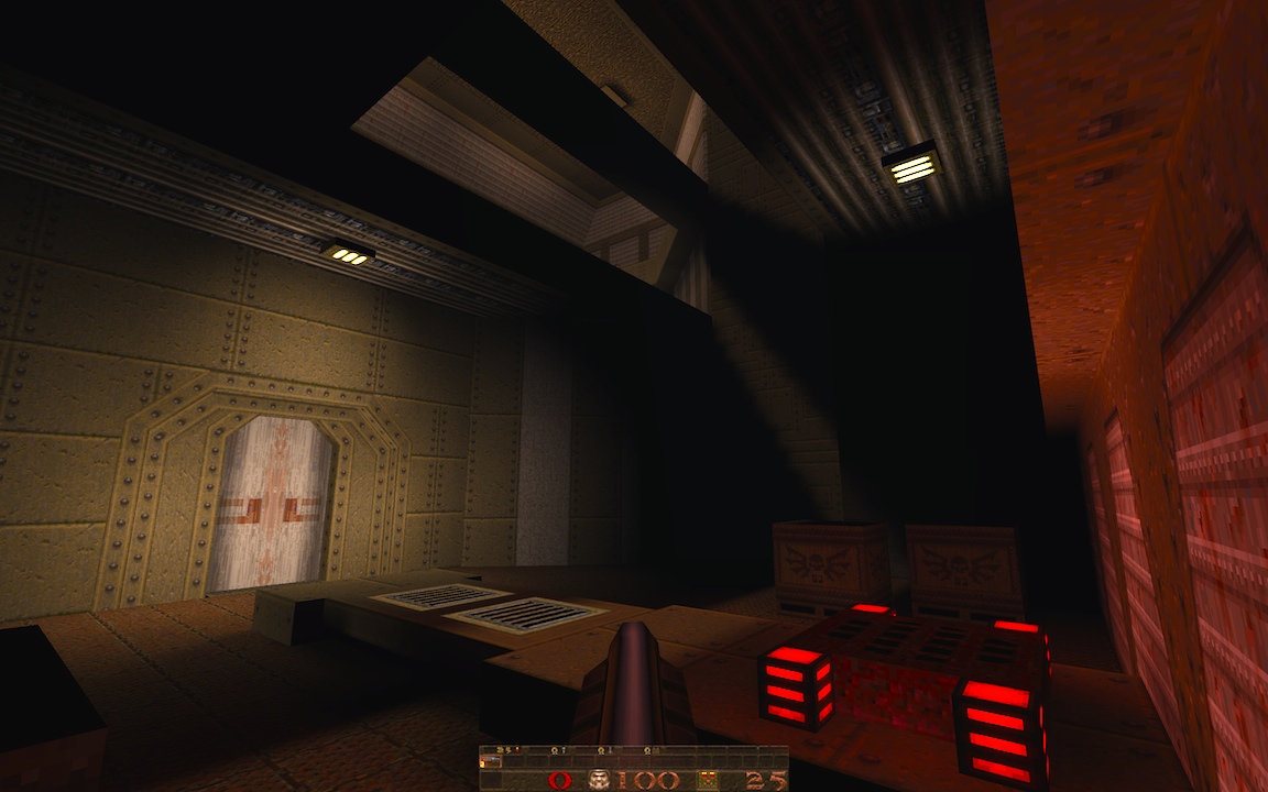
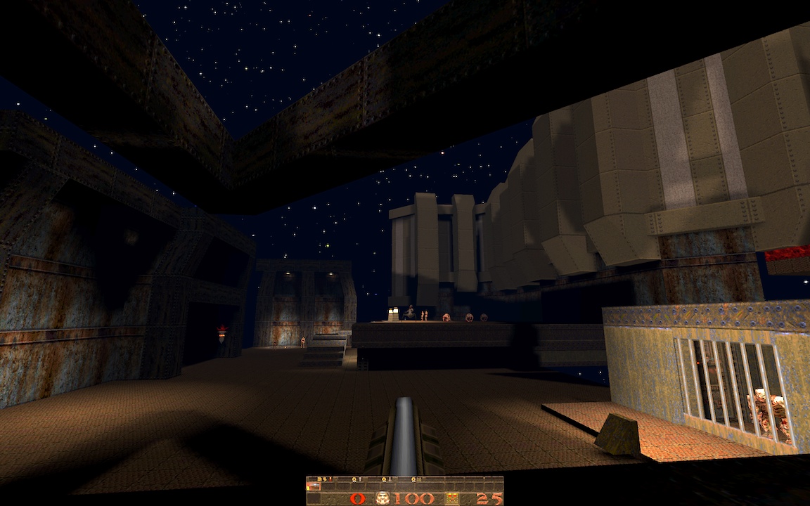
It might be that we're used to Quake having all white light, it might be that the palette doesn't work with a broad range of strong tints, or some of both, but there are really almost no cases in Quake that I can think of where even remotely saturated colored light (more than 10-20%) actually looks good. Maybe lava. However, as with any lighting, subtle colors well-chosen can look terrific. This is true in any game, but especially Quake. i've been having good luck with infinite lights: the shadow cast by the beam in the first shot, and the starlight in the second shot is from one point light on each side of the skybox (it's currently a map inside of a giant cube of sky..)
http://quaketastic.com/files/screen_shots/ericw_station_1.jpg http://quaketastic.com/files/screen_shots/ericw_station_2.jpg The red light from the slipgate in the first shot is probably oversaturated. For the second shot, I need to do something with that wide swath of flooring, for both gameplay and visuals. The brushwork and lighting is good, good work!, but
And are you using blue fog? it goes well with the brushes at the bottom, but doesn't look so well for the sky. Maybe it is that i never got the fog right in Quake 1 - First shot looks very promising.l Maybe some detail in the wall around the door, make one of the panels go 8 units out of it. Where is the transparency? I can't find it, RoQ. I got interested. - About Tronyn colorful screenshot, i agree with Quaketree there, could look good on an otherwordly theme or for a for the fun map. But above everythihg, keep trying, maybe you'll get something unexpectedly good. I miss the experimental maps that we saw a lot back in the 90's, even those that looked terrible visually. Now the trend is professional looking maps. Not that it is bad, but more variety would be good. thanks for the feedback. The textures in the second shot do clash, it's sort of two bases in one map (an idbase-textured base, and a rusty ogro and speedbase textured base). I'll try to do something to fix the part on the right where the rusty wall panels are touching the idbase chunk.
There is a faint blue fog, yeah. "0.015 0.01 0.02 0.04" maybe it's too blue? The bars of the ogre cage are a doom sprite displayed with a (quoth) mapobject_custom. I love sprites! Only problem is they render as fullbright, so you have to have a bright light on them to hide the fact. you can see the grill sprites by the slipgate in the first shot stick out because the brushwork isn't lit enough. ijed, yeah a crate maze could be good, I'll try it out. I miss the experimental maps that we saw a lot back in the 90's, even those that looked terrible visually. Now the trend is professional looking maps. Not that it is bad, but more variety would be good.
Thank god we still have Madfox 8-) ... isn't experimental, his layout is. His brushwork, more than classic, should be classsified as idish in style.
Recent examples of experimental maps, i would say, Nyarlahotep, ITS, Ascending as descending, sm170, sm172, etc.
|
| You must be logged in to post in this thread. |
| Website copyright © 2002-2024 John Fitzgibbons. All posts are copyright their respective authors. |