|
I think the transition from wall to ceiling is a bit abrupt, maybe another layer of trim would do the trick. Especially with the protruding wall columns. Maybe lower the brightness of the wall torches a bit and push it some more on the chandelier? The torch lighting trick linked earlier might also help sell the lighting more.
This was more evident in the old shot before you put a chandelier in front of it:
The curved ceiling in the first area extends all the way down the hall, but you cap it off with just a 45 degree slope. If you used the same barrel turned sideways & intersecting, the regular square ceiling tile texture would bridge across the seam with perfect alignment. That's exactly what I ended up doing, Luaran. I decided to move on from that ceiling at that time because I have a tendency for myopia.
I have a mapping question posted in the help forum as well. Thanks This is the very first section of my map where I believe I'm ready to get advice on the difficulty and monster placement, etc. It is very short scene, but I tried to design it so that the player has a choice in how the approach the battle:
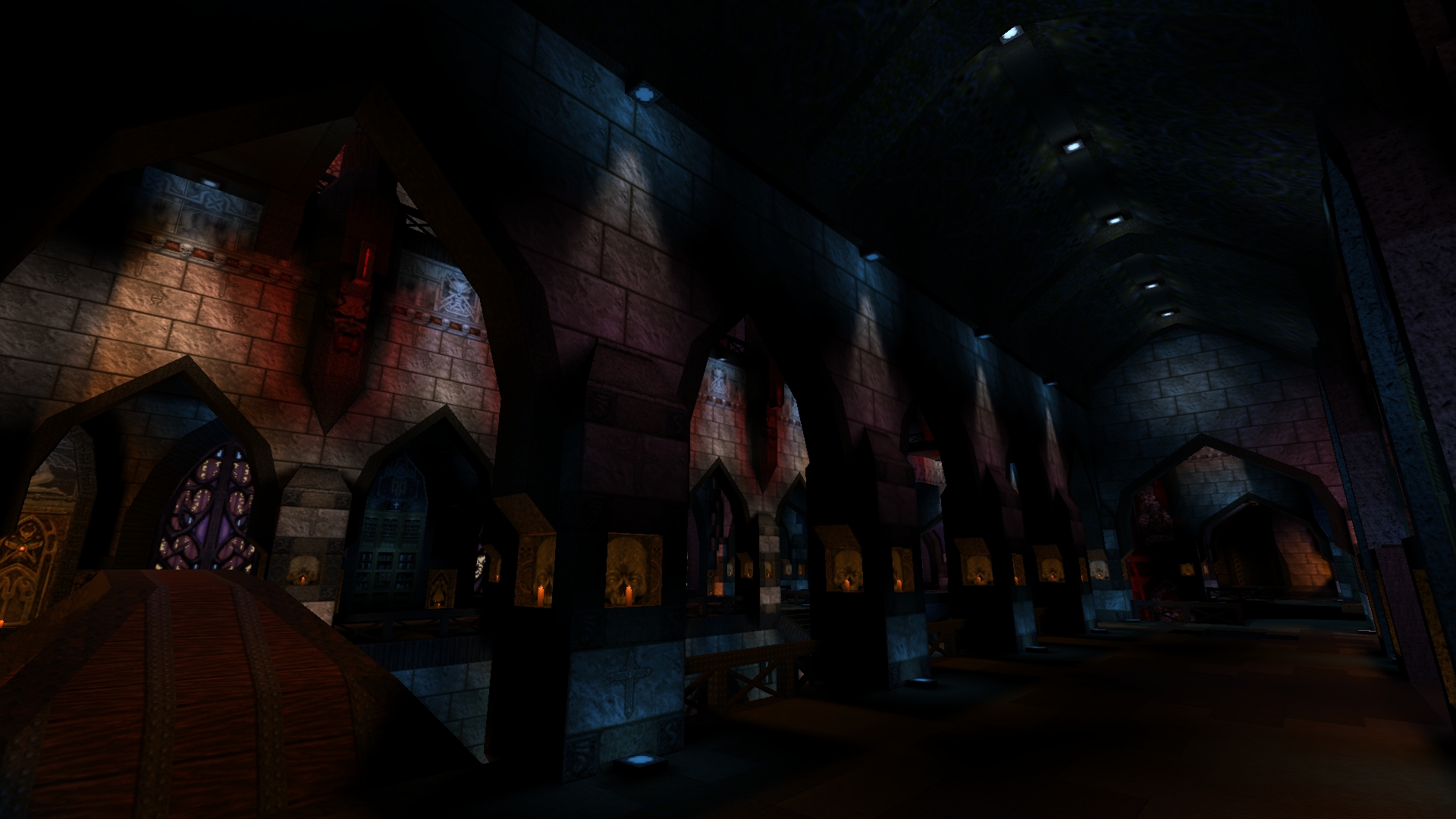
http://www.mediafire.com/download/wjznnigdhkn9shi/dom.bsp I don't really use coloured lighting in Quake, for some reason it never seemed to work as well as in other games I've mapped for, but how does this look?:
http://www.quaketastic.com/files/screen_shots/colorhall.jpg I also just suck at lighting in general, which is why I usually make outdoor maps (heh, lighting Arcanum was such a pain in the ass). that looks terrible.. Subtle is a word used often when it comes to colored lights, but not here.
Tone them down, and don�t use the whole palette, i would advice you to do, maybe even strip them at all and go with fog.. IMO lighting is the easiest part of mapping. Less is more is my motto, use less lights but use them effectively. Cast big shadows, make the light at the source nice and bright for contrast and don't over saturate the lighting to make things washed out.
not feeling it Tronyn. Have to agree it is pretty OTT. minimalism isn't really your thing though...
Or an N64 game...
Red should be bright red but any other colours should be closer to white, I use paint's colour picker to set values that play nice with quake's palette. In the shot you've got a lot going on too close - you're going from red to blue and where they mix you get a muddy purple / pink that isn't doing the brushwork any favors. Try an only ents where the blue is 192 192 255 and the red ones have a wait of 1.5 or 2. Those are just hunches, I'm not great at lighting either. No doubt some of the masters here can give better advice. Oh, and avoid using delay unless you want it for a specific special effect - it's like hotsauce, useful on the right meal, but you can't drink it on its own. And if you like your hot sauce, you'll know there's a right time for the green or red, the matured, the smoked, the pastes and the smoked. Those being parralells for delay 1-5... Yeah, I'm eating while typing this. Woah there!
There's just too many colours. I would remove all the different colours being emitted by the various stain glass windows. Change all the blue ceiling / floor lights back to white and just keep the orange candle light and uncommon red wall lamps. Or even better, remove most of the candles and use normal light, and have the candles+orange light be a nice contrast. You could use the candles to draw the players' eyes to things. I'm gonna dissent a bit from what to change, although I agree with the general feeling it might be too much. I'd say lose the bright red light in the back, it's too distracting and has unfortunate 90's coloured light overdose connotations.
I'd also replace the dim blue spotlights. I can see where you're going with blue tones in the shadows and warm tones in the brighter light, but it's easier to do that with a slight blue tint to unsourced light and warm colours in the spotlights. Blue sourced light seems a bit odd. Keep the orange candles, everyone seems to like them. I also like the blended colour effect coming from the downwards vertical spotlights, so keep that up. I guess there's something with stained glass going on from the right, but it's hard to judge if that's working from the angle of this shot. fuck that, make them more saturated!
and make the flash too!! on a serious note, i find it doesn't matter what colour you pick as long as there's sort of one main colour of a room. then you can use a colour wheel to pick the second colour if you really have a hard time with just eyeballing it. http://www.rapidtables.com/web/color/RGB_Color.htm
Also, only make them flash if you can do it in time to the masic and maybe use some rotatings with alpha to make strobe laser effects. + white fog. Maybe you could stick to exactly two colors that could be mediated by white lights. Representations of dusk usually combine a light blue and tan, for example.
Valve used to have a great article about use of color in Nova Prospekt. Can't find it now. There is this:
https://developer.valvesoftware.com/wiki/Color_Theory_in_Level_Design I think that IF (and it's a kinda big if) you are going for a more surrealistic look then it has possibilities.
If you're going for realism then just no. That lighting is totally wrong. Think American McGee's Alice with odd floating bits for no reason other than to have them be odd floating bits (which may or may not be important to getting through the level). Have some fun with it and get a bit outside of the box with what you do. Be creative and people will respect you for that. That being said... Colored lights are very tricky, less is more in almost every case and if you do use it it has to be consistent across the entire level/episode (unless you use it to indicate a secret or some other important element). Look around the real world and there are very few instances where the lighting isn't white or close to it. Colored lights are used to attract attention but not for task lights or for everyday living (unless you live everyday in a LSD induced fog). I like it! See some comments inside the demos. https://www.quaddicted.com/files/temp/dom-beta-spirit.7z
Scale of the table felt off, that room needs detail too. Skill level seemed high normal or hard. Maybe have one knight patrol the big room? I never realised how different things looked on different monitors.
On my normal screen it looks pretty bad because the colours come out saturated and therefore very artificial. However, when I looked at on another monitor with both contrast and brightness set high (and I mean way over the top) I thought it looked great because there were no saturated colours but the colour was still visible. (do I remember someone releasing a discoQuake map where Ogres were dancing? I'm sure some collaboration would result in something er... different)
|
| You must be logged in to post in this thread. |
| Website copyright © 2002-2024 John Fitzgibbons. All posts are copyright their respective authors. |