|
I started this as a speed map, but then thought that I should actually finish this. So far I have play tested it with my friend, but I would like to know what you guys think about it.
It is on beta state, starting path about 50% percent done. http://www.quaketastic.com/files/single_player/newhouse_runic1_beta1.zip I need to add music to the next beta then, what would be a good track for these runic/maya type maps?
I played your map. Everything works well. My crittics :
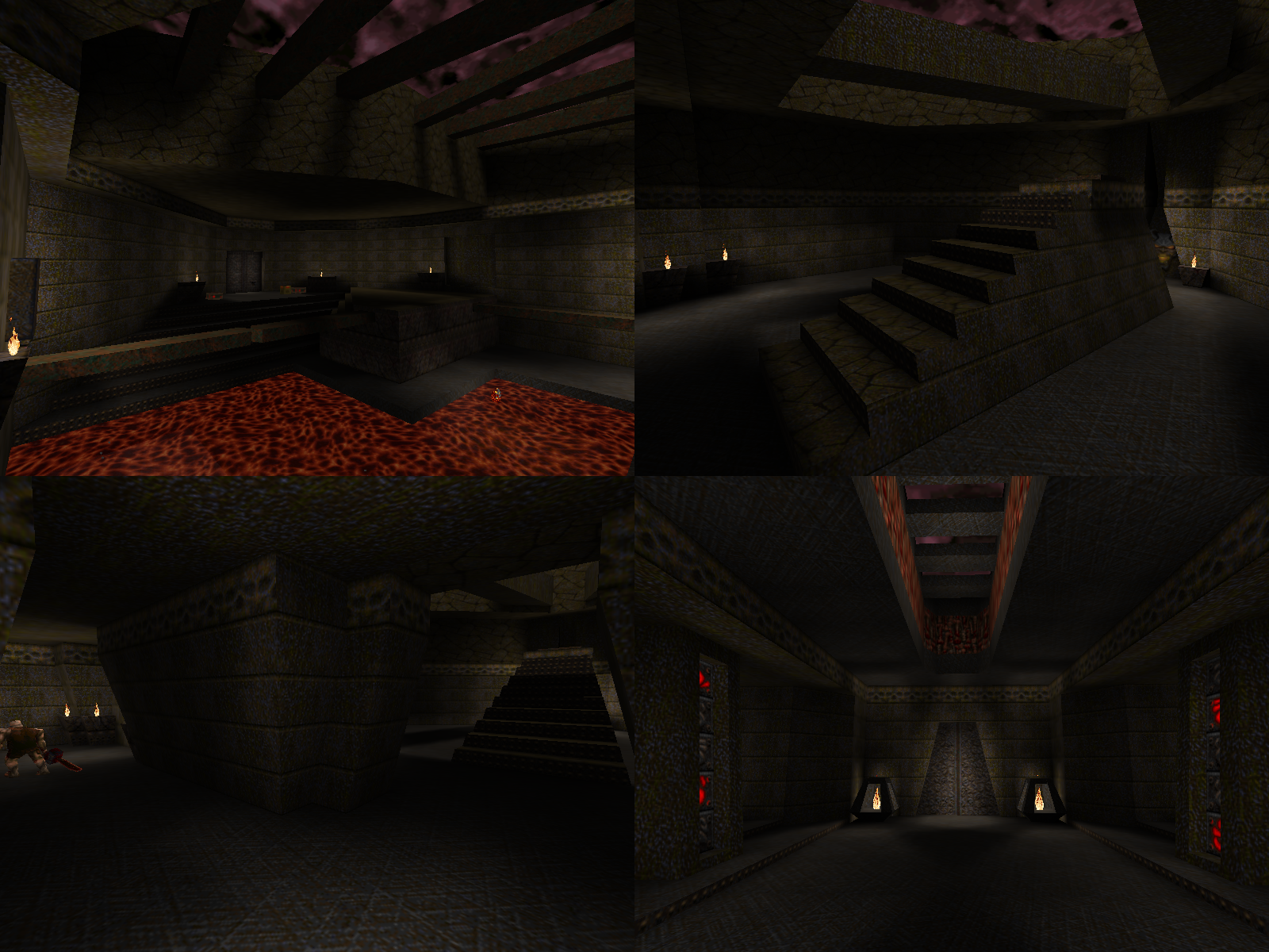
1. Map too small. Not long enough. Need more exploration and discoveries. 2. Not enough geometrical details and architecture. The map feels too retro old-school to my taste. 3. Ambiance/atmosphere is weak. 4. I don't like the bones piles. They look fake. Thank you for your feedback. It is indeed made to feel like old maps without too much details.
1. It is second half of the start path. It is first beta, like I mentioned. I wanted to see is the beginning working before I start extending it more. 2. I can always add there more, but it has to follow some rules how I made these areas. It has to feel retro as much as possible. 3. I need to select good ambient track, adding possible ambient sounds, maybe considering using fog. For lighting I purely used delay 0 mostly, in couple parts I added delay 5 but I tried to prefer vanilla quake lighting as much as possible. I'm not experienced with that lighting style yet. 4. Bones indeed looks a bit fake, but personally I don't think it should look too real, always I could shape it differently. Did you accidentally make a skin group?
There's a functionality in the Quake engine to continuously animate the model texture. Much like the frame groups work, except with skins. I meant by beta actually short alpha. I haven't been using these terms that much. Sorry I confused them.
Nice work, looks like an E3 map with some unique details. I especially like the broken walls with the bones, but I have to agree that the texture looks odd used to stop up the doorways near the beginning. I would at least put a little more work into the shape of those blocks.
Gameplay seems fine, hard to judge based on the beginning of a map though. The traps I could go either way on, though I like how you used the crumbling pathway over the lava to signal to the player what would happen when they pushed the buttons. All I'll add is that I hope you expand the map vertically as well as horizontally! id1 may not be filled with towering monstrosities but they worked with the z-axis for sure. Demo: http://www.quaketastic.com/files/demos/nh_runic1_beta1_lp.dem Thank you*
Yeah, I just quickly sealed map for "alpha" testing, those bone walls aren't going to be there, instead there will be other passage ways (possible non-lineary) and surely more stuff in layers in z-axis too. Thanks for the demo as well! I think this iteration of hc3 is complete now. The full version will be available soon.
Quaketastic download link: http://www.quaketastic.com/files/single_player/maps/hc3test.bsp I didn't play the map, just noclipped around.
Pleased to see it's sealed for a change! Don't really like the textures, but nevermind that. Picking up on my earlier Tony Hawk joke: much like a skate park is a playground for skaters, this map seems like a playground where you try different styles and architecture, which is good. Some interesting bits like the curved walls and the girders. Although the latter are used somewhat excessively in certain areas, you might want to break it up with other stuff for more varied visuals. The lava texture is broken, you can see the tiles. Just use the standard Quake one, or better yet, something more in line with the (base-ish) setting like slime or water. I think you should primarily focus on improving two things here: - Lighting. It's very bright/flat and makes the textures look even more washed-out than they already do after the conversion. There are many (possibly too many) light sources next to each other -> experiment with lower light values or modify their attenuation (by adding "wait" key >1, provided more recent compilers are used; e.g. "wait" "2" halfs their range). Try to create contrast. Also, be sure to run light.exe with -extra or even -extra4, at least when doing the final compile, in order to get smoother shadows. Currently, in some areas there are shadows with ugly jagged edges. -Random monster setups. Like in your previous levels, there are rooms where you just threw in a random bunch of monsters and items, simply to fill the space it seems. While this can work in certain circumstances, more often than not it feels weird and doesn't play into a map's atmosphere. Try to create interesting encounters. For example, don't let the monsters appear all at once (standing around next to each other waiting for the player) rather than making them appear in waves, killing the ones in the lower part of the room makes some more rise up from a pit in the upper half, and when those are dead, the vore appears. Or something along those lines -> variation. http://imgur.com/a/tkRX5
I'm a total lightweight, by the way. It's easy to get me off-balance. If the screenshots in the album look really fucking dark, click on them to make them bigger. Even after the expanded view is shrunk back down they look a lot better. If the screenshots in the album look really fucking dark, click on them to make them bigger. Even after the expanded view is shrunk back down they look a lot better.
Weird, that actually works. Looks promising, good theme and the rocks in the last shot are real nice. Looks good but I really think you need to use some brighter lights. I'm not saying make everything brighter but use spotlights or something.
I see you expanded on the rock stuff since the alpha :)
I agree with Fifth and it was an issue when I ran through the prototype, the source lights need to be more obvious...not brighter but more intensity. Otherwise this is shaping up really nicely! Screenshot:
http://imgur.com/a/Aao5Z Download: http://www.mediafire.com/file/26rl2cg4bnlr9xu/LuLz.zip Buildtime: 1h 30min vistime: 60 sec monster count: about 150 Type: ID1 map Influenced by Hexcalk I didnt want to post this as news because this map is really stupid and ugly, but its fun. There is a demo in the folder if you are having difficulty with the map. I've been working on a map for AD
here are some screenshots: http://imgur.com/gLoUo3w http://imgur.com/JeRpnmx http://imgur.com/AT7AOtY http://imgur.com/UtbjGZ5 That is shaping up great. The tech-castle combo is still a bit weird but the designs look very impressive. Nice one.
|
| You must be logged in to post in this thread. |
| Website copyright © 2002-2024 John Fitzgibbons. All posts are copyright their respective authors. |