|
Misunderstanding! The problem is the conversion into the Quake palette.
http://forums.inside3d.com/viewtopic.php?t=1975 has some brainstorming More convenient to put everything in one, though, I think (unless there's an upper limit on the number of textures in a wad?).
I have got all of the textures in one big page and I indexed the colours to a 240 palette. What is the top 16 colours in the Q1 palette? Does someone have a link to the top 16 colours in the palette?
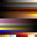
Ok I found an example of a Q1 palette :-
http://www.gamers.org/dEngine/images/quakepal.gif I assume the top 32 are not useable leaving me 224. Should I save all the images as GIF to preserve the colour table? Would a zip full of resized GIF's (all using the same palette) work? I'm pretty sure you can use all 256.
Here's a more accurate image. I used to have a no, do not use 256.
the last 32 colours are fullbright. (in both images, that's the bottom couple of rows) also, sock, i found when i was creating q1 editor textures that first shrinking 50% with bi-cubic or some interpolating algorithm, THEN shrinking with a nearest algorithm yielded better results than just shrinking 25% with interpolation. the final reduction with nearest will give harder edges otherwise it looks a little blurred out. finally, i'd recommend not converting all the different coloured textures together. esp. the green and blue ones would benefit from some heavy dithering while the concrete ones would probably be better off with none or very light dithering. you might want to convert the layers separately in the case of concrete + metal overlay textures. just my 0.02 anyway. and then there is the question if it would be worth the trouble at all
there was a photoshop palette somewhere I think no, i think maybe i misunderstood?
i thought you meant you had every single texture (of all colours) on the same sheet and then you were running the whole thing through the shrink/palettization process. everything should be in the same wad. i just meant you should palettize each coloured set separately so you can tune dithering settings for best results. honestly though... if you use these, you should just include the high res external textures. too much of the great details are lost in just native palette/res. :(
one of my favourite things about the trims are that the edges are not straight at all and wobble around like they are seriously busted up. adds a lot of character to them which gets lost at low res :( * re-sized all the textures through several phases (1024>512>256>128 different filters, bicubic first 3 and final hard edge)
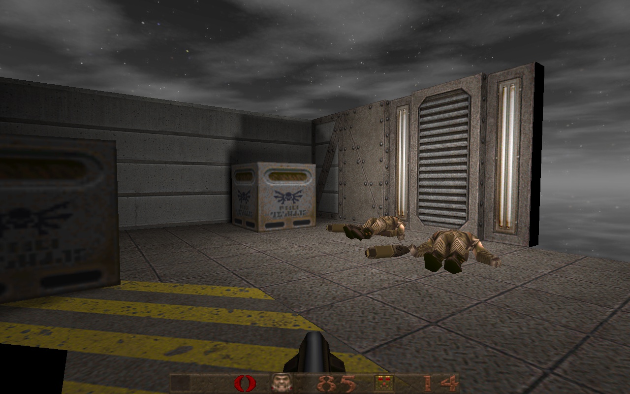
* Converted to an optimized palette which I got from putting all the textures on to one page. * Ran the textures through textures2quake program to create optimized versions. Look really good at the point. * Imported them into wally and then they look like shit. All textures converted to the default Q1 palette. I was under the impression that every texture in Q1 could have it's own unique 256 colour palette with the top 24 being the full-bright stuff. It seems not, wally wants all textures to be fixed Q1 default palette. Yuck! I have all the files and palettes, will zip them up, maybe useful to someone else. yeah, that palette is *it*. nothing else. :S
that's why i was saying you'd want to fine tune the dithering settings for the blue and green ones separate from the rest. they will need heavy dithering to work with the quake palette (which does not have many greens or blues of that shade). half life is the one that allows a palette for each texture, iirc. And textures2quake makes Half-Life ones too ;)
And the renaming convention allows using the origins as external texture replacements of the Q1 palette converted set. ;-) Often times with quake conversions it's best to accept that there are some colours it can't render that well, and apply wholesale (consistent) colour filters to the set so that the starting point is at least close to a comfortable quake range. For example I'd take the blue metal set and drop saturation out a bit and reduce the green levels a tad so that it'll map to the icy blue range with just enough dithering to keep it busy and exciting.
One of the really lovely things about this texture set from a quake point of view is that the "base" set is already a very good fit to the quake palette. I tried some tester conversions and the results were really good - just the right level of grain from positional dithering with very little loss of colour fidelity. I did run into the issues Necros mentioned about blurriness in some places with the fine detail. On the sample I just did some manual cloning from the sections that came out sharp to get a clean result, but it's good to hear there's a way to achieve it algorithmically, because it'd be a large undertaking to do all of that manually. I tried a conversion to quake palette myself using imagemagick. Going down to 12.5% (128x128) killed too much detail, so I used 256x256. They look more detailed than standard quake textures, but I think the overall effect works. (is it likely one would run in to an engine limit using mostly 256x256 textures in a map?)
quakespasm shot: http://www.quaketastic.com/upload/files/screen_shots/tp_indust_base_ericw_test.jpg winquake shot: http://www.quaketastic.com/upload/files/screen_shots/tp_indust_base_ericw_test2.jpg I just need to convert the coloured texture packs and I'll upload my wad. http://www.quaketastic.com/upload/files/texture_wads/tp-indust-256.zip
the blue and green didn't come out great; probably needs some pre-tinting as Preach suggests. I made 256� first but negke complained.
ericw, what are you doing with the filenames there? I am confused. You might have done it all in one line with mogrify if I understand it correctly. Because 256*256 is usually too big for a normal Q1 wall texture. You'd have to scale it down to 50% like in Q3A, which is somewhat beside the point. It may or may not look slightly better than a manually downscaled texture (though I'd argue that, if done properly, the 128 texture can look just as good), but it'll bump the texture data size unproportionally.
I tried to get the blue textures to look nice with a Q1 palette and they certainly look rough when squeezed down by a factor of 8. I like the idea to shift the palette from blue to purple or wizmetal blue. The Q1 palette is fine tuned for some colours better than others.
I did release the Photoshop (CS 5.x version) source file, so it will be very easy for someone to create their own coloured versions. Plus the source file will give people the chance to create or add more stuff to the basic tiles I generated for the packs. There is plenty of stuff buried in the source file I did not use. @eric, looks cool the textures in Q1, they seem very grey compared to the brown I made, but I think that is the conversion process because wally did the same for me as well. The brown/yellow parts of my set should certainly feel at home in Q1, for some reason I keep making brown stuff.
Spirit: I just copied a bash script I found - it used to rename the files to jpg, so it is more complex than needed. For each file foo.tga in the current directory it writes the converted result to quake1/foo.tga. I suck at imagemagick and bash. I think you're right, it could be a one-liner with mogrify.
|
| You must be logged in to post in this thread. |
| Website copyright © 2002-2024 John Fitzgibbons. All posts are copyright their respective authors. |