|
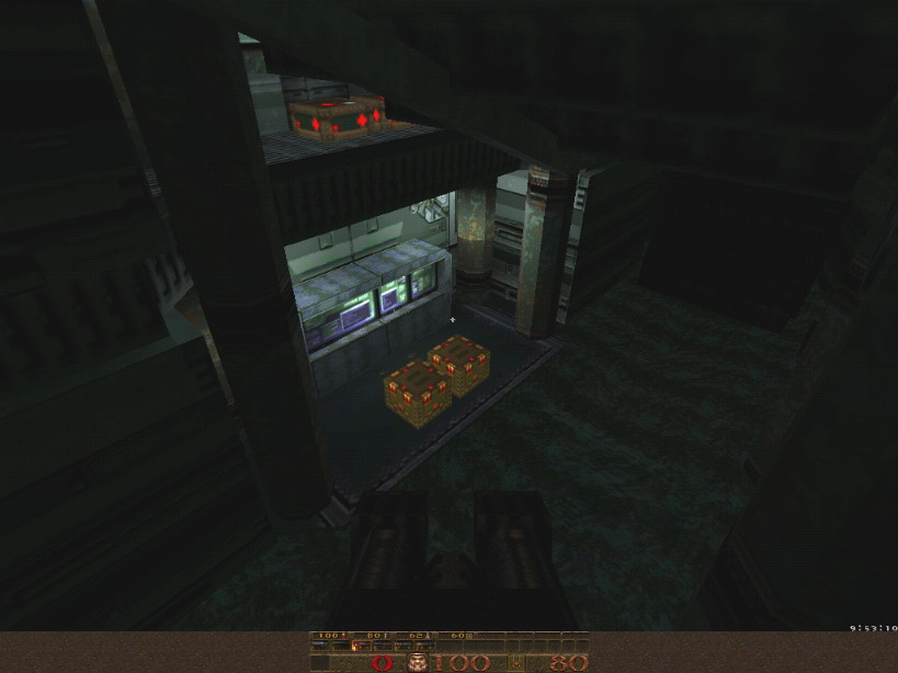
Love it or hate it, yes, but I think D3 texes look just perfect here. I'm not sure hires originals will suit so well. Bit downgrading to the Quake palette generates a great posterization effect. A welcome modern touch for Q1 that doesn't look much like D3 anymore, in fact. I mean, SRC recalls Malice and Neil Manke's SOF and Starship levels... The old Fox banned and somewhat awkward Alien Quake TC might get a great lift with such textures! The level room interconnection design (of which the slime tunnels is my preferred part) and lighting ooze JPL's love for SciFi. Cool and well balanced. Regarding this, I think Quoth rocketeers and defenders are highly suitable in this environment. Kinda disgraceful in classic goth Quake surroundings and mostly avoided Quoth monster, the bob has finally been cast in starring role here! Bob's AI, sound fx and deadly lasers sweetly go on my nerves. I just love to frame them one by one in these cramped corridors (with plenty of boxes to hide behind). Both drone traps are this map gameplay highlights!
I whish sometimes skill 0 to be easier, to really enjoy a map design on first run. But not here. One could say my interest is much more design/progression than fight/survival driven. True. But SRC's easy is indeed easy. The battle challenge never ruins the enjoyable trip. (I confess having a beer or two when going for hard and nightmare feast usually...) Many Quake level designers in the past have successfully pushed Q1 beyond its original visual bonds. I think JPL is one of them. And don't call me a fan, please! My single whine: the final teleporter. Outside of the rather nice sound fx, nothing happens! I was expecting a tube teleport raising, a lightning blitz from above. Say, some visual reward/cherry on the cake... @Trinca: I saw the message, and it is effectively weird... BTW, shame on you!: you beta tested the map and didn't find it before the release :P Anyway, anybody knows what is this Host_Error message that an inelligible something is not possible (sorry I didn't capture the full message)? Maybe it comes from JoeQuake ? Weird...
@than: Thanks a lot for the acronym explanation ;) @JohnXmas: Thanks a lot for all these good comments, I do not deserve it you know, cause some people seemed to think I'm a "nasty" guy. Anyway, I'm really happy to read such comments: it conforts me that I've made the good choice by releasing this map without waiting for Base Pack.... @Shambler: OTT, can I consider this as a compliment on my Doom3 texture conversion even if you don't like it ? :P @generic_maps / the silent: Thanks for the feedback, it is always interesting to read what other people think of my small "work"... BTW, if you need a clue to the secrets, don't hesitate to email me Well, I hope you will not be deceived by the next coming maps... I finished the 2nd episode of "Five Rivers Land" project, and I still have to make some small tests before launching beta tests... It is even more linear than SRC, but there are some "good" reasons.. you'll see that in time :) Again, thanks a lot for all the feedback. ops i forget to talk about map ;) i enjoi it a lot and as you guys can see in my demo is pretty easy to finish map ;)
i think the doom3 are not the best to fit in a Quake map but JPL did a great job becouse the lights are very good and map a very nice Quake feeling, i enjoi the map becouse of the many good action on it! the most negative aspect in map was that bob area near start where were about 6 or more bob�s :\ that was real boring dispist of that i enjoi the map a lot ;) It's an old QC bug that's in most mods, including Quoth. It happens when you enter one of the secret areas, a shambler and two bobs are killed when they spawn in (you can hear this as a sudden weird noise). In this case the shambler gets telefragged, but the two bobs start up even if they're already dead.
As you can see, they don't behave normally either; this is because there are repeated checks in the bob animation code for the monster being alive, so animation doesn't work properly when it flies around being dead. To work around the QC bug, you'd have to make sure the shambler and the two bobs don't spawn in so close to each other. Ask JPL to fix it or patch the entity section in the bsp. Trinca's bug demo has probably been recorded in JoeQuake, therefore there are some Nehahra info in it that e.g. Fitz can't read (hence the Host_Error). Playback the demo with Joe or any of my engines or convert it to std Q1 demo format using my ConvDem utility.
The demo shows two zombie bobs that remain after all monsters seem killed (128/128) and that can't be killed. My post above explains the two unkillable bobs. So it is not coming from the map itself... good news indeed ;)
And thanks for the feedback Trinca ! Thanks also to metlslime for the additional Quoth info in the thread announcement.. I sent you an email this morning, and it seemed to be rejected...
I re-sent it, and it seemed to pass: Did you received it ? I didn't mind the Doom 3 textures, they even looked quite nice in parts combined with the architecture. Reminded me of Invein (nehara add-on) or that aliens TC. The gameplay, however, was let down by the ridiculous over-use of the annoying robot flyers. Its a shame because the other Quoth monsters fitted in really nicely. Also, I too encountered the robot zombies as mentioned above, and that was really the icing on the cake (or not).
I played it in Quoth 2 beta, and not the original
Quoth so the feel of Bob is quite a bit different in the two versions. So, meh bad. I take it that it was meant to be a bit dark because even after turning up the default brightness for quake I still struggled to see, is that the doom3 influence?
Anyway, it's good stuff. I didnt have a problem with bobs on normal, more those grenade enforcers and their damaging shotgun blasts. Looks are decent, dont really like the textures in quake, but brushwork is good. and I have to say best use of coloured lighting yet in quake, very subtle and effective. Nice map overall jpl, keep it up. I died once in slime and once with those shotgun guys.
Found one secret, killed all. Played with skill 1. I liked some details too. You do nice lighting. I liked the silvery curvy place too. Some textures were lighted upside down btw? ... too bad there weren't 3 maps, heheh.
I think this used the Quoth base guys very well, I had never been worried about the green enforcers or the flying drones in any other map that had used them, but this map used them very effectively and I hated them ;) I liked the unusual attention to detail with all areas of the map. Quoth really needs a base boss that is the equivalent of the Gug, like the Cyberdemons used in Event Horizon or something. Speaking of potentially useful base bad guys I am no lover of base maps (monsters especially).
Thus I did not expect to like the map anyways and I didn't... ;) However, here my comments: I liked the doom3-ish curvy part. Looked nice. Now the ranting: The map was way too dark-bland lit. This plus the high amount of "visual noise" from the textures made it pretty hard to get a good aim on the monsters. They just melted into the background. Might be just the textures and not so much the lighting though, no idea. I REALLY hate when maps have little brushes everywhere that make the player's view (and step) go up and down and up and down. Blocking decent strafing in combat, generally making it a pain in the ass to move. Same goes for crampy door and corridors (the one near the Vore at the slime pit where the scrags spawn is a good example, I died 3 times there and always simply quit Quake because it made me so freaking angry that the map caused me to die). And why on earth did you make all those small ammo/health "stashes" (the small holes in the walls) just so high that a player thinks "hey, I can walk right in there" but instead one has to jump?! I don't want to think about how often I died because I went for health inside there (eg in the last room) and still thought "hey, let's just walk in there - what? - oi!- now, in therARGH!". I really hate Bobs and the green enforcers, but I blame Kell & Necros for these instead. :P Bob is a typical "modern" monster that strafes like a mad man, one of the reasons I dislike many modern shooters. The green enforcers are so very powerful and just unfair if you place them in the back of the player because they fire very fast and with such high damage (that ass behind the crate there...). Another flaw: There was no visual mark for the sk/gk doors. The sk door even had a yellow/golden mark on it. :\ Doors generally were hard to see. Agree with Spirit. I must say that I have exactly the same feelings about this map like him. The textures were ok for me and the architecture looked pretty nice but there were those annoying "details".
The level felt very cramped for me. There was not much space to manouver which made the fights with bobs and green enforcers very hard. The final room looks very nice but I always hit the walls and supports during the fight. Those holes in the walls with ammo/health annoyed the hell out of me. I quit quake twice before I finished this map. I don't think that bobs should be used in packs. Fighting so many of them at one place was pretty boring and annoying. I also think that there was not enough ammo (or health) on hard skill. For me it is always the case that when I try to save ammo I loose some more health (and vice versa) . I have played the map on hard skill (after reading the silent's post :) and didn't have any ammo in front of the SK door. I have lost too much of it trying to fight the bobs from far away. Well, maybe I just can't play the game good enough. For me the map looks nice and interesting but the gameplay was not good. Same goes for crampy door and corridors
I thought it felt like really being in a base. A base isn't going to have wide corridors and someone might be around every turn. In wide open areas, there isn't a monster (or even 10) in the world that stands a chance against a good player (unless it is a vore and the map is a void map or a lava area). This was one of the most frustrating (combat wise) maps to play I've played in a long time, but it was frustrating in a good way in that I had to pay attention and be careful for once. If there were 2 more maps and some sort of "base boss" somewhere at the end, it would have been perfect (to me). I can understand the map was frustrating in a way. My intention, as denoted Baker, was to create a certain unsecurity ambience. Remember Doom / Doom2 / Doom3, the idea was to create bad surprises on each corners, and stress the player as far as possible. It was my primary idea... as usual I should say...
Concerning layout, I took inspirations from some 1870 war bases I know (an old Germans vs Frenchs war... once again..), also refreshing the brushwork, in order to avoid flat concrete walls as in CMC... Also, to increase the insecurity feeling, I think that there must be more darkness areas than brigthnes areas..... in the nigth it is more difficult to see what you are shooting, and alos more frightening (e.g Predator movie...).. I know some people don't like it, and I tried to tune the darkness/brightness ratio in this way... In anyway you are not navigating in the complete darkness... maybe it comes from my flat screen... Well, maybe I will "respin" the map when Quoth2 will be released (next century maybe :P ), because gameplay was less boring with those cool new monsters (e.g pyro, sentinels...): as examples, half of the bobs have been replaced by sentinels... a shame... you know what I mean... Anyway, thanks a lot for the feedback, good or bad, it is always interesting to read different point of view, and to learn from that, even if it is difficult to satisfy everybody... BTW, soon will come an even more frightening map (about the ambience).. "Five rivers Land" is waiting for you... :D I have to agree with JohnXmas on the textures. I think they looked fine, but then I guess everybody has their own idea about what Quake should be. I like different maps, and generally feel modern Quake mods and maps suffer somewhat from people reining in their creativity for the sake of making something that fits in with predetermined ideas of... erm... Quakeness.
All the Warp textures were from classic-type sources, but if you're going to use more modern sets at least convert them properly to the Q1 palette, which was my beef with these ones.
Why I asked for an external It was the blocky pixel resampling I didn't like - the textures are probably great undeneith that. I found the visuals very confusing. The color scheme made it hard for me to see where I was going/was supposed to go. Half the time I was mistaking wall panels for doors. The little niches added to the irritating feel.
The Quake/Quoth base monsters don't really mix with the textures' color scheme. The bobs I think are too tough to be used in groups. Their HP should be reduced to the level of Quake2's flyers (they should die from at most four SG blasts.) They're robots, they should please a) be stupid and b) fall over when shot. The green enforcers are too tough, and Bob's strafing gets on my nerves. I'll take scrags over Bob any day. Technically the map is obviously good, texturing is fine etc. Gameplay/flow is very Quakey but it strangely doesn't feel like Quake because of the textures. I didn't find the map too dark, except in the slime. It's not my cup of tea though :-) I corrected the 2 zombies bob generated by spawning / telefragging monsters. I updated the stuff in the download link.
I just would like to thank all the people who supported me during this project from Base Pack to "here": theys will recognize themselves (e.g beta testers, technical support, etc...). Thanks to all the people that gave feedback, bad or good. I would like to emphase a single thing: it is really difficult to innovate without hurting the Quake purist.... I will be recognized after my death only... ;P I think the crampiness added to the baseyness of it. There were a few holes yeah but it was not that bad.
The problem with suits and slime is that you have no multiple tries to go through the swimming place. It was not obvious which door opened when you came from the other side.
|
| You must be logged in to post in this thread. |
| Website copyright © 2002-2024 John Fitzgibbons. All posts are copyright their respective authors. |