|
Clean texturing and pretty good lighting. Two things the original doesn't have (although it's one of the "more tolerable" e4 maps) :-) I like the lanterns and the way you did the wall decorations.
IMO you went a bit overboard with the torches under the rooftops (in the halls), creates a small mess of shadows. The grey corridors feel a bit bland, which is not your fault, but the original's. Did you add the fake doorways, or are they original? I like. In some areas, you have stairstep shadows (first room) I think that in general, it's slightly out of scale (i.e. corridors too high/wide, staircases too big) like it's made for giants. but not bad. Many id maps were pretty horribly textured, obviously under pressure. So it's pretty "easy" (still lots of work of course) to visually update them. The gameplay of the originals (which I think they focused on) is pretty hard to top, though. I can't really comment on that though because I just went spectating in tourist mode. I'll replay this when I get out of stone age. Please think of poor third world people (germans)... But I like the fiend at the start :-) very in your face. yay for slaughter and bloody mess! I see this was meant to be a quick overhaul of the entities rather than a full remake, so I won't comment on textures, brushwork etc. It's satisfying to see the Quoth bad guys getting the run of the original maps. Challenging enough, I died about 5 times on nightmare. One thing that was frustrating though, are those stupid little braziers that damage you. There are too many in places where its easy to run over them. I would suggest turning off the damage on those if its possible.
I should have put this in the first post, but it was only meant as a bit of fun for a quick runthrough.
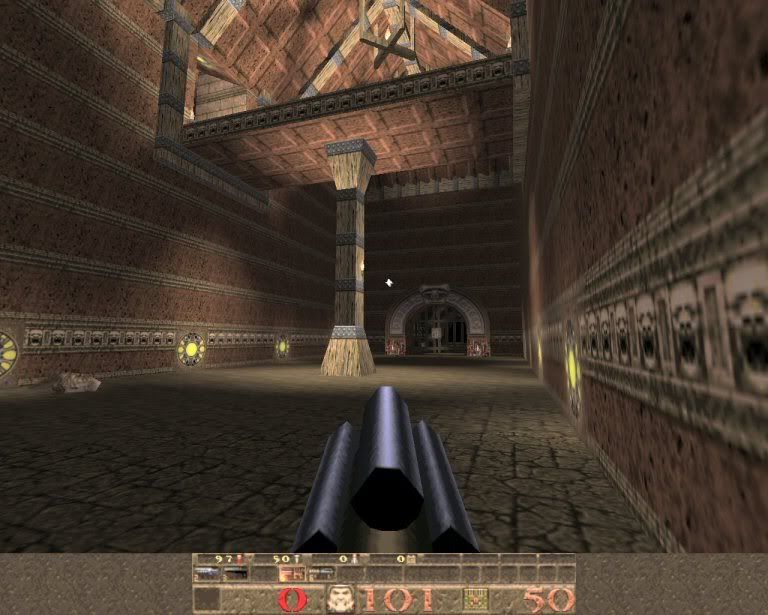
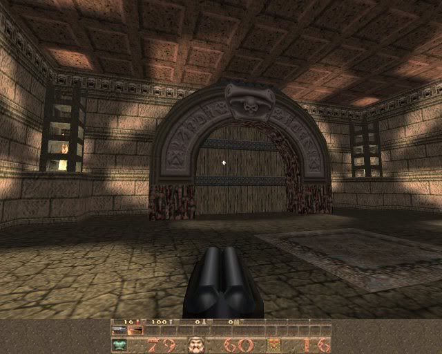
I upped ths scale about 1.5 - which makes it feel a bit empty. I was trying to agitate the player. In hard you�ll notice there aren�t any health packs, only the heal pool and the odd megahealth. The idea was to create the same fear in a seasoned Quake player of today as they would have had when treading these halls in the way back when. >cough< I added the fake doorways, ot was very bland there until then. The stairstep shadows from the lanterns were hard to eliminate - this was as close as I could get, for some reason. (-full -extra4). Sorry about the braziers - and they can�t be turned off. They don�t work the way I imagened they would - just irritating. Visually it's still pretty oldschool, but that certainly doesn't detract from the overall experience. I took the liberty of grabbing a couple of screenshots, simply because no new map announcement should be without some visual reference point.
http://i11.photobucket.com/albums/a155/text_fish/tpof_02.jpg http://i11.photobucket.com/albums/a155/text_fish/tpof_01.jpg I did get properly shocked a few times, which is rare for Quake these days. It's all about breaking expectations, which is absolutely the right thing to do in a remake, whilst of course maintaining the general ambiance of the original. ijed, if you wanted to fix the braziers [they were annoying, especially when backing away from fiends] you could probably place a small clip brush over them, with a slight step so that the player can still move over the top of them. One of the droles on a walkway seems to like to get burned on the braziers, he keeps doing it until he dies. He doesn't even want to break away if you attack him
Quoth.
I still haven't played all through episode 4 anyway, so maybe I will do before I play this map. Yes, I know I've been playing the game 10 years and never bothered to finish episode 4 :) I will one day. Just played in 2 players coop, lot of fun. I like the upped scale, it's really oppressive, really "lovecrafty" that's perfect for a q1 map. The gameplay is great with some shock as Text_Fish said, the level of detail is not. Oldschool does not fit with Quoth I think. But as you said this is not a proper map but more a turtlemap so I think that's pretty fair.
My vote: I like it! I get your point about the scale.
How to create fear or shock in an FPS is probably stuff for a whole thread. Architecture-wise I would say it has to do with not knowing what's behind the next corner. Fear of the unknown, if you will. Broad, tall corridors and well-lit halls perhaps don't have enough "fear spots". You can see pretty far. This theory would favour smaller, more cramped layouts. Like the Alien movies - monster-infested air ducts, low, twisted corridors with timed doors, being locked in a small steel room with monster etc. Confined, inescapable places, possibly even dark. Those movies are full of corridors (sometimes flooded!) - ironically something that mappers are trying to get away from. Rooms are typically small, difficult to survey, and have well-defined functions: sickbays, prison cells, cockpits, cargo bays (these are bigger but full of crates etc.), scrapyards (outdoors, dark), and surprisingly, kitchens and canteens. They're eating all the time it seems (spaghetti!). Atria are few and far between, and are often safe havens and meeting points because space also means space to escape, and space to control. No space means no escape, no control. That sums up why I personally think that larger scale actually creates less horror. Of course Quake just isn't a horror game, not like Doom is. Good Doom levels are very cramped, full of corners and doglegs, monster cabinets, and they're DARK. Build a quake map like that, and people will get annoyed. "It's too dark, cramped, boxy, bleak, oldschool..." Quake is more like a sports game, especially multiplayer. It's more about the flow and "twitch" than horror. Consequently, Quake 2 is a wargame. Although I have to say, in some ways it has more scare potential, for example the prison cells, cyborg stuff and the tech theme. It's not taken advantage of, though. It could have been much more scary. Castles and cathedrals just don't scare me much. Neither do "satanic artifacts". That's why I find maps like Day of the Lords, CDA etc. technically interesting, but not really scary. I find Zerst�rer pretty scary though.
|
| You must be logged in to post in this thread. |
| Website copyright © 2002-2024 John Fitzgibbons. All posts are copyright their respective authors. |