|
Mankrip I mean, will you be able to see that the sand is either floating over the floor or sunken beneath it, due to parallax?
Are here any worthy screenshots:
http://i.imgur.com/90sPB7K.png http://i.imgur.com/bW9vqW2.png http://i.imgur.com/cXuLMWp.png http://i.imgur.com/kHITt10.png http://i.imgur.com/CTVbjrE.png ? Looks very interesting. Unique geometry and feel to these. That rotunda in the first few screens reminds me of a roulette wheel.
That is some crazy central cylinder thing you got going there. I also like that sewer shot with an apparent gold key door. Nice work, keep us updated!
Yes, it looks a bit floating over. But if you look from an angle parallel to the floor, the sand will look fully opaque, because there won't be any surface near it from behind. The depth is calculated from the view plane.
I have an idea for properly multitextured surface blending, which would be way faster to render, but it's also too complicated to try at this moment. drow: It looks good, but you could use different texture themes for each side (medieval/metal/etc.), instead of changing the colors only.
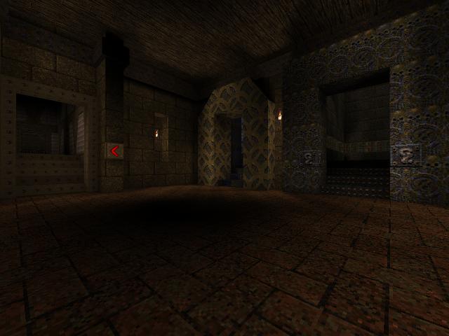
Kres: Really bloody good. Water in Quake doesn't look good enough in pitch black areas, though. It may look better if you try to align your rivet textures in the floor grid in the first shot: they should follow the angle of the metal pieces that make up the shape (dodecagon?).
Other than that, it is looking good. I'd be more inclined to use a more basic texture to avoid filtering seams and sliced rivets. There's a metal texture that's the same background but without rivets that might work better. Or is that one I made myself?
I've got no time to finish this at the moment, but I'd really like some opinions:
download screenshots The floor on the exit to Shub-Niggurath's Pit is crap, I was doing an experiment that turned out bad and scrapped it. Also, the lava texture is wrong because there was a custom texture wad in the BSP compiler path. Two obvious things:
1. the painted-on doorway trim in shot two does not look good (and Shambler hates painted-on trim), and the trim itself doesn't fit the width of the brickwork 2. in shot four, the brickwork of the transom is wrong on the left - the last brick on the left should overlap the pier below it (as it does on the right) otherwise it has no bearing strength 2: I agree, but I didn't want to change the proportions of the geometry too much to fix that.
Those columns are connected to the iron bars of the ceiling, and the fireplaces are centered between both columns, so to fix that I'd have to move the fireplaces and change the relative proportions of the wooden areas of the ceiling. But I'll play around with the proportions to see which looks better: extending the transom, or shortening it. 1: The thing is, the design of the original doorway from the main hall to the episode 2 corridor is almost impossible to salvage: screenshot. It was likely supposed to represent a toroidal arch, but Quake's BSP format doesn't support the kind of texture projection that would be needed to perfectly align the texture on all edges of such a thing. So, I decided to reshape it using a mix of curves and square angles, keeping the textures continuous along the curves, and changing them along the square angled edges. With that in mind, I've also shaped it in a way that allowed most of the doorway to retain the original texture. I'm not sure what you mean by the trim not fitting the width of the brickwork, but its proportions are exactly the same of the original doorway. In the original, the tiles in the lower steps were also cut in half by the doorway. There's no way to fix that without making the tile alignment change across steps, and I don't have a better idea. There's a great challenge in trying to figure out what exactly some of the geometry in the original maps are supposed to represent. Trying to achieve a clear representation without deviating too much from the original design is a really interesting exercise. The area where I took the greatest liberty was the path to Shub-Niggurath's Pit. The original was just a bland underground corridor with the same texture everywhere, but I thought that turning it into a proper underground cave would be more fitting. I've added wooden beams to make the steps of the staircase more noticeable, used a darker texture in the inside of the cave to give it a heavier atmosphere, emphasizing its "hidden underground" nature, and made the shape of the cave start wide and short, and end thin and tall, to emphasize the transition from the realm of humans to the realm of an elder goddess. I've also raised the ceiling of the room with the portal to Shub-Niggurath's Pit to put it in pitch black darkness, thus matching the ceiling of Shub-Niggurath's room in the end map. I did not remember how bad the original texture alignments were until I looked again just now. Oh, my word, they're bad.
The bit about the texture not fitting the brickwork is that the texture is based on circles and the circle is offset on the column. It just grates the eye; neither the circle, nor the enclosed diamond shape is centred on the brickwork. I guess the brushes were created without reference to the texture that would be used, and then the textures applied later at the default alignments. Also, now I look at it again, it is a totally inappropriate texture for a doorway anyway. If I had decided to rebuild (not that I would) , then I would automatically correct those types of errors. ('error' is my choice of word as no builder worth his salt would choose to use an eighth of a brick with seven-eighths; they would use two four-eighths or one whole brick. Although Quake is a fantasy world, the architecture must still make sense.) Nevertheless, good luck with the rebuild. Although Quake is a fantasy world, the architecture must still make sense
No. Maybe it's more believable to some but not necessary at all and limiting to have to create "realistic" architecture. Think about void maps like HipDM1 or the space maps of Quake 3 Arena. Those really defy all logic but they are fun. I only play Q1SP.
When I say it needs to make sense, I mean that an ogre who can make a chainsaw capable of slicing your head clean off your shoulders, would not be so naïve as to not lay his bricks in proper, off-set, courses to ensure good bonding and load bearing strength ;) But I suspect that we may have to disagree on one point: I don't think that 'making sense' is necessarily the same as 'realistic'. The best maps (imo) have fantastical architecture that, nevertheless, makes sense i.e it won't all fall apart with the first grenade explosion. I see you've been reading "Better Caves & Crypts" magazine for those Orge bricklaying tips and tricks. Cheers!
Because I stumbled into this awesome conversation I would like to say the following:
In one of the levels I've been working on, and maybe this is just a form of narcicissm as my theoretical builders suck at modern (Quake) design techniques, I think the builders, even if they were Ogres, did such a good job building, that it is kind of a shame to kill them. Alas, that's what the level is there for. Maybe I'll try to incorporate a merciful "no kill" alternative gameplay where a Ring of Shadows is always available within proper timing, if you can find it based on hints. But I swear at least some of those Ogres really can do infrastructure right... I just watched the Daz stream of your Zerstorer Jam entry the other day. WTF was that level?
Amazing... that's what. I digress... I think we should refrain from culling the Ogre herd until we can be sure there will be enough for the species to survive. I've read at least one theory that those chainsaws were originally designed to cut bricks. Makes sense to me. Grenade launchers were originally "mortar" guns that spewed uh... mortar. In a bureaucratic mix up, the term mortar was confused and explosives suddenly were introduced into their construction routine, to catastrophic results. The rest, as they say is history. You're right about Better Caves & Crypts, I was given a subscription as a retirement present a few years back, and it has had a bad influenced me over me ever since
And I love the ogre chainsaw theory - mortar/mortar - brilliant. Tronyn: having used some (plenty) of your mapwork in some of my released maps - A Roaming Wildebeest in Spain comes to mind - I would describe your maps as great examples of fantastical architecture that always makes sense. Please keep mapping. Sliced rivets always look very wrong to me. I've never seen less than a full rivet in real life.
Any time a texture with rivets spans across two surfaces and rivets fall on the seam, then it should align perfectly. If the texture ends at a seam, it shouldn't end in the middle of a rivet. This is not always possible to avoid, but should never be allowed in an obvious location. Hidden in darkness or where a player is not likely to see is okay. I'm using a ton of the rivet texture in my current map. Trying to avoid "splitting rivets" is challenging. I've been tempted to fire up photoshop and make a rivet-less version of the texture to use as a clean-up for those edges. With content aware scale - this might be possible to do without too much pain.
|
| You must be logged in to post in this thread. |
| Website copyright © 2002-2024 John Fitzgibbons. All posts are copyright their respective authors. |