|
Really curious about what you did with the secrets, I'll play it again in a few days to try and find them. I enjoyed the map, but not a fan of wall humping for the secrets that I managed to find. Here's my playthrough with ramblings, good stuff as usual!
I've now gone from "not entirely convinced" on the secrets to "they were a bad idea", for several reasons:
1. In a map where the detail is mostly happening on the micro scale, i.e. tiny circular brushwork rivets, it is a little unfair to demand the player to notice a very/overly subtle change in texture in a particular spot. JCR stumbled into both his secrets by accident, even though they followed the same pattern. 2. It's fine to have secrets that have explicit, discrete triggers, and also fine to have secrets that don't, and require exploration instead. The best secrets will naturally be some combination of both. But the method used here is actually neither. Mathias Worch (of beyond belief fame)
Glad you explained that, since obviously nobody on func knows who made Beyond Belief. 3. I've said "thumbs up for consistency" earlier, but now I think the near-total consistency actually hurts the gameplay and the secret hunting metagame (real life LD lingo straight from San Francisco).
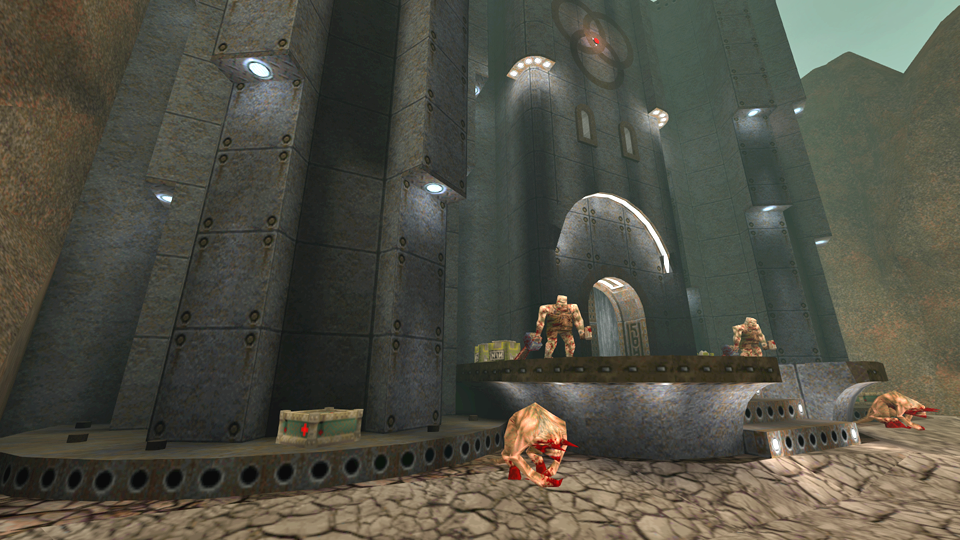
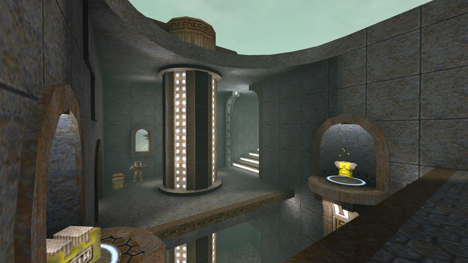
I would say that the right way of hiding secrets is variation, not just mechanically i.e. button vs secret wall, but also in terms of difficulty. Warp Spasm was very famous for its plentiful secrets with various degrees of difficulty (and I quote): The secrets range from stupidly easy (Haunter of the Dark, Bile Plant) to very complex (Shadow Tower, Sealed City) but there's so many in each level that casual players will almost certainly come across a handful. Once you apply the same method of discovery i.e. barely distinguishable secret fake walls to most your secrets, you're making them equally difficult to find, and leave the player with a sense of dissatisfaction. Contrast this to sock's xmas18 map which employed the same method of discovery: the texture on each fake wall was much more pronounced, and there was ample variety in their placement, as some were very easy to spot, and some very more hidden and needed more observation. (Obviously this way of going around things is troublesome on its own - since secret hunting devolves into rather painstakingly observing every surface your eyes come across, and then once you find one secret, you're able to find all of them - so perhaps absolute consistency is not recommended) I think redesigning some of the secrets, i.e. the Shadow Axe, and the Quad, to be more typical Quake secrets, would have made for a less consistent map but a more satisfying one. They're almost all marked in 2 ways (light style plus texture), and they're all optional (my maps are always testing without using any secrets - the items can be a bit arbitrary). Also the consistency means the player can spot ahead of time and plan around.
Maybe by the time I've been making Quake levels and working on AA games for 20 years I'll do secrets slightly differently. As it was, I was just putting them in in a way that inspired me and they're not the major focus of the map. Gameplay-wise - yes maybe the map design prevents fancier gameplay / arena set-ups. The design (correctly Id-ed) was the major focus of the map and the gameplay worked around that. Thus no dropping into pits or whatever. Having said that almost all monsters were placed to either work to their strengths and/or give the player a bit of excitement even if they were relatively easy to deal with (this is a style I personally like, use the monsters for dramatic effect rather than mercilessly inescapable gameplay effect). Also the ogre had a fishing permit and you didn't, so leave him alone. The issue in this map is more of a layout problem whereby the level itself allows for the player to trigger an encounter and then retreat from it.
The vast majority of id1 and indeed all custom levels are built around encounters you can back out of if you really need to. The trick I think is not to go too wild with artificial lock-ins and drop downs, but to make it apparent to the player that he can be in a better position to fight if he just gets stuck in and presses forward into the new area. Item and ammo distribution should encourage player to press forward through the enemies to tool up and then turn round and let rip. The area he is charging into should visibly give him better cover options and vantage points than he'd have if he hung back at the entrance. It's all about dangling carrots to manipulate where you want the player to be. I'm the only one who doesn't have the skybox "dawn-of-time"? :P
When loading the map the console message says that dawn-of-time skybox was not found... so i renamed the interstellar's files that came with the map to dawn-of-time :P Sorry I should have mentioned, I re-uploaded the map file with the DOT skybox in instead. Sorry for the initial mistake and forgetting to mention the update. I reckon interstellAr will work good tho ;)
Uploaded a walkthrough here: https://www.youtube.com/watch?v=yWDhutaeRoQ , with secrets and design commentary etc, plus some bonus content. It might not make secrets less frustrating, but hey ho!
A great work of geometric detail, tainted by poor texture alignment.
The map is fun, the architecture is smooth, but the bad texture alignment breaks the intended visual smoothness. Even though TB may be overall better for mapping, a final texture alignment edit through JACK would make maps like this better. Managed to find all but one secret, killed all the enemies.
Not much to say other than good map Fifth - glad you liked it.
Mankrip - glad you liked the designs. I'm not sure what textures you were finding so distressing (apart from the water puddle which is typically 0.005% of the playtime). I took a lot of care to align the detail / light / trim / drilled metal etc. Due to the geometry there were issues with the domes / convex curves so I deliberately chose plain / homogenous textures for those. The rock floor textures ARE a problem as splitting them up stopped proper alignment. However I regarded this as a small issue compared to the overall effect of the map and since no-one else whatsoever was upset by it, my guess might have been right?? Anyway, rest assured you're now at the top of my beta-testing list if there's a next map! The rock floor textures ARE a problem as splitting them up stopped proper alignment.
It sounds like you're using "align to face" instead of "align to world", but I don't know if TB has an option to switch between both modes. Anyway, for the water puddles "align to view" is better because "align to world" breaks up the alignment when the geometry curves out too much ("align to world" effectively limits the alignment to a 6-face cube orientation, making all faces align to the closest square angle, so it breaks up the alignment across 45 degree angles). There might have been issues as it's british summer time here so the space-time continuum through to germany probably fucked most of the textures. And my brush alignment to grid.
I've made a quick video about the role of texture alignment in level design.
Turn the captions on, I've manually edited them to make it understandable. My English skills are awful. https://www.youtube.com/watch?v=QQq95_Qz5Vg The pipe and water yes. Most people seem to move swiftly on from there though.
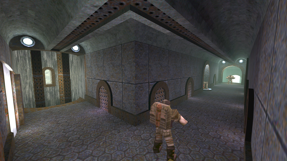
The ground at 3:38, that's two textures there, I put the darker rock texture in for a bit of variety, like the water is seeping in to the dirt. The whole of the rest of the rock floor in that room has b0rked alignment due to the terrainness of the floor, but you didn't seem to notice that? 4:45 is, errr, a secret area. The pillars, from what I've seen, most people don't get too close to them. So yes, there is the odd b0rkage. The whole of the rest of the rock floor in that room has b0rked alignment due to the terrainness of the floor, but you didn't seem to notice that?
I noticed, but I only wanted to highlight the fact that one thing leads to another. After noticing the water, and then the floor near the water, it's obvious that the player would also notice the rest of the floor. It would get repetitive to point at everything. But there's something interesting to mention: As soon as the player turns around the corner the combat begins, so yes, there's less chance that the player will notice the misalignments on the rest of the floor. The less combat there is in an area, the more attention the player will pay to the scenery in order to figure out what to do. The lack of combat stimulates curiosity. The pillars, from what I've seen, most people don't get too close to them. Agreed, which is why I've said that the misalignment isn't a problem in them. I've come to realize that you really don't want your secrets to be found. I found 1 and that was only after I cleared the level and walked through the entire thing all over again. I thought that the brush work was really fancy with a lot of curves - arches and such everywhere. I'm actually curious as to how you created such small domes on grid in some cases.
Game play was okay. I liked the Addams family hands coming out of the grates on the walls. Also nice that you keep the player on their toes by having teleport ambushes from previously cleared areas. I didn't find the combat as fun as Acidophilus. That's not to say it was bad, it just wasn't always as engaging. Still a good map and quality AD content is always appreciated. I might be referencing some of your brush work on this map in the future. It seems like you put a lot of work in even the smallest of areas like the smooth S curve staircase. What is this "on grid" you talk about??
The secrets are very much designed to be found, to reward exploration and observation, and extend playtime for dilligent hunters. See the playthrough video. Almost all marked in two ways and with a consistent motif. I did put a lot of effort into brushwork, that was the plan. Gameplay was designed to be a bit steadier than usual although again most of the monsters are specifically planned to be effective if not very challenging. You might find Annihilith more your taste as this map was a "counter" to that in many ways. |
|
|
| You must be logged in to post in this thread. |
| Website copyright © 2002-2024 John Fitzgibbons. All posts are copyright their respective authors. |