|
Ok, played with the texture set a little bit and came up with this -
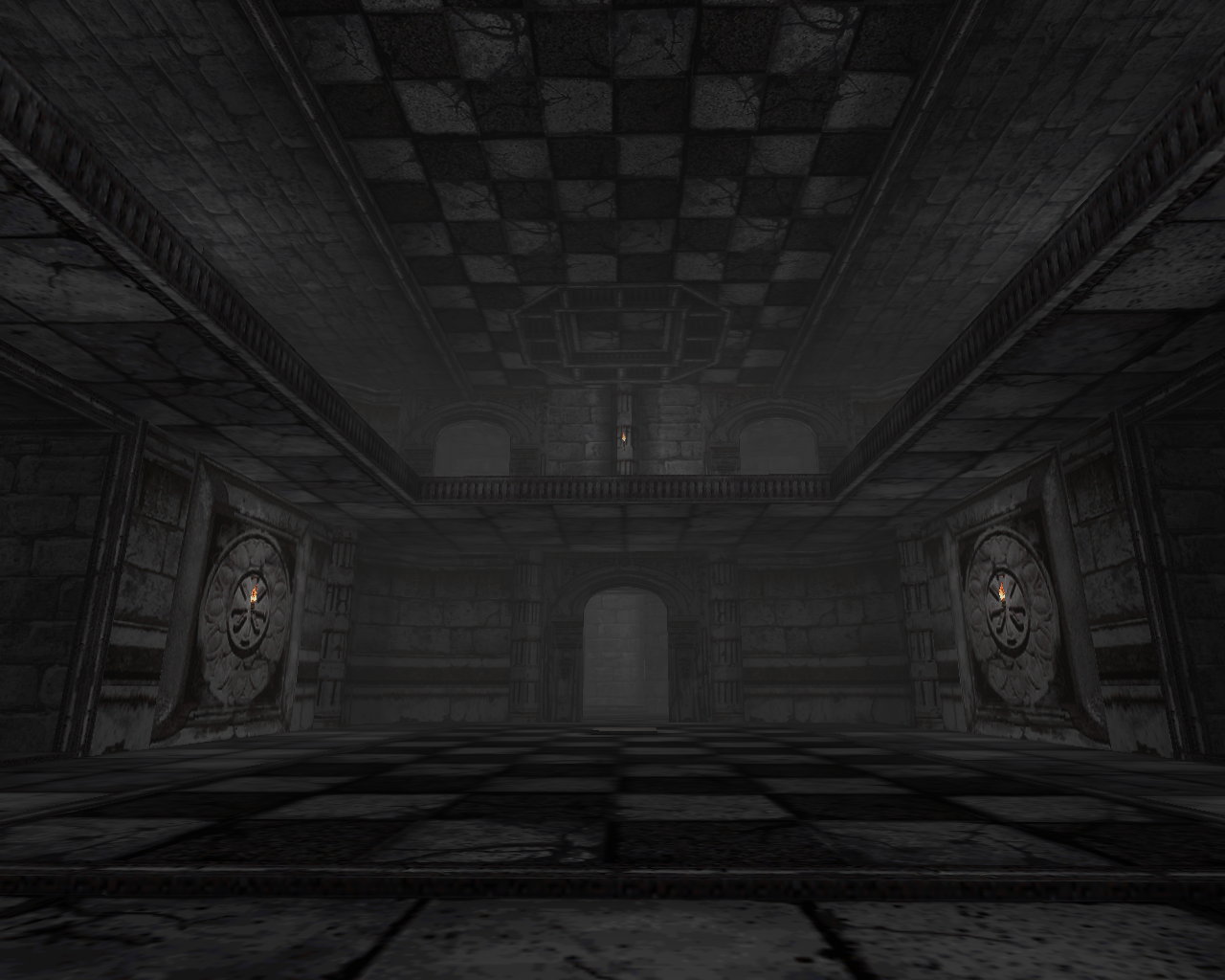
http://www.quaketastic.com/files/single_player/maps/5cat.zip And I'm not 100% sure the set is easy to make it look like it isn't min-lit. The textures are fairly light compared to quake. The filesize of the map is quite large simply because I used 50% scale on them, this tends to have that effect. I wouldn't consider having the textures at normal size because they're not designed for Quake. The room sizes I used are 512x512 I think which is a pretty standard size for a room, bigger rooms are fine but harder to make fun without getting creative with the floor heights and adding pillars for gameplay (which is generally a good idea anyway). Nice little texture set, would be good for making a catacomb style map. As you might notice in the above file I didn't use the wall torches but instead I made my own sconces from brush-work because this is easier to have interesting shadows cast underneath the flames (which can be done with the wall torches but involves messing with the light angles and stuff).
@Fifth I think you meant to post a link to a level not the same demo? Interested in your thoughts as you took the time to experiment.
fifth - yeah the texture set is pretty light, I ended up spacing light sources out quite a bit more than I usually would, even with lower wait values. also I concur with dumptruck, the second zip you uploaded just has a demo in it? I'm excited to see what you came up with
breezeep - thanks so much! and thanks for the demo, I will definitely keep mapping. adib - I think I agree with you. I had a lot of fun limiting myself to just this texture set, and I think it's a beautiful one, but I was a little sad to not have any wood or metal to add in there. I just love trimming things out in wood and metal. Oh right, my mistake then...
Heres the actual file I intended to upload - http://www.quaketastic.com/files/single_player/maps/5cat-map.zip All time that I was playing this map I was felling that it needed intense grey fog instead of black. I played this fog values and got this:
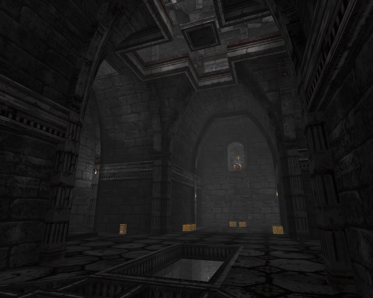
http://quaketastic.com/files/screen_shots/cat1.png http://quaketastic.com/files/screen_shots/cat2.png It looks more mysterious imo. The value is 0.04. fifth - what a great use of the texture set! yeah those lights are very dramatic, I love the shadows and the sense of detail it brings to the textures. there's so much potential to this set
pulsar - that's some fantastic fog! I agree, greater sense of mystery and it really livens up the textures. Especially in that second shot. Love it. I would avoid doing the 50% scale implementation that I did. It increases compile times, reduces how many mark surfaces you can have and can cause some irregularities.
Plus I think the texture set currently doesn't have enough palette variation in its present state. I think having a small variety in colour and tone would make it a better set. But it certainly has potential! Also Pulsar is right about the fog, I think you have to be careful with a set like this as it didn't stop it from looking flat. I like my fog to have a subtle hue, for example if I have a green skybox I will have a slightly green fog, same if it's purple or blue. I'm almost sorry to say this as I know it's such a cliche to complain about this... but this is the histogram for one of those screenshots: http://imgur.com/XvRJ6w7 -- that's not just my monitor or my eyes saying it's too dark to see anything!
Look forward to playing the map though :-) fifth, the map is clearly 100% grayscale on purpose, it's not like he forgot to color it or something
this map makes me want to make my own map using this textureset with desaturated pickups' and monster textures.
I get that. I'm just saying I would have tweaked it a tad, personally. Plus it's a white set, practically a blank canvas that you could have used some subtle coloured lighting like I did in my example map above to add a bit more character.
It's all subjective of course, NarNar can take it or leave it. thanks necros :)
Pulsar - I had that thought! I wanted to use the set for a full map after I'd made a lil room with some zombies, and the red blood and gib explosions were gorgeous set against the textures. (They also flew out of world and cascaded in infinite HOM streaks, which looked SO COOL in grayscale world :P) So it would be neat to use this texture set and desaturate everything except the gore. This is only your second map and your skills have improved alot. I found the map to be on the easy side, with plenty of health and ammunition, even on hard skill. Nevertheless, it was still enjoyable.
First run demo, hard skill, recorded in Quakespasm: http://www.quaketastic.com/files/demos/orl_nar_cat.rar too easy on hard, mainly due to too much ammo. I didn't find the monster amounts to be too small considering room size though.
More varied heights etc in each room. would have been nice, though ths was achieved in some places, with a couple raised ogres, and of course scrags. I liekd the touch of non linearity the super nailgun secret affords - it's a nice touch youshould consider implementing into secrets for future maps. I found a lot of secrets by accident, with hell knights etc shooting buttons and so forth. I didn't mind the monochromatic aesthetic. but considering my comments re lighting in 'finally' I guess thats not saying much... But yes, you're definitely improving! If your productivity and progression keeps up at this pace we all have a lot to look forward too. Thanks You can balance ammo with some quick math and some rules of thumb.
Every 'BIG' box of shells counts as 1000 points of damage. 56 dmg per SSG blast times 40 shells divided by 2 shells per shot, rounded down from 1120 just to fudge a bit for missed pellets. assume an equal rate for the SG, since even though it's actually a little weaker than half a SSG it's more accurate. We're going with an assumed maximum damage of 25 HP per shell. Every 'BIG' box of nails counts as 450 points of damage. (9 per nail/18 per supernail times 50 nails.) Rockets are harder to gauge, because splash can potentially do a lot of damage to a lot of clustered targets, but call one rocket ~180 damage, on average. A 'BIG' box carries 10, so that's 1800. LG, 30 damage per cell, 12 in a 'BIG' box, that's 360 more. Add up the damage that can be done by all the ammo pickups in your map. Add 360 for every ogre, since they drop rockets in twos, 125 for every grunt and 150 per enforcer (you didn't have any), then add another 625 for the player's starting 25 shells. Now, add up all the monsters' health. You see where I'm going with this. You now have two numbers. Are those two numbers close to each other? Is the correct one larger? Is the ratio between them appropriate for the difficulty of your map? Is that ratio steeper on Easy, or on Hard? How much infighting is possible in your map? How much infighting do you want the player to actually rely on? Lun - thanks for all that, gonna keep all that information in a txt file in my map folder. you also managed to explain it in a way that makes more sense for my brain than other things I've read, so thanks! :)
nitin - doesn't it?! I was trying to make it look smoky but I like pulsar's pretty silent hill 2 shit a lot better. https://dl.dropboxusercontent.com/u/33279452/daz_cat.zip
Nice textures and general atmosphere but lighting was weak and felt very uniform. Lots of ammo (too much) made this level quite easy. only found one secret but didn't really look too hard. First play demo (skill 2):
http://quaketastic.com/files/katedra_paru.zip Breathtaking use of a texture set I cannot remember seeing before. Everybody said everything, except: I was really, really hoping the teleporter was not the end yet. This texture set doesn't look properly in the software renderer, overall the colors gets mapped to low-saturated light blue tones. I was surprised to see them fully gray in the screenshots here.
The overabundance of ammo and health definitely made this map too easy. Due to this, even the hardest encounters didn't scare me. Good secrets, well elaborated. I've found them all. The architecture was very good, the vertical vistas were beautiful, but monster placement was a bit odd at times. A scrag noticed me but he was blocked by an elevator, two knights were facing backwards in a staircase and weren't woken up by the other monsters who attacked me, and there were too many monsters too far away, allowing for me to hit them before they noticed me. But it was a fun map overall.
|
| You must be logged in to post in this thread. |
| Website copyright © 2002-2024 John Fitzgibbons. All posts are copyright their respective authors. |