|
Hi,
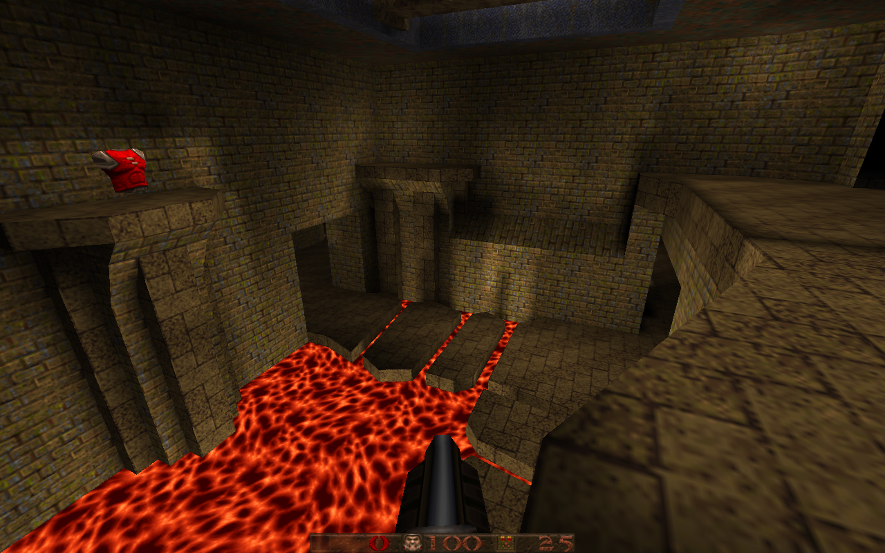
I have created small multiplayer map for duel. Anyone would like to take a look on it and let me know what might be improved? MAP: http://www.quaketastic.com/files/multiplayer/maps/mokodm2_beta.zip screenshot http://www.quaketastic.com/files/multiplayer/maps/spasm0006.png Thanks folks I didn't play a match but I did load it up and looked around.
Things I liked: I has a very solid old school feed to it. Very nice lighting overall. The shadows from the skylights look great. Looks like a fun layout for a duel map for sure. You have some nice brushwork, particularly the Red Amor area. Suggestions: Some of the areas are a bit bland looking. And monochromatic. Try a darker floor color in different areas maybe? You also may want to add some simple trim here and there. Or add some accents like torches or light fixtures. This would help to differentiate the areas. There's an area with a pool of water and room behind the bars it is very dark. Might be a good area for a secret or a strobing or pulsing light. Right now it's just dark. I would consider one more connection between your play areas. The layout seems like a loop and maybe you could add one passageway somewhere to open up the flow a bit. Overall you have a very nice level - keep mapping! I forgot something important in my last post. Use -soft and -extra4 when you light your map. You have a lot of "jaggy" shadows at the moment in your map. These settings will look way better.
More info here: https://ericwa.github.io/ericw-tools/doc/light.html Played against the Reaperbot and had a lot of fun. It can improve on the looks for sure. I'm not talking about brush sculpting, only common sense design like: door frames, variation of color and light/dark on the textures, etc.
I frequently got stuck on teleport frames. Also, I couldn't see a point in that water volume. Am I missing something? Hi guys,
thanks for comments so far!!!! Yeah, I've needed it. Answers to you comments are below. I admit maps is not finished yet. - Teleportes stuck me frequently when I am playing. I plan to correct it. I will move it into wall - Some areas are "bland looking", I have paused work on on great look and testing playability. - I am plannig to retuxturize it. Maybe I will give up for brick texture and try dm4 texture. - I am planning to add frames and details at the end. Regarding dark area, there was passage to the GL room but I have close it. It was not used when we have played with my friend. Water... My plan was to use it to set up trap to kill player who dominates at the moment (it is all about keeping red armor). So you could jump into water and discharge :) Aparently no one has used it so far when playing. It might be removed. I have to admin i have got various comments on the level. First. my own opinion is that level is bit small for duel, as you can run around level within few seconds (yes, strafe jumping!). Then I got feeedback that level is to big and is better for FFA. And another, that it shuld be more open map, not so many corridors as in maze :) At the end I think each plays differently and expect different motions, like more shooting, more sniffing and setting traps. Anyway, thanks again for feedback and yes, I am going to continues mapping as this gives me fun! So I wrote a script to generate arbitrarily-sized stepped terrain from a height map.
https://imgur.com/ZljOJzo Happy to share, but I wrote the script in Mathematica which is not the most mainstream of languages!
https://www.dropbox.com/s/4swxnjpjz6mka7z/quake_from_heightmap.nb?dl=0 Hey Ubiq, I'm a Mathematica user too!
Mma is the best math package out there, and fuck Maple. I didn't tried your code though. Hi guys,
I've been working on my first map for 6 weeks and it's almost ready for release but I'm not sure about the ammo/health distribution and number of monsters. If anyone wants to test it and let me know if it's too easy/hard I'd really appreciate it. Also, any general criticism or advice is always welcome, as it will help me plan future maps better. I intended to just test some ideas and learn the basics of TrenchBroom (thanks dumptruck for the great tutorials) but it got out of hand very quickly so I combined it all into a playable level. There are some puzzle experiments which I decided to leave in, but I made them easy to avoid frustration. I limited myself to just using start.wad, so there isn't much texture variety, but I tried to compensate with geometry The map is based on an ancient Dwarven Forge, infested with monsters. There's a small back story in the readme.txt map & screenshots here: http://daniel.brayforum.com/quakemods I didn't tested the map yet, but I feel it is for sissies again.
In nightmare mode, there should be 500 monsters, at the very least. People play Nightmare because they want a real challenge, so I'll add plenty of pain for the release.
For now, I'd just like to get it balanced for Normal/Hard and then I can remove some for Easy and add loads for Nightmare. The zombie/underground area was the highlight for me. The blue areas felt a bit cramped and the strong enemies made it challenging. I noticed bumping into the geometry in certain areas, see the demos. Check out my comments in the demos as well. It was fun and well designed. Great job!
Demos Thanks jcr for the great demos, and your kind words. I'll definitely take note of your suggestions, I need to tidy up those door edge textures, I keep forgetting because they're not visible in the editor :)
http://www.quaketastic.com/files/screen_shots/CityOfLights.avi
https://www.youtube.com/watch?v=dfqdJxbPB4s Video preview of upcoming map.
|
| You must be logged in to post in this thread. |
| Website copyright © 2002-2024 John Fitzgibbons. All posts are copyright their respective authors. |